Despite a decent fourth quarter, global equity markets had a volatile year in 2015. U.S. and global equities both finished the quarter with solid gains. After the summer correction in the S&P; 500, U.S. stocks snapped back quickly. This was a surprise to many investors who were looking for the end of one of the longest bull markets on record. After the snapback, equities treaded water and moved in a very tight trading range to close out the year. Fixed Income (measured by the Barclay’s Aggregate Index) finished the fourth quarter down slightly, but held on to scrape a 0.55% gain for the year. Commodities, led by oil, continued their sell off and were the worst performing class of the year. The trouble in commodities also affected emerging markets, which finished the year down over -14%.
If you were left scratching your head and wondering why it was so difficult to make money in 2015 you are not alone! According to data from Societe Generale, 2015 was the hardest year to make money in 78 years. U.S. equities (measured by the S&P; 500 Total Return Index) were the best performing major asset class, but only managed to squeak out a gain of 1.38% for the year. That paltry gain was more than bonds, international equities, and short-term T-bills. Way back in 1937 (despite what my kids say I was not around to witness that market!) short term treasuries were the best performing major asset class with a gain of only 0.3%. Even in 2008, bonds were up over 20% so there was somewhere to make money. This year’s environment was very difficult for hedge funds and for strategies that try to capitalize on major global trends.
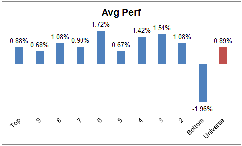
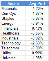
Momentum and Relative Strength was a bright spot for the year. We noticed that more focused (i.e., focused on one specific market) and concentrated (i.e., fewer holdings) strategies performed better. For example, a concentrated U.S. equity momentum strategy did much better than a strategy with a large number of holdings or a strategy that was invested in multiple asset classes. It was also advantageous to have a momentum overlay combined with other factors. Value strategies didn’t fare well in 2015, but value stocks that also had good momentum did very well. A lot of the momentum outperformance this year came from what momentum strategies avoided rather than what they held. When we looked at the performance of the S&P; 500 industry groups and broke them into quintiles (based on a monthly rebalance), the top four quintiles all had similar performance for the year. The performance of the bottom quintile, however, was dreadful. That quintile was made up mainly of Energy and Basic Materials groups. It is rare to see one group underperform the other four groups by such a large margin (over -13%) for the year.
The Federal Reserve finally took action and raised interest rates by 0.25% during the fourth quarter. The move was long anticipated, but had been put off due to market volatility and concerns about the health of the global economy. It is important to keep in mind that even with the hike, rates are still historically low. We have seen some studies recently that show equities are not as affected as you might think until rates get up around 5%, and we are a long way from that now. This may be more of a problem for the fixed income markets than equities, but only time will tell.
As the current bull market continues to age we expect a few things to happen we believe will be positive for our strategies. First, you will begin to hear more cries that the market is “expensive.” That usually affects valuation based strategies more than relative strength based processes. Second, the market will continue to narrow. That is natural and totally expected as the bull market matures. A narrow market is very positive for our strategies because we can overweight the small pockets of strength that are performing well and avoid the areas that are weak. As a result, we are encouraging people to take a look at their portfolios and overweight momentum relative to value. If you have any questions about your allocations or the best way to get exposure to momentum strategies please call us at any time.
Information is from sources believed to be reliable, but no guarantee is made to its accuracy. This should not be considered a solicitation to buy or sell any security. Past performance should not be considered indicative of future results. Potential for profits is accompanied by possibility of loss.