GEnron?

August 7, 2009

General Electric has fallen from grace with the market, and lately, with the SEC as well. They recently paid a $50 million fine to the SEC to settle charges that they had falsified some of their accounting. Of course, GE neither admitted or denied the charges–they just paid.

Floyd Norris, in his High and Low Finance column, wonders whether their accounting problems were an aberration or just standard practice. The accounting issues in question occurred during 2003, although the SEC didn’t get their investigation rolling until 2005. Forensic accountants will have to figure out who knew what when. But if you look at the point & figure relative strength chart of GE versus the market, it went on a sell signal in September 2001. Since that time, the S&P; 500 is up approximately 3%, while GE has lost more than 50% of its value.

This whole debacle points out why we prefer to use price as an input for relative strength, rather than relying solely on fundamental data like many investment management organizations. Fundamental analysts have been working with GE’s financial data for years—and basing investment decisions on it. Unfortunately, the data has now turned out to be false.

Posted by:


Disjointed

August 7, 2009

The August edition of Ford Equity Research’s newsletter (click here to learn more about Ford Equity Research) was in my inbox this morning. I certainly don’t anticipate seeing their newsletter in my inbox like I anticipate seeing the SI Swimsuit edition in my mailbox, but that’s a different story.

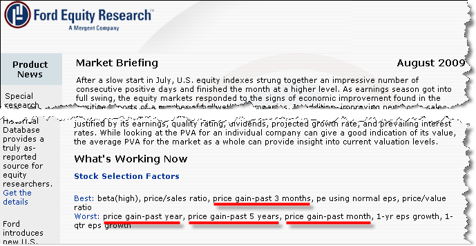
Ford did have one interesting piece of information I wanted to pass along. We have been noticing that relative strength strategies have been, for lack of a better term, disjointed recently. What I mean is some RS formulations are doing fine right now, but others are doing very poorly. Longer term RS, which generally tests much more favorably than shorter term RS, has lagged the market by a wide margin. But some of the shorter term models are doing much better. Go figure. It’s something I can’t remember seeing to this magnitude before.

A couple of months ago I looked at the returns of different RS factors over a YTD time horizon. At that time the 1 Month RS factor was performing exceptionally well, and most of the other factors were lagging the market. We were picking up the initial stages of the laggard rally. It seems the 1 Month Factor, which has traditionally been a better mean-reversion factor than RS factor, seems to have reverted to form. Now the 3 Month Factor is performing well, but the longer term stuff is still lagging. Ford’s interpretation is in the graphic below:

Ford

In the “Best” category you find a bunch of Value factors and the 3 Month Momentum factor. In the “Worst” category you have factors on either side of the 3 Month (1 Month, 12 Month) and some growth factors. Very strange indeed.

It just goes to show how difficult it is right now to define a “strong” stock. Using different RS factors can lead to dramatically different results. We run several different types of accounts using different RS factors. This week, for example, some of the styles outperformed the market by a good margin, and others were way behind. Same philosophy, different measurement period with a dramatically different end product. I wouldn’t expect this type of thing to continue, but a disjointed market like this can leave you scratching your head sometimes.

Posted by: