Via Morgan Housel:

Via Morgan Housel:
 1 Comment |
  Investor Behavior, Markets |
  Permalink

Posted by: Andy Hyer
Wise words from Jim O’Shaughnessy (from an article written August 28, 2014):
In the past, the United States has endured far more perilous times than those we currently face, and I believe that you will never make money betting against the United States over the long-term. We have come through far greater challenges to emerge stronger, more vibrant and ready to face the future. And today, we find ourselves at inflation-adjusted highs for the S&P; 500. Does this mean that stocks will continue to rise? Absolutely not. I’m sure that at some point we will get a 10 to 20 percent correction in the market. But when we do, remind yourself of this simple fact—the U.S. stock market has come back from every setback and gone on to make new highs. Hundreds of years of data back this up. When the next correction comes—and it will come—remind yourself of this simple fact, and BUY.
Past performance is no guarantee of future returns.
1 Comment | Investor Behavior, Markets | Permalink
Posted by: Andy Hyer
Sound advice from James Osborne:
Your strategy is not going to work unless you work with it. I have beaten this dead horse well into the ground, but if you keep looking at your neighbor’s returns, you’re committing investor suicide. Somebody, somewhere did better than you this year. Lots of somebodies. Anyone who works for Facebook or Amazon or Netflix and has a bunch of their net worth in company stock probably crushed you this year. Is that a strategy you should pursue? Probably not, but you need to remind yourself why you have the strategy you do. Everything has a bad year. Value stocks get cheaper. Trendfollowers get whipsawed. S&P; 500 investors get caught in tech bubbles. “Factors” don’t show up.
You will either get this or you won’t. If you think you are entitled to the best return of the best strategy every year, good luck to you. You will bounce from strategy to strategy, constantly disappointed with your returns. You will chase performance and fail to capture the long term return of ANY strategy, let alone the “best” strategy. You’ll fire dozens of financial advisors and complain to your friends about what schmucks these clowns are. You’ll say the markets are rigged. For you, they are and always will be.
Leave a Comment » | Investor Behavior | Permalink
Posted by: Andy Hyer
Insightful commentary from Ben Carlson about the lingering effects of the financial crisis:
We’re well into the seventh year of an economic and stock market recovery. The economic expansion hasn’t been as robust as many would like and the recovery has been uneven, as some have fared better than others in the aftermath of the worst economic contraction since the Great Depression. But you can’t deny that things are much better than they were during that fateful 2007-2009 period.
Click here to continue reading.
Leave a Comment » | Investor Behavior, Sentiment | Permalink
Posted by: Andy Hyer
In a sense, asset allocation decisions are nothing more than a series of trade-offs. If an investor employs a fully-invested equity strategy, the investor may feel the full brunt of of market downturns, but they will also be ready to participate in the rebound. Alternatively, an investor may employ an equity strategy that seeks some measure of risk mitigation by at times raising cash in the portfolio. Such a move may help to limit some of of the downside risk, but has the additional risk of missing some of the rebound.
If only the “all of the up and none of the down” portfolio strategy would hurry up and get invented! Absent that illusive strategy, most investors seek diversification. Perhaps, an investor will diversify their investments among some of the following sleeves:
As we all know, there is no shortage of ways to put together an asset allocation. Everyone has their own twist on how they deal with this task. Each sleeve of the allocation serves a purpose. I have seen meaningful psychological and investment benefits come to clients who employ an equity strategy that has the ability to go to cash. It can help them ride out the inevitable rough patches in the markets knowing that some defensive action may be taken.
At Dorsey Wright, we manage both fully-invested equity strategies and equity strategies that have the ability to go to cash. See below for a profile of our Systematic RS Growth portfolio.
The chart below shows the amount of cash that has been raised in the Systematic RS Growth portfolio over time:
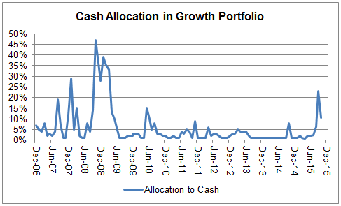
Source: Dorsey Wright, cash allocation of a sample Growth portfolio from 12/31/06 – 10/31/15.
Performance of the strategy is shown below:


Inception 12/31/06. Performance updated through 10/31/15
Over this period of time, the Systematic RS Growth portfolio has outperformed the S&P; 500 by 2.02% annually on a net basis with lower standard deviation than the S&P; 500. Those are the investment advantages. However, the emotional aspect of this type of portfolio shouldn’t be overlooked. My experience in consulting with investors in this strategy over the years is that they take great comfort in knowing that this portfolio has the ability to raise some cash at times. Keeping clients invested and committed to their investment plan is key to helping them ultimately achieve their financial goals.
Among the firms where this SMA is currently available:
Please e-mail [email protected] for a fact sheet or call 626-535-0630.
Click here for important disclosures. The relative strength strategy is NOT a guarantee. There may be times where all investments and strategies are unfavorable and depreciate in value. The percentage allocation to cash shown in the chart above reflects a monthly snapshot of the holdings.
1 Comment | Investor Behavior, Momentum | Permalink
Posted by: Andy Hyer
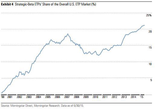
The growth of assets in Smart Beta ETFs is staggering. From Michael Batnick:
Investors have become enamored with alternative ways to slice and dice the indices. According to Morningstar, “Strategic Beta” now accounts for 21% of total industry (ETP) assets, up from under 5% in 2000. As assets have exploded, so too has the number of strategic-beta ETPs, which have grown from 673 to 844 in the past year, while assets grew 25% to $497 billion.
While much of the focus is on the nomenclature- “smart” vs. “factor” vs “strategic,” perhaps the most important aspect is being overlooked; like all things investing, the product won’t to be drive returns as much as your behavior will.
To demonstrate this point, I chose five popular strategies that differ from the traditional plain vanilla cap-weighted index: Nasdaq US Buyback Achievers Index, S&P; 500 Equal Weight Index, Nasdaq US Buyback Achievers, MSCI USA Momentum Index and the S&P; 500 Low Volatility index.*
Every one of these Smart Beta strategies has outperformed the S&P; 500 from 2007-today**. The problem investors run into, as you can see below, is that very often the best performing in each year lagged the S&P; 500 in the prior year. Myopia is a huge impediment to successful investing as much of our “discipline” is driven by “what have you done for me lately?”
Each of these five strategies has outperformed the S&P; 500 over the previous eight years.
Had you chased the prior year’s best strategy, you would have compounded your money at just 3.5%, less than the 6% you would have earned if you invested in the prior year’s worst strategy. This goes to show that mean reversion is a powerful force for a proven, repeatable process.
Interesting. There are all kinds of studies showing that when it comes to individual stocks, buying last year’s winners works great (click here for just one of the white papers written on this topic). However, Batnick is arguing that buying last year’s winning Smart Beta ETF is not effective (at least in this short sample) when it comes to investment factors.
This has important implications for building an asset allocation that includes a variety of Smart Beta factors: You may well be better off simply seeking to identify those factors that are likely to outperform over time (we like momentum and value in particular) and make passive allocations to those factors rather than trying to time your exposure to them.
Smart Beta has, in our view, been a tremendous positive for investors. However, it won’t keep performance-chasing investors from hurting themselves if they fail to allocate money to them in a prudent way.
Past performance is not indicative of future results. Potential for profits is accompanied by possibility of loss.
36 Comments | Investor Behavior | Permalink
Posted by: Andy Hyer
Truly something to be ecstatic about, via Nicholas Kristof of the NYT:
We journalists are a bit like vultures, feasting on war, scandal and disaster. Turn on the news, and you see Syrian refugees, Volkswagen corruption, dysfunctional government.
Yet that reflects a selection bias in how we report the news: We cover planes that crash, not planes that take off. Indeed, maybe the most important thing happening in the world today is something that we almost never cover: a stunning decline in poverty, illiteracy and disease.
Huh? You’re wondering what I’ve been smoking! Everybody knows about the spread of war, the rise of AIDS and other diseases, the hopeless intractability of poverty.
One survey found that two-thirds of Americans believed that the proportion of the world population living in extreme poverty has almost doubled over the last 20 years. Another 29 percent believed that the proportion had remained roughly the same.
That’s 95 percent of Americans — who are utterly wrong. In fact, the proportion of the world’s population living in extreme poverty hasn’t doubled or remained the same. It has fallen by more than half, from 35 percent in 1993 to 14 percent in 2011 (the most recent year for which figures are available from the World Bank).
Consumers of news would be well served to remember this reality—the news only tells part of the story and it is the part of the story that generally makes people depressed and think that the world is coming to an end. From an investment perspective, the headlines of the day are very likely to lead an investor to do exactly the wrong thing at the wrong time.
2 Comments | Investor Behavior, Media | Permalink
Posted by: Andy Hyer
That is the question that has been top of mind for many investors over the past several weeks as the markets have done their best imitation of the Twisted Colossus at 6-Flags. As it relates to our family of separately managed accounts, the answer really differs by portfolio. Here is the overview of the approach to risk management for our 7 Systematic Relative Strength portfolios:
Aggressive
Core
Growth
International
Balanced
Global Macro
Tactical Fixed Income
The chart below is based on Dorsey Wright’s opinion of the likely relationship between volatility and return relationships between each of the different strategies over a long period of time. Actual results may differ from these expectations. Greater volatility may result in greater gains and greater losses.

Life is full of trade offs and the financial markets are no different. Good results are likely to be achieved when a caring financial advisor takes the time to understand their client’s needs and risk tolerance and then to build the right allocation for that client. For those advisors using our SMA’s as part of that allocation, they will find that these 7 portfolios have very different approaches to risk management. All of them employ some form of risk management. Even the fully invested portfolios are managing risk through individual position management (i.e. cutting them back when they become too large a percentage of the portfolio or completely selling them when dictated by relative strength rank) and through sector exposure. Others, like Growth, can raise up to 50% cash to seek to mitigate some of the downside risk. Balanced benefits from the time-tested benefits of combining equities and fixed income. Global Macro is our “go any-where” portfolio that can completely shift away from weak asset classes if needed.
If you would like to receive the brochure for these portfolios, please e-mail [email protected] or call 626-535-0630.
Past performance does not guarantee future results. In all securities trading, there is a potential for loss as well as profit. It should not be assumed that recommendations made in the future will be profitable or will equal the performance as shown. Investors should have long-term financial objectives when working with Dorsey, Wright & Associates.
Leave a Comment » | Investor Behavior, Momentum | Permalink
Posted by: Andy Hyer
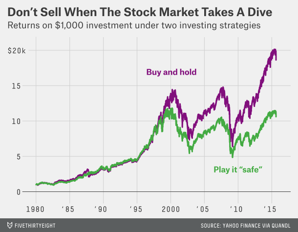
Food for thought from FiveThirtyEight’s Ben Casselman:
Financial markets around the world continued to melt down today. The Dow Jones Industrial Average was down 1,000 points at one point this morning (it has since rebounded). Asian and European shares are down even more. Oil has fallen below $40 a barrel.
Here’s what you need to know: Don’t sell.
Let me try that again, with greater emphasis: Do. Not. Sell.
Got it? Good. You can stop reading. The rest of this article is for people who aren’t convinced.
Let me be clear: I have no idea whether stocks are going to keep tumbling or if they’ll quickly rebound. I don’t know what’s causing today’s collapse. (“Fears that China’s economy is slowing dramatically,” as The Wall Street Journal wrote Monday? Sure, but those fears have existed for months.) I don’t think a few days of turmoil are a sign that the U.S. is headed for another recession, but economists are notoriously terrible at predicting recessions.
But the simple fact is that you don’t know any of those things either. Nor does anyone else.
What we do know is that market crashes, however you define them, happen. Since 1950, the S&P; 500 has had one-day declines of 3 percent or more nearly 100 times. It’s had two dozen days where it fell by 5 percent or more. Slow-motion crashes, where big declines are spread out over several trading days, are even more common.
But every one of those declines has been followed by a rebound. Sometimes it comes right away. Sometimes it takes weeks or months. But when it comes, it comes quickly. If you wait until the rebound is clearly visible, you’ve already missed the biggest gains.
Imagine two people who each invested $1,000 in the S&P; 500 at the beginning of 1980. The first one buys once and never sells. The second one is slightly more cautious: He sells any time the market loses 5 percent in a week, and buys back in once it rebounds 3 percent from wherever it bottoms out. At the end of last week, the first investor’s holdings would be worth $18,635. The second investor would have just $10,613. (For simplicity’s sake, I’m ignoring dividends, fees, taxes and other factors.)
I would argue that most investors would benefit from some portion of their asset allocation being invested in a strategy that has the ability to get defensive, which would involve selling at some point. However, as this article points out, any selling better be part of a well-researched and well-tested strategy because simply investing based on what feels right is likely to end poorly.
5 Comments | Investor Behavior | Permalink
Posted by: Andy Hyer
From Bespoke:
This week’s sentiment survey from the American Association of Individual Investors (AAII) showed that bullish sentiment increased from 24.32% up to 30.45%. So even as volatility increased, bullish sentiment saw its largest weekly increase since late June. At current levels, however, bullish sentiment has now been below its bull market average of 38.1% for 20 straight weeks, which is the longest streak of below average readings in the current bull market. On top of that, bullish sentiment has also been below 40% for 24 straight weeks. The last time that happened was all the way back in 1994.
Bearish sentiment, meanwhile, remains elevated. In this week’s survey, bearish sentiment also increased up to 36.15% from last week’s level of 31.66%. While bearish sentiment remains below its recent high of 40.7% two weeks ago, the trend has clearly been higher since the start of 2015.
Leave a Comment » | Investor Behavior | Permalink
Posted by: Andy Hyer
Interesting analysis by Vanguard estimating that a good financial advisor has the potential to add 3% annually (net) to their client’s portfolios. See below for the breakdown of their estimate:

By their estimation, the area where a financial advisor has the most potential to add value for their clients is in Behavioral Coaching. I would agree that “providing support to stay the course in times of market stress” is among the areas of greatest opportunities for advisors to add value. I am sure we all know clients that made drastic asset allocation changes towards equities in the late 1990’s, arriving just in time for a bear market, or away from equities following the 2008-2009 financial crisis, and have been very slow to return. Such changes can cripple the financial health of an individual and family.
There are all kinds of ways that an advisor could attempt to help their clients stay the course in times of market stress. They could show their clients the data on historical returns of the stock market. They could show their client data with the percentage of rolling 3, 5, and 10 year periods where the stock and bond markets have produced positive returns. They could give reasons why they personally believe that it makes sense to be bullish over the coming year. They could cite the views of a well-known “expert” who believes that the market is going to rise from here. They could share behavioral finance research with the client to try to persuade them that they are being irrational.
Some of the above approaches may have their time and place, but ultimately, I believe they are insufficient to keep clients from making the big mistakes—the types of mistakes that alter their standard of living in retirement.
In my view, an absolutely critical component to helping clients stay the course in times of market stress is to have an asset allocation that can adapt to different, even scary, market environments. Most strategic asset allocations won’t cut it. They are too static and too dependent upon bull markets in the stock and bond markets. I will be the first to admit that being a perma-bear has been a losing proposition over time. However, there must be some portion of a client’s allocation invested in a tactical strategy that can play defense. Take the following as a sample allocation:
What if that 50% in Global Tactical Allocation had the ability to be heavily focused on equities in favorable equity markets. Then, the majority of the time the client is going to have a moderately aggressive allocation in order to participate in good markets. However, the client has the peace of mind that a meaningful portion of their overall allocation can deal with major bear markets. This peace of mind will minimize the chance that they will demand wholesale changes to their overall asset allocation at exactly the wrong time (because a portion of their asset allocation is already shifting as dictated by relative strength) . The last two bear markets are always going to be top of mind for this generation of investors. Permanently defensive strategies (like a constant allocation to gold) are not the answer. Strategic asset allocation falls short. However, a relative strength-driven global asset allocation strategy does a much better job at providing a robust long-term solution for clients.
The relative strength strategy is NOT a guarantee. There may be times where all investments and strategies are unfavorable and depreciate in value.
Leave a Comment » | Investor Behavior, Tactical Asset Alloc | Permalink
Posted by: Andy Hyer
Words of wisdom from Morgan Housel:
One summer in college I interned at an investment bank. It was the worst job I ever had.
A co-worker and I survived our days by bonding over a mutual interest in the stock market.
My co-worker was brilliant. Scary brilliant. The kind of guy you feel bad hanging out with because he makes you realize how dumb you are. He could dissect a company’s balance sheet and analyze business strategies like no one else I knew or have known since. He was the smartest investor I ever met.
He went to an Ivy League school, and after college he landed a high-paying gig at an investment firm. He went on to produce some of the worst investment results you can imagine, with an uncanny ability to pile into whatever asset was about to lose half its value.
This guy is a genius on paper. But he didn’t have the disposition to be a successful investor. He had a gambling mentality and couldn’t grasp that his book intelligence didn’t translate into investing intelligence, which made him wildly overconfident. His textbook investing brilliance didn’t matter. His emotional faults led him to be a terrible investor.
He’s a great example of a powerful investing truth: You can be brilliant on one hand but still fail miserably because of what you lack on the other.
There is a hierarchy of investor needs, in other words. Some investing skills have to be mastered before any other skills matter at all.
Here’s a pyramid I made to show what I mean. The most important investing topic is at the bottom. Each topic has to be mastered before the one above it matters:
Every one of these topics is incredibly important. None should be belittled.
But you can be the best stock-picker in the world, yet if you buy high and sell low – the epitome of bad investing behavior – none of it will matter. You will fail as an investor.
Investor Behavior trumps all other factors. Our solution to this challenge was to embrace a systematic–or rules-based–investment process that seeks to capitalize on a proven investment factor (momentum) while keeping our emotions from messing things up. Some may try to develop the right disposition to be a successful investor on their own. I am skeptical of how much progress can actually be made on that front without the aid of a systematic model, but it is certainly a worthy endeavor.
The relative strength strategy is NOT a guarantee. There may be times where all investments and strategies are unfavorable and depreciate in value.
1 Comment | Investor Behavior, Momentum | Permalink
Posted by: Andy Hyer
The latest Dalbar numbers, via NYT:
For the two decades through December, Dalbar found, the actual annualized return for the average stock mutual fund investor was only 5.19 percent, 4.66 percentage points lower than the 9.85 percent return for the Standard & Poor’s 500-stock index. Bond investors did even worse, trailing the benchmark Barclays Aggregate Bond index by 4.71 percentage points.
In isolation, these figures, which aren’t adjusted for inflation, may seem small. But they aren’t when they recur year after year. In fact, because of the effects of compounding — in which a positive return in one year adds to your stash and can grow further in subsequent years — those annualized numbers translate into life-changing disparities.
Consider a $10,000 investment in the S.&P.; 500 index. Using the Dalbar rates, my calculations show that with dividends, that $10,000 would grow to $65,464 over 20 years, compared with only $27,510 over the same period for the return of the average stock mutual fund investors.
That gap grows over time. At those rates after 40 years, with compounding, the nest egg invested in the plain vanilla stock index would grow to about $428,550, compared with only $75,680 for the average returns of stock mutual fund investors, a $352,870 difference. Disparities of this order have been showing up year after year in the Dalbar numbers. And with so many Americans forced to rely on their own investing acumen because of the decline of traditional pension plans and lax government rules about financial advice, these awful returns really matter.
Keep in mind that those numbers are just average investor returns. Plenty of people excel in the financial markets and, no, passive cap-weighted indexing is not the only (or perhaps not even the best) solution. However, succeeding in the financial markets does require an understanding (or use of a professional who understands) what factors work over time and what investor behavior practices are most likely to lead to good outcomes.
HT: Abnormal Returns
Leave a Comment » | Investor Behavior | Permalink
Posted by: Andy Hyer
One well-recognized method of assessing the overall direction of the market is comparing the S&P; 500’s current price to its 200 day moving average. If the S&P; 500 is above its 200 day moving average, it suggests a lower risk environment for the broad market. If the S&P; 500 is below its 200 day moving average, it suggests a higher risk environment for the broad market. As the adage goes, the trend is your friend. Being prepared to play defense when in a higher risk environment has the potential to help mitigate severe declines for investors. Consider the following charts of the S&P; 500 and its 200 day moving average since 1950 and the second chart showing it since 2000.


Source: Yahoo! Finance. *10/18/1950 – 5/12/2015. The performance above is based on pure price returns, not inclusive of dividends or all transaction costs. Past performance is not indicative of future results. Potential for profits is accompanied by possibility of loss. Investors cannot invest directly in an index. Indexes have no fees.
Since 1950, the S&P; 500 has been above its 200 day moving average 70% of the time. That means that 30% of the time it was below its 200 day moving average and there were some pretty hairy markets during those times. Consider the range of trailing 12 month performance of the S&P; 500 over this period of time:

Source: Yahoo! Finance. 10/18/1950 – 5/12/2015. The performance above is based on pure price returns, not inclusive of dividends or all transaction costs. Past performance is not indicative of future results. Potential for profits is accompanied by possibility of loss. Investors cannot invest directly in an index. Indexes have no fees.
During some 12 month periods, the S&P; 500 had spectacular returns—even approaching and exceeding 60%. However, there were also plenty of trips into negative territory, with a number of them falling 20+%.
What does this mean for your clients? Well, it depends upon the client. If a particular client’s time horizon is really long and their tolerance for draw downs is high, then a passive approach to investing may work just fine. However, most clients would prefer to have the ability to play some defense, especially if they planning on tapping into their nest egg in the near future.
One of the nice features of the 5 Virtus funds that Dorsey Wright was recently hired to provide research for is that they all have the ability to play defense in a meaningful way. Each of the funds implement defensive measures in a slightly different way, but the 200 day moving average is a key component in all 5 of the funds.
To learn more about each of the funds, please click here to access the fact sheets and accompanying How It Works sheets.
The relative strength strategy is NOT a guarantee. There may be times where all investments and strategies are unfavorable and depreciate in value.
Leave a Comment » | Investor Behavior, Momentum, Tactical Asset Alloc | Permalink
Posted by: Andy Hyer
The Irrelevant Investor kills it with this post:
The Worst Investment Strategy Ever
Sarcasm
Do you make bad decisions when your portfolio goes down? What if there was a way to automate the decision so that your emotions wouldn’t get in the way. Good news, I found a way!
Here is the strategy, every time stocks drop five percent, you sell and wait for “clarity.” Why would you voluntarily ride out volatility, right? And here is the best part, you don’t get back in until things have stabilized. Repurchase stocks when they are one percent higher than when you sold, just to make sure that the dust has settled. Better be safe then sorry right? Here is what that strategy has looked like since the inception of the S&P; 500.
Alright so you didn’t beat the buy and hold investors but you did compound your money at 2.8% with less than a ten percent annualized standard deviation. This is just slightly worse than what the average investor has historically earned, but after adjusting for risk this looks like a great alternative.
End sarcasm
If you want to suppress volatility it’s likely you’ll suppress your returns as well, it’s just that simple. Here is an idea- if you are uncomfortable with equities, pick a different asset class. Notably, five year treasury notes have compounded at 6.6% a year since 1957 with an annualized standard deviation of just five percent. Unless your looking for an equity strategy with bond-like returns, you might want to rethink jumping in and out every time the market takes a dip.
Comfortable doesn’t work in the financial markets if you want to earn equity-like returns over time. My simple solution (for typical 55ish-65ish+ year old): Divide your portfolio into three buckets. Income Bucket, Balanced Bucket, and Growth Bucket. For your Growth Bucket, don’t try to manage the volatility (that is, in large part, what the other buckets are for). Don’t do something similar to the strategy described above of selling when you feel uncomfortable and buying when “the dust settles.” Rather, accept that your Growth Bucket is going to have some volatility to it, some drawdowns, some uncomfortable years. By all means, spend the necessary time (or seek the appropriate financial advice) to put together a well-thought-out allocation for that Growth Bucket, but once that part is done, don’t look at the Growth Bucket in isolation. Look at it in the context of your overall asset allocation. Simple advice, but I believe it would lead to much better outcomes than are typically achieved in the financial markets by investors.
Past performance is not indicative of future results. Potential for profits is accompanied by possibility of loss. The relative strength strategy is NOT a guarantee. There may be times where all investments and strategies are unfavorable and depreciate in value. Nothing contained herein should be construed as an offer to sell or the solicitation of an offer to buy any security. This post does not attempt to examine all the facts and circumstances which may be relevant to any product or security mentioned herein. We are not soliciting any action based on this post. It is for the general information of readers of this blog. This post does not constitute a personal recommendation or take into account the particular investment objectives, financial situations, or needs of individual clients. Before acting on any analysis, advice or recommendation in this post, investors should consider whether the security or strategy in question is suitable for their particular circumstances and, if necessary, seek professional advice.
Leave a Comment » | Investor Behavior, Thought Process | Permalink
Posted by: Andy Hyer
Mutual fund flow estimates are derived from data collected by The Investment Company Institute covering more than 95 percent of industry assets and are adjusted to represent industry totals.
This data is presented for illustrative purposes only and does not represent a past recommendation.
Leave a Comment » | Investor Behavior | Permalink
Posted by: Andy Hyer
Mutual fund flow estimates are derived from data collected by The Investment Company Institute covering more than 95 percent of industry assets and are adjusted to represent industry totals.

This data is presented for illustrative purposes only and does not represent a past recommendation.
Leave a Comment » | Investor Behavior | Permalink
Posted by: Andy Hyer
Pre-commitment to a rational investment plan is important, because the intuitive impulse to act otherwise is strong. —Shlomo Benartzi
Understated quote by Shlomo Benartzi, but essential for investment success.
Leave a Comment » | Investor Behavior | Permalink
Posted by: Andy Hyer
In case there was any question about whether or not investors need advice (Forbes):
The stock market was up 30% in 2013, but if you’re like most investors, that’s news to you.
A new Gallup survey shows that nine out of ten people are unaware that the stock market climbed 30% last year. Most believe that stocks performed well, just not that well — 17% say stocks increased 20% and 37% say stocks increased 10%. Three out of ten people thought stocks stayed the same or decreased.
The bull market is well into its fifth year, but many Americans haven’t reaped the gains.
Just 52% of Americans were invested in the stock market last year, down from 62% in 2008, according to a previous Gallup survey. Another study pegs equity allocations at their lowest levels over the last half century. This includes workers who own equities through money invested in a 401(k) or other retirement account.
“Every bull market, such as the one the country is now experiencing, has the bear’s shadow hanging over it. And that shadow tends to grow bigger and darker with every additional month of market gains,” notes Gallup.
But instead of reasoning that folks are scared to put money into the stock market because of hefty gains, the fact is that most investors are actually unaware of these gains.What if investors were handed $10,000 to save or invest now? Just 41% would put it in the stock market, while 36% would keep it in cash and 20% would buy a CD.
1 Comment | Investor Behavior | Permalink
Posted by: Andy Hyer
From Bespoke Investments Group comes a reminder of the continuing skittishness of investors:
One thing that investors have been able to count on during this bull market is that whenever equities run into trouble bulls scatter and bears come out of the woodwork. Given the recent market weakness, that has once again been the case this week. Following the worst week for equities in over two years, bullish sentiment on the part of individual investors dropped and bearish sentiment spiked. According to the weekly survey of investor sentiment from the American Association of Individual Investors (AAII), bullish sentiment dropped from 31.12% down to 30.89%. While that was just a marginal decline, as you can see in the chart, it is still down sharply from where it was in early July.
Meanwhile, the magnitude of the move in bearish sentiment was much greater. Compared to last week’s reading of 31.12%, bearish sentiment rose over 7 percentage points this week to 38.23%. That is the highest level of bearish sentiment in nearly a year (8/22/13). With bullish sentiment now exceeding bullish sentiment by 7.34 percentage points, this is only the second time this year that bears have outnumbered bulls.
It seems that every time the market drops a few percent, bullish sentiment dissipates. In a secular bull market, which we may very well be in, that type of knee-jerk reaction can be costly.
13 Comments | Investor Behavior | Permalink
Posted by: Andy Hyer
Mutual fund flow estimates are derived from data collected by The Investment Company Institute covering more than 95 percent of industry assets and are adjusted to represent industry totals.

This data is presented for illustrative purposes only and does not represent a past recommendation.
1 Comment | Investor Behavior | Permalink
Posted by: Andy Hyer
Who knew we had so much in common with squirrels! Bob Seawright has a fun summary of a study of squirrels that tried to find out what causes a squirrel to flee. After all, we’ve all had the experience of walking right by a squirrel and they don’ t seem to be the least bit bothered. However, make eye contact with a squirrel and off they go. Read his whole article for the methods of the study, but the key conclusion are as follows:
The key point is that it makes a big difference whether or not people are looking at the squirrels, although staying on the footpaths also keeps them calmer. In truly dreadful scientific prose that tries desperately to sound authoritative, the researchers conclude as follows:
“We have identified cues that are likely to be important for risk perception by an urban animal species monitoring its environment. Together with direction of attention of people, urban squirrels were more reactive to pedestrians that showed a divergence from ‘usual’ behaviour (e.g. pedestrians entering areas which are usually human-free), even when not associated with closer approach or changes in speed. In addition to being arboreal (which can include use of anthropogenic structures), which minimizes vulnerability to diurnal terrestrial ‘predators’ (see Herr, Schley & Roper, 2009), general trophic and social flexibility (Baumgartner, 1943; Don, 1983; Koprowski, 2005) may help explain why eastern grey squirrels are successful urban adapters.”
What they mean is that squirrels pay attention to unusual human behavior and eye contact. When they see them, they bolt.
Seawright then skilfully makes the connection to investor behavior:
These squirrels are a pretty good metaphor for us, but perhaps not in the way we might expect. Squirrels, like humans, are highly risk averse. We humans feel a loss two to two-and-a-half times more strongly than we feel a comparable gain. In the wild, that makes perfect sense. If the squirrels run away too readily, they may lose a nut or two, but little else. But if the varmint sticks around too long, it can get eaten by a predator. That’s a loss that is permanent and unrecoverable.
We are remarkably like squirrels. If markets are behaving as we expect, we’re fine. When they deviate from what we expect, we get concerned and pay special attention, ready to flee. And when we spend too much time looking head-on at what’s going on (as when the squirrels’ and the observers’ eyes meet in sweet communion)—perhaps checking our accounts online every day or, heaven forbid, watching one of the “business” channels, we tend to trade (read “bail”) far too often.
The research bears this tendency out. And, sadly, the professionals tend to flee as readily as their clients. The metaphor is a bit mixed, but if we have a good plan in place (a crucial “if”) and when the markets are wild, we’d be wise to “avert our eyes” and stay calm.
In the investment world, being too skittish—bailing out of the markets too readily—is generally much more dangerous to our success than holding on too long, especially when the applicable time horizon is a relatively long one. Staying the course through tough times requires that we deal with immediate pain for far-off gain, which is always very difficult for us. That makes this sort of situation that much tougher.
“Averting our eyes” only makes sense if we have a good plan in place. That is the value of consulting with a competent financial advisor. But, if that is in place, behaving like a squirrel is likely to end in disappointment.

Source: ThinkAdvisor.com
Leave a Comment » | Investor Behavior | Permalink
Posted by: Andy Hyer
Mutual fund flow estimates are derived from data collected by The Investment Company Institute covering more than 95 percent of industry assets and are adjusted to represent industry totals.
This data is presented for illustrative purposes only and does not represent a past recommendation.
2 Comments | Investor Behavior | Permalink
Posted by: Andy Hyer
Mutual fund flow estimates are derived from data collected by The Investment Company Institute covering more than 95 percent of industry assets and are adjusted to represent industry totals.
This data is presented for illustrative purposes only and does not represent a past recommendation.
Leave a Comment » | Investor Behavior | Permalink
Posted by: Andy Hyer
You are currently browsing the archives for the Investor Behavior category.