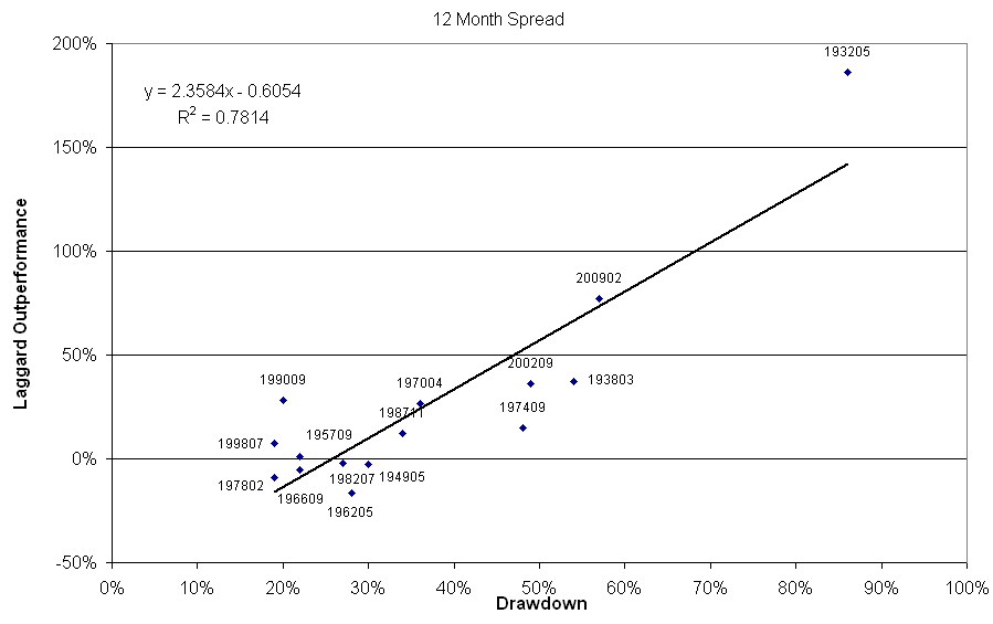
The laggard rally of 2009 has been the second largest in history. Only the massive laggard rally off the market low in 1932 was larger (and by a substantial amount!). Doug Ramsey of The Leuthold Group (http://www.leutholdgroup.com) published a great study in their December 2009 Green Book that addressed laggard rallies in relation to market drawdowns. His thesis is that the larger the market drawdown, the larger the laggard rally.
Doug was kind enough to help me sort through the source data they used for the research (6 Portfolios Formed On Size & Momentum on Ken French’s website) so I was able to recreate his results, which are shown below.
(Click To Enlarge)
The chart above measures the market drawdown on the horizontal axis, and the amount of the laggard outperformance over 12 months on the vertical axis. You can see the very strong relationship between drawdown and laggard outperformance. The laggard rally from the lows of the most recent drawdown are basically sitting on the regression line. In terms of the fitted model, this is about what we should have expected.
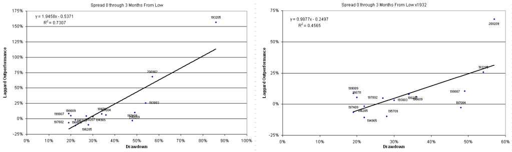
The striking relationship between drawdown and laggard outperformance got me thinking. We are always on the lookout for a reliable regime switching methodology that can reliably predict these periods of laggard outperformance. We have tested a lot of ideas, but nothing ever seems to improve the performance of simply sticking with the winners over the long haul. I broke the performance of the laggards out into multiple time periods to see how the laggard rally unfolds over time. The charts below show what happens over the first three months from the market bottom. One chart includes all of the data, and the second chart excludes the datapoint from the bottom in 1932 because it was such an outlier.
(Click To Enlarge)
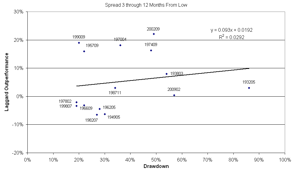
You can see there is a very strong relationship between drawdown and laggard outperformance over the first three months after the market low. Excluding the datapoint from 1932 weakens the fit somewhat, but the relationship is still there. Now compare the performance over the first 3 months to the performance of the next 9 months (months 3-12).
(Click To Enlarge)
Once you get past the initial thrust off the bottom there is very little correlation between laggard outperformance and drawdown. Sometimes the laggard rally ends, and the leaders begin to outperform again. Other times the laggards continue to outperform. It is very unreliable and you might as well just toss a coin.
In looking at the data, it is my opinion that the reason it is so difficult to consistently capitalize on the laggard rallies is that market timing becomes so important. Most of the consistent money is made in the laggards in the initial thrust off the lows. I think it goes without saying that in order to get in at the lows you either need to be a very good market timer or very lucky! Buying laggards near what you think is the bottom can be a disaster. Many people (yours truly included) thought the market bottomed in November 2008. If you had bought some bank stocks at that point you had problems as they got crushed in the first part of 2009. Bank Of America, one of the poster children for laggard stocks in the decline, went from $11.50 to $3.75 from the November lows until the ultimate lows in March 2009. You would have ultimately been bailed out in that trade if you held on because the laggard rally has been so dramatic. But I think everyone reading this needs to be honest with themselves: very few people would have actually held on to that stock for the entire round trip.
Catching a nice laggard rally requires tremendous timing. It also requires incredible fortitude because you must buy companies that appear to have very dim prospects of survival (let alone outperformance). If you can do these two things you must be extremely nimble because the effect doesn’t appear to be consistently reliable once the initial thrust is done. We have just seen the second largest laggard rally in history (at least according to this data). This laggard rally has been about double what we have seen from the rallies off the lows in 1938, 1990, and 2002. Given the magnitude of outperformace by the laggards it is extremely tempting to attempt to enter into a regime switching methodology to capitalize on it. I see two problems with this. First, over time it has been more difficult to consistently capitalize on this phenomenon than the most recent rally would suggest. Second, this laggard rally has been historically huge. You probably won’t get the same results going forward for quite some time. Of course there will be laggard rallies in the future, but history shows they have a higher probability of being much more muted than the current one.


