Back in the 1970s, economist Arthur Okun coined the term “misery index” for a measurement that combined the inflation rate and the unemployment rate. The thought was that everyone in the country would be feeling miserable about the economy if both of those rates were high.
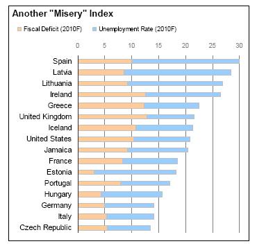
Recently, Moody’s put out their 2010 sovereign outlook. They incorporated a slightly different misery index for sovereign borrowers that incorporates the fiscal deficit and the unemployment rate. The Financial Times has a summary here, along with the table that I have reproduced below.
Here’s what I find interesting about the chart: most of the countries that are in the worst shape are relatively developed economies. The U.S. and western Europe feature in a lot of the top spots. Many of the entrants on the list are wealthy countries that have spent themselves into a problem.
I would not have guessed that the table would look the way it does. We see the same thing all of the time in our Systematic Relative strength accounts where we find ourselves buying stocks or asset classes that would not necessarily have occurred to us to buy in the absence of a systematic approach. It’s a pretty clear reason to use quantitative data and not hunches, emotion, or guesswork to determine where to invest. It’s also a pretty clear reason to keep emerging markets and other non-traditional asset classes on your radar. When you examine everything from a quantitative framework, sometimes it is surprising what pops out.


