Jim O’Shaughnessy, author of What Works on Wall Street, has done a great deal of research on momentum investing. He recently produced commentary in which he pointed out that strong returns in the stock market this year have been driven by stocks that had been pushed down the worst in the six months leading up to the March 9th bottom. Since then, previous losers (low-momentum stocks) have outperformed previous winners (high-momentum stocks) by a staggering amount. O’Shaughnessy stated the following:
As with any strategy, there have been and will be periods where momentum underperforms. Since 1926, there have been several other periods when low-momentum stocks outperformed high-momentum stocks. In general, these periods are aligned with recessionary inflection points when stock leadership changes. These periods are unpredictable, but not unexpected.
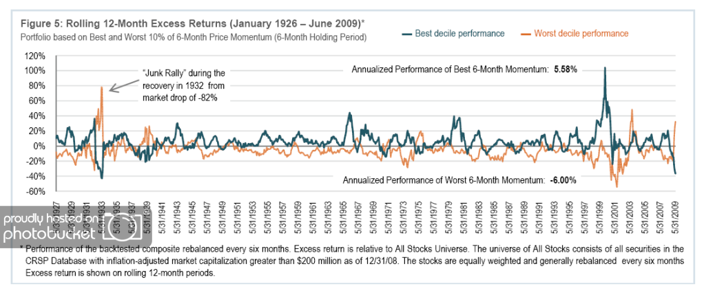
Using the CRSP database, O’Shaughnessy studied momentum investing back to 1926 and concluded that there is a consistent advantage to buying high-momentum stocks. The stocks in the best six-month price momentum decile had excess returns of 5.6 percent per year over his All Stocks Universe, while the stocks in the worst six-month price momentum decile lost 6.0 percent per year versus the All Stocks Universe. Click here for disclosures of the testing process. Historically, investing in “out-performers” versus “underperformers” has created a spread of 11.6 percentage points, as seen in the chart below:
(Click to Enlarge)
As seen in the chart above, historical periods where the worst 6-month momentum outperformed the best 6-month momentum were followed by periods– often multi-year stretches–where high momentum performed very well.
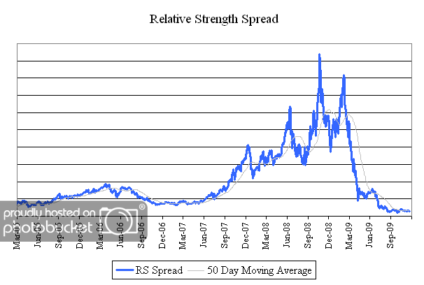
The chart below is the spread between the relative strength leaders and relative strength laggards of U.S. mid and large cap stocks. When the chart is rising, relative strength leaders are performing better than relative strength laggards. Given the historical tendency for high momentum to bounce back strongly from periods of underperformance, the chart below will be important to watch in coming months.
(Click to Enlarge)
