High RS Diffusion Index

June 30, 2010

The chart below measures the percentage of high relative strength stocks that are trading above their 50-day moving average (universe of mid and large cap stocks.) As of 6/29/10.

The 10-day moving average of this indicator is 39% and the one-day reading has fallen to the extremely oversold level of 14%. Dips in this indicator have often provided good opportunities to add to relative strength strategies.


Why Trends Exist

June 29, 2010

Source: Jatrophatrends

What makes the existence of trends possible, you ask?

From Ivanhoff:

At the foundation of every major price trend there is either an improvement in fundamentals or (as it is in most cases) rising expectations for future improvement in fundamentals. From a bird’s eye view major changes in expectations for fundamentals are based on new social trends, business cycle, economic cycle or new regulations – all of them are sustainable sources of change and don’t just disappear overnight. This is what makes the existence of trends possible.

Momentum then becomes an effective means of capitalizing on those trends.

Momentum investing is based on the premise that past price performance is a good indicator of future price performance. Stocks with the highest relative strength over the past 3-12 months often remain among the best price performers over the next 3-12 months. The central idea behind this investment approach is to find an already existing price trend and a proper point of entry.


Relative Strength Spread

June 29, 2010

The chart below is the spread between the relative strength leaders and relative strength laggards (universe of mid and large cap stocks). When the chart is rising, relative strength leaders are performing better than relative strength laggards. As of 6/28/2010:

The relative strength spread continues to mark time at this point, neither rising nor declining. Nobody knows how soon we will again see a rising spread. However, we do know that relative strength tends to move in and out of favor over time. It is quite possible that the transition that we are seeing now could be setting the stage for a very favorable environment for relative strength investing in the coming years.


Across the Pond

June 28, 2010

U.S. investors tend to think mainly about the domestic economy. However, investors and consumers in every country tend to react rationally and similarly to the same incentives. Right now, consumers in the U.S. are pulling back on spending and rebuilding their balance sheets. Their views on risks and rewards have changed. But this is not just a domestic phenomenon. Consumers in the U.K., for example, are doing exactly the same thing. The Daily Telegraph reports:

Families are banking more money than they are borrowing for the first time in more than 20 years, a Bank of England report shows.

The austerity, which is also being seen in government budgets, is coming from the same two sources as in the U.S.:

Peter Spencer, the chief economic adviser to the Ernst & Young ITEM Club, said: “People are reducing their borrowings. It’s the combined effect of some families not being able to get credit and other families choosing to pay their debts off.”

In other words, some of the austerity is voluntary and some is involuntary. The net result is that savings rates are rising in the U.K., as they are here:

Overall savings, including pensions and investments, rose last year from 2 per cent of household income to 7 per cent as families prepared for leaner times, according to the Office for National Statistics. This year, the savings ratio has risen further, to 8 per cent, a level not achieved since 1998.

Consumer behavior, given similar incentives, tends to be quite similar. Investor behavior is no different around the globe. When the economic and political climate seem uncertain, as they are now, investors tend to be risk averse. When investors feel more confident, they are more likely to embrace risk in the quest for higher returns. (Return factors like relative strength tend to work across markets and asset classes because behavior really isn’t so different, despite location and circumstance.) I suspect we will see this same behavior in every country that is currently feeling a fiscal squeeze.

Source: Sizzling Europe

Although the immediate macro-economic effect of increased savings may be slower growth, the long-term impact is a rising store of cash to fuel the next market boom. Money goes where it is treated well-and that asset doesn’t have to be domestic equities. Even in a difficult overall environment for financial assets, there are always big winners. Relative strength can help identify those winners around the globe, wherever they are.


Shifting Wealth

June 28, 2010

The rapid growth of emerging economies has led to a shift in economic power: forecasts based on analysis by late economist Angus Maddison suggest that the aggregate economic weight of developing and emerging economies is about to surpass that of the countries that currently make up the advanced world.

The Organization for Economic Cooperation and Development (OECD) reports that poorer countries now contribute 49% of world G.D.P. - an increase of 9% since 2000. Furthermore, they project that non-OECD members will make up 57% of world G.D.P. by the year 2030.

Source: OECD

There is no need for U.S. investors to drag their feet as this shift takes place. I suspect that there will continue to be tremendous investment opportunities in the United States, and other developed economies, in the coming decades. However, it makes no sense to limit one’s investments just to developed economies, which are becoming a smaller slice of the global economic pie.


Dorsey, Wright Sentiment Survey Results - 6/18/10

June 28, 2010

Our latest sentiment survey was open from 6/18/10 to 6/25/10. The response rate fell off its all-time highs, clocking in at 139 respondents. Your input is for a good cause! If you believe, as we do, that markets are driven by supply and demand, client behavior is important. We’re not asking what you think of the market—since most of our blog readers are financial advisors, we’re asking instead about the behavior of your clients. Then we’re aggregating responses exclusively for our readership. Your privacy will not be compromised in any way.

After the first 30 or so responses, the established pattern was simply magnified, so we are comfortable about the statistical validity of our sample. Most of the responses were from the U.S., but we also had multiple advisors respond from at least two other countries. Let’s get down to an analysis of the data! Note: You can click on any of the charts to enlarge them.

Question 1. Based on their behavior, are your clients currently more afraid of: a) getting caught in a stock market downdraft, or b) missing a stock market upturn?

Chart 1: Greatest Fear. 85.6% of clients were fearful of a downturn, as the bounce off recent lows seems to have alleviated some of the hair-pulling we’ve noticed lately. The market action of the last two months has pushed investor sentiment to very bearish, pessimistic levels, but the modest bounce has taken the edge off; last survey’s fear reading was at 89.1%. Only 14.4% of clients were concerned about missing an up-move, a slight push higher from last survey’s reading of 10.9%. Overall, we are still seeing a strongly pessimistic outlook in client sentiment.

Chart 2. Greatest Fear Spread. Another way to look at this data is to examine the spread between the two groups. The spread remains significantly skewed towards fear of losing money this round. This survey’s reading was 71%, down from last survey’s 78%. Chart 2 is constructed by subtracting the percentage of respondents reporting clients fearful of missing an upturn from the clients reported as fearful of a market downdraft.

Question 2. Based on their behavior, how would you rate your clients’ current appetite for risk?

Chart 3: Average Risk Appetite. The average risk appetite for this survey moved in-line with the other stats we’ve gone over thus far. With a modest bounce in the market, client fear has abated slightly, while the average risk appetite has also ticked higher. This survey’s average risk appetite was 2.29, up from last week’s reading of 2.18.

Chart 4: Risk Appetite Bell Curve. This chart uses a bell curve to break out the percentage of respondents at each risk appetite level. Right now the bell curve is biased to the low-risk side, as it has been for the last two months or so. What we see in the bell curve is just more evidence that clients are afraid of losing money in the market. Just as in last survey, we have absolutely zero 5’s, which points towards a market dominated by fear.

Chart 5: Risk Appetite Bell Curve by Group. The next three charts use cross-sectional data. This chart plots the reported client risk appetite separately for the fear of downdraft and for the fear of missing upturn groups. We would expect that the fear of downdraft group would have a lower risk appetite than the fear of missing upturn group and that is what we see here.

Again we have a total of zero responses with a risk appetite of 5, indicating pervasive fear in the marketplace. Only time will tell if these “oversold” emotional conditions will lead to a market rally.

Chart 6: Average Risk Appetite by Group. A plot of the average risk appetite score by group is shown in this chart. The fear of missing downdraft group had an average risk appetite of 2.18, while the fear of missing upturn group had an average risk appetite of 2.95. Theoretically, this is what we would expect to see.

In the last survey recap, we highlighted the fact that the missing upturn group seems to have a more volatile risk tolerance – their risk appetite as a group seems to swing more frequently and further than the downdraft group. We see this again, with the missing upturn average bouncing 20 basis points from 2.75 to 2.95, versus only a 7 basis point move in the downdraft group, from 2.11 to 2.18.

Chart 7: Risk Appetite Spread. This is a spread chart constructed from the data in Chart 6, where the average risk appetite of the downdraft group is subtracted from the average risk appetite of the missing upturn group. The spread is currently .77, a modest bounce from last survey’s reading of .63.

This round of sentiment survey is still suffering from the effects of the market mini-meltdown which started in late April. The last survey was conducted on 6/8/10, near the lows of the latest downturn; this survey was conducted on 6/18/10, which was the most recent high. The volatility of the last 2 months has put a significant damper on client mood – it seems like the biggest factor in client sentiment is what happened over the last two weeks. As we like to emphasize, it’s important for the advisor to keep the client’s eye on the prize – long term performance. In two weeks, anything can happen in the markets, and as these surveys point out, a client’s emotional tolerance for pain can swing just as easily. It’s your job as an advisor to help the client manage his emotional proclivity to shift his long-term investment objectives, based on short-term market action.

No one can predict the future, as we all know, so instead of prognosticating, we will sit back and enjoy the ride. A rigorously tested, systematic investment process provides a great deal of comfort for clients during these types of fearful, highly uncertain market environments. Until next time, good trading and thank you for participating!


Weekly RS Recap

June 28, 2010

The table below shows the performance of a universe of mid and large cap U.S. equities, broken down by relative strength decile and quartile and then compared to the universe return. Those at the top of the ranks are those stocks which have the best intermediate-term relative strength. Relative strength strategies buy securities that have strong intermediate-term relative strength and hold them as long as they remain strong.

Last week’s performance (6/21/10 – 6/25/10) is as follows:

It was the stocks that had neither very strong nor very weak relative strength that outperformed the universe last week.


Sector and Capitalization Performance

June 25, 2010

The chart below shows performance of US sectors and capitalizations over the trailing 12, 6, and 1 month(s). Relative strength strategies buy securities that have strong intermediate-term relative strength and hold them as long as they remain strong. Performance updated through 6/24/2010.


Fund Flows

June 24, 2010

The Investment Company Institute is the national association of U.S. investment companies, including mutual funds, closed-end funds, exchange-traded funds (ETFs), and unit investment trusts (UITs). Members of ICI manage total assets of $11.82 trillion and serve nearly 90 million shareholders. Flow estimates are derived from data collected covering more than 95 percent of industry assets and are adjusted to represent industry totals.

Taxable bonds continued to attract the most assets in the week ending 6/16/10. Foreign equity flows also moved from a net inflow to a net outflow for this week.


Don’t Hold Your Breath

June 23, 2010

Many investors refuse to participate in the market from time to time because it is, in their opinion, “over-valued.” Definitions and opinions on what constitutes over-valuation vary widely. Any given day, you can read pundits in the financial press declaring both over- and under-valuation at the present time. Whatever the proper valuation is, it’s a pretty nebulous concept.

CXO Advisory shared the results of a paper that looked at the reversion of stock markets to a valuation benchmark based on a world stock market index. In other words, when the market is over-valued does it make sense to wait around for it to correct back to the mean? Or should we just go with the flow, keeping in mind Keynes’ maxim, “In the long run, we are all dead”?

CXO concluded:

…evidence indicates that speed of reversion of stock markets to a valuation benchmark is not reliable over an investing lifetime.

They reached this conclusion because, working with a huge 109-year data sample, the study showed that correcting divergences took a long, long time:

On average over the entire sample period, stock markets eliminate half of a divergence from the valuation benchmark in about 13.8 years…

The 95% confidence interval for correcting half the divergence was a span from 10 to 21 years. Yikes! When something gets out of synch, it can stay that way for a long time. An investor probably will not have the luxury of waiting around for the market to go where it is theoretically supposed to. In this context, following the current trends in markets to extract returns today may be a more realistic option than waiting around for markets to behave themselves tomorrow-or 15 years from now.


Your Money or Your Life

June 23, 2010

This used to be just a cliche that muggers would use when relieving you of your wallet. Apparently Americans headed toward retirement feel like they are being mugged as well. According to an Allianz Life Insurance study cited in Financial Planning magazine,

…more respondents between the ages of 44 and 49 say they fear outliving their assets more than they fear death (77% versus 23%).

In other words, an overwhelming majority consider running out of money a fate worse than death. Saving and investing must be far worse than death because Americans really don’t want to do that.


Global Macro: It’s Not Just for Breakfast Anymore

June 23, 2010

Bloomberg Businessweek has a nice article about how small investors are currently embracing hedge fund-like strategies. One of the most prominent hedge fund strategies is global macro, in which the manager has the freedom to forage among all kinds of global asset classes. At Dorsey, Wright we offer exposure to a global macro strategy through both a separate account (Global Macro) and a mutual fund (Arrow DWA Tactical Fund, DWTFX).

Retail investors are intrigued for a couple of reasons. After large losses in 2008, investors seem to be more willing to explore alternative asset classes and to experiment with a more tactical approach. There may also be some level of disenchantment with strategic asset allocation, which did not perform as expected during the last bear market.

According to the article, one of the significant attractions of hedge fund-like strategies is this:

Hedge funds as an asset class have a high correlation to equities during bull markets and a low correlation during bear markets…

This is certainly true of our global macro asset class rotation strategy using a systematic relative strength criterion. If you dig into our recent white paper on asset class rotation, you can see how the portfolio beta ranges up and down in different environments.

[click on the image to enlarge it]

Source: Dorsey, Wright Money Management

The big shift in perspective, though, has to do with the level of allocation to tactical strategies. In the core-satellite approach, tactical or global macro approaches were typically considered as part of the satellite package and were given small capital allocations. That has changed rather dramatically. According to one fund manager interviewed in the article [my emphasis]:

…while the tactical approach is labeled “alternative,” it’s not attracting the typical alternative-asset allocation of 3 percent to 5 percent. “More often, [retail investors] are making this a core allocation. We’re getting a 35% core allocation typically because advisors don’t think they’re getting return expectations or risk [protection] out of traditional strategies.”

We’ve seen much the same thing since the launch of our popular Global Macro separate account last year-very often this portfolio is operating as a core allocation for clients.

What has caused the change in mindset? Clients appear to be interested in the strategy for multiple reasons. Some clients gain comfort that it can hold growth assets-but it’s not necessarily locked into holding them in difficult markets. Other clients seem to be attracted by the fact that the menu is broad and encompasses domestic and international equities, fixed income, currencies, commodities, real estate, and inverse funds. Like all global macro strategies, that leaves it free to pursue returns wherever they may be. Other clients focus on the ways in which our portfolio is different: unlike an actual hedge fund, for example, our portfolios do not employ leverage and have a much higher level of transparency than a traditional global macro fund.

Whatever the reasons, it seems that tactical global allocation is increasingly being considered part of investors’ core allocation.

To obtain a fact sheet and prospectus for the Arrow DWA Tactical Fund (DWTFX), click here or call Jake Griffith at 301-260-0163.

Click here for disclosures. Past performance is no guarantee of future results.


High RS Diffusion Index

June 23, 2010

The chart below measures the percentage of high relative strength stocks that are trading above their 50-day moving average (universe of mid and large cap stocks.) As of 6/22/10.

This indicator is snapping back after having reached very oversold levels. The 10-day moving average has now risen to 42% after having reached a low of 21% on 6/1. Dips in this indicator have often provided good opportunities to add to relative strength strategies.


“One of the Most Fascinating Phenomena in Finance”

June 22, 2010

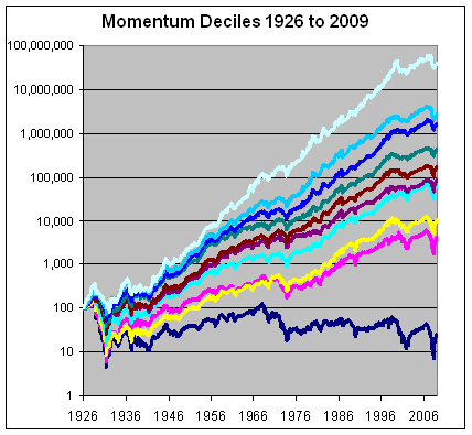
Using data from Dr. Ken French’s website, Eddy Elfenbein has posted updated performance of momentum models that cover the 1926-2009 period. Elfenbein states, “This is one of the most fascinating phenomena in finance. Stocks that have done well, on average, continue to do well.”

The chart shows the historical performance of stocks ranked by momentum decile (meaning 10% slices).

image951.png

The deciles are perfectly rank ordered. The stocks that had been doing the best, do the best. The stocks that had been doing the worst, fare the worst.

The data comes from Dr. Ken French’s website. Just to be clear, momentum is defined by performance over the 11-month period starting 12 months ago and ending one month ago. The one-month directly prior to each period is excluded. At the end of the month, the whole thing is repeated. The data series goes back over 80 years.

Here’s how each decile has performed:

Decile 1: 16.79%
Decile 2: 13.11%
Decile 3: 12.42%
Decile 4: 10.63%
Decile 5: 9.42%
Decile 6: 8.47%
Decile 7: 8.05%
Decile 8: 5.73%
Decile 9: 4.54%
Decile 10: -1.73%

Such superior results achieved by momentum, aka relative strength, is exactly why we have based our entire management process on its application.

Past performance is no guarantee of future results.


Relative Strength Spread

June 22, 2010

The chart below is the spread between the relative strength leaders and relative strength laggards (universe of mid and large cap stocks). When the chart is rising, relative strength leaders are performing better than relative strength laggards. As of 6/21/2010:

What is likely to follow this transitionary phase of the RS Spread over the past year? I suspect that we are setting the stage for a very favorable environment for relative strength investing in the coming years.


Attention, All Municipal Bond Speculators

June 21, 2010

Yikes! I hadn’t realized that the credit default swap market is pricing the default risk of some municipal debt higher than some troubled European countries!

Source: The Economist (click to enlarge)

The prospect of some states defaulting over the next ten years is something that is new. Maybe things really are different this time. Is your investment policy equipped to handle a left-field event like this?


Six Impossible Things Before Breakfast

June 21, 2010

“ALICE laughed: ‘There’s no use trying,’ she said; ‘one can’t believe impossible things.’ ‘I daresay you haven’t had much practice,’ said the Queen. ‘When I was your age, I always did it for half an hour a day. Why, sometimes I’ve believed as many as six impossible things before breakfast.’”

—-Lewis Carroll, Alice in Wonderland

This is the beginning of an article from The Economist entitled “Something Doesn’t Fit.” The piece goes on to discuss something that is happening now in the capital markets, but according to handbooks on strategic asset allocation, isn’t supposed to happen. Both gold and Treasury bonds are doing well. Market lore says gold is supposed to do well during times of inflation and Treasury bonds are supposed to do well during deflationary periods. As The Economist points out:

There is something remarkable about this combination. You would expect the performance of gold and Treasury bonds to be inversely correlated. When gold was at its real all-time high in 1980, the ten-year Treasury-bond yield was 10.8%. Fixed-income investors had suffered years of negative real returns in the 1970s.

Adding other assets to the mix does not solve the dilemma. David Ranson of Wainwright Economics, a consultancy, has examined how gold and corporate-bond spreads have worked as a guide to asset allocation since 1978. The gold price is an indicator of inflationary pressures. Bond spreads are an indicator of growth: investors are happy to take the risk of owning corporate bonds, and spreads come down, when the economy, and thus business revenues, are strengthening. Over the year to end-May gold was up by 25% while corporate-bond spreads narrowed sharply. History suggests that such a combination should be bad news for government bonds.

One of the more striking things about financial markets is their repeated ability to do impossible things; impossible at least in the finance textbooks. It turns out that a lot of the things history suggests just don’t pan out.

This is one of the reasons that a trend-following approach based on relative strength can be so helpful. Trend following does not make any a priori assumptions about how the world works or about how things are correlated. It just goes with the flow. A trend follower has no difficulty reconciling gold and Treasury prices going up at the same time. What is, is.

Models that are based on historical correlations are prone to break when (not if) the correlations go haywire. Relative strength models are designed to be adaptive. This is one of the primary reasons we choose to have all of our investment processes driven by relative strength.

As relative strength flows from one asset class to another, an adaptive simply model changes the holdings. The changes in relative strength between asset classes are generally somewhat durable. The flow in relative strength, after all, usually has a rational cause. In the case of the recent conundrum, The Economist suspects a couple of possible causes:

So what explains the current situation? Both gold and Treasury bonds could be classed as “safe haven” assets that investors buy when they are risk-averse.

So the safe haven trade is one possibility. The next possibility is very different:

Martin Barnes of Bank Credit Analyst, a research firm, points out that the direction of official policy (low rates, quantitative easing, big deficits) looks inflationary but the economic fundamentals (a big output gap, sluggish credit growth) look deflationary. Faced with this dichotomy, investors who buy both Treasury bonds and gold are not displaying cognitive dissonance. They are just hedging their bets.

In the absence of being able to figure out what will happen next, perhaps investors are just hedging their bets-otherwise known as “having no clue.”

From a fundamental point of view, these choices are quite different. From the point of view of a relative strength investor, the explanation is less important than what is actually happening. Impossible things will contine to happen, but relative strength will just continue to adapt.


Weekly RS Recap

June 21, 2010

The table below shows the performance of a universe of mid and large cap U.S. equities, broken down by relative strength decile and quartile and then compared to the universe return. Those at the top of the ranks are those stocks which have the best intermediate-term relative strength. Relative strength strategies buy securities that have strong intermediate-term relative strength and hold them as long as they remain strong.

Last week’s performance (6/14/10 – 6/18/10) is as follows:

Last week was a good week for the entire universe of securities. Those stocks with the highest relative strength (top decile) outperformed the universe by 37 basis points.


Dorsey, Wright Sentiment Survey - 6/18/10

June 18, 2010

Our participation rate is hovering near all-time highs; thank you very much for participating. Let’s keep the momentum going!

Here we have the next round of the Dorsey, Wright Sentiment Survey, the first third-party sentiment poll. As you know, when individuals self-report, they are always taller and more beautiful than when outside observers report their perceptions! Instead of asking individual investors to self-report whether they are bullish or bearish, we’d like financial advisors to weigh in and report on the actual behavior of clients. It’s two simple questions and will take no more than 20 seconds of your time. We’ll construct indicators from the data and report the results regularly on our blog–but we need your help to get a large statistical sample!

Click here to take this week’s client survey!

Contribute to the greater good! It’s painless, we promise.


Sector and Capitalization Performance

June 18, 2010

The chart below shows performance of US sectors and capitalizations over the trailing 12, 6, and 1 month(s). Relative strength strategies buy securities that have strong intermediate-term relative strength and hold them as long as they remain strong. Performance updated through 6/17/2010.


The Arrow DWA Balanced Fund (DWAFX)

June 17, 2010

Financial advisors will often categorize their book of business in order to be able to more efficiently structure their business efforts. It is common practice for financial advisors to categorize their book into “A,” “B,” and “C” clients. The A clients are generally those with the largest assets and tend to be the best source of referrals. The B clients have potential and may one day turn into A clients. Finally, the C clients make up that portion of an advisor’s book of business that may have smaller account balances (often in the range of $50,000 - $250,000 of liquid assets.) The A clients tend to get the most specialized attention and the C clients tend to get the least. However, just because the C clients tend to get the least amount of specialized attention from the financial advisor does not mean that they are not personally important to the advisor. Furthermore, the C clients can represent both a current and future meaningful piece of business for the advisor. I would suggest that many C clients throughout the industry feel neglected by their financial advisor and I would also suggest that the quality of financial advice and portfolio execution is often not up to par with that which is provided to the A clients. This need not be so.

Several years ago, we brought a strategy to the market that I believe is an ideal solution for this portion of an advisor’s book of business: The Arrow DWA Balanced Fund (DWAFX.) This global tactical asset allocation strategy invests in U.S. equities, international equities, fixed income, and alternative investments. The allocations are driven by a systematic relative strength process that seeks to overweight the portfolio in those asset classes with the best relative strength. However, this strategy will always maintain a minimum amount of exposure in each of the asset classes in order to buffer the volatility and as a way to mitigate the amount of underperformance experienced during major changes in asset class leadership. The ranges of exposure in the strategy are shown in the table below:

(Click to Enlarge)

There are 4 reasons why this is the ideal solution for the C clients.

  1. Within one portfolio an investor is able to achieve broad diversification across multiple asset classes.
  2. The strategy is designed to benefit from shifting exposure to those asset classes with the best relative strength. However, it always maintains at least some exposure in each of the asset classes at all time in order to buffer the volatility and to mitigate the underperformance during major changes in asset class leadership. As a result, there tends to be less hand-holding required by the financial advisor.
  3. There is no need for the financial advisor and the client to meet periodically in order to “re-balance” the portfolio. All re-balancing is done on an ongoing basis and is driven in a disciplined fashion by relative strength.
  4. It is likely to be an easy sell, given the excellent performance of the strategy since its inception in August of 2006. As can be seen in the table below, the fund is outperforming 97% of its peers YTD, it is outperforming 79% of its peers MTD, it is outperforming 67% of its peers over the last twelve months, and it is outperforming 90% of its peers over the last three years.

Source: Morningstar, updated through 6/16/10

To get a feel for how this fund adapts over time, see the charts below which show the allocations to each of the different asset classes from December of 1998 to date. (Data before the fund’s inception of 8/9/06 is based on hypothetical returns.) You can click the images to enlarge them.

The Sector rotation portion of the strategy can invest in the following sectors: Basic Materials, Consumer Goods, Consumer Services, Energy, Financial Services, Healthcare, Industrials, Technology, Telecom, and Utilities.

The Style rotation portion of the strategy can invest in the following styles: Large Cap Growth, Large Cap Value, Mid Cap Growth, Mid Cap Value, Small Cap Growth, and Small Cap Value.

The International rotation portion of the strategy can invest in the following countries: Australia, Austria, Belgium, Brazil, Canada, China, France, Germany, Hong Kong, India, Israel, Italy, Japan, Malaysia, Mexico, Netherlands, Singapore, South Africa, South Korea, Spain, Sweden, Switzerland, Taiwan, Thailand, Turkey, and the U.K.

The Fixed Income rotation portion of the strategy can invest in the following: Aggregate Bonds, Corporate Debt: Short Term, Intermediate, and Long Term, Govt. Agencies, U.S. Treasurys: T-Bills, Notes, and Govt. Bonds.

The Alternative rotation portion of the strategy can invest in the following: Commodities: Aggregated, Agriculture, Energy, Industrial Metals, Precious Metals, Softs, Currencies, REITs, and TIPs.

To obtain a fact sheet and prospectus for the Arrow DWA Balanced Fund (DWAFX), click here or call Jake Griffith at 301-260-0163.

Click here for disclosures. Past performance is no guarantee of future results.


Fund Flows

June 17, 2010

The Investment Company Institute is the national association of U.S. investment companies, including mutual funds, closed-end funds, exchange-traded funds (ETFs), and unit investment trusts (UITs). Members of ICI manage total assets of $11.82 trillion and serve nearly 90 million shareholders. Flow estimates are derived from data collected covering more than 95 percent of industry assets and are adjusted to represent industry totals.

Taxable bonds continued to attract the most assets in the week ending 6/8/10.


The “All-in-One Fund” With a Twist

June 16, 2010

Morningstar’s Christine Benz recently made the case for the “All-in-One Fund” that has the ability to allocate among multiple asset classes. According to Benz, the most compelling reason to choose such a fund:

Finally-and I’d say this is the key reason why it’s a mistake to avoid all-in-one allocation funds-flexibility can be an important advantage for talented managers who choose to take advantage of it. In a recent column I noodled on what constitutes a core holding, and Morningstar.com users chimed in with their own take on this topic. The mother of all core investments, as one poster argued, is one that has the freedom to go wherever opportunities beckon. [My emphasis added]

One of Benz’s favorite funds in this category is the $40 billion BlackRock Global Allocation Fund (MDLOX.) This value-oriented fund, has generated excellent returns over time. It also happens to only have a correlation of 0.44 to our own “All-in-One Fund”- our Global Macro portfolio. Mixing a good value strategy with a good relative strength strategy may allow you to increase your returns and decrease the volatility as can be seen in the efficient frontier below:

(Click to Enlarge)

A 50/50 mix between the Global Macro strategy and the BlackRock Global Allocation fund resulted in higher returns and less volatility than either of the strategies independently. The S&P 500 only had a 0.29% annualized return over this same time period and had an annual standard deviation of 17.95%.

To receive the brochure for our Global Macro strategy, click here. For information about the Arrow DWA Tactical Fund (DWTFX), click here.

Click here and here for disclosures. Past performance is no guarantee of future returns. Source of returns for MDLOX is Yahoo! Finance.


Bonds: Upon Further Review

June 16, 2010

One of the effects of PBSS (Post-Bear Stress Syndrome) has been the flood of money into fixed income over the last couple of years. According to the Investment Company Institute, from October of 2007 through May 2010 there have been net inflows into bond funds of $230 billion while there have been net redemptions from equity funds of $553 billion. After going through two major bear markets in 10 years, investors want less risk. It is only understandable that investors have reacted this way. Over the last ten years, investor’s focus has steadily moved from investing in order to achieve long-term financial goals, like providing for a comfortable retirement, to a focus on avoiding short-term portfolio losses. However, the further that we get from the last bear market the more investors are going to remember the whole reason for investing in the first place. Once again, they will start looking at their current assets and deciding whether or not they will have enough money to maintain their lifestyle throughout their lives. When those shifts in focus start to take place, more and more investors are going to take a closer look at their current asset allocation and wonder if their giant bond portfolio is going to get the job done.

For many investors today, their view of bonds has been colored by the performance of this asset class over the last thirty years. Over this period of time, the wind has been at the back of bond investors as the yields have steadily declined from their peak in 1981 (bond yields and prices move inversely).

(Click to Enlarge)

Data courtesy of The Leuthold Group.

However, the experience of fixed income investors was something entirely different prior to 1981. As seen in the chart above, from 1957 until 1981 bond yields trended higher (and bond prices declined.)

The chart below shows the real (net of inflation as defined by CPI) return of the 10 year Treasury Note Total Return Bond Index from 1969 to April 2010.

(Click to Enlarge)

Data courtesy of The Leuthold Group.

A lot of investors may be surprised by this chart. All of a sudden bonds don’t seem quite so safe when considered in the context of real (after inflation) returns. I have real return data for the 10-year Treasury Note Total Return Index from December of 1969 through April 2010. From December 1969 through December of 1981, when yields were rising, the average 12 month real return of bonds was -3.16%. From January 1982 through April 2010, when yields were declining, the average 12 month real return of bonds was 7.18%. The question now is what comes next for bonds. They have been excellent for 30 years, but we have also seen periods where they were dreadful.

Harold Parker, one of our senior portfolio managers, entered this business in the late 1970s and offers some perspective on investor sentiment towards bonds both then and now:

One of the problems with getting older is that you start to lose some of your old friends. I have been experiencing that in my life. The friends who are being called back to their maker were born in the early 1980′s and one by one they are disappearing. These friends, these remnants of a bygone era, are not people; they are Treasury bonds. They are some of the last survivors of a time when double digit yields on long term Treasurys were there for the taking. Locking in a “risk free” double digit yield for decades seems so attractive now, yet investors could hardly be persuaded to take long term bonds by anything short of a gun.

It was a different world when these old friends were born. Bonds had been in a decades-long bear market. Inflation was running at double digits. The conventional wisdom was that nobody in their right mind would buy a long-term bond. Real estate and gold were booming and it took yields of over 13% to entice buyers.

But alas, our old friends are leaving us. As they leave, we find ourselves in a very different world. We have enjoyed a decades-long bull market in bonds as interest rates have declined to levels not seen since our grandparent’s days. Inflation rates are low and and most non-bond asset classes look volatile and risky.

Nobody in their right mind would buy anything but a bond now.

With interest rates and inflation at rock bottom levels, every investor should be asking the question of what comes next for bonds. In order to achieve long-term financial goals, and with risk management still a priority, I would suggest that there are much better investment options than bonds right now. One such option would be our Global Macro strategy (available as a separately managed account and as the Arrow DWA Tactical Fund - DWTFX). This strategy can invest in bonds, but only does so when the relative strength of bonds is strong. The strategy can also invest in U.S. equities, international equities, currencies, commodities, real estate, and inverse equities.

The chart below shows the allocation of our Global Macro strategy to fixed income over the period of its testing and live performance. You will notice that the exposure to fixed income tends to pick up during major bear markets, but is reduced or eliminated when there is better relative strength in other asset classes.

(Click to Enlarge)

Investors have no desire to jump from the frying pan and into the fire in their search for safety. Yet, that may be exactly what they are doing by piling into fixed income right now. I would suggest that a global tactical asset allocation strategy would give them the comfort of knowing that it can be allocated very conservatively at times, but it will systematically move to other asset classes when needed.

To receive the brochure for our Global Macro strategy, click here. For information about the Arrow DWA Tactical Fund (DWTFX), click here.

Click here and here for disclosures. Past performance is no guarantee of future returns.


Gentlemen Prefer Bonds?

June 16, 2010

According to CNBC.com, the world’s largest bond manager, Bill Gross of PIMCO, is shifting toward equities.

Global bonds guru Bill Gross, chief investment officer of Pimco, told CNBC Wednesday that he is making a shift towards equities.

“We are making a move into equities, period,” said Gross.

His rationale was somewhat surprising, but gives some insight into what he thinks of most sovereign credits these days:

“Corporate equities, in terms of valuation, are selling at very low P/E ratios and in some cases might be perceived to be almost as safe, or almost as secure as the sovereigns themselves,” said Gross.

When even the bond guys aren’t excited about owning bonds, you’ve got to scratch your head. Retail investors, on the other hand, are still piling money into bonds like crazy, I suspect in an effort to reduce their portfolio volatility. There might be more productive ways to accomplish the same task without taking on the risk of buying bonds at incredibly low yields. For example, a global allocation fund (like DWAFX or DWTFX) will typically have less volatility than most of the individual asset classes such as commodities or equities, but won’t necessarily lock you into a bond position. The volatility will clearly be higher than an all-bond portfolio, but the returns over time are likely to be higher as well.

For information about the Arrow DWA Tactical Fund (DWTFX) & Arrow DWA Balanced Fund (DWAFX), click here.

Click here and here for disclosures. Past performance is no guarantee of future returns.