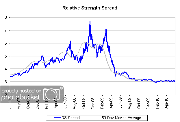
The chart below is the spread between the relative strength leaders and relative strength laggards (universe of mid and large cap stocks). When the chart is rising, relative strength leaders are performing better than relative strength laggards. As of 6/7/2010:
The sharp decline in the RS Spread during much of the first half of 2009 has transitioned into a flat spread, which may be setting the stage for a more favorable environment for relative strength investing.

Maybe, maybe, maybe….
Since no one ever knows what will happen in the future, “maybe” is all anyone can ever get in the market! You can choose to approach “maybe” with a positive or a negative mindset, but you will never have any kind of certainty. You may as well get used to it!
They been saying maybe for a year… obviously this relative strength spread chart isn’t very informative.. I’m not knocking relative strength… just this useless chart that gets posted every week.