Using data from Dr. Ken French’s website, Eddy Elfenbein has posted updated performance of momentum models that cover the 1926-2009 period. Elfenbein states, “This is one of the most fascinating phenomena in finance. Stocks that have done well, on average, continue to do well.”
The chart shows the historical performance of stocks ranked by momentum decile (meaning 10% slices).
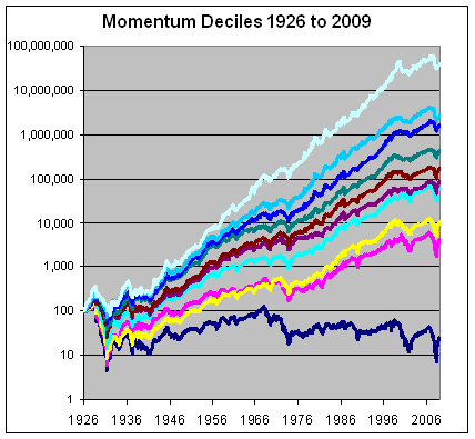
The deciles are perfectly rank ordered. The stocks that had been doing the best, do the best. The stocks that had been doing the worst, fare the worst.
The data comes from Dr. Ken French’s website. Just to be clear, momentum is defined by performance over the 11-month period starting 12 months ago and ending one month ago. The one-month directly prior to each period is excluded. At the end of the month, the whole thing is repeated. The data series goes back over 80 years.
Here’s how each decile has performed:
Decile 1: 16.79%
Decile 2: 13.11%
Decile 3: 12.42%
Decile 4: 10.63%
Decile 5: 9.42%
Decile 6: 8.47%
Decile 7: 8.05%
Decile 8: 5.73%
Decile 9: 4.54%
Decile 10: -1.73%
Such superior results achieved by momentum, aka relative strength, is exactly why we have based our entire management process on its application.
Past performance is no guarantee of future results.

How does that chart look after taxes and transaction costs, and was liquidity accounted for?
It would be lower. Ken French also shows the benchmark universe return on his website over the same time horizon. The universe return came in around 8% per year so there is more than enough excess return to cover those costs.
So, just to make this clear, this study is about a trading strategy, right? A monthly one, correct?
[...] strength strategies, we often refer to the data found at the Ken French Data Library. Click here, here, and here for some of our past commentary on this data which highlights the magnitude and [...]