Dorsey, Wright Sentiment Survey - 7/30/10

July 30, 2010

We are hovering just off the most extreme fear levels we’ve seen in this survey since we launched it in March. Reader participation is also near historical highs.

Here we have the next round of the Dorsey, Wright Sentiment Survey, the first third-party sentiment poll. As you know, when individuals self-report, they are always taller and more beautiful than when outside observers report their perceptions! Instead of asking individual investors to self-report whether they are bullish or bearish, we’d like financial advisors to weigh in and report on the actual behavior of clients. It’s two simple questions and will take no more than 20 seconds of your time. We’ll construct indicators from the data and report the results regularly on our blog–but we need your help to get a large statistical sample!

Click here to take Dorsey, Wright’s Sentiment Survey.

Contribute to the greater good! It’s painless, we promise.

Posted by:


Sector and Capitalization Performance

July 30, 2010

The chart below shows performance of US sectors and capitalizations over the trailing 12, 6, and 1 month(s). Relative strength strategies buy securities that have strong intermediate-term relative strength and hold them as long as they remain strong. Performance updated through 7/29/2010.

Posted by:


It’s Later Than You Think

July 29, 2010

A good bit of the practice of most financial advisors is helping clients accumulate enough assets for retirement. I was reading through a MetLife survey on retirement readiness, much of it do with the emotional side of readiness, and was struck by a couple of responses. MetLife surveyed a diverse group, starting with pre-retirees as young as age 45, up through actual retirees, who composed about 20% of the sample.

Here’s what really struck me: they asked the pre-retirees “Do you plan to retire…?” and these are the responses they got.

Earlier than you planned/expected 6%

About the same time as you planned/expected 47%

Later than you planned/expected 46%

Most people, in other words, expect to retire on their own schedule, while a big chunk also figure they will have to work longer than they thought.

But when they asked the actual retirees, who have already gone through the transition, “Did you retire…?” there was a completely different outcome.

Earlier than you planned/expected 64%

About the same time as you planned/expected 33%

Later than you planned/expected 3%

Almost two-thirds ended up retiring earlier than they thought they would, and almost no one retired later than they expected. Since the survey is current, I’m going to assume that the 64% didn’t retire early because they made an enormous amount of money shorting the market in 2008. I’m guessing they retired earlier than they expected because they had health issues, got laid off due to lower productivity relative to younger workers, or simply got sick of working and decided not to deal with it anymore. And, really, the reason for early retirement doesn’t matter.

The message is simply this: Your clients are expecting to retire on their schedule, but 2/3 of them may well have their retirement accelerated. To be prudent, they will need to have their capital accumulation completed earlier than they think. You may be planning to save for another ten years; you might only have five.

It’s almost impossible to overstate the importance of savings and a patient investment policy in preparing for retirement. Save early and often. And search out proven return factors, like relative strength, and stick with them over the long term.

Posted by:


Fund Flows

July 29, 2010

The Investment Company Institute is the national association of U.S. investment companies, including mutual funds, closed-end funds, exchange-traded funds (ETFs), and unit investment trusts (UITs). Members of ICI manage total assets of $11.82 trillion and serve nearly 90 million shareholders. Flow estimates are derived from data collected covering more than 95 percent of industry assets and are adjusted to represent industry totals.

Almost $7 billion was added to taxable bonds and $1.5 billion was withdrawn from domestic equity funds in the week ending 7/21. These flows represent a substantial increase in flows to taxable bonds, and a substantial decrease in domestic equity withdrawals. For the year, $156 billion has been added to taxable bond funds while $27 billion has been removed from domestic equity funds. Hybrids, municipal bonds, and foreign equity funds have all seen modest inflows for the year.

Posted by:


Consumer Confidence

July 29, 2010

It’s very difficult to maintain conviction in the stock market as an investment vehicle when the economy is so rotten. (Frankly, it’s never very easy!) The market was rattled a little bit this week when it was reported that one of the consumer confidence indexes was down again. The bears aggressively took to the airwaves, discussing how the economy could not recover unless and until consumers felt better about things.

This made me curious. What actually happens to the stock market when consumer sentiment is poor? J.P. dug up all of the data from the University of Michigan’s Consumer Sentiment Index, which runs back to 1978. He broke all of the monthly observations into deciles and examined stock market returns over the subsequent five years.

(click to expand image)

Interesting, isn’t it? When consumer sentiment was low-in the bottom three deciles-subsequent five-year returns in the S&P 500 were over 12% per year, significantly higher than the 9.3% average over the entire sample period. When consumers felt absolutely fantastic about things and sentiment was in the top decile, subsequent five-year returns were actually negative! Confident consumers engage in reckless behaviors that sow the seeds for the next downturn. Fearful consumers engage in behaviors that build the foundation for the next upturn.

Right now, consumer sentiment resides in the second decile. Based on historical precedent, subsequent five-year returns are likely to be above average from here.

It is well-known that advisory sentiment indexes can be interpreted in a contrary fashion, and it seems that consumer sentiment may fall into the same category, at least over the longer term. This is one of the many reasons investing is difficult-it is an uphill climb against human nature to be bullish when conditions are poor. To buy when the outlook is dim takes a real leap of faith-and a steadfast optimism that things will improve over time. When things seem like they can’t get any worse, it just might be because they really can’t get any worse-and are about to get better.

Posted by:


High RS Diffusion Index

July 28, 2010

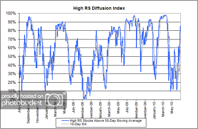
The chart below measures the percentage of high relative strength stocks that are trading above their 50-day moving average (universe of mid and large cap stocks.) As of 7/27/10.

 High RS Diffusion Index

The 10-day moving average of this indicator is 60% and the one-day reading is 84%. The diffusion index continues to shoot higher as HighRS stocks and sectors cling to gains earned in the July rally. Dips in the High RS Diffusion Index have often provided good opportunities to add to relative strength strategies.

Posted by:


Relative Strength Spread

July 27, 2010

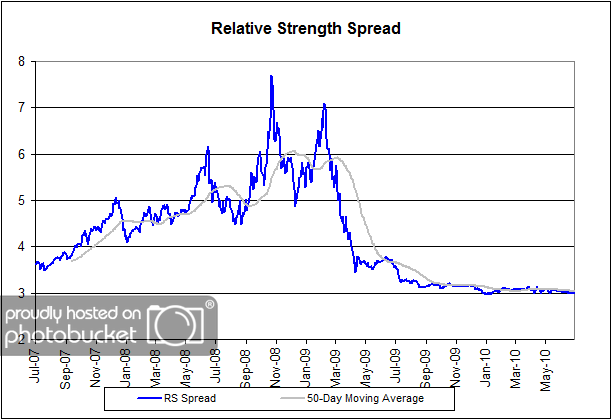
The chart below is the spread between the relative strength leaders and relative strength laggards (universe of mid and large cap stocks). When the chart is rising, relative strength leaders are performing better than relative strength laggards. As of 7/26/2010:

 Relative Strength Spread

No change this week–or for much of the past year for this indicator. The relative strength spread continues to reflect the fact that neither the relative strength leaders nor the relative strength laggards have been able to pull away. For now, both groups continue to generate similar performance.

Posted by:


Dorsey, Wright Sentiment Survey - 7/19/10

July 26, 2010

Our latest sentiment survey was open from 7/19/10 to 7/23/10. The response rate was higher than last survey’s with 167 participants. Your input is for a good cause! If you believe, as we do, that markets are driven by supply and demand, client behavior is important. We’re not asking what you think of the market—since most of our blog readers are financial advisors, we’re asking instead about the behavior of your clients. Then we’re aggregating responses exclusively for our readership. Your privacy will not be compromised in any way.

After the first 30 or so responses, the established pattern was simply magnified, so we are comfortable about the statistical validity of our sample. Most of the responses were from the U.S., but we also had multiple advisors respond from at least two other countries. Let’s get down to an analysis of the data! Note: You can click on any of the charts to enlarge them.

Question 1. Based on their behavior, are your clients currently more afraid of: a) getting caught in a stock market downdraft, or b) missing a stock market upturn?

Chart 1: Greatest Fear. 92.8% of clients were fearful of a downdraft, just off the all-time highest levels of fear we saw last survey (94.7%). The market staged a respectable bounce since the last survey, but the move had a miniscule effect on the overall client sentiment. On the flip side, we saw the missed opportunity group tick barely higher to 7.2%, up from last survey’s 5.3%. Bearish sentiment is dominating the market right now, and it will probably take a major move higher to get Joe Investor remotely interested in risking money in the stock market.

Chart 2. Greatest Fear Spread. Another way to look at this data is to examine the spread between the two groups. The spread remains significantly skewed towards fear of losing money this round. This survey’s reading was 86%, a hair lower than last week’s reading of 89%. Again, we are seeing fear levels just off the all-time highs that were set 2 weeks ago. Chart 2 is constructed by subtracting the percentage of respondents reporting clients fearful of missing an upturn from the clients reported as fearful of a market downdraft.

Question 2. Based on their behavior, how would you rate your clients’ current appetite for risk?

Chart 3: Average Risk Appetite. The average risk appetite from this survey paints a crystal clear picture that mimics the research done by DALBAR. The market topped most recently on April 26, the same week that clients’ risk appetites peaked at 2.85. Since then we’ve seen the average risk tolerance trudge steadily lower with the market. That’s what we see time and again, both anecdotally and statistically – risk appetite moves higher with the market, until EVERYBODY wants maximum risk, and then the market crumbles. On the other side, risk appetite moves lockstep lower with the market until EVERYBODY wants zero risk, and then the market rallies.

Right now we have average risk appetite levels at 2.12, just off the lows of last survey’s 2.05.

Chart 4: Risk Appetite Bell Curve. This chart uses a bell curve to break out the percentage of respondents at each risk appetite level. Right now the bell curve is biased to the low-risk side, as it has been for the few months. What we see in the bell curve is more evidence that clients are afraid of losing money in the market. The big news in this chart is the single, solitary 5 we see on the right side. Brave soul or internet troll? You decide!

Chart 5: Risk Appetite Bell Curve by Group. The next three charts use cross-sectional data. This chart plots the reported client risk appetite separately for the fear of downdraft and for the fear of missing upturn groups. We would expect that the fear of downdraft group would have a lower risk appetite than the fear of missing upturn group and that is what we see here.

Although we have a 5 and a few 4’s in this survey round, this graph shows a very pessimistic, bearish market sentiment dominated by fear. The Upturn group mustered up a decent number of 3’s, but the overall sentiment can still be tied directly to the first graph of Greatest Fear.

Chart 6: Average Risk Appetite by Group. A plot of the average risk appetite score by group is shown in this chart. The downdraft group clocked in at 2.1, while the upturn group scored an average of 2.75. Theoretically, this is what we would expect to see, with the fearful clients wanting less risk than clients worried about missing opportunities.

Once again, the upturn group exhibits a more volatile average appetite than the downdraft group, with a 50 basis point swing versus the downdraft group’s 5 basis point move.

Chart 7: Risk Appetite Spread. This is a spread chart constructed from the data in Chart 6, where the average risk appetite of the downdraft group is subtracted from the average risk appetite of the missing upturn group. The spread is currently .67.

Recent market action continues to suppress any type of positive client sentiment. We’ve seen the market stage a significant correction since recent highs in April, and it seems like clients are still holed up in “bunker mode,” willing to jump to safety at the first sign of a downward market move. While it’s important to consider risk management and to keep a watch on your portfolios, it’s unfortunate to see client sentiment jump around so much based solely on the market action over the last two weeks. In particular, the overall greatest fear numbers swing significantly with the market, while the upturn group’s average risk tolerance is downright volatile. Only time will tell whether the market is merely correcting, or changing gears after the superb rebound of 2009.

No one can predict the future, as we all know, so instead of prognosticating, we will sit back and enjoy the ride. A rigorously tested, systematic investment process provides a great deal of comfort for clients during these types of fearful, highly uncertain market environments. Until next time, good trading and thank you for participating!

Posted by:


Weekly RS Recap

July 26, 2010

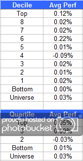
The table below shows the performance of a universe of mid and large cap U.S. equities, broken down by relative strength decile and quartile and then compared to the universe return. Those at the top of the ranks are those stocks which have the best intermediate-term relative strength. Relative strength strategies buy securities that have strong intermediate-term relative strength and hold them as long as they remain strong.

Last week’s performance (7/19/10 – 7/23/10) is as follows:

 Weekly RS Recap

It was a flat week for stocks in all relative strength deciles. We have no out- or under-performance to speak of.

Posted by:


Sector and Capitalization Performance

July 23, 2010

The chart below shows performance of US sectors and capitalizations over the trailing 12, 6, and 1 month(s). Relative strength strategies buy securities that have strong intermediate-term relative strength and hold them as long as they remain strong. Performance updated through 7/22/2010.

Posted by:


Good vs. Best

July 22, 2010

Relative Strength is just that-a method of measuring strength not in absolute terms, but in relative terms. It is one thing to attempt to assign an intrinsic value to a given security in isolation and another thing entirely to assign a relative value, or relative rank, within the context of a universe of securities.

I am reminded of a line from the film Crocodile Dundee, when a street hoodlum pulls a switchblade against our hero, Paul Hogan. “You call that a knife?” says Hogan incredulously, withdrawing a bowie blade from the back of his boot. “Now this,” he says with a sly grin, “is a knife.”

One of the biggest challenges for an investor is to be able to make the best use of limited resources. After all, the value of every investment portfolio is finite. How can you be sure that you are allocating your finite resources to those securities that represent the “best” investment opportunities and not just “good” or “acceptable” investment opportunities?

The elegance of systematic relative strength models is that all securities in the investment universe are evaluated relative to every other security in the investment universe. With this knowledge you can be sure that each of the final holdings has superior relative strength characteristics and, therefore, gives you the best probabilities of successful investment results.

HT: Dan Ariely, Predictably Irrational

Posted by:


Large Cap Stocks: “Once in a Lifetime Opportunity”

July 22, 2010

Your heart will surely tell you that Bill Miller’s arguments in Large Cap Stocks Represent a Once in a Lifetime Opportunity are insane. However, your mind may tell you that he just might be right.

The public’s distaste for equities is palpable and understandable. Negative returns for 10 years in stocks while “riskless” treasuries have soared, and right after one of the best 6 months treasuries have had in the decade, is more than enough to convince folks that stocks are just not where you want to invest long term.

Then there is the really long term. Long term treasuries as measured by the Barclay’s Capital Long Term Treasury Bond total return index have beaten equities as measured by the S&P 500 year to date, and in the 1-, 3-, 5-, 10-, 15-, and 20-year time frames. It’s a tie at 25 years. Over 20 years of consistently superior returns over stocks in an asset guaranteed by the U.S. government seems to be sufficient to drive a stake through the heart of the idea that you want stocks for the long term. Gentlemen and ladies both prefer bonds. Who doesn’t?

It is almost a tautology in capital markets that the best investments are those with the worst previous returns, where expectations are low, demand is down, and prospects appear at best highly uncertain. In 1980 bonds had been through a 30 year bear market relative to stocks, inflation was soaring, yields were at historic highs, yet expected to go higher, and a long bull market in bonds was at hand. The idea that U.S. interest rates would be at all time lows 30 years later would have been dismissed as ludicrous. The situation is now reversed, with stocks having underperformed bonds for decades.

The point here is simple: U.S. large capitalization stocks represent a once in a lifetime opportunity in my opinion to buy the best quality companies in the world at bargain prices. The last time they were this cheap relative to bonds was 1951. I was 1 year old then, but did not have then sufficient sentience or capital to invest. I do now, and if you are reading this, so do you.

His whole article is well worth the read. If Bill Miller is right, does your investment strategy allow for the flexibility to capitalize on the type of move in large cap stocks that he foresees?

Posted by:


Fund Flows

July 22, 2010

The Investment Company Institute is the national association of U.S. investment companies, including mutual funds, closed-end funds, exchange-traded funds (ETFs), and unit investment trusts (UITs). Members of ICI manage total assets of $11.82 trillion and serve nearly 90 million shareholders. Flow estimates are derived from data collected covering more than 95 percent of industry assets and are adjusted to represent industry totals.

Another $5 billion was added to taxable bonds and another $3 billion was withdrawn from domestic equity funds in the week ending 7/14. For the year, $144 billion has been added to taxable bond funds while $23 billion has been removed from domestic equity funds. Hybrids, municipal bonds, and foreign equity funds have all seen modest inflows for the year.

Posted by:


The Next Shoe To Drop? Perhaps Not.

July 22, 2010

For months, the talk about commercial real estate centered around the fear that this could be “the next shoe to drop.” With that backdrop, I was surprised to come across Jeff Fox’s recent article Commerical Real Estate’s Death Knell May Have Been Premature.

In the face of some otherwise-daunting obstacles, commercial real estate is proving to be an attractive area for investors looking for bargains as loans come due and foreclosures mount.

Analysts have been warning for months that commercial real estate could be the next shoe to drop in the subprime mortgage collapse that came to a head in 2008.

But with signs of thawing in the securitization markets and indications that investors are ready to come to auction when properties are on the block, the idea that the industry represents a major looming danger for the economy is losing traction.

My emphasis added. At the time that we were buying commercial real estate ETFs in our Global Macro strategy in early 2010 articles like this were nowhere to be found. However, we bought it anyway because that what we do-buy and sell securities based solely on their relative strength. Performance in the table below is for the period 7/21/2009 - 7/21/2010 and YTD through 7/21/2010.

One of the realities of employing relative strength strategies is that we often buy and sell securities well before such action is being trumpeted in the main stream media. Waiting for the blessing of the main stream media before taking action is a recipe for disaster.

To receive the brochure for our Global Macro strategy, click here. For information about the Arrow DWA Tactical Fund (DWTFX), click here.

Click here and here for disclosures. ICF, IYR, RWR and other real estate securities are current holdings in products managed by Dorsey Wright Money Management. Past performance is no guarantee of future returns.

Posted by:


High RS Diffusion Index

July 21, 2010

The chart below measures the percentage of high relative strength stocks that are trading above their 50-day moving average (universe of mid and large cap stocks.) As of 7/20/10.

After spending several months bouncing around in oversold territory, the 10-day moving average of this indicator has now risen to 44%. Dips in this indicator have often provided good opportunities to add to relative strength strategies.

Posted by:


Relative Strength Spread

July 20, 2010

The chart below is the spread between the relative strength leaders and relative strength laggards (universe of mid and large cap stocks). When the chart is rising, relative strength leaders are performing better than relative strength laggards. As of 1/8/2010:

No change this week-or for much of the past year for this indicator. The relative strength spread continues to reflect the fact that neither the relative strength leaders nor the relative strength laggards have been able to pull away. For now, both groups continue to generate similar performance.

Posted by:


Dorsey, Wright Sentiment Survey - 7/19/10

July 19, 2010

Last survey’s readings were the most extreme we’ve seen. Thanks for participating.

Here we have the next round of the Dorsey, Wright Sentiment Survey, the first third-party sentiment poll. As you know, when individuals self-report, they are always taller and more beautiful than when outside observers report their perceptions! Instead of asking individual investors to self-report whether they are bullish or bearish, we’d like financial advisors to weigh in and report on the actual behavior of clients. It’s two simple questions and will take no more than 20 seconds of your time. We’ll construct indicators from the data and report the results regularly on our blog–but we need your help to get a large statistical sample!

Click here to take Dorsey, Wright’s Sentiment Survey.

Contribute to the greater good! It’s painless, we promise.

Posted by:


Weekly RS Recap

July 19, 2010

The table below shows the performance of a universe of mid and large cap U.S. equities, broken down by relative strength decile and quartile and then compared to the universe return. Those at the top of the ranks are those stocks which have the best intermediate-term relative strength. Relative strength strategies buy securities that have strong intermediate-term relative strength and hold them as long as they remain strong.

Last week’s performance (7/12/10 – 7/16/10) is as follows:

The best relative performance last week came from the stocks in the third relative strength quartile. The stocks in the top relative strength quartile underperformed the universe last week.

Posted by:


So What Happens Now?

July 16, 2010

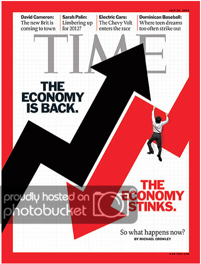
The current cover of Time magazine does a nice job of capturing the level of uncertainty that currently exists about the direction of the economy. The same cover would be just as timely if the word “economy” were replaced with “stock market.” So what happens now?

time071610 So What Happens Now?

Every time that there seems to be an unusually large degree of uncertainty about the direction of the economy or stock market, the natural reaction for many is to seek “expert” opinion. Richard Ferri’s recent article in Forbes should make you think twice before getting too excited about what the “experts” think is in store for the economy or stock market in the months and years to come.

Truth be told, market predictions aren’t about the markets; they’re about marketing. By predicting markets, the gurus provide the illusion of skill and knowledge, and that brings attention to whatever service they’re selling. This is especially true if a guru makes an outrageous market prediction that actually comes true. People tend to remember the one big call and overlook a guru’s dismal long-term track record. Is there hope of finding a guru that actually has market timing skill? Sure there is. Anything’s possible. It’s possible that some guru someplace has forecasting powers, just like it’s possible that space aliens will send giant cockroaches to eat the Earth. It’s just not probable.

A behavioral economist could very easily explain why my plea to pay no attention to investment gurus will fall on deaf ears (it’s emotionally satisfying for an investor to rely on expert opinion so that it is no longer their fault if things don’t work out). Another explanation, could simply be that many are unaware of the poor track record of forecasters.

For those of us who employ trend-following strategies, the name of the game is to always maintain the flexibility to adapt to new trends. Furthermore, the question isn’t whether “it” is going to go up or down because there are generally some asset classes going up, some stagnating, and some going down. Trend followers focus not on forecasting, but on execution. A behavioral economist would probably also point out that one reason someone like us may prefer to rely on systematic trend-following models is because that it is also emotionally satisfying (I can attest to the fact that it is much less stressful to manage money by strict adherence to models than by my current judgement/emotions). If reliance on guru opinion and reliance on systematic trend-following models are BOTH emotionally satisfying ways of dealing with uncertainty, doesn’t it make sense to choose the one that gives you the best probability of investment success? To help you evaluate the probabilities and performance associated with trend-following models, click here to read the white paper Relative Strength and Asset Class Rotation, written by one of our portfolio managers, John Lewis.

Posted by:


Sector and Capitalization Performance

July 16, 2010

The chart below shows performance of US sectors and capitalizations over the trailing 12, 6, and 1 month(s). Relative strength strategies buy securities that have strong intermediate-term relative strength and hold them as long as they remain strong. Performance updated through 7/15/2010.

Posted by:


Reconciling Seemingly Contradictory Reports

July 15, 2010

Daryl Montgomery of Seeking Alpha reconciles the stellar earnings reports this earnings season with the poor U.S economic reports.

So far this earnings season, company reports indicate that business is going gangbusters. U.S. economic reports are painting exactly the opposite picture, however. This may not be as contradictory as it appears on the surface.

As for earnings, Intel (INTC) reported record numbers yesterday, after Alcoa (AA) upgraded its forecast for global aluminum sales and U.S. railroad company CSX (CSX) said shipments were up considerably. This morning, however, U.S. retail sales numbers disappointed again, falling 0.5% in June following a 1.1% drop in May. Mortgages for home purchases fell to a 14-year low. According to the non-farms payroll reports, close to a million people net left the U.S. labor market in May and June because jobs were so scarce that they simply gave up looking. Later today, the Federal Reserve is expected to lower its expectations for second half U.S. economic growth.

One of the important things to note is that both Intel and Alcoa are global companies. While many people assume that the U.S. is Intel’s major market, it isn’t. East Asia dominates Intel’s sales. Strong Intel numbers generally indicate a robust East Asian economy. Growth has indeed been strong there. Intel’s biggest growth sector by far was servers, which were up 170%s…

Investors should not make judgments for the U.S. economy based on figures for global companies, especially when the U.S. is only a minority of their business. The U.S. economy can be much weaker than Asian economies. Asia was in the driver’s seat pulling the world out of the Credit Crisis recession and the U.S. followed.

Just another reminder that U.S. investors would do well not to focus entirely on U.S. economic reports. As pointed out by Moody’s interactive website below, much of the world is currently experiencing strong economic growth.

HT: Barry Ritholz

Posted by:


Lousy Investor Sentiment as Far as the Eye Can See

July 15, 2010

And that’s a good thing. Investor sentiment works very nicely when it is interpreted in a contrary fashion. In other words, when everyone is bearish, prices tend to go higher. One of the long-time sentiment gauges for the domestic stock market is the Advisory Sentiment Index compiled by Investors Intelligence. This indicator was originally developed by A.W. Cohen, the popularizer of the 3-box point & figure reversal chart. Bloomberg reported the most recent levels today and advisors are decidedly negative.

The following are results from Investors Intelligence’s analysis of investment newsletters for July 7 through yesterday.

             This Week  Last Week  Comments
Bullish *      32.6%      37.0%    Lowest level since March 2009
Bearish #      34.8%      34.8%    Stays at highest in 12 months
Correction &   32.6%      28.2%    Biggest jump since January
     * The bullish reading fell to 22.2 percent in October 2008,
the lowest since November 1988.
     # The bearish reading fell to 15.6 percent in December
2009, the lowest since April 1987. It rose to 54.4 percent in
October 2008, the highest since December 1994.
     & The correction reading rose to 39.8 percent in February
2010, the highest since September 1983.

Since I like to stick to actual evidence and testing, I referred to Robert Colby’s Encyclopedia of Technical Market Indicators (Colby & Meyers, 1988). After examining 17 years of advisory sentiment data, they conclude:

When a relatively small percentage (37.5% or less) of advisory services were bullish, there was a significant bullish tendency for stock prices.

The 37.5% threshold applies to a 4-week average of the bullish readings-the current 4-week average is 38.0%. There was also a very bullish tendency for single week readings below 32.7% bulls, which is where we find ourselves this week. Because Colby and Meyers tested everything for statistical significance, “very bullish” readings are defined as:

Probability less than 1 in 1000 that the stock market rose by random chance alone after an indicator reading in this range of values for the specified time frame. Therefore, we can be 99.9% confident that the indicator is significant.

It’s important to note that the significance of the Advisory Sentiment Index was only apparent at the 6-month and12-month time horizons for the 4-week average and at the 12-month time horizon for the single week reading. At 1-month and 3-month time horizons, statistical significance was not achieved. In other words, stock prices are likely to be higher 12 months from now. The likely path to higher prices could be smooth or rocky from here, but nothing is certain over the near-term time frame.

To put a bow on it is an article that appeared on Doug Short’s website. He points out that often high-yield bonds lead the stock market. High yield bonds are showing a positive divergence right now.

Source: dshort/Kimble Charting Solutions (click to enlarge)

It’s interesting to note that some of the preconditions for a stock market rally are starting to appear at a time when the public is very negative on stocks. I guess it’s always darkest before the dawn. Economic data aside, stock market data is arguing that things might not be so bad.

Posted by:


Fund Flows

July 15, 2010

The Investment Company Institute is the national association of U.S. investment companies, including mutual funds, closed-end funds, exchange-traded funds (ETFs), and unit investment trusts (UITs). Members of ICI manage total assets of $11.82 trillion and serve nearly 90 million shareholders. Flow estimates are derived from data collected covering more than 95 percent of industry assets and are adjusted to represent industry totals.

Domestic equity funds had estimated outflows of over $4 billion and taxable bonds had estimated inflows of over $5 billion in the week ending 7/7/10. So far in 2010, taxable bonds have had net inflows of over $144 billion while domestic equity funds have had net outflows of over $23 billion. Municipal bond funds, foreign equity funds, and hybrid funds have all had modest inflows for the year.

Posted by:


PowerShares Technical Leaders Podcast

July 14, 2010

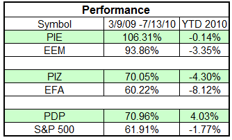
Dorsey Wright Analyst, Susan Morrison, and Dorsey Wright Portfolio Manager, John Lewis, recently completed a podcast (click here to listen) in which they discuss the performance and current allocations of the PowerShares Technical Leaders Indexes (PDP, PIE, and PIZ). Noteworthy overweights and underweights for each of the ETFs are discussed. PDP is the U.S. Technical Leaders ETF; PIE is the Emerging Markets Technical Leaders ETF; and PIZ is the Developed International Markets Technical Leaders ETF.

As shown in the table below, each of these ETFs has outperformed its respective benchmark since the beginning of the current bull market and also YTD (1/1/10 - 7/13/10).

Performance071410 PowerShares Technical Leaders Podcast

Additional information and disclosures for each of the ETFs can be found at www.powershares.com.

Posted by:


RS Recap Since 7/2

July 14, 2010

So far, the low for most of the major U.S. equity indexes came on July 2. In the week and a half since that time the market has rallied sharply with all relative strength quartiles participating to roughly the same degree. The table below shows the performance of a universe of mid and large cap U.S. equities, broken down by relative strength decile and quartile and then compared to the universe return. Those at the top of the ranks are those stocks which have the best intermediate-term relative strength. Relative strength strategies buy securities that have strong intermediate-term relative strength and hold them as long as they remain strong.

Performance (7/2/10 – 7/13/10):

Posted by: