Roubini Sentiment Index — An Instant Classic!

August 31, 2010

Check out Make Money with Roubini Sentiment Indicator for a hilarious take on one media staple’s correlation with stock market performance. Nouriel Roubini has become famous in the last three years for his correct prediction of a dramatic worldwide recession and stock market decline. Roubini-mania has subsided a bit since the height of the financial crisis, but it doesn’t take many clicks on a finance website to find a mention of Dr. Doom, as he’s affectionately known.

Dr. Dogan at Insider Monkey takes a look at the raw data, using GoogleTrends to form an underlying Roubini Index which gauges Roubini’s media exposure. He then takes a look at market performance, and more specifically, the VIX.

Long story short, it turns out the Roubini Index actually leads VIX performance by about two weeks, allowing for some actionable VIX trades which have made money over the last three years.

Here is our simple trading strategy: Go long the VIX when Roubini Sentiment Index goes %25 above its four-week moving average. Following this strategy over the 2007-2010 period will earn us a weekly average return of an amazing 2.4% (If we had simply gone long VIX at all times, the average weekly return would have been 1.6%). If we hold on to our long VIX position for three weeks, the average return over this time period is 8.25%

I’d be interested to find out what the longer-term trading results are for this new indicator. What’s problematic is that Roubini was completely off the radar until 2006. Here’s a screen grab of his GoogleTrends chart – his name doesn’t start to jump until mid-2007, which would only give us 2 years of worthwhile data (we can only test forward to August, 2009 on a yearly basis).

Click to Enlarge. source: Google

Theoretically we could just use the VIX as a proxy and test the results…check back for more!

HT: Clusterstock

Posted by:


Relative Strength Spread

August 31, 2010

The chart below is the spread between the relative strength leaders and relative strength laggards (universe of mid and large cap stocks). When the chart is rising, relative strength leaders are performing better than relative strength laggards. As of 8/30/2010:

We continue to see the RS Spread reflect the similar performance between the relative strength leaders and the relative strength laggards.

Posted by:


Weekly RS Recap

August 30, 2010

The table below shows the performance of a universe of mid and large cap U.S. equities, broken down by relative strength decile and quartile and then compared to the universe return. Those at the top of the ranks are those stocks which have the best intermediate-term relative strength. Relative strength strategies buy securities that have strong intermediate-term relative strength and hold them as long as they remain strong.

Last week’s performance (8/23/10 – 8/27/10) is as follows:

The third quartile of relative strength ranks delivered the best performance last week — down only -0.11% while the universe was -0.30%. However, there was not a great deal of separation in performance in the different quartiles last week.

Posted by:


Dorsey, Wright Client Sentiment Survey - 8/27/10

August 30, 2010

Client fear levels remain near all-time highs. Thanks to all of our steady participants!

Here we have the next round of the Dorsey, Wright Sentiment Survey, the first third-party sentiment poll. As you know, when individuals self-report, they are always taller and more beautiful than when outside observers report their perceptions! Instead of asking individual investors to self-report whether they are bullish or bearish, we’d like financial advisors to weigh in and report on the actual behavior of clients. It’s two simple questions and will take no more than 20 seconds of your time. We’ll construct indicators from the data and report the results regularly on our blog–but we need your help to get a large statistical sample!

Click here to take Dorsey, Wright’s Client Sentiment Survey.

Contribute to the greater good! It’s painless, we promise.

Posted by:


Shift Your Paradigm!

August 27, 2010

Sometimes in order to see something differently, you just have to look at it from a different vantage point. Jonathan Hoenig, writing in Smart Money, makes a very valid point about how investors tend to look at the market.

First, we’re conditioned to want a bargain. If we’re bullish on NTT DoCoMo (DCM: 17.04*, +0.34, +2.03%) trading at $16.75, for some reason we refuse to pay anything more than $16.40, and when it rallies further, we stubbornly sit on our hands and promise to add shares only if the price corrects back to where we originally spotted it. We’re a nation of hagglers: Nobody wants to pay full price.

In other words, investors tend to look at things in terms of high or low. The desire for a bargain has led to various flawed analogies that investors should be delighted to buy stocks “on sale,” as if they were buying toilet paper or vegetables. That may not be the correct frame to use. Toilet paper and vegetables are consumables that fulfill a specific need. Vegetables and toilet paper are not performance-based. A financial asset cannot be consumed to fulfill a specific need-its only value lies in its eventual performance. Hoenig goes on to say:

Regular readers know we never characterize markets as “high” or “low,” but as “strong” or “weak.” And in trending markets, strong securities like the yen or bonds tend to stay strong, or at least stronger than alternatives. On a price basis alone, an all-time-high is a reason to follow a market, not flee it.

Although this is a simple statement, the implications are profound. As soon as markets are framed as strong or weak (rather than high or low), your perspective changes. It is a crucial paradigm shift. As Hoenig points out (and lots of research has confirmed), strong markets tend to stay strong. I think strong and weak is the correct mindset when dealing with financial markets from a performance perspective. Relative strength approaches financial markets from this perspective-measuring strength or weakness objectively and always pushing the portfolio toward strength.

In every other endeavor where performance is important, we gravitate to strength. When a baseball manager fills in a lineup card, he tries to put the best players on the field to win the game. When a corporation needs to win over a big account, they send their best salesperson, not their worst. When we send a relay team to the Olympics, we send the four fastest runners-not slow runners that we hope will improve. As Damon Runyan wrote, “The race is not always to the swift, but if you have to bet, that’s the way to play it.”

Markets are no different. The paradigm shift in thinking about strong and weak assets seems simple but may be a tipping point in terms of finding profitable investment strategies.

Posted by:


Sector and Capitalization Performance

August 27, 2010

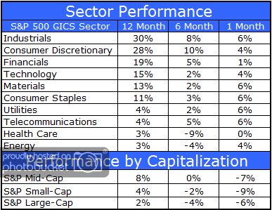
The chart below shows performance of US sectors and capitalizations over the trailing 12, 6, and 1 month(s). Relative strength strategies buy securities that have strong intermediate-term relative strength and hold them as long as they remain strong. Performance updated through 8/26/2010.

 Sector and Capitalization Performance

Posted by:


Moving Average Ratio and Momentum

August 26, 2010

A few months ago I had a post about the Momentum Echo (click here to read the post). I ran across another relative strength (or momentum if you prefer) paper that tests yet another factor. In Seung-Chan Park’s paper, “The Moving Average Ratio and Momentum,” he looks at the ratio between a short-term and long-term moving average of price in order to rank securities by strength. This is different from most of the other academic literature. Most of the other studies use simple point-to-point price returns to rank the securities.

Technicians have used moving averages for years to smooth out price movement. Most of the time we see people using the crossing of a moving average as a signal for trading. Park uses a different method for his signals. Instead of looking at simple crosses, he compares the ratio of one moving average to another. A stock with the 50-day moving average significantly above (below) the 200-day moving average will have a high (low) ranking. Securities with the 50-day moving average very close to the 200-day moving average will wind up in the middle of the pack.

In the paper Park is partial to the 200-day moving average as the longer-term moving average, and he tests a variety of short-term averages ranging from 1 to 50 days. It should come as no surprise that they all work! In fact, they tend to work better than simple price-return based factors. That didn’t come as a huge surprise to us, but only because we have been tracking a similar factor for several years that uses two moving averages. What has always surprised me is how well that factor does when compared to other calculation methods over time.

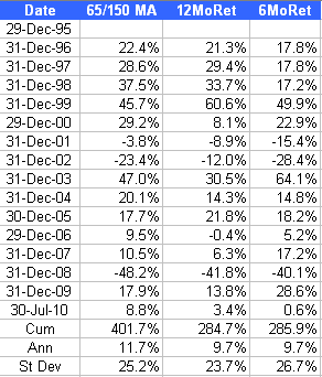
The factor we have been tracking is the moving average ratio of a 65-day moving average to the 150-day moving average. Not exactly the same as what Park tested, but similar enough. I pulled the data we have on this factor to see how it compares to the standard 6- and 12-month price return factors. For this test, the top decile of the ranks is used. Portfolios are formed monthly and rebalanced/reconstituted each month. Everything is run on our database, which is a universe very similar to the S&P 500 + S&P 400.

 Moving Average Ratio and Momentum

(click to enlarge)

Our data shows the same thing as Park’s tests. Using a ratio of moving averages is significantly better than just using simple price-return factors. Our tests show the moving average ratio adding about 200 bps per year, which is no small feat! It is also interesting to note we came to the exact same conclusion using different parameters for the moving average, and an entirely different data set. It just goes to show how robust the concept of relative strength is.

For those readers who have read our white papers (available here and here) you may be wondering how this factor performs using our Monte Carlo testing process. I’m not going to publish those results in this post, but I can tell you this moving average factor is consistently near the top of the factors we track and has very reasonable turnover for the returns it generates.

Using a moving average ratio is a very good way to rank securities for a relative strength strategy. Historical data shows it works better than simple price return factors over time. It is also a very robust factor because multiple formulations work, and it works on multiple datasets.

Posted by:


One-Trial Learning

August 26, 2010

It’s well known in psychology that one-trial learning can be created if the stimulus is aversive enough. For example, a child that puts down their hand on a hot stove typically will never do it again. Maybe that is part of what is happening with the stock market right now.

According to a recent article in the New York Times, investors are acting differently toward the stock market recovery this time around.

After past recessions, ordinary investors have typically regained their enthusiasm for stocks, hoping to profit as the economy recovered. This time, even as corporate earnings have improved, Americans have become more guarded with their investments.

“At this stage in the economic cycle, $10 to $20 billion would normally be flowing into domestic equity funds” rather than the billions that are flowing out, said Brian K. Reid, chief economist of the investment institute. He added, “This is very unusual.”

Investors have been buying so many bonds that there has been unrelenting talk about a “bond bubble.” I’m not sure that investors are actually interested in bonds; I think the emotional drivers may be more complicated.

Surveys over the years have shown that most retail investors do not even understand that bond prices and interest rates are inversely related. It’s not unusual to find an investor that thinks the U.S. is headed for inflation down the road, but is still happily buying bonds right now. Maybe I am incorrect in my assumption, but I don’t think the average person managing their own 401k plan is paying close attention to all of the economic arguments about the prospects for inflation or deflation. They just aren’t that sophisticated. I think they are buying bonds because 1) they got burned in stocks and want out, and 2) bonds are pretty much the only other investment option they know about.

In other words, it may be that investors are simply removing their hand from the stove (stocks). Because their knowledge about financial instruments is so limited, however, there is a potential danger of going from the frying pan to the fire.

Bonds are simply loans. If all goes well, you get your money back with interest. Bonds might hold their market value in a deflationary or slow growth environment, although a slow economy might actually increase the chances of default. Bonds are not growth instruments.

All great fortunes, on the other hand, depend on growth. Entreprenuers that start a company that grows sometimes become wealthy. Real estate fortunes are made using leverage—and growth in the underlying property values or their cash flows. Stock market fortunes have been made through canny ownership of equity securities. Off the top of my head, I can’t think of any fortunes that have depended on buying loans.

In their rush to run away from pain, many investors have, perhaps unwittingly, also run away from growth. Believe me, I understand the appeal of bonds right now. Every investor has taken plenty of lumps over the past few years. Yet the only way I see for investors to successfully prepare for retirement involves exposing a significant part of the portfolio to growth.

There are a couple of ways to accomplish that. One could construct a strategic allocation with some growth exposure, or you could look to a tactical portfolio that owned growth investments when equity market conditions were strong and owned other assets when equity market conditions were not conducive. Such a portfolio need not be limited to stocks and bonds; it could include other asset classes such as commodities, currencies, and real estate. This flexibility in tactical asset allocation was the driving idea behind our Global Macro portfolio. A portfolio that rotates systematically toward strong asset classes has the ability to profit during strong trends and the potential to reduce capital risk in poor equity environments. To our way of thinking, a flexible solution is superior to a knee-jerk reaction to exit all growth investments.

Posted by:


The Overwhelming Power of Supply and Demand

August 26, 2010

King Canute famously (and unsuccessfully) commanded the tide not to come in to demonstrate to his sycophantic followers that he really didn’t have the power to alter the course of nature. It would be worthwhile for the U.S. government to learn that lesson.

The Economist had a short blog piece on July new home sales. In this case, a picture is worth a thousand words.

(click to enlarge) Source: The Economist, Calculated Risk

This is a long-term view of new home sales going back into the early 1960s. You can see that there was cyclical variation between about 400,000 and 800,000 units for many years during the baby boom. In the late 1990s, for whatever reason, home sales took off. Maybe demand for homes was actually higher between the aging baby boomers and new echo boomers just going into the housing market, or maybe it was just real estate speculation-it doesn’t really matter. Demand was huge and housing boomed.

After demand was satiated, the market peaked around 2006 and has since been in a steady decline. Although the boom was encouraged, the decline on the flip side has been considered a bad thing by the government. In 2009, the U.S. government approved a large national stimulus package to revive the overall economy and a significant new housing tax credit to specifically encourage home purchases.

On the chart, the intervention effect of the largest global economic superpower in history can be seen as the small recent blip around the 400,000 unit area. As soon as the artificial stimulus was ended, new home sales resumed their decline. Some economists look at this as evidence that we need more stimulus. I look at it as evidence that the market is going to find the equilibrium point between supply and demand sooner or later, whether the government interferes or not. If prices continue to fall and housing becomes a bargain versus renting, unit sales will probably rebound more quickly than if demand is temporarily manipulated by intervention.

That’s how free markets, including the stock market, are supposed to work. Markets are price discovery mechanisms for finding the equilibrium point for supply and demand. Price discovery is a natural process of markets. Relative strength allows an investor to identify those areas where demand is in control of the situation, although one never knows exactly how long it will last. By systematically rotating toward relative strength, an investor over time may have the opportunity to earn outsized returns. King Canute knew that you needed to go with the flow and market participants would do well to heed that lesson today.

Posted by:


Fund Flows

August 26, 2010

The Investment Company Institute is the national association of U.S. investment companies, including mutual funds, closed-end funds, exchange-traded funds (ETFs), and unit investment trusts (UITs). Members of ICI manage total assets of $11.82 trillion and serve nearly 90 million shareholders. Flow estimates are derived from data collected covering more than 95 percent of industry assets and are adjusted to represent industry totals.

No surprise in fund flows for the week ending 8/18/10 as another $6.5 billion in new money went to taxable bond funds while other asset classes either had modest inflows or outflows. For the year, taxable bond funds have attracted nearly $179 billion in new assets. Domestic equity funds are at the bottom of the ranks, with nearly $39 billion in redemptions.

Posted by:


High RS Diffusion Index

August 25, 2010

The chart below measures the percentage of high relative strength stocks that are trading above their 50-day moving average (universe of mid and large cap stocks.) As of 8/24/10.

The 10-day moving average of this indicator is 56% and the one-day reading is 41%. Dips in this indicator have often provided good opportunities to add to relative strength strategies.

Posted by:


Cramer on CRM

August 24, 2010

One of the benefits of relative strength is its ability to drill down and find those dynamic stocks that are thriving even in the midst of lackluster broad market action. One such stock is Salesforce.com (CRM), which is also one of our current holdings. Over the last 12 months, CRM is +109% while the S&P 500 is only +4%. That kind of relative performance is attractive to us, so CRM was purchased in some of our account styles early in the summer. The recent earnings report, which was stronger than expected, supports the thesis that often stocks with powerful relative strength characteristics are strong because the underlying fundamentals are strong. (Not every stock works out this well, of course, but it’s nice to see that even in a difficult market environment, some companies can perform well.)

Source: StockCharts.com

Click here to watch a fascinating interview with Jim Cramer and Salesforce.com’s CEO Mark Benioff. This interview took place August 23, 2010.

Salesforce.com is a current holding of Dorsey Wright Money Management. Past performance is no guarantee of future returns. A list of all holdings over the previous 12 months is available upon request.

Posted by:


Relative Strength Spread

August 24, 2010

The chart below is the spread between the relative strength leaders and relative strength laggards (universe of mid and large cap stocks). When the chart is rising, relative strength leaders are performing better than relative strength laggards. As of 8/23/2010:

The waiting game continues. The RS Spread has been flat since August 2009. As we have pointed out before, RS leaders have performed much better than RS laggards over time and we expect that trend to continue. However, for the time being, RS leaders and RS laggards continue to generate similar performance.

Posted by:


Dorsey, Wright Sentiment Survey Results - 8/13/10

August 23, 2010

Our latest sentiment survey was open from 8/13/10 to 8/20/10. We saw a nice uptick in the response rate, with 143 readers participating. Your input is for a good cause! If you believe, as we do, that markets are driven by supply and demand, client behavior is important. We’re not asking what you think of the market—since most of our blog readers are financial advisors, we’re asking instead about the behavior of your clients. Then we’re aggregating responses exclusively for our readership. Your privacy will not be compromised in any way.

After the first 30 or so responses, the established pattern was simply magnified, so we are comfortable about the statistical validity of our sample. Most of the responses were from the U.S., but we also had multiple advisors respond from at least two other countries. Let’s get down to an analysis of the data! Note: You can click on any of the charts to enlarge them.

Question 1. Based on their behavior, are your clients currently more afraid of: a) getting caught in a stock market downdraft, or b) missing a stock market upturn?

Chart 1: Greatest Fear. Client fear continues to dominate our broad sentiment index. 93% of clients were fearful of a downdraft, nudging higher from last survey’s 92%. Since the last survey, the market has fallen around 2%; the market chop over the last 2 months or so has not alleviated any of the client fear we’ve been documenting. In fact, in our last survey report, we noted that a +7% rally in the market had little, if any, effect on client sentiment. It looks like it’s going to take *at least* a +10% sustained move to get the fear numbers below 90%. And with this market incapable of holding any kind of momentum in either direction, it’s anyone’s guess as to when clients will start to feel pressure to get back into the market.

Chart 2. Greatest Fear Spread. Another way to look at this data is to examine the spread between the two groups. The spread remains significantly skewed towards fear of losing money this round. This survey’s reading was 86%, just higher than last week’s reading of 84%. The spread has remained in a tight 5% spread since the beginning of July, as the market continues to trade within a similar range on its own chart.

Question 2. Based on their behavior, how would you rate your clients’ current appetite for risk?

Chart 3: Average Risk Appetite. Average risk appetite has been trading within a fairly steady range since the end of May, pointing to a long-term patten of low-risk tolerance during times of heightened market uncertainty. Right now the average risk appetite for all participants is 2.10, just down from last week’s reading of 2.24. There’s not much to add at this point; the average risk appetite number syncs up perfectly with our observations so far. Right now we are in a fearful environment, where hardly anyone wants to take any risk. See here for some commentary on the wisom of going to bonds to avoid equity risk.

Chart 4: Risk Appetite Bell Curve. This chart uses a bell curve to break out the percentage of respondents at each risk appetite level. Right now the bell curve is biased to the low-risk side, as it has been for the few months. What we see in the bell curve is more evidence that clients are afraid of losing money in the market. This week we had a grand total of two respondents with a risk appetite of 5 (Take Risk). There is basically zero appetite for risk right now among our clients.

Chart 5: Risk Appetite Bell Curve by Group. The next three charts use cross-sectional data. This chart plots the reported client risk appetite separately for the fear of downdraft and for the fear of missing upturn groups. We would expect that the fear of downdraft group would have a lower risk appetite than the fear of missing upturn group and that is what we see here.

Chart 6: Average Risk Appetite by Group. A plot of the average risk appetite score by group is shown in this chart. These readings come exactly into line with what we’ve noticed before. The downturn group’s average risk appetite clocked in at 2.05, while the upturn group’s came in at 2.90. In past survey reports, we’ve noted that the upturn group has a much more volatile average risk appetite, which moves in large swings when compared to the downturn group. Whether this is based on a small sample size (this round we had 10 upturn participants) or some other underlying factor, we’ve yet to decide. At this point, it’s just helpful to see the groups acting as they should with regards to their respective risk appetites.

Chart 7: Risk Appetite Spread. This is a spread chart constructed from the data in Chart 6, where the average risk appetite of the downdraft group is subtracted from the average risk appetite of the missing upturn group. The spread is currently .85, down moderately from last week’s spread of 1.06.

As a whole, our participants have been responding to market action exactly as we would expect them to, in all aspects of the survey. During a market rally, we see a shift from a fear of decline to a fear of missed oppurtunity, and the opposite has held true when the market declines. Investors want to participate in rallies, but it takes a big rally to get everybody on board. Conversely, investors want to avoid losses, but it takes a big drop in the market to get everybody out of the market. In some ways, it seems like 2008 is all too fresh in Joe Investor’s mind. The Trailing Twelve Month return for the S&P 500 is +7.9%, and year to date the S&P is down around -3.5%. When you compare those fairly innocuous returns against the massive wall of fear evident in our sentiment surveys, it becomes clear that the bloodbath of 2008 is still weighing on the market. In the last survey, I asked how much of a rally is needed to get Joe Investor back in the market. It’s clear that +10% won’t cut it…how about +25%? +50%?

No one can predict the future, as we all know, so instead of prognosticating, we will sit back and enjoy the ride. A rigorously tested, systematic investment process provides a great deal of comfort for clients during these types of fearful, highly uncertain market environments. Until next time, good trading and thank you for participating!

Posted by:


Weekly RS Recap

August 23, 2010

The table below shows the performance of a universe of mid and large cap U.S. equities, broken down by relative strength decile and quartile and then compared to the universe return. Those at the top of the ranks are those stocks which have the best intermediate-term relative strength. Relative strength strategies buy securities that have strong intermediate-term relative strength and hold them as long as they remain strong.

Last week’s performance (8/16/10 – 8/20/10) is as follows:

High relative strength stocks showed strong positive divergence last week. While the universe return was slightly negative for the week, the top quartile of the relative strength ranks was up 0.81%.

Posted by:


Sector and Capitalization Performance

August 20, 2010

The chart below shows performance of US sectors and capitalizations over the trailing 12, 6, and 1 month(s). Relative strength strategies buy securities that have strong intermediate-term relative strength and hold them as long as they remain strong. Performance updated through 8/19/2010.

Posted by:


Fund Flows

August 19, 2010

The Investment Company Institute is the national association of U.S. investment companies, including mutual funds, closed-end funds, exchange-traded funds (ETFs), and unit investment trusts (UITs). Members of ICI manage total assets of $11.82 trillion and serve nearly 90 million shareholders. Flow estimates are derived from data collected covering more than 95 percent of industry assets and are adjusted to represent industry totals.

More inflows for taxable bond funds last week, more outflows for domestic equity funds, and more modest inflows for municipal bond funds, foreign equity funds, and hybrid funds. So far in 2010, taxable bond funds have had inflows of over $172 billion and domestic equity funds have had outflows of nearly $36 billion.

Posted by:


Jeremy Siegel: “The Great American Bond Bubble”

August 18, 2010

Jeremy Siegel - March 14, 2000

On March 14, 2000 Professor Jeremy J. Siegel of the Wharton School penned an article in the WSJ titled “Big-Cap Tech Stocks Are a Sucker Bet in which he argued that tech stocks were overvalued and should be avoided:

Until yesterday’s sell-off the Nasdaq Stock Market had enjoyed quite a run, surpassing 5000 for the first time even as the Dow Jones Industrial Average went through a correction. But are the high valuations of the tech stocks that drive the Nasdaq index justified? History Suggests not.

Included in that article was the following chart. Look at those P/E ratios!

Siegel continued:

Many of today’s investors are unfazed by history-and by the failure of any large-cap stock ever to justify, by its subsequent record, a P/E ratio anywhere near 100.

What does all this mean? Our bifurcated market has been driven to an extreme not justified by any history. The excitement generated by the technology and communications revolution is fully justified , and there is no question that the firms leading the way are superior enterprises. But this doesn’t automatically translate into increased shareholder values.

Professor Siegel’s call turned out to be prescient. As of this writing the Nasdaq index remains 56% below its value of 5,048.62 achieved just days before Siegel’s article appeared in the WSJ over 10 years ago.

Jeremy Siegel - August 18, 2010

Well, Professor Siegel is at it again with his article, The Great American Bond Bubble in the August 18, 2010 WSJ. My emphasis added.

Ten years ago we experienced the biggest bubble in U.S. stock market history—the Internet and technology mania that saw high-flying tech stocks selling at an excess of 100 times earnings. The aftermath was predictable: Most of these highfliers declined 80% or more, and the Nasdaq today sells at less than half the peak it reached a decade ago.

A similar bubble is expanding today that may have far more serious consequences for investors. It is in bonds, particularly U.S. Treasury bonds. Investors, disenchanted with the stock market, have been pouring money into bond funds, and Treasury bonds have been among their favorites. The Investment Company Institute reports that from January 2008 through June 2010, outflows from equity funds totaled $232 billion while bond funds have seen a massive $559 billion of inflows.

We believe what is happening today is the flip side of what happened in 2000. Just as investors were too enthusiastic then about the growth prospects in the economy, many investors today are far too pessimistic.

Those who are now crowding into bonds and bond funds are courting disaster. The last time interest rates on Treasury bonds were as low as they are today was in 1955. The subsequent 10-year annual return to bonds was 1.9%, or just slightly above inflation, and the 30-year annual return was 4.6% per year, less than the rate of inflation.

Furthermore, the possibility of substantial capital losses on bonds looms large. If over the next year, 10-year interest rates, which are now 2.8%, rise to 3.15%, bondholders will suffer a capital loss equal to the current yield. If rates rise to 4% as they did last spring, the capital loss will be more than three times the current yield. Is there any doubt that interest rates will rise over the next two decades as the baby boomers retire and the enormous government entitlement programs kick into gear?

With future government finances so precarious, private asset accumulation and dividend income must become the major sources of retirement funding. At current interest rates, government bonds will not be the answer. One hundred times earnings was the tipping point for the tech market a decade ago. We believe that the same is now true for government bonds.

How long will the bond bubble go? I don’t know. Last time Siegel made such a call he was within days of the top. Given the strength in bonds, many of our tactical asset allocation models currently own some bonds. However, I take great comfort in knowing that relative strength models have the flexibility to reduce or even eliminate (depending on the model constraints) any asset class that deteriorates and loses sufficient relative strength. As Siegel points out, all the investors who are giving up on other asset classes and piling into bonds for their perceived safety may well be sorely disappointed in the coming years and decade.

HT: Joel Chitiea

Posted by:


High RS Diffusion Index

August 18, 2010

The chart below measures the percentage of high relative strength stocks that are trading above their 50-day moving average (universe of mid and large cap stocks.) As of 8/17/10.

The 10-day moving average of this indicator is 70% and the one-day reading is 67%. This oscillator has rebounded strongly from the deeply oversold levels that were seen in May and June when it reached the 10% level several times.

Posted by:


No More Tears Investing

August 17, 2010

The masses are convinced that equities are not for them (“The Age Of No More Tears Investing,” Forbes, 8/17/10). Surely, this time will turn out better than all the other times the masses have felt so strongly about a given investment theme…

Posted by:


Relative Strength Spread

August 17, 2010

The chart below is the spread between the relative strength leaders and relative strength laggards (universe of mid and large cap stocks). When the chart is rising, relative strength leaders are performing better than relative strength laggards. As of 8/16/2010:

There was no significant change in this indicator over the past week. The relative strength leaders and relative strength laggards continue to generate similar performance for now.

Posted by:


Momentum Investing: “Nearly Unmatched In Its Predictive Strength and Robustness”

August 16, 2010

Tobias J. Moskowitz, PhD has a nice article on momentum investing in the July/August issue of IMCA’s journal, Investments & Wealth Monitor (linked here with permission from IMCA). As pointed out in the article, Dorsey Wright is among those providing momentum (aka relative strength) products to investors:

Known to financial academics for many years, momentum investing is a powerful tool for building portfolio efficiency, diversification, and above-average returns. Until recently, momentum investing has been difficult to access for most investors, but that is changing.

A couple firms recently launched products that give more investors access to momentum. Some are technical, such as Dorsey-Wright’s ETF: others, such as MSCI, are based on proprietary models.

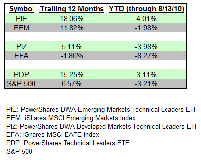
My emphasis added. In fact, Dorsey Wright provides three technical leaders indexes that are used to manage PDP, PIE, and PIZ. Trailing twelve-month performance and year-to-date performance is shown for each relative to their benchmark. As shown in the table, each have performed better than their benchmark over the past 12 months and YTD.

TL081610 Momentum Investing: Nearly Unmatched In Its Predictive Strength and Robustness

After detailing much of the academic testing of momentum investing on U.S. equities, Moskowitz then turns to the rest of the world and other asset classes. His conclusion: it was found to work pretty much everywhere!

The original momentum studies focused on U.S. equities during the period 1963-1990. Subsequent studies found momentum as far back as the Victorian age (Chabot et al. 2009) and in the out-of-sample period after the original research was published (Carhart 1997, Jegadeesh and Titman 2001, Grundy and Martin 2001, Asness et al. 2009). Momentum has been found in markets in Europe (Rouwenhorst 1998), in emerging markets (Rouwenhorst 1999), in Asia (Chui e al. 2000), and in 40 different markets globally (Griffin et al. 2005). Momentum also has been documented among other asset classes than individual stocks, e.g., bonds, commodities, and currencies (Asness et al. 2009); industries (Moskowitz and Grinblatt 1999, 2004; Asness et al. 2000), and country indexes (Asness et al. 1997).

Among the possible explanations for momentum, Moskowitz says:

Several possible behavioral explanations have been put forth, many based on the Nobel memorial prize-winning work of Daniel Kahneman and Amos Tversky. One explanation posits that investors may be slow to react to new information: different investors (e.g., a trader vs. a casual investor) receive news from different sources and react to news over different time horizons and in different ways. This “anchoring and adjustment” is a behavioral phenomenon in which individuals update their views only partially when faced with new information, slowly accepting its full impact. Ample evidence supoports slow-reaction-to-information theories ranging from market response to earnings and dividend announcements to analysts’ reluctance to update their forecasts.

Overall, Moskowitz’s article is a great overview of momentum investing and makes a compelling case for employing momentum strategies as part of an asset allocation. However, we couldn’t help smile when noting the irony that the author, Tobias J. Moskowitz, PhD, is currently the Fama Family Professor of Finance at The University of Chicago Booth School of Business, given that Eugene Fama (along with Ken French) have arguably done more to advance the theory of the Efficient Markets Hypothesis than any other academics. Regular readers of our blog may remember one of our earlier rants on the topic. But, I digress. A vast amount of research supports Moskowtiz’s conclusion that “Momentum is a powerful investment style, nearly unmatched in its predictive strength and robustness.”

Disclosures for PDP, PIE, and PIZ can be found at www.powershares.com.

Posted by:


Weekly RS Recap

August 16, 2010

The table below shows the performance of a universe of mid and large cap U.S. equities, broken down by relative strength decile and quartile and then compared to the universe return. Those at the top of the ranks are those stocks which have the best intermediate-term relative strength. Relative strength strategies buy securities that have strong intermediate-term relative strength and hold them as long as they remain strong.

Last week’s performance (8/9/10 – 8/13/10) is as follows:

It was an ugly week for all relative strength deciles and quartiles last week. However, the worst performance did come from those stocks with the weakest relative strength.

Posted by:


Client Sentiment Survey - 8/13/10

August 13, 2010

Client fear levels remain near all-time highs. We need big participation to achieve statistically valid reports!

Here we have the next round of the Dorsey, Wright Sentiment Survey, the first third-party sentiment poll. As you know, when individuals self-report, they are always taller and more beautiful than when outside observers report their perceptions! Instead of asking individual investors to self-report whether they are bullish or bearish, we’d like financial advisors to weigh in and report on the actual behavior of clients. It’s two simple questions and will take no more than 20 seconds of your time. We’ll construct indicators from the data and report the results regularly on our blog–but we need your help to get a large statistical sample!

Click here to take Dorsey, Wright’s Sentiment Survey.

Contribute to the greater good! It’s painless, we promise.

Posted by:


Relative Strength Across the Globe

August 13, 2010

CXO Advisory has a nice review of a study of the German stock market, which looked for universal factors that served as a source of return. Here is their summary:

“The Cross-Section of German Stock Returns: New Data and New Evidence” informs beliefs as follows:

  • There is no basis for belief that stock beta or firm size predict future returns.
  • There is some basis for belief that book-to-market ratio predicts future returns.
  • There is strong basis for belief that momentum predicts future returns.

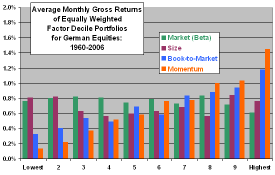
Not surprisingly, relative strength (known to academics as momentum) was the strongest return factor, outperforming value. (Book-to-market ratio is a value factor and that seemed to have some predictive ability as well. The best mix was stocks with good momentum that were also inexpensive.) Below you can see the returns of each factor by decile.

 Relative Strength Across the Globe

Source: CXO Advisory (click to enlarge)

The picture shows very graphically what we find over and over-most of the excess returns in every factor come from the top couple of deciles. In other words, most of the returns come at the extremes. If you try to buy middle-of-the-road value stocks, it is likely not going to work. The same thing is true of relative strength. It’s important to hold assets with powerful relative strength characteristics. The biggest benefit of a systematic approach is that it forces our portfolios to hold these outliers, however uncomfortable it may feel.

One of the reasons that it is difficult for investors to outperform indexes is the psychological discomfort entailed by holding stocks at the extremes. No one wants to own stocks that have already gone up a lot (high relative strength) or stocks that are financially impaired or teetering on the edge of bankruptcy (deep value stocks). Instead, they prefer to own something that seems safer. Hence, the premium returns of stocks in the top couple of deciles persist. Dozens of studies show exactly where the excess returns are-investors are just unwilling, for the most part, to do what is necessary to take advantage of them.

Posted by: