The chart below shows performance of US sectors and capitalizations over the trailing 12, 6, and 1 month(s). Relative strength strategies buy securities that have strong intermediate-term relative strength and hold them as long as they remain strong. Performance updated through 8/12/2010.
Sector and Capitalization Performance
August 13, 2010
 Leave a Comment » |
  Markets |
  Permalink
 Posted by Andy Hyer
Podcast #6 DWAFX: 4 Years On
August 12, 2010John Lewis and Andy Hyer
For more information about the Arrow DWA Balanced Fund, see www.arrowfunds.com or call Arrow Funds at 301-260-0163.
Leave a Comment » | Podcasts | Permalink
Posted by Andy Hyer
Fund Flows
August 12, 2010The Investment Company Institute is the national association of U.S. investment companies, including mutual funds, closed-end funds, exchange-traded funds (ETFs), and unit investment trusts (UITs). Members of ICI manage total assets of $11.82 trillion and serve nearly 90 million shareholders. Flow estimates are derived from data collected covering more than 95 percent of industry assets and are adjusted to represent industry totals..
Another $6 billion in new money was added to taxable bond funds in the week ending 8/24/10. Domestic equity funds continued to see outflows, losing nearly $3 billion. The massive influx of money into taxable bonds in 2010 now totals more than $166 billion, while domestic equity funds have had outflows of over $33 billion. Municipal bonds, hybrids, and foreign equity funds have all had modest inflows for the year.
Leave a Comment » | Markets | Permalink
Posted by Andy Hyer
High RS Diffusion Index
August 11, 2010The chart below measures the percentage of high relative strength stocks that are trading above their 50-day moving average (universe of mid and large cap stocks.) As of 8/10/10.
This indicator has recovered sharply from the deeply oversold levels that were seen in the May to June period. The 10-day moving average of this indicator is now at 80%.
Leave a Comment » | Markets | Permalink
Posted by Andy Hyer
Booming Business of Permabears
August 10, 2010The New York Times points out that “Economic Pessimists Gain Cachet.”
Apparently, the permabear newsletter business is booming. Unfortunately, the same can’t always be said about their investment advice. (Bold is my emphasis.)
Further afield, Raoul Pal, a former Goldman Sachs derivatives expert and hedge fund manager, has attracted a growing following with his monthly research note that, most recently, predicted a depression in the United States similar to that of the 1930s and eventual bankruptcy for Britain.
Mr. Pal writes The Global Macro Investor from a holiday village in Valencia. a province in Spain. He said that demand was so great now that he has the luxury of doling out his high-priced annual subscriptions only to clients he considers sophisticated enough to pass muster or who come recommended by people he trusts. Others must join a waiting list, Mr. Pal said, although he declined to say how large the group is.
He said that 30 percent of his clientele — which includes pension and hedge funds, governments and proprietary traders at banks — consisted of wealthy family offices with assets of more than $200 million.
“They are easily the most bearish of my subscribers because they invest in the longer term,” he said, “and in the longer run they see more uncertainty than ever before.”
According to TrimTabs, a funds researcher, hedge funds withdrew $3.5 billion in April and industry consultants say that many funds — positioned in July for a continuum of bad market news — were caught by surprise when the market rallied. “Where is the research telling me how good Intel’s earnings were going to be?” Mr. Jabre said. “I just have not seen it.”
In fact, if investors had been following the advice of Mr. Edwards or Mr. Pal over the last month as stocks have bounced back, they would have lost money, as both men readily acknowledge. Mr. Edwards has advised investors to be heavily underinvested in all equities, and Mr. Pal is betting against the United States stock market as well as shorting the euro.
Mr. Pal’s bad run began when, after becoming bearish in 2007 and reaping the fruits in 2008, he was caught short by the powerful recovery that began in March 2009. To date in his model portfolio, he has lost 96 percent on a short bet on the Indian stock exchange, 68 percent betting against the Chinese H share stock market and 68 percent on the American mutual fund company Franklin Templeton.
HT: Abnormal Returns
Leave a Comment » | Sentiment | Permalink
Posted by Andy Hyer
RS Spread
August 10, 2010The chart below is the spread between the relative strength leaders and relative strength laggards (universe of mid and large cap stocks). When the chart is rising, relative strength leaders are performing better than relative strength laggards. As of 8/9/2010:
A longer term RS Spread is shown below.
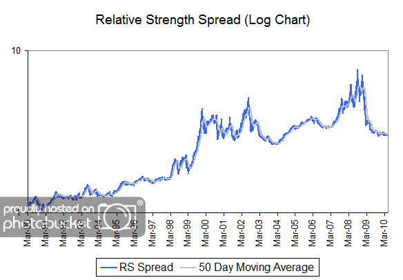
The RS Spread has risen (in fits and starts) over time as the high relative strength stocks have handily outperformed the relative strength laggards. The RS Spread has been relatively flat for the last year or so, after declining sharply in the first half of 2009. Can you identify other periods where the RS Spread had similar action to what we have seen over the last couple of years? What followed those periods? Perhaps, that will help provide insight into our optimism for relative strength strategies in the coming years.
1 Comment | Markets, Relative Strength Research | Permalink
Posted by Andy Hyer
Dorsey, Wright Sentiment Survey Results - 7/30/10
August 9, 2010Our latest sentiment survey was open from 7/30/10 to 8/6/10. The response rate was much lower than last survey’s, coming in at 113. Your input is for a good cause! If you believe, as we do, that markets are driven by supply and demand, client behavior is important. We’re not asking what you think of the market—since most of our blog readers are financial advisors, we’re asking instead about the behavior of your clients. Then we’re aggregating responses exclusively for our readership. Your privacy will not be compromised in any way.
After the first 30 or so responses, the established pattern was simply magnified, so we are comfortable about the statistical validity of our sample. Most of the responses were from the U.S., but we also had multiple advisors respond from at least two other countries. Let’s get down to an analysis of the data! Note: You can click on any of the charts to enlarge them.
Question 1. Based on their behavior, are your clients currently more afraid of: a) getting caught in a stock market downdraft, or b) missing a stock market upturn?
Chart 1: Greatest Fear. Client fear continues to dominate our broad sentiment index. 92% of clients were fearful of a downdraft, just off the all time highs of 94.7%. The market has rallied for 4 weeks straight now, which has had a negligible effect on client fear levels. Using the survey data points, the market has rallied +7.7% since recent lows in July, but client confidence has not been restored in the slightest. How big of a rally is needed to get Joe Investor back in the market…10%…25%…50%? On the other side, we have the fear of missed opportunities stuck down below the 10% line, near all-time lows at 8.0%.
Chart 2. Greatest Fear Spread. Another way to look at this data is to examine the spread between the two groups. The spread remains significantly skewed towards fear of losing money this round. This survey’s reading was 82%, a hair lower than last week’s reading of 84%. Again, even despite a respectable rally over the month of July, client sentiment remains entrenched in the fear camp. What’s it going to take to get retail investors willing to risk their savings in the stock market?
Question 2. Based on their behavior, how would you rate your clients’ current appetite for risk?
Chart 3: Average Risk Appetite. While the Greatest Fear and Spread numbers didn’t move much in July, it’s clear that average risk appetite is slowly creeping upwards again after hitting all-time lows at the end of June. This is exactly what we expect to see — as the market goes higher, investors are willing to assume more risk in return for more rewards. The DALBAR research & anecdotal evidence both point towards this phenomonen, where we see investors piling into the market at tops, and getting out at the bottom. Right now we have average risk appetite a 2.25, just higher than last week’s reading of 2.13.
Chart 4: Risk Appetite Bell Curve. This chart uses a bell curve to break out the percentage of respondents at each risk appetite level. Right now the bell curve is biased to the low-risk side, as it has been for the few months. What we see in the bell curve is more evidence that clients are afraid of losing money in the market. Our solitary 5 from last week seems to have disappeared, as a grand total of zero respondents are looking to “Take Risk” in this market.
Chart 5: Risk Appetite Bell Curve by Group. The next three charts use cross-sectional data. This chart plots the reported client risk appetite separately for the fear of downdraft and for the fear of missing upturn groups. We would expect that the fear of downdraft group would have a lower risk appetite than the fear of missing upturn group and that is what we see here.
Once again, we are seeing the missing upturn group swing big towards more risk, based on the market move. In past surveys, we’ve noticed that the upturn group’s risk appetite swings much more volatilely than the downturn group. However, with this few respondents, it’s hard to tell if the volatility is a function of the group as a whole, or the size of the testing sample. For example, we only had nine respondents in the upturn group, so just one wayward click can significantly skew the balance. However, we’ve seen the volatility present itself in surveys with a much higher response rate than this round’s, so we do believe there is something to be said about the volatility of the upturn’s group risk appetite.
Chart 6: Average Risk Appetite by Group. A plot of the average risk appetite score by group is shown in this chart. The downdraft group clocked in at 2.16, while the upturn group scored an average of 3.22. Theoretically, this is what we would expect to see, with the fearful clients wanting less risk than clients worried about missing opportunities.
Once again, the upturn group exhibits a more volatile average appetite than the downdraft group, with another 50 basis point swing versus the downdraft group’s 9 basis point move.
Chart 7: Risk Appetite Spread. This is a spread chart constructed from the data in Chart 6, where the average risk appetite of the downdraft group is subtracted from the average risk appetite of the missing upturn group. The spread is currently 1.06. The jump in the spread can be directly attributed to the swing in the upturn group’s risk appetite.
The market has continued to rally off the lows set in early July, but client sentiment is clearly not following suit. After a +7% correction in the S&P 500, client fear is still dominating broad market sentiment. This round of survey also pointed towards the volatile risk appetite of the upturn group; a larger data-set and more inputs will be needed to determine if the phenomenon is statistically valid, or a function of the few number of respondents in that category.
No one can predict the future, as we all know, so instead of prognosticating, we will sit back and enjoy the ride. A rigorously tested, systematic investment process provides a great deal of comfort for clients during these types of fearful, highly uncertain market environments. Until next time, good trading and thank you for participating!
Leave a Comment » | Investor Behavior, Markets, Sentiment | Permalink
Posted by JP Lee
Weekly RS Recap
August 9, 2010The table below shows the performance of a universe of mid and large cap U.S. equities, broken down by relative strength decile and quartile and then compared to the universe return. Those at the top of the ranks are those stocks which have the best intermediate-term relative strength. Relative strength strategies buy securities that have strong intermediate-term relative strength and hold them as long as they remain strong.
Last week’s performance (8/2/10 – 8/6/10) is as follows:
The best performance last week came from the bottom quartile — those stocks with the weakest relative strength. However, the third quartile had returns of 1.66% which was also above the universe return of 1.50%.
Leave a Comment » | Markets | Permalink
Posted by Andy Hyer
Updated Global Macro Video
August 6, 2010We have just posted an updated video presentation on our Global Macro strategy (click here) which describes the strategy and discusses our current allocations. This global tactical asset allocation strategy can invest in domestic equities (long & inverse), international equities (long & inverse), currencies, commodities, real estate, and fixed income.
To receive the brochure for our Global Macro strategy, click here. For information about the Arrow DWA Tactical Fund (DWTFX), click here.
Click here and here for disclosures. Past performance is no guarantee of future returns.
Leave a Comment » | Tactical Asset Alloc | Permalink
Posted by Andy Hyer
Sector and Capitalization Performance
August 6, 2010The chart below shows performance of US sectors and capitalizations over the trailing 12, 6, and 1 month(s). Relative strength strategies buy securities that have strong intermediate-term relative strength and hold them as long as they remain strong. Performance updated through 8/5/2010.
Leave a Comment » | Markets | Permalink
Posted by Andy Hyer
When The Facts Change
August 5, 2010When the facts change, I change my mind. What do you do, sir? -John Maynard Keynes
Although their theories seem to be no more or no less accurate, British economists always seem to have better quips than other economists. At the same time, Keynes brings up an important point. What do you do when the facts change-and how do you know if the facts have changed?
CSS Analytics has an interesting post on this subject today. The author points out a problem with forecasting:
The strangest thing about the forecasting world is not that it is a dismal science (which it is) but rather that forecasters share some remarkably primitive biases. Whether you look at purely quantitative forecasts or “expert/guru” forecasts, they have one thing in common: they rarely change their opinions or methods in light of new information. In fact, what I have noticed is that the smarter the person is and the more information they seem to possess, the less likely they are to change their mind. Undoubtedly this is why many genuinely intelligent and knowledgeable experts have blown up large funds or personal trading accounts.
It wouldn’t be so sad if it weren’t true. This lack of adaptability wiped out even a couple of Nobel Prize winners at Long Term Capital Management. The problem really is one of properly structuring one’s decision framework. CSS Analytics observes:
Ask a person to give you an opinion on where a market is going, and then notice what happens when the market goes dramatically the other way along with news announcements that seem to conflict with their thesis. Most of the time this person will tell you that they have not changed their mind, and in fact that it is an even better price to buy (or short). Models or systems suffer from the same problem–they typically do not adjust as conditions or regimes change…
Here, the decision framework is fixed. Since humans are naturally wired to seek out confirming evidence and to ignore disconfirming evidence, that is what happens. All evidence begins to be massaged to support the opinion, which is assumed to be correct. The story from CSS Analytics below is sadly familiar to most investors, almost all of whom start out as value investors:
I spent my early investing experiences as a “value investor” and let me tell you that I learned the hard way many times that the market was more often right than wrong. It was uncanny how well future fundamentals were sometimes “forecasted” by price. At the time, I had no knowledge of technical analysis and lacked the intellectual framework to synthesize a superior decision-making method. Of course, I would ride that “under-valued” stock with a price to book ratio less than 1 all the way to being a penny stock before I gave up. I also sold many of my winners far too early because their P/E indicated they were no longer undervalued. Some of these stocks went on to go up 400% or more, while I was content to make 25% profit. I did the exact opposite with overvalued stocks or stocks with crappy fundamentals. I was heavily short Fannie Mae and Freddie Mac as well as General Motors in early 2007! Of course, I got my clock cleaned and got margin-calls long before they plunged almost to zero. This was a case of being right, but too early to fight the sentiment of the crowd.
As a wise man once said, “Being early is indistinguishable from being wrong.” Even knowing that we should avoid a fixed decision framework, however, doesn’t really get us any closer to knowing how to handle the forecasting problem. CSS Analytics describes their epiphany:
It finally dawned on me one day that good forecasting (or decision-making) was a dynamic process involving feedback. In fact, the actual information used to make the initial decisions need not be complex as long as you are willing to adjust after the fact.
I put the whole thing in bold because I think it’s that important-although I don’t think our systematic relative strength process is forecasting at all. It’s simply a decision-making framework that incorporates a specific kind of feedback: the most important feedback to an investor, which is price. Price change tells you whether your decision is working out or not. If something isn’t working, you kick it out of the portfolio-that’s adjusting after the fact. Price is not complex at all, but it is the one mission-critical piece of feedback that is needed because that’s how every investment is measured.
Investing is one of those weird fields where clever opinions are often more valued than results. Certain gurus still get media exposure and sell hordes of newsletter subscriptions because subscribers agree with their bullish or bearish opinions, even though an outside service like Hulbert can demonstrate that their actual performance is abysmal. In professional sports, if you suck, you get released or sit on the bench. If you really suck, you don’t make the roster in the first place. Sometimes, in the investment field, if you really suck, you get to be on CNBC and have well-coiffed, polite hosts take your opinions seriously.
I think the description of good decision-making as a dynamic process involving feedback is very concise. Incorporating feedback is what makes a model adaptive. Models that are based on historical data ranges blow up all the time for this very reason-they are, in effect, optimized to the historical data but cannot always incorporate feedback. Continuous measurement of relative strength is not unlike former New York City mayor Ed Koch’s greeting, “How am I doing?” If the answer is ”not well,” then it’s time to ditch that asset and replace it with another one that has the prospect of better performance. The beauty of a relative strength model is that when the facts change, it changes its mind.
2 Comments | From the MM, Thought Process | Permalink
Posted by Mike Moody
What A Difference A Decade Makes
August 5, 2010I suspect that 10 years ago there were few that would have guessed that the S&P 500 would be underwater 10 years later. After all, on June 30, 2000 the S&P 500 had a 10-year average compound return of 17.8% and it was easy to be optimistic.
S&P 500 Then: As of June 30, 2000
It is much easier to be pessimistic today now that the 10-year average compound return of the S&P 500 is -0.8%.
S&P 500 Now: As of June 30, 2010
Source: The Leuthold Group
I would suggest two takeaways from this comparison:
- There can be wide variability in returns decade-to-decade in the same asset class. One way to deal with this is to adopt a tactical asset allocation strategy that can invest in multiple asset classes and can vary the amount of exposure to each of those asset classes according to their relative strength. This can help mitigate extended periods of underperformance and may enhance your ability to generate superior investment returns over time.
- Performance in a given asset class over the last 10 years doesn’t guarantee returns over the next 10 years. Given the tendency for markets to revert to the mean, it is quite possible that the returns of the S&P 500 over the next 10 years will be very good. Giving up on equities may prove to be a very poor decision over the next decade.
1 Comment | Tactical Asset Alloc, Thought Process | Permalink
Posted by Andy Hyer
Fund Flows
August 5, 2010The Investment Company Institute is the national association of U.S. investment companies, including mutual funds, closed-end funds, exchange-traded funds (ETFs), and unit investment trusts (UITs). Members of ICI manage total assets of $11.82 trillion and serve nearly 90 million shareholders. Flow estimates are derived from data collected covering more than 95 percent of industry assets and are adjusted to represent industry totals.
The trend in fund flows continues with taxable bond funds picking up the most new assets and domestic equity funds seeing the most redemptions. $160 billion in new money has flowed into taxable bond funds in 2010 while $31 billion has been removed from domestic equity funds. Hybrid, municipal bond, and foreign equity funds have seen modest gains in assets for the year.
Leave a Comment » | Markets | Permalink
Posted by Andy Hyer
High RS Diffusion Index
August 4, 2010The chart below measures the percentage of high relative strength stocks that are trading above their 50-day moving average (universe of mid and large cap stocks.) As of 8/3/10.
Once again we have seen a deeply oversold measure of this indicator lead to a strong rebound in high relative strength stocks. This indicator fell to the 10% range several times in the May to June period, but has since surged higher. The 10-day moving average of this indicator is 74% and the one-day reading is 80%.
Leave a Comment » | Markets | Permalink
Posted by Andy Hyer
Reversing Everything You Thought About Risk
August 3, 2010For your daily dose of why a relative strength approach to managing money is so essential, Matthew Lynn’s Risk is the New Black in World Turned Upside Down is a must read.
What is risky and what is safe? That has always been a crucial question for anyone working in the financial markets. Bankers provide their clients with an asset mix, tailored to suit the aging widow or the young entrepreneur.
But what if everything you know about risk was suddenly turned upside down? In the last two years, all the stuff we thought was really safe and dull turned out to be dangerous. And the things we thought were risky ended up being quite reliable.
In reality, investors need to reverse everything they thought they knew about risk.
In the context of a relative strength model there is no such thing as “safe” or “risky;” there is only relatively strong and relatively weak. As a result, relative strength models are free to adapt to whatever the new “safe” is or whatever the new “risky” is. One thing we can be sure of is that such designations will change. With a relative strength strategy, your portfolio can reflect those changes and can remain focused on keeping the portfolio fresh with relatively strong securities and therefore improve your chances of earning superior investment returns over time.
Leave a Comment » | Thought Process | Permalink
Posted by Andy Hyer
The Bullish Thesis For REITs
August 3, 2010For those trying to understand the reasons for the exceptionally strong relative strength of REITs, today’s WSJ offers some insight.
WSJ on the strength in the apartment sector:
The hottest REIT stocks in 2010 have been in the apartment sector: names such as Apartment Investment & Management Co. (AIV) and Equity Residential Properties Trust (EQR). Both companies reported quarterly earnings last week, and the shares have gained more than 30% this year.
A solid quarterly report from Equity Residential, which lifted its 2010 outlook, combined with improving market conditions “should have a positive impact on the overall apartment sector,” said Stifel Nicolaus analyst Rod Petrik. “The company appears well positioned to take advantage of positive market trends in the apartment industry.”
Stephen Swett at Morgan Keenan added, “We remain positive on apartments, relative to commercial REITs, as we believe the overall risks in the economy pose less risk to multifamily fundamentals at this time.”
Part of the bullish thesis for the apartment sector is that a soft economy and housing market have caused many to continue renting. The recovery in the multifamily sector “continues to gain momentum driven by lower resident turnover, higher occupancy levels, and accelerating pricing power,” said Raymond James analyst Buck Horne.
WSJ on investors’ hunger for yield:
Investors’ hunger for yield may also be lifting REITs, and some companies have raised dividends after cutting or eliminating them during the credit crunch.
“Investors are viewing REITs as a more attractive investment than they have in the past few years, given their yields compared to U.S. Treasurys and bonds,” said Morgan Joseph analyst Carol Kemple in a quarterly earnings preview.
(Click to Enlarge)
Source: StockCharts.com
As shown in the chart above, REITs have more than doubled the return of the S&P 500 since the beginning of this bull market in March 2009. Due to their strong relative strength, REITs are well represented in our Global Macro separately managed account and in the Arrow DWA Tactical Fund (DWTFX) and will remain so as long as this asset class retains strong relative strength.
To receive the brochure for our Global Macro strategy, click here. For information about the Arrow DWA Tactical Fund (DWTFX), click here.
Click here and here for disclosures. ICF, IYR, RWR and other real estate securities are current holdings in products managed by Dorsey Wright Money Management. Past performance is no guarantee of future returns.
Leave a Comment » | Markets, Tactical Asset Alloc | Permalink
Posted by Andy Hyer
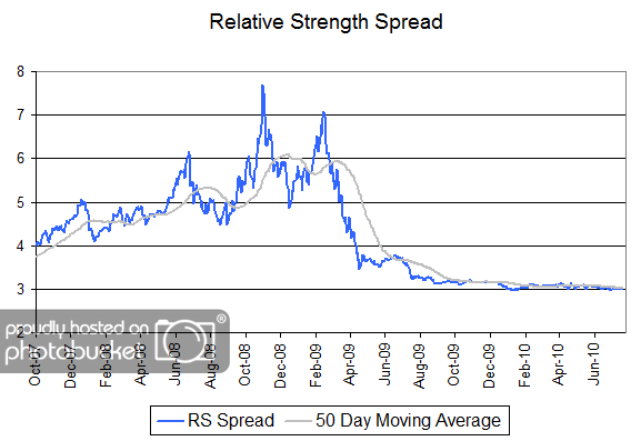
Relative Strength Spread
August 3, 2010The chart below is the spread between the relative strength leaders and relative strength laggards (universe of mid and large cap stocks). When the chart is rising, relative strength leaders are performing better than relative strength laggards. As of 8/2/2010:
RS leaders and laggards continue to mark time without either one substantially distinguishing itself from the other in terms of performance. This transition from a declining spread to what may well be a period of a rising spread has now lasted for over a year.
Leave a Comment » | Markets | Permalink
Posted by Andy Hyer
SRS Aggressive: Five Years On
August 2, 2010One of the benefits managing money in a systematic (i.e. rules-based) fashion is that we are able to apply a given set of investment rules to a historical data set in order to see how those rules worked over longer periods of time. In fact, a major reason that we introduced our rules-based relative strength portfolios to the market is because of the compelling results of such tests by us and by many others. Our family of Systematic Relative Strength separately managed accounts consists of a number of different strategies which focus on different asset classes. The first member of this family of Systematic Relative Strength portfolios was our Aggressive strategy which invests in 20-25 U.S. mid- and large-cap stocks with powerful relative strength characteristics.
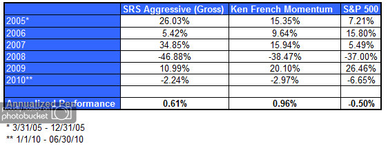
Now that we have over five years worth of real returns, it is instructive to compare the actual gross returns of our Aggressive strategy to one of the more prominent publicly available relative strength models to see how it has stacked up.
One of the more prominent publicly-known relative strength models is maintained by Dr. Ken French at his online data library. French’s data library is valuable source of information for those who want to see the validity of rules-based models. French maintains models on a number of different investment factors, including a number of value and price momentum factors.
The table below shows the results of Dr. French’s Momentum Model which is constructed by taking stocks with the top third of market capitalization in his universe of stocks that trade on the NYSE, AMEX, and NASDAQ and the top third of price momentum (defined by trailing 12-month returns) out of the same universe. As shown in the table below, the public momentum model outperformed the benchmark by over 5% per year over the last 83 years. (The benchmark is an equally-weighted index of the stocks with the top third of market capitalization in the same investment universe.)

(Click to Enlarge)
Although our own relative strength models are based on a proprietary relative strength factor, it is similar to Dr. French’s model in that it is designed to keep the portfolio fresh with stocks that have strong intermediate-term relative strength. If our model is working as anticipated, one would expect the returns to be similar to Dr. French’s momentum portfolio. And, in fact, that is exactly the case. There was only a difference in annualized performance of 35 basis points between the French Momentum Model and our own Aggressive portfolio over the last 5.25 years. In other words, the live returns of our Aggressive model are about in line with what we would expect after comparing it to a publicly-known method of constructing a relative strength model.
Our longer-term testing suggests that there may be performance advantages of our proprietary method over publicly-known methods for calculating relative strength. Nevertheless, the real key to outperformance over time is found in the consistent execution of relative strength models.
(Click to Enlarge)
The amount of outperformance of relative strength strategies over the past 5.25 years has been modest compared to the longer-term average. However, a more detailed look at the historical returns of the Ken French Momentum Model reveal that relative strength tends to move in and out of favor as an investment factor. Relative strength strategies have plenty of short-term time periods where the returns are fairly average or even sub-par. However, over longer periods of time, relative strength has proven capable of delivering spectacular outperformance. Here’s a view of the longer-term performance of Dr. French’s momentum model.
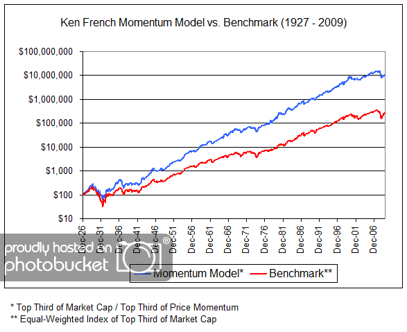
(Click to Enlarge)
At first glance, it looks nice, but not earthshaking. However, it is a logarithmic chart scale, designed to equate percentage changes. For a mind-blowing perspective, look carefully at the terminal values of the line on the right hand side of the chart: less than $300,000 for the benchmark, but around $11 million dollars for the high relative strength portfolio. Now that’s a testament to the power of compounding!
In summary, after 5.25 years of managing live money in the Systematic Relative Strength Aggressive strategy we are right where we need to be and we look forward to capitalizing on what we expect to be the very fruitful rewards that have been earned by those who stick to the discipline for extended periods of time.
Click here to receive the brochure on our Systematic Relative strength portfolios. Click here for disclosures.
Leave a Comment » | Relative Strength Research | Permalink
Posted by Andy Hyer
Invest Like Harvard, Yale Endowments
August 2, 2010That’s the title of an article by Joe Mont at TheStreet.com. The article discusses using ETFs to build your own endowment model.
Or you could just look at the Arrow DWA Balanced Fund (DWAFX), where exposure to domestic equities, international equities, fixed income, and alternative assets is handled for you.
For information about the Arrow DWA Tactical Fund (DWTFX), click here.
Click here for disclosures. Past performance is no guarantee of future returns.
Leave a Comment » | Markets, Tactical Asset Alloc, Thought Process | Permalink
Posted by Mike Moody
Weekly RS Recap
August 2, 2010The table below shows the performance of a universe of mid and large cap U.S. equities, broken down by relative strength decile and quartile and then compared to the universe return. Those at the top of the ranks are those stocks which have the best intermediate-term relative strength. Relative strength strategies buy securities that have strong intermediate-term relative strength and hold them as long as they remain strong.
Last week’s performance (7/26/10 – 7/30/10) is as follows:
Leave a Comment » | Markets | Permalink
Posted by Andy Hyer
Ned Davis Research on Consumer Confidence
August 2, 2010John Dorfman’s article on Bloomberg discusses research done by Ned Davis on the Conference Board’s Consumer Confidence Index. The results are in line with what we found when looking at the University of Michigan survey data.
Poor confidence = good market. Often the best trades are the ones that are hardest to do.
Leave a Comment » | Markets, Sentiment | Permalink
Posted by Mike Moody
