Fund Flows

September 30, 2010

The Investment Company Institute is the national association of U.S. investment companies, including mutual funds, closed-end funds, exchange-traded funds (ETFs), and unit investment trusts (UITs). Members of ICI manage total assets of $11.82 trillion and serve nearly 90 million shareholders. Flow estimates are derived from data collected covering more than 95 percent of industry assets and are adjusted to represent industry totals.

Investors continue to withdraw money from domestic equity funds while adding to other asset classes-most notably taxable bond funds. It will be interesting to see how long this trend in asset flows persists in light of the fact that taxable bond funds have underperformed the S&P 500 by roughly 10% in the third quarter.


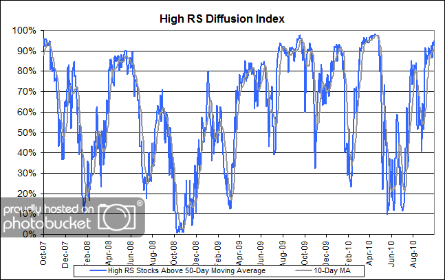
High RS Diffusion Index

September 29, 2010

The chart below measures the percentage of high relative strength stocks that are trading above their 50-day moving average (universe of mid and large cap stocks.) As of 9/28/10.

The 10-day moving average of this indicator is 91% and the one-day reading is 95%. After pulling back to the middle of the distribution in August, this index has risen sharply in recent weeks and continues to inch higher.


Will Inflation Wipe You Out?

September 28, 2010

Although a number of economists are still concerned about deflation, there is a growing concern on the part of other economists about inflation. Irwin Kellner, the economist at MarketWatch, had an article with his take on the topic recently. One thing that is clear is that inflation is partly a child of globalization. A recent Yahoo! Finance article on Starbuck’s planned price increase makes that clear:

The upcoming agony of Starbucks devotees offers three fundamental truths that should be apparent to all who pay attention to economic news:

(1) global growth is strong;

(2) U.S. growth is weak compared to global growth;

(3) the world’s national economies and markets have never been more connected or interconnected.

The global economy continues to recover from the plague year of 2009 — the first since 1944 in which the world’s economic output shrunk. The International Monetary Fund pegs growth at 4.5 percent for 2010.

In nearly every corner of the world, more people are building and eating more stuff. That has pushed up prices for a range of commodities — steel, copper, cotton, soybeans, wheat, and cotton. Many commodities (notably oil and gold) are priced in dollars. Slow U.S. growth, which weakens the dollar, can also have the effect of making commodities more expensive.

But it’s the third factor — the rising tide of globalization — that is making venti-size waves at Starbucks and elsewhere. In an era where production of key staples and finished goods can happen anywhere, so too can problems. Coffee is expensive in part because of poor harvests in Vietnam and Colombia. Bloomberg reported on Monday, that “raw sugar rose to a seven-month high in New York on concern that suppliers will struggle to meet demand.” A big part of the problem: “Drought in Brazil, the world’s biggest producer of coffee and oranges as well as sugar, is harming crops and drying the Amazon River to its lowest in 47 years.” For farmers in Brazil, Antonio Carlos Jobim’s Waters of March can’t come soon enough.

In other areas, the problem is too much water. Bloomberg notes that “sugar-cane yields in Uttar Pradesh, India’s biggest cane producer” could be harmed by recent flooding. The price of a pound of sugar for delivery in October has soared 67 percent in the past few months (For current prices on agricultural commodities, check out the CME Group’s website.)

Since inflation is a global phenomenon, it’s not going to be possible to counteract it with a new government policy. Inflation is bigger than any one government, so we’re just going to have to deal with it. Here’s the big problem: most investors do not have the resources to deal with inflation.

Rob Arnott has an outstanding article on the inflation problem for 401k investors. (You really need to read this article all the way through. Important stuff.) The problem with most 401k plans is that investors do not have sufficient flexibility to deal with inflation if it crops up:

The evidence supports this: investors hold between 55–75% in stocks and 25–45% in short-term fixed-income and bonds. Most 401(k) plans have a money market or stable value option, and one or two bond funds providing fixed-income exposure. But, on average, only 5 of the typical 18 investment choices are non-stock funds! With stock funds comprising 70% of our available choices, it’s no coincidence that the average 401(k) investor has roughly 70% of their 401(k) in stocks.

I’d generalize things even further: even outside a 401k plan, most investors do not have the expertise to use an alternative toolset to deal with investment problems that they have not been seen in their investing career. Inflation requires that alternative toolset. Mr. Arnott thinks there are four critical components:

An effective real return strategy should have four key components:

1. Inflation-fighting assets such as TIPS, REITs, and commodities should be blended into the portfolio in a meaningful way.

2. Non-dollar assets should be used on a scale large enough to protect against any government choices that may debase the dollar. Of course, Japan and Europe face the same “3-D Hurricane” that we face here, only more so. So, these non-dollar investments should be in the emerging markets, in the local currencies. It bears mention that the emerging markets largely shrugged off the “global financial crisis” and the “great recession.” Why? Most did not have massive debt. Most did not respond to the crisis with massive deficit spending and new debt. And most chose to let failing enterprises fail instead of propping them up.

3. There should be investments in inflation “stealth fighters” such as high-yield bonds, bank loans, convertibles, and local currency emerging markets debt. Inflation stealth fighters work in a subtle way. Inflation reduces the real value of the debts, improving debt coverage ratios. As the coverage ratios improve, the credit spread can narrow creating capital gains on top of the original rich yields. This leads to startlingly high correlations between their returns and the rate of inflation.

4. Tactical allocations among the asset class choices. Higher inflation breeds volatility which, in turn, breeds opportunities to be tactical in response to price dislocations. This includes the ability to invest in absolute return, low beta, alpha-oriented strategies for times when both traditional and real return funds offer meager risk-adjusted returns.

That is a handful. Excuse me for believing that Mom and Pop are not prepared to deal in TIPs, REITs, commodities, high-yield bonds, bank loans, convertibles, and emerging markets debt and equity, let alone make knowledgeable tactical asset allocations among them! Most investors have enough trouble making money in boring stocks and bonds.

Our Global Macro portfolio (and the Arrow DWA Tactical Fund, DWTFX) is designed to deal with this very problem. It allows an investor to rotate toward strong asset classes, whether in domestic equities, international equities, emerging market debt and equity, REITs, commodities, inverse funds, currencies, inflation-protected securities, and more traditional fixed income. Both exposure and timing are addressed so that Mom and Pop-who have no expertise-don’t have to try to figure out what to buy and when. Best of all, the portfolio adapts as strength in various asset classes waxes and wanes. Market regimes change, and while Mr. Arnott is concerned about inflation now, it is possible that an entirely different concern will be on the horizon a few years from now. Global Macro is designed to roll with the changes.

To receive the brochure for our Global Macro strategy, click here. For information about the Arrow DWA Tactical Fund (DWTFX), click here.

Click here and here for disclosures. Past performance is no guarantee of future returns.


Relative Strength Spread

September 28, 2010

The chart below is the spread between the relative strength leaders and relative strength laggards (universe of mid and large cap stocks). When the chart is rising, relative strength leaders are performing better than relative strength laggards. As of 9/27/2010:

There were no major changes this week in the RS Spread. The top quartile and the bottom quartile of relative strength stocks continue to generate similar performance-as they have for over a year now. A long-term view of the relative strength spread reveals the strong upward bias of the spread over time.

The RS Spread has seen other transitions from declining spreads to flat spreads to rising spreads (notably following the 2000-2002 bear market). I suspect that we could see a similar pattern this time where a flat spread is followed by a multi-year period of a rising spread-which could really put the wind at the back of relative strength strategies.


Money Goes Where It Is Treated Best

September 28, 2010

Seeking Alpha recently published an interesting interview with noted speaker and best selling author, Dr. Marc Faber. I found the following interchange particularly insightful:

HRN: Given the poor prospects for US economic growth, do you foresee a flight of capital from the United States?

Dr. Marc Faber: You would be out of your mind, with health care reforms and with the government interventions and the uncertainty about future taxes in the US, to even consider expanding in the US and this is a problem. I mean people say that loan demand is down because banks are not lending, but maybe nobody wants to borrow any money in the US and nobody wants to expand in the US but they are expanding in China, India, Vietnam, Bangladesh, Africa and Brazil. The business world is an international place today, and if you run a corporation, whether you employee 50 people or 10,000, you can choose where you invest your money in terms of capital spending. Where do you want to expand factories? If I employed people in the US, I would rather think of reducing the 50 employees maybe to only 20.

As Marc Faber stated, “The business world is an international place today.” I am not sure that many U.S. investors have fully grasped the ease with which they can have a global multi-asset class portfolio. It could be a serious mistake for investors to limit their asset allocations to just a sliver of assets in such areas as emerging market equities, commodities, and currencies. While I don’t necessarily agree with Marc Faber’s pessimism for U.S. economic growth, I also willingly admit that it is a concern. However, U.S. investors have no need to feel trapped in their asset allocations. With exchange traded funds, U.S. investors can invest in U.S. equities, international equities, inverse equities, currencies, commodities, real estate, and fixed income with equal facility. It is no wonder that a large number of investors have embraced our Global Macro separate account strategy, which provides a logical framework for allocating among each of those asset classes and seeks to find profitable investments wherever they may be found in the world.

To receive the brochure for our Global Macro strategy, click here. For information about the Arrow DWA Tactical Fund (DWTFX), click here.

Click here and here for disclosures. Past performance is no guarantee of future returns.


A Nearly Foolproof Recipe for Market Gains

September 27, 2010

Tell Congress to go home and stay there. According to a recent article in the New York Times:

…stocks fare better when Congress is out of session, much as [Will] Rogers suggested. Along with Michael F. Ferguson of the University of Cincinnati, Professor Witte corroborated this finding in a 2006 paper. The researchers found that more than 90 percent of the price gains over the 108-year life of the Dow Jones industrial average through 2006 came on days when Congress was out of session.

Amazing, is it not? Several theories were offered as to why this effect occurs, but I prefer the theories of American humorists Will Rogers and Mark Twain. Twain’s take on the situation:

Suppose you were an idiot. And suppose you were a member of Congress. But I repeat myself.

Will Rogers went for immaturity rather than stupidity. He wrote:

This country has come to feel the same when Congress is in session as we do when the baby gets hold of a hammer. It’s just a question of how much damage he can do with it before you can take it away from him.

Will Rogers wrote in 1930. Twain’s commentary came in his autobiography, which was dictated to a stenographer between 1906 and his death in 1910. Current sentiments toward Congress are obviously nothing new! For those who are seriously concerned, here is a link to a Congressional calendar. The target date for the next adjournment is October 8.


Weekly RS Recap

September 27, 2010

The table below shows the performance of a universe of mid and large cap U.S. equities, broken down by relative strength decile and quartile and then compared to the universe return. Those at the top of the ranks are those stocks which have the best intermediate-term relative strength. Relative strength strategies buy securities that have strong intermediate-term relative strength and hold them as long as they remain strong.

Last week’s performance (9/20/10 – 9/24/10) is as follows:

The top decile of relative strength stocks was up 2.97% last week-this is 0.88% better than the universe. The very bottom of the relative strength ranks also delivered performance above the universe last week.


Dorsey, Wright Client Sentiment Survey — 9/24/10

September 24, 2010

Here we have the next round of the Dorsey, Wright Sentiment Survey, the first third-party sentiment poll.

As you know, when individuals self-report, they are always taller and more beautiful than when outside observers report their perceptions! Instead of asking individual investors to self-report whether they are bullish or bearish, we’d like financial advisors to weigh in and report on the actual behavior of clients. It’s two simple questions and will take no more than 20 seconds of your time. We’ll construct indicators from the data and report the results regularly on our blog–but we need your help to get a large statistical sample!

Click here to take Dorsey, Wright’s Client Sentiment Survey.

Contribute to the greater good! It’s painless, we promise.


Inflation? What Inflation?

September 24, 2010

According to the Bureau of Labor Statistics, inflation is low and still declining. The reported 12-month change in the Consumer Price Index is a mere 1.1%. Some economists are worried that the faltering economy will double-dip and that we will see actual deflation.

On the other hand, there is anecdotal evidence that price increases are sneakily happening throughout the economy. Looking at commodity price charts, it is difficult to come to the conclusion that inflation is not occurring. As I scanned through some commodity charts recently, here are a few that have made new 2010 high in August or September: feeder cattle, lean hogs, live cattle, pork bellies, gold, silver, cotton, milk, coffee, orange juice, sugar, soybean oil, corn, wheat, oats, soybeans, soybean meal, Australian dollar, British pound, Swedish krona, Japanese yen, and Swiss franc. The big missing piece is the energy complex, where most of the items peaked in May. Since energy is, by far, the biggest weight in most of the commodity indexes, most indexes have pretty tame behavior.

On the other hand, the Greenhaven Continuous Commodity Index is more equal-weighted. Here’s what it looks like over the last six months, compared to both the S&P 500 and the Barclays Aggregate Bond Index.

Click to enlarge. source for both Yahoo! Finance

No one knows how this will play out in the future, of course. I can guess that CPI might begin to climb pretty rapidly if energy demand ever picks up though. Will it end up spooking the bond market? I don’t know-bonds have performed decently this year so far. I think the message is maybe just to make sure that your investment policy has a way to cope with inflation if it appears, whether it is through potential exposure to inflation-sensitive equities or actual alternative assets. Don’t assume inflation is not a threat just because the economy is barely keeping its head above water right now.


Sector and Capitalization Performance

September 24, 2010

The chart below shows performance of US sectors and capitalizations over the trailing 12, 6, and 1 month(s). Relative strength strategies buy securities that have strong intermediate-term relative strength and hold them as long as they remain strong. Performance updated through 9/23/2010.


Bond Market: The Movie

September 23, 2010

Courtesy of MTV Films and Paramount Productions

Starring Johnny Knoxville as the Retail Investor and the bison as the Bond Market. Not sure when it will be released, but I’m pretty sure it’s in production. Oh, wait-never mind-wrong movie. My bad.


Don’t Try This at Home

September 23, 2010

Every car ad I watch seems to have a warning at the bottom of the screen: “Professional driver on closed course. Do not attempt.” Perhaps it is just our litigious society these days, or maybe knuckleheads actually try to replicate some of the stunts. When something difficult is done well by a professional, it only looks easy!

That’s pretty much the experience that Deborah Levine, a brave reporter at MarketWatch, had when she tried to trade foreign exchange on her own. The painfully honest article is entitled How I Lost $100,000 Trading Currencies: A Reporter’s Firsthand Experience. Her experience is quite typical of retail forays into the financial markets:

I opened two trial accounts, one with FXCM and the other with Forex.com, figuring that after writing about foreign-exchange markets for a while, I could put on some trades based on what I know about the markets.

The results were not pretty. Nor were they any better when she attempted to rely on “expert” opinion.

In one month of setting my own trades, I lost about $45,000.

I also tried a platform that allows individuals to piggyback on successful, professional traders. I started with $100,000 there, and split it between a few systems that seemed to be doing well. I ultimately lost $72,000 trying this.

Fortunately for Ms. Levine, the trial accounts only let you use play money. Unfortunately, lots of amateur investors go off half-cocked with real money in their 401k or personal account-and not necessarily just in forex. This process happens in every asset class, from stocks to bonds to precious metals. Amateur investors often have issues they are not fully aware of.

1) they think they know something about the market. The truth is, no one knows anything. Forecasting has not been shown to be a fruitful way to interact with the markets.

2) they do not have a disciplined plan for what to trade, when to trade, and how much to trade. All of those things need to be specified. Without a systematic process in place, you cannot do adequate testing.

3) they do not have any test results on their approach. Testing is critical. Would you like to fly in a plane that had not be tested for airworthiness?

A systematic approach utilizing relative strength does not require forecasting, specifies a transactional process precisely, and allows for long-term testing to be done. Even then, a return factor that can be shown to have a good record over the long term will go through numerous negative periods of performance. Markets aren’t easy even when you take a professional approach, but are almost sure to beat you senseless if you engage them in an amateurish way.


Who Has the Better Business Model?

September 23, 2010

And we didn’t even have to look at any fundamental data to answer this question.

(Click to Enlarge)

Disclosure: Dorsey Wright currently owns Netflix.


Increase the Returns from Your Strategy

September 23, 2010

…by buying on the dips in the strategy returns. So says an excellent recent post from Condor Options. A strategy doesn’t necessarily work the same way as an individual security. Even if a strategy is robust, it will go through periods where it works better or worse.

…for a strategy with long-term positive expectancy, the appropriate response to a drawdown is to increase exposure – not reduce or eliminate it – on the view that the performance of the strategy will revert to its mean. Conversely, one mark of a skittish, irrational investor is that he sells after a sizable decline. Individual stock investors are notoriously driven by emotion instead of information…

In fact, some research suggests that many of the best strategies are quite volatile. It might make sense to let the volatility of the strategy work in your favor by adding to it when it is out of favor. Condor Options shows an equity curve from a simple mean reversion strategy used on the S&P 500 from 2000-2010. Investors fall into three categories:

When the equity curve of yesterday’s original strategy was below its simple moving average, “Panic” moves entirely to cash, waiting for the original strategy to rise above its moving average before stepping back in. “Frown” cuts its exposure by half when trading below the moving average, while “Think” actually commits 50% more capital whenever the original strategy is below the average.

The equity curves that are achieved are quite dissimilar. The “panic” strategy that goes to cash during the drawdowns performs terribly. Also worse than the base strategy is the “frown” strategy that cuts back exposure during drawdowns. The best results are achieved with the “think” strategy that adds exposure during the drawdowns.

Click to enlarge. Source: Condor Options

Before doing this blindly, keep in mind the requirement that the strategy needs to have a long-term positive expectancy-that means a long-term record of solid performance and a steadily rising equity curve, according to Condor. Relative strength is one of several return factors that has a long-term record of solid performance. If you look at the RS spread chart that we post weekly on this blog, you can see that RS leadership has endured a drawdown and that leaders and laggard groups have been performing similarly for a while. We see hints from the recent strong performance of our separate accounts that RS leadership may be poised to reassert itself once more. If that turns out to be the case, this could be an excellent opportunity to add to the strategy.

To receive the brochure for our Separately Managed Acccounts, click here. For information about the Arrow DWA Tactical Fund (DWTFX) or Arrow DWA Balanced Fund (DWAFX), click here.

Click here for disclosures. Past performance is no guarantee of future returns.


Blockbuster: Who Saw This Coming?

September 23, 2010

Blockbuster, the video rental chain, filed for Chapter 11 bankruptcy this morning. Not too much of a surprise for anyone observing the trend or the relative strength charts over the past 10 years.

(Click to Enlarge)


Fund Flows

September 23, 2010

The Investment Company Institute is the national association of U.S. investment companies, including mutual funds, closed-end funds, exchange-traded funds (ETFs), and unit investment trusts (UITs). Members of ICI manage total assets of $11.82 trillion and serve nearly 90 million shareholders. Flow estimates are derived from data collected covering more than 95 percent of industry assets and are adjusted to represent industry totals.

Last week was another big week of new money for taxable bond funds and another week of redemptions for domestic equity funds. There has now been over $200 billion in new money for taxable bonds for the year while domestic equity funds have had redemptions of over $56 billion. Foreign equity funds, hybrid funds, and municipal bond funds have all had modest inflows for the year.


Advice From Retirees: Learn From Their Mistakes

September 22, 2010

The market drop in 2008 was a very unpleasant events for retirees, or near retirees. The strong market in 2009 was perhaps equally unexpected. Merrill Lynch Wealth Management did a survey of affluent retirees in early 2010 to find out how they were coping. The insights are important.

Surprisingly, given the opportunity to do it all again, roughly half (51%) of retired respondents indicated that they would have focused more on their “life goals” and less on “the numbers” and on hitting a specific nest egg dollar amount when planning for retirement, while the remaining respondents (49%) indicated that they would have focused more on “the numbers.”Retirees who wished they had focused more on their “life goals” indicated that they would have spent more time determining how they wanted to live in their retirement years (38%) and based their retirement income needs not just on a number that would sustain them but on one that would help them live their ideal lifestyle during these years (13%). Additionally, 8 percent would have created a plan to better support their philanthropic missions. Among those who indicated that they would have focused more on “the numbers,” 23 percent wished they had started working with a financial advisor earlier in life and 18 percent would have given up more luxuries in order to reach their retirement goals. Among all retired respondents, three out of 10 (31%) worked with a financial advisor when planning for retirement, though, in hindsight, more than half (55%) wished they had started doing so sooner.

I find it quite enlightening that among the group most focused on life goals, they really wished they had spent more time figuring out what they wanted to do in retirement and then saved enough to live their ideal lifestyle and not just enough to get by. Among the group focused on the numbers, a significant chunk wished they had started working with a financial advisor earlier-and for those already working with a financial advisor, a majority wished they had started working with an advisor sooner.

In short, most of the retirees wish they had saved more and started working with an advisor earlier. For advisors, the implications are clear: push clients to save more and to focus on retirement much earlier.


Gold Back in Focus

September 22, 2010

Gold is making headlines again, although it has been a pretty good performer for quite some time. Some of the attention comes about when any asset goes to new highs, but gold is also getting attention because of the Fed’s statement yesterday. A number of observers noted that Fed balance sheet expansion could lead to a weaker dollar and higher gold prices, while others, of course, disagreed. Since I am not an economist, I have no idea whose side to take in the argument, but gold has already made its decision.

Click to enlarge. Source: Yahoo! Finance

The problem with gold, from a portfolio point of view, is that it is a commodity. It’s never clear how to incorporate commodities into a strategic allocation, because sometimes commodities rock and other times they are terrible performers for years at a time. If they are included in a strategic allocation at all, they are typically included as a small 5-10% slice. In that small role, they can neither hurt you or help you much.

Tactical asset allocation does not suffer from this same problem. When commodities are strong, they are included in the portfolio; when they are weak, they are not. Our Global Macro separate account, for example, has held precious metals for most of the period shown on the chart above. That doesn’t mean we are gold bugs or that we have expectations about what the dollar or the economy will do. We own assets because they have powerful relative strength-and we will exit them unceremoniously as soon as that ceases to be the case. Asset class rotation allows a portfolio to have significant exposure to an asset class during times when it potentially can do some good, and tries to avoid exposure when an asset class appears to be dead money.

To receive the brochure for our Separately Managed Account strategies, click here. Click here for disclosures. Past performance is no guarantee of future returns.


Dorsey Wright Polo Shirts Through November

September 22, 2010

As we head into the final months of the year, we want to thank all of our clients for their business. 2010 has so far been a very good year for our portfolios and we think it could well be the beginning of a strong multi-year move for relative strength strategies.

As a way of thanking you for your business, we will be offering a polo shirt, embroidered with the Dorsey Wright XO logo, for advisors who open new separately managed accounts with us from now until the end of November.

www.companycasuals.com

To receive the brochure on our Systematic Relative Strength portfolios, please click the image below.


High RS Diffusion Index

September 22, 2010

The chart below measures the percentage of high relative strength stocks that are trading above their 50-day moving average (universe of mid and large cap stocks.) As of 9/21/10.

The 10-day moving average of this indicator is 89% and the one-day reading is 93%. After pulling back to the middle of the distribution in August, this index has risen sharply in recent weeks.


The Economy and the Stock Market

September 21, 2010

Patrick O’Shaughnessy’s recent research confirms that the stock market has historically handsomely rewarded those who step up during troubling economic times (like we are in now). The entire research paper is well worth the read.

The natural emotional response to a weak economy and uncertainty about the future is one of conservatism. The dominant trade in 2010 has been out of stocks and into bonds, or looked at another way, away from risk and into apparent safety. The trouble with this investment decision is that for many it is based on what this research has found to be irrelevant data points. GDP growth, unemployment, taxes, and consumer sentiment all seem like they should matter for your portfolio, but 110 years of history says that they do not. The relationships between these sensitive economic variables and future equity returns are very weak and, if anything, contrarian.


Relative Strength Spread

September 21, 2010

The chart below is the spread between the relative strength leaders and relative strength laggards (universe of mid and large cap stocks). When the chart is rising, relative strength leaders are performing better than relative strength laggards. As of 9/21/2010:

It has been well documented that the most difficult environments for relative strength strategies are those where there are dramatic changes in leadership-where the laggards become the leaders. We experienced that from mid-2008 to mid-2009 and it was reflected in a sharply declining relative strength spread during that time. We have been in a transition phase for over a year now where the relative strength leaders and the relative strength laggards are duking it out and neither one has distinguished itself from the other in terms of performance. Stay tuned for developments, but I suspect that we could well see a steadily rising trend in the coming years as relative strength leaders reassert themselves.


In Case You Missed It…

September 21, 2010

The recession is now over. According to the National Bureau of Economic Research, the recession actually ended in June 2009. Oh, wait-wasn’t that more than a year ago? Welcome to the wonderful world of economics, where time travel is possible. But just in case Scotty is not able to beam you back to June of 2009, here is a nice illustration of why the S&P 500 is part of the Index of Leading Economic Indicators.

source: Yahoo! Finance (click to enlarge)

The S&P 500 bottomed in March 2009, three months ahead of when the time-traveling economists have now determined the recession ended. This is just another demonstration of why price matters and why price data is the primary input into our systematic relative strength process.


Dorsey, Wright Client Sentiment Survey Results — 9/10/10

September 20, 2010

Our latest sentiment survey was open from 9/10/10 to 9/17/10. We saw a sizeable drop in the response rate, with only 116 readers participating. TSK TSK! Your input is for a good cause! If you believe, as we do, that markets are driven by supply and demand, client behavior is important. We’re not asking what you think of the market—since most of our blog readers are financial advisors, we’re asking instead about the behavior of your clients. Then we’re aggregating responses exclusively for our readership. Your privacy will not be compromised in any way.

After the first 30 or so responses, the established pattern was simply magnified, so we are comfortable about the statistical validity of our sample. Most of the responses were from the U.S., but we also had multiple advisors respond from at least two other countries. Let’s get down to an analysis of the data! Note: You can click on any of the charts to enlarge them.

Question 1. Based on their behavior, are your clients currently more afraid of: a) getting caught in a stock market downdraft, or b) missing a stock market upturn?

Chart 1: Greatest Fear. The 4% rally that held up from survey to survey had a big impact on client fear levels. 89% of clients were fearful of a downdraft, down from last survey’s reading of 94%. On the flip side, we saw a nice bounce in the missed opportunity group, which moved from only 6% of the respondents to around 11%. The moves don’t represent a seismic shift in broad investor sentiment — they DO, however, show that client sentiment is often directly tied to recent performance. In this case, a 4% move in the market represented a 5% move in client sentiment. For financial health reasons, long-term investor sentiment should probably NOT be tied that closely to short-term market performance.

Chart 2. Greatest Fear Spread. Another way to look at this data is to examine the spread between the two groups. The spread remains significantly skewed towards fear of losing money this round. As with the general numbers, the spread tightened a bit to represent the market move, from last week’s reading of 89% to this week’s reading of 77%.

Question 2. Based on their behavior, how would you rate your clients’ current appetite for risk?

Chart 3: Average Risk Appetite. Average risk bounced up to the highest point we’ve seen since the middle of June. The average risk number has been churning around in a tight range since the beginning of summer, and with this move up, the indicator is at the top of its range. Like the market, it’s anyone’s guess as to whether this number will stay range-bound or find the gumption to make a move one way or the other.

Chart 4: Risk Appetite Bell Curve. This chart uses a bell curve to break out the percentage of respondents at each risk appetite level. Right now the bell curve is biased to the low-risk side, as it has been for the few months. What we see in the bell curve is more evidence that clients are afraid of losing money in the market. This week we had zero respondents whose clients would be considered a 5, which is “Take Risk.” With this indicator, we would expect the bell curve to shift towards more risk if the market continues to rally into the fall.

Chart 5: Risk Appetite Bell Curve by Group. The next three charts use cross-sectional data. This chart plots the reported client risk appetite separately for the fear of downdraft and for the fear of missing upturn groups. We would expect that the fear of downdraft group would have a lower risk appetite than the fear of missing upturn group and that is what we see here.

Chart 6: Average Risk Appetite by Group. A plot of the average risk appetite score by group is shown in this chart. These readings come exactly into line with what we’ve noticed before. The downturn group’s risk bumped up about 20 basis points to 2.21, and the upturn group’s moved by about the same amount to 2.87. Usually we’ve noticed that the upturn group’s average appetite moves with much more volatility relative to the downturn group. This week, we saw that effect mitigated a bit, as they both moved by around the same amount.

Chart 7: Risk Appetite Spread. This is a spread chart constructed from the data in Chart 6, where the average risk appetite of the downdraft group is subtracted from the average risk appetite of the missing upturn group. The spread is currently .66, down just a notch from last week’s .67. Normally with a market move, we’ll see the upturn group have a much bigger swing than the downdraft group. Not so with the numbers this week.

This survey’s responses go a long way in highlighting just how sensitive investor sentiment is to recent market performance. We all know that we *should* be making long-term investment decisions based on a long-term time horizon. However, these numbers show the true story — investor sentiment tends to be more correlated with very short-term market performance. This is the exact opposite of what should happen! How many clients are making long-term decisions based on a 5% market move over 2 weeks (in either direction)? That kind of behavior is just plain bad for long-term performance. It’s your job as an advisor to mitigate the effects of the emotional rollercoaster. Good luck!

No one can predict the future, as we all know, so instead of prognosticating, we will sit back and enjoy the ride. A rigorously tested, systematic investment process provides a great deal of comfort for clients during these types of fearful, highly uncertain market environments. Until next time, good trading and thank you for participating!


Weekly RS Recap

September 20, 2010

The table below shows the performance of a universe of mid and large cap U.S. equities, broken down by relative strength decile and quartile and then compared to the universe return. Those at the top of the ranks are those stocks which have the best intermediate-term relative strength. Relative strength strategies buy securities that have strong intermediate-term relative strength and hold them as long as they remain strong.

Last week’s performance (9/13/10 – 9/17/10) is as follows:

Last week was a good week for the market and even better week for high relative strength stocks.