Third Quarter Review

October 12, 2010

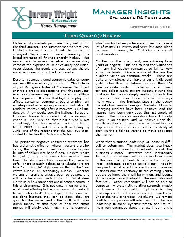
Click the image below to read the third quarter review of our Systematic RS portfolios.

To receive the brochure for our Separately Managed Acccounts, click here. Click here and here for disclosures. Past performance is no guarantee of future returns.


Stocks/Bonds Performance Differential: Reverting To The Mean

October 12, 2010

The Leuthold Group’s October Green Book included an interesting update on the stock/bond performance differential. As pointed out in the table below, the stock/bond performance differential hit generational lows as of the end of the first quarter of 2009.

(Click to Enlarge) Chart courtesy of The Leuthold Group

However, we have seen a sharp reversion to the mean since the bottom of the bear market on March 9, 2009, as shown in the chart below.

(Click to Enlarge) Source: Stockcharts.com

The Leuthold Group ran the same stock/bond performance differential analysis at of the end of September 2010 to see how much the strong performance in stocks has impacted the percentile ranks. Interestingly, even with the strong outperformance of stocks over bonds over the last 19 months, the stock/bond performance differential remains in the cellar, as shown in the table below. In fact, the 30-year stock/bond performance differential remains in the bottom percentile!

(Click to Enlarge) Chart courtesy of The Leuthold Group

The Leuthold Group concluded “going forward, we expect the stock/bond performance differential to continue to move in the direction of the median, which implies stock market total return performance will run far ahead of the total return of ten-year treasuries.

Retail investors are all over this as they are positioning their portfolios to capitalize on this likely reversion to the mean…oh wait, maybe not.

Analysis, such as that shown above, offers the advantage of putting current events in the context of longer-term history. However, we freely acknowledge that it is no guarantee of what is to come. Above all, investors can benefit from maintaining a flexible asset allocation. One of the greatest benefits of using relative strength to drive asset allocations is that it dispassionately identifies strength—and if that strength is in stocks (or bonds, commodities, real estate, currencies…) then so be it.


Relative Strength Spread

October 12, 2010

The chart below is the spread between the relative strength leaders and relative strength laggards (universe of mid and large cap stocks). When the chart is rising, relative strength leaders are performing better than relative strength laggards. As of 10/11/2010:

RS leaders and laggards continue to generate similar performance-as they have for over a year now. A longer-term view of the RS Spread is shown below:

Over time, the RS Spread had risen as a result of relative strength leaders performing better than relative strength laggards.


Weekly RS Recap

October 11, 2010

The table below shows the performance of a universe of mid and large cap U.S. equities, broken down by relative strength decile and quartile and then compared to the universe return. Those at the top of the ranks are those stocks which have the best intermediate-term relative strength. Relative strength strategies buy securities that have strong intermediate-term relative strength and hold them as long as they remain strong.

Last week’s performance (10/4/10 – 10/8/10) is as follows:

The top quartile (stocks with the strongest relative strength) underperformed the universe last week. However, the 3rd quartile (still above average relative strength) did perform better than the universe. On a sector basis, the Energy sector, which has been a laggard for most of the past 12 months, was up over 3% last week. It will be interesting to see if Energy begins to move from a laggard to a leader or if that was just a short-term blip.


Dorsey, Wright Client Sentiment Survey - 10/8/10

October 8, 2010

Here we have the next round of the Dorsey, Wright Sentiment Survey, the first third-party sentiment poll.

As you know, when individuals self-report, they are always taller and more beautiful than when outside observers report their perceptions! Instead of asking individual investors to self-report whether they are bullish or bearish, we’d like financial advisors to weigh in and report on the actual behavior of clients. It’s two simple questions and will take no more than 20 seconds of your time. We’ll construct indicators from the data and report the results regularly on our blog–but we need your help to get a large statistical sample!

Click here to take Dorsey, Wright’s Client Sentiment Survey.

Contribute to the greater good! It’s painless, we promise.


Sector and Capitalization Performance

October 8, 2010

The chart below shows performance of US sectors and capitalizations over the trailing 12, 6, and 1 month(s). Relative strength strategies buy securities that have strong intermediate-term relative strength and hold them as long as they remain strong. Performance updated through 10/7/2010.


The Zen of Relative Strength

October 7, 2010

Simplicity is the ultimate sophistication—-Leonardo da Vinci

Perhaps no investment method better exemplifies the Zen virtue of simplicity than relative strength. You do not need a complicated, multi-factor quant model to use relative strength. You need only one piece of data—price—and a robust measurement of performance. Then, buy what is performing and hold it until it is no longer performing. Simplicity.

There are occasional critics who believe that relative strength is too simple, too naive to work. They would prefer to analyze reams of data to try to determine (i.e. guess) what will happen next. Zen is focused in the now-moment. Relative strength just measures what is happening now. What is, is. We cannot change the past; we all look forward to an uncertain future. All we have is the present.

Click to enlarge. Source: Ken French

Strong stocks have outperformed weak stocks for decades, laid out perfectly, decile by decile. (If the stock market were really a random walk, this chart could not exist.) If you surround yourself with virtuous friends, your path is likely to be smooth and successful. This is no less true if you surround yourself with virtuous stocks. Simplicity.

Managing a relative strength portfolio is not complicated. Buy what is performing and hold it until it is no longer performing. Simplicity.

The challenge with a relative strength portfolio is emotional. In fact, this is the challenge with all investing. Volatility is a part of any return factor. In fact, it is because of volatility that investors can earn a risk premium at all. Volatility is like an old childhood friend; it should be embraced when it appears, rather than feared. Instead of concerning yourself with the ups and downs of the market, perhaps volatility should simply be viewed as an opportunity to practice your Zen calmness and detachment. Let the path unfold as it wishes. Enjoy the journey. Simplicity.


Fund Flows

October 7, 2010

The Investment Company Institute is the national association of U.S. investment companies, including mutual funds, closed-end funds, exchange-traded funds (ETFs), and unit investment trusts (UITs). Members of ICI manage total assets of $11.82 trillion and serve nearly 90 million shareholders. Flow estimates are derived from data collected covering more than 95 percent of industry assets and are adjusted to represent industry totals.

Investors continue to withdraw money from domestic equity funds while adding to other asset classes–most notably taxable bond funds. In the last week, investors pulled nearly twice the amount of money from domestic equities compared with the week before.


High RS Diffusion Index

October 6, 2010

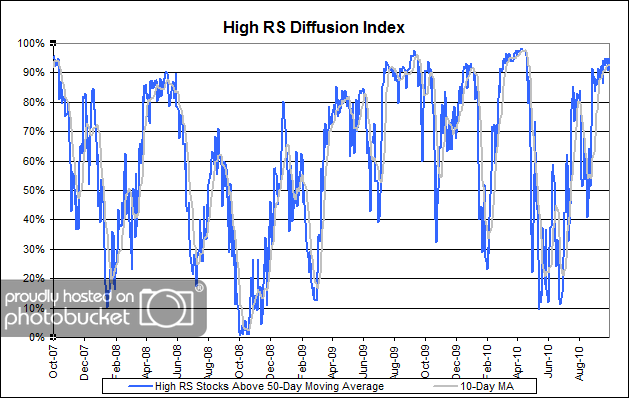
The chart below measures the percentage of high relative strength stocks that are trading above their 50-day moving average (universe of mid and large cap stocks.) As of 10/5/10.

The 10-day moving average of this indicator is 93% and the one-day reading is 95%. After pulling back to the middle of the distribution in August, this index has risen sharply in recent weeks and continues to hold its ground at the top of its range.


Why Investors Fail

October 5, 2010

My earlier post about passive investing does bring up an interesting point. Even though investors are, by and large, buying decent funds, they’re not making much money. As a class, DALBAR’s QAIB has shown pretty conclusively that retail mutual fund investors underperform-and the onus should really be where it belongs-on investor behavior. It’s not active management that is the problem. As Morningstar shows, investors are making good fund choices, but their emotional asset allocation decisions are killing them. Owning an index fund, unfortunately, does not make you emotionally numb. Index fund investors may be just as likely to fall prey to behavioral issues as active fund investors. Finding winning strategies is clearly possible, but that’s not the whole story. Good investor behavior is probably the best ticket to better returns.

We see the same thing here as every other money management shop with a good long-term strategy: a decent percentage of clients bail out after a period of short-term underperformance. What really makes for good returns is good clients. Seth Klarman, the legendary hedge fund manager, said exactly that in a recent interview with Jason Zweig:

…ideal clients have two characteristics. One is that when we think we’ve had a good year, they will agree. It would be a terrible mismatch for us to think we had done well and for them to think we had done poorly. The other is that when we call to say there is an unprecedented opportunity set, we would like to know that they will at least consider adding capital rather than redeeming.

You can’t say it more clearly than that. Imagine how much money clients would make if 1) they understood a strategy well enough to know when it had performed well, when it had performed poorly, and why, and 2) they added money during periods when the strategy was temporarily out of favor.

Relative strength trend following is an excellent strategy that has historically afforded investors large excess returns, along with periodic episodes of underperformance (i.e., good entry points). The inherent volatility keeps most investors away so that returns do not appear to have been arbitraged away over time. Unless human nature changes, the relative strength return factor is likely to continue to work extremely well over time. Have we mentioned this before? Yes-but the reason we are mentioning it again is because relative strength has had a significant period of underperformance which may be in the process of ending. (Check out the short-term and long-term views here.)


$170 Billion Down the Tubes

October 5, 2010

That’s the conservative estimate of how much money institutional pension managers cost their participants in lost investment returns, according to the Stewart et al. article that appeared in the Financial Analysts Journal. Stewart examined the PSN database of pension funds from 1984 to 2007 and cleverly constructed flow portfolios based on what asset classes were reduced and which were increased. It turns out that institutions are just as bad as retail investors in knowing when to enter or exit an asset class or style. Stewart’s conclusion:

The preceding analyses show that plan sponsors are not acting in their stakeholders’ best interests when they make rebalancing or reallocation decisions concerning plan assets. Portfolios of products to which they allocate money underperform compared with the products from which assets are withdrawn. Performance is lower over one- and three-year periods and shows no signs of reversal even after two more years.

It’s kind of sad. Institutions have access to top-tier consulting firms to help them select managers and make allocation decisions, yet still they struggle to do it properly. Volatility is the culprit. If institutions were cleverly buying when a strategy was out of favor, their results would be best with the high volatility products. Instead, their results were negative across the board-and worst of all in the high volatility products. They are practicing emotional asset allocation in the same way as retail investors! Patience is clearly an undervalued asset. Stewart points out:

Clearly, plan sponsors could have saved hundreds of billions of dollars in assets if they had simply stayed the course.

I think there are at least two important take-aways from this paper. 1) Measure twice, cut once. That’s something my junior high shop teach taught everyone. Do your due diligence carefully. Make sure you have data backing the effectiveness of the strategy. Once you cut, you’re done-leave it alone. 2) Be suspicious of where the asset flows are going. As Stewart shows, the flow-weighted portfolios performed terribly. The assets and products that no one wanted are what performed the best. In other words, buy into your strategies when they are out of season. (And maybe think twice about mimicking the huge flows into bonds that have been happening recently. What asset are people dumping? Domestic equities…hmmm.)

For a link to the complete paper that appeared in the Financial Analysts Journal, click here.


Relative Strength Spread

October 5, 2010

The chart below is the spread between the relative strength leaders and relative strength laggards (universe of mid and large cap stocks). When the chart is rising, relative strength leaders are performing better than relative strength laggards. As of 10/4/2010:

There were no major changes this week in the RS Spread. The top quartile and the bottom quartile of relative strength stocks continue to generate similar performance–as they have for over a year now. A long-term view of the relative strength spread reveals the strong upward bias of the spread over time.

The RS Spread has seen other transitions from declining spreads to flat spreads to rising spreads (notably following the 2000-2002 bear market).


Dorsey, Wright Client Sentiment Survey Results - 9/24/10

October 4, 2010

Our latest sentiment survey was open from 9/24/10 to 10/1/10. We saw a decrease in the response rate, with 91 readers participating. Your input is for a good cause! If you believe, as we do, that markets are driven by supply and demand, client behavior is important. We’re not asking what you think of the market—since most of our blog readers are financial advisors, we’re asking instead about the behavior of your clients. Then we’re aggregating responses exclusively for our readership. Your privacy will not be compromised in any way.

After the first 30 or so responses, the established pattern was simply magnified, so we are comfortable about the statistical validity of our sample. Most of the responses were from the U.S., but we also had multiple advisors respond from at least two other countries. Let’s get down to an analysis of the data! Note: You can click on any of the charts to enlarge them.

Question 1. Based on their behavior, are your clients currently more afraid of: a) getting caught in a stock market downdraft, or b) missing a stock market upturn?
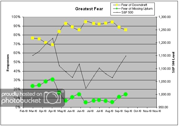
Chart 1: Greatest Fear. Now we got a rally going! And guess what…client fear levels are moving in-line, as predicted. Using only the survey data points, the market has rallied around 8% since August. 86% of clients were afraid of losing money this round, versus 14% of clients who were afraid of losing out on a rally. Contrast this with the most recent August lows, where 94% of clients were fearful of losing money. Let’s do some simple math: An 8% market rally corresponds to an 8% client fear level move! The two are moving lock-step with each other. The only question is whether it’s going to take a 40% market move to get client fear levels to a 50/50 split. Only time will tell.
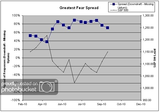
Chart 2. Greatest Fear Spread. Another way to look at this data is to examine the spread between the two groups. The spread remains skewed towards fear of losing money this round. Same as with the general fear numbers, the market move has corresponded exactly with a move in the spread between the two groups. Right now the spread is at 71%.

Question 2. Based on their behavior, how would you rate your clients’ current appetite for risk?
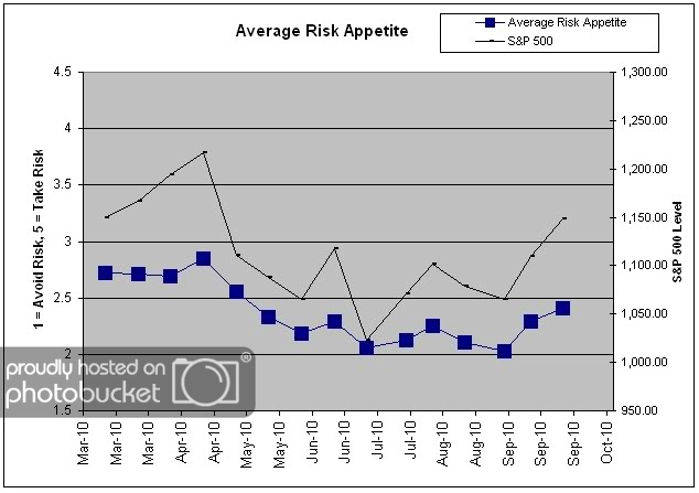
Chart 3: Average Risk Appetite. The market move has led to the average risk appetite scoring the highest number since May! That’s a big breakout after holding a pretty tight range for the entire summer. Right now average risk appetite is 2.4, up from last week’s 2.3, and well off the most recent lows of 2.0. It’s great to see all of our indicators working exactly as we thought they would.
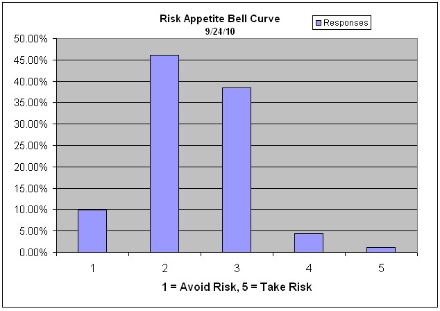
Chart 4: Risk Appetite Bell Curve. This chart uses a bell curve to break out the percentage of respondents at each risk appetite level. Even with the modest rally and the shift towards more risk, clients are definitely not taking many chances in this market. With this indicator, we would expect the bell curve to shift towards more risk if the market continues to rally into the fall.
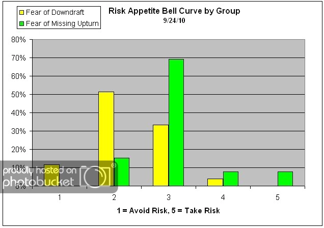
Chart 5: Risk Appetite Bell Curve by Group. The next three charts use cross-sectional data. This chart plots the reported client risk appetite separately for the fear of downdraft and for the fear of missing upturn groups. We would expect that the fear of downdraft group would have a lower risk appetite than the fear of missing upturn group and that is what we see here.
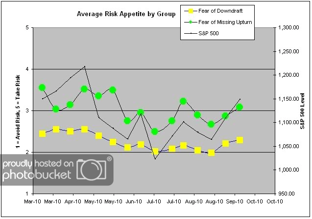
Chart 6: Average Risk Appetite by Group. A plot of the average risk appetite score by group is shown in this chart. Here we see that the average risk appetite for the fear of losing money group is significantly lower than the risk appetite for the fear of missing the rally group — perfect. Both averages have spiked in-line with the market, which is also reflected in the general average risk appetite chart. This time, we saw the upturn group have a little bit more volatility, but not as significantly as we’ve seen before. Currently the average risk appetite of the downturn group is 2.3 and the risk appetite of the upturn group is 3.1.
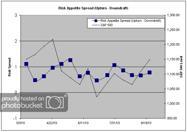
Chart 7: Risk Appetite Spread. This is a spread chart constructed from the data in Chart 6, where the average risk appetite of the downdraft group is subtracted from the average risk appetite of the missing upturn group. The spread has become a little bit more stable during the rally, as both groups react to market performance at around the same pace. Right now the spread is .78, up about 10 basis points from last week’s .66. It’s not that large of a move considering that we’ve seen moves of close to 50 basis points in just two weeks before.

The current survey numbers show just how consistently client sentiment is linked to short-term market performance. We see an 8% market move, we get an 8% fear level move. Is it really that simple? One would hope not, but unfortunately, all signs point to “Yes” at the moment. Short term market performance should not be closely tied to long-term market outlook!! But it is. Advisors, it’s clearly a tough job to keep your clients’ emotions in check.

No one can predict the future, as we all know, so instead of prognosticating, we will sit back and enjoy the ride. A rigorously tested, systematic investment process provides a great deal of comfort for clients during these types of fearful, highly uncertain market environments. Until next time, good trading and thank you for participating!

Getting Exposure to Indonesia and Thailand

October 4, 2010

Minyanville profiles 4 ETFs today, including our own PIE, as a way to get exposure to some of the best performing emerging markets this year- Indonesia and Thailand:

Editor’s Note: This content was originally published on Benzinga.com by The ETF Professor.

Unless you’ve been living in a cave, you know that the iShares MSCI Thailand Investable Market Index Fund (THD) and the Market Vectors Indonesia ETF (IDX) have sizzled in 2010. And with good reason. After all, those two markets are the only Asian markets officially in bull-market territory.

But what’s an investor who may want exposure to both markets or several other emerging markets along with Indonesia and Thailand in a single ETF to do?

Given how well Indonesia and Thailand have performed and how many emerging marketsETFs represent plays on multiple markets, there aren’t a ton of options capturing Indonesia and Thailand in a single fund, but there are few.

Here’s a quartet of ETFs that offer exposure to both Indonesia and Thailand.

1. SPDR S&P Emerging Asia Pacific ETF (GMF):
Don’t get too excited if you’re hunting for Indonesia or Thailand exposure here because GMF allocates more than 35% of its weight to China. Indonesia checks in at 4.45% and Thailand gets almost 3.6% of this fund’s weight.

2. SPDR S&P Emerging Markets Small Cap ETF (EWX):
Same goes for EWX, which is a great fund, but its weights to Indonesia and Thailand disappoint at 3.05% and 2.75%, respectively. Taiwan represents almost one-third of EWX’s weight.

3. PowerShares DWA Emerging Markets Technical Leaders ETF (PIE):
Alright, now we’re getting somewhere. Indonesia and Thailand combine for almost 21% of PIE’s weight. The fund is a solid performer in its own right, though it hasn’t grabbed many headlines this year.

See also, Time to Grab a Piece of This PIE ETF?

4. WisdomTree Emerging Markets SmallCap Dividend ETF (DGS):
While short on Indonesia exposure (just about 2.6%), DGS does allocate almost 10.5% of its weight to Thailand, making it an interesting option for the investor that’s long IDX, but doesn’t have any Thai exposure in his portfolio.

See www.powershares.com for more information.


Updated Global Macro Video

October 4, 2010

We have just posted an updated video presentation on our Global Macro strategy (click here) which describes the strategy and discusses our current allocations. This global tactical asset allocation strategy can invest in domestic equities (long & inverse), international equities (long & inverse), currencies, commodities, real estate, and fixed income.

To receive the brochure for our Global Macro strategy, click here. For information about the Arrow DWA Tactical Fund (DWTFX), click here.

Click here and here for disclosures. Past performance is no guarantee of future returns.


PIE In The News

October 4, 2010

ETF Channel profiled PIE on 10/1/10:

The DWA Emerging Markets Technical Leaders Portfolio (PIE) has been soaring. This ETF has had a total return of almost 25% over the last three months, and over 28% in the trailing twelve months. One of the ETF’s holdings, Vivo Participacoes S/A Ads (VIV), is up nearly 5% in the last three months, and 16% in the last year. Another holding, Creditcorp(BAP) is up over 25% in the last three months, and nearly 52% in the last year. And Wimm-Bill-Dann Foods OJSC (WBD) is higher by 27% in three months, and 35.5% in the last year.

The Fund will normally invest at least 80% of its total assets in securities of emerging economies within Dorsey Wright & Associates’ classification definition, excluding companies listed on a U.S. stock exchange.

The underlying index includes approximately 100 companies that possess powerful relative strength characteristics and are domiciled in emerging market countries including, but not limited to Argentina, Brazil, Chile, China, Colombia, Czech Republic, Egypt, Hungary, India, Indonesia, Israel, Malaysia, Mexico, Morocco, Pakistan, Peru, Philippines, Poland, Russia, South Africa, Taiwan, Thailand and Turkey.

See www.powershares.com for more information.


Not All 30-Year Periods Are The Same For Bonds

October 4, 2010

Not all 30-year periods are quite as spectacular for bonds as have been the last 30. From Ben Levishohn’s Oct. 2nd WSJ article, “How To Play Rising Rates”:

Bond yields have fallen for most of the past three decades. A $1,000 investment in the U.S. government debt in 1980 would be worth about $12,970 today, according to the Ryan Labs Treasury Composite Index. Treasury prices, which move in the opposite direction of yields, have surged 9.3% this year alone.

Now consider a different era: 1949 through 1979. Over that 30-year span, a $1,000 initial investment in Treasurys would have turned into a far humbler $2,950. That’s because yields soared during the period; by 1980 the yield on the 10-year Treasury had reached a record high of nearly 16%.

Given that Treasury yields have since plunged back down to 2.5% or so, how much further can they fall?

It wouldn’t take much of a rise in rates to pose problems for investors. A one-point jump in Treasury yields would translate to a 5% loss for the 10-year Treasury note and a 12% drop for a 30-year Treasury. Many strategists are predicting 10-year Treasury rates above 3% over the next year.

From a relative strength perspective, bonds continue to have pretty good relative strength (although real estate and commodities have better relative strength). However, now is the time for investors to make sure that their asset allocation has the flexibility to handle a rising-rate environment.


Weekly RS Recap

October 4, 2010

The table below shows the performance of a universe of mid and large cap U.S. equities, broken down by relative strength decile and quartile and then compared to the universe return. Those at the top of the ranks are those stocks which have the best intermediate-term relative strength. Relative strength strategies buy securities that have strong intermediate-term relative strength and hold them as long as they remain strong.

Last week’s performance (9/27/10 – 10/1/10) is as follows:

The best performance last week came from the stocks with the weakest relative strength.


One Argument for Passive Investing Bites the Dust

October 1, 2010

Advocates of passive investing have lots of talking points, quite a few of which I think are horse-pucky. It appears that Morningstar may agree with me, although they phrased it in a much more conciliatory way. They looked at how investors actually selected mutual funds and had some interesting findings.

One of the common things spouted is that “80% of mutual fund managers underperform.” This is cited as evidence that you should just give up and buy an index fund, but the argument is bogus for at least two reasons. Here’s why:

1) It assumes that investors select funds by throwing darts. And that’s not what happens.

2) The logical syllogism is faulty. 80% of Americans can’t dunk either, but if I am in charge of the draft for an NBA team, does that mean I should give up on finding someone who can dunk? Of course not! By restricting my draft selections to, say, Division I college basketball players that are 6’8″ or greater, I significantly improve my chances of finding a whole lot of people who can dunk a basketball.

Morningstar weighs in on 1) as well:

And I think Morningstar user mrpcid hit the nail on the head posting one of the earliest comments on the Ferri video, saying that the flaw with some academic studies is that they act as if investors pick their actively managed funds at random from the entire pool of funds. But in reality, they use research from firms such as Morningstar to narrow the field, avoiding obviously horrible funds while focusing their efforts on what the military calls a target-rich environment. In this case, it is the small group of funds with numerous favorable characteristics that are not too hard to identify and which tend to endure, such as proven managers with a repeatable process, good stewardship, reasonable costs, and a manageable asset base.

If you assume investors could be picking from a target-rich environment, it turns out to be a game-changer. When Morningstar analyzed which funds investors owned the most of, a trend emerged:

That sounds great on paper, but what have investors done? Turns out, they know quality when they see it. About 80% of the total assets in active equity funds are held in funds that have beaten the market over the past 15 years. For sure, there’s been performance-chasing, but the flow data indicates that investors have done a decent job of avoiding the losers and buying the winners, perhaps switching from one winner to another.

[My emphasis.] Further, Morningstar points out that the active funds that have outperformed have done so by larger margins than the funds that have lagged. That means that if you put together a portfolio of several funds, even if one or two of them lagged a little bit, you might well make up the performance lag from the funds that outperformed.

There might be reasons to own index funds, but the “80% of active managers underperform” argument isn’t one of them.


Sector and Capitalization Performance

October 1, 2010

The chart below shows performance of US sectors and capitalizations over the trailing 12, 6, and 1 month(s). Relative strength strategies buy securities that have strong intermediate-term relative strength and hold them as long as they remain strong. Performance updated through 9/30/2010.