But If Not

November 30, 2010

I believe equities will likely do very well over the next 20 years, but if not, I take comfort in knowing that it doesn’t necessarily mean that my portfolio needs to remain stuck in neutral.

DShort has produced a series of charts showing the 5, 10, 20, and 30-year total real returns of the S&P Composite (U.S. equity returns) that could be a great resource for a financial advisor who is talking to their clients about the advantages of an adaptive multi-asset class strategy.

(Click to Enlarge)

Unfortunately, a 20-year time horizon is no guarantee that a cap-weighted indexing approach will result in meaningful portfolio gains. Let me first say, that this is not an argument not to have equity exposure! Of course, most investors should have equity exposure. However, this reality should make you think about the flexibility that will be needed as part of your asset allocation.

There have been 20-year periods where the real annualized returns of equities have been over 13% and others where they have been slightly negative. The advantage of a “global macro” approach is that we don’t have to fret about whether or not the next 20 years are going to be rewarding for equity investors. If equities ultimately do well over the next couple of decades, global tactical asset allocation strategies are likely to have significant exposure to this asset class. However, I believe today’s investors will appreciate knowing that they have some other options (like commodities, real estate, fixed income, currencies, or even inverse equities) if equities don’t do well.

Click here to watch a video presentation on our approach to multi-asset class investing.

Click here and here for disclosures. Past performance is no guarantee of future returns.


Requirements for Long-Term Investment Success

November 30, 2010

Investment success needs to be measured over fairly long periods of time, which is one of the many things that frustrates many individual investors. But there are a few criteria that investors might be able to search for during their due diligence process, to try to determine if a particular strategy has a decent shot at long-term outperformance. From The Market Predictor blog:

…people who have long term success in the markets tend to use little or no leverage, they take a holistic and complex view of the market, diversify, and are constantly adapting.

That’s a pretty crisp summary of what needs to be done. Some of the things, I think, tend to go together. You only bother to create an adaptive model if you see the market as a complex system rather than a simple input-output model. Leverage always seems to accompany blow-ups, whether of Long Term Capital Management, Lehman Brothers, or credit default swaps. Diversification is really just an admission that although you might be able to identify long-term return factors with success, you really can’t predict which individual assets will do the best. (If you could, you’d just buy the single best asset and you would have no need of diversification.)

Relative strength is the most universal and adaptive return factor we know. It works across markets and asset types, and has worked for long periods of time. If you diversify in a reasonable way and don’t overleverage, there is a good chance that you will do very well over time.


Podcast #8 The Death of Momentum - Argument Exposed

November 30, 2010

Podcast #8 The Death of Momentum - Argument Exposed

Mike Moody and Andy Hyer

(click here for the article “Why Momentum Funds Don’t Have Any” by Russel Kinnel of Morningstar)


Look Ma, No Risk!

November 29, 2010

In a recent article in Pensions & Investments, Robert Pozen took the industry to task for recent changes in the allocation of pension plans:

As corporate pension plans have shifted away from equities, they have substantially increased their allocations to high-quality bonds after the financial crisis. Most of this increase was concentrated in U.S. Treasuries with maturities of one to 10 years. In making this move to high-quality bonds, the trustees of corporate pensions were trying to “de-risk” their portfolios. In their view, more bonds would mean lower annual volatility for their portfolios, which would in turn minimize future corporate contributions to the plans.

Yet this reduction in annual portfolio volatility comes with a price — lower long-term returns. The expected returns of U.S. corporate pension plans now are around 8% per year. The average corporate pension plan was 82% funded in 2009, and that will reportedly fall to 75% by the end of 2010.

Risk is like matter in physics-it cannot be created or destroyed. Like matter, it just changes form. Pension funds have not actually “de-risked.” They have reduced volatility and simultaneously increased their risk of long-term underperformance, not to mention drastically increasing their interest rate risk. As Pozen points out, this is a big problem because of the terribly underfunded state of pensions today:

Like their corporate counterparts, public pension plans are facing large funding deficits. These plans were on average about 80% funded in mid-2009, and at least eight state plans were less than 65% funded. Even these estimates are overstated because of the unique accounting rules applicable to public pension plans. If public plans were subject to standard pension accounting, their funding deficits would be 20% to 30% larger.

Up to now, public pension plans have been allowed to compute their deficits based on the returns they expect from their portfolios, rather than relevant current interest rates. The Governmental Accounting Standards Board has proposed that public plans begin to use current interest rates of high-quality municipal bonds. However, this proposal would be confined to calculating cash flows needed to eliminate a plan’s current deficit. It would still allow expected returns to be used for valuing existing plan assets.

Given these accounting rules, it is not surprising to see that public pension plans have set expected returns of 8% per year for their investment portfolios.

Wow! I’d like to be able to report my performance based on my expected return too! (I added the italics, just because it is so mind-boggling.) Why stop at 8%? Public pension plans could eliminate their funding issues simply by assuming that would earn 20% per year! Besides the bogus accounting for funding deficits, Pozen points out the other flaw in “de-risking:”

To achieve these returns, public pension plans have decreased their equity allocations and instead allocated much more to alternative investments. In other words, public pension plans have not “de-risked” their portfolios by replacing stocks with bonds. Instead, public plans have “up-risked” their portfolios by replacing stocks with hedge funds and private equity funds.
Geez! Apparently stocks are so risky that pensions would rather own high-fee leveraged hedge funds and high-fee private equity funds! With the lack of transparency of many of these funds, it simply makes it more likely that some state pension will end up the victim of a mini-Madoff at some point.
This is classic investor behavior—emotional asset allocation. After you’ve been burned, run away. Unfortunately, the decisions made by public pension plans affect all of us, either as beneficiaries or as the taxpayers doing the funding. The urge to reduce risk has led to greater risk. And it’s prevented many pension plans from earning good returns in relative strength strategies this year.

Dorsey, Wright Client Sentiment Survey Results - 11/19/10

November 29, 2010

Our latest sentiment survey was open from 11/19/10 to 11/26/10. We had one more respondent than last survey, with 110 readers participating. Your input is for a good cause! If you believe, as we do, that markets are driven by supply and demand, client behavior is important. We’re not asking what you think of the market—since most of our blog readers are financial advisors, we’re asking instead about the behavior of your clients. Then we’re aggregating responses exclusively for our readership. Your privacy will not be compromised in any way.

After the first 30 or so responses, the established pattern was simply magnified, so we are comfortable about the statistical validity of our sample. Most of the responses were from the U.S., but we also had multiple advisors respond from at least two other countries. Let’s get down to an analysis of the data! Note: You can click on any of the charts to enlarge them.

Question 1. Based on their behavior, are your clients currently more afraid of: a) getting caught in a stock market downdraft, or b) missing a stock market upturn?

Chart 1: Greatest Fear. From survey to survey, the S&P 500 fell around 2%, and client fear levels spiked by a large degree. 86% of clients were afraid of losing money in the market this round, up big from last survey’s reading of 71%. On the other side, we saw the missed opportunity levels fall from 29% to 14%. This is clear evidence that despite a major summer rally (+17% since June lows), market participants are still on edge, ready to jump at first notice. When we see client fear levels go from 71% to 86% on a 2% market drop, that points to overwhelmingly negative, fearful sentiment.

Chart 2. Greatest Fear Spread. Another way to look at this data is to examine the spread between the two groups. The spread remains skewed towards fear of losing money this round. We can see the same move in the spread as we saw in the overall fear levels, as the spread jumped from 41% to 73%. The technical breakout we discussed last survey could not withstand the market pullback.

Question 2. Based on their behavior, how would you rate your clients’ current appetite for risk?

Chart 3: Average Risk Appetite. Risk appetite levels pulled back *slightly* from their recent highs. Average risk appetite fell from 2.72 to 2.56, and the word “slightly” is important here because of the relative size of the move compared to the basic fear level indicator. Looking at the raw Client Fear levels, we would expect a much larger drop in client risk appetites to go along with the rise in fear levels. We could consider this a divergence pattern, as the risk appetite held up relatively well while the fear levels caved easily on a -2% move.

Chart 4: Risk Appetite Bell Curve. This chart uses a bell curve to break out the percentage of respondents at each risk appetite level. This week we saw the same basic pattern as the previous survey, with the majority of respondents looking for risk levels of 2 to 3.

Chart 5: Risk Appetite Bell Curve by Group. The next three charts use cross-sectional data. This chart plots the reported client risk appetite separately for the fear of downdraft and for the fear of missing upturn groups. We would expect that the fear of downdraft group would have a lower risk appetite than the fear of missing upturn group and that is what we see here.

Chart 6: Average Risk Appetite by Group. A plot of the average risk appetite score by group is shown in this chart. Here again, we see more evidence of a muted move in the risk appetite of the respondents, compared to the overall fear levels. We would expect average risk appetite to move dramatically lower, in-line with the general fear levels. However, we see in this chart that client fear levels didn’t fall by that much, and in the case of the missing upturn group, average risk appetite actually moved higher.

Chart 7: Risk Appetite Spread. This is a spread chart constructed from the data in Chart 6, where the average risk appetite of the downdraft group is subtracted from the average risk appetite of the missing upturn group. The spread this week rose by around .10 points this round.

The story of the survey this round would be the massive shift in client sentiment towards the fear of losing money. Right now the S&P 500 is up around 17% from the lows of the summer — that’s a big summer rally. Client fear levels have been inching lower as the rally managed to hold up, but after a -2% pullback, client fear levels have shot right back up. Clearly, market participants are NOT willing to jump into the rally with full faith. The second big story would be the muted move in average risk appetite. Client fear levels and average risk appetite have moved pretty much in-line with each other as expected, but not so on this round. Average risk appetite fell by a much smaller percentage compared with client fear levels — we’d expect to see a major shift towards lowering risk as fear levels grew. However, we saw only a minor shift towards less risk.

No one can predict the future, as we all know, so instead of prognosticating, we will sit back and enjoy the ride. A rigorously tested, systematic investment process provides a great deal of comfort for clients during these types of fearful, highly uncertain market environments. Until next time, good trading and thank you for participating!


What’s Hot…And Not

November 29, 2010

How different investments have done over the past 12 months, 6 months, and month.

1PowerShares DB Gold, 2iShares MSCI Emerging Markets ETF, 3iShares DJ U.S. Real Estate Index, 4iShares S&P Europe 350 Index, 5Green Haven Continuous Commodity Index, 6iBoxx High Yield Corporate Bond Fund, 7JP Morgan Emerging Markets Bond Fund, 8PowerShares DB US Dollar Index, 9iBoxx Investment Grade Corporate Bond Fund, 10PowerShares DB Oil


Weekly RS Recap

November 29, 2010

The table below shows the performance of a universe of mid and large cap U.S. equities, broken down by relative strength decile and quartile and then compared to the universe return. Those at the top of the ranks are those stocks which have the best intermediate-term relative strength. Relative strength strategies buy securities that have strong intermediate-term relative strength and hold them as long as they remain strong.

Last week’s performance (11/22/10 – 11/26/10) is as follows:

High RS stocks had another good week last week, with the top quartile outperforming the universe by 114 basis points. The Consumer Cyclical and Technology sectors (two sectors that have been market leaders for well over a year now) were again among the market leaders.


Sector and Capitalization Performance

November 26, 2010

The chart below shows performance of US sectors and capitalizations over the trailing 12, 6, and 1 month(s). Relative strength strategies buy securities that have strong intermediate-term relative strength and hold them as long as they remain strong. Performance updated through 11/24/2010.


Cognoscenti Only, Please

November 24, 2010

The Stockbee ran a piece on relative strength the other day. It was a compendium of academic citations on relative strength and some endorsements by other researchers like Ned Davis. That alone should be enough to get investors to take it seriously. The quote that caught my eye, though, was from former hedge fund manager, Mark Boucher, detailing his research findings:

In the mid- to late-1980s, I was involved in a large research project with Stanford Ph.D., Tom Johnson and his graduate students. Our objective was very similar to what every trader is obsessed with today: We wanted to determine which tools actually made money in stocks, bonds, currencies and futures. I am pleased to report that we found what we were searching for. We measured the performance of all indicators that had results we could easily measure. These included: PEs, P/Ss, volume accumulation, volatility, trend-following tools, earnings models, earnings growth and momentum, growth rates of earnings, projected earnings growth, value compared to earnings growth, chart patterns, pace of fund accumulation of the stock, capitalization—you name it.
Of all the independent variables we tested, Relative Strength (RS) was the most consistent, reliable and robust. It single-handedly improved profit better than anything else we tested.
I didn’t even have to add the bold. Stockbee did that for me. Value is a very well-known return factor; I am always surprised that relative strength is almost completely unknown outside the cognoscenti.

Everything Is Relative

November 24, 2010

In this video, Dan Ariely points out that everything in the human world is judged on the basis of relativity.

HT: Ivan Hoff


Bill Miller on the Deep Mystery of the Retail Investor

November 24, 2010

Bill Miller of Legg Mason Capital Management, in his November 2010 issue of Perspectives, discusses the market situation. I think he correctly points out that economic conditions are pretty good, but what is really lacking is confidence and optimism. Pessimism has infected the masses-and people are always more comfortable doing what is being done by the crowd. The crowd is driven by emotions, and emotions are driven by price action.

One of the most remarkable things about the investing world is how (correctly) venerated Warren Buffett is and how completely people ignore his investing advice. Since Mr. Buffett has made more money than anyone in the history of the planet solely through investing, one would think that when he says quite clearly what to invest in, people would pay attention. I guess they do pay attention, they just do the opposite. In 1974, near the bottom of the market, he said stocks were so cheap he felt like an over-sexed guy in a harem. In 1999, near the top, he opined that stocks would see returns way below those experienced in the bull market up to that time. From the time of his comments in November 1999 to the end of October 2008, stocks fell over 2% per year. In October 2008, again near the bottom, Buffett published an op-ed in The New York Times entitled, “Buy American. I Am.” telling people to buy American stocks. They promptly accelerated their selling. On October 5th of this year, he said the following: “It is quite clear stocks are cheaper than bonds. I can’t imagine anybody having bonds in their portfolio when they can own equities.” The result: people pour their money into bond funds in record amounts, and sell their holdings in funds that invest in U.S. stocks. Why investors persist in doing the opposite of what the greatest investor of all time does, is a greater mystery than the problem of consciousness, or the origin of life, or free will and determinism. Those at least are hard problems.

What will bring the public back to stocks? The same thing that always does: higher prices. People like bonds not because they have carefully considered the risks and rewards of owning them, but because they have gone up so much over the past several decades. Stocks are the long duration asset, and their level reflects people’s optimism about the future and their attitude toward risk.

The bold is my emphasis, I suppose because I find his commentary accurate, funny, and sad, all at the same time. Investors have memories and the freshest memory right now is the beating the stock market took in 2008-2009. Investors want nothing to do with stocks right now, even though some return factors have performed pretty well this year. [As an aside, investors are generally stunned to learn that the PowerShares DWA Technical Leaders Index is up more than 20% year-to-date. It's just not in their mental framework that things could be going well.] Will they ever come back to equities? Of course-when they feel comfortable. Unfortunately, they will likely miss a great deal of the recovery by relying on their emotions.

Going against the crowd is difficult for people. Maybe we just need to figure out a way to form a new crowd that is more productive for investors. Perhaps snazzy banners saying “100% of successful investors go against the crowd. Join us!” would do the trick. Clearly, I will never be a slogan writer, but you get the idea.


High RS Diffusion Index

November 24, 2010

The chart below measures the percentage of high relative strength stocks that are trading above their 50-day moving average (universe of mid and large cap stocks.) As of 11/23/10.

This diffusion index has dipped to 85% after remaining above 90% for a couple months. In a strong trending market for high relative strength securities we will often only see modest pullbacks before again surging higher. Dips in this index have often provided good opportunities to add to relative strength strategies.


Animal Spirits, Revisited

November 23, 2010

About a month ago, I wrote a piece on animal spirits, pointing out that optimism and pessimism have economic consequences. In a pleasant, blog-affirming twist of fate, the Wall Street Journal yesterday made mention of a research paper published by the Federal Reserve Bank of San Francisco, brought to my attention by the excellent Abnormal Returns blog. The researcher, Sylvain Leduc, concluded that confidence really did have a big impact on the economy. According to the WSJ article:

What Leduc found was that current confidence does indeed have an impact of future activity to a significant extent. For example, when the survey forecasts became more optimistic, the unemployment rate was more than one percentage point lower a year later.

Maybe my background in psychology has warped my view, but it often seems to me that confidence is the whole ballgame. Any given asset is really only worth whatever we agree it’s worth. Intrinsic value is a better theoretical concept than a practical one. A supermarket isn’t going to take a chunk of metal for your groceries, even if it is gold. The real store of value is confidence. The whole financial system operates smoothly if all participants are confident that everyone else will meet their obligations. With a situation like Lehman Brothers, confidence evaporated and the whole mechanism locked up.

The study suggests central bankers should pay attention to changes in confidence when deciding policy moves.

And, I would suggest, legislators and policy makers should also pay attention to how some of their regulatory iniatiatives and/or poorly crafted legislation impacts business confidence. It’s more important than they seem to realize.


Podcast #7 Systematic RS: A Blended Process

November 23, 2010

Podcast #7 Systematic RS: A Blended Process

Mike Moody and Andy Hyer

(click on image to enlarge)


Avoiding Value Traps

November 22, 2010

In the U.S. at least, value investing seems to be the approved mode of thought. It could be nothing more than historical accident, but since Graham and Dodd’s Security Analysis is now enshrined in many business and finance programs, it seems likely to continue that way. (It always surprises people to learn that John Bogle’s survey of mutual funds concluded that growth funds had virtually identical performance to value funds.)

The bugaboo of value investing is the so-called “value trap.” It’s a stock that looks cheap, but turns out to be cheap for a good reason and continues to go down or perform poorly. The reason that value investors refer to such stocks as value traps is because they are difficult to identify. After all, if you are buying something because it is cheap relative to various metrics, dropping in price often makes it theoretically more attractive.

Clay Allen of Market Dynamics thinks he knows why many portfolio managers underperform common benchmarks over time: the value traps sneak up on them. In his weekly essay of October 29, he writes:

The record of market performance shown by a large number of stocks indicates that as many as 25% to 30% of all stocks show a history of market performance that is worse than the market but not bad enough to force the portfolio manager to face up to the problem. As a result, the long-term investor whose approach is strictly fundamental will not be able to see the persistence of poor performance by many stocks. The long-standing record of poor relative performance shown by 80% of professionally managed portfolios may, in fact, be attributed to value-trap stocks.

The portfolio process that we use for our Systematic Relative Strength accounts is called “casting out.” The casting-out process is tailor-made for relative strength investing. It requires that we remove an asset from the portfolio when it is no longer highly ranked and replace it with an asset that is stronger. It’s impossible not to face up to a problem stock. The casting out process ensures that the portfolio is always exposed to strong assets, and thus, always exposed to the relative strength return factor. Relative strength is a potent source of returns and by keeping the portfolio focused in strong names, we have a good chance of outperforming market benchmarks over time.

Consider the difficulties of using a casting-out process for value investing. (In fact, many value managers talk about this when they discuss selling a stock to replace it with a better value.) First, you rank everything by value and then buy the items that are cheapest. The items that rise in price often no longer qualify as inexpensive, so they are sold and replaced with better values. The stocks that drop in price, the aforementioned value traps, are retained in the portfolio because they often continue to be very attractive from a valuation standpoint. Think about what happens to the portfolio over a period of time: you sell all of the winners and hold on to the losers! Which, of course, is the exact opposite of what you would like to do. Ouch! Managing a value portfolio well thus generally requires a great deal of discretion. It’s difficult to do systematically. Even good value managers aren’t going to be right about every judgement, and of course there is always inherent market volatility and the periodic investor preference rotation from value to growth and back again to deal with. Research shows that deep value provides excess returns, but the return is tough to capture because of those tricky value traps.

Relative strength investing has an equally aggravating problem: occasionally getting into a trend just as it is ending. Investors get to pick their poison. No method is perfect, but we think because systematic application of relative strength avoids value traps, it might also, just through a happy marriage of the casting-out process with the relative strength return factor, make it a little bit easier to capture the available excess return.


Value or Growth: Which is Better?

November 22, 2010

This isn’t exactly the topic of my post, but it’s an inquiry along those lines, and it probably got your attention. My occasion for thinking about this was a comment in the Prudent Speculator newsletter, published by Al Frank Asset Management through Forbes. John Buckingham is the chief investment officer, one of the most respected deep value investors around, and has the track record to prove it. In addition, he is a super nice guy and a friend of mine. John cited data from the Ibbotson Yearbook, compiled by Eugene Fama and Ken French, that indicated that value stocks had higher returns than growth stocks:

Certainly there have been periods (the 30s and 90s) during which value stocks have lagged growth, but data compiled by Eugene Fama and Ken French show that from 1928-2009, large value stocks had an 11.0% geometric return, compared to 8.7% for large growth, while small value stocks have outperformed by a wider margin (13.9% to 9.0%).

It is untrue that value outperforms growth, contradicted by both experience and statistics, but it is a popular misconception. The misconception stems from the way in which value and growth are defined. The Ibbotson Yearbook in question uses the book-to-market ratio as their metric. This is probably the most common definition in the academic literature as well. Value is virtuously defined as having high book-to-market values. Growth is defined in opposition as those stocks with low book-to-market values. In other words, growth is defined rather perversely as bad value! If growth is defined as bad value, it’s not too surprising that bad value performs worse than good value!

Our research assistant, J.P. Lee, went to the Ken French data library and looked at portfolios formed by market capitalization and book value. The relationships are just as Ibbotson reported, although the numbers are slightly different because of different time periods and a slightly different methodology. For the period from 1/30/1927 to 6/30/2010, large cap value (high book-to-market) stocks had a 13.0% compounded return, compared to 9.0% for large growth (low book-to-market/bad value). Small value stocks outperformed by a wider margin (18.9% to 8.1%). The charts below show the relationships. (Click all charts to enlarge)

source: Ken French Data Library

Of course, growth investors don’t actually busy themselves trying to find overpriced stocks! John Brush has written a very important paper about this, Value and Growth, Theory and Practice, (archived on our website) which was published in 2007 in The Journal of Portfolio Management. He points out that all the conventional academic definition shows is that good value beats bad value. He proposes, instead, a list of ten selection factors to define the value and growth styles.

VALUE FACTORS GROWTH FACTORS
Dividend-to-price Short-term change in earnings-to-price
Earnings-to-price Long-term change in earnings-to-price
Cash flow-to-price Estimate revisions
Expected future earnings-to-price Earnings surprise
Book value-to-price Price momentum

source: John Brush, Journal of Portfolio Management

Note that the value factors are static, while the growth factors are dynamic. As Brush puts it:

Most value managers will agree that the static factors describe their style. Most growth managers will perhaps more reluctantly recognize the dynamic measures as the basis of their style.

Brush shows that annualized excess returns for un-rebalanced portfolios formed monthly for the period from 1971-2004 are higher for growth stocks over holding periods up to a year, then shift slightly in favor of value stocks for longer holding periods. Of course, in real life, portfolios are not left unchanged for years at a time. Evidence from actual mutual fund portfolios shows that growth stock returns are very similar to value stock returns, if not slightly ahead. For example, John Bogle of Vanguard fame, in his 2003 book, Common Sense on Mutual Funds, writes:

In recent years, the conventional wisdom has been to give the value philosophy accolades for superiority over the growth philosophy. Perhaps this belief predominates because so few observers have examined the full historical record…For the full 60-year period, the compound total returns were: growth, 11.7 percent; value, 11.5 percent - a tiny difference.

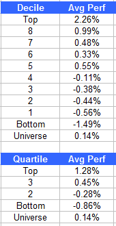
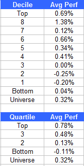
Relative strength is a growth factor. Academics refer to it as price momentum, which is how you will find it listed in the table above. We think it is the most powerful growth factor, and also the most adaptable. Because of its incredible adaptibility, we use relative strength exclusively to manage portfolios. When you compare high relative strength to value, suddenly the tables are turned. Keep in mind that the charts below are generated from the exact same Ken French data library. Value is still defined as high book-to-market, the same data definition that made growth/bad value look like such a nebbish in the last set of charts. But this go round, growth/bad value has been replaced with a worthier opponent, high relative strength.

source: Ken French data library

When it is a fair fight, it’s pretty clear that relative strength is not inferior to value at all. Large cap high RS stocks had a 14.9% compounded return, compared to 13.0% for large cap value. Relative strength also outperformed in the small cap arena, with compounded returns of 20.0%, compared to 18.9% for small cap value.

And, as it turns out, relative strength and value are quite complementary. Their excess returns tend to be uncorrelated, a fact that is remarked on both in Bogle’s book and Brush’s article. Any advisor that has been in the business for a while has seen this effect-both value and growth go through pronounced cycles. Now that we know that both relative strength and value are powerful return factors, and that their excess returns are uncorrelated, what are the practical implications for an advisor?

1) If relative strength is the premier growth factor, it might make sense to replace the growth managers in your stable with managers that use relative strength.

2) Since the excess returns from relative strength and value are uncorrelated, it might make sense to expose clients to both return factors. Brush’s article suggests that a 50/50 mix is the best combination.

So which is better, value or growth? The truth is none of the above. Both are valuable return factors for a portfolio-and because they tend to offset one another, they are even better in combination. If you like, think of the client’s portfolio as a Milky Way bar. Chocolate is good; so is caramel. And together, mmm!

source: Skiptomylou.org


Put Aside the Focus on the Economy

November 22, 2010

Time provides a great overview of why “It’s Not The Economy” that investors should focus on:

A recent story on the daily peregrinations of the stock market concluded that, at least for the day, “U.S. stocks erased their losses to finish in positive territory, as investors weighed an improving domestic economy against heightened global concerns.” That seems an innocuous enough statement. The markets did well because investor concerns about the economy were allayed by some data or shift in sentiment. Pretty simple, right? Yes, but also pretty wrong.

Reading markets in light of economic data is common, but it is using a deeply flawed lens. Not only can markets rise when the economy is weak and fall when the economy is strong, but the fate of an increasingly large number of companies has little to do with the fate of their home countries. Using national economic data as a barometer of companies and stocks may have once made sense — when firms were intimately tethered to their homelands — but no longer. In fact, using national economic data as a guide to how companies will perform is almost certain to lead to the wrong conclusions.

In part, this is because companies have become increasingly global in their business, especially publicly listed companies that trade on the world’s stock exchanges. Nearly 50% of the earnings of the S&P 500 companies came from outside the U.S. last year, and if you take out companies that are closely tied to the American economy such as utilities and health care services, that percentage is almost certainly above 50%. Even some prominent, dynamic U.S. consumer companies like Nike are seeing their most dramatic growth by selling to China and its rapidly emerging middle class, along with a host of other emerging countries. The swoosh is as familiar in Guangdong province as it is in Galveston, Texas.

So while there remain industries like health care that are inextricably linked to the domestic economy, those are the exceptions. The new rule for investing should be to put aside the quaint notion that getting the economy right helps you get stocks right. Once, what was good for GM might have been good for America, but that was another time, another age, one that should be remembered as history. And only as history.

This is a pretty good argument for allowing price trends to dictate allocations as opposed to obsessing about the growth of “the economy.” As pointed out in the article, the U.S. economy will be fortunate if it ekes out 2% to 3% growth this year, while S&P 500 third quarter earnings grew by an astonishing 31% (year over year).


What’s Hot…and Not

November 22, 2010

How different investments have done over the past 12 months, 6 months, and month.


1PowerShares DB Gold, 2iShares MSCI Emerging Markets ETF, 3iShares DJ U.S. Real Estate Index, 4iShares S&P Europe 350 Index, 5Green Haven Continuous Commodity Index, 6iBoxx High Yield Corporate Bond Fund, 7JP Morgan Emerging Markets Bond Fund, 8PowerShares DB US Dollar Index, 9iBoxx Investment Grade Corporate Bond Fund, 10PowerShares DB Oil


Weekly RS Recap

November 22, 2010

The table below shows the performance of a universe of mid and large cap U.S. equities, broken down by relative strength decile and quartile and then compared to the universe return. Those at the top of the ranks are those stocks which have the best intermediate-term relative strength. Relative strength strategies buy securities that have strong intermediate-term relative strength and hold them as long as they remain strong.

Last week’s performance (11/15/10 – 11/19/10) is as follows:

Last week was another strong week for high relative strength stocks; the top quartile outperformed the universe by 46 basis points and it outperformed the bottom quartile by 89 basis points.


Dorsey, Wright Client Sentiment Survey - 11/19/10

November 19, 2010

Here we have the next round of the Dorsey, Wright Sentiment Survey, the first third-party sentiment poll.

As you know, when individuals self-report, they are always taller and more beautiful than when outside observers report their perceptions! Instead of asking individual investors to self-report whether they are bullish or bearish, we’d like financial advisors to weigh in and report on the actual behavior of clients. It’s two simple questions and will take no more than 20 seconds of your time. We’ll construct indicators from the data and report the results regularly on our blog–but we need your help to get a large statistical sample!

Click here to take Dorsey, Wright’s Client Sentiment Survey.

Contribute to the greater good! It’s painless, we promise.


Impossible, Part Deux

November 19, 2010

The Wall Street Journal is reporting on more craziness in the bond market this morning, in their article, “The Muni Market Goes Bonkers.” What is the occasion of their disbelief? Well, for whatever reason, tax-free bonds are yielding more than Treasurys, and now for the first time, also yielding more than comparable corporate bonds:

Something funny happened in the municipal-bond market this week. Yields on munis didn’t just rise above those on Treasurys. A few actually rose above those on corporate bonds as well. Tom Metzold, manager of the Eaton Vance National Municipal Income Fund, notes that on Wednesday a tax-exempt bond backed by Goldman Sachs actually paid slightly more than a taxable bond backed by the bank. And that’s before counting the tax break on the interest. No kidding. The 10-year taxable Goldman bond paid 4.51%, gross. The 10-year tax-exempt: 4.61%.

We write about this sort of thing a lot. In fact, I think this is the second item this week that is not supposed to happen, at least according to a finance textbook.

It makes no sense. It’s crazy. Someone in a top federal tax bracket pays 35% tax on bond interest. So in a perfect market you’d expect tax-exempt bonds to offer about a third less interest than those with the same default risk and duration (and that’s not including any applicable state and local tax breaks).

Instead, the relationship has turned upside-down.

“We saw stupid, panicky reactions by some people,” says Mr. Metzold. Many retail investors, who play a huge role in the municipal market, dumped their muni funds this month.

Well, yes, that’s the point. The market is made up of people and they aren’t all rational. Retail investors, especially, have a reputation for being on the wrong side of trades. Yet, it’s not clear how this will all work out. It is entirely possible that, in retrospect, there will be a good reason that the muni market is cheaper than the corporate market. Defaults, for example.

The beauty of trend following by systematically applying relative strength is that you don’t have to make any assumptions about what is “overvalued” and “undervalued.” What is, is. Whatever the price, it’s what buyers and sellers have agreed upon. The lack of assumptions makes it much easier to stay with trends, even when sometimes the reasons for them are not yet clear.


Sector and Capitalization Performance

November 19, 2010

The chart below shows performance of US sectors and capitalizations over the trailing 12, 6, and 1 month(s). Relative strength strategies buy securities that have strong intermediate-term relative strength and hold them as long as they remain strong. Performance updated through 11/18/2010.


Netflix CEO: Willing To Cannibalize His Own Business

November 18, 2010

Fortune has an interesting profile of Reed Hastings, CEO of Netflix, that provides some color on how Netflix has been able to generate such exceptional performance:

Reed Hastings isn’t supposed to be here — not on a list of the year’s top businesspeople, and certainly not on the cover of Fortune. His DVD-by-mail company, Netflix, was supposed to have flamed out by now, a one-trick pony that was destined to be crushed by Blockbuster or Wal-Mart or Apple or you name it. He and his little red envelopes were supposed to be long gone, with Hastings toiling at some new startup, or perhaps enjoying an early retirement in Santa Cruz, Calif., the laid-back seaside city he calls home.

Whoops. Not only has Hastings earned the No. 1 spot on Fortune’s Businessperson of the Year list, he and Netflix (NFLX) are also killing it: The company he founded in 1997 is the stock of the year, up more than 200% since January, vs. the S&P 500′s tepid 7% gain. Its shares have run laps around even Apple’s. Expanding at home, and now internationally, Hastings has built his company on a hard-driving and risk-taking culture that has made him a guru to a new generation of Silicon Valley entrepreneurs. And his reach extends far beyond the Valley. Hastings already upended the movie distribution business; now he’s changing the media game again by streaming movies and television shows over the Internet — at the expense of Netflix’s still-booming DVD business. Cable companies hate him. Hollywood studios aren’t sure whether to embrace him or fend him off. Virtually every movie deal today includes an online-distribution component. Declares film producer Harvey Weinstein: “It’s because of Netflix.”

My emphasis added below on what seems to be his key to success.

An obsession with failure inspires Hastings to try new things, like offering $1 million to anyone who can make Netflix’s movie recommendation algorithms better. It also drives him to do what so many CEOs are afraid to do: cannibalize their own businesses.

Source: StockCharts.com

The article also includes the following nugget:

In January 2005, Wedbush Securities stock analyst Michael Pachter called Netflix a “worthless piece of crap.” He put a price target of $3 on the stock, at the time trading around $11.

NFLX is currently trading at $168.

Disclosure: Dorsey Wright currently owns NFLX in our Aggressive portfolios and it is a holding in the PowerShares DWA Technical Leaders Index (PDP). A list of all trades over the previous 12 months is available upon request.


Fund Flows

November 18, 2010

The Investment Company Institute is the national association of U.S. investment companies, including mutual funds, closed-end funds, exchange-traded funds (ETFs), and unit investment trusts (UITs). Members of ICI manage total assets of $11.82 trillion and serve nearly 90 million shareholders. Flow estimates are derived from data collected covering more than 95 percent of industry assets and are adjusted to represent industry totals.

Taxable bond funds have been and continue to be the asset class that is most appealing to investors in 2010.


Inflation’s Impact On The Concept Of “Safe” and “Risky”

November 17, 2010

Admit it-at times over the last couple of years your commitment to allocating a large portion of your portfolio to risky securities has been shaken to the core. Perhaps, you might have thought that you could get along just fine over the long run without exposing your portfolio to risk.

Via Mebane Faber’s World Beta and Ned Davis Research, comes a nice reminder of one of the primary reasons to invest: preservation of purchasing power.

Due to the impact of inflation, the purchasing power of the U.S. dollar has declined by 94% over the last 76 years!

Alternatively, you could have invested in stocks or bonds and have preserved and increased your purchasing power.

It is funny how the concept of “safe” and “risky” change when the effects of inflation are taken into account.