Dorsey, Wright Client Sentiment Survey Results - 11/5/10

November 15, 2010

Our latest sentiment survey was open from 11/5/10 to 11/12/10. We had a few more respondents than last survey, with 107 readers participating. Your input is for a good cause! If you believe, as we do, that markets are driven by supply and demand, client behavior is important. We’re not asking what you think of the market—since most of our blog readers are financial advisors, we’re asking instead about the behavior of your clients. Then we’re aggregating responses exclusively for our readership. Your privacy will not be compromised in any way.

After the first 30 or so responses, the established pattern was simply magnified, so we are comfortable about the statistical validity of our sample. Most of the responses were from the U.S., but we also had multiple advisors respond from at least two other countries. Let’s get down to an analysis of the data! Note: You can click on any of the charts to enlarge them.

Question 1. Based on their behavior, are your clients currently more afraid of: a) getting caught in a stock market downdraft, or b) missing a stock market upturn?

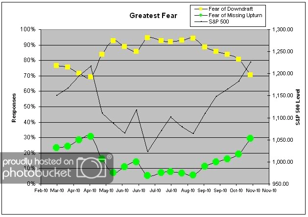
Chart 1: Greatest Fear. From survey to survey, the market rallied over 3%, and client fear levels dropped in kind. Only 71% of clients were afraid of losing money in the market, versus last survey’s reading of 81%. On the flip side, 29% of clients are now afraid of actually missing out on the rally. In late August, 94% of clients were afraid of losing money in the market. It took a 15% market rally to move fear levels to their current reading at 71%.

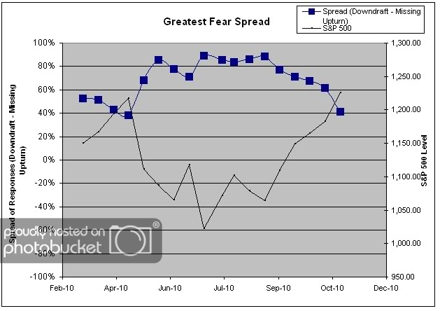
Chart 2. Greatest Fear Spread. Another way to look at this data is to examine the spread between the two groups. The spread remains skewed towards fear of losing money this round, but significantly closer to par. Right now the spread is sitting at 42%, the furthest towards 0% we’ve seen since April of 2010. We would consider this recent move a significant technical breakout.

Question 2. Based on their behavior, how would you rate your clients’ current appetite for risk?

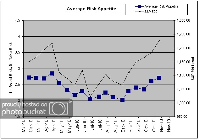
Chart 3: Average Risk Appetite. Risk appetite levels continued higher in their breakout, but not to the same degree as client fear levels. This survey round, risk appetite came in 2.72, up just a little over last survey’s 2.62. Considering that client fear levels fell by such a large degree, it seems like this move is a bit more muted than we’d expect. Average risk appetite is still around its 6-month highs.

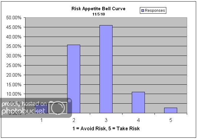
Chart 4: Risk Appetite Bell Curve. This chart uses a bell curve to break out the percentage of respondents at each risk appetite level. This week we saw a continuation from last survey’s shift to more risk. We had a smattering of 5′s this round, whereas in the past few months we were lucky to see even one.

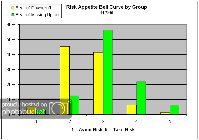
Chart 5: Risk Appetite Bell Curve by Group. The next three charts use cross-sectional data. This chart plots the reported client risk appetite separately for the fear of downdraft and for the fear of missing upturn groups. We would expect that the fear of downdraft group would have a lower risk appetite than the fear of missing upturn group and that is what we see here.

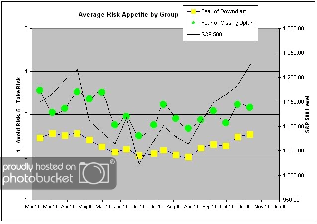
Chart 6: Average Risk Appetite by Group. A plot of the average risk appetite score by group is shown in this chart. This chart highlights one of the more nuanced stories of this round of surveys — that average risk appetite has not moved as strongly as client fear levels. In a rally market, we’d expect to see shifts in fear levels to move lower, and risk appetites to move higher. And while this did happen, the fear of missing an upturn group dropped the ball. The upturn group’s risk appetite actually fell this round, to 3.1 from 3.2, possibly suggesting concern that the rally is near the end. The downturn group performed as expected, as their average risk appetite was slightly higher.

We’ve noted before that the upturn group has a much more volatile risk appetite, and this is again what we are seeing here. Could this be a divergence pattern?

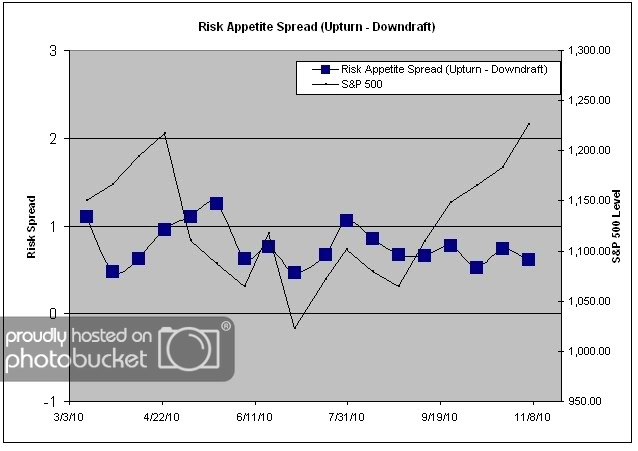
Chart 7: Risk Appetite Spread. This is a spread chart constructed from the data in Chart 6, where the average risk appetite of the downdraft group is subtracted from the average risk appetite of the missing upturn group. The spread this week fell by around .10 points, which can be attributed to the upturn group’s falling risk appetite.

There are two big stories in this client sentiment survey — the significant drop in client fear levels, and the muted move in risk appetite. Client fear levels dropped by around 10% from survey to survey, fueled by a market rally that started in August and is now up around 15%. If the rally can manage to sustain itself, it’s likely that client fear levels will continue to drop. Maybe one day, we’ll even see client fear levels at the exact opposite end of the range, below 10%. On the other hand, we would expect risk appetite to continue to rise in-line with the market. This week, we saw the upturn group’s average actually move lower, which may be a divergence pattern (we would expect the risk appetite to move higher with the market, versus diverging from the expected pattern-but that dataset is so young that we may just not yet know what to look for or how to interpret it).

No one can predict the future, as we all know, so instead of prognosticating, we will sit back and enjoy the ride. A rigorously tested, systematic investment process provides a great deal of comfort for clients during these types of fearful, highly uncertain market environments. Until next time, good trading and thank you for participating!
Impossible!

November 15, 2010

In theory, there’s no difference between theory and practice. In practice, there is.—Yogi Berra

On Friday, an article in the Wall Street Journal highlighted a bizarre situation: the average U.S. homebuyer can now borrow at a lower rate than the U.S. government, which is no doubt creating havoc for leveraged convergence traders. Several observers had comments that indicated how unusual the situation was:

“This is fascinating,” said Michael Shaoul, chief executive at brokerage firm Oscar Gruss, who spotlighted the screwball market action in one of his intraday market notes. “You have, in theory, an impossible event, which is that the man in the street is paying less interest than the government is.”

The hullabaloo was caused by the occasion that a weekly survey of 30-year mortgage rates showed that consumers could borrow at 4.17%, while the federal government is paying 4.24% on 30-year Treasury bonds. As we’ve discussed before, lots of things happen in real life that are impossible in finance textbooks. This is just another one.

Below: an interest rate convergence trade viewed from a safe distance

It goes without saying that it is extremely hazardous to your wealth to assume that something can’t happen just because it hasn’t happened before, or just because it’s not supposed to happen. Assumptions like that can be expensive.

Systematic application of relative strength avoids this assumption completely. Instead of forecasting what will happen, the trend follower simply adapts to trends as they change. Strong in, weak out, and around and around we go.


What is a Balanced Fund, and Why Should You Care?

November 15, 2010

A balanced fund is a fund that is designed to balance income, growth, and capital preservation. Balanced funds have some special attributes, a couple of which are summarized in this article in the Baltimore Sun.

1) The SEC requires that any fund purporting to be balanced maintain at least 25 percent of its assets in fixed-income senior securities — that is, debt securities, such as bonds and notes, and preferred stocks.

2) A balanced fund is designed to be a complete investment program. As the prospectus for American Balanced Fund puts it, “The fund approaches the management of its investments as if they constituted the complete investment program of the prudent investor.” The prospectus for Dodge & Cox Balanced Fund refers to investors finding it “suitable for their entire long-term investment program.”

3) The Department of Labor has established “safe harbor” regulations for pension plans. The regulations set out certain investment alternatives that pension sponsors under ERISA are allowed to use for default options for employee pensions. The approved default categories in the DoL proposal - now known as qualified default investment alternatives (QDIAs) - include:

  • lifecycle or targeted-retirement date funds,
  • balanced funds, and
  • managed accounts.

“The new default options will help workers accumulate larger nest eggs for retirement,” said [Assistant Secretary of Labor, Ann] Combs. “Workers who don’t feel equipped to make investment decisions will be automatically invested in a mix of stocks and bonds appropriate for long term savings.”

The basic idea is that balanced funds conform to the prudent investor rule and that employers, assuming they continue to monitor the investment managers, cannot be sued (hence “safe harbor”) for lack of suitability.

Clearly, if you own just one fund, a balanced fund is probably the best choice. A balanced fund would be the logical choice for the smaller accounts in your book, or as the first fund for a beginning investor. A balanced fund is also an excellent choice for a systematic investment plan, where the investor places a fixed dollar amount in a fund each month. (I think advisors who are not urging their clients to use a systematic investment plan alongside their other investments are missing the boat.) It would make sense to have a balanced fund in a 401k plan. Finally, a balanced fund can help protect you from legal liability.

Traditional balanced funds often stayed close to the 60% equity/40% bond mix. Modern balanced funds now often include international stocks as part of the equity mix and have some latitude to change the mix slightly over time.

Fun fact: the first balanced fund was started by a Philadelphia accountant named Walter Morgan. He was the founder of Wellington Management. Vanguard’s Wellington Fund is still one of the largest balanced funds today.

Most of the giant balanced funds in the investment industry are large because they have had long track records of superior performance. Some of the largest funds currently are Capital Income Builder ($58 billion), Income Fund of America ($51 billion), Franklin Income Fund ($33 billion), American Balanced Fund ($30 billion), Vanguard Wellington Fund ($28 billion), Fidelity Balanced Fund ($17 billion), and Dodge & Cox Balanced Fund ($14 billion). [These asset numbers came from Lipper.] Chances are that you have holdings of one or more of these funds in your book.

Each fund approaches the balanced mandate slightly differently. Franklin Income Fund tilts toward a large chunk of fixed income (55% of the portfolio), including a slug of high yield bonds. Capital Income Builder has the largest part of its equity investments overseas (39% of the portfolio), while Dodge & Cox Balanced Fund stays close to home (61% of the portfolio). [This asset allocation information came from Morningstar.]

The Arrow DWA Balanced Fund (DWAFX) has a similar mandate. Like all balanced funds, we have a minimum of 25% bond exposure at all times. However, there are a couple of things we do rather differently than many balanced funds.

1) Different from most balanced funds, DWAFX has a sleeve dedicated to alternative assets. This is because the fund is run along the lines of the Yale Endowment model, with a very broad mix of investable asset classes. Right now those alternative assets (19%) are gold and real estate, which have been quite additive to returns.

2) Different from most balanced funds, DWAFX allocates assets dynamically based on relative strength. The four sleeves within the portfolio-domestic equities, international equities, fixed income, and alternative assets-can have their weights vary dynamically within broad bands depending on the strength of the asset class. For example, right now the bond allocation is 27%, but it has been as high as 52% during periods of market stress. Similarly, the international equity allocation is currently 21%, but it has been as high as 38% during periods of U.S. dollar weakness.

Here’s a snapshot of DWAFX’s allocation as of 9/30/10:

Source: ArrowFunds.com

We think systematic application of relative strength across a broad range of asset classes-otherwise known as global tactical asset allocation-within a balanced fund can be a superior strategy for an investor that is looking for a complete investment solution. Although the Arrow DWA Balanced Fund does not yet have the long tenure of many of the other excellent balanced funds, performance has been strong since inception. (For an interactive price chart of performance of DWAFX versus the other industry heavyweights, click here. Select “max” under the chart to see full performance since inception.) We hope that at some point in the future we will be mentioned in the same breath as the other top balanced funds.

For information about the Arrow DWA Balanced Fund (DWAFX), click here. Click here for disclosures. Past performance is no guarantee of future returns.


Weekly RS Recap

November 15, 2010

The table below shows the performance of a universe of mid and large cap U.S. equities, broken down by relative strength decile and quartile and then compared to the universe return. Those at the top of the ranks are those stocks which have the best intermediate-term relative strength. Relative strength strategies buy securities that have strong intermediate-term relative strength and hold them as long as they remain strong.

Last week’s performance (11/8/10 – 11/12/10) is as follows:

After several weeks of strong gains, the market gave some back last week. The top quartile underperformed the universe (and the bottom quartile outperformed) the universe by a very small amount for the week.