Don’t Let Bonds Kill Your Pie Chart

December 13, 2010

Earlier this week, the Wall Street Journal ran an article on the relative attractiveness of stocks and bonds. Like the responsible journalists that they are, they quoted both bond bulls and bond bears. They mentioned that money had come out of bond funds for the first time in a long time. And they mentioned briefly that bonds have actually performed pretty well:

Despite the pain in November, Treasurys have still returned nearly 7% this year, and high-yield bonds have returned nearly 14%.

“The inflection point is not upon us,” said James Camp, managing director of fixed income at Eagle Asset Management in St. Petersburg, Fla., who oversees about $3.9 billion in fixed-income funds. He called the recent selloff a “welcome” correction after a long run.

“People have been lulled into opening up their statements month after month and seeing bonds keep going up,” Mr. Camp said, “and mathematically we know that’s impossible.”

The complacency that bond investors have been lulled into is important for another reason: bonds might kill your pie chart. The traditional model for strategic asset allocation involves rounding up a bunch of asset classes and trying to figure out how best to split up a portfolio to get the most return for the least risk. The process is called mean variance optimization and requires three inputs: asset class returns, standard deviations, and the correlations between the asset classes. Then you optimize to create the most efficient portfolio.

Strangely enough, when doing technical strategy tests, optimization is considered a dirty word. That’s because models that are optimized to past data usually perform poorly when confronted with new data. Advocates of strategic asset allocation often fail to recognize that optimization to past data is exactly what their pie chart is doing. And, probably, the result will be pretty much the same as every other form of optimization. (Purists will complain that you’re not really supposed to use historical data; you’re supposed to forecast all of the inputs. Question: if you could forecast all of the asset class returns, why wouldn’t you just buy the best asset class and be done with it?)

Bonds have been in a 30-year bull market. As Mr. Camp points out, everyone is used to their bond prices going up month after month, year after year. During the long bond bull market, at least, bonds have certainly not been as volatile as stocks. Any mean variance optimization process loves assets with good returns and low volatility—are you beginning to see the problem here? Strategic asset allocation could easily create an efficient portfolio that is loaded with bonds, at potentially just the wrong point in the interest rate cycle.

Tactical asset allocation driven by relative strength will own the strongest assets available. That could be bonds, but it could just as easily be equities, commodities, real estate, or foreign currencies. Our tactical process is built to adapt to changes in the market. Wherever the market goes, it will follow. It will not robotically rebalance to a faulty, optimized allocation. Every cycle investors are confronted with new circumstances. It might be valuable to use a method that will adapt to them.

Pie Chart Malfunction


U.S. Equities May Be Hard to Beat

December 13, 2010

It’s interesting that it takes an unbiased view from across the pond to find anyone enthusiastic about U.S. stocks! This article in the Daily Telegraph, written by a British fund manager, has an unique perspective about stocks. He points out that while every market has problems, we might have fewer than most markets. He seems skeptical that the trades everyone is excited about will actually turn out to be the best. Finally, he sees a lot of fuel:

The final reason why 2011 could be America’s year is the sheer weight of money that is sitting on the edge of the equity market. I think the rise in yields on government bonds in the past few weeks might mark a watershed moment when investors start to question whether they have got their money in the right place.

We’ve talked about the tremendous build up of cash in the system before. It usually needs some kind of trigger event to pry it loose, and the trigger event is almost always price movement. Rising prices create a tremendous fear of missing out and tend to drive money toward whatever is performing well. High RS stocks in the U.S. market have certainly had an excellent year, so I would not be at all surprised to see good performance in U.S. stocks next year—especially since no one else is looking for it.


Dorsey, Wright Client Sentiment Survey - 12/3/10

December 13, 2010

Our latest sentiment survey was open from 12/3/10 to 12/10/10. We had a holiday drop-off in respondents this round, with 84 people participating. Your input is for a good cause! If you believe, as we do, that markets are driven by supply and demand, client behavior is important. We’re not asking what you think of the market—since most of our blog readers are financial advisors, we’re asking instead about the behavior of your clients. Then we’re aggregating responses exclusively for our readership. Your privacy will not be compromised in any way.

After the first 30 or so responses, the established pattern was simply magnified, so we are comfortable about the statistical validity of our sample. Most of the responses were from the U.S., but we also had multiple advisors respond from at least two other countries. Let’s get down to an analysis of the data! Note: You can click on any of the charts to enlarge them.

Question 1. Based on their behavior, are your clients currently more afraid of: a) getting caught in a stock market downdraft, or b) missing a stock market upturn?

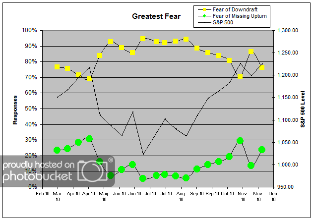
Chart 1: Greatest Fear. From survey to survey, the S&P 500 gained around 2% (which was the same it lost from last survey to survey), and client fear abated in-kind. This round, 76% of clients were afraid of losing money, down from last survey’s reading of 86%. On the flip side, 24% of clients were worried about missing out on a rally, up from the previous reading of 14%. This whip-saw in client sentiment highlights exactly the type of short-term thinking that we try to avoid. A 2% market move in EITHER direction in two weeks should not swing client sentiment as strongly as it does! This emotional over-reaction is precisely what we want to avoid, and, unfortunately, this behavior is widespread and systemic. Shame on you, wavering 10%.

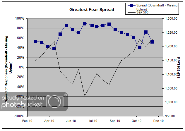
Chart 2. Greatest Fear Spread. Another way to look at this data is to examine the spread between the two groups. The spread remains skewed towards fear of losing money this round. This survey, we saw the spread slip to 52%, still quite a bit away from parity (0%).

Question 2. Based on their behavior, how would you rate your clients’ current appetite for risk?

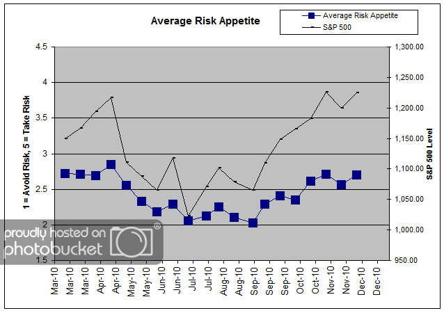
Chart 3: Average Risk Appetite. Risk appetite levels rose in-line with the market move. Right now the average risk appetite is 2.70, just off the recent highs of a month ago at 2.72. If the market continues to rally to close the year, risk appetite levels should be able to stage a significant breakout.

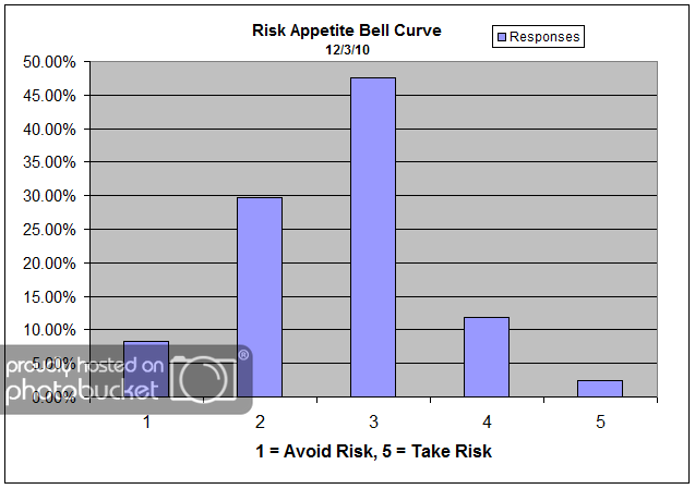
Chart 4: Risk Appetite Bell Curve. This chart uses a bell curve to break out the percentage of respondents at each risk appetite level. This week we saw a bit more dispersion than we have been seeing in prior weeks. Before, most respondents were clustered in at the 2 and 3 level. While 3′s continue to dominate, we saw the percentage of 4′s creep higher with the 2% market move.

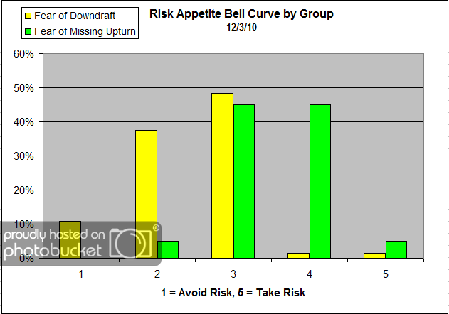
Chart 5: Risk Appetite Bell Curve by Group. The next three charts use cross-sectional data. This chart plots the reported client risk appetite separately for the fear of downdraft and for the fear of missing upturn groups. We would expect that the fear of downdraft group would have a lower risk appetite than the fear of missing upturn group and that is what we see here.

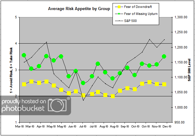
Chart 6: Average Risk Appetite by Group. A plot of the average risk appetite score by group is shown in this chart. Here we see that the fear of losing money group stayed almost exactly the same as the round before, at 2.45. On the other hand, we can see a sizeable rise in the risk appetite of the opportunity crowd. The missed opportunity crowd has shown itself to be more volatile in their risk appetites, and they do the same again here. The missed opportunity group’s average rose from 3.2 to 3.5, which would be considered a technical breakout to 7 month highs.

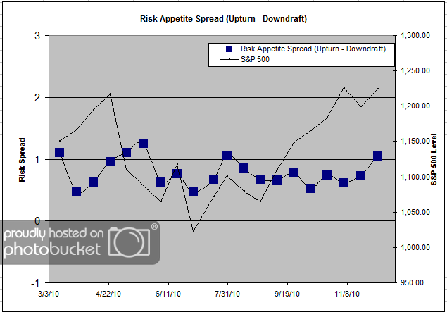
Chart 7: Risk Appetite Spread. This is a spread chart constructed from the data in Chart 6, where the average risk appetite of the downdraft group is subtracted from the average risk appetite of the missing upturn group. The spread jumped by about .30 points from last survey, all due to the upturn group’s risking risk appetite.

The big story this go-round would be the skittishness we’re observing in the overall client fear levels. Last survey we saw fear levels shoot up on a -2% market move. This survey, we saw fear levels fall significantly on a +2% market move. We wish there was some deeper meaning to extract, but there doesn’t seem to be. It’s the same old story! Based on the sentiment data, we could surmise that clients are making long-term investment decisions based on short-term market movement. A 2% move in either direction should not cause such huge emotional swings!

Once again, the average risk appetite of the missed opportunity group spiked higher on the market move, while the fear of losing money group’s average did not move. The upturn group’s risk appetite continues to be much more volatile than the counterpart, and this volatility is driving the overall average’s movement.

No one can predict the future, as we all know, so instead of prognosticating, we will sit back and enjoy the ride. A rigorously tested, systematic investment process provides a great deal of comfort for clients during these types of fearful, highly uncertain market environments. Until next time, good trading and thank you for participating!


Weekly RS Recap

December 13, 2010

The table below shows the performance of a universe of mid and large cap U.S. equities, broken down by relative strength decile and quartile and then compared to the universe return. Those at the top of the ranks are those stocks which have the best intermediate-term relative strength. Relative strength strategies buy securities that have strong intermediate-term relative strength and hold them as long as they remain strong.

Last week’s performance (12/6/10 – 12/10/10) is as follows:

The relative strength laggards generated the strongest performance last week. In fact, financials were the best performing sector of the market last week even though they have been among the worst performing sectors for most of the last 12 months.