Bonds Look Around the Corner and See Dr. Copper

December 14, 2010

Yikes! Perhaps it is a coincidence that bond prices began declining right about the time that copper surged to new highs. Then again, maybe not. The market clearly anticipates that economic growth is going to be more robust than most forecasters believe. I don’t know who will eventually be right, but Dr. Copper is already voting.

Source: Yahoo! Finance

Bonds might still be useful for reducing volatility in portfolios, but I wouldn’t want to be counting on them for capital gains right now.


The Recession is Over

December 14, 2010

At least that’s the distinct impression that one gets from a chart of retail sales, courtesy of Calculated Risk.

Click to enlarge. Source: Calculated Risk

If you are looking for graphics of economic data, Calculated Risk is a great site. This chart is particularly interesting to me because it indicates that retail sales are essentially back to more or less 6% annual growth, which is pretty much the average since the early 1990s-that’s somewhere in the neighborhood of the nominal GDP growth rate. Overall retail sales are just about back to their all-time high. You’d never know that with all of the negative attention given to the economy in the media. Considering the horrible recession we are supposedly in, that is stunning. Maybe we just have a confidence recession.


Relative Strength Outlook Through 2014

December 14, 2010

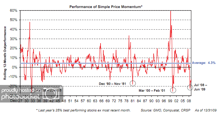
When discussing the long-term results of relative strength strategies, we often refer to the data found at the Ken French Data Library. Click here, here, and here for some of our past commentary on this data which highlights the magnitude and consistency of outperformance over time. A close study of the data reveals that a high percentage of rolling 5-year periods have been favorable for relative strength strategies. However, the data clearly shows that relative strength strategies periodically get put through the wringer! Nothing is perfect. One such period was June 2008-June 2009, as is shown in the chart below.

(Click to Enlarge)

As shown in the chart above, a simple relative strength strategy underperformed a cap-weighted benchmark by roughly 20% from June 2008 to June 2009. What was it about that environment that made it so difficult for relative strength strategies? Simple answer: frequent leadership changes. In other words, there was a dearth of sustainable trends during this period of time.

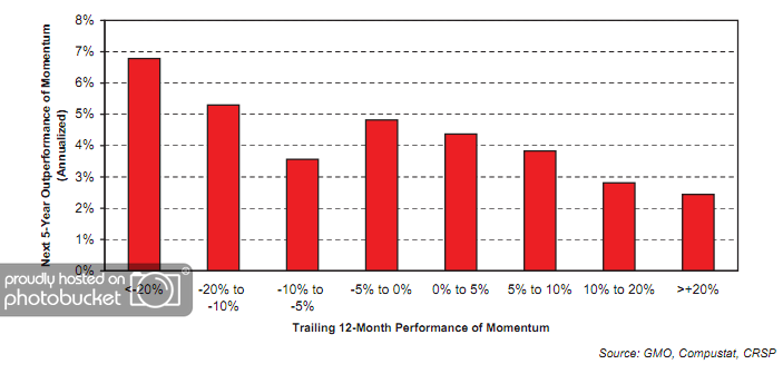
Now for the good news! After identifying four such periods of underperformance of relative strength strategies since 1927, GMO then calculated the outperformance of a simple relative strength model over the subsequent five years.

(Click to Enlarge)

GMO points out that relative strength strategies have generated nearly 7% annual outperformance over a cap-weighted benchmark over the 5 years following periods of being sharply out of favor. Right on cue, relative strength has mounted a comeback over the last year and a half as we detailed here.

I would hope that this data would get some investors excited! It certainly gives me reason to believe that the next several years could be very rewarding for relative strength investors.

Past performance is no guarantee of future returns.


What’s Hot…and Not

December 14, 2010

How different investments have done over the past 12 months, 6 months, and month.

1PowerShares DB Gold, 2iShares MSCI Emerging Markets ETF, 3iShares DJ U.S. Real Estate Index, 4iShares S&P Europe 350 Index, 5Green Haven Continuous Commodity Index, 6iBoxx High Yield Corporate Bond Fund, 7JP Morgan Emerging Markets Bond Fund, 8PowerShares DB US Dollar Index, 9iBoxx Investment Grade Corporate Bond Fund, 10PowerShares DB Oil