The Return of Active Share

December 20, 2010

Over the weekend, the Wall Street Journal ran an article on active share. Active shares is essentially how much of a given fund’s allocation is truly active-in other words, how much does it really differ from the benchmark. It turns out that there is quite a strong correlation between high active share and good long-term performance. At the same time, there has been a marked tendency for funds to have lower active share over the past couple of decades. Sadly, more and more funds have embraced the scourge of closet indexing.

We’ve written about active share before, and this new Wall Street Journal article is a welcome addition to the discussion. One of the interesting things to me is why there has been such a rise in closet indexing. I have a couple of hypotheses, but since there is no way to confirm or disconfirm them directly, you’ll just have to determine for yourself if they make sense.

1) The rise of consultants who want low-tracking error. Portfolio managers have a choice—they can reduce their tracking error or they can watch the business go to another firm. Typically, they choose to retain the business, but investors potentially suffer.

2) The rise of wussy investors. If you read stock market books from a generation or two ago, stock market operations were considered speculation. You could make money, potentially a lot of money, but it wasn’t considered to be the safest thing in the world. Stock market traders embraced their roles as speculators. Savers put their money in banks, not in the market. Since the rise of modern portfolio theory, the whole emphasis has been on investing to get higher returns with less risk. We’ve gone from intelligent speculation to The Intelligent Investor. Returns were deemed to be practically assured if you followed the orthodoxy. The entitlement mentality has now taken hold, with investors often feeling quite offended if they don’t make a 10% annual return, especially if they have strategically allocated their investments in the academically approved way. News flash, cupcakes—the market doesn’t work that way! You have to battle for everything you get in the market. If you want a ”guaranteed” return, buy a U.S. Treasury bill and hope the government gets their spending under control before it’s too late.

Active share research points out the truth of the markets. The funds with the best returns have the highest active share and the biggest tracking error. If you want to make money, you have to take the chance that you’re going to deviate a lot from the benchmark—sometimes profitably, other times not.

Here’s the good news: since so few investors are willing to go out on a limb, I think the prospects of focusing on a valid historical return factor and making good returns in the long-run are actually quite good. It’s not a crowded trade right now. We think relative strength is one good way to do it, but value can also be mixed in nicely.

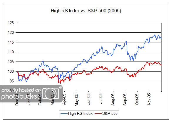
[Note: the current level of active share versus the S&P 500 benchmark in our Systematic RS Aggressive (Core) portfolio is over 93% (94%). Active shares below 60% are considered closet indexing. We think our high active share bodes well for long-term returns.]


2005 All Over Again?

December 20, 2010

Michael Santoli highlights the similarities between 2004 and 2010 in his Barron’s column over the weekend:

The year 2004 has served as a useful, if imperfect, touchstone here for at least a year. Some parallels are eerie, some are mere diverting coincidence. As 2004 opened, the Standard & Poor’s 500 index had rallied ferociously off a March bear-market low and sat at 1112; this year it began at 1115, having surged even further from its March 2009 bear-market trough.

In ’04, it knocked around a narrow path until a late-year rally carried it above 1200 to 1211. This year the ride was similar, if more dramatic, rallying into April and then dropping quickly by 17%, before the late-year rally carried it back above 1200, to a current 1243.

In both years, the consensus entering the year was that Treasury yields should rise and the market would remain volatile. In both years, the 10-year Treasury yield, while jumpy, hardly budged from start to finish, and market volatility plummeted all year, reflecting the numbing effects of heavy liquidity.

Then, as now, the market was up respectably, yet finished at a valuation lower than where it started, with corporate earnings advancing far more than share prices did, even as profit growth was about to decelerate sharply.

And the psychology on Wall Street now is pretty close to where it was a few years ago—mostly bullish, with a growing collective belief that things have turned for the better, after months of mass frustration over the unsatisfying pace of economic recovery.

My boldface emphasis added. If the psychology of market participants today is similar to that seen at the end of 2004, it could bode well for relative strength strategies in 2011 as investors increasingly gain confidence in market leadership. As shown in the chart below, 2005 was a very good year for relative strength strategies with our High RS Index gaining 16% while the S&P 500 was up only 3%.

(Click to Enlarge)

“High RS Index” is a proprietary Dorsey, Wright Index composed of stocks that meet a high level of relative strength. The volatility of this index may be different than any product managed by Dorsey, Wright. The “High RS Index” does not represent the results of actual trading. Clients may have investment results different than the results portrayed in this index. Past performance is no guarantee of future results.


In Commodities, Active Management Matters

December 20, 2010

Gavyn Davies has an excellent article in the Financial Times about using commodities in a portfolio. Most importantly, they might not be so great as a portfolio diversifier:

It is not sufficient simply to look back over past periods and then conclude that commodities are positively correlated with equities, or indeed negatively correlated, because these conclusions depend on the time period selected, and the state of the global economy in the relevant time periods.

Even better, he includes an excellent graphic displaying the completely unstable correlations between commodities and other asset classes. So much for the “uncorrelated asset” argument. In fact, the correlation ranges all over the map depending on the time period.

Source: Financial Times (click on graph to enlarge)

He also makes a strong case for tactical asset allocation as a solid method for investing in the asset class. Passive products simply haven’t worked that well.

Mainly because of the negative roll return, there has been a strong tendency for “passive” commodity indices to be out-performed by more actively managed commodity products. These include “enhanced” index products, which attempt to avoid negative periods of “roll” returns when futures curves are shaped in an adverse way. They also include commodity products which are protected from large 2008-style collapses in spot prices. And finally they include portfolios of active commodity funds which attempt to provide skill in asset class timing for the commodity complex as a whole, and for one commodity against another. Evidence suggests that an appropriate mix of these actively managed commodity products has produced better total returns, with less downside risk, than relying on the passive index products which became widespread in the late 1990s and early 2000s.

That is exactly what tactical asset allocation is designed to do. Right now, our Global Macro strategy has significant exposure to commodities, but that’s just because they are strong assets right now. At another time, it may be beneficial to be out of the commodity complex as a whole. Skill in asset class timing is likely to be more fruitful than just a strategic allocation to commodities as part of your pie chart.

To receive the brochure for our Separately Managed Acccounts, click here. For information about the Arrow DWA Tactical Fund (DWTFX) or Arrow DWA Balanced Fund (DWAFX), click here.

Click here for disclosures. Past performance is no guarantee of future returns.


The Economy Parties Hearty

December 20, 2010

The Index of Leading Economic Indicators is having a really good time right now, as this article in the Atlantic makes clear. Yes, that near-vertical blue thing on the graph is the leading index. Shhhh…no one has told the public yet.

Source: The Atlantic (click on graph to enlarge)

If the index can be believed, the economy is looking at a blowout year coming up. At the very least, it seems we can all stop worrying about a double-dip in the immediate future.


Weekly RS Recap

December 20, 2010

The table below shows the performance of a universe of mid and large cap U.S. equities, broken down by relative strength decile and quartile and then compared to the universe return. Those at the top of the ranks are those stocks which have the best intermediate-term relative strength. Relative strength strategies buy securities that have strong intermediate-term relative strength and hold them as long as they remain strong.

Last week’s performance (12/13/10 – 12/17/10) is as follows:

The relative strength laggards generated modestly better performance than the universe last week. The Healthcare sector, which has been a relative strength laggard, led the market last week with gains of over two percent.


Dorsey, Wright Client Sentiment Survey - 12/17/10

December 20, 2010

Here we have the next round of the Dorsey, Wright Sentiment Survey, the first third-party sentiment poll.

As you know, when individuals self-report, they are always taller and more beautiful than when outside observers report their perceptions! Instead of asking individual investors to self-report whether they are bullish or bearish, we’d like financial advisors to weigh in and report on the actual behavior of clients. It’s two simple questions and will take no more than 20 seconds of your time. We’ll construct indicators from the data and report the results regularly on our blog–but we need your help to get a large statistical sample!

Click here to take Dorsey, Wright’s Client Sentiment Survey.

Contribute to the greater good! It’s painless, we promise.