Is Your Index Fund Broken?

January 31, 2011

That’s the provocative title of a recent article in Smart Money. The article makes a controversial claim:

The Journal of Indexes gives academic treatment to bland investments, and so might not seem a likely source of hot controversy. The latest issue, however, is packed with it–and has greatly annoyed mutual fund titan Vanguard. A report therein gives new support for the claim that most index investors are unknowingly missing out on a large portion of the returns that their passive approach ought to provide.

Are investors really missing out on a large part of the passive return? The article implies that a variety of alternative weighting methods like efficiency weighting, volatility weighting, equal weighting, and fundamental weighting provide better returns than traditional capitalization weighting. ETFs are even available for some of these alternative methods, most notably equal weighting (RSP) and fundamental weighting (PRF). Over the eleven-year period cited in the article, all of them have better returns than capitalization weighting.

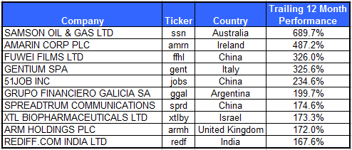
Source: Smart Money/The Journal of Indexes

Here’s what drives me crazy: when alternative weighting methodologies are discussed, there is always one method omitted. That method is relative strength. Perhaps it is no surprise that over the eleven-year period cited in the article, relative strength weighting outperformed all of the other methods. (And I didn’t get to cherry pick the time period–the article made that choice. If the blowout year of 2010 was included in the results, relative strength would have an even larger advantage over its rivals.) It’s also nice to note that there is a relative strength weighted index available, the Technical Leaders Index (PDP). Here’s what the same chart looks like if relative strength weighting is included.

Source: Journal of Indexes, Dorsey Wright

Why is relative strength weighting always left out? If I were cynical, I might say that relative strength is intentionally disregarded so that alternative methodologies do not have to show their comparative performance. But since I am in a charitable mood, I think the reason it is often ignored is because it is too simple. Yes, too simple.

It does not require manipulation of a massive fundamental database. It does not require equations and a mainframe computer to calculate a covariance matrix. It does not require a CFA, MBA, or PhD. (Think how much money you could save on grad school!) Instead, it requires a pocket calculator or spreadsheet and one of the many methods for measuring relative strength. We are partial to our proprietary measurements, but lots of methods work just fine. What does it say about your complicated alternative indexing method when it can be outperformed by something a middle-school student could learn to calculate?

There is one big advantage to capitalization weighting: it can be implemented in nearly infinite size. Along with theoretical reasons (“owning the market portfolio” in Modern Portfolio Theory), that may well be one reason why institutions, and Vanguard, believe it is the way to go. On the other hand, it is not really a stretch to believe that there are alternative indexing methodologies that could be designed for better performance. We think that relative strength has been demonstrated to be the simplest and most robust way to build the better mousetrap.

Posted by:


Dilbert on Taxation

January 31, 2011

A humor piece from Dilbert’s creator Scott Adams that appeared in the Wall Street Journal this weekend. Sounds crazy, might work?

Posted by:


Paradigm Shift

January 31, 2011

The Wall Street Journal ran an interesting article on the sudden changes in correlation between stocks and the dollar, and between gold and stocks.

In recent weeks, moves in stocks and the U.S. dollar have had little connection, a breakdown of the trend during much of 2010, when they were virtual mirror images of each other.

Meanwhile, gold and U.S. stock prices are no longer moving in the same direction, as they did for most of the second half of 2010. Their correlation has turned negative recently, with gold mostly falling as stocks rise. Gold and Treasurys, which also moved together at times last year, have been unconnected lately.

Correlation shifts are a big problem for portfolios structured using Modern Portfolio Theory. MPT relies on mean variance optimization–essentially optimizing a portfolio structure based on historical returns, correlations, and standard deviations. When they shift suddenly, you find yourself with the wrong portfolio. Oops. This is a problem generally with every kind of optimization–a paradigm shift can be catastrophic.

In fact, the news that correlations change all the time is not really news. What mostly amazes me is how long the beseiged defenders of MPT have been able to get people to use it! Even the Wall Street Journal comments:

The nonstop, frenetic interplay of asset classes across global markets defies simplistic analysis, and defining a “normal” market is a fool’s errand anyway. Longstanding relationships form and break down suddenly and for any number of reasons in the best of times.

One of the many reasons that we prefer systematic application of relative strength is that relative strength makes no assumptions about future returns, correlations, or standard deviations. It is not optimized to the past. Relative strength just goes with the flow and rotates toward strong assets, whether they are theoretically supposed to be strong or not. What is, is.

Posted by:


Weekly RS Recap

January 31, 2011

The table below shows the performance of a universe of mid and large cap U.S. equities, broken down by relative strength decile and quartile and then compared to the universe return. Those at the top of the ranks are those stocks which have the best intermediate-term relative strength. Relative strength strategies buy securities that have strong intermediate-term relative strength and hold them as long as they remain strong.

Last week’s performance (1/24/11 – 1/28/11) is as follows:

Last week was a strong week for high relative strength stocks as the top quartile outperformed the universe by 0.47% and outperformed the bottom quartile by 0.99%.

Posted by:


Dorsey, Wright Client Sentiment Survey - 1/28/11

January 28, 2011

Here we have the next round of the Dorsey, Wright Sentiment Survey, the first third-party sentiment poll.

As you know, when individuals self-report, they are always taller and more beautiful than when outside observers report their perceptions! Instead of asking individual investors to self-report whether they are bullish or bearish, we’d like financial advisors to weigh in and report on the actual behavior of clients. It’s two simple questions and will take no more than 20 seconds of your time. We’ll construct indicators from the data and report the results regularly on our blog–but we need your help to get a large statistical sample!

Click here to take Dorsey, Wright’s Client Sentiment Survey.

Contribute to the greater good! It’s painless, we promise.

Posted by:


From the Archives: Sink That Putt!

January 28, 2011

This is a fascinating piece about how golfers, consciously or unconsciously, behave more conservatively on birdie putts than on par putts, costing themselves—on average—a full stroke over 72 holes, and for a top golfer, more than $1 million in annual prize money. The reason for their conservatism is loss aversion, a psychological phenomenon noted by Nobel Prize winner Daniel Kahneman and his collaborator, Amos Tversky. In short, people try harder to avoid perceived losses than they pursue gains. Kahneman realized loss aversion is in full bloom in the financial markets, which is why (among other related investor irrationalities) he was awarded the Nobel Prize.

Articles like this point out why it is so important to have a systematic, rules-based approach to the markets. By doing so, we are able to treat every putt the same way, so to speak. A systematic approach does not vary depending on whether our last transaction was a success or a failure, or whether we’ve recently been outperforming or underperforming. We just keep pounding away at a strategy that has been shown to add value over time. By not pulling any psychological punches, we are more likely to capture whatever excess returns are available in the strategy.

—-this was originally published July 7,2009. Loss aversion reared its ugly head last year when investors became inordinately attracted to low bond yields. Now that yields are rising–and bond prices are dropping, with an assist from Meredith Whitney–the cost of loss aversion is becoming clear. To win, you have to play to win. You’re in trouble if you play to not lose.

Posted by:


Relative Strength Goes Dutch

January 28, 2011

Two very clever investment strategists at Robeco, an investment firm in the Netherlands, recently published a paper on global tactical sector allocation. They tested relative strength (i.e., momentum in academia) and several other factors to see what worked–and what continued to work after publication. Here’s what they found:

We document significant returns for momentum (1-month and 12-1 month) and the Sell in May seasonal. Interestingly, the predictive power of these factors remains after their publication dates. Although not previously tested for sectors we provide evidence which shows that sectors with positive earnings revisions outperform sectors with negative earnings revisions. We confirm the US findings of Capaul (1999) that valuation, measured as mean-reversion and dividend yield, does not work for global sector allocation. Furthermore, monetary policy fails to predict global sector returns, especially after publication date.

Although it is no surprise to us, relative strength worked in a couple of different formulations, and continued to work after the factors were published. Valuation using mean-reversion and dividend yield did not work, nor did monetary policy. Why does relative strength continue to work when other factors fail? I believe that it is because relative strength is adaptive and does not have catastrophic failures when there is a paradigm shift.

One of the nice things about relative strength is that the factor is so robust it works when measured in many different ways. Our own proprietary RS calculation is the engine behind the Global Macro strategy and the the two Arrow mutual funds that we subadvise.

HT to CXO Advisory.

To receive a brochure for our Systematic RS portfolios, please click here.

Click here to visit www.arrowfunds.com for a prospectus & disclosures. Click here for disclosures from Dorsey Wright Money Management. Past performance is no guarantee of future results.

Posted by:


New Relative Strength White Paper

January 28, 2011

A year ago, we released a white paper on our unique, Monte Carlo-based testing process which detailed the exceptional returns delivered by systematic relative strength models over time. That paper applied our testing process to a universe of mid and large cap US stocks.

We are now re-releasing Bringing Real-World Testing To Relative Strength, updated with data through 2010 (Click here to access). Additionally, the paper now includes an appendix which provides supplemental information about different relative strength factors.

Testing, such as is detailed in this white paper, has provided the insights needed to develop our family of Systematic Relative Strength portfolios. Click here to receive our brochure.

Posted by:


Performance by Sector and Capitalization

January 28, 2011

The chart below shows performance of US sectors and capitalizations over the trailing 12, 6, and 1 month(s). Relative strength strategies buy securities that have strong intermediate-term relative strength and hold them as long as they remain strong. Performance updated through 1/27/2011.

Posted by:


DWAFX: #3 In Category In 2010

January 27, 2011

The numbers are in and The Arrow DWA Balanced Fund (DWAFX) finished 2010 +16.08% and #3 out of 510 funds in the Mixed-Asset Target Allocation Funds category for one-year performance as of Dec. 31.

(Click to Enlarge)

Source: WSJ

For more information, see www.arrowfunds.com.

Posted by:


Netflix Target Price TBD

January 27, 2011

Here is a cool chart from MarketBeat. It’s from an article on Netflix in which they discussed how analysts are still playing catch-up on the stock price target. Currently, the analysts’ consensus price target is $186, but the stock is currently trading at about $210.

Click to enlarge. Source: MarketBeat, FactSet

It’s a tough business, estimating a target price, especially when the darn stock won’t cooperate. It looks like the stock price and the consensus target were pretty aligned in 2009. In 2010, the stock charged higher and the analysts are still trying to make sense of the move. (On the other hand, the 18% of analysts that carried NFLX as a buy in March 2009 are looking pretty good.)

No doubt Netflix will top out at some point in the future–but that price is still to be determined.

Disclosure: Dorsey, Wright Money Management owns NFLX in some account styles.

Posted by:


Jeremy Grantham of GMO on Momentum

January 27, 2011

Art Cashin, the market guru at UBS, quoted Jeremy Grantham of GMO in his newsletter this morning. Am I the only one that finds it ironic that Grantham was speaking at the annual Graham & Dodd breakfast? This is Grantham discussing the economist John Maynard Keynes:

Remember, when it comes to the workings of the market, Keynes really got it. Career risk drives the institutional world. Basically, everyone behaves as if their job description is “keep it.” Keynes explains perfectly how to keep your job: never, ever be wrong on your own. You can be wrong in company; that’s okay. For example, every single CEO of, say, the 30 largest financial companies failed to see the housing bust coming and the inevitable crisis that would follow it. Naturally enough, “Nobody saw it coming!” was their cry, although we knew 30 or so strategists, economists, letter writers, and so on who all saw it coming. But in general, those who danced off the cliff had enough company that, if they didn’t commit other large errors, they were safe; missing the pending crisis was far from a sufficient reason for getting fired, apparently. Keynes had it right: “A sound banker, alas, is not one who foresees danger and avoids it, but one who, when he is ruined, is ruined in a conventional and orthodox way along with his fellows, so that no one can really blame him.”

So, what you have to do is look around and see what the other guy is doing and, if you want to be successful, just beat him to the draw. Be quicker and slicker. And if everyone is looking at everybody else to see what’s going on to minimize their career risk, then we are going to have herding. We are all going to surge in one direction, and then we are all going to surge in the other direction. We are going to generate substantial momentum, which is measurable in every financial asset class, and has been so forever. Sometimes the periodicity of the momentum shifts, but it’s always there. It’s the single largest inefficiency in the market. There are plenty of inefficiencies, probably hundreds. But the overwhelmingly biggest one is momentum…

Brilliant. I put the really good parts in bold so you wouldn’t miss it. This is an interesting explanation for momentum and might partially explain why it is always present in markets: it’s part of human nature. We just try to measure it and use it.

HT to GA.

Posted by:


Fund Flows

January 27, 2011

The Investment Company Institute is the national association of U.S. investment companies, including mutual funds, closed-end funds, exchange-traded funds (ETFs), and unit investment trusts (UITs). Members of ICI manage total assets of $11.82 trillion and serve nearly 90 million shareholders. Flow estimates are derived from data collected covering more than 95 percent of industry assets and are adjusted to represent industry totals.

Taxable bond funds again attracting the most new money, picking up another $3.5 billion last week. However, domestic equity, foreign equity, and hybrid funds also had a nice week of inflows. Municipal bond funds continue to bleed.

Posted by:


Small Caps Forever?

January 27, 2011

Maybe Jeff Reeves is right about small caps versus large caps, maybe he isn’t. All I know is that it is quite hazardous to make any kind of claim based on three years of data. In a commentary in Marketwatch, “Investors Should Never Buy Large Cap Stocks,” this is his thesis statement:

I calculated the returns of both the S&P; 500 and Russell 2000 index across the last three years. And for 33 of the past 36 months, an investor putting money into an index fund would have been better served by purchasing the small cap Russell index instead of the S&P.;

After a discussion of some of the ups and downs of the last three years, he concludes:

In short, whether the market is about to take a historic flop like it did in 2008, or if it’s poised for a historic run like it saw in 2009, over the long term you are better off buying into small-cap stocks.

Take that advice at your own risk! I’m not sure that three years qualifies as the “long term.” As far as investment horizons go, that’s pretty short. There is some Ibbotson data that suggests that small caps may do better than large caps over the very long term, but that conclusion has always been in dispute. And what’s not in dispute is that markets also go through long cycles of large cap dominance.

Right now, yes, small caps are great. It’s the strongest area in the style box and our relative strength rankings like it too. But this too shall pass, and at some point another asset class or style will be dominant.

Interestingly enough, Long Term Capital Management, according to Roger Lowenstein’s book When Genius Failed, also based their convergence trades on a three-year database! They thought they had plenty of data because they had actual tick data. Their three-year database didn’t work out too well. This testing process could not contrast more with the testing process used by Dorsey, Wright Money Management. The relative strength factor has an 80+ year record of success and our unique Monte Carlo testing process makes the portfolio results repeatable and robust.

Maybe small caps will outperform from here to infinity and beyond. But I wouldn’t bet on it based on three years of selective data.

Posted by:


Coming Soon: the $6 Latte?

January 26, 2011

Starbucks announced disappointing earnings today. Why? Inflation whacked their margins. According to Clusterstock:

Commodity costs, which are now expected to have an unfavorable impact on EPS of approximately $0.20 for the full fiscal year attributable primarily to higher coffee costs, are reflected in the revised EPS target.

As fast as the price of the mocha frappacino is going up–Starbucks has put through two price increases for their drinks in the last 18 months–their commodity costs are going up even faster. Take a look at coffee prices below.

Source: Yahoo! Finance

Fortunately, there is no consumer inflation according to the government.

Without some type of disciplined tactical approach to asset class rotation, many investors are going to find it difficult to cope with a high inflation environment if one appears.

Posted by:


Relative Strength Webcast Replay

January 26, 2011

Dorsey Wright portfolio manager, John Lewis, recently presented a webcast for the MTA, titled “Relative Strength and Portfolio Management” that is a must-see for any advisor employing relative strength strategies in their business.

In this webcast, John presents the results of a series of relative strength studies that reveal the best methods of implementing this powerful return factor.

Click here to access the replay.


Posted by:


Top ADR Performers Over Trailing 12 Months

January 26, 2011

Although U.S. investors often focus on U.S.-based companies because of greater familiarity, I suspect that many would be interested in learning more about international companies that trade on U.S. exchanges in the form of American Depository Receipts (ADRs). The top ten performing ADRs over the past 12 months, out of our universe, are shown in the table below. As of 1/25/2011.

To learn more about Dorsey Wright’s Systematic Relative Strength International portfolio, click here.

Dorsey Wright’s ADR universe is a sub-set of the entire universe of ADRs. Dorsey Wright currently owns SPRD . A list of all holdings for this portfolio over the past 12 months is available upon request.

Posted by:


High RS Diffusion Index

January 26, 2011

The chart below measures the percentage of high relative strength stocks that are trading above their 50-day moving average (universe of mid and large cap stocks.) As of 1/25/11.

This index has pulled back some in recent weeks, although a high percentage of high relative strength stocks continue to trade above their 50-day moving average. The 10-day moving average of this indicator is 78% and the one-day reading is 70%.

Posted by:


Ignore the Extremists

January 25, 2011

From the Boston Globe comes a reminder that the forecaster who was correct about an outlier event is probably a terrible forecaster. From a study by an economist at Oxford they note:

…Denrell and Fang took predictions from July 2002 to July 2005, and calculated which economists had the best record of correctly predicting “extreme” outcomes, defined for the study as either 20 percent higher or 20 percent lower than the average prediction. They compared those to figures on the economists’ overall accuracy. What they found was striking. Economists who had a better record at calling extreme events had a worse record in general. “The analyst with the largest number as well as the highest proportion of accurate and extreme forecasts,” they wrote, “had, by far, the worst forecasting record.”

In other words, the extreme forecast gets your attention when it is correct–but you might not notice all of the other, incorrect forecasts that the pundit is making. More productive than making forecasts, we think, is to go where the market has identified leadership. Counting on a lucky forecaster–well, what are the odds of lightning striking twice?

Posted by:


Winning the Super Bowl

January 25, 2011

Every NFL team competes every week with one goal in mind: to get to the Super Bowl. No team wins every year, but every team tries to win every year. Like NFL teams, investment managers are a competitive bunch. Each year, about this time, firms wrap up their year-end performance data. We always look to see how we stack up against our direct competitors–some years great, other years not so well.

Last year, 2010, turned out to be a very good year for relative strength generally, and especially our relative strength process. The grand-daddy of relative strength indexes, the Technical Leaders Index, performed admirably against both the market and other momentum indexes. While that is unlikely to be the case every year, perhaps we should take the opportunity to do a touchdown dance now!

2010 S&P; 500 total return +15.06%

AQR Momentum Index +18.60%

Technical Leaders Index +26.59%

There are some differences between the indexes, of course. The S&P; 500 is the de-facto market, containing 500 companies weighted by capitalization. The AQR Momentum Index (AMOMX) contains the top third (about 300 companies) of the largest 1000 by market value. It is ranked by 12-month return and is capitalization weighted. The Technical Leaders Index (PDP) contains 100 companies from the Russell 1000, ranked by Dorsey Wright’s proprietary relative strength measure. The 100 stocks are weighted by relative strength also.

Click to enlarge. Source: Yahoo! Finance

Posted by:


Jim Simons’ “Slavish Use of Models”

January 25, 2011

Jim Simons, founder of one of the world’s most successful hedge funds–Renaissance Technologies, recently spoke at MIT about his career as a mathematician, as a hugely successful hedge fund manager, and now as a philanthropist.

Starting at the 29 minute mark (click here to view), Simons talks about how he transitioned from fundamental trading to “slavish use of models” in 1988 and how “it turned out to be a wonderful decision.” Furthermore, he stated that fundamental trading “is not a way to live your life” as a result of constantly vacillating between feeling like a genius one day and an idiot the next.

HT: Infectious Greed

Posted by:


What’s Hot…and Not

January 25, 2011

How different investments have done over the past 12 months, 6 months, and month.

1PowerShares DB Gold, 2iShares MSCI Emerging Markets ETF, 3iShares DJ U.S. Real Estate Index, 4iShares S&P; Europe 350 Index, 5Green Haven Continuous Commodity Index, 6iBoxx High Yield Corporate Bond Fund, 7JP Morgan Emerging Markets Bond Fund, 8PowerShares DB US Dollar Index, 9iBoxx Investment Grade Corporate Bond Fund, 10PowerShares DB Oil, 11iShares Barclays 20+ Year Treasury Bond

Posted by:


The Last Decade Before Retirement

January 24, 2011

From the New York Times comes an excellent article about the havoc that results from a “lost decade” in an investor’s final decade before retirement:

What would you do if your financial planner prescribed the following advice? Save and invest diligently for 30 years, then cross your fingers and pray your investments will double over the last decade before you retire.

You might as well go to Las Vegas.

Yet that’s exactly what many professionals and fancy financial calculators have been telling consumers for years, argues Michael Kitces, director of research at the Pinnacle Advisory Group in Columbia, Md., who recently illustrated this notion in his blog, Nerd’s Eye View.

The advice is never delivered in those exact words, of course. Instead, this is the more familiar refrain: save a healthy slice of your salary from the start of your career, invest it in a diversified portfolio and then you should be able to retire with relative ease.

The problem is that even if you do everything right and save at a respectable rate, you’re still relying on the market to push you to the finish line in the last decade before retirement. Why? Reaching your goal is highly dependent on the power of compounding — or the snowball effect, where your pile of money grows at a faster clip as more interest (or investment growth) grows on top of more interest. In fact, you’re actually counting on your savings, in real dollars and cents, to double during that home stretch.

But if you’re dealt a bad set of returns during an extended period of time just before you retire or shortly thereafter, your plan could be thrown wildly off track. Many baby boomers know the feeling all too well, given the stock market’s weak showing during the last decade. (Emphasis added)

A more prudent course of action is a flexible one that acknowledges the many possibilities and accounts for ideal and less-than-ideal spending amounts. (Emphasis added)

This is exactly the case that we make for using our Global Macro strategy as a core piece of a client’s portfolio–it is a means of being able to potentially generate good returns in a variety of market environments. The closer a client gets to retirement, the more important this is.

To receive the brochure for our Global Macro strategy, click here. For information about the Arrow DWA Tactical Fund (DWTFX), click here.

Click here and here for disclosures. Past performance is no guarantee of future returns.

Posted by:


Podcast #10 “What Should I Do Now?”

January 24, 2011

Podcast #10 “What Should I Do Now?”

Mike Moody, Harold Parker, and Andy Hyer

Posted by:


Dorsey, Wright Client Sentiment Survey Results - 1/14/11

January 24, 2011

Our latest sentiment survey (and first of the year) was open from 1/14/11 to 1/21/11. We had a slight drop off in advisor respones, with 83 participants. Your input is for a good cause! If you believe, as we do, that markets are driven by supply and demand, client behavior is important. We’re not asking what you think of the market—since most of our blog readers are financial advisors, we’re asking instead about the behavior of your clients. Then we’re aggregating responses exclusively for our readership. Your privacy will not be compromised in any way.

After the first 30 or so responses, the established pattern was simply magnified, so we are comfortable about the statistical validity of our sample. Most of the responses were from the U.S., but we also had multiple advisors respond from at least two other countries. Let’s get down to an analysis of the data! Note: You can click on any of the charts to enlarge them.

Question 1. Based on their behavior, are your clients currently more afraid of: a) getting caught in a stock market downdraft, or b) missing a stock market upturn?

Chart 1: Greatest Fear. From survey to survey, the S&P; 500 gained around +2.8%, a great start to the year. Most of the responses of this survey round came BEFORE the mid-week market correction, so keep in mind that we are analyzing data points based on when the survey was published. So, we had a great start to the year, and client fear levels dropped as expected. This survey, 75% of clients were afraid of losing money, versus 79% from last round. On the flip side, 25% of clients were afraid of missing a market rally, up moderately from the last reading of 21%. Client fear levels have been basically stuck in the 90-75% range since late October, and those support/resistance levels seem to be fairly entrenched in client behavior.

Chart 2. Greatest Fear Spread. Another way to look at this data is to examine the spread between the two groups. The spread remains skewed towards fear of losing money this round. The spread dropped slightly to 49% from the previous survey’s reading of 58%.

Question 2. Based on their behavior, how would you rate your clients’ current appetite for risk?

Chart 3: Average Risk Appetite. The average risk appetite number nudged its way to new highs this round, at 2.92 over last round’s 2.90. It’s great to see an indicator working exactly as we would expect it to — average risk appetite falls in a down market and rises in an up market. Some of the other indicators have been a little spotty in the recent surveys (click here), but not so for average risk appetite. As we now know, the market has taken a bit of a hit since most respondents chimed in, so we would expect to see a drop in this reading if the market continues to move lower.

Chart 4: Risk Appetite Bell Curve. This chart uses a bell curve to break out the percentage of respondents at each risk appetite level. The most common risk appetite was 3 this round, with nearly half of all survey respondents. If you consider that the overall average was 2.92, this isn’t a surprising breakdown.

Chart 5: Risk Appetite Bell Curve by Group. The next three charts use cross-sectional data. This chart plots the reported client risk appetite separately for the fear of downdraft and for the fear of missing upturn groups. We would expect that the fear of downdraft group would have a lower risk appetite than the fear of missing upturn group and that is what we see here. The fear of downdraft group sticks close together, with only 2’s, 3’s and 4’s. On the flip side, the missing upturn group has a wide variety of responses, with a single 1 and a single 5. Again we see the fear of missing upturn group representing a wide variety of risk appetites (more volatility) while the downturn group is a more tight-knit group across the board (less volatility).

Chart 6: Average Risk Appetite by Group. We’ve noticed that this particular indicator is usually the one which performs differently than we would expect. For instance, with the market up from survey to survey, we expect both groups to have a higher risk appetite than before. It turns out that the upturn group’s risk appetite actually fell during this period, while the downturn’s group inched higher. The upturn group has historically been the more volatile of the two groups, and we see that again here. Is that extra volatility a function of the smaller sample size? Or, is that group by definition a more volatile bunch, in that the first question determines their broad risk profile (fear of losing money vs. fear of missing the rally)?

Chart 7: Risk Appetite Spread. This is a spread chart constructed from the data in Chart 6, where the average risk appetite of the downdraft group is subtracted from the average risk appetite of the missing upturn group. The spread is one of the less volatile indicators found in the survey, and seems to be trading within a fairly stable range.

This round we saw more of the same, with most of the indicators performing as expected. The market went higher, and fear levels receded a bit. Along with falling fear levels, we saw rising average risk appetite as people on the sidelines feel the need to participate in the rally. Because of the mid-week pullback, it’s important to remember that these analyses are from survey to survey, and publishing dates might not perfectly sync up with market moves. At any rate, we are still seeing short-term market performance affect long-term risk appetites, which should not be the case.

2011 is only beginning, and our indicators are performing mostly as expected. Any type of short-term anomalies are usually sorted out over the next few weeks, as we saw a month ago with rising fear in a falling market (this round was back to normal). No one can predict the future, as we all know, so instead of prognosticating, we will sit back and enjoy the ride. A rigorously tested, systematic investment process provides a great deal of comfort for clients during these types of fearful, highly uncertain market environments. Until next time, good trading and thank you for participating!

Posted by: