The Last Decade Before Retirement

January 24, 2011

From the New York Times comes an excellent article about the havoc that results from a “lost decade” in an investor’s final decade before retirement:

What would you do if your financial planner prescribed the following advice? Save and invest diligently for 30 years, then cross your fingers and pray your investments will double over the last decade before you retire.

You might as well go to Las Vegas.

Yet that’s exactly what many professionals and fancy financial calculators have been telling consumers for years, argues Michael Kitces, director of research at the Pinnacle Advisory Group in Columbia, Md., who recently illustrated this notion in his blog, Nerd’s Eye View.

The advice is never delivered in those exact words, of course. Instead, this is the more familiar refrain: save a healthy slice of your salary from the start of your career, invest it in a diversified portfolio and then you should be able to retire with relative ease.

The problem is that even if you do everything right and save at a respectable rate, you’re still relying on the market to push you to the finish line in the last decade before retirement. Why? Reaching your goal is highly dependent on the power of compounding — or the snowball effect, where your pile of money grows at a faster clip as more interest (or investment growth) grows on top of more interest. In fact, you’re actually counting on your savings, in real dollars and cents, to double during that home stretch.

But if you’re dealt a bad set of returns during an extended period of time just before you retire or shortly thereafter, your plan could be thrown wildly off track. Many baby boomers know the feeling all too well, given the stock market’s weak showing during the last decade. (Emphasis added)

A more prudent course of action is a flexible one that acknowledges the many possibilities and accounts for ideal and less-than-ideal spending amounts. (Emphasis added)

This is exactly the case that we make for using our Global Macro strategy as a core piece of a client’s portfolio-it is a means of being able to potentially generate good returns in a variety of market environments. The closer a client gets to retirement, the more important this is.

To receive the brochure for our Global Macro strategy, click here. For information about the Arrow DWA Tactical Fund (DWTFX), click here.

Click here and here for disclosures. Past performance is no guarantee of future returns.

Posted by:


Podcast #10 “What Should I Do Now?”

January 24, 2011

Podcast #10 “What Should I Do Now?”

Mike Moody, Harold Parker, and Andy Hyer

Posted by:


Dorsey, Wright Client Sentiment Survey Results - 1/14/11

January 24, 2011

Our latest sentiment survey (and first of the year) was open from 1/14/11 to 1/21/11. We had a slight drop off in advisor respones, with 83 participants. Your input is for a good cause! If you believe, as we do, that markets are driven by supply and demand, client behavior is important. We’re not asking what you think of the market—since most of our blog readers are financial advisors, we’re asking instead about the behavior of your clients. Then we’re aggregating responses exclusively for our readership. Your privacy will not be compromised in any way.

After the first 30 or so responses, the established pattern was simply magnified, so we are comfortable about the statistical validity of our sample. Most of the responses were from the U.S., but we also had multiple advisors respond from at least two other countries. Let’s get down to an analysis of the data! Note: You can click on any of the charts to enlarge them.

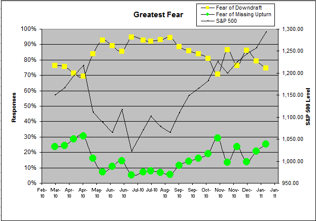
Question 1. Based on their behavior, are your clients currently more afraid of: a) getting caught in a stock market downdraft, or b) missing a stock market upturn?
 Dorsey, Wright Client Sentiment Survey Results   1/14/11

Chart 1: Greatest Fear. From survey to survey, the S&P 500 gained around +2.8%, a great start to the year. Most of the responses of this survey round came BEFORE the mid-week market correction, so keep in mind that we are analyzing data points based on when the survey was published. So, we had a great start to the year, and client fear levels dropped as expected. This survey, 75% of clients were afraid of losing money, versus 79% from last round. On the flip side, 25% of clients were afraid of missing a market rally, up moderately from the last reading of 21%. Client fear levels have been basically stuck in the 90-75% range since late October, and those support/resistance levels seem to be fairly entrenched in client behavior.
 Dorsey, Wright Client Sentiment Survey Results   1/14/11

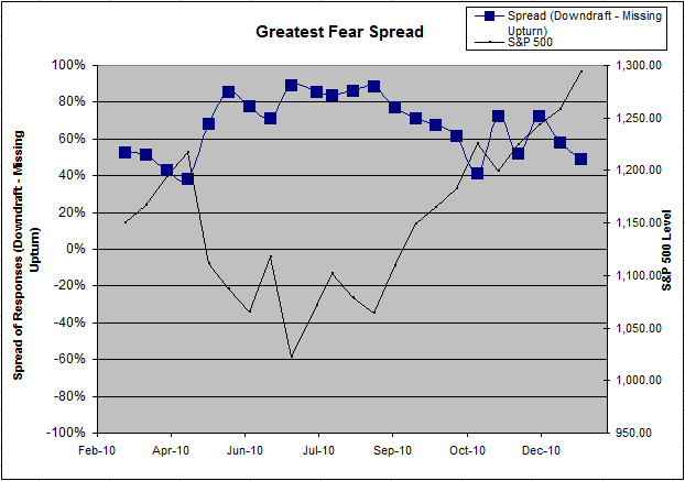
Chart 2. Greatest Fear Spread. Another way to look at this data is to examine the spread between the two groups. The spread remains skewed towards fear of losing money this round. The spread dropped slightly to 49% from the previous survey’s reading of 58%.

Question 2. Based on their behavior, how would you rate your clients’ current appetite for risk?
 Dorsey, Wright Client Sentiment Survey Results   1/14/11

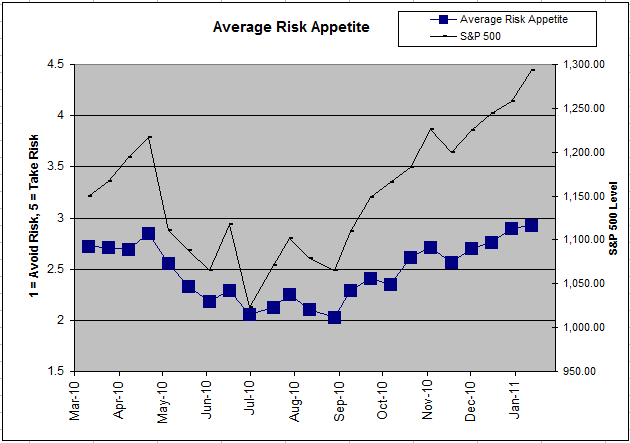
Chart 3: Average Risk Appetite. The average risk appetite number nudged its way to new highs this round, at 2.92 over last round’s 2.90. It’s great to see an indicator working exactly as we would expect it to — average risk appetite falls in a down market and rises in an up market. Some of the other indicators have been a little spotty in the recent surveys (click here), but not so for average risk appetite. As we now know, the market has taken a bit of a hit since most respondents chimed in, so we would expect to see a drop in this reading if the market continues to move lower.
 Dorsey, Wright Client Sentiment Survey Results   1/14/11

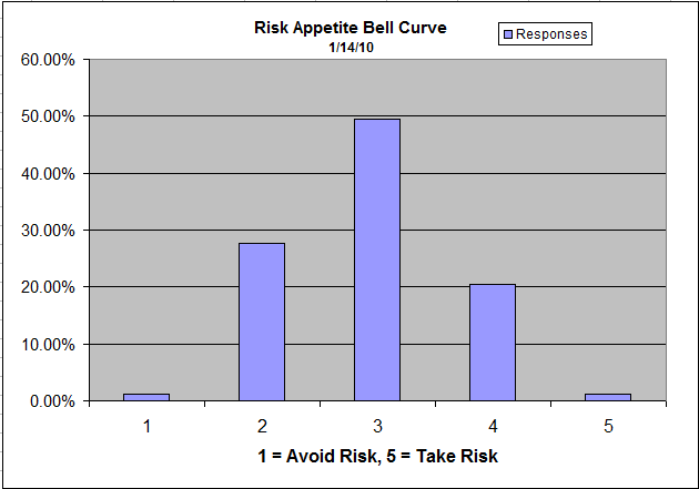
Chart 4: Risk Appetite Bell Curve. This chart uses a bell curve to break out the percentage of respondents at each risk appetite level. The most common risk appetite was 3 this round, with nearly half of all survey respondents. If you consider that the overall average was 2.92, this isn’t a surprising breakdown.
 Dorsey, Wright Client Sentiment Survey Results   1/14/11

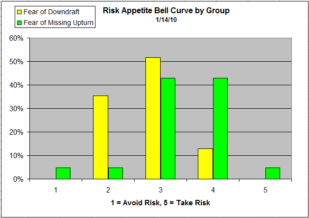
Chart 5: Risk Appetite Bell Curve by Group. The next three charts use cross-sectional data. This chart plots the reported client risk appetite separately for the fear of downdraft and for the fear of missing upturn groups. We would expect that the fear of downdraft group would have a lower risk appetite than the fear of missing upturn group and that is what we see here. The fear of downdraft group sticks close together, with only 2′s, 3′s and 4′s. On the flip side, the missing upturn group has a wide variety of responses, with a single 1 and a single 5. Again we see the fear of missing upturn group representing a wide variety of risk appetites (more volatility) while the downturn group is a more tight-knit group across the board (less volatility).
 Dorsey, Wright Client Sentiment Survey Results   1/14/11

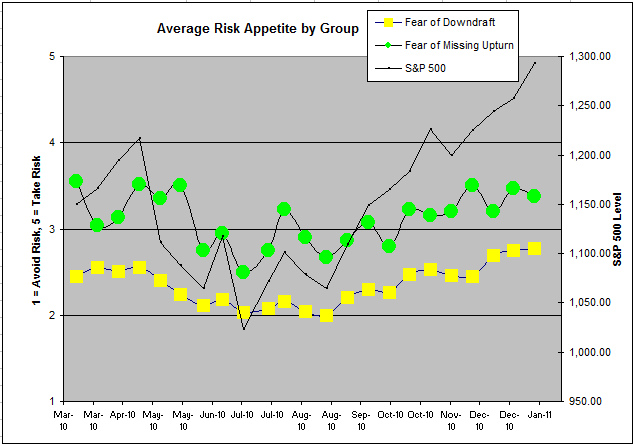
Chart 6: Average Risk Appetite by Group. We’ve noticed that this particular indicator is usually the one which performs differently than we would expect. For instance, with the market up from survey to survey, we expect both groups to have a higher risk appetite than before. It turns out that the upturn group’s risk appetite actually fell during this period, while the downturn’s group inched higher. The upturn group has historically been the more volatile of the two groups, and we see that again here. Is that extra volatility a function of the smaller sample size? Or, is that group by definition a more volatile bunch, in that the first question determines their broad risk profile (fear of losing money vs. fear of missing the rally)?
 Dorsey, Wright Client Sentiment Survey Results   1/14/11

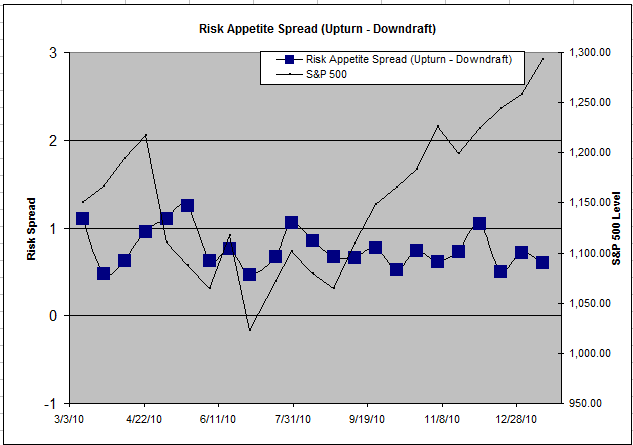
Chart 7: Risk Appetite Spread. This is a spread chart constructed from the data in Chart 6, where the average risk appetite of the downdraft group is subtracted from the average risk appetite of the missing upturn group. The spread is one of the less volatile indicators found in the survey, and seems to be trading within a fairly stable range.

This round we saw more of the same, with most of the indicators performing as expected. The market went higher, and fear levels receded a bit. Along with falling fear levels, we saw rising average risk appetite as people on the sidelines feel the need to participate in the rally. Because of the mid-week pullback, it’s important to remember that these analyses are from survey to survey, and publishing dates might not perfectly sync up with market moves. At any rate, we are still seeing short-term market performance affect long-term risk appetites, which should not be the case.

2011 is only beginning, and our indicators are performing mostly as expected. Any type of short-term anomalies are usually sorted out over the next few weeks, as we saw a month ago with rising fear in a falling market (this round was back to normal). No one can predict the future, as we all know, so instead of prognosticating, we will sit back and enjoy the ride. A rigorously tested, systematic investment process provides a great deal of comfort for clients during these types of fearful, highly uncertain market environments. Until next time, good trading and thank you for participating!

Posted by:


Quantitative Inflation?

January 24, 2011

David Einhorn’s most recently quarterly letter from Greenlight Capital poses some interesting questions about inflation. Here’s an excerpt via Clusterstock:

On August 27, 2010, Fed Reserve Bank Chairman Ben Bernanke gave a speech in Jackson Hole, Wyoming where he hinted that the Fed would provide additional monetary easing. At the time, the S&P 500 was down more than 3% for the year. From that point through the end of the year, the s&P rallied 19%. At the same time, oil prices rose 16%, copper prices rose 32%, coffee prices rose 34%, corn prices rose 43%, and cotton prices rose 57%.

In front of Congress, Mr. Bernanke credited his policies for “significant improvements in stock prices” which are “contributing to a better outlook for the economy.” Mr. Bernanke also said his policies are not to blame for the sharp increase in the price of oil, which he claimed is the result of strong demand from emerging markets. Does Mr. Bernanke really believe anyone buys that? Ostensibly, it’s a coincidence that many of the necessities of life came into simultaneous shortage and shot up in price just as Mr. Bernanke promised additional monetary stimulus.

Fortune points out that corporations are dealing with severe commodity inflation:

Kimberly-Clark has warned that its 2010 profits won’t meet analysts’ expectations — third-quarter net income dropped almost 20% - largely because its input costs soared by $265 million. The company won’t say how much it saves on each tube-free roll of TP, but every little bit helps.The commodities crunch is corporate America’s dirty little secret. Even as consumers open their wallets once again and sales volume improves, inflationary pressure is creeping in. It’s hitting companies small and large. And even giant corporations with plenty of heft to negotiate the best possible rates from suppliers are feeling the pinch. Procter & Gamble’s (PG) chief financial officer, Jon Moeller, told us on Squawk Box that the consumer-products giant saw a 160-basis-point impact from higher input costs late last year.

Corporations are going to allow their margins to be squeezed just so far-and then they will start to pass on the costs to the consumer. If inflation starts to accelerate, your purchasing power will drop right along with it. Most investors give little or no thought to real returns-that is, returns after inflation. They look only at the nominal return reflected on their statement. In an inflationary environment, it is perfectly possible to make money while getting poorer and poorer!

Few investors have any explicit plan to deal with inflation if it comes. They may not even know which assets or equities tend to do well during inflationary periods. One of our considerations when designing our Global Macro strategy (available directly as a separate account or through the Arrow DWA Tactical Fund) was constructing a universe of assets that would adapt to a wide variety of economic environments, including inflationary episodes. We incorporated inflation-protected securities on the fixed income side, commodities, precious metals, real estate, and plenty of ability to get exposure to energy and basic materials. All of these assets typically provide some inflation protection.

Our Systematic RS portfolios, likewise, have the ability to significantly overweight sectors that may benefit from inflation like energy, industrials, and basic materials. Each market is different, but we’ve designed our portfolios to adapt. It’s the ability to adapt to a potentially difficult inflationary environment that is the key. Your clients need to give this some thought when formulating their investment policy.

To receive a brochure for our Systematic RS portfolios, please click here.

Click here to visit www.arrowfunds.com for a prospectus & disclosures. Click here for disclosures from Dorsey Wright Money Management. Past performance is no guarantee of future results.

Posted by:


Jaded Investor Psychology

January 24, 2011

The WSJ‘s Jason Zweig points out another interesting historical tidbit about investor psychology:

It has been ages since stocks nearly doubled and investors didn’t give a darn. In early 1948—nearly two decades after the Crash of 1929—the Federal Reserve surveyed 3,500 investors nationwide about their attitudes toward stocks. Only 5% were willing to invest in equities, and 62% were opposed. Asked why, 26% said stocks were “not safe” or “a gamble.” Just 4% felt that stocks offered a “satisfactory” return.

Even after stocks had doubled over the preceding five years, the wounds of the Great Crash still hadn’t healed.

Today, a different generation of investors seems to be repeating the behavior highlighted by Zwieg, as revealed by the mutual fund flows reported by ICI. It is quite possible that the coming decade or more could be a very rewarding, and relatively uncrowded, environment for those investors willing to choose the road less traveled.

Image Source: The Saladmag Blog

Posted by:


Weekly RS Recap

January 24, 2011

The table below shows the performance of a universe of mid and large cap U.S. equities, broken down by relative strength decile and quartile and then compared to the universe return. Those at the top of the ranks are those stocks which have the best intermediate-term relative strength. Relative strength strategies buy securities that have strong intermediate-term relative strength and hold them as long as they remain strong.

Last week’s performance (1/18/11 – 1/21/11) is as follows:

ranks12411 Weekly RS Recap

Some of the strongest relative strength stocks sold off this week after reporting earnings for the last quarter. The top quartile underperformed the universe by 1.55% last week and the top decile fared even worse.


Posted by: