From the Archives: Andy’s Short Course in Financial Planning

February 28, 2011

Andy and I were talking about the problems with the concept of “financial planning” in the office the other day. Most of what passes for financial planning is a waste of time. Financial anything is bogus if you have no money. Clients want financial planning to give them a road map to retirement, but in many cases the road is washed out because the client has not built up enough capital to get to their destination in the first place. Real financial planning gives the client guidance on how to build up the capital that is required to retire. Here’s the short course in financial planning, which is my restatement and interpretation of the advice Andy received as a young man. I think it’s pretty darn good advice.

1. Save 15% of each paycheck you get, starting with your first job. That’s pretty simple. If you do it, you’re already halfway to your goal. It’s also a pretty sure path to your goal, as opposed to saving erratically or waiting until you are 55 and then panicking because you haven’t saved enough money. Sure, you might have to live like a college student for a little while after college, but those cinder block and board bookcases are actually kind of charming, don’t you think?

2. Invest for growth. Forget about getting rich rolling CDs or Treasury bills. It’s not going to happen. Don’t bother with bonds either. Bonds have two good uses: for income and to reduce volatility. If you don’t need income, skip them. If you really can’t live with the volatility of a growth portfolio, then use only enough bonds to settle it down to where you can sleep. The best strategy is just to ignore the volatility. It’s not the same thing as risk. Distract yourself by reading the sports pages. How ‘bout those Golden State Warriors!

3. Transition to a balanced account as you near the withdrawal phase. Notice that I didn’t say retirement! Many retirees don’t actually need to draw down their accounts. The habits of saving and growth investing become so ingrained over time that they have much more capital than they need. Studies do show, however, that in the withdrawal phase, accounts survive longer when the volatility is lower. This is your chance to add bonds to the portfolio. Pick a timeframe and transition. For example, you could move 15% of your equity holdings to bonds each year for five years. After the five-year period, your allocation might be closer to 44% equities and 56% bonds. The lowest-risk spots on the efficient frontier for a two-asset portfolio tend to be around 20-40% equities and 60-80% bonds.

I should modestly point out here that our Systematic Relative Strength accounts are ideal growth vehicles for purposes of item #2! But really, any growth portfolio that you continue to contribute to will get you on your way. If you’re a young person just reading this, you have no idea how much more financially secure your life will be if you handle your finances this way. You’ll have a lot of options later, at a time when many of your peers will have none. If you’re an older person, realize it’s never too late to start. If you’re on the wrong path, get off it, and get on to the right one. The sooner you do it, the quicker you will see results.

— Originally published on 5/7/2007.

Posted by:


Weekly RS Recap

February 28, 2011

The table below shows the performance of a universe of mid and large cap U.S. equities, broken down by relative strength decile and quartile and then compared to the universe return. Those at the top of the ranks are those stocks which have the best intermediate-term relative strength. Relative strength strategies buy securities that have strong intermediate-term relative strength and hold them as long as they remain strong.

Last week’s performance (2/21/11 – 2/25/11) is as follows:

After weeks of strong gains, the market exhaled last week. The top quartile underperformed the universe by 0.33% last week.

Posted by:


Dorsey, Wright Client Sentiment Survey - 2/25/11

February 25, 2011

Here we have the next round of the Dorsey, Wright Sentiment Survey, the first third-party sentiment poll. We’re also featuring a Dorsey, Wright Polo Shirt Giveaway for the next few months. Participate to learn more.

As you know, when individuals self-report, they are always taller and more beautiful than when outside observers report their perceptions! Instead of asking individual investors to self-report whether they are bullish or bearish, we’d like financial advisors to weigh in and report on the actual behavior of clients. It’s two simple questions and will take no more than 20 seconds of your time. We’ll construct indicators from the data and report the results regularly on our blog–but we need your help to get a large statistical sample!

Click here to take Dorsey, Wright’s Client Sentiment Survey.

Contribute to the greater good! It’s painless, we promise.

Posted by:


PIMCO: Inflation Going Higher

February 25, 2011

PIMCO recently released a commentary on their inflation outlook and how to handle it in a portfolio. The comments of Mihir Worah, the head of PIMCO’s Real Return portfolio management team, were, I thought, exceptionally clear and direct. A glance at PIMCO’s resume as the largest global bond manager might also suggest you take their viewpoint seriously (or cause heart palpitations, depending on your portfolio allocation). Here’s their summary:

  • We expect popular measures of inflation to show modest increases in price levels this year from last year.
  • Masked behind these seemingly benign near-term increases in inflation are a number of longer-term factors that we believe could actually result in undesirably high rates of inflation in the not-too-distant future.
  • Higher rates of increases in food, energy and other commodity prices are leading to a divergence between the core rate of inflation that the Fed focuses on and the headline rate that includes food and energy prices and actually affects consumers.

That’s a pretty calm way of saying 1) inflation is going up, especially if you eat or drive, and 2) it could get out of control.

The article discusses some of the causes, which include increased demand for commodities in emerging markets, overseas wage increases that may increase import prices, and problematic domestic monetary and fiscal policy. Mr. Worah points out that large components in the CPI, like rents, appear to have stablized and will no longer be offsetting increases in some of the other areas. Commodity prices especially were emphasized as a problem:

We feel that although commodity prices may show tendencies to revert to a “mean,” the mean itself is not static, but rather a moving and, in our opinion, a rising target.

The most stark conclusion comes after the discussion of domestic fiscal policy:

Our budget deficit is around 10% of GDP and given the current trajectory and in the absence of a surprise economic expansion or political compromise, we estimate our debt-to-GDP ratio will reach around 100% in a few years. There are three ways to solve our debt problem: Growth, Inflation or Default. The choice is clear to us; which one seems most likely to you?

This is an excellent rhetorical question! Realistically, it seems that intentional inflation is a more palatable political option than default. Growth is really a non-option in my view, since the historical track record of governments is that they have always spent all receipts, plus a little more for good measure. Growth will help but seems unlikely to bail us out in the long run. Ken Rogoff points out that defaults often occur when debt is owned externally, but when much of the debt is owned domestically, inflation is a more typical outcome.

In archly understated fashion, PIMCO suggests:

All things considered, investors may wish to consider adding assets typically associated with inflation-hedging strategies to their portfolios.

While this may be bad news to the legions of retail investors snuggling up with their recently purchased bond portfolios, it may not be the end of the world for investors committed to global asset class rotation. (The types of asset classes than PIMCO suggests may be useful for inflation-hedging—commodities, real estate, equities, foreign bonds, and TIPs—are all, not coincidentally, included in the investment universe for our Global Macro strategy.) Tactical asset allocation makes a great deal of sense for inflation hedging, since many of the asset classes in question are quite volatile and may not be desirable to hold for the long term in the context of a strategic asset allocation.

Posted by:


Sector and Capitalization Performance

February 25, 2011
The chart below shows performance of US sectors and capitalizations over the trailing 12, 6, and 1 month(s). Performance updated through 2/24/2011.

Posted by:


Podcast# 12 Stock Market Adages: Truth or Myth?

February 24, 2011

Podcast# 12 Stock Market Adages: Truth or Myth?

Mike Moody, Harold Parker, Andy Hyer

Posted by:


Trade the Market, Not Your Policy Views

February 24, 2011

I suspect that many in the free market economy camp would agree with the following analysis by David Merkel of The Aleph Blog:

When you are in the bust phase of the credit cycle, there are no good solutions. Do you try to reflate? You can try to, and you will succeed (sort of), if the Fed Funds rate maintains a respectable positive value that does not kill savers. But you might not succeed, because there is not enough interest margin available to capitalize today. That is where we are today, and so the Fed moves on to QE, where any asset can be financed via the Fed’s fiat.

The best policy focuses on the booms, and seeks to limit excesses. It seeks to deliver pain in the bust phase to those who made bad lending decisions. Had the Fed allowed real pain to be delivered to the banks in the late 80s and early 90s, we wouldn’t be having our current problems. The Fed lowered rates far lower than was needed, and kept them there until a crisis erupted, forcing change.

Had the Treasury and the Fed let Mexico fail in 1994, and let the stupid Americans who had put money into cetes lose money, we would have been better off now. If losses are not delivered to those who deserve them imbalances build up.

The same applies to the 1997 Asian crisis, Russia/LTCM, the popping of the tech bubble, and the response of the Fed flooding the system with liquidity. Too much, and too long — it set us up for the housing/financial bubble of which we are now in the aftermath.

So, when the latest crisis hit in 2008, I took up the lonely position of suggesting failure was the better solution. If the government had to get involved, let it be a DIP lender. If it had to meddle in the creation of credit, create a bunch of new mutual banks.

But as I mentioned in the first paragraph, when the big bust hits, and Fed funds drops to zero, all solutions are pretty useless. At that level, normal monetary policy can no longer cause revaluations of asset prices (and liabilities), allowing the reflation of assets with low ROAs. That is, until QE appears, leading to temporary inflation of assets through sucking in a decent chunk of the safest part of the intermediate fixed-income universe, forcing a temporary increase in risk taking.

There is no question about the fact that government intervention creates moral hazard among market participants. There is also no question about the fact that government intervention has an impact on the boom/bust cycle. However, from an investor’s perspective it makes no sense to look at this issue in normative terms. We have to deal with the market that we are given. It’s impossible to tell to what degree current trends are being driven by the “private economy” or by “government intervention.”

From a trend-following perspective it makes little difference what dynamics combine to produce long-term trends. We have seen times when government intervention has caused problems with trend-following strategies (think financials going from the weakest group in early 2009 to the strongest group), but over time trend-following strategies have shown the ability to excel and even capitalize on government intervention in the private economy. There was certainly plenty of government intervention during the time frame studied in our two white papers (click here and here) which detailed the excellent results achieved by relative strength strategies over time.

It’s best to save normative discussions on government policy for another arena.

Posted by:


Stocks in the Lead

February 24, 2011

I’m always entertained when economists go on CNBC to discuss what the stock market will do in the future, based on their economic forecast. They seem unaware that the S&P; 500 is one of the members of the Index of Leading Indicators, statistically the most reliable of the bunch. The stock market tends to lead the economy, not the other way around.

Now academics are contending that the stock market also leads the bond market. According to a recent article on CXO Advisory:

  • The S&P; 500 Index, FFR and Treasury yields tend to move in the same direction, with stocks in the lead. FFR and short-term yields lead long-term yields until mid-2007, but precedence reverses thereafter. More succinctly, causal flows are:

    • Before April 2007: Stocks → FFR → Short-term Yields → Long-term Yields
    • After April 2007: Stocks → Long-term Yields → Short-term Yields → FFR
  • In summary, evidence from two types of lead-lag analyses indicates that U.S. stock market behavior leads both the Federal Funds Rate and Treasury instrument yields during the 2000s.

    That may not be as surprising as it sounds. The stock market is smaller than the bond market—and also more volatile. Its greater sensitivity might make it a better leading indicator.

    Posted by:


    Fund Flows

    February 24, 2011

    The Investment Company Institute is the national association of U.S. investment companies, including mutual funds, closed-end funds, exchange-traded funds (ETFs), and unit investment trusts (UITs). Members of ICI manage total assets of $11.82 trillion and serve nearly 90 million shareholders. Flow estimates are derived from data collected covering more than 95 percent of industry assets and are adjusted to represent industry totals.

    For several weeks now we have seen large flows into US equity funds, which is a big change from the aversion to this category that has been seen over the past couple years. Investors continue to pull money out of municipal bond funds.

    Posted by:


    From the Archives: Volatility and Personal Responsibility

    February 23, 2011

    I have to confess that I am a little confused about this article. First, the author presents information from Morningstar that confirms the QAIB information that Dalbar has been pointing out for many years—that investors in funds do not do as well as the underlying funds themselves.

    Then, he appears to blame volatility for making investors behave badly and suggests that funds with lower volatility will create better investor performance. After which he quotes Warren Buffett, who indicates the opposite—that he would rather have the higher return and accept the volatility than take the lower return. All of this is a little unclear to say the least.

    Let me clear up a few things then. First, I’m not at all sure it is true that lower volatility enhances investor returns. Dalbar’s QAIB shows that bond fund investors lag bond funds by approximately the same margin as stock fund investors lag stock funds. Bonds are significantly less volatile, but that doesn’t seem to help at all. Dalbar shows only a marginally longer holding period for asset allocation funds than for stock funds, where again there is a significant difference in volatility. If volatility were really the determining factor in whether investors could hang in and perform well or not, these metrics should reflect it.

    Second, I believe it is the investor and the advisor’s responsibility to do due diligence and know what they are buying. If you buy an emerging markets growth fund, for example, the fund is not exactly trying to hide that it may be volatile. You accept the volatility as your tradeoff for the potentially higher return. That’s the American way. To blame the volatility for poor returns, to me, is symptomatic of current, soft-headed American culture where no one is ever responsible for their own decisions. After all, wasn’t it that mortgage broker who made you buy a house you couldn’t afford?

    No, Mr. Buffett has it right, I think. Ultimately, what makes you wealthy is the return. That means you have to deal with the volatility. And really, what is the big deal? The only “investment acumen” a fund investor has to have to earn the NAV return is to sit like a slug! That’s it—you don’t really have to do anything clever. There is no magic trick involved, just patience. Research a strategy thoroughly, take a stand, and make a commitment, for goodness sake!

    —-this article was originally published on July 7, 2009. Warren Buffett still has the right idea, I think: take the higher return and accept the volatility. Investors are still acting like sheep and running from volatility, or seaching for that holy grail of safe returns. Last year, investors bought bonds in record amounts. This year, muni bonds are already being dumped due to the volatility in that market. Now that we’ve had a couple of volatile days in the equity market, how will you react? Will you stick with a well-researched strategy, or will you bail out?

    Posted by:


    High RS Diffusion Index

    February 23, 2011

    The chart below measures the percentage of high relative strength stocks that are trading above their 50-day moving average (universe of mid and large cap stocks.) As of 1/19/10.

    Nearly all high relative strength stocks continue to trade above their 50-day moving average. The 10-day moving average of this indicator is 89% and the one-day reading is 84%.

    Posted by:


    Margin of Safety

    February 22, 2011

    I’ve been re-reading a few investment classics lately. A concept that struck me recently was the “margin of safety” discussed in The Intelligent Investor. (The Intelligent Investor was Benjamin Graham’s slightly simplified version of his approach to securities analysis for individuals.) In fact, Graham claimed that the margin of safety was the essential message of his entire approach to investing:

    Confronted with a like challenge to distill the secret of sound investment into three words, we venture the motto, MARGIN OF SAFETY.

    For Graham, the margin of safety might be in the interest coverage ratio for a bond, or in the projected earnings growth rate for a common stock. The idea is that even if the investment does not meet your projection, you have ample room for error and are still likely to come out okay. Hence, you have a margin of safety.

    Margin of safety was the first thing that occurred to me when I read a Wall Street Journal article over the weekend entitled Retiring Boomers Find 401(k) Plans Fall Short. (This morning the article also ran on MarketWatch.) As the article points out, 401(k) plans first came into wide use in the 1980s, so the leading edge of the baby boomers now retiring are the first group to have the accounts form the backbone of their retirement savings. The situation is not encouraging:

    The median household headed by a person aged 60 to 62 with a 401(k) account has less than one-quarter of what is needed in that account to maintain its standard of living in retirement, according to data compiled by the Federal Reserve and analyzed by the Center for Retirement Research at Boston College for The Wall Street Journal.

    How in the heck do you end up 75% short of the savings needed to maintain your standard of living? Answer: no margin of safety.

    Think about it—if you are doing things prudently, you should have a margin of safety. You need to over-save in case something goes wrong. Which, inevitably, it will. Trust me on this: unexpected expenses are way, way more common than unexpected windfalls! If you have a margin of safety in your savings, the worst case scenario is that you will have too much money saved for your retirement. Is that really a problem? Have you heard more retirees complaining that 1) they can’t get a first-class cabin on a last-minute Caribbean cruise, or 2) they were planning to travel in retirement but now they can’t afford to?

    401(k) providers are slowly catching on. According to the article, Vanguard recently suggested saving 12-15% of their income, versus the 9-12% recommendation earlier. In Andy’s short course in financial planning, we recommended that a minimum of 15% of income should be saved.

    I think it is worthwhile to show clients the article. It is a litany of undersaving and/or things going wrong, sometimes at the worst possible time. (When else do things ever go wrong?) In each case cited in the article, the retirees were up against it because they had no margin of safety. Frankly, many clients are worse off than some of the retirees mentioned in the article. As an advisor, it’s your job to help people make intelligent financial decisions, especially those they will find difficult to make on their own. Convincing them to save with a margin of safety might just be the most important thing you will ever do for them.

    Posted by:


    Dorsey, Wright Client Sentiment Survey Results - 2/11/11

    February 22, 2011

    Our latest sentiment survey was open from 2/11/11 to 2/18/11. We had a drop off in responses, down to 74 participants. Unacceptable! If you believe, as we do, that markets are driven by supply and demand, client behavior is important. We’re not asking what you think of the market—since most of our blog readers are financial advisors, we’re asking instead about the behavior of your clients. Then we’re aggregating responses exclusively for our readership. Your privacy will not be compromised in any way.

    After the first 30 or so responses, the established pattern was simply magnified, so we are comfortable about the statistical validity of our sample. Most of the responses were from the U.S., but we also had multiple advisors respond from at least two other countries. Let’s get down to an analysis of the data! Note: You can click on any of the charts to enlarge them.

    Question 1. Based on their behavior, are your clients currently more afraid of: a) getting caught in a stock market downdraft, or b) missing a stock market upturn?


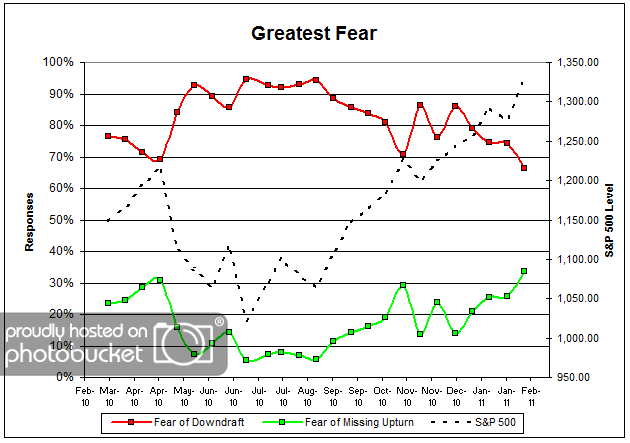
    Chart 1: Greatest Fear. From survey to survey, the S&P; 500 rose by just over 4%, and the greatest fear numbers reacted in kind. This round, 66% of clients were afraid of losing money, down from last survey’s reading of 74%. The greatest fear numbers are currently at all time lows (or highs, depending on your perspective). On the flip side, 34% of clients were afraid of missing out on the rally, also the highest levels we have seen thus far since the survey began nearly a year ago. Client fear levels are now sitting at around 1-year lows, having broken through significant technical resistance.

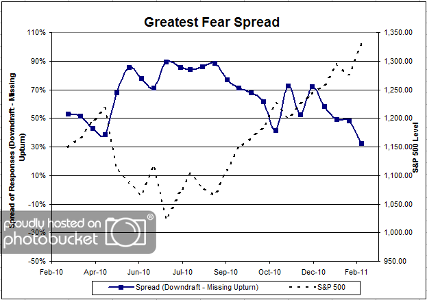
    Chart 2. Greatest Fear Spread. Another way to look at this data is to examine the spread between the two groups. The spread remains skewed towards the fear of losing money crowd, at 34%; however, let’s not forget that this is the closest to parity we’ve seen thus far.

    Question 2. Based on their behavior, how would you rate your clients’ current appetite for risk?

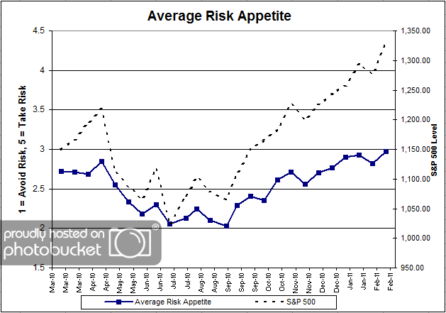
    Chart 3: Average Risk Appetite. Average risk appetite also managed to eke out new all-time survey highs this round, rising from 2.82 to 2.97. The average risk appetite chart is a great visual representation between short term market moves and client risk appetite. They basically move in lock-step through time. And now that the stock market is hitting all-time survey highs, we can clearly see client risk appetite moving right along.

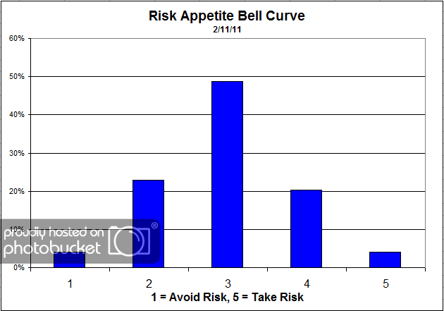
    Chart 4: Risk Appetite Bell Curve. This chart uses a bell curve to break out the percentage of respondents at each risk appetite level. The most common risk appetite was 3 this round, with just under half of all respondents. Compared to previous bell curves, we are beginning to see a much higher percentage of 4’s and 5’s, while the level of 1’s and 2’s noticeably declines.

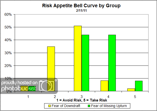
    Chart 5: Risk Appetite Bell Curve by Group. The next three charts use cross-sectional data. This chart plots the reported client risk appetite separately for the fear of downdraft and for the fear of missing upturn groups. We would expect that the fear of downdraft group would have a lower risk appetite than the fear of missing upturn group and that is what we see here. What’s interesting about this particular graph is the wide dispersion in the fear of downdraft group, versus the concentrated risk of the updraft group. The downdraft group has respondents in each risk category, from 1 to 5. On the other hand, you can see the upturn group is tightly concentrated in the 3-5’s, which just one respondent answering 1.

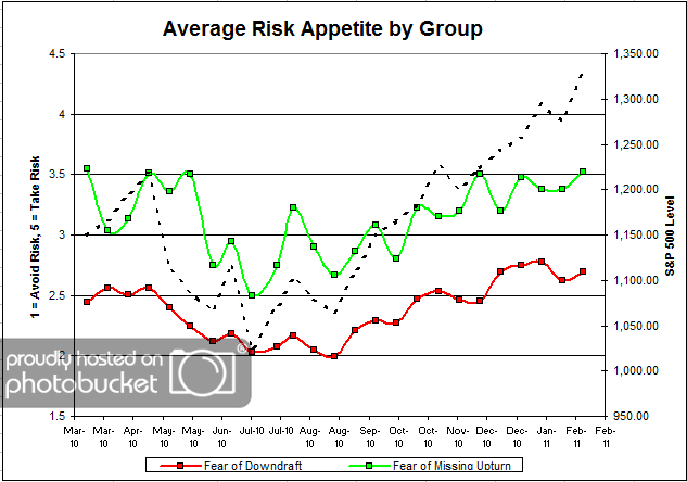
    Chart 6: Average Risk Appetite by Group. For once, the average risk appetite by group indicator performed in-line with our expectations, with both groups rising along with the market. Both groups experienced a noticeable uptick in risk appetite, due to a rising market and a fear of missing out on a rally. This is what we expect to see.

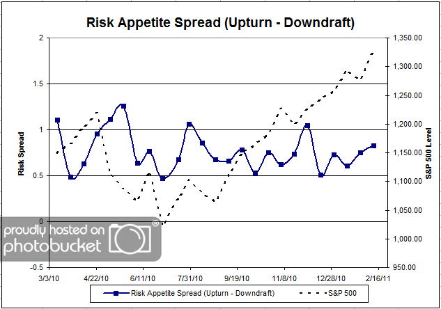
    Chart 7: Risk Appetite Spread. This is a spread chart constructed from the data in Chart 6, where the average risk appetite of the downdraft group is subtracted from the average risk appetite of the missing upturn group. The spread is one of the less volatile indicators found in the survey, and continues to trade within a fairly stable range.

    This round we saw a big rally in the S&P; 500, and all of our client sentiment indicators follow suit. The greatest fear levels have hit all-time highs (or lows), driven by a surging market. If this market continues to rally, we will no doubt see more people become more concerned about missing out on the rally. Ultimately, that’s what this survey is trying to measure — how high can the market rally before people cannot afford to remain on the sideline? And conversely, how long can the market fall before people jump ship?

    The average client risk appetite chart has shown itself to be a great measure of client sentiment; it’s great to see an indicator perform exactly as expected!

    2011 is only beginning, and our indicators are performing mostly as expected. Any type of short-term anomalies are usually sorted out over the following weeks. No one can predict the future, as we all know, so instead of prognosticating, we will sit back and enjoy the ride. A rigorously tested, systematic investment process provides a great deal of comfort for clients during these types of fearful, highly uncertain market environments. Until next time, good trading and thank you for participating!

    Posted by:


    From the Archives: The Problem With Prediction

    February 22, 2011

    Marketwatch ran a rare mea culpa today. They had originally written an article in December 2008 to tell readers what investments they should buy for the coming year. Like all crystal balls, theirs was apparently cracked. Almost every prediction they made turned out to be incorrect. I give them a heap of credit for running the follow-up article to discuss what actually happened and what went wrong with their predictions.

    Unfortunately, this wouldn’t be so nice if you still owned all of these investments. Investors love hearing predictions, but they often believe the forecasters have actual ability to predict. Imagine a scenario where you are flipping a coin. Only one of two outcomes are possible—heads or tails. I am the wise forecaster who will tell you which of the two you are about to flip. Do you believe that I have forecasting ability in this case?

    Probably not, since you know that coin flips are random. Yet at least the forecaster has 50% odds of being correct in the coin flip scenario. With thousands of economic and stock market variables, I would venture to say that the real odds of a correct prediction in financial markets are far lower than 50%—it is a vastly more complex system.

    Our investment methodology does not involve prediction. We follow the trend until it ends. When it ends, we find a new strong trend to get involved with. Sometimes following trends leads us to surprising places, and it certainly is not always profitable every quarter, but we don’t have to make guesses about what to do. Trend following is something that can be rigorously tested and we think that puts it more than a few steps ahead of trying to use a crystal ball.

    —-this article ran originally on July 6, 2009. I do have a couple of things to add though. As I mentioned, drawing attention to a batch of bad forecasts is rare. The perma-bears are not going out of their way to let you know that we’ve just had the fastest stock market double in history. And my intuition about the real odds of a correct prediction in the financial markets turned out to be correct. According to the Tetlock study, which I became aware of subsequently, forecasters are right far less than half the time. Markets are complex; trend following is simple. Simple is good.

    Posted by:


    Weekly RS Recap

    February 22, 2011

    The table below shows the performance of a universe of mid and large cap U.S. equities, broken down by relative strength decile and quartile and then compared to the universe return. Those at the top of the ranks are those stocks which have the best intermediate-term relative strength. Relative strength strategies buy securities that have strong intermediate-term relative strength and hold them as long as they remain strong.

    Last week’s performance (2/14/11 – 2/18/11) is as follows:

    Another strong week for the equity markets. The top quartile was roughly in line with the universe, while the best performance came from the 3rd quartile — still stocks with strong relative strength.

    Posted by:


    Buy and Hope: More Failure

    February 18, 2011

    From academia comes a study that suggests that simply buying a market index does not live up to reasonable return expectations, even over a long period of time. (The study is summarized here by CXO Advisory. You can access the full paper here.) S&P; 500 constituents were measured from 1991-2010 by sampling the members in 2004 and 2010. The reasonable return expectation was set up by the authors using the 10-year Treasury bond yield, plus a risk premium of 4.0% to 4.7%. This is a standard way that long-term returns are estimated in academic finance, by the way. (Back in the olden days, when people thought stocks were actually risky, a risk premium of 6% was the rule of thumb.) So how did stocks actually measure up during that 20-year period? According to CXO Advisory:

    Even though the aggregate market value of S&P; 500 components grows from $2.8 trillion in 1991 to $11.4 trillion in 2010, these firms underperform reasonable investor rate of return requirements (T-note yield plus a modest equity risk premium) by $4.5 trillion.

    Even using a pedestrian risk premium, blue chip stocks–in aggregate–did not compensate you very well for the risk. The authors also point out in the abstract that:

    41% of the companies included in the S&P; 500 in 2004 or 2010 created value in 1993-2010 for their shareholders, while 59% destroyed value.

    Even over a 17-year holding period, the majority of companies destroyed shareholder value. Keep in mind that these were not fly-by-night outfits, but the bulk of the largest public firms in America. Even buying blue chip companies over the long run is likely to cause you to lose your shirt. Buy and hope, unless you get lucky, is not going to work.

    Should you give up on stocks entirely and hide your money under the mattress? We think not. After all, 41% of the stocks created shareholder value—and some of them did exceptionally well. The stocks that created the most shareholder value were the ones that went up the most in price. If we focus our attention on those stocks with the most powerfully rising prices, we can identify the companies that created the most shareholder value. Hmmm…come to think of it, that’s the basic definition of relative strength.

    In contrast to buy-and-hope (internally we sometimes refer to this investment solution as sit-and-take-it), systematic application of the relative strength return factor has been shown to add a lot of value to the investment process.

    Posted by:


    Peter Lynch’s Cocktail Party Indicator

    February 18, 2011

    An absolute classic, by way of Barry Ritholtz at The Big Picture. I know, not quite as exciting as the Sports Illustrated Swimsuit Indicator. Hard to say what stage we are at, but it’s clearly not stage four!

    Posted by:


    Putting The Last Two Years In Context

    February 18, 2011

    Now that the market has doubled since its Great Recession low, it is getting more popular to argue that this could be it for this bull market. That argument is a little hard to believe when put in the context of the chart below which shows the 10-year S&P; 500 annual compound returns from 1926-2010. The data is displayed in a distribution with the lowest 10-year returns on the left hand side of the chart and the highest 10-year returns on the right. As shown below, the 10-year annualized return of the S&P; 500 at the end of 2010 was a scanty +1.4%. This reading of +1.4% is the first to register in positive territory since 2008. However, it remains the twenty-fourth lowest reading over this 1926 to date time frame (out of 300 quarterly observations) and in the first decile of the distribution since 1926!

    (Click to Enlarge)

    Printed with permission from The Leuthold Group.

    Posted by:


    Sector and Capitalization Performance

    February 18, 2011

    The chart below shows performance of US sectors and capitalizations over the trailing 12, 6, and 1 month(s). Performance updated through 2/17/2011.

    Posted by:


    Trend Wins Again

    February 17, 2011

    All those news scoops that you’re getting on CNBC? According to an academic study cited on MarketBeat, there’s no real news:

    The rarefied world of academics recently confirmed a sneaking suspicion: those “breaking news” banners on CNBC actually hardly ever, well, break news. And the market knows it.

    A study that culled from almost 7,000 interviews with chief executives on CNBC over nearly a decade found a recurring pattern: the stock surged on the day the company’s head gave an interview to the business news cable television channel, then dropped right back down over the next 10 trading days.

    That one-day surge is probably enough to pull in the suckers, but will not be enough to budge a long-term measure of relative strength. It’s more important to pay attention to trend than noise.

    Posted by:


    Relative Strength and Asset Class Rotation White Paper

    February 17, 2011

    No investment structure has justifiably generated more interest over the past decade than the exchange traded fund. Its growth has been staggering, in part because of its ability to provide investors access to virtually every investable asset class in a very efficient manner. Furthermore, no investment strategy has produced more interest in recent years than global macro strategies because of their mandate to seek out the best investment opportunities wherever they may be found in the world.

    A year ago, we released a white paper on our unique, Monte Carlo-based testing process which detailed the exceptional returns delivered by a relative strength-based asset class rotation strategy. That paper applied our testing process to a universe of exchange traded funds.

    We are now re-releasing Relative Strength and Asset Class Rotation, updated with data through 2010 (Click here to access). Additionally, the paper now includes an appendix which provides supplemental information about different relative strength factors.

    Testing, such as is detailed in this white paper, has provided the insights needed to develop our Global Macro portfolio. Click here to receive our brochure.

    Posted by:


    Sports Illustrated Swimsuit Indicator #2

    February 17, 2011

    This one might even be statistically significant. Apparently the market prefers blondes. CNBC.com reports:

    The models’ hair color was gauged from the Sports Illustrated website, dating back to 1964.

  • 24 Blonde covers — average annual return of Dow 10.0%, S&P; 10.9%

  • 20 Brunette covers — average annual return of Dow 2.2%, S&P; 2.3%

  • The fact that there is such a large return difference between covers featuring blondes and brunettes is obviously coincidental. However, it points to the danger of data-mining and optimization. If you search through enough data to find relationships, you will succeed in your quest—and lots of the relationships will be coincidental. When you do research, you must first start from a logical premise that suggests that two data series are related in a specific way. Otherwise you will find lots of stuff with high statistical significance that will fall apart in real life.

    Posted by:


    Here We Go!

    February 17, 2011

    During the dark days of the Great Recession, corporations were frozen. There was uncertainty about the economy, uncertainty about healthcare legislation, and so on. So companies sat on their hands and just let their cash flow pile up. We wrote earlier about this incredible pile of cash, which was also replicated on the consumer side of the economy as cash swelled at money market funds. The “risk off” trade was in full effect.

    Consumers worked down some of their cash balances over the past year by buying bonds—wisely or unwisely depending on your forecast for interest rates. But corporations resolutely refused to budge. Until now. According to Bloomberg:

    Corporate America is putting its cash hoard back to work.

    In the first decline since mid-2009, Standard & Poor’s 500 companies reduced cash and short-term investments to $2.4 trillion from a record $2.46 trillion, according to data Bloomberg compiled from their most recent quarterly reports. Capital spending increased $22.3 billion, the biggest quarter- to-quarter jump since the end of 2004, to $142.8 billion, the highest level in two years.

    Capital spending is now beginning to surge, and with a $2.4 trillion treasure hoard, there’s still a lot of firepower left. If businesses stay confident about the path the economy is taking, we are likely to see a mini-boom because all of the deferred spending is going to come roaring back.

    It’s never clear how this will play in the market—you can watch your favorite market statistics for that—but we’re likely to see material improvement in the economy as capital finally gets put back to work.

    Posted by:


    Fund Flows

    February 17, 2011

    The Investment Company Institute is the national association of U.S. investment companies, including mutual funds, closed-end funds, exchange-traded funds (ETFs), and unit investment trusts (UITs). Members of ICI manage total assets of $11.82 trillion and serve nearly 90 million shareholders. Flow estimates are derived from data collected covering more than 95 percent of industry assets and are adjusted to represent industry totals.

    Domestic equity funds are back on the radar! They pulled in nearly $5 billion last week. Municipal bond funds continue to bleed.

    Posted by:


    And the Other 32% Lied?

    February 16, 2011

    Investing is a tough business, and even more difficult when decisions are made emotionally. According to an SEI poll cited on Advisor One:

    A new Quick Poll from SEI on Monday showed that 68% of high-net-worth individuals surveyed have let their emotions get in the way of making the best investment decisions. And while leading with the heart may be a good thing on Valentine’s Day, research has shown that results suffer when emotions are the primary driver of investment decisions.

    I emphasized the good part. 68% is a big number, and I suspect the other 32% just couldn’t bring themselves to admit it. We’re all human and emotions come along with the territory. I don’t know of any way to eliminate emotions, but we can eliminate acting on them when implementing a systematic investment process.

    Posted by: