Our latest sentiment survey was open from 1/28/11 to 2/4/11. We had a nice boost in responses, with 93 participants. Your input is for a good cause! If you believe, as we do, that markets are driven by supply and demand, client behavior is important. We’re not asking what you think of the market—since most of our blog readers are financial advisors, we’re asking instead about the behavior of your clients. Then we’re aggregating responses exclusively for our readership. Your privacy will not be compromised in any way.
After the first 30 or so responses, the established pattern was simply magnified, so we are comfortable about the statistical validity of our sample. Most of the responses were from the U.S., but we also had multiple advisors respond from at least two other countries. Let’s get down to an analysis of the data! Note: You can click on any of the charts to enlarge them.
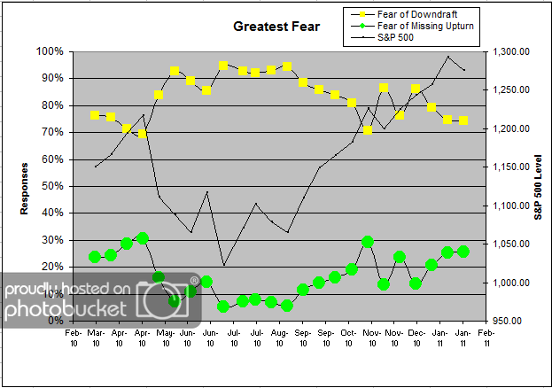
Question 1. Based on their behavior, are your clients currently more afraid of: a) getting caught in a stock market downdraft, or b) missing a stock market upturn?
Chart 1: Greatest Fear. From survey to survey, the S&P 500 fell by around -1.3%, but the greatest fear numbers mostly stayed put. This round, 74% of clients were afraid of losing money, down fractionally from 75% (actually, the raw numbers went from 74.70% to 74.19%, so the move was worth about half a percentage point). So while the market experienced a small correction, client fear levels remained mostly the same. On the flip side, 26% of clients were afraid of missing a rally, up slightly from last round’s reading of 25%. As we’ve noted, client fear levels have been stuck in the same 90-75% range for months now, and this muted move is more of the same.
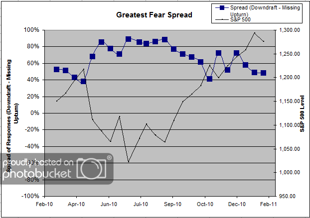
Chart 2. Greatest Fear Spread. Another way to look at this data is to examine the spread between the two groups. The spread remains skewed towards fear of losing money this round. The spread this round dropped from 49% to 48%.
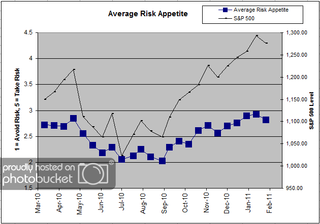
Question 2. Based on their behavior, how would you rate your clients’ current appetite for risk?
Chart 3: Average Risk Appetite. The average risk appetite of clients moved lower with the market this round, from 2.92 to 2.82. Unlike client fear levels, which have been vaguely unpredictable over the last few months, we’ve noticed that the overall average risk appetite numbers usually perform as expected. When the market rises, so does average risk appetite, and when the market falls, so does average risk appetite.
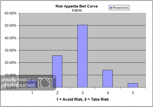
Chart 4: Risk Appetite Bell Curve. This chart uses a bell curve to break out the percentage of respondents at each risk appetite level. The most common risk appetite was 3 this round, with just over half of all respondents. The number of respondents answering “5″ also jumped this round, perhaps an indication of an underlying willingness to add risk on the heels of a prolonged S&P rally.
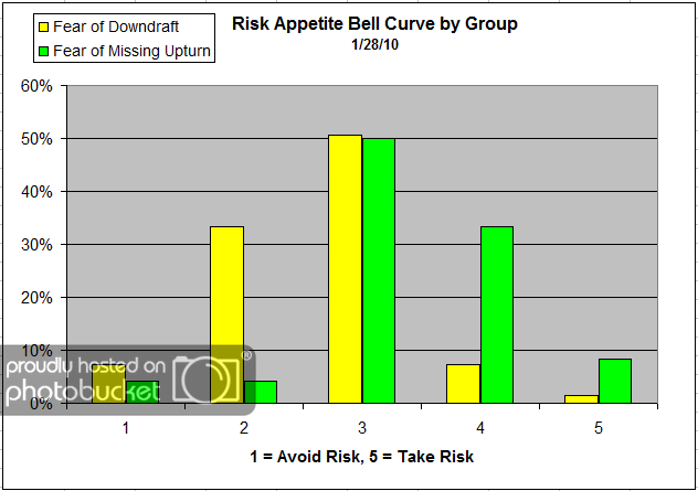
Chart 5: Risk Appetite Bell Curve by Group. The next three charts use cross-sectional data. This chart plots the reported client risk appetite separately for the fear of downdraft and for the fear of missing upturn groups. We would expect that the fear of downdraft group would have a lower risk appetite than the fear of missing upturn group and that is what we see here. For the fear of downdraft group, we see mostly 1′s, 2′s and 3′s. For the fear of missing upturn group, we see mostly 3′s, 4′s and 5′s. One respondent from the fear of downdraft group was looking to add risk, perhaps another example of clients trying to sort out how they feel about missing out on the big rally.
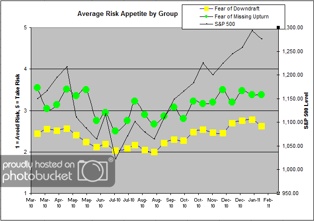
Chart 6: Average Risk Appetite by Group. Once again, the average risk appetite by group indicator acts up (though not in a big way)! We see the average risk appetite of the missing upturn group stay nearly the same, while the fear of downdraft group fell moderately. Usually, it’s the upturn group that makes the big moves, but not so this time. Here’s a theory: The missing upturn group surges big on up-moves, because that group is pre-disposed to want to participate in the rallies. On the other hand, the fear of downturn group falls big on down-moves, because that group is pre-disposed to seek safety. In both instances, when the market moves in a certain direction, those who are most concerned move their risk appetites further towards their respective goals.
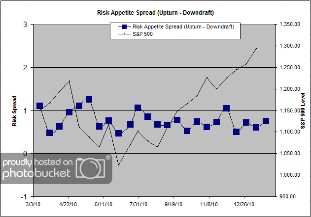
Chart 7: Risk Appetite Spread. This is a spread chart constructed from the data in Chart 6, where the average risk appetite of the downdraft group is subtracted from the average risk appetite of the missing upturn group. The spread is one of the less volatile indicators found in the survey, and continues to trade within a fairly stable range.
This round we saw a fairly muted market correction, along with mostly stable survey indicators. The greatest fear level, in particular, barely nudged at the sight of a -1.3% drawdown. Perhaps the two camps have figured out where they stand in the market right now, and it’s going to take a much bigger, more protracted market move to see those fear levels move as well. Also, the average risk appetite by group indicator continues to shed light on how the two camps feel about adding risk. In this round, we saw a moderate drop in risk appetite in the fear of downdraft group, while the upturn camp remained the same. What might be happening is this — the fear of downdraft group’s risk falls more dramatically on a market fall, and the fear of upturn group’s risk rises more dramatically on a market rise. The theory would point towards the the two groups acting out their greatest fears if the market moves towards their respective greatest fear.
2011 is only beginning, and our indicators are performing mostly as expected. Any type of short-term anomalies are usually sorted out over the following weeks. No one can predict the future, as we all know, so instead of prognosticating, we will sit back and enjoy the ride. A rigorously tested, systematic investment process provides a great deal of comfort for clients during these types of fearful, highly uncertain market environments. Until next time, good trading and thank you for participating!
