Margin of Safety

February 22, 2011

I’ve been re-reading a few investment classics lately. A concept that struck me recently was the “margin of safety” discussed in The Intelligent Investor. (The Intelligent Investor was Benjamin Graham’s slightly simplified version of his approach to securities analysis for individuals.) In fact, Graham claimed that the margin of safety was the essential message of his entire approach to investing:

Confronted with a like challenge to distill the secret of sound investment into three words, we venture the motto, MARGIN OF SAFETY.

For Graham, the margin of safety might be in the interest coverage ratio for a bond, or in the projected earnings growth rate for a common stock. The idea is that even if the investment does not meet your projection, you have ample room for error and are still likely to come out okay. Hence, you have a margin of safety.

Margin of safety was the first thing that occurred to me when I read a Wall Street Journal article over the weekend entitled Retiring Boomers Find 401(k) Plans Fall Short. (This morning the article also ran on MarketWatch.) As the article points out, 401(k) plans first came into wide use in the 1980s, so the leading edge of the baby boomers now retiring are the first group to have the accounts form the backbone of their retirement savings. The situation is not encouraging:

The median household headed by a person aged 60 to 62 with a 401(k) account has less than one-quarter of what is needed in that account to maintain its standard of living in retirement, according to data compiled by the Federal Reserve and analyzed by the Center for Retirement Research at Boston College for The Wall Street Journal.

How in the heck do you end up 75% short of the savings needed to maintain your standard of living? Answer: no margin of safety.

Think about it—if you are doing things prudently, you should have a margin of safety. You need to over-save in case something goes wrong. Which, inevitably, it will. Trust me on this: unexpected expenses are way, way more common than unexpected windfalls! If you have a margin of safety in your savings, the worst case scenario is that you will have too much money saved for your retirement. Is that really a problem? Have you heard more retirees complaining that 1) they can’t get a first-class cabin on a last-minute Caribbean cruise, or 2) they were planning to travel in retirement but now they can’t afford to?

401(k) providers are slowly catching on. According to the article, Vanguard recently suggested saving 12-15% of their income, versus the 9-12% recommendation earlier. In Andy’s short course in financial planning, we recommended that a minimum of 15% of income should be saved.

I think it is worthwhile to show clients the article. It is a litany of undersaving and/or things going wrong, sometimes at the worst possible time. (When else do things ever go wrong?) In each case cited in the article, the retirees were up against it because they had no margin of safety. Frankly, many clients are worse off than some of the retirees mentioned in the article. As an advisor, it’s your job to help people make intelligent financial decisions, especially those they will find difficult to make on their own. Convincing them to save with a margin of safety might just be the most important thing you will ever do for them.

Posted by:


Dorsey, Wright Client Sentiment Survey Results - 2/11/11

February 22, 2011

Our latest sentiment survey was open from 2/11/11 to 2/18/11. We had a drop off in responses, down to 74 participants. Unacceptable! If you believe, as we do, that markets are driven by supply and demand, client behavior is important. We’re not asking what you think of the market—since most of our blog readers are financial advisors, we’re asking instead about the behavior of your clients. Then we’re aggregating responses exclusively for our readership. Your privacy will not be compromised in any way.

After the first 30 or so responses, the established pattern was simply magnified, so we are comfortable about the statistical validity of our sample. Most of the responses were from the U.S., but we also had multiple advisors respond from at least two other countries. Let’s get down to an analysis of the data! Note: You can click on any of the charts to enlarge them.

Question 1. Based on their behavior, are your clients currently more afraid of: a) getting caught in a stock market downdraft, or b) missing a stock market upturn?

 Dorsey, Wright Client Sentiment Survey Results   2/11/11

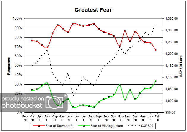
Chart 1: Greatest Fear. From survey to survey, the S&P 500 rose by just over 4%, and the greatest fear numbers reacted in kind. This round, 66% of clients were afraid of losing money, down from last survey’s reading of 74%. The greatest fear numbers are currently at all time lows (or highs, depending on your perspective). On the flip side, 34% of clients were afraid of missing out on the rally, also the highest levels we have seen thus far since the survey began nearly a year ago. Client fear levels are now sitting at around 1-year lows, having broken through significant technical resistance.

 Dorsey, Wright Client Sentiment Survey Results   2/11/11

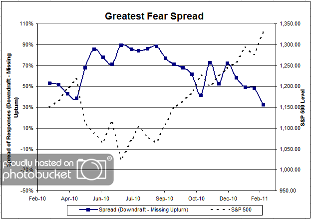
Chart 2. Greatest Fear Spread. Another way to look at this data is to examine the spread between the two groups. The spread remains skewed towards the fear of losing money crowd, at 34%; however, let’s not forget that this is the closest to parity we’ve seen thus far.

Question 2. Based on their behavior, how would you rate your clients’ current appetite for risk?

 Dorsey, Wright Client Sentiment Survey Results   2/11/11

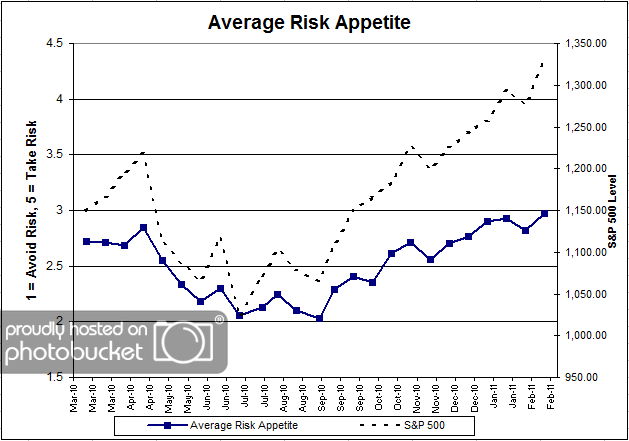
Chart 3: Average Risk Appetite. Average risk appetite also managed to eke out new all-time survey highs this round, rising from 2.82 to 2.97. The average risk appetite chart is a great visual representation between short term market moves and client risk appetite. They basically move in lock-step through time. And now that the stock market is hitting all-time survey highs, we can clearly see client risk appetite moving right along.

 Dorsey, Wright Client Sentiment Survey Results   2/11/11

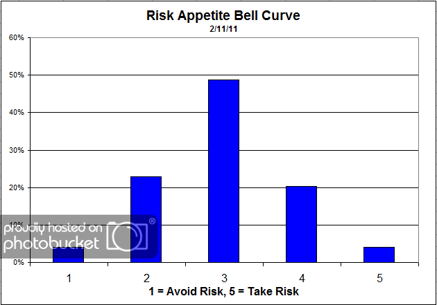
Chart 4: Risk Appetite Bell Curve. This chart uses a bell curve to break out the percentage of respondents at each risk appetite level. The most common risk appetite was 3 this round, with just under half of all respondents. Compared to previous bell curves, we are beginning to see a much higher percentage of 4′s and 5′s, while the level of 1′s and 2′s noticeably declines.

 Dorsey, Wright Client Sentiment Survey Results   2/11/11

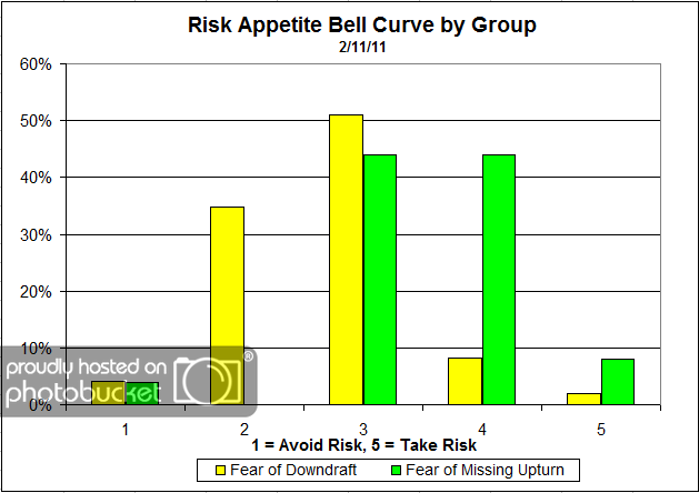
Chart 5: Risk Appetite Bell Curve by Group. The next three charts use cross-sectional data. This chart plots the reported client risk appetite separately for the fear of downdraft and for the fear of missing upturn groups. We would expect that the fear of downdraft group would have a lower risk appetite than the fear of missing upturn group and that is what we see here. What’s interesting about this particular graph is the wide dispersion in the fear of downdraft group, versus the concentrated risk of the updraft group. The downdraft group has respondents in each risk category, from 1 to 5. On the other hand, you can see the upturn group is tightly concentrated in the 3-5′s, which just one respondent answering 1.

 Dorsey, Wright Client Sentiment Survey Results   2/11/11

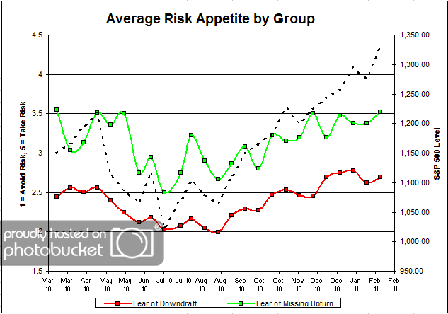
Chart 6: Average Risk Appetite by Group. For once, the average risk appetite by group indicator performed in-line with our expectations, with both groups rising along with the market. Both groups experienced a noticeable uptick in risk appetite, due to a rising market and a fear of missing out on a rally. This is what we expect to see.

 Dorsey, Wright Client Sentiment Survey Results   2/11/11

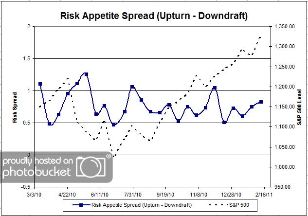
Chart 7: Risk Appetite Spread. This is a spread chart constructed from the data in Chart 6, where the average risk appetite of the downdraft group is subtracted from the average risk appetite of the missing upturn group. The spread is one of the less volatile indicators found in the survey, and continues to trade within a fairly stable range.

This round we saw a big rally in the S&P 500, and all of our client sentiment indicators follow suit. The greatest fear levels have hit all-time highs (or lows), driven by a surging market. If this market continues to rally, we will no doubt see more people become more concerned about missing out on the rally. Ultimately, that’s what this survey is trying to measure — how high can the market rally before people cannot afford to remain on the sideline? And conversely, how long can the market fall before people jump ship?

The average client risk appetite chart has shown itself to be a great measure of client sentiment; it’s great to see an indicator perform exactly as expected!

2011 is only beginning, and our indicators are performing mostly as expected. Any type of short-term anomalies are usually sorted out over the following weeks. No one can predict the future, as we all know, so instead of prognosticating, we will sit back and enjoy the ride. A rigorously tested, systematic investment process provides a great deal of comfort for clients during these types of fearful, highly uncertain market environments. Until next time, good trading and thank you for participating!

Posted by:


From the Archives: The Problem With Prediction

February 22, 2011

Marketwatch ran a rare mea culpa today. They had originally written an article in December 2008 to tell readers what investments they should buy for the coming year. Like all crystal balls, theirs was apparently cracked. Almost every prediction they made turned out to be incorrect. I give them a heap of credit for running the follow-up article to discuss what actually happened and what went wrong with their predictions.

Unfortunately, this wouldn’t be so nice if you still owned all of these investments. Investors love hearing predictions, but they often believe the forecasters have actual ability to predict. Imagine a scenario where you are flipping a coin. Only one of two outcomes are possible—heads or tails. I am the wise forecaster who will tell you which of the two you are about to flip. Do you believe that I have forecasting ability in this case?

Probably not, since you know that coin flips are random. Yet at least the forecaster has 50% odds of being correct in the coin flip scenario. With thousands of economic and stock market variables, I would venture to say that the real odds of a correct prediction in financial markets are far lower than 50%—it is a vastly more complex system.

Our investment methodology does not involve prediction. We follow the trend until it ends. When it ends, we find a new strong trend to get involved with. Sometimes following trends leads us to surprising places, and it certainly is not always profitable every quarter, but we don’t have to make guesses about what to do. Trend following is something that can be rigorously tested and we think that puts it more than a few steps ahead of trying to use a crystal ball.

—-this article ran originally on July 6, 2009. I do have a couple of things to add though. As I mentioned, drawing attention to a batch of bad forecasts is rare. The perma-bears are not going out of their way to let you know that we’ve just had the fastest stock market double in history. And my intuition about the real odds of a correct prediction in the financial markets turned out to be correct. According to the Tetlock study, which I became aware of subsequently, forecasters are right far less than half the time. Markets are complex; trend following is simple. Simple is good.

Posted by:


Weekly RS Recap

February 22, 2011

The table below shows the performance of a universe of mid and large cap U.S. equities, broken down by relative strength decile and quartile and then compared to the universe return. Those at the top of the ranks are those stocks which have the best intermediate-term relative strength. Relative strength strategies buy securities that have strong intermediate-term relative strength and hold them as long as they remain strong.

Last week’s performance (2/14/11 – 2/18/11) is as follows:

Another strong week for the equity markets. The top quartile was roughly in line with the universe, while the best performance came from the 3rd quartile — still stocks with strong relative strength.


Posted by: