Our latest sentiment survey was open from 2/11/11 to 2/18/11. We had a drop off in responses, down to 74 participants. Unacceptable! If you believe, as we do, that markets are driven by supply and demand, client behavior is important. We’re not asking what you think of the market—since most of our blog readers are financial advisors, we’re asking instead about the behavior of your clients. Then we’re aggregating responses exclusively for our readership. Your privacy will not be compromised in any way.
After the first 30 or so responses, the established pattern was simply magnified, so we are comfortable about the statistical validity of our sample. Most of the responses were from the U.S., but we also had multiple advisors respond from at least two other countries. Let’s get down to an analysis of the data! Note: You can click on any of the charts to enlarge them.
Question 1. Based on their behavior, are your clients currently more afraid of: a) getting caught in a stock market downdraft, or b) missing a stock market upturn?
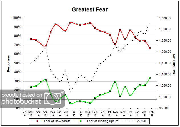
Chart 1: Greatest Fear. From survey to survey, the S&P 500 rose by just over 4%, and the greatest fear numbers reacted in kind. This round, 66% of clients were afraid of losing money, down from last survey’s reading of 74%. The greatest fear numbers are currently at all time lows (or highs, depending on your perspective). On the flip side, 34% of clients were afraid of missing out on the rally, also the highest levels we have seen thus far since the survey began nearly a year ago. Client fear levels are now sitting at around 1-year lows, having broken through significant technical resistance.
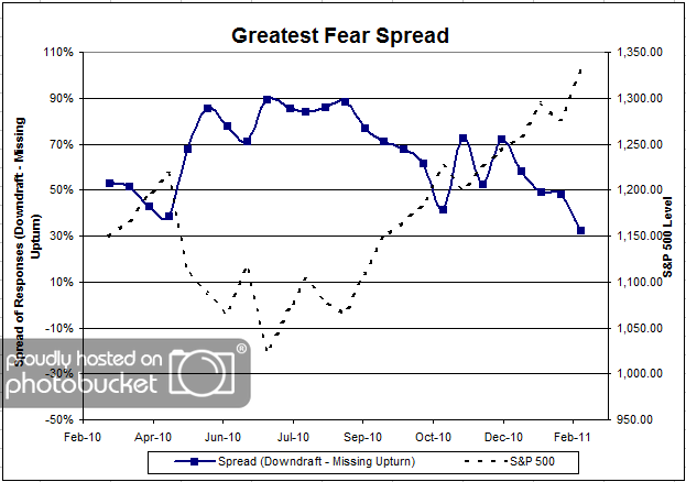
Chart 2. Greatest Fear Spread. Another way to look at this data is to examine the spread between the two groups. The spread remains skewed towards the fear of losing money crowd, at 34%; however, let’s not forget that this is the closest to parity we’ve seen thus far.
Question 2. Based on their behavior, how would you rate your clients’ current appetite for risk?
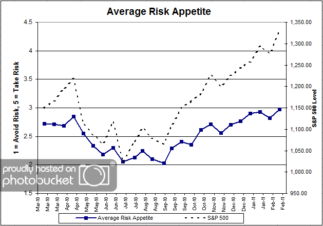
Chart 3: Average Risk Appetite. Average risk appetite also managed to eke out new all-time survey highs this round, rising from 2.82 to 2.97. The average risk appetite chart is a great visual representation between short term market moves and client risk appetite. They basically move in lock-step through time. And now that the stock market is hitting all-time survey highs, we can clearly see client risk appetite moving right along.
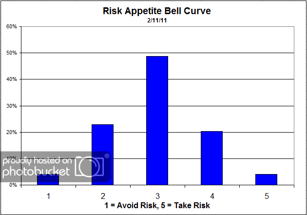
Chart 4: Risk Appetite Bell Curve. This chart uses a bell curve to break out the percentage of respondents at each risk appetite level. The most common risk appetite was 3 this round, with just under half of all respondents. Compared to previous bell curves, we are beginning to see a much higher percentage of 4′s and 5′s, while the level of 1′s and 2′s noticeably declines.
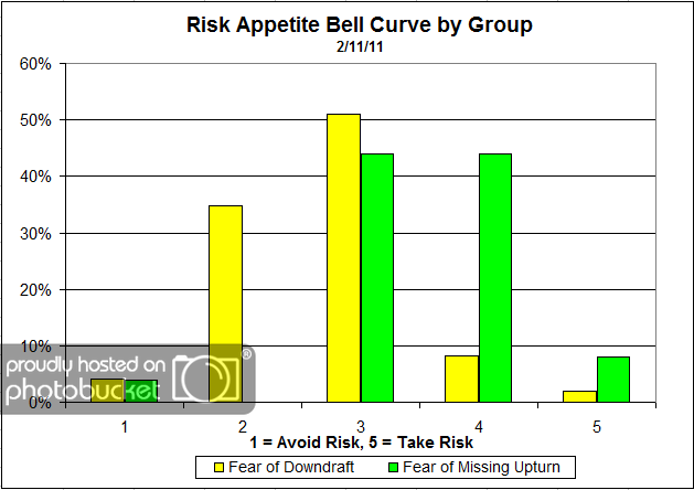
Chart 5: Risk Appetite Bell Curve by Group. The next three charts use cross-sectional data. This chart plots the reported client risk appetite separately for the fear of downdraft and for the fear of missing upturn groups. We would expect that the fear of downdraft group would have a lower risk appetite than the fear of missing upturn group and that is what we see here. What’s interesting about this particular graph is the wide dispersion in the fear of downdraft group, versus the concentrated risk of the updraft group. The downdraft group has respondents in each risk category, from 1 to 5. On the other hand, you can see the upturn group is tightly concentrated in the 3-5′s, which just one respondent answering 1.
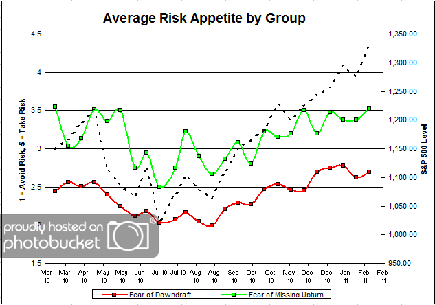
Chart 6: Average Risk Appetite by Group. For once, the average risk appetite by group indicator performed in-line with our expectations, with both groups rising along with the market. Both groups experienced a noticeable uptick in risk appetite, due to a rising market and a fear of missing out on a rally. This is what we expect to see.
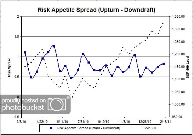
Chart 7: Risk Appetite Spread. This is a spread chart constructed from the data in Chart 6, where the average risk appetite of the downdraft group is subtracted from the average risk appetite of the missing upturn group. The spread is one of the less volatile indicators found in the survey, and continues to trade within a fairly stable range.
This round we saw a big rally in the S&P 500, and all of our client sentiment indicators follow suit. The greatest fear levels have hit all-time highs (or lows), driven by a surging market. If this market continues to rally, we will no doubt see more people become more concerned about missing out on the rally. Ultimately, that’s what this survey is trying to measure — how high can the market rally before people cannot afford to remain on the sideline? And conversely, how long can the market fall before people jump ship?
The average client risk appetite chart has shown itself to be a great measure of client sentiment; it’s great to see an indicator perform exactly as expected!
2011 is only beginning, and our indicators are performing mostly as expected. Any type of short-term anomalies are usually sorted out over the following weeks. No one can predict the future, as we all know, so instead of prognosticating, we will sit back and enjoy the ride. A rigorously tested, systematic investment process provides a great deal of comfort for clients during these types of fearful, highly uncertain market environments. Until next time, good trading and thank you for participating!
