Our latest sentiment survey was open from 3/11/11 to 3/18/11. The Dorsey, Wright Polo Shirt raffle continues to drive advisor participation — thank you for taking the time! Please remember, the first drawing will be held on June 1, so keep playing to increase your odds of winning. We hit a new all-time high of participation, with 206 advisors chiming in. If you believe, as we do, that markets are driven by supply and demand, client behavior is important. We’re not asking what you think of the market—since most of our blog readers are financial advisors, we’re asking instead about the behavior of your clients. Then we’re aggregating responses exclusively for our readership. Your privacy will not be compromised in any way.
After the first 30 or so responses, the established pattern was simply magnified, so we are comfortable about the statistical validity of our sample. Most of the responses were from the U.S., but we also had multiple advisors respond from at least five other countries. Let’s get down to an analysis of the data! Note: You can click on any of the charts to enlarge them.
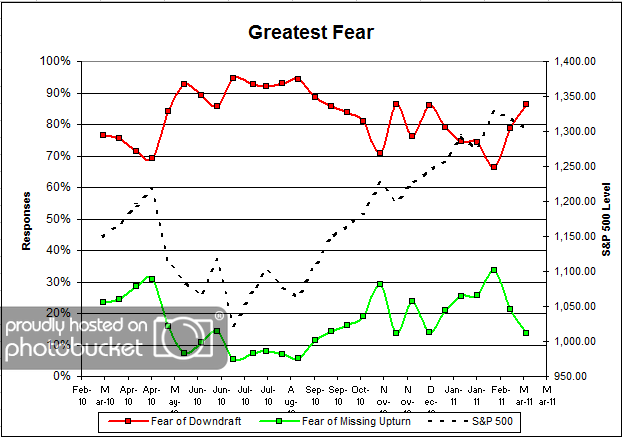
Question 1. Based on their behavior, are your clients currently more afraid of: a) getting caught in a stock market downdraft, or b) missing a stock market upturn?
Chart 1: Greatest Fear. From survey to survey, the S&P 500 fell by around -1.1%. That was enough to send fear levels much higher, from 79% last round to 86% this round. In the last two surveys, we’ve had total losses of -1.8%, yet we’ve seen fear levels move from 66% to 86%. Classic!
On the flip side, the fear of missed opportunity group went from 21% to 14%. It’s amazing how much a 2% market pullback can affect client sentiment. And no, we’re not forgetting about the tsunami, the possible nuclear meltdown, the Arab revolts, or any other harbingers of the apocalypse. That’s one of the great things about this survey — we are only using price points from one day per every two weeks, so a lot of the “noise” gets cancelled out.
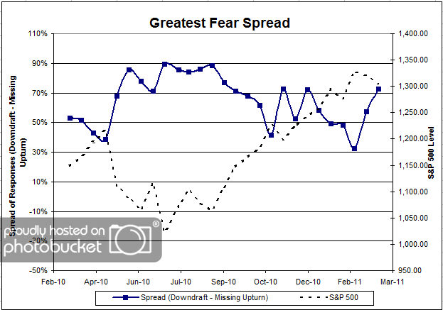
Chart 2. Greatest Fear Spread. Another way to look at this data is to examine the spread between the two groups. The spread continued to move higher, up to 73% from 57%.
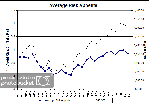
Question 2. Based on their behavior, how would you rate your clients’ current appetite for risk?
Chart 3: Average Risk Appetite. Average risk appetite finally succumbed to the pressures of the pullback, as average risk moved from 2.98 to 2.85. Average risk appetite seems to be holding up much better than the overall fear numbers, given the relatively small move downward (compared to the huge jump in fear levels).
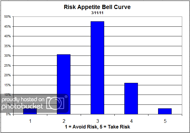
Chart 4: Risk Appetite Bell Curve. This chart uses a bell curve to break out the percentage of respondents at each risk appetite level. The most common risk appetite was 3 this round (again!), with just under half of all respondents.
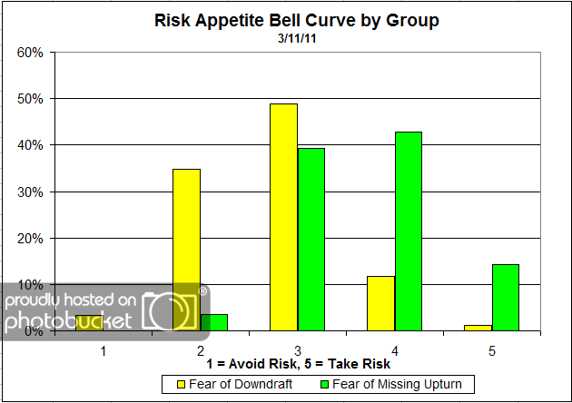
Chart 5: Risk Appetite Bell Curve by Group. The next three charts use cross-sectional data. This chart plots the reported client risk appetite separately for the fear of downdraft and for the fear of missing upturn groups. This chart sorts out as exactly as we would expect. The fear group is looking for less risk than the missed opportunity group. Also, note the relatively high percentage of 5′s in the upturn group.
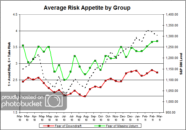
Chart 6: Average Risk Appetite by Group.
The fear of missed opportunity group’s risk appetite continued to rise, even in the face of two consecutive down readings in the market. On the other side, we see the fear of losing money lower their average risk appetite, in line with the market.
The upturn group is sticking to their guns, wanting to add risk despite a falling market.
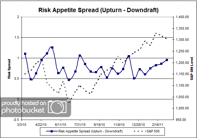
Chart 7: Risk Appetite Spread. This is a spread chart constructed from the data in Chart 6, where the average risk appetite of the downdraft group is subtracted from the average risk appetite of the missing upturn group. The spread is one of the less volatile indicators found in the survey, and continues to rise with the market.
This round we saw a continuation of the S&P 500 pullback, with losses nearing a full -2%. Unsurprisingly, more clients became afraid of losing money in the market, despite a relatively small market correction. Here’s the bottom line for this survey: the S&P 500 is up around 93% since its March ’09 lows, yet a -2% pullback is enough to get 86% of clients scared of losing money! Does that make sense?
No one can predict the future, as we all know, so instead of prognosticating, we will sit back and enjoy the ride. A rigorously tested, systematic investment process provides a great deal of comfort for clients during these types of fearful, highly uncertain market environments. Until next time, good trading and thank you for participating






[...] the last month. Our own sentiment survey (the full results of the most recent survey can be seen here), and the most recent AAII survey both show retail investors have become more bearish over the last [...]