Dorsey, Wright Client Sentiment Survey Results - 4/25/11

May 2, 2011

Our latest sentiment survey was open from 4/25/11 to 4/29/11. The Dorsey, Wright Polo Shirt raffle continues to drive advisor participation — thank you for taking the time! Please remember, the first drawing will be held on June 1, so keep playing to increase your odds of winning. This round, we had 133 advisors participate in the survey. If you believe, as we do, that markets are driven by supply and demand, client behavior is important. We’re not asking what you think of the market—since most of our blog readers are financial advisors, we’re asking instead about the behavior of your clients. Then we’re aggregating responses exclusively for our readership. Your privacy will not be compromised in any way.

After the first 30 or so responses, the established pattern was simply magnified, so we are comfortable about the statistical validity of our sample. Most of the responses were from the U.S., but we also had multiple advisors respond from at least five other countries. Let’s get down to an analysis of the data! Note: You can click on any of the charts to enlarge them.

Question 1. Based on their behavior, are your clients currently more afraid of: a) getting caught in a stock market downdraft, or b) missing a stock market upturn?

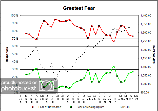
Chart 1: Greatest Fear. From survey to survey, the S&P rallied around +0.5%, not that much. Client fear levels dropped from 76% to 73%, also not that much. On the other side, we see the fear of missed opportunity group rise from 24% to 27%.

Nothing much to say here. We saw the market rally barely, and client fear levels drop by around the same. Once again, it’s great to see the indicators performing as we hypothesized they would.

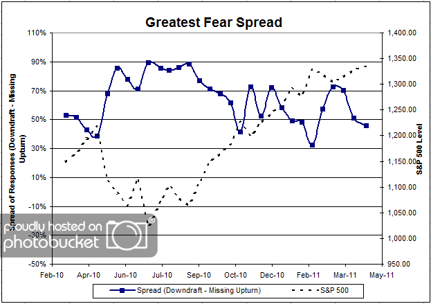
Chart 2. Greatest Fear Spread. Another way to look at this data is to examine the spread between the two groups. The spread also remained fairly stable, dropping from 51% to 46%.

Question 2. Based on their behavior, how would you rate your clients’ current appetite for risk?

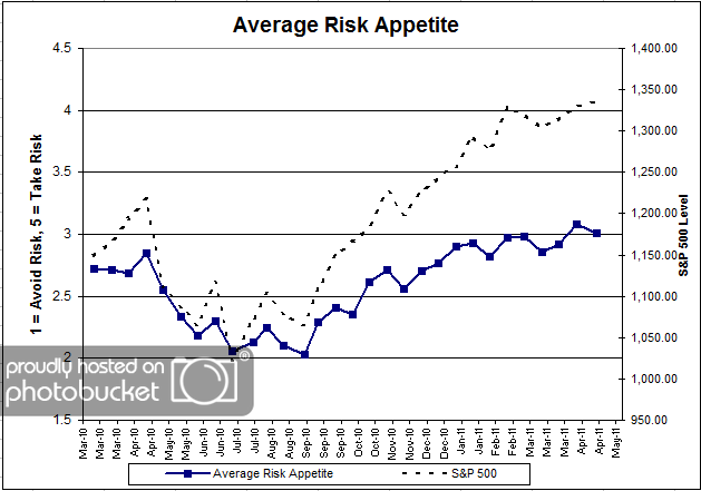
Chart 3: Average Risk Appetite. Average risk appetite dropped barely, from 3.07 to 3.01. Last survey’s risk appetite number ranked the highest since we started the survey. Considering the market’s tepid rally from the previous survey, it’s not too surprising to see client risk appetite fall back a little from those levels. Again, we’re seeing our sentiment indicators match the strength of the market moves. Big rally = big sentiment move. Small rally = small sentiment move.

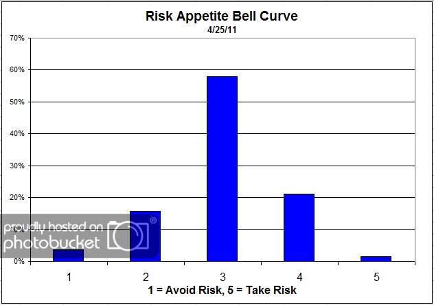
Chart 4: Risk Appetite Bell Curve. This chart uses a bell curve to break out the percentage of respondents at each risk appetite level. The majority of respondents continue to desire a risk appetite of 3, while there are not as many clients at the tail ends of either side of the bell curve. We’ve been seeing this bell-curve pattern for a few weeks now, and expect it to continue as long as the market keeps treading water.

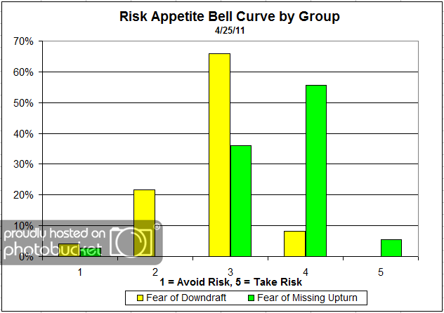
Chart 5: Risk Appetite Bell Curve by Group. The next three charts use cross-sectional data. This chart plots the reported client risk appetite separately for the fear of downdraft and for the fear of missing upturn groups. This chart sorts out perfectly, save one person in the missing upturn group who desired a risk appetite of 1. The fear group is looking for lower risk (3′s through 1′s), while the opportunity group is looking for more risk (3′s through 5′s).

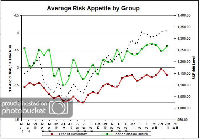
Chart 6: Average Risk Appetite by Group. Leave it up to the average risk appetite by group graph to mix it up a bit. We’ve long noticed that this particular chart is one of the most interesting out of the group, in that we see more divergences from our expectations. Here we see the upturn group’s risk appetite jump by a pretty large degree, while the exact opposite happens in the downturn group.

In acting this way, both groups have resorted to their default mode, in that both groups made a big push towards what we would expect their desired risk appetite would be. The upturn group had a big push to more risk, and the downturn group had a big push to less risk.

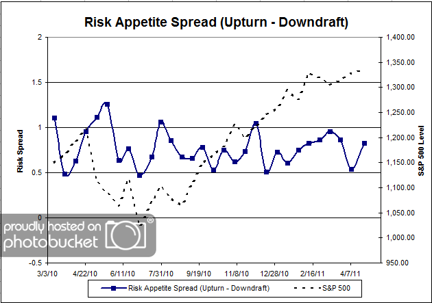
Chart 7: Risk Appetite Spread. This is a spread chart constructed from the data in Chart 6, where the average risk appetite of the downdraft group is subtracted from the average risk appetite of the missing upturn group. The spread is normally one of the least volatile indicators, but in the last 2 surveys we have seen some relatively large swings in this indicator.

This round, the market rallied around +0.5% from survey to survey, and the overall fear numbers moved by around the same degree (not that much). This is what we would expect, as we’ve noticed that large market moves lead to large fear swings, and smaller market moves lead to muted fear swings. All in all,the survey indicators are performing exactly as expected.

One of my favorite indicators is the overall risk appetite average, which has been one of the most reliable proxies for determining what the clients “really feel” when compared to the overall fear numbers. Having barely pulled back from all-time highs above the 3.0 level, it will be fun to watch this one move in relation to the market going forward.

No one can predict the future, as we all know, so instead of prognosticating, we will sit back and enjoy the ride. A rigorously tested, systematic investment process provides a great deal of comfort for clients during these types of fearful, highly uncertain market environments. Until next time, good trading and thank you for participating.
Dorsey, Wright Exclusive: Ben Bernanke’s Diary!

May 2, 2011

Here at Dorsey, Wright Money Management, we are lucky enough to have the resources to do a little more research than might be expected from your typical money managers. Specifically, we have agents in the field doing the real work behind the scenes to get us the edge we need to stay ahead in the game.

One of our agents acquired the following slip of paper during some routine “research.” Based on handwriting analysis and the DNA analysis of the tear stains on the paper (it was soaked), we’ve come to the conclusion that this is DEFINITELY Ben Bernanke’s diary…

Dear Diary,

Man o man. March has been so brutal I can’t even take it…testifying on Capitol Hill to those jokers in Congress has done nothing good for my blood pressure. Lucky for me I have been flying to Los Angeles for acting classes so I can speak with a straight face without bursting into tears or rage, depending on who is grilling me. The breathing exercises I learned in class have really really helped me…I hope nobody finds out I’m moonlighting as a thespian just to handle my real job.

The thing that really pisses me off…no wait, there’s three things that really piss me off that nobody can just leave me alone about. The first is obviously the US dollar. I mean I know it’s going to go straight down, but somehow I trick myself into believing that it won’t…that it’ll turn around. It’s an acting trick I learned called Method Acting where I really have to “believe” it’s true, and then it will become true. Or is that The Secret? I get the two confused, but the point is Mind Over Matter. Anyway, everybody knows that as long as we keep buying our own debt and printing cash, each individual dollar’s worth is going to go down. Everybody knows that, right? But then I have to turn around and say something completely different, on TV to a panel of sleeping beauties. It’s rough.

Then there are the jokers in Congress. They complain all day about debt, debt, debt, and then what do they do? Spend more, and then more, and then some more. And this is all somehow my fault? Did I draft the laws that fueled the housing bubble? The way they talk out of both sides of their mouth at the same time is just sick. But, at the same time, they’ve taught me SO MUCH about how to blatantly lie, saying one thing while doing another. They’re a tricky bunch, like I said…I’ve learned a lot from them, but I wish they would get off my back about problems that they started and refuse to own up to.

And then of course there’s the ace in the hole – inflation. Gas prices are going up and food prices are going crazy…lucky for me I like to just chop those two things out of my reports because their prices are a little too volatile for the public to pay attention to (they won’t notice!). Don’t even get me started on gold and silver.

It’s getting kinda late and I have to get up tomorrow really early and go over to Timmy’s house and play some racquetball. Man—it was so hilarious when he got caught not paying his taxes. I ribbed him on that one for weeks.

Sure hope things get better for me soon. Wish me luck, Diary!

Haters Gonna Hate


More on Confirmation Bias

May 2, 2011

The wonderful Jonah Lehrer had a piece on Wired.com in his Frontal Cortex blog that discussed confirmation bias in relation to political beliefs. Although this blog isn’t political, the bias applies to all of our beliefs, not just political ones. We believe what we want to believe. Here’s a long excerpt, which might give you a flavor for some of the psychological research that’s been done. I’ve highlighted some of it:

The answer returns us to the difference between rational voters (what we think we are) and rationalizing voters (what we really are). It turns out that the human mind is a marvelous information filter, adept at blocking out those facts that contradict what we’d like to believe. Just look at this experiment, which was done in the late 1960’s, by the cognitive psychologists Timothy Brock and Joe Balloun. They played a group of people a tape-recorded message attacking Christianity. Half of the subjects were regular churchgoers while the other half were committed atheists. To make the experiment more interesting, Brock and Balloun added an annoying amount of static – a crackle of white noise – to the recording. However, they allowed listeners to reduce the static by pressing a button, so that the message suddenly became easier to understand. Their results were utterly predicable and rather depressing: the non-believers always tried to remove the static, while the religious subjects actually preferred the message that was harder to hear. Later experiments by Brock and Balloun demonstrated a similar effect with smokers listening to a speech on the link between smoking and cancer. We silence the cognitive dissonance through self-imposed ignorance.

Unfortunately, the same process also applies to our political beliefs. It doesn’t matter if we’re holding forth on birth certificates or tax policy – we can’t help but discount and disregard facts that contradict what we’d like to believe. The Princeton political scientist Larry Bartels analyzed survey data from the 1990’s to prove this point. During the first term of Bill Clinton’s presidency, the budget deficit declined by more than 90 percent. However, when Republican voters were asked in 1996 what happened to the deficit under Clinton, more than 55 percent said that it had increased. What’s interesting about this data is that so-called “high-information” voters – these are the Republicans who read the newspaper, watch cable news and can probably identify their representatives in Congress – weren’t better informed than “low-information” voters. According to Bartels, the reason knowing more about politics doesn’t erase partisan bias is that voters tend to only assimilate those facts that confirm what they already believe. If a piece of information doesn’t follow Republican talking points – and Clinton’s deficit reduction didn’t fit the “tax and spend liberal” stereotype – then the information is conveniently ignored. “Voters think that they’re thinking,” Bartels writes, “but what they’re really doing is inventing facts or ignoring facts so that they can rationalize decisions they’ve already made.”

It takes a scientific mindset to get away from the confirmation bias problem. You have to look at the data in a rigorous way and actively try to disprove your hypothesis. If you don’t, you are very likely to conclude that what you would like to be true is true.

Many theoretical frameworks in modern finance may fall into this category. Take efficient markets or modern portfolio theory, for example. There is lots of contradictory evidence to suggest they are failed paradigms—but not if you turn on the static filter and refuse to acknowledge the new information!


Weekly RS Recap

May 2, 2011

The table below shows the performance of a universe of mid and large cap U.S. equities, broken down by relative strength decile and quartile and then compared to the universe return. Those at the top of the ranks are those stocks which have the best intermediate-term relative strength. Relative strength strategies buy securities that have strong intermediate-term relative strength and hold them as long as they remain strong.

Last week’s performance (4/25/11 – 4/29/11) is as follows:

Last week was strong for the overall universe — which was up 1.73% — but was weak for the top decile which was essentially flat.