Dorsey, Wright Client Sentiment Survey Results - 5/20/11

May 31, 2011

Our latest sentiment survey was open from 5/20/11 to 5/27/11. The Dorsey, Wright Polo Shirt raffle was a huge success! The winning advisor will receive an email today. Thanks to everyone who participated. This round, we had 117 advisors participate in the survey. If you believe, as we do, that markets are driven by supply and demand, client behavior is important. We’re not asking what you think of the market—since most of our blog readers are financial advisors, we’re asking instead about the behavior of your clients. Then we’re aggregating responses exclusively for our readership. Your privacy will not be compromised in any way.

After the first 30 or so responses, the established pattern was simply magnified, so we are comfortable about the statistical validity of our sample. Most of the responses were from the U.S., but we also had multiple advisors respond from at least five other countries. Let’s get down to an analysis of the data! Note: You can click on any of the charts to enlarge them.

Question 1. Based on their behavior, are your clients currently more afraid of: a) getting caught in a stock market downdraft, or b) missing a stock market upturn?

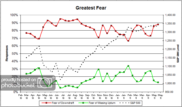
Chart 1: Greatest Fear. From survey to survey, the S&P was down fractionally (-0.5%). Client fear levels nudged higher from 85% to 88%, which is what we would expect to see. On the other side, the missing opportunity group fell from 15% to 12%.

Considering how big the fear move was the round before, we expected to see these type of numbers. Despite the S&P’s 2-year performance track record (hint: it’s up nearly +30% since June of 2010), client fear levels hover near 90% on a measly -2% pullback from survey to survey. Andy’s weekly “Fund Flows” posts also back this up, with client assets still flooding into taxable bond funds (fear).

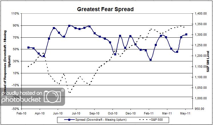
Chart 2. Greatest Fear Spread. Another way to look at this data is to examine the spread between the two groups. The spread edged higher this round from 70% to 75%.

Question 2. Based on their behavior, how would you rate your clients’ current appetite for risk?

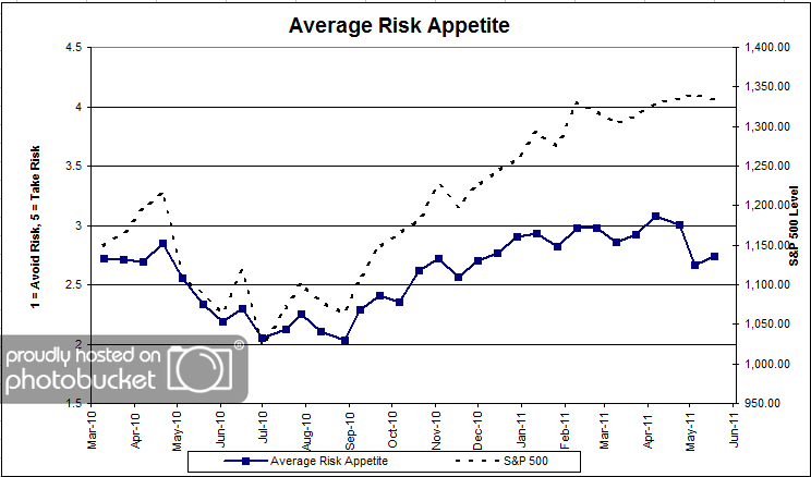
Chart 3: Average Risk Appetite. Average risk appetite bounced slightly this round, from 2.66 to 2.73. We saw a significant decline in client risk appetite last round, despite the market moving higher. This could be a case of minor mean reversion, as clients settle into a new risk profile in light of the big, bad scary pullback. We’re still well off the recent all-time risk appetite highs.

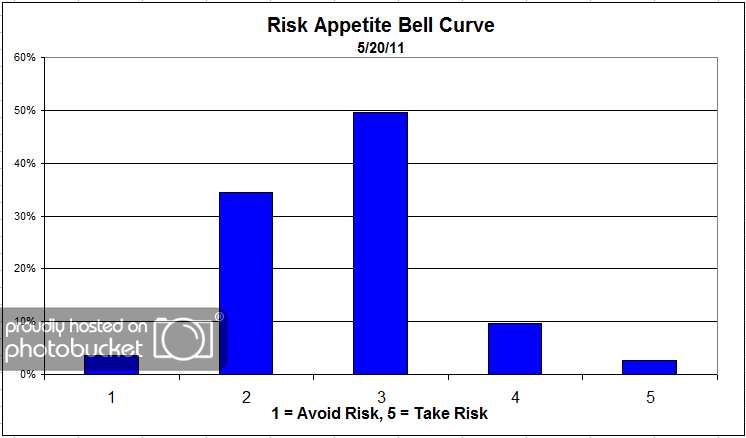
Chart 4: Risk Appetite Bell Curve. This chart uses a bell curve to break out the percentage of respondents at each risk appetite level. Here we see the majority of clients are looking for moderate to less risk, as evidenced by the large percentage of 2′s and 3′s.

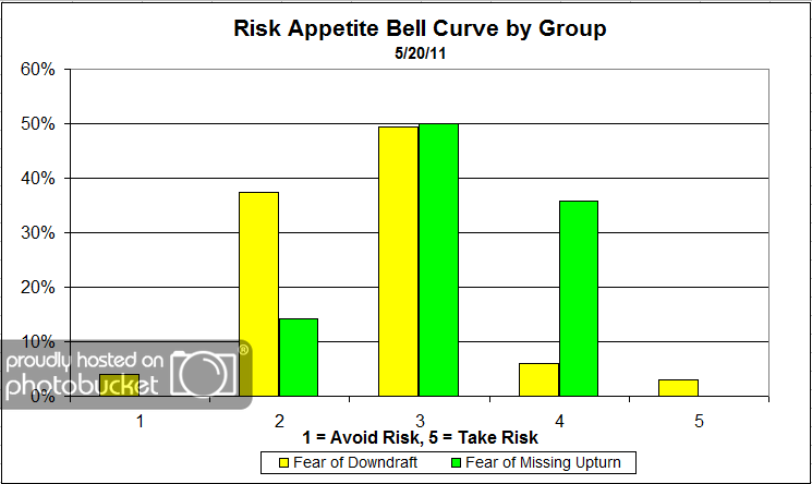
Chart 5: Risk Appetite Bell Curve by Group. The next three charts use cross-sectional data. This chart plots the reported client risk appetite separately for the fear of downdraft and for the fear of missing upturn groups. We had a few outliers in the fear camp who were looking for a risk appetite of 5. Are those mis-clicks or trolling on the part of survey takers? Because there was more than just 1 respondent doing that, I’m going to guess that there are people who are afraid of losing money, but also want a risk appetite of 5. Other than those few participants, the rest of the bell curve sorts out normally, with the fear group wanting less risk and the opportunity group wanting more risk.

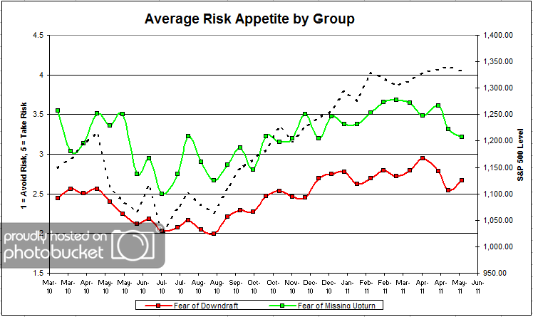
Chart 6: Average Risk Appetite by Group. Here we can see that the overall risk appetite number’s bounce probably came from the fear group, which jumped from 2.54 to 2.66. The opportunity group’s risk fell, which is what we expect to see when the market falls. This particular chart has a history of being more volatile than the others, and also bucking the usual trend.

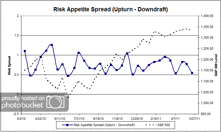
Chart 7: Risk Appetite Spread. This is a spread chart constructed from the data in Chart 6, where the average risk appetite of the downdraft group is subtracted from the average risk appetite of the missing upturn group. The spread fell moderately this round but seems to be sticking within a fairly stable range.

This round, the market fell fractionally from survey to survey, and fear levels continued to rise. The S&P 500 is up around 30% in less than a year, but still almost 90% of clients are more afraid of losing money than missing a rally. As we see in the weekly Fund Flows post by Andy, clients are still in total fear and safety mode, adding assets to taxable bond funds at a rate of 3:1 over others. Once the market has rallied +XYZ%, we will inevitably see a huge swing towards opportunity and risk, but we aren’t there yet.

No one can predict the future, as we all know, so instead of prognosticating, we will sit back and enjoy the ride. A rigorously tested, systematic investment process provides a great deal of comfort for clients during these types of fearful, highly uncertain market environments. Until next time, good trading and thank you for participating.
Your Personal Inflation Rate

May 31, 2011

I was just made aware of an incredibly cool website called the Khan Academy, which offers short educational videos on a variety of topics from Calculus to Biology to Quantitative Easing. I just watched this discussion of inflation and the construction of the CPI index. The video does a great job of explaining some of the nuts and bolts of the CPI index’s construction. Above all, you will walk away realizing that YOUR inflation rate could be wildly different than that reflected by CPI. For example, if healthcare costs make up more than 6.39% of your disposable income, then CPI may be understating your inflation rate. Furthermore, for those of us who will be sending multiple children to college our inflation rate is likely significantly higher than CPI (education costs are only a 3% weight in CPI).

This is a crucial topic to have a handle on when devising an asset allocation since maintaining purchasing power for YOU may mean needing to earn much more than the 3.2% currently reflected by CPI. This is useful information because it should inform the types of investments you choose as well as the amount of money that you will need to save.

Image source: Anyiko


Strategic Asset Allocation Bites

May 31, 2011

For the record, I love Christine Benz at Morningstar. She writes great articles that are accessible and informative, and often with a non-traditional take on things. That’s why I’m so disappointed with her recent article on asset allocation for retirement. In fact, articles like this make me crazy.

Selecting a stock and bond mix is just a way to try to target volatility. (Even asset class volatilities can vary over time, so it’s not a perfect solution. But volatilities tend to be reasonably stable, so I can buy into the idea of volatility buckets.) But traditional asset allocationists often make much broader claims. Here are all of the things that typical strategic asset allocation cannot do:

1) It can’t help you predict what your returns will be. It can tell you what your returns would have been in the past, but that has no effect on what returns will look like in the future. Most asset allocations simply assume that equity returns will always be positive and somewhere around the historical norm. That’s a crucial problem because most asset allocations count on the equity returns to drive overall growth.

2) It can’t help you predict your risk level. Volatility might be somewhat predictable, but risk is a different animal. You can’t eat low volatility if it turns out you did not invest in assets with good returns.

3) It cannot make the investing process predictable. Everyone wants certainty. As long as historical norms continue, it seems like the process is fairly predictable. If there is a paradigm shift, you will quickly realize it was not. Markets are not predictable. The primary function of strategic asset allocation seems to be to generate really nice-looking pie charts.

Yet many, many articles contain these sorts of homilies about asset allocation:

Most experts agree that your retirement portfolio’s asset allocation-its mixture of stocks, bonds, and cash-will have the biggest impact on how much it grows, as well as its risk level. Unfortunately, retirement savers seeking guidance on what an appropriate asset allocation may have a hard time knowing where to look. Sure, you could certainly do worse than adopting Jack Bogle’s simple formula: 100 minus your age equals how much you should hold in stocks. But what if you want to come at the problem with a greater sense of precision?

Morningstar’s Asset Allocator tool provides another, goal-based view of asset allocation, harnessing your own portfolio information if you’ve saved one on Morningstar.com. The tool calculates how likely you are to meet financial goals based on your current portfolio value, monthly investments, time horizon, and asset mix, and is useful for fine-tuning your allocation.

I’m not trying to pick on Morningstar. Their strategic asset allocation tool, I’m sure, is as good as anyone else’s. The point is that all of the tools are flawed because their fundamental premise is flawed: they rely completely on historic return streams being repeated in one fashion or another. If you were a Japanese investor in 1990 working with 40 years of data (1950 - 1990) to construct a strategic asset allocation for your retirement, it would no doubt include a large equity component because historic equity returns had been both large and positive for a long period of time. Asset allocation steered you directly into a disaster. Since we know this has already happened in other markets, why do we continue to court disaster here? Do you really believe that other markets can go down, but not the US? Why would you continue to use a tool that you know will eventually fail?

After all, it’s not as if alternatives do not exist. There are various kinds of dynamic asset allocation to choose from. Tactical asset allocation using relative strength is just one form; other analysts try to forecast returns based on asset valuation or to rebalance across asset classes when sentiment gets too one-sided. How well something works is often a function of how well it is implemented, but no one can make a failed process work regardless of how cleverly it is implemented. I urge you to rethink your asset allocation methodology before it bites you in the ass. If your asset allocation is not responsive to actual price changes, it is pretty much useless.

A Regretful Strategic Asset Allocator


Weekly RS Recap

May 31, 2011

The table below shows the performance of a universe of mid and large cap U.S. equities, broken down by relative strength decile and quartile and then compared to the universe return. Those at the top of the ranks are those stocks which have the best intermediate-term relative strength. Relative strength strategies buy securities that have strong intermediate-term relative strength and hold them as long as they remain strong.

Last week’s performance (5/23/11 – 5/27/11) is as follows:

High relative strength stocks outperformed by a wide margin last week as the top quartile outperformed the universe by 87 basis points.

Materials and Energy were particularly strong last week.