Raging Bull

August 31, 2011

This from First Trust’s chief economist Brian Wesbury, by way of Real Clear Markets:

We use a capitalized profits model to value stocks, dividing corporate profits by the 10-year Treasury yield. We compare the current level of this index to that from each quarter for the past 60 years to estimate an average fair-value. Not only are 10-year yields low (2.2%), but corporate profits are growing strongly. As a result, and hold onto your hats, this top down model says that the fair-value for the Dow is currently 40,000.

However, we think the Treasury market is in a bubble. So, instead of a 2.2% yield, we use a more conservative discount rate of 5% for the 10-year Treasury. This generates a “fair value” of 18,500 on the Dow and 1,940 for the S&P 500. In other words, the US equity markets are currently undervalued by about 65%.

So what does our model say if profits revert to the historical mean of about 9.5% of GDP? Even in that scenario, and assuming a 5% yield on the 10-year Treasury, equities are about 21% undervalued, with fair value at 1430 for the S&P 500 and 13,700 for the Dow.

The problem with this scenario is that it takes the worst of both worlds: a major decline in profits and a surge in interest rates. In the real world, a large decline in profits would normally be accompanied by a drop in bond yields. In other words, our model says the risk of investing in equities today is very low.

I have no idea if he is right or not, but I feel better after reading it! Market sentiment has been so negative lately that I think I just like reading something where we aren’t all on the way to hell in a handbasket.

Source: caglecartoons.com

Posted by:


Paradigm Shift?

August 31, 2011

Treasury debt has always been considered the safest debt you can buy. The bond market convention is to price debt in basis points over Treasurys. Even though Treasury yields are obscenely low, the last go-round saw a few corporates trade through Treasurys to a lower yield!

Now, it appears that market participants think the default risk on Treasurys is higher than the default risk on some high grade corporate debt. Clusterstock reported on Gillian Tett’s original article in the Financial Times:

Tett argues that multinational “American” companies may really be better bets than the sovereign government of the U.S. for two reasons: overseas diversification and transparency.

While CDS are not always the most accurate methods of assessing a credit bet, the cost of insuring U.S. debt exceeds the cost of insuring the debt of 70 different companies based in the U.S. Not to mention the fact that S&P’s has maintained the AAA-ratings of Automatic Data Processing, ExxonMobil, Johnson & Johnson, and Microsoft.

First of all these companies are more easily able to hedge their bets against economic downturn because they can transfer their funds overseas. Second, their finances are far more transparent and less politically volatile (ehem, debt ceiling) than those of the U.S.

So not only are the companies safer than the Treasury—there might even be a good reason for it. That’s quite a paradigm shift. Theoretically this shouldn’t happen. The US government has the ability to levy taxes to pay its debt; corporations are dependent on the goodwill of their customers.

Fixed income valuation models predicated on pricing over Treasurys would conclude the Treasurys are drastically undervalued relative to corporates—but what if they’re not? What if this turns out to become a common condition, as it has in several European countries?

Counting on things to revert to historical relationships is dangerous. You could be right, or spectacularly wrong if a paradigm shift is underway. Systematic use of relative strength seems safer to me because it does not make any assumptions about relationships between and among financial instruments.

Posted by:


High RS Diffusion Index

August 31, 2011

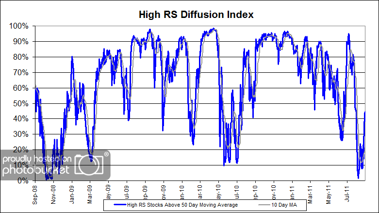
The chart below measures the percentage of high relative strength stocks that are trading above their 50-day moving average (universe of mid and large cap stocks.) As of 8/30/11.

HighRSddfff High RS Diffusion Index

After reaching the deeply oversold level of 2% on August 8th, this index has snapped back in a big way. The 10-day moving average of this index is 21% and the one-day reading is 44%. Dips in this index have often provided good opportunities to add money to relative strength strategies.

Posted by:


In Defense of “Chart Strength”

August 30, 2011

We’ve found another delusional-technical analysis hater. Jeff Nielson writes:

However, readers are right to be skeptical about the “chart strength” that gold has demonstrated. As I continually remind people, “technical analysis” is the least significant aspect of market analysis. This will naturally enrage the “T/A jockeys”, who like to pretend that technical analysis is all-powerful — simply because it is fast and easy, and requires no genuine comprehension, other than the ability to spot patterns in pictures.

This complete reliance upon charts rather than fundamentals is more than merely simplistic, it is dangerous. This is due to the fact that all technical analysis is based upon a long list of assumptions — all of which must be true, or all statistical validity of such analysis instantly evaporates. Thus, the appropriate way to demonstrate the “unsinkable” status of gold is through fundamentals-based analysis rather than statistical hocus pocus. It is here that gold shines even brighter.

Clearly, Mr. Nielson has a very limited/incorrect view of technical analysis. I challenge anyone to read this, this, and this and still conclude that relative strength is not effective over time. There may be many technical (and fundamental) investment methodologies that can not be statistically demonstrated to work over time, but there is no need to throw the baby out with the bath water.

 In Defense of Chart Strength

Posted by:


Forecasting Follies

August 30, 2011

Bill Gross has a tremendous long-term track record in the fixed income markets. Even legends, however, can have feet of clay. A recent Wall Street Journal article discusses how Mr. Gross wrongly forecast that Treasury yields would surge when quantitative easing ended. Instead, the economy slowed and Treasury prices surged.

Forecasting is a mug’s game. Even skilled, experienced forecasters can get things completely wrong. This is why we use a trend following approach driven by relative strength. There are no slam dunks in financial markets—nothing is easy. Your best bet is often just to go with the trend, until it ends.

As a result, several of our global tactical asset allocation portfolios have fixed income exposure, even though philosophically (or mathematically) we are not any more comfortable with bonds here than Mr. Gross. In fact, Mr. Gross may prove to be right down the road—but it’s also possible that we will see a Japan-like scenario where bonds hold their value for a long time. We’re not about to guess (i.e. forecast). When fixed income is highly rated on our relative strength models we’ll own it, and happily sell it if the rank weakens.

As the old saying goes, “The tree that bends to the wind does not break.”

Disclosure: Dorsey, Wright Money Management has positions in TIP, WIP, AGG, IEF, and BSV in various global tactical allocation accounts.

Posted by:


What’s Hot…and Not

August 30, 2011

How different investments have done over the past 12 months, 6 months, and month.

1PowerShares DB Gold, 2iShares MSCI Emerging Markets ETF, 3iShares DJ U.S. Real Estate Index, 4iShares S&P Europe 350 Index, 5Green Haven Continuous Commodity Index, 6iBoxx High Yield Corporate Bond Fund, 7JP Morgan Emerging Markets Bond Fund, 8PowerShares DB US Dollar Index, 9iBoxx Investment Grade Corporate Bond Fund, 10PowerShares DB Oil, 11iShares Barclays 20+ Year Treasury Bond

Posted by:


Podcast #17 Different is Good

August 30, 2011

Podcast #17 Different is Good

Mike Moody, Harold Parker, and Andy Hyer

“If you want to have better performance than the crowd, you must do things differently from the crowd.” — Sir John Templeton

Posted by:


Weekly RS Recap

August 29, 2011

The table below shows the performance of a universe of mid and large cap U.S.equities, broken down by relative strength decile and quartile and then compared to the universe return. Those at the top of the ranks are those stocks which have the best intermediate-term relative strength. Relative strength strategies buy securities that have strong intermediate-term relative strength and hold them as long as they remain strong.

Last week’s performance (8/22/11 – 8/26/11) is as follows:

Huge week for the market and even better for high relative strength securities.

Posted by:


Dorsey, Wright Client Sentiment Survey - 8/26/11

August 26, 2011

Here we have the next round of the Dorsey, Wright Sentiment Survey, the first third-party sentiment poll. Participate to learn more about our Dorsey, Wright Polo Shirt raffle! Just follow the instructions after taking the poll, and we’ll enter you in the contest. Thanks to all our participants from last round.

As you know, when individuals self-report, they are always taller and more beautiful than when outside observers report their perceptions! Instead of asking individual investors to self-report whether they are bullish or bearish, we’d like financial advisors to weigh in and report on the actual behavior of clients. It’s two simple questions and will take no more than 20 seconds of your time. We’ll construct indicators from the data and report the results regularly on our blog–but we need your help to get a large statistical sample!

Click here to take Dorsey, Wright’s Client Sentiment Survey.

Contribute to the greater good! It’s painless, we promise.

Posted by:


Should You Fear the New Normal?

August 26, 2011

This is a phrase popularized by the folks at PIMCO to denote a long period of slow economic growth and subpar equity returns. Forbes described their outlook like this:

According to the Pimco party line, those implications are rather grim for the U.S. A year ago Gross told FORBES that our future will likely include a lowered living standard, high unemployment, stagnant corporate profits, heavy government intervention in the economy and disappointing equity returns. Nor, with interest rates already low, can investors expect much from bonds, other than their mediocre coupons.

PIMCO is not the only firm in this camp. Other observers have talked about forward-looking returns for the stock market in the 5% range for the next decade. Here’s John Hussman in a recent commentary:

As a result of last week’s decline, the S&P 500 ended Friday priced, by our estimates, to achieve an average annual 10-year total return of about 4.9%, which is an improvement from the 3.4% level we observed a few months ago, but is nowhere near what would reasonably be viewed as undervalued.

Other observers on valuation are a little less pessimistic, like Jeremy Grantham at GMO, who is looking for returns that might average 8% for the next decade.

Another guru is Aswath Damodaran of NYU, who authored a common textbook on valuation. He wrote recently:

I am not much of a market timer but there is one number I do track on a consistent basis: the equity risk premium. I follow it for two reasons. First, it is a key input in estimating the cost of equity, when valuing individual companies. Second, it offers a window into the market mood, rising during market crises.

For the ERP to play this role, it has to be forward looking and dynamic. The. conventional approach of looking at the past won’t accomplish this. You can however use the current level of the index, with expected cashflows, to back out an expected return on stocks. (Think of it as an IRR for equities.) You can check out the spreadsheet that does this, on my website (http://www.damodaran.com) on the front page.Here is the link for the July 1 spreadsheet. Just replace the index and T.Bond rate with the current level and use the Goal seek in excel:
http://pages.stern.nyu.edu/~adamodar/pc/implprem/ERPJune11.xls

A little history on this “implied ERP”: it was between 3 and 3.5% through much of the 1960s, rose during the 1970s to peak at 6.5% in 1978 and embarked on a two decade decline to an astoundingly low 2% at the end of 1999 (the peak of the dot com boom). The dot com correction pushed it back to about 4% in 2002, where it stagnated until September 2008. The banking-induced crisis caused it to almost double by late November 2008. As the fear subsided, the premium dropped back to pre-crisis levels by January 2010. I have the month-by-month gyrations on my site, also on the front page. http://pages.stern.nyu.edu/~adamodar/pc/implprem/ERPbymonth.xls

Now, to the present. The ERP started this year at 5.20% and gradually climbed to 5.92% at the start of August. Today (8/8/11) at 11.15 am, in the midst of market carnage, with the S&P 500 at 1166 and the 10-year T. Bond at 2.41%, the implied ERP stood at 6.62%.

In this case, the expected return on stocks would be about 9.03% (2.41% plus an equity risk premium of 6.62%).

Why am I bringing all of this up, as I am clearly no expert on valuation or value investing? Well, for a couple of reasons. First, these commentators are largely driven by data, not opinions. Both Hussman and Damodaran, for example, have long-standing models and they change their minds when the data changes. Second, even within the camp that uses robust valuation models, there is quite a range of expectations. Hussman’s model suggests that the market is not undervalued, but Damodaran’s work shows the equity risk premium at multi-decade highs.

That the new normal will happen is no slam dunk, but it’s certainly not out of the question. After all, equity market returns have been extremely anemic over the last ten years and Japan’s experience shows that such a situation can last for much longer than anyone expects. The prospect of another decade of lousy returns is discouraging enough to keep many investors on the sidelines.

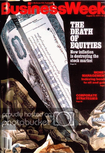
To help understand what the new normal might mean for relative strength investors, J.P. dug into US stock market data from the 1968-1982 period. This period is roughly analogous to our current markets, at least perhaps psychologically. 1968 saw a bear market for speculative names (2000-02), followed by a mega-bear market in 1973-74 in which blue chips got torched as well (2008). The public was turned off to stocks in general, culminating in disgust with the 1979 “Death of Equities” Business Week cover. The S&P 500 total return for the period was 7.2% annualized. Prices barely moved, but dividend yields were reasonably high and accounted for more of the total return than capital appreciation.
DeathofEquities Should You Fear the New Normal?

To get a robust estimate for relative strength returns during this period, J.P. went to the database of Ken French at Dartmouth. He looked at returns for portfolios formed from the top half of market capitalization (large cap) and the top third in relative strength. Dr. French constructs his relative strength ranks by calculating the 12-month trailing return, less the return of the most recent month. The portfolio is rebalanced each month with any new names. (Incidentally, this is the same model used by the AQR Momentum Fund.)
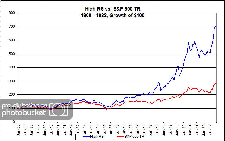
SPTR1982 Should You Fear the New Normal?

Source: Dorsey, Wright Money Management

As you can see, the new normal is not necessarily a problem for a disciplined relative strength investor. Although market returns were 7.2% annualized, the high relative strength segment returns were about 13.9% per year. It may be fashionable to talk gloom and doom, but the data is clear that good returns are still available in some segments of the market—even if the broad indexes don’t go anywhere.

Note: this chart may well understate the high RS returns, since Dr. French’s database does not incorporate total returns. Looking at price returns only, the comparison would be 13.9% annually for high RS and 2.3% annually for the market.

Posted by:


Sector and Capitalization Performance

August 26, 2011

The chart below shows performance of US sectors and capitalizations over the trailing 12, 6, and 1 month(s). Performance updated through 8/25/2011.

Posted by:


Fund Flows

August 25, 2011

The Investment Company Institute is the national association of U.S. investment companies, including mutual funds, closed-end funds, exchange-traded funds (ETFs), and unit investment trusts (UITs). Members of ICI manage total assets of $11.82 trillion and serve nearly 90 million shareholders. Flow estimates are derived from data collected covering more than 95 percent of industry assets and are adjusted to represent industry totals.

I suspect that some of the reason for the positive flows into equity funds last week has to do with investors’ relief that the financial markets did not cease to exist in the aftermath of the debt-ceiling debate. There had been so much fear mongering leading up to that deadline that fund investors pulled over $23 billion from domestic equity funds two weeks ago.

Posted by:


Quote of the Week

August 24, 2011

A market is the summation of the decisions of its participants. Markets are inefficient because the participants are inefficient. Thus, the participant with superior emotional control has a decisive advantage. -Cullen Roche, Pragmatic Capitalism

How does one develop the emotional control to trade in a disciplined manner? I’m sure there are plenty who could delve into different techniques to build up your emotional muscles. However, we prefer just to run things systematically. That way we leave the emotions out of it.

Posted by:


High RS Diffusion Index

August 24, 2011

The chart below measures the percentage of high relative strength stocks that are trading above their 50-day moving average (universe of mid and large cap stocks.) As of 8/23/11.

After reaching the deeply oversold level of 2% on August 8th, this index has risen some. The 10-day moving average of this index is 13% and the one-day reading is 18%. Dips in this index have often provided good opportunities to add money to relative strength strategies.

Posted by:


Hanging on for Dear Life

August 23, 2011

2008 was a tremendously challenging market. Volatility was extraordinarily high and the alarming news coverage—and the reality of the credit crisis—was enough to shake almost anyone’s confidence. The rewards to hanging on, however, were tremendous. A Fidelity study of 401k participants reported on Marketwatch found the following:

For 401(k) investors who kept with their equity allocation and continued to contribute to their plan as the financial markets went into free-fall in late 2008, their average account balance grew by 64% in the period from Oct. 1, 2008, through June 30, 2011, according to a Fidelity Investments study published Thursday.

But the average account balance grew just 2% in that time period for retirement savers who moved their money entirely out of equities between Oct. 1, 2008 and March 31, 2009 — and stayed out of equities through June 2011,
according to Fidelity’s study of 7.1 million 401(k) people who participated in the plans it manages from Oct. 1, 2008 through June 30, 2011.

Some savers exited equities during the 2008 downturn, but then jumped back in at some point: Their account balances grew by 25% on average. The percentage change in average account balance includes both the workers’ contributions plus market gains or losses.

Yes, jumping back in helped somewhat—but neither jumping back in or staying out entirely worked as well as just staying the course.

We advocate tactical asset allocation, which we think has some advantages over a straight buy-and-hold approach. What the Fidelity study demonstrates, I think, is that even buy-and-hold may be preferable to emotional asset allocation. Your gut is a poor investment guide. Investors who ignored the news and just kept contributing to their savings plans did much better than investors who panicked and bailed out.

Unless you have some kind of systematic plan to handle the ups and downs of the market—and reacting emotionally is not a plan—you are probably better off just sitting on your hands.

Hanging on for Dear Life

Source: www.sportsillustrated.cnn.com

Posted by:


Transparency

August 23, 2011

This might really be the public’s view of what goes on at a hedge fund—and at least at some, like Galleon, maybe it was uncomfortably close to the truth.

Source: Scott Adams, www.dilbert.com

Our Global Macro separate account, on the other hand, uses ETFs and is completely transparent. It doesn’t use leverage, but can rotate among a broad range of assets. I think an argument can be made that it is a reasonable substitute for a hedge fund in the part of your portfolio dedicated to alternative assets.

To obtain a fact sheet and prospectus for the Arrow DWA Tactical Fund (DWTFX), click here.

To receive a brochure for our Systematic RS portfolios, please click here. Click here for disclosures from Dorsey Wright Money Management. Past performance is no guarantee of future results.

Posted by:


Ignorance is Bliss

August 23, 2011

…at least when it comes to financial news. We’ve all had clients that are Nervous Nellies. They call after every 4% correction or about every bad economic data release. Although they are invested in the market, it seems like they are always looking for a reason to sell and to be gloomy about the prospects for the future. Every financial advisor also knows that Gloomy Gus never makes any money.

The clients who tend to make money always seem like the ones who are checked out. When they call they seem more interested in talking about their family or their latest travels. They never ask about random CNBC news stories. Sometimes you wonder whether they are even opening their statements.

It turns out that clients who ignore financial news are wise. Time carried an article that discussed this counterintuitive finding:

A landmark Harvard study of investment habits (which my TIME Moneyland colleagues Gary Belsky and Tom Gilovich cite in their book) famously found that investors who consumed no financial news earned better returns than investors who were fed a constant stream of it. And the results were even more dramatic with regard to volatile stocks: In those cases, investors who learned nothing about their stock earned more than twice as much money as those whose trades were influenced by the media.

I put the awesome parts in bold. Ignoring the news kept emotions from interfering with good decision-making. And refusing to learn anything about their stocks ensured that whatever they owned was just another ticker symbol, not something in which they had an emotional investment. More than likely they judged the stock by its performance instead of its media profile.

Before you scoff at the poor, uninformed investors who don’t know what they are missing, think about this: they made twice as much money as the “informed” investors. Twice as much.

These investors may not know anything about the stocks they own, but they certainly know about the corrosive effect of emotions on the investment process. There is a good reason that our investment approach is systematic and not discretionary. If you knew you could make twice as much money by turning off CNBC, could you do it?

Posted by:


Dorsey, Wright Client Sentiment Survey Results - 8/22/11

August 22, 2011

Our latest sentiment survey was open from 8/12/11 to 8/19/11. The Dorsey, Wright Polo Shirt Raffle continues to drive advisor participation, and we greatly appreciate your support! This round, we had 100 advisors participate in the survey. If you believe, as we do, that markets are driven by supply and demand, client behavior is important. We’re not asking what you think of the market—since most of our blog readers are financial advisors, we’re asking instead about the behavior of your clients. Then we’re aggregating responses exclusively for our readership. Your privacy will not be compromised in any way.

After the first 30 or so responses, the established pattern was simply magnified, so we are comfortable about the statistical validity of our sample. Most of the responses were from the U.S., but we also had multiple advisors respond from at least three other countries. Let’s get down to an analysis of the data! Note: You can click on any of the charts to enlarge them.

Question 1. Based on their behavior, are your clients currently more afraid of: a) getting caught in a stock market downdraft, or b) missing a stock market upturn?

greatestfear 35 Dorsey, Wright Client Sentiment Survey Results   8/22/11

Chart 1: Greatest Fear. From survey to survey, the S&P fell -8.8%, and fear levels actually dropped. This week, the survey results went completely opposite of what we would expect to happen. Fear levels dropped from 88% to 79% survey to survey. On the flip side, the missed opportunity camp rose from 12% to 21%.

spread222 Dorsey, Wright Client Sentiment Survey Results   8/22/11

Chart 2. Greatest Fear Spread. Another way to look at this data is to examine the spread between the two groups. The spread fell this round from 76% to 58%.

Question 2. Based on their behavior, how would you rate your clients’ current appetite for risk?

avgriskapp 28 Dorsey, Wright Client Sentiment Survey Results   8/22/11

Chart 3: Average Risk Appetite. Same as the overall fear numbers, average client sentiment actually rose in the face of a market meltdown. We have no explanation for why this happened! Average risk appetite rose from 2.31 to 2.49.

riskappbellcurve 22 Dorsey, Wright Client Sentiment Survey Results   8/22/11

Chart 4: Risk Appetite Bell Curve. This chart uses a bell curve to break out the percentage of respondents at each risk appetite level. Low risk appetite dominated this round, with the majority of respondents answering 2 and 3.

riskappbellcurvegroup 11 Dorsey, Wright Client Sentiment Survey Results   8/22/11

Chart 5: Risk Appetite Bell Curve by Group. The next three charts use cross-sectional data. This chart plots the reported client risk appetite separately for the fear of downdraft and for the fear of missing upturn groups. This chart also sorts out pretty much as expected, with the fear group wanting less risk and the opportunity group wanting more. Neither camp seems to be able to stomach a risk appetite of 5 yet.

avgriskappgroup 19 Dorsey, Wright Client Sentiment Survey Results   8/22/11

Chart 6: Average Risk Appetite by Group. In line with the other indicators from this report, the average risk appetite by group bucked the hypothesis, as both groups wanted to add more risk.

riskappspread 28 Dorsey, Wright Client Sentiment Survey Results   8/22/11

Chart 7: Risk Appetite Spread. This is a spread chart constructed from the data in Chart 6, where the average risk appetite of the downdraft group is subtracted from the average risk appetite of the missing upturn group. The spread continued its move higher this round.

What a doozy! We saw major market action over this survey period, and our indicators did not perform as we expected. With the market down a whopping -8% from survey to survey, we were expecting fear levels to hit all-time highs. Instead, fear levels actually dropped by a significant amount. The overall risk appetite average reflected the same thing. In the face of a major market meltdown, clients were looking to add risk and get in the market! Is this a sign that clients have turned the page…that clients have finally learned their lesson? Is this the beginning of a new era of emotional asset allocation? I’ll bet “No,” but only time can tell!

No one can predict the future, as we all know, so instead of prognosticating, we will sit back and enjoy the ride. A rigorously tested, systematic investment process provides a great deal of comfort for clients during these types of fearful, highly uncertain market environments. Until next time, good trading and thank you for participating.

Posted by:


Abnormal Volatility?

August 22, 2011

Is the market volatility over the past decade higher than that seen historically? Apparently, not so:

Brightman said the annualized standard deviation of monthly stock-market returns was 15% for the past decade, up from about 10% in the 1990s and 1960s. Still, he said, “the average recent volatility of 14% to 15% is only slightly higher than the 13% to 14% level during the 1970s and 1980s.” Since 1831, the average is 14.5%.

-MarketWatch, Aug. 16, 2011

It always feels like the present must be so much different than the past, but in terms of volatility, it’s just not the case. Markets are always full of both opportunity and peril. There’s no need to wait for the stars to align before getting serious about your investment plan. Of course you should allocate a sufficient percentage of your earnings to liquid investments to be able to weather the inevitable economic storms, but in order to preserve purchasing power throughout your potentially long life, you must realize that the biggest long-term threats to your financial health are inadequate savings and inflation, not volatility.

financial markets 1 Abnormal Volatility?

Source: Druta Soutions

Posted by:


Stock Analysts Dig in Heels When They’re Wrong: Study

August 22, 2011

So reads the headline of an instructive article in Financial Planning. It turns out that analyst’s egos get involved and they actively work at ignoring contrary evidence. My background is in psychology, and from that vantage point, behavior like this looks like a classic case of confirmation bias.

Beshears’ and Milkman’s paper, “Do Sell-Side Stock Analysts Exhibit Escalation of Commitment?” appeared in the Journal of Economic Behavior and Organization.

The duo studied a database with more than 6,200 analysts’ quarterly forecasts on about 3,500 companies over more than 18 years, from 1990 to 2008. The results may pop another hole in the idea of rational markets.

“There’s mounting evidence to suggest that the market does not always get it right,” Beshears said. “This is one piece of the puzzle.”

Among their specific findings:

- As analysts got more and more extreme, or “out-of-consensus,” they became less and less responsive to the new earnings information when revising their full-year forecasts.

The psychological biases that help shape market participants’ behavior have been noted in previous research, which shows that when people make decisions that turn out to be wrong, they try to justify them. They are reluctant to back down because they may have invested time, money and effort into a decision and they also wish to be vindicated, Beshears said.

And so one more brick comes out of the Efficient Markets wall. I’m not sure how much more evidence needs to “mount” before they decide the whole foundation is rotted, but regime change is a slow process I guess!

Although analysts exhibit stubborness in an attempt to protect their egos, price shows no such reluctance to change! Relative strength relies on price activity, not opinions.

I'm not changing my estimates!

Source: www.superstock.com

Posted by:


Good Advice on Retirement Calculators

August 22, 2011

Figuring out what you need to retire is not as simple as it seems. Calculating your “number” is as straightforward as punching a few numbers into a calculator, but understanding the context of the inputs and the output is more complicated. This article from Advisor Perspectives, by way of dshort.com, is the best discussion of retirement calculators I have seen.

After covering some of the issues with assumptions, Todd Tresidder summarizes with six rules for using retirement calculators:

Below are 6 rules for getting the most value of retirement calculators and not being deceived:

  1. The Map Is Not The Territory: Never delude yourself into believing your retirement estimate is accurate. It is simply a calculated projection of the assumptions used. If any assumptions are incorrect the estimate will be similarly wrong.
  2. Walk-forward Process: Don’t perform the retirement savings goal exercise once, put it on a shelf and forget it. Instead, check back every few years and see what assumptions proved valid and which ones did not. Adjust the assumptions, recalculate, and shift your plans accordingly. Rinse and repeat every few years. This way you will hit your retirement target like a rocket ship that constantly course corrects toward its target.
  3. Errors Multiply: Small errors in estimates compound into large errors in results. Retirement savings are built and spent over multiple decades. A 2% error in inflation or investment return that is manageable over 5-10 years is a complete disaster when compounded over 30-40 years. Small details make big differences so pay close attention to the details.

In short, retirement calculators should not be used as commonly practiced. You should never take a guess at the required assumptions, create a fictitious number, and plan your financial future based on it. That is a dangerous mistake even though it’s exactly what most people do.

After years of working with clients as a retirement planning coach, certain techniques have emerged that are extremely valuable in providing viable workaround solutions to the impossible-to-make assumptions. You can plan your finances into the future with confidence and security when retirement calculators are used as follows:

  1. Scenario Analysis: Use retirement calculators to test various retirement scenarios. For example, should you try to save your way to retirement with a traditional portfolio or pursue income-producing real estate as an alternative? Test both scenarios and see what the numbers indicate. How would a part-time hobby-business affect your retirement savings needs? What happens if you work 7 more years or convert your career into consulting for a phased retirement? Retirement calculators are fantastic tools for comparing the impact of various retirement planning scenarios. As you get creative applying various scenarios it usually becomes readily apparent what will work for your situation.
  2. Teach Principles: Retirement calculators are invaluable for teaching essential retirement planning principles. Users quickly grasp how real return net of inflation is the only number that matters after just a few quick scenario tests. They also see the importance of time in compounding their way to wealth versus trying to save their way to wealth. They understand how much they must save to support $1,000 per month in spending. Without a calculator these concepts are difficult to grasp, but with a calculator they become obvious for even a layman. Each lesson learned will affect how you plan your retirement.
  3. Confidence Interval: Since you can’t possibly estimate all the assumptions with accuracy, the next best thing is to use a range of plausible assumptions. Simulate one extreme by using all pessimistic assumptions like high inflation, low investment returns, and a very long life with prolonged medical expenses (just don’t have any razor blades nearby when you see the result). Then simulate the optimistic extreme with high investment returns, low inflation and a prompt, peaceful death without medical complications. You will be amazed. The pessimistic scenario can easily require 2-4 times the nest egg of the optimistic scenario. This can be a very instructive exercise for understanding the range of possibilities so you can plan accordingly.

Really, really good advice all around. You can’t just calculate your number once and then forget about it. It’s important to keep updating things as conditions evolve. Give yourself a margin of safety.


Posted by:


Federal Budget 101

August 22, 2011

This comes from an unusual source, a memo written by an attorney in Louisiana. But the analysis is really clarified by taking away all of the zeroes!

The U.S. Congress sets a federal budget every year in the trillions of dollars. Few people know how much money that is so we created a breakdown of federal spending in simple terms. Let’s put the 2011 federal budget into perspective:

  • U.S. income: $2,170,000,000,000
  • Federal budget: $3,820,000,000,000
  • New debt: $1,650,000,000,000
  • National debt: $14,271,000,000,000
  • Recent budget cut: $38,500,000,000

It helps to think about these numbers in terms that we can relate to. Let’s remove eight zeros from these numbers and pretend this is the household budget for the fictitious Jones family.

  • Total annual income for the Jones family: $21,700
  • Amount of money the Jones family spent: $38,200
  • Amount of new debt added to the credit card: $16,500
  • Outstanding balance on the credit card: $142,710
  • Amount cut from the budget: $385

I think Visa or Mastercard would have cut this family off long before they ran up $142,000 on their credit card! And a $385 cut in spending is not much when the overspending is $16,500. Being considered a AA credit might be generous.

The most amazing thing is that the US is better off than many of the countries in Western Europe.

HT: DO, HP

Posted by:


Weekly RS Recap

August 22, 2011

The table below shows the performance of a universe of mid and large capU.S.equities, broken down by relative strength decile and quartile and then compared to the universe return. Those at the top of the ranks are those stocks which have the best intermediate-term relative strength. Relative strength strategies buy securities that have strong intermediate-term relative strength and hold them as long as they remain strong.

Last week’s performance (8/15/11 – 8/19/11) is as follows:

Well, that was unpleasant. After the top quartile outperformed the bottom quartile by 4.49% two weeks ago, the top quartile gave some of that relative performance back last week, underperforming the bottom quartile by 0.57% and underperforming the universe by 1.05%.

Posted by:


Barron’s Profiles PIE

August 22, 2011

Our PowerShares DWA Emerging Markets Technical Leaders fund (PIE) received some nice coverage from Barron’s this week. The cover story is “Emerging Markets” and they had the following to say about PIE:

Of course, anyone looking to pare risk can buy an exchange-traded fund that tracks the MSCI index. The cheapest option is the Vanguard MSCI Emerging Markets fund. But the best-performing is PowerShares DWA Emerging Markets Technical Leaders fund, which is up 12.7% over the last 12 months and has fallen only 4.1% since Jan. 1. PowerShares owns just 100 stocks, but they are spread out across the Dorsey Wright Emerging Markets Technical Leaders Index, from Russia to Peru. That shows high conviction in markets as turbulent as these.

emgmkts Barrons Profiles PIE

See www.powershares.com for more information about PIE.

Posted by:


When Cash Isn’t Safe

August 19, 2011

Marc Faber on why the conventional wisdom of going to cash for safety might not be too wise:

Given his bleak assessment of the U.S. dollar, it’s no surprise that Faber doesn’t recommend holding cash as a long-term cushion against portfolio shocks.

“It would be very dangerous to say ‘I don’t trust stocks, gold, real estate, I want to keep my money in cash.’ That’s a way to end up losing a lot of money,” Faber said.

Specifically, the problem in Faber’s view is the loss of purchasing power as inflation whittles away the value of money.

“We’re in a paradoxical situation where under a traditional monetary system the safest places are cash, Treasury deposits, government bonds,” Faber said. Nowadays, he noted, “they have been made by monetization into the most unsafe assets from a longer term perspective.

“Weak economies usually have higher inflation rates than stronger economies,” Faber added. “In weak economies you have loose fiscal policies and money printing. And the U.S. is the world champion in loose monetary policies. I don’t believe a single word of what the Bureau of Labor Statistics is printing about inflation figures.

dollar 3 300x133 When Cash Isnt Safe

Posted by: