The Real Goal of Forecasting

September 19, 2011

The Wall Street Journal had an article on forecasting a while back, partly highlighting how bad forecasts typically were. When I re-read it, one of the things that struck me was the following quote:

Sometimes forecasting isn’t even about the future, some researchers say. The true goals of some predictions, says Kesten Green, a forecasting researcher at Monash University in Melbourne, Australia, include lighting a fire under the sales force or alarming the public into some sort of action.

That’s very true in the public policy arena when someone has an axe to grind. In the financial markets, it seems like the forecasts are often designed just to get attention. If your goal is “hey, look at me,” it’s understandable why some of the forecasts are so extreme. The more in tune with public sentiment and the crazier the forecast is, the more attention it gets.

With public confidence in the financial market very low right now, no one wants to hear about a Dow 36,000 forecast—but a Dow 6,000 forecast will have lots of eager listeners. Is that really forecasting or is it just pandering?

You can always make an articulate case for whatever you want, if you selectively choose data and interpret it liberally. That doesn’t make it correct. While it is sometimes interesting to contemplate what might happen, no one really knows. And often, worrying about what might happen keeps investors from acting in the here and now.

We think the market is so incredibly complex that it is not possible to make consistently accurate forecasts. As a result, we rely on an adaptive process that modifies portfolio holdings as conditions evolve. That way the portfolio is based on what is actually happening, as opposed to what may or may not happen in the future.

Posted by:


The Return of Stagflation?

September 19, 2011

The term stagflation is a holdover from the 1970s, a period of sluggish economic growth and relatively high inflation. With falling inflation and strong economic growth over the past couple of decades, stagflation has been forgotten. My memory of stagflation was roused when I read an article in Bloomberg with these items scattered throughout the story:

The cost of living in the U.S. rose more than forecast in August as consumers paid more for food, energy and housing.

The consumer-price index increased 0.4 percent after a 0.5 percent gain in July, figures from the Labor Department showed today in Washington.

The rise in commodity prices earlier this year prompted some companies such as Lowe’s Cos. to pass on the higher costs at a time when Americans’ wages are stagnating. Federal Reserve Chairman Ben S. Bernanke last week said inflation was likely to moderate as some price increases prove “transitory.”

“There has been more momentum in underlying inflation than many had expected,” Jeremy Lawson, a senior U.S. economist at BNP Paribas in New York.

Applications for U.S. unemployment benefits unexpectedly rose last week to the highest level since the end of June, underscoring a struggling labor market, the Labor Department also said. Jobless claims climbed by 11,000 to 428,000 in the week ended Sept. 10 that included the Labor Day holiday.

The Federal Reserve Bank of New York reported manufacturing in the region contracted at a faster pace in September. The Federal Reserve Bank of New York’s general economic index dropped to minus 8.8, the weakest reading since November, from minus 7.7 in August.

Hmm…inflation higher than forecasted, growth lousy. That’s the general recipe for stagflation, which we might end up hearing about again. From Wikipedia:

In economics, stagflation is a situation in which the inflation rate is high and the economic growth rate is low. It raises a dilemma for economic policy since actions designed to lower inflation may worsen economic growth and vice versa. The portmanteaustagflation is generally attributed to British politicianIain Macleod, who coined the phrase in his speech to Parliament in 1965.[1][2][3][4]

The concept is notable because, in Keynesian macroeconomic theory which was dominant between the end of WWII and the late-1970’s, inflation and recession were regarded as mutually exclusive, the relationship between the two being described by the Phillips curve. In addition because stagflation has generally proven to be difficult and, in human terms as well as budget deficits, very costly to eradicate once it starts.

Stagflation is a problem to deal with using typical Keynesian economic tools because it’s not theoretically supposed to exist in the first place. You should take some comfort in knowing that relative strength leaders began to outperform relative strength laggards in the 1970s about five years before the bull market began in earnest in 1982. Stagflation creates winners and losers too—and relative strength is designed to find the winners.

Source: boardmark.com

Posted by:


Dorsey, Wright Client Sentiment Survey Results - 9/19/11

September 19, 2011

Our latest sentiment survey was open from 9/9/11 to 9/16/11. The Dorsey, Wright Polo Shirt Raffle continues to drive advisor participation, and we greatly appreciate your support! This round, we had 109 advisors participate in the survey. If you believe, as we do, that markets are driven by supply and demand, client behavior is important. We’re not asking what you think of the market—since most of our blog readers are financial advisors, we’re asking instead about the behavior of your clients. Then we’re aggregating responses exclusively for our readership. Your privacy will not be compromised in any way.

After the first 30 or so responses, the established pattern was simply magnified, so we are comfortable about the statistical validity of our sample. Most of the responses were from the U.S., but we also had multiple advisors respond from at least two other countries. Let’s get down to an analysis of the data! Note: You can click on any of the charts to enlarge them.

Question 1. Based on their behavior, are your clients currently more afraid of: a) getting caught in a stock market downdraft, or b) missing a stock market upturn?
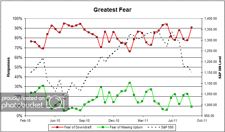
Chart 1: Greatest Fear. From survey to survey, the S&P; fell around (-1.8%), and client fear levels spiked in a big way. This round, client fear levels jumped to 91% from 78%, while the opportunity group fell from 22% to 9%. What’s interesting to note here is that it took a few extra weeks after the major market move before we saw the big spike in fear levels. It might be that clients were away on vacation for the summer, and now that school is back in session, everyone is taking a hard look at the overall stock market and where they want to be positioned. Whatever it is, sentiment levels are not pretty right now.
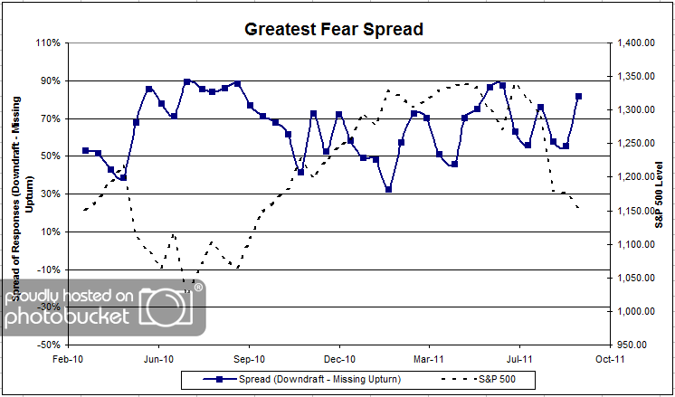
Chart 2. Greatest Fear Spread. Another way to look at this data is to examine the spread between the two groups. The spread jumped by a large margin, from 55% to 82%.

Question 2. Based on their behavior, how would you rate your clients’ current appetite for risk?
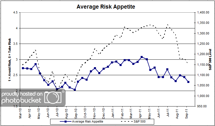
Chart 3: Average Risk Appetite. Overall risk appetite numbers fell in-line with the market, but not to the same degree as the overall fear numbers. The average risk appetite fell from 2.43 to 2.28 this round.
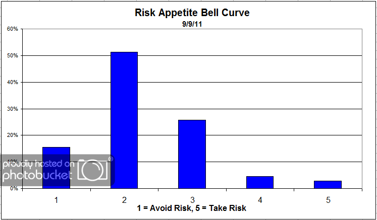
Chart 4: Risk Appetite Bell Curve. This chart uses a bell curve to break out the percentage of respondents at each risk appetite level. Low risk continues to dominate client sentiment, with over half of all respondents wanting a risk appetite of 2.
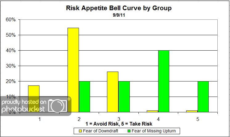
Chart 5: Risk Appetite Bell Curve by Group. The next three charts use cross-sectional data. This chart plots the reported client risk appetite separately for the fear of downdraft and for the fear of missing upturn groups. This bar chart sorts out as we expect, with the fear group looking for low risk and the opportunity group looking for more risk.
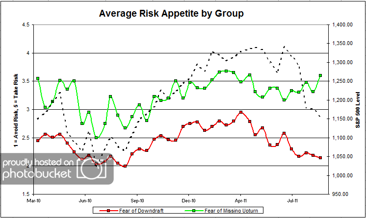
Chart 6: Average Risk Appetite by Group. Here we see the opportunity group acting up again, like they are prone to do. The opportunity group’s risk appetite bounced higher this round, while the fear group’s risk appetite moved slightly lower.
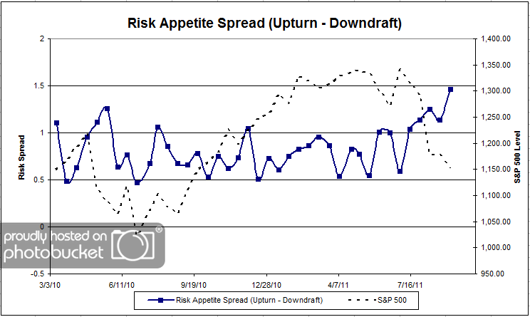
Chart 7: Risk Appetite Spread. This is a spread chart constructed from the data in Chart 6, where the average risk appetite of the downdraft group is subtracted from the average risk appetite of the missing upturn group. The spread reached new all-time highs this round, as the two camps’ appetites moved in opposite directions.

This survey round, the overall fear numbers hit their highest levels since the market started to move lower at the beginning of the summer. What’s interesting is the month or so time-lag it took for fear levels to jump after the market’s terrible summer. Are people just coming back from vacation to see what’s been going on? Or is this a deeper shift in client sentiment? As usual, the overall risk appetite numbers moved in-sync with the market.

No one can predict the future, as we all know, so instead of prognosticating, we will sit back and enjoy the ride. A rigorously tested, systematic investment process provides a great deal of comfort for clients during these types of fearful, highly uncertain market environments. Until next time, good trading and thank you for participating.

Posted by:


Weekly RS Recap

September 19, 2011

The table below shows the performance of a universe of mid and large cap U.S. equities, broken down by relative strength decile and quartile and then compared to the universe return. Those at the top of the ranks are those stocks which have the best intermediate-term relative strength. Relative strength strategies buy securities that have strong intermediate-term relative strength and hold them as long as they remain strong.

Last week’s performance (9/9/11 – 9/16/11) is as follows:

The market had big gains last week–led by performance from the relative strength laggards.

Posted by: