Laggard Rally…Grrr!

October 31, 2011

From time to time, relative strength investing can be frustrating. Evidence shows that over time the strongest stocks have provided the highest returns. But there are most definitely instances where the weakest stocks really take off. These laggard rallies often do not last long, but it is supremely frustrating to watch the dead cats bounce! Andy’s Weekly RS Recap certainly tells the tale, as does this item from Bespoke. Their image is below as well:

Source: Bespoke Investment Group

Posted by:


Reversal of Fortune

October 31, 2011

Frankly, I am amazed that investors have not been blasted by buying bonds at these yields by now. Retail investors typically get their timing wrong—and maybe it will still happen eventually—but for now they’ve been right to buy bonds. A recent article at Bloomberg discusses the magnitude of the reversal of fortune:

Long-term government bonds have gained 11.5 percent a year on average over the past three decades, beating the 10.8 percent increase in the S&P 500, said Jim Bianco, president of Bianco Research in Chicago.

The combination of a core U.S. inflation rate that has averaged 1.5 percent this year, the Federal Reserve’s decision to keep its target interest rate for overnight loans between banks near zero through 2013, slower economic growth and the highest savings rate since the global credit crisis have made bonds the best assets to own this year. Not only have bonds knocked stocks from their perch as the dominant long-term investment, their returns proved everyone from Bill Gross toMeredith Whitney and Nassim Nicholas Taleb wrong.

“The generation-long outperformance of bonds over stocks has been the biggest investment theme that everyone has just gotten plain wrong,” Bianco said in an Oct. 26 telephone interview. “It’s such an ingrained idea in everyone’s head that such low yields should be shunned in favor of stocks, that no one wants to disrupt the idea, never mind the fact that it has been off.”

Unlike Bill Gross, however, our global tactical accounts currently have a slug of bonds. This is why we use relative strength data rather than our personal opinions to invest. The fact is that bonds have been a relatively strong asset—their place in our portfolios was earned. No doubt that will change at some point going forward—and when the relative strength changes, we will too.

Here’s what is going to be interesting: how will the MPT/strategic asset allocation crowd react? If you run a pie chart at your firm, will it now suggest the bulk of the account be invested in fixed income? If the model is using mean variance optimization based on historical returns it should, since bonds have had both higher returns and lower standard deviation than equities for the last 30 years! Somehow, I doubt that is going to happen.

I’m betting that most firms will continue to emphasize stocks in their strategic allocations, by shifting their emphasis to “future expected returns” and suggesting that stocks will do better than bonds going forward from these price levels. There’s no way to know if that will happen—and it conveniently ignores the fact that they certainly did not anticipate that bonds would do better than stocks over the past 30 years based on future expected returns. Speaking just for myself, I can testify that every pie chart I have ever seen in my 25+ year career has always had a majority allocation to equities for a growth-oriented investor. There are some real questions about intellectual honesty embedded in those pie charts.

Mr. Bianco is right. No one wants to disrupt the idea that stocks should outperform bonds, never mind that it’s been wrong! To me, this is a fundamental reason why investment decisions should be driven by data and not opinions.

Posted by:


Weekly RS Recap

October 31, 2011

The table below shows the performance of a universe of mid and large cap U.S.equities, broken down by relative strength decile and quartile and then compared to the universe return. Those at the top of the ranks are those stocks which have the best intermediate-term relative strength. Relative strength strategies buy securities that have strong intermediate-term relative strength and hold them as long as they remain strong.

Last week’s performance (10/21/11 – 10/28/11) is as follows:

It was good to be a laggard last week!

Posted by:


Real Millionaires

October 28, 2011

I’ve been meaning to post on this book for a while, but this morning’s report on the consumer savings rate falling back to the lowest level since December 2007, got me off the dime.

Thomas Stanley’s book Stop Acting Rich…And Start Living Like A Real Millionaire offers some fascinating data on the behaviors of millionaires. The great thing about his book is that the conclusions made are all data-driven (Dr. Stanley has spent decades intensively studying the affluent in America).

I suspect that many would be very surprised by the following points made in his book:

  • More than two-thirds of those who are country club members are not millionaires.
  • Real millionaires pay about $16 (tip included) for a haircut.
  • The median price paid for motor vehicles among millionaires surveyed was $31,367.
  • 70% of millionaires in America have never owned a boat or a yacht or even a raft.
  • 64% of millionaires did not own a second home.
  • Most millionaires do not live in homes that have a market value of $1 million or more. About 90 percent live in homes valued at under $1 million.
  • The majority of millionaires report that their spouse is more frugal than their frugal husband (in the case where the males were the bread winners).
  • Only 7 percent of millionaires own a bottle of wine that costs more than $100.
  • 67 percent of millionaires own wine that costs somewhere in the range of $10-$25.
  • Millionaires usually pay $19.59 (median) for the dinner that they order at their favorite restaurant.
  • Toyota make of automobile was found to be the number one in market share among millionaires (10.9 percent).

The reality is that it is ultimately those individuals that embrace a frugal lifestyle who are able to enjoy a life of financial independence. As discussed in Dr. Stanley’s book, the affluent understand that what brings happiness in life is not the watch on your wrist, but life activities, relationships, the peace of mind associated with financial independence, and the ability to donate to charitable causes.

stanley 199x300 Real Millionaires

Finally, I did enjoy the following quote from his book (a philosophy taken at face value by so many…)

Anyone who lives within their means suffers from a lack of imagination. -Oscar Wilde

Posted by:


Sector and Capitalization Performance

October 28, 2011

The chart below shows performance of US sectors and capitalizations over the trailing 12, 6, and 1 month(s). Performance updated through 10/27/2011.

Posted by:


Erosion Of Financial Smarts With Age

October 27, 2011

Robert Powell of MarketWatch writes about a critical, but very sensitive topic in his article “Our Financial Smarts Erode Quickly After Age 60.”

Regardless of gender or education level, Americans become considerably less literate about all things money after age 60, according to a new study.

The scores on a test measuring knowledge of investments, insurance, credit and money basics fell about 2% each year starting after age 60, falling from about 59% correct — hardly a passing grade — for those in their 60s to a dismal 30% for those 80 and older, according to Michael Finke, an associate professor at Texas Tech University and a co-author of the study.

Here’s what’s even worse: Our confidence in our financial decision-making abilities rises with age. We are not older and wiser. Rather, we are older, less smart and overconfident.

This notion of confidence rising while financial literacy is falling spells trouble for that group of Americans that now represents more than 12% of the population and controls half of all the financial wealth in America, according to Finke, who is also head of Texas Tech University’s Ph.D. in financial-planning program.

Obviously, there are noteworthy exceptions to this tendency. In fact, it is likely that each of us could immediately think of a number of people who seem to defy this trend. However, it would be unwise to disregard these results. The very population with the bulk of the financial wealth in this country is also the population that can benefit most from good financial advice and money management.

Posted by:


Fund Flows

October 27, 2011

The Investment Company Institute is the national association of U.S. investment companies, including mutual funds, closed-end funds, exchange-traded funds (ETFs), and unit investment trusts (UITs). Members of ICI manage total assets of $11.82 trillion and serve nearly 90 million shareholders. Flow estimates are derived from data collected covering more than 95 percent of industry assets and are adjusted to represent industry totals.

Taxable bond funds continue to attract the most new money, largely at the expense of domestic equity funds.

Posted by:


What’s Hot…and Not

October 26, 2011

How different investments have done over the past 12 months, 6 months, and month.

1PowerShares DB Gold, 2iShares MSCI Emerging Markets ETF, 3iShares DJ U.S. Real Estate Index, 4iShares S&P Europe 350 Index, 5Green Haven Continuous Commodity Index, 6iBoxx High Yield Corporate Bond Fund, 7JP Morgan Emerging Markets Bond Fund, 8PowerShares DB US Dollar Index, 9iBoxx Investment Grade Corporate Bond Fund, 10PowerShares DB Oil, 11iShares Barclays 20+ Year Treasury Bond

Posted by:


The Rise and Fall of the Style Box

October 25, 2011

Dr. C. Thomas Howard of AthenaInvest included an interesting nugget about style boxes in a recent article at Advisor Perspectives.

A few years ago we conducted an extensive research trying to identify who launched the style grid. As part of this research, we spoke with Russell Investments who provided information for what we believe was its initial launch. In 1984, the number of active equity funds was exploding and Russell was casting about for ways to categorize funds so that advisors and investors could make sense of this bewildering array. They tapped Bill Sharpe to help them address this problem. During a brainstorming session, Sharpe, as business faculty are wont to do, wandered to a chalkboard and drew a two-by-two matrix.

As all good academics believe, business challenges – no matter how complex the finance, marketing, or management issues they involve can best be summarized in a two-by-two matrix. Since small-firm and low-PE effects were all the rage in 1984, he proposed the axes be market capitalization and the average PE of the stocks held by the fund.

Thus was born the style grid.

It was launched that year, and Russell was stunned when, by the following year, the investment industry identified “style drift” as a serious problem for active equity mutual funds. They knew there was no research behind the style grid; it was simply put forward as a way to organize the growing array of funds. But the law of unintended consequences had already taken effect.

Even more amazing, the style grid is inferior to randomly forming fund peer groups. That is, funds within a style box pursue widely differing strategies as Dodson observed.

Again, it is hard to imagine a worse system than the style grid.

AthenaInvest, as you might imagine, categorizes managers by strategy rather than by style box, but I just thought it was interesting how something off the cuff gained a cult-like following in the industry, even when it doesn’t work.

Certainly, the style box is not the only cult item that has gained a following on Wall Street. The Efficient Market Hypothesis and Modern Portfolio Theory are at the top of my list. Not to mention this recent nugget from an article on the Dogs of the Dow:

…the most popular dividend-stock strategy among retail investors is the Dogs of the Dow, which calls for buying and holding the 10 stocks from the 30 in the Dow Jones Industrial Average with the highest dividend yields as of each Jan. 1.

The strategy took the investment world by storm in the early and mid-1990s, on the strength of both its simplicity and excellent long-term track record — at least when back-tested.

A funny thing happened on the way to the bank, however: In real time since then, the strategy has failed to keep up with a simple index fund. For example, the strategy has beaten the Dow itself in just 5 of the last 15 calendar years. And those five winning years have not come close to making up for the losses incurred in the 10 losing years.

Style boxes, MPT, Dogs of the Dow are all relics. They should be exhibits in a frontier museum, where you can point to them and say “look how the old-timers used to do it!” The story of the style box shows just how random some of the ideas are—and it’s not that they were bad ideas at the time. To advance any field, you need to brainstorm and throw ideas out there and test them. But when they can be shown not to work or when there are better ways to move forward, let go of it for goodness sake!

Posted by:


From the Archives: The Dilemma

October 25, 2011

O’Shaughnessy has another insightful article discussing the flood of money out of equity funds and into bond funds this year. Click here to read. He shows the results from shifting allocations dramatically to fixed income after the last 14 recessions…not pretty.

This is quite the dilemma for investors. Their heart tells them to shun stocks. Their mind tells them that they should overweight stocks. I can’t think of a better reason to give serious consideration to a global tactical asset allocation fund, like our Global Macro strategy, that systematically allocates to different asset classes based on their relative strength.

Click here for disclosures from Dorsey Wright Money Management.

—-this article originally appeared 9/10/2009. The sluggish economy of the last several years has done nothing to resolve this dilemma for investors. Global Macro still makes a lot of sense.

Posted by:


High RS Diffusion Index

October 25, 2011

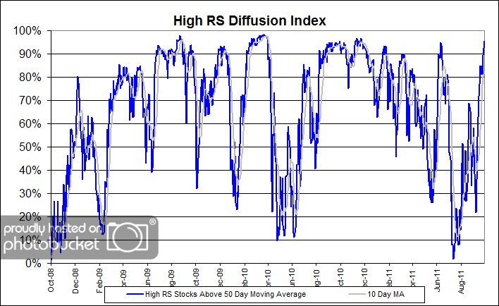
The chart below measures the percentage of high relative strength stocks that are trading above their 50-day moving average (universe of mid and large cap stocks.) As of 10/18/11.

HighRSDiff 2 High RS Diffusion Index

The 10-day moving average of this indicator is 82% and the one-day reading is 95%. Things have certainly turned around for the High RS stocks since mid-summer.

Posted by:


Weekly RS Recap

October 24, 2011

The table below shows the performance of a universe of mid and large capU.S.equities, broken down by relative strength decile and quartile and then compared to the universe return. Those at the top of the ranks are those stocks which have the best intermediate-term relative strength. Relative strength strategies buy securities that have strong intermediate-term relative strength and hold them as long as they remain strong.

Last week’s performance (10/17/11 – 10/21/11) is as follows:

Another strong week for the overall market last week, with slightly better performance coming from the relative strength laggards.

Posted by:


Dorsey, Wright Client Sentiment Survey - 10/21/11

October 21, 2011

Here we have the next round of the Dorsey, Wright Sentiment Survey, the first third-party sentiment poll. Participate to learn more about our Dorsey, Wright Polo Shirt raffle! Just follow the instructions after taking the poll, and we’ll enter you in the contest. Thanks to all our participants from last round.

As you know, when individuals self-report, they are always taller and more beautiful than when outside observers report their perceptions! Instead of asking individual investors to self-report whether they are bullish or bearish, we’d like financial advisors to weigh in and report on the actual behavior of clients. It’s two simple questions and will take no more than 20 seconds of your time. We’ll construct indicators from the data and report the results regularly on our blog–but we need your help to get a large statistical sample!

Click here to take Dorsey, Wright’s Client Sentiment Survey.

Contribute to the greater good! It’s painless, we promise.

Posted by:


Sector and Capitalization Performance

October 21, 2011

The chart below shows performance of US sectors and capitalizations over the trailing 12, 6, and 1 month(s). Performance updated through 10/20/2011.

Posted by:


Free Advice

October 20, 2011

Human psychology can be perversely counter-intuitive. Psychological literature suggests that buyers often equate price with value. When advice is free, potential buyers often assume it is useless. That may have been what happened when a major European brokerage offered its clients free advice on mean-variance optimization of their portfolios. (Depending on your view of mean-variance optimization, maybe the advice really was useless.) The idea was that they could get additional input on asset allocation for free. Guess what happened? According to CXO Advisory:

  • Only 385 (5%) of the 8,195 clients accept the offer.
  • Compared to a typical client, those accepting tend to be male, older, wealthier and financially more sophisticated (higher, less volatile pre-offer returns) and have a longer relationship with the broker.
  • Among accepted offers, recommended optimized portfolios are on average very different from pre-offer client portfolios. During the post-offer interval, recommended (pre-offer client) portfolios have an average return of 24.8% (21.2%), with a 9.6% (15.0%) standard deviation of returns. In other words, if implemented, the free advice would tend to improve client investment performance.
  • However, very few clients who accept the offer actually follow the advice. Among those who accept, those with lower portfolio values are more likely to implement.

In summary, evidence suggests that individual investors tend to ignore offers of expert advice, and even those who accept tend not to implement. Investors may want to reflect on how they process expert advice, and advisors may want to consider how to address resistance to such advice.

Only 5% of the clients even accepted the free advice and very few clients who accepted the advice implemented it! Of the 385 retail investors who requested the advice, which involved portfolio diversification and free trades to implement it, 260 (68%) did not follow it at all. Of the 125 (32%) retail investors who implemented some of the advice, the average amount of advice followed was only 21%!

How interesting is that? Only about 1.5% of the total sample followed any of the advice—and the few who did implemented very little of it! The full paper shows that pre-advice portfolio performance was terrible and that the mean-variance optimization advice actually improved the portfolio performance, but investors didn’t want it. It would be interesting to see this study run once more with a nominal cost attached to the advice, even if the implementation was still offered for free. I would not be surprised to see more investors both request the advice and implement it if it was offered to them for $25.

Offering poor advice at any price is a losing proposition, but even offering good advice too cheaply may lead to little or no implementation. It may be important for advisors to make a good case for the value of their advice—and then to charge a realistic amount for it.

Posted by:


From the Archives: The Truth About Rebalancing

October 20, 2011

Among devotees of strategic asset allocation, rebalancing is considered to be a crucial tool for risk management. Jason Zweig of the Wall Street Journal does the math and points out that rebalancing sometimes just makes things worse.

The truth is that no investment method is magic. Every single method ever devised has advantages and disadvantages; thus there will always be alternating periods of outperformance and underperformance. Retail clients, by their performance-chasing behavior, obviously believe otherwise. Sorry to have to break this to them–you’re better off doing careful due diligence to find a strategy likely to outperform over the long run and then just sticking with it.

—-this was originally published 9/24/2009. There is still no magic investment method, but the pursuit of it continues unabated. Be especially wary of magic methods during difficult economic times. It’s much more appealing than thorough due diligence, but it may not serve you well in the end.

Posted by:


Fund Flows

October 20, 2011

The Investment Company Institute is the national association of U.S. investment companies, including mutual funds, closed-end funds, exchange-traded funds (ETFs), and unit investment trusts (UITs). Members of ICI manage total assets of $11.82 trillion and serve nearly 90 million shareholders. Flow estimates are derived from data collected covering more than 95 percent of industry assets and are adjusted to represent industry totals.

There is not much more to say other than investors really hate stocks and really love bonds.

Posted by:


Sustainable Withdrawal Rates

October 19, 2011

Can a retirement portfolio sustain 4% withdrawals in retirement? That’s the generally accepted rule of thumb, but Dr. Wade Pfau, writing in the Journal of Financial Planning, points out some of the complications in that theory.

Bottom line: current valuations might have a big impact on the withdrawal rates, since what happens early in retirement is much more critical than what happens after a portfolio has had an opportunity to grow for many years.

Dr. Pfau’s findings dovetail nicely with work from James Garland. I do think that it’s useful to consider withdrawals in a relative sense. From an earlier article here at Systematic Relative Strength:

Sustainable spending is a tricky concept. Dozens of studies have been performed on historical data that suggest that the proper spending rate is 3 to 5%. A lot of endowments use 4%, for example. In reality, I think the sustainable spending level depends quite heavily on financial conditions at the time. A stock market with a 6% dividend yield is going to support more spending than a market yielding 3%. In other words, I tilt toward a relative calculation first developed by James Garland. He shows that you can generally spend more than just your dividend and interest income, but far less than your total earnings yield. His rule of thumb is that sustainable spending is about 130% of the yield on the major stock indexes. (You can use this link to find the current dividend yield on the major stock indexes.)

Recommended reading for all advisors with clients hoping to retire!

Posted by:


Another Proof of Market Inefficiency

October 19, 2011

Barry Ritholtz of The Big Picture featured an interesting paper the other day. An upcoming paper in Algorithmic Finance by Philip Maymin uses the momentum “anomaly” to show mathematically that markets are not efficient. An interesting read, but not an easy read. Mr. Ritholtz’s post has a link to the complete paper.

One piece of good news from the paper:

Most finance academics believe markets are weak form efficient: Doran, Peterson, and Wright (2007) survey more than 4,500 finance professors and find that of the nearly 650 usable responses, the majority believe the US stock market is weak form efficient; only 8 percent generally disagree.

If you are looking for ways to exploit market inefficiencies through technical analysis, you are part of a very small minority! I find the belief in any kind of efficiency rather amazing, considering all of the craziness we have all seen over the past decade or so.

Posted by:


High RS Diffusion Index

October 19, 2011

The chart below measures the percentage of high relative strength stocks that are trading above their 50-day moving average (universe of mid and large cap stocks.) As of 10/18/11.

The 10-day moving average of this indicator is 69% and the one-day reading is 85%-well above the washed-out levels of mid-August.

Posted by:


Good News for the Bulls

October 18, 2011

Mark Hulbert at Marketwatch has a good write up today of Norm Fosback’s High Low Logic Index, which is currently very bullish. It’s nice to see something positive about the market for a change.

The indicator I’m referring to is the High Low Logic Index, which was devised in the 1970s by Norman Fosback, then the President of the Institute for Econometric Research, and currently editor of Fosbacks Fund Forecaster. The index represents the lesser of two numbers: New 52-week highs and new 52-week lows with both expressed as a percentage of total issues traded.

In fact, there have been only four other occasions over the last 25 years in which the Ned Davis Research version of the High Low Logic Index has moved from bearish territory above 4.05% to as low as it is today, and all four came close to a major market bottom: Late 1987, late 1990, early 2003, and late 2008.

I understand the point of the indicator. Very few new highs suggest you might be near a bottom. Very few new lows suggest the market is already trending strongly. The last few days, however, have been marked by very few new highs or new lows. That might be evidence only of indecision in the middle of a range.

The NYSE high-low index that we track is trending weakly upward right now as well, lending at least some credibility to the thesis. We’ll have to see how it pans out, but for the record, I hope that Fosback’s indicator is correct!

Posted by:


From the Archives: Bubble-nomics

October 18, 2011

Alan Greenspan used to believe that bubbles did not exist. One group of economists thinks bubbles can’t be stopped, while others think they can be identified and should be deflated.

In reality, bubbles occur all the time and for all sorts of reasons, some rational and some not. Often bubbles have a fundamental basis originally, followed on by mob psychology at the end. Every bubble is a little different and a lot the same, as this insightful article from the International Herald Tribune points out.

The history of markets is one bubble after another, some large and some small. This is the main reason that we are not concerned about trends disappearing from the markets. Relative strength gives us a way to measure the strength of the trends, in order to pick out the trends we want to participate in—the strongest trends.

—-this article originally appeared 9/15/2009. Despite the very challenging environment lately, unless human nature somehow changes, I suspect trends will be with us forever.

Posted by:


Relative Strength Spread

October 18, 2011

The chart below is the spread between the relative strength leaders and relative strength laggards (universe of mid and large cap stocks). When the chart is rising, relative strength leaders are performing better than relative strength laggards. As of 10/17/2011:

Relative strength leaders and relative strength laggards have generated similar performance over the past two years. A meaningful shift higher in this spread could bode well for relative strength strategies in the coming years.

Posted by:


Dorsey, Wright Client Sentiment Survey Results - 10/7/11

October 17, 2011

Our latest sentiment survey was open from 10/7/11 to 10/14/11. The Dorsey, Wright Polo Shirt Raffle continues to drive advisor participation, and we greatly appreciate your support! This round, we had 91 advisors participate in the survey. If you believe, as we do, that markets are driven by supply and demand, client behavior is important. We’re not asking what you think of the market—since most of our blog readers are financial advisors, we’re asking instead about the behavior of your clients. Then we’re aggregating responses exclusively for our readership. Your privacy will not be compromised in any way.

After the first 30 or so responses, the established pattern was simply magnified, so we are comfortable about the statistical validity of our sample. Most of the responses were from the U.S., but we also had multiple advisors respond from at least two other countries. Let’s get down to an analysis of the data! Note: You can click on any of the charts to enlarge them.

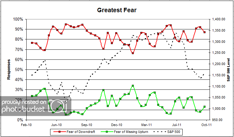
Question 1. Based on their behavior, are your clients currently more afraid of: a) getting caught in a stock market downdraft, or b) missing a stock market upturn?

greatestfear 40 Dorsey, Wright Client Sentiment Survey Results   10/7/11

Chart 1: Greatest Fear. From survey to survey, the S&P rose around +1.7%, and client fear levels responded as expected. Client fear levels dropped from 92% to 87%, while the opportunity camp rose from 8% to 13%. Despite the minor bounce, client sentiment remains poor overall.

greatestfearspread 41 Dorsey, Wright Client Sentiment Survey Results   10/7/11

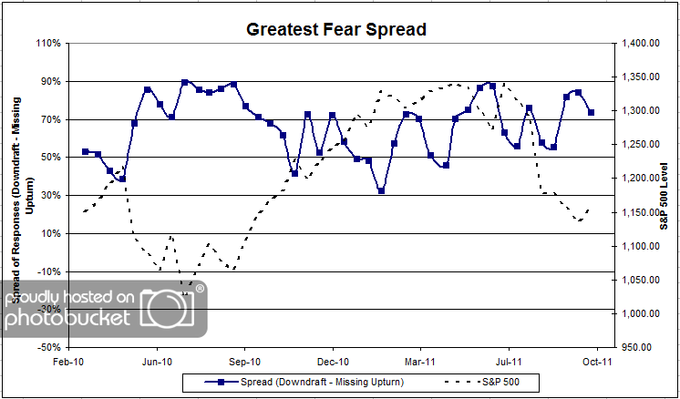
Chart 2. Greatest Fear Spread. Another way to look at this data is to examine the spread between the two groups. The spread fell from 84% to 74% this round.

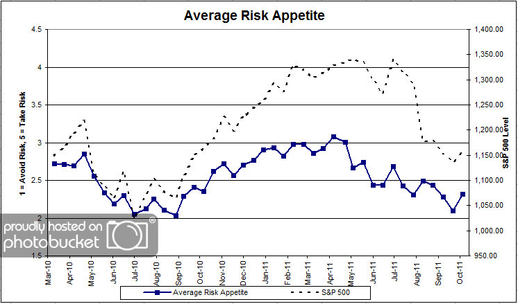
Question 2. Based on their behavior, how would you rate your clients’ current appetite for risk?

avgriskapp 32 Dorsey, Wright Client Sentiment Survey Results   10/7/11

Chart 3: Average Risk Appetite. Overall risk appetite numbers rose this round, as they should in a rising market. This survey the overall risk appetite average was 2.32, up from 2.10 from last time. The overall numbers are still hovering around all-time survey lows.

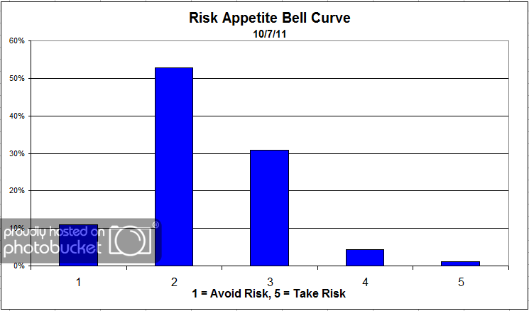
riskappbellcurve 26 Dorsey, Wright Client Sentiment Survey Results   10/7/11

Chart 4: Risk Appetite Bell Curve. This chart uses a bell curve to break out the percentage of respondents at each risk appetite level. Once again, over half the respondents answered 2, and nearly a third answered 3.

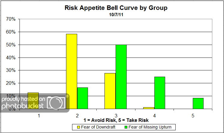
riskappbellcurvegroup 13 Dorsey, Wright Client Sentiment Survey Results   10/7/11

Chart 5: Risk Appetite Bell Curve by Group. The next three charts use cross-sectional data. This chart plots the reported client risk appetite separately for the fear of downdraft and for the fear of missing upturn groups. This bar chart sorts out as we expect, with the fear group looking for low risk and the opportunity group looking for more risk.

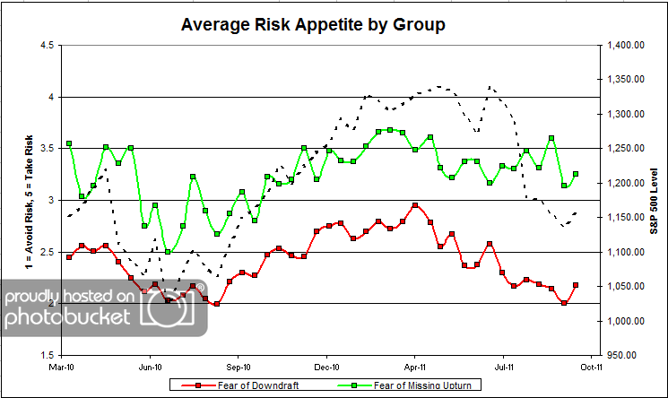
avgriskappgroup 22 Dorsey, Wright Client Sentiment Survey Results   10/7/11

Chart 6: Average Risk Appetite by Group. Both camps’ risk appetite rose this round with the market. Nothing much to see here.

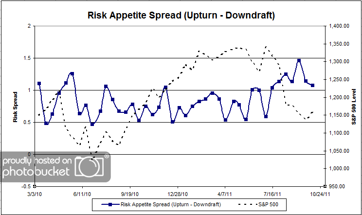
riskappspread 32 Dorsey, Wright Client Sentiment Survey Results   10/7/11

Chart 7: Risk Appetite Spread. This is a spread chart constructed from the data in Chart 6, where the average risk appetite of the downdraft group is subtracted from the average risk appetite of the missing upturn group. The spread nudged lower this round.

This survey, we saw a moderate rally in the market over two weeks, and all of our client sentiment indicators responded as they “should have.” The overall fear levels fell, and the overal risk appetite numbers rose. Everything performed as expected, which is nice to see.

No one can predict the future, as we all know, so instead of prognosticating, we will sit back and enjoy the ride. A rigorously tested, systematic investment process provides a great deal of comfort for clients during these types of fearful, highly uncertain market environments. Until next time, good trading and thank you for participating.

Posted by:


Unstable Correlations: Commodity / Equity Edition

October 17, 2011

Anyone with the idea that there is a dependable relationship (correlation) between equities and commodities over time may be taken aback by the following chart.

Source: MarketSci Blog

Seeking stable relationships between asset classes is fool’s gold. There are good reasons for including many different asset classes in your investment universe, but dependable correlations is not one of them.

HT: Abnormal Returns

Posted by: