Apple Computer: Massive P/E Compression

November 28, 2011

Apple Computer has unquestionably been one of the best momentum stocks over the past decade. It is +1,314% from December 31, 1999-November 25, 2011, while the S&P 500 is -21% over that same period of time. It has also been one of the holdings in the DWA Technical Leaders Index (PDP) since its inception of 3/1/2007 and it has outperformed the S&P 500 handily over that period of time (Apple is +317% vs. -17% for the S&P 500).

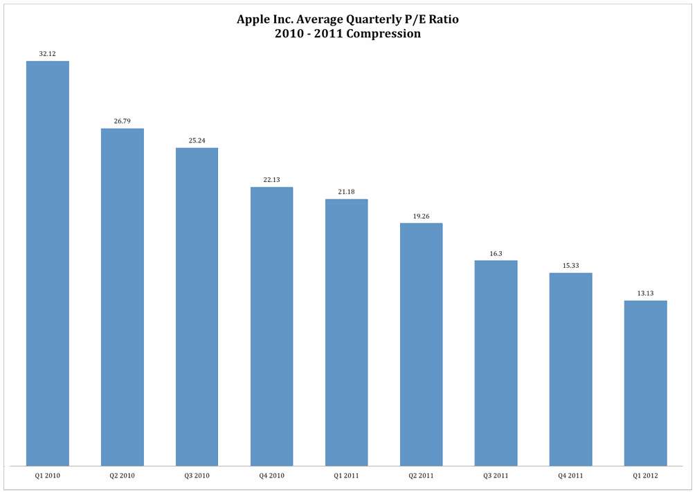
However, as pointed out by Bullish Cross, even with the strong performance of Apple’s stock, there has been massive P/E compression over the past couple of years.

Apple Apple Computer: Massive P/E Compression

(Click to enlarge)

The stock is now trading at an extremely low 13.1 trailing P/E ratio. We’re talking about a valuation level that Apple hasn’t seen in nearly a decade – this despite the fact that the company grew its earnings 82% this year which is the highest in over 7 years. We’re talking about a valuation that is more than 10% lower than the lowest point during the financial crisis.

Seemingly, Apple is an increasingly undervalued stock as investors have been slow to fully price in the exceptionally strong fundamentals. Clearly, just because a stock has a sustained period of outperformance does not mean that it is necessarily becoming overvalued on a fundamental basis.

See www.powershares.com for more information about PDP. Past performance is no guarantee of future returns. A list of all holdings for the trailing 12 months is available upon request.

HT: Abnormal Returns

Posted by:


Dorsey, Wright Client Sentiment Survey Results - 11/18/11

November 28, 2011

Our latest sentiment survey was open from 11/18/11 to 11/25/11. The Dorsey, Wright Polo Shirt Raffle continues to drive advisor participation, and we greatly appreciate your support! This round, we had 61 advisors participate in the survey (holiday week = light traffic). If you believe, as we do, that markets are driven by supply and demand, client behavior is important. We’re not asking what you think of the market—since most of our blog readers are financial advisors, we’re asking instead about the behavior of your clients. Then we’re aggregating responses exclusively for our readership. Your privacy will not be compromised in any way.

After the first 30 or so responses, the established pattern was simply magnified, so we are comfortable about the statistical validity of our sample. Most of the responses were from the U.S., but we also had multiple advisors respond from at least two other countries. Let’s get down to an analysis of the data! Note: You can click on any of the charts to enlarge them.

Question 1. Based on their behavior, are your clients currently more afraid of: a) getting caught in a stock market downdraft, or b) missing a stock market upturn?

greatesfear Dorsey, Wright Client Sentiment Survey Results   11/18/11

Chart 1: Greatest Fear. From survey to survey, the S&P fell -3.0%, and client fear levels responded in-kind. The overall fear number rose from 88% to 93%; the greatest fear numbers are now the highest we’ve seen since mid-June. On the flip side, the opportunity group fell from 12% to 7%. Client sentiment remains terrible.

greatestfearspread 44 Dorsey, Wright Client Sentiment Survey Results   11/18/11

Chart 2. Greatest Fear Spread. Another way to look at this data is to examine the spread between the two groups. The spread jumped this round, from 77% to 87%.

Question 2. Based on their behavior, how would you rate your clients’ current appetite for risk?

avgriskapp 35 Dorsey, Wright Client Sentiment Survey Results   11/18/11

Chart 3: Average Risk Appetite. Overall risk numbers plummeted this round, from 2.44 to 2.08. Overall risk appetite is now the lowest we’ve seen since September of 2010.

riskbellcurve Dorsey, Wright Client Sentiment Survey Results   11/18/11

Chart 4: Risk Appetite Bell Curve. This chart uses a bell curve to break out the percentage of respondents at each risk appetite level. Over 50% of all respondents want a risk appetite of either 1 or 2.

bellcurvegroup 2 Dorsey, Wright Client Sentiment Survey Results   11/18/11

Chart 5: Risk Appetite Bell Curve by Group. The next three charts use cross-sectional data. This chart plots the reported client risk appetite separately for the fear of downdraft and for the fear of missing upturn groups. This bar chart sorts out as we expect, with the fear group looking for low risk and the opportunity group looking for more risk. Keep in mind that with the light holiday response, there were only 4 total respondents in the upturn category.

avgriskappgroup 24 Dorsey, Wright Client Sentiment Survey Results   11/18/11

Chart 6: Average Risk Appetite by Group. Both groups’ risk appetite fell, just like the overall risk number.

riskappspread 35 Dorsey, Wright Client Sentiment Survey Results   11/18/11

Chart 7: Risk Appetite Spread. This is a spread chart constructed from the data in Chart 6, where the average risk appetite of the downdraft group is subtracted from the average risk appetite of the missing upturn group. The spread jumped by a small degree this round.

This survey, we saw the market dip lower, and both client fear levels and overall risk appetite respond as expected. The overall risk appetite number paints an ugly picture — client sentiment is now the worst it’s been since September of 2010. While that’s never a good thing, some studies have shown that when client sentiment reaches these types of overextended low levels, the stock market does well going foward.

No one can predict the future, as we all know, so instead of prognosticating, we will sit back and enjoy the ride. A rigorously tested, systematic investment process provides a great deal of comfort for clients during these types of fearful, highly uncertain market environments. Until next time, good trading and thank you for participating.

Posted by:


Long Horizon Investing

November 28, 2011

Institutional pension funds and foundations-most obviously-have long-term investment horizons. What is less well-appreciated in the investment industry is that individuals have long-term horizons too. If anything, an individual’s task is more complex, since it is broken into a long capital accumulation phase and then, possibly, into a capital distribution period. (If capital accumulation is extraordinarily successful, some accounts never have a distribution phase. The portfolio sometimes just continues to accumulate because the spending never approaches the fecundity of the portfolio.)

Like a institutional pension fund, an individual’s retirement savings has a very long life span—because it is, in fact, your pension fund. A recent article by Andrew Ang of Columbia University and Knut Kjaer points out some of the chief advantages of long horizon investing:

Long horizon investors have an edge. They can ride out short-term fluctuations in risk premiums, profit from periods of elevated risk aversions and short-term mispricing, and they can pursue illiquid investment opportunities. The turmoil we have seen in the capital markets over the last decade has increased the competitive advantage of a long investment horizon. Unfortunately, the two biggest mistakes of long horizon investors—procyclical investments and misalignments between asset owners and managers—negate the long horizon advantage. Long horizon investors should harvest many sources of factor risk premiums, be actively contrarian, and align all stakeholders so that long horizon strategies can be successfully implemented. Illiquid assets can, but do not necessarily, play a role for long horizon investors, but investors should demand high premiums to compensate for bearing illiquidity risk and agency issues.

I put their recommendations in bold. For individuals, aligning stakeholders shouldn’t be a huge problem. You’re the only stakeholder, which is another advantage over an institution.

It makes perfect sense to harvest multiple factor risk premiums. Historically, relative strength is among the largest of these, but lots of them are worthwhile. Value is a well-known factor and minimum volatility also seems promising. A big benefit of these two factors is that the excess returns are often negatively correlated with relative strength. You can build better equity exposure by combining uncorrelated factors.

Finally, they suggest being actively contrarian. I read this as being willing to add to a strategy when it is out of favor, something they euphemistically term as “short-term fluctuations in risk premiums.” When relative strength has underperformed, add to it. When value has underperformed, plump up your portfolio in that area. Although the fluctuations can often be hair-raising, they are very correct about what a big mistake procyclical investments can be. (Procyclical is just a fancy word for buying high and selling low.)

Their conclusion is also worth reiterating: The turmoil we have seen in the capital markets over the last decade has increased the competitive advantage of a long investment horizon.

As an individual investor, you have some handicaps relative to institutions. But if you work from the standpoint of a long investment horizon, you also have a big potential competitive advantage. Whether you turn that potential into reality or not is a function of how successfully you implement their recommendations-constructing a portfolio to capture several return factors and adding to a strategy on dips.
Posted by:


Weekly RS Recap

November 28, 2011

The table below shows the performance of a universe of mid and large capU.S.equities, broken down by relative strength decile and quartile and then compared to the universe return. Those at the top of the ranks are those stocks which have the best intermediate-term relative strength. Relative strength strategies buy securities that have strong intermediate-term relative strength and hold them as long as they remain strong.

Last week’s performance (11/21/11 – 11/25/11) is as follows:

It was a bad week for the market, but high relative strength stocks held up much better than the universe.

Posted by: