Quantitative Wheezing

January 31, 2012

Central bank balance sheets are being rapidly expanded all over the world. Jim Bianco has a nice piece at The Big Picture, replete with amazing graphics. For the record, I’ve known Jim for 20 years and he does some of the most intriguing fixed income research you will ever see. He writes:

The degree to which central banks around the world are printing money is unprecedented.

He proceeds to show the balance sheets for each of the large central banks, converted back into dollars. Your eyes will bug out when you see the original article. For the sake of brevity, all I show here is his graphic of the composite of eight large central banks.

Big8balancesheets Quantitative Wheezing

Source: Bianco Research/The Big Picture (click on image for a sharper version)

Jim points out that:

The combined size of these eight central banks’ balance sheets has almost tripled in the last six years from $5.42 trillion to more than $15 trillion and is still on the rise!

I have no idea if this is a good or bad thing. How you interpret it probably depends on which group of economists you put your faith in. My guess—and this is only a guess—is that huge increases in the money supply will eventually result in some inflation. Commodities generally respond fairly well to inflation, while fixed income may be gasping for air. (This sort of fits the ”retail investor is always wrong” template, given the huge amounts poured into bonds over the last couple of years.) Inflation might be a good thing from the Federal government’s point of view, as it will make paying off debt a lot less expensive in real terms. It might not be so good for investors, depending on how their portfolio is constructed.

The one thing I don’t have to guess at is that quantitative easing, whether it continues to accelerate to ever-giddier heights or starts to wind down, will lead to trends of some kind. When that happens, relative strength will be a useful guide to sort out where the investment opportunities lie.

Posted by:


A Winner In The “War On Savers”

January 31, 2012

Jim Jubak on why dividend-paying stocks are one of the winners in a low interest rate environment:

The Federal Reserve’s low interest-rate policy has been called a war on savers. That seems pretty accurate to me. Currently you can earn a whopping 0.248% (national average) on a three-month certificate of deposit (with a $10,000 minimum). Want to make a decent return — say, something as magnificent as 1%? Forget a 12-month CD. The yield is just 0.556%. Willing to go out two years? The national average for a two-year CD is just 0.875%. To add insult to injury, the headline inflation rate for 2011 was 3%; the core rate (which excludes increases in the prices of food and fuel) was up 2% for the year. No matter which inflation rate you use, all of those CDs lost value in 2011.

No wonder, then, that dividend stocks paying more than 3% (so an investor at least stays even with inflation) are among the hottest stocks on the market. In a year when the Standard & Poor’s 500 Index managed a return of just over 2%, a not-especially-stellar drug company like Merck returned 8.9% — because it paid a dividend of better than 4%. Verizon Communications, in not a particularly good year for phone companies, managed a 17.6% total return — because it paid more than 5%. Pipeline master limited partnerships such as Oneok Partners, with a dividend yield of 6%, returned 51% for the year. Another master limited partnership, Magellan Midstream Partners, returned 27%.

I don’t see any reason that dividend stocks with yields above 3% won’t turn in another stellar performance in 2012. After all, the Federal Reserve just guaranteed that savers won’t be able to make 2% even if they buy seven-year Treasury notes. And, looking at the number of financial advisers and gurus that I see praising dividend stocks, I think 2012 could be even better for anything with a pulse and a yield.

Dorsey Wright currently owns Verizon and Oneok Partners. A list of all holdings for the previous 12 months is available upon request. Past performance is no guarantee of future returns.

Posted by:


Relative Strength Spread

January 31, 2012

The chart below is the spread between the relative strength leaders and relative strength laggards (universe of mid and large cap stocks). When the chart is rising, relative strength leaders are performing better than relative strength laggards. As of 1/30/2012:

spread13112 Relative Strength Spread

Over the past two and a half years, relative strength leaders have had similar performance to the relative strength laggards. Using history as a guide, we expect this spread to eventually resume its upward trend.

Posted by:


The Cleansing Effect of Recessions

January 30, 2012

Now that we seem to be through the recession and investor sentiment is beginning to improve to the point that maybe Recession 2.0 is not on the immediate horizon, investors are faced with trying to figure out what to do next. The Freakonomics blog has a useful thought about what they call the “cleansing effect” of recessions:

In the past, when I’ve tried to schedule our window cleaners they have always been able to come within two days. Despite the still-slow economy, the first available appointment this time is not for three weeks.

“Why?” I ask. The owner says that during the worst of the recession his firm had enough clients to survive, but barely; smaller, less efficient companies died off. Now that demand for cleaning has increased, his own customers are coming back; and the customers of the now-defunct companies are hiring him too, so he’s swamped with business. Recessions kill off inefficient firms; but at least in this case, those that survive come out stronger than before.

Relative strength is a good tool for sorting out the winners from the losers. Companies that have been hit hard from the lingering recession often show weak relative strength, while companies that have managed to power through tough times and grow despite it are often leaders.

Posted by:


Dorsey, Wright Client Sentiment Survey Results - 1/20/12

January 30, 2012

Our latest sentiment survey was open from 1/20/12 to 1/27/12. The Dorsey, Wright Polo Shirt Raffle continues to drive advisor participation, and we greatly appreciate your support! This round, we had 43 advisors participate in the survey. If you believe, as we do, that markets are driven by supply and demand, client behavior is important. We’re not asking what you think of the market—since most of our blog readers are financial advisors, we’re asking instead about the behavior of your clients. Then we’re aggregating responses exclusively for our readership. Your privacy will not be compromised in any way.

After the first 30 or so responses, the established pattern was simply magnified, so we are comfortable about the statistical validity of our sample. Most of the responses were from the U.S., but we also had multiple advisors respond from at least four other countries. Let’s get down to an analysis of the data! Note: You can click on any of the charts to enlarge them.

Question 1. Based on their behavior, are your clients currently more afraid of: a) getting caught in a stock market downdraft, or b) missing a stock market upturn?

greatestfear 46 Dorsey, Wright Client Sentiment Survey Results   1/20/12

Chart 1: Greatest Fear. From survey to survey, the S&P rose by +2.9%, and the overall fear numbers nudged slightly lower. The fear of downdraft group fell from 83% to 81%, while the upturn group rose from 17% to 19%. We’re still stuck in overwhelmingly negative territory.

fearspread Dorsey, Wright Client Sentiment Survey Results   1/20/12

Chart 2. Greatest Fear Spread. Another way to look at this data is to examine the spread between the two groups. The spread fell this round from 65% to 63%.

Question 2. Based on their behavior, how would you rate your clients’ current appetite for risk?

riskapp Dorsey, Wright Client Sentiment Survey Results   1/20/12

Chart 3: Average Risk Appetite. The overall risk appetite number managed to reach the highest levels we’ve seen since May of 2011. The overall risk number rose from 2.57 to 2.70.

bellcurvbe Dorsey, Wright Client Sentiment Survey Results   1/20/12

Chart 4: Risk Appetite Bell Curve. This chart uses a bell curve to break out the percentage of respondents at each risk appetite level. The bell curvethis round is heavily concentrated in 3′s and 2′s, a much more lukewarm response than we’ve seen recently. We have been used to seeing heavy concentration in the 1′s and 2′s, so this is a positive shift in client sentiment.

riskappbellcurve 30 Dorsey, Wright Client Sentiment Survey Results   1/20/12

Chart 5: Risk Appetite Bell Curve by Group. The next three charts use cross-sectional data. This chart plots the reported client risk appetite separately for the fear of downdraft and for the fear of missing upturn groups. This chart sorts out as expected, with the upturn group wanting more risk than the downturn group.

avgriskgroup 5 Dorsey, Wright Client Sentiment Survey Results   1/20/12

Chart 6: Average Risk Appetite by Group. Both groups’ risk appetite pushed higher this round with a rising market. Here we see the upturn group’s risk appetite actual fall in the face of a rising market, while the downturn group’s average moves to recent highs. This is not what we would expect to see (both should rise in a rising market).

riskappspread 39 Dorsey, Wright Client Sentiment Survey Results   1/20/12

Chart 7: Risk Appetite Spread. This is a spread chart constructed from the data in Chart 6, where the average risk appetite of the downdraft group is subtracted from the average risk appetite of the missing upturn group. The spread continues its recent trend of whipsawing.

This survey round, we saw the market rise a respectable +2.9% over two weeks, and most of our indicators respond as they should. The greatest fear numbers ticked lower, and the overall risk appetite average rose to recent highs. Clients seem to be wanting to dip their toes back into the water (risk), but it’s going to take a bigger market rally than what we’ve seen in the last few weeks before clients are ready to pile on the risk.

No one can predict the future, as we all know, so instead of prognosticating, we will sit back and enjoy the ride. A rigorously tested, systematic investment process provides a great deal of comfort for clients during these types of fearful, highly uncertain market environments. Until next time, good trading and thank you for participating.

Posted by:


Weekly RS Recap

January 30, 2012

The table below shows the performance of a universe of mid and large cap U.S. equities, broken down by relative strength decile and quartile and then compared to the universe return. Those at the top of the ranks are those stocks which have the best intermediate-term relative strength. Relative strength strategies buy securities that have strong intermediate-term relative strength and hold them as long as they remain strong.

Last week’s performance (1/23/12 – 1/27/12) is as follows:

ranks13012 Weekly RS Recap

RS laggards had another strong week last week.

Posted by:


Consumer Sentiment Improves

January 27, 2012

The final University of Michigan Consumer Sentiment Index came in at 75.0 for January. That’s a sharp improvement from where it was last summer and fall, but it’s still in the lower part of the range over the past 30 years. Check out the fantastic graphic from Calculated Risk:

ConsumerSentFinalJan2012 Consumer Sentiment Improves

Source: Calculated Risk (click on chart to expand)

Maybe the world isn’t ending after all. One never knows exactly how investors will respond to economic data, but movement from low levels to consumer sentiment to high levels of consumer sentiment is usually associated with decent equity markets. The best entries tend to occur when sentiment is very poor—i.e., investors are perhaps overly pessimistic.

Posted by:


Harnessing the Power of Momentum

January 27, 2012

That’s the title of a recent article in Advisor Perspectives about relative strength investing. (Academics call it momentum.) The article was written by a principal at a Canadian money management firm, Michael Nairne, so it’s nice to see a little cross-border validation. From the article:

Numerous academic studies have confirmed that, when measured in periods of approximately three to 12 months, past investment winners tend to keep on outperforming while past losers tend to keep underperforming.

Momentum is not simply a US phenomenon. A recent study2 covering equities in 23 countries from November 1989 to September 2010 found evidence of strong momentum returns in North America, Europe and Asia Pacific; only Japan was an exception. Another study tracking the largest 100 stocks in the British market from 1900 to 2009 found that a portfolio comprised of the 20 best performers over the prior 12 months outperformed the worst performers by 10.3% annually3. The same authors found momentum in 18 out of 19 markets, dating back to 1975 in larger European markets and 1926 in the US.

Momentum is not confined to portfolios of individual stocks – it exists in a variety of asset classes. A recent study4 has found that momentum exists in government bonds, commodities and currencies as well as country equity indexes. Momentum has also been found in corporate bonds5 as well as the financial futures market6.

The article is well-footnoted. I recommend you read the original, which I linked to above. The article does a good job discussing both the pros and cons of relative strength. For example, the author points out that:

…there are prolonged periods where stocks with positive momentum underperform the market. Despite an overall annualized premium of 3.9%, there have 22 periods where stocks with positive momentum have underperformed the market by greater than 5%, with durations as long as several years.

Although investors have a marked tendency to abandon strategies when they underperform for a period of time, that might not be a good idea with relative strength. Despite periods of underperformance, long-term results have been remarkable:

The $1.00 investment in momentum stocks grew to $67,309, nearly 30-times larger than the $2,321 earned in the S&P 500. [August 1927 to July 2011] For long-term investors, this outperformance has been remarkably enduring. In 99.6% of the 10-year rolling periods since July 1937, momentum stocks have outperformed the S&P 500. [my emphasis]

Investors have a lot of choices when it comes to selecting an investment strategy, but not many have been as well validated over as long a period of time in multiple markets as relative strength.

Posted by:


From the Archives: Another Way To Look at Modern Portfolio Theory

January 27, 2012

This week the noted management consultant, Russell Ackoff, passed away. He was famous for gathering data and trying to use it to make the correct decision. His fundamental theory was this:

All of our social problems arise out of doing the wrong thing righter. The more efficient you are at doing the wrong thing, the wronger you become. It is much better to do the right thing wronger than the wrong thing righter! If you do the right thing wrong and correct it, you get better!

Since the origination of Modern Portfolio Theory in the 1950s, academics and practitioners have been polishing it up and implementing in better and better ways. It may just have been a case of getting more efficient at doing the wrong thing—and the wronger it got. After 2008, even many of its supporters began to acknowledge that there were problems with its implementation.

This recognition has fueled a rush to the new magic potion, tactical asset allocation. If tactical asset allocation is indeed the “right” thing, it should work out better than doing something wrong. Yet there are significant challenges in the design and execution of a systematic tactical asset allocation process as well. I think going forward, it’s going to be important to distinguish between marketers who are trying to exploit the latest fad and practitioners who have a well-thought-out and well-executed process for tactical asset allocation.

—-this article was originally published 11/13/2009. It’s hard to do the right thing right, but don’t settle for doing the wrong thing righter!

Posted by:


Sector and Capitalization Performance

January 27, 2012

The chart below shows performance of US sectors and capitalizations over the trailing 12, 6, and 1 month(s). Performance updated through 1/26/2012.

gics212712 Sector and Capitalization Performance

Posted by:


Whole Wide World

January 26, 2012

Sometimes we focus so much on our own situation that we forget there is a whole wide world out there-and lots of investment opportunities. A chart that was eye-opening for me appeared recently on Dr. Ed’s Blog, written by the estimable Wall Street economist Ed Yardeni. Check it out:

crudeoildemand Whole Wide World

Source: Ed Yardeni (click on image to expand)

Ok, so the developed world isn’t really boosting oil demand. There could be a lot of reasons for that besides a lack of economic growth: conservation, increased efficiency, substitution of other energy sources, etc. But emerging markets—wow! The financial crisis was barely a blip in oil demand.

Money will go wherever it is treated best-and it tends to seek out growth. Markets are global and your portfolio should be too.

Posted by:


Tactical Management and Flawed Forecasting

January 26, 2012

Bob Veres is a highly respected columnist for Financial Planning magazine. He’s been in the forefront of advocating good practices in financial planning. He had an interesting article about the dangers of tactical management last month-and the longer I chew over that article, the more problems I see with forecasting, explicit and implicit.

First, let me set the scene for you. Mr. Veres indicated that he had spent a month doing data analysis of a survey of over 1000 financial planners. One of the most interesting takeaways:

Perhaps the most striking thing I learned is that, post-2008, activities once labeled “market timing” are now solidly in the mainstream. No, planners are not moving into or out of the market based on reading the entrails of animal sacrifices. But they seem to be taking a much more active approach to protecting clients from downside risk. The survey asked whether advisors planned to raise or lower their allocations to each of 35 different investment classes or vehicles in the next three months. A remarkable 83% are anticipating at least one tactical adjustment - and the great majority expects to make several.

Mr. Veres raises a legitimate question about how accurate planner’s forecasts are, and what the possible consequences of poor forecasts could be. As an example, he cites inflation forecasts:

One of the most provocative set of responses came when advisors were asked to forecast the inflation rate and the real (after-inflation) return of both equities and 10-year Treasuries over the next 10 years. On inflation, the majority of responses clustered between 3% and 5%, and the remaining responses had a center of gravity on the 6% to 7% part of the chart. If there is wisdom in the crowd, the crowd of advisors seems to believe we will experience above-average inflation for at least the remainder of this decade.

But we also had responses as low as -4% a year (projecting severe Japanese-style deflation), several as high as 10% and one advisor who anticipates annual inflation of 13% over the coming decade. One or the other group on the fringes is going to be spectacularly wrong (or both will), and I suspect that damaging consequences will show up in the portfolios they recommend.

He is absolutely correct in his belief that a strategic allocation based on a wildly incorrect forecast will be damaging to a client. And, he indicated that expectations for real returns were even more widely dispersed. It’s where he goes next that made me think. He writes:

Say what you will about the buy-and-hold ethos that lasted until September 2008. It may not have been an ideal strategy during the worst of the bear markets, but it did keep the members of the herd from straying too far from the center - and, more important, it kept the profession from getting the kinds of black eyes I think advisors are going to encounter in the future.

I think there is a critical error in this line of thinking. Buy-and-hold strategic allocations are typically based on historic returns. Those historic returns, of course, are the same for everybody and they do have the effect of keeping everyone in the middle of the herd.

This is the critical error: basing your allocation on historic returns is also a forecast-it’s simply an implicit forecast that historic returns will continue along the same path! If that doesn’t happen, you will end up just as horribly wrong as the advisors on the forecasting fringes! Yes, you will fail conventionally along with everyone else in the middle of the herd, but you will fail nonetheless. (How do you think most clients feel right now, with their equity allocations based for the last decade on an 8-10% historic return, a return that has not materialized? And there’s always Japan.)

Frankly, if you’re going to do strategic asset allocation at all, research shows that naive equal-weighting performs as well as anything else. The reason advisors are gravitating toward tactical management in the first place is because traditional strategic asset allocation has so much trouble with tail events, and 2008-2009 was a big tail event. Clients have memories, and advisors are simply responding to client demand for a more active form of risk management. Now, like Mr. Veres, I’m not very confident in the forecasting abilities of financial planners. I’m not very confident in the forecasting abilities of anyone, for that matter, including me.

All forecasting is flawed, whether it is explicit or implicit. To me, there are only two realistic choices for asset allocation. Either 1) equal-weight a large number of asset classes and rebalance periodically or 2) commit to a systematic method of tactical asset allocation. There are funds that use valuation triggers and funds that use relative strength to rotate among asset classes-and I suspect either will perform acceptably over time if it is systematic and disciplined.

Posted by:


Getting Professional Guidance

January 26, 2012

Lots of studies show that investors do better when they have qualified professional help. David Edwards of Heron Capital wrote a clever piece in Advisor Perspectives that puts a humorous twist on investors’ tendency to panic and try to do everything themselves. He wrote:

We recently developed a series of scenarios for our clients and prospective clients to consider as a way to establish how they really feel about investment risk.

Scenario 1:

You’re on a plane preparing land at LaGuardia Airport in New York City during a thunderstorm. With minutes to go before landing, the plane is suddenly rocked by violent down drafts. Do you:

  • Buckle your seatbelt tighter, clutch your armrests and toss a prayer to your personal deity.
  • Rush down the aisle, kick open the cockpit door and seize controls of the plane yourself.

Scenario 2:

You’re at the dentist having root canal. Suddenly, you feel acrid dust on your tongue and smell smoke. Do you:

  • Ask for a moment to rinse your mouth and clear your throat (this will be over soon.)
  • Grab the drill and finish the operation yourself.

Scenario 3:

You’re a defendant in a major product liability case. If you lose, you could be out $500,000. After two weeks of trial, the case could go either way. During the final summation do you:

  • Rely on your attorney to finish the trial – win or lose, he’s the one who went to law school.
  • Address the judge and jury yourself.

Scenario 4:

Your three year old car develops a case of “mushy” brakes and won’t stop as quickly as you expect. Do you:

  • Take the car into the dealer for a thorough inspection.
  • Tinker with the master cylinder, calipers and brake pads yourself.

Scenario 5:

Stock prices have fallen 20% over the last 6 months, and leveraged investors everywhere are vomiting up securities. On the television, investment analysts soberly explain how you must hedge your portfolio by “loading up on the UltraProShares Triple-Short ETF.” Your brother-in-law is buying gold and dividing his cash up among 6 different banks, in case one of them fails. Do you:

  • Hang tight, knowing that you won’t draw on your assets in stocks for at least five years, and think about maxing out your 401K contributions a bit early this year.
  • Fire your investment advisor (“that idiot!”) and convert all your stocks to cash.

If you would select option “B” in any of these scenarios, please write a few sentences as to why.

A good tongue-in-cheek reminder of why it sometimes makes sense to take professional advice and stick with a well thought out strategy!

Posted by:


Fund Flows

January 26, 2012

The Investment Company Institute is the national association of U.S. investment companies, including mutual funds, closed-end funds, exchange-traded funds (ETFs), and unit investment trusts (UITs). Members of ICI manage total assets of $11.82 trillion and serve nearly 90 million shareholders. Flow estimates are derived from data collected covering more than 95 percent of industry assets and are adjusted to represent industry totals.

ici12612 Fund Flows

Posted by:


Why Capitalism Works

January 25, 2012

Incentives! I first saw this story on Carpe Diem, the blog of economist Mark Perry at the University of Michigan. He excerpts a story from NPR‘s Planet Money that details a secret contract that Chinese farmers made in 1978, during a period of communist rule. Everyone in a small village essentially agreed to become capitalists! And the results were remarkable. From NPR:

In 1978, the farmers in a small Chinese village called Xiaogang gathered in a mud hut to sign a secret contract. They thought it might get them executed. Instead, it wound up transforming China’s economy in ways that are still reverberating today.

The contract was so risky — and such a big deal — because it was created at the height of communism in China. Everyone worked on the village’s collective farm; there was no personal property.

“Back then, even one straw belonged to the group,” says Yen Jingchang, who was a farmer in Xiaogang in 1978. “No one owned anything.”

At one meeting with communist party officials, a farmer asked: “What about the teeth in my head? Do I own those?” Answer: No. Your teeth belong to the collective.

In theory, the government would take what the collective grew, and would also distribute food to each family. There was no incentive to work hard — to go out to the fields early, to put in extra effort, Yen Jingchang says.

“Work hard, don’t work hard — everyone gets the same,” he says. “So people don’t want to work.” In Xiaogang there was never enough food, and the farmers often had to go to other villages to beg. Their children were going hungry. They were desperate.

So, in the winter of 1978, after another terrible harvest, they came up with an idea: Rather than farm as a collective, each family would get to farm its own plot of land. If a family grew a lot of food, that family could keep some of the harvest.

This is an old idea, of course. But in communist China of 1978, it was so dangerous that the farmers had to gather in secret to discuss it.

One evening, they snuck in one by one to a farmer’s home. Like all of the houses in the village, it had dirt floors, mud walls and a straw roof. No plumbing, no electricity.

“Most people said ‘Yes, we want do it,’ ” says Yen Hongchang, another farmer who was there. “But there were others who said ‘I don’t think this will work — this is like high voltage wire.’ Back then, farmers had never seen electricity, but they’d heard about it. They knew if you touched it, you would die.”

Despite the risks, they decided they had to try this experiment — and to write it down as a formal contract, so everyone would be bound to it. By the light of an oil lamp, Yen Hongchang wrote out the contract. The farmers agreed to divide up the land among the families. Each family agreed to turn over some of what they grew to the government, and to the collective. And, crucially, the farmers agreed that families that grew enough food would get to keep some for themselves.

The contract also recognized the risks the farmers were taking. If any of the farmers were sent to prison or executed, it said, the others in the group would care for their children until age 18.

The farmers tried to keep the contract secret — Yen Hongchang hid it inside a piece of bamboo in the roof of his house — but when they returned to the fields, everything was different.

Before the contract, the farmers would drag themselves out into the field only when the village whistle blew, marking the start of the work day. After the contract, the families went out before dawn. “We all secretly competed,” says Yen Jingchang. “Everyone wanted to produce more than the next person.”

It was the same land, the same tools and the same people. Yet just by changing the economic rules — by saying, you get to keep some of what you grow — everything changed. At the end of the season, they had an enormous harvest: more, Yen Hongchang says, than in the previous five years combined.

Listening to this story makes me much more optimistic about the possibility for eventual intelligent economic reform. The power of incentives to transform behavior is truly remarkable! Thoughtful incentives make the economy better for everyone. I hope it is not lost on policymakers that a 15% tax on the huge harvest generates more revenue than a 70% tax on the lousy harvest. (Even bad incentives, I suppose, make the economy better for certain groups while making it worse for others. Relative strength is a good way to detect who is benefiting and who is being held back.)

HT to FT Alphaville.

Posted by:


From the Archives: Will I run out of money?

January 25, 2012

The number one concern among many investors approaching retirement is, “Will I run out of money?” This question is causing sleepless nights for many approaching retirement. In fact, at the end of October, the U.S. Center for Retirement Research released a report that 51% of Americans are at risk of reduced living standards in retirement – including 42% of those in high income households. And if the cost of health care and long-term care were included, these numbers would be even higher. It is just a fact that many people, including high-income earners, will enjoy a reduced standard of living in retirement due to inadequate savings.

However, simply pointing this reality out to a client with inadequate savings who is approaching retirement doesn’t do them a lot of good. That information may be motivational to younger people who still have the time to increase their savings, but those approaching retirement need two things. First, they need financial planning help to determine a prudent withdrawal rate on their portfolio to minimize the risk that they actually do run out of money. Second, they need help determining a prudent approach to asset allocation to take them through the next 30 plus years.

One of the most influential studies on withdrawal rates and asset allocations in retirement was a 1998 paper by three professors of finance at Trinity University.

Its conclusions are often encapsulated in a “4% safe withdrawal rate rule-of-thumb.” It refers to one of the scenarios examined by the authors. The context is one of annual withdrawals from a retirement portfolio containing a mix of stocks and bonds. The 4% refers to the portion of the portfolio withdrawn during the first year; it’s assumed that the portion withdrawn in subsequent years will increase with the CPI index to keep pace with the cost of living. The withdrawals may exceed the income earned by the portfolio, and the total value of the portfolio may well shrink during periods when the stock market performs poorly. It’s assumed that the portfolio needs to last thirty years. The withdrawal regime is deemed to have failed if the portfolio is exhausted in less than thirty years and to have succeeded if there are unspent assets at the end of the period.

The authors backtested a number of stock/bond mixes and withdrawal rates against market data compiled by Ibbotson Associates covering the period from 1925 to 1995. They examined payout periods from 15 to 30 years, and withdrawals that stayed level or increased with inflation. The table below shows the percentage of trials in which the portfolios survived for the entire testing period.

Table: Portfolio Success Rate: Percentage of all Past Payout Periods From 1926 to 1995 that are Supported by the Portfolio After Adjusting Withdrawals for Inflation and Deflation

Note: Numbers in the table are rounded to the nearest whole percentage. The number of overlapping 15-year payout periods from 1926 to 1995, inclusively, is 56; 20-year periods, 51; 25-year periods, 46; 30-year periods, 41. Stocks are represented by Standard and Poor’s 500 Index, bonds are represented by long-term, high-grade corporates, and inflation (deflation) rates are based on the Consumer Price Index (CPI). Data source: Calculations based on data from Ibbotson Associates.

trinity From the Archives: Will I run out of money?

Source: Retirement-Income.net

It becomes clear from reviewing this table that being “conservative” and allocating heavily to bonds may be safe in the short run, but it may very well lead to eating dog food over the long term. Furthermore, any withdrawal rate over 3-4% is likely to be disastrous over a 30 year period of time.

The biggest opportunity for a financial advisor to be able to add value to their client’s dilemma is to be able to help them commit to an appropriate withdrawal rate and then to focus on the asset allocation. The financial advisor who is able to clearly explain how a global tactical asset allocation strategy may be able to address the weakness of static asset allocation or strategic asset allocation and potentially decrease the probability of running out of money is the financial advisor who can make a real difference for their clients.

—-this article was originally published 11/24/2009. The payout tables are based on 1926-1995 returns and suggest real conservatism in withdrawal rate assumptions. Returns since 1995, and especially since 2000, have been lower than the long-term averages. If you had opted for a high withdrawal rate, things would be tough right now. Investors need to save more and invest intelligently and patiently to have retirement success. Consider incorporating portfolio fecundity into your withdrawal assumptions because it will better reflect the current investing environment.

Posted by:


Divergent Investment Market Scenarios

January 25, 2012

TFC Financial Management makes an argument for divergent market performance:

The global financial markets today appear to be divided into three distinct economic modes: 1) Europe with its sovereign debt crisis seemingly headed into recession; 2) the emerging countries and Asia, most apparently back on a moderate growth track; and 3) the U.S. entering a surprisingly improved economic recovery which seems to have caught the “experts” unaware. What may be unfolding is a global picture of divergent investment market scenarios, not the free market convergence which investors have come to accept as gospel these past 15-20 years.

As a general rule, the larger the dispersion in returns in a given investment universe, the better the environment for relative strength strategies.

HT: Real Clear Markets

Posted by:


High RS Diffusion Index

January 25, 2012

The chart below measures the percentage of high relative strength stocks that are trading above their 50-day moving average (universe of mid and large cap stocks.) As of 1/24/12.

diffusion12512 High RS Diffusion Index

The 10-day moving average of this indicator is 88% and the one-day reading is 87%.

Posted by:


Tasty Flavor of the Month: Low Volatility

January 24, 2012

Low volatility funds have been hot lately. They are easy to market right now. Low volatility sounds appealing and they have performed well. According to the Wall Street Journal:

…it’s not difficult to see why investors might prefer a low-volatility strategy. It certainly paid off last year: The S&P 500 Low Volatility Index returned 10.9% in 2011, more than eight percentage points higher than the Standard & Poor’s 500-stock index.

But there is a caveat:

If the market continues to rally this year, low-volatility strategies could underperform.

Since 2008, the S&P 500 Low Volatility Index has underperformed during years when the Chicago Board Options Exchange Market Volatility Index, or VIX—which tracks investor expectations for market volatility—dropped, while outperforming when the VIX rose. (One exception: In 2007, the VIX rose, but the Low Volatility Index underperformed.)

Low volatility funds tend to lag when markets get hot. Investors, wrapped in their current bearish gloom, aren’t worrying about that right now. But flat market years like 2011 are often followed by above-average years.

One way to use low volatility funds in your portfolio without perhaps taking the full brunt of underperformance is to pair the low volatility return factor with relative strength. Examine, if you will, an efficient frontier constructed from SPLV and PDP. Relative strength often outperforms when markets trend. It’s a nice efficient frontier and might smooth out your core equity exposure over time.

pdp 9 Tasty Flavor of the Month: Low Volatility

Source: Dorsey Wright Money Management (click on chart to expand)

For the time periods when hypothetical returns were used, the returns are that of the PowerShares Dorsey Wright Technical Leaders Index and of the S&P 500 Low Volatility Index. The hypothetical returns have been developed and tested by the Manager (Dorsey Wright in the case of PDP and Standard & Poors in the case of SPLV), but have not been verified by any third party and are unaudited. The performance information is based on data supplied by the Dorsey Wright or from statistical services, reports, or other sources which Dorsey Wright believes are reliable. The performance of the Indexes, prior to the inception of actual management, was achieved by means of retroactive application of a model designed with hindsight. For the hypothetical portfolios, returns do not represent actual trading or reflect the impact that material economic and market factors might have had on the Manager’s decision-making under actual circumstances. Actual performance of PDP began March 1, 2007 and actual performance of SPLV began May 5, 2011. See PowerShares.com for more information.

Posted by:


From the Archives: Why Americans Are in Debt

January 24, 2012

James Surowiecki has a fantastic article in the New Yorker about why Americans take on so much debt. Incentives work and we have incentives to use debt embedded in our financial structure. I’m a big fan of his writing anyway, but this short piece explains a lot.

John Kenneth Galbraith wrote that all financial crises are the result of “debt that, in one fashion or another, has become dangerously out of scale.”

That’s his thesis and in a couple of paragraphs he explains how we got there so efficiently.

—-this article was originally published 11/16/2009. This article has a fantastic explanation of how effectively incentives work. And a couple of years down the road we can see even more clearly how debt has saddled Western economies.

Posted by:


What’s Hot…and Not

January 24, 2012

How different investments have done over the past 12 months, 6 months, and month.

ranks12412 Whats Hot...and Not

1PowerShares DB Gold, 2iShares MSCI Emerging Markets ETF, 3iShares DJ U.S. Real Estate Index, 4iShares S&P Europe 350 Index, 5Green Haven Continuous Commodity Index, 6iBoxx High Yield Corporate Bond Fund, 7JP Morgan Emerging Markets Bond Fund, 8PowerShares DB US Dollar Index, 9iBoxx Investment Grade Corporate Bond Fund, 10PowerShares DB Oil, 11iShares Barclays 20+ Year Treasury Bond

Posted by:


Debt and Deleveraging

January 23, 2012

This is the title of a new report from McKinsey & Company on global debt. So far, things are playing out pretty much like Ken Rogoff and Carmen Reinhart suggested they would. To wit:

…major economies have only just begun deleveraging. In only three of the largest mature economies—the United States, Australia, and South Korea—has the ratio of total debt relative to GDP fallen. The private sector leads in debt reduction, and government debt has continued to rise, due to recession. However, history shows that, under the right conditions, private-sector deleveraging leads to renewed economic growth and then public-sector debt reduction.

In many countries, debt is still growing. In a few, debt has gone down in the private sector (corporations and individuals), mostly offset by rising debt in the government sector. The good news is that the public sector debt may start to drop when the economy begins to grow.

The Economist has some nice graphics from the McKinsey study. It’s very interactive and allows you to see what happened around the world over time. And they make a good point about debt and wealth:

Wealth ebbs away a lot faster than debt. Our interactive guide shows levels of debt as a % of GDP for a selection of rich countries and emerging markets. With a few exceptions, such as Germany and Japan, most rich countries saw a huge rise in debt levels in the years running up to the crisis. Unwinding these dues will take a lot longer. In many rich countries the process of debt reduction hasn’t even started.

I added the bold. It will take some spending restraint and renewed economic growth to start to pare the debt burdens. By the way, this is true on an individual level as well as a national level! When asset values implode, the debt remains.

It’s too early to tell if the US market has turned the corner and will pay more attention to growth than debt going forward. There are still a lot of things up in the air in Europe and in domestic politics. Once again, relative strength may be the best option for sorting out what assets are going to perform over time.

Posted by:


Hotel Occupancy

January 23, 2012

Recessions are usually death to hotels. Hotel occupancy falls, which often results in an orgy of price-cutting to fill the rooms. Prices can’t rise until occupancy picks up again. Since most travel is for business or vacation, it is really, really discretionary. Cutting out the family vacation or skipping that conference in Cleveland is often the first thing to go when budgets get tight. As a result, hotel occupancy is a very sensitive indicator of economic health-and there’s finally some good news on that front.

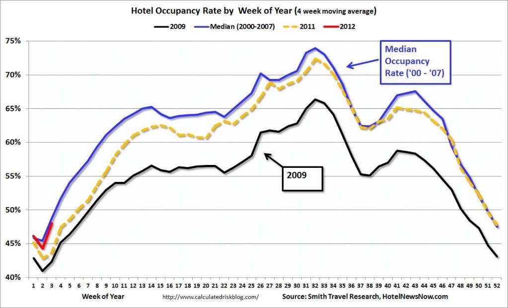
Calculated Risk points out that 2009 was the worst year for hotel occupancy since the Great Depression. But it has sinced picked up and is now back to its median level from the 2000-2007 good old days. As usual, Calculated Risk has a gorgeous graphic:

HotelOccupancy Hotel Occupancy

Source: Calculated Risk (click on image to expand)

Good economic news is no longer a rarity. Consumer sentiment seems to be slowly improving. Perhaps animal spirits in the market will not be too far behind.

Posted by:


Weekly RS Recap

January 23, 2012

The table below shows the performance of a universe of mid and large cap U.S. equities, broken down by relative strength decile and quartile and then compared to the universe return. Those at the top of the ranks are those stocks which have the best intermediate-term relative strength. Relative strength strategies buy securities that have strong intermediate-term relative strength and hold them as long as they remain strong.

Last week’s performance (1/16/12 – 1/20/12) is as follows:

ranks12312 Weekly RS Recap

The laggards had another strong week last week.

Posted by:


Dorsey, Wright Client Sentiment Survey - 1/20/12

January 20, 2012

Here we have the next round of the Dorsey, Wright Sentiment Survey, the first third-party sentiment poll. Participate to learn more about our Dorsey, Wright Polo Shirt raffle! Just follow the instructions after taking the poll, and we’ll enter you in the contest. Thanks to all our participants from last round.

As you know, when individuals self-report, they are always taller and more beautiful than when outside observers report their perceptions! Instead of asking individual investors to self-report whether they are bullish or bearish, we’d like financial advisors to weigh in and report on the actual behavior of clients. It’s two simple questions and will take no more than 20 seconds of your time. We’ll construct indicators from the data and report the results regularly on our blog–but we need your help to get a large statistical sample!

Click here to take Dorsey, Wright’s Client Sentiment Survey.

Contribute to the greater good! It’s painless, we promise.

Posted by: