This post explores relative strength success by decade, dating back to the 1930s. Once again, we’ve used the Ken French data library and CRSP database data. You can click here for a more complete explanation of this data.
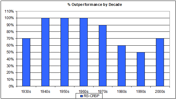
Chart 1: Percent Outperformance by Decade. This chart shows the number of years in which relative strength has outperformed the CRSP universe each decade. RS outperformance has occurred in at least half of all years each decade.
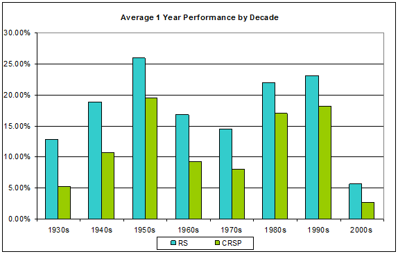
Chart 2: Average 1-Year Performance by Decade. This chart shows the average yearly growth by decade of a relative strength portfolio and of the CRSP universe. Each decade, the average performance of relative strength has been greater than the average performance of the CRSP universe. Generally speaking, when the market’s average performance is increasing, RS outperforms CRSP by a greater percentage than it does when the market is doing poorly.
In short, relative strength has been a durable return factor for a very long time.


[...] past posts (“Relative Strength vs. Value-Performance over Time” and “Relative Strength, Decade by Decade”), I’ve used the Ken French database’s relative strength portfolio. While this is useful in [...]