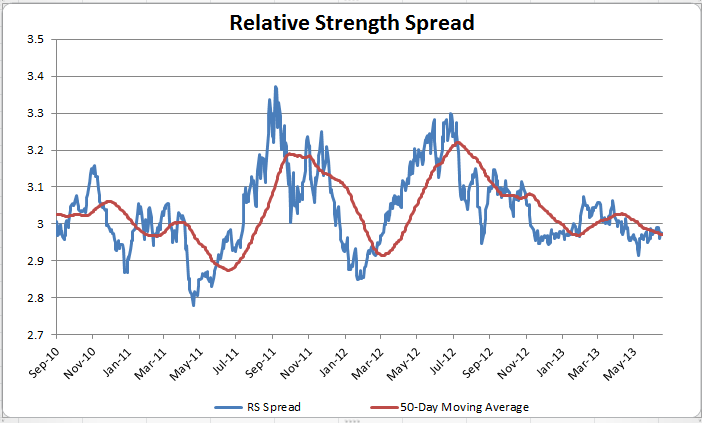
The chart below is the spread between the relative strength leaders and relative strength laggards (universe of mid and large cap stocks). When the chart is rising, relative strength leaders are performing better than relative strength laggards. As of 7/15/2013:
Systematic Relative Strength
The Official Blog of Dorsey Wright Money Management
Asset Management
Seeking Alpha Certified
Financial Blogs
Sites
Archives
Categories
- From the Archives (70)
- From the MM (125)
- Investor Behavior (570)
- Just for Fun (165)
- Markets (2167)
- Media (44)
- Momentum (2)
- Non-partisan op-ed (41)
- Off-Topic (9)
- Podcasts (38)
- Portfolio Theory (30)
- Relative Strength and Value (29)
- Relative Strength Research (177)
- Retirement/Saving (110)
- Sentiment (187)
- SRI (3)
- Tactical Asset Alloc (408)
- Thought Process (831)
- Uncategorized (17)
- Wealth Management (11)
Stat Counter
Systematic RSS Feed
Meta
Theme: Contempt by Vault9.
Get a free blog at WordPress.com


For me it is not clear what the graph is showing. Could you explain more, what the y-axis is showing?
Thanks in advance!
Fab