At Dorsey Wright Money Management, we view dispersion among asset classes and sectors as an opportunity to gain exposure to the strongest performing markets while minimizing exposure to the weakest. Throughout most of the year this has allowed us to maintain our highest exposure towards US equities, while keeping exposure toward under performing asset classes such as commodities to a minimum. However, this isn’t to say there haven’t been some underlying pockets of relative strength within commodities asset class that have created opportunities. In a blog post from a few weeks back, we noted the relative strength of the grains markets (corn, soybeans, and wheat) appeared to be strengthening. This has continued to hold true with all three of them now trading at multi-month highs.
In this piece we will take a look at the traditional point & figure charts for both Live Cattle & Cotton. Although not the most commonly discussed commodities, they both provide for very solid examples of how using relative strength can provide market participants with great advantages from both an offensive and defensive perspective. We will also discuss the RS point & figure charts for each respective market in order to better display the dispersion in performance relative to their peers.
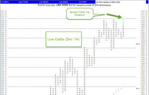
Point & Figure Chart: Live Cattle (LC/Z4 - Dec ’14)
We can see below just how large of base the live cattle market has been forming. The sharp move higher yesterday was able to punch through the key overhead supply level which had been located at $170.00. From a trading perspective, it could also be viewed that a large number of sellers (or shorts) who had previously shown up at $170.00 are now holding positions which are “under-water.” Often times this will propel the market sharply higher as race to exit losing positions creates demand (short covering). The triple top break out pattern which was confirmed with the move above $170.00 has a measured move price objective of $180.50 and would only be negated on a move below $164.50.

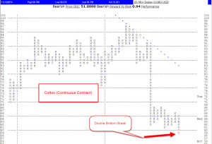
Point & Figure Chart: Cotton (CT/ - Continuous Contract)
On the flip side, we can see right away on the below chart that the cotton market has been displaying a very different picture in terms of supply & demand then that of live cattle. The sharp move lower yesterday was able to punch through a key demand level located at $0.60. This double bottom break pattern has a measured move price objective of $0.51, and would only be negated on a move above $0.67. In terms of a trading perspective, those previous buyers at the $0.60 level are now holding losing positions (under-water) which may spark a rush to the exits and another sharp leg down as those same market participants look to minimize losses.

Let’s move on to the relative strength Point & Figure charts to see if we can get a better visible picture of how each of the above commodities performance has been this year relative to their peers. Given the patterns and targets we mapped out above, we should already have a pretty good idea of what the relative strength charts should look like.
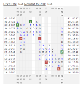
Relative Strength P&F: Live Cattle vs. Continuous Commodities Index (LC/ vs. UV/Y)
The relative strength chart below displays the continuous live cattle contract vs. a basket of commodities. This is a great visual aide in showing us just how strongly the cattle market has performed relative to the rest of the commodities universe.

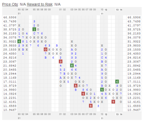
Relative Strength P&F: Cotton vs. Continuous Commodities Index (CT/ vs. UV/Y)
A quick glance at the RS chart below and we can clearly see the under performance cotton is displaying compared to the majority of its peers. The RS chart is now currently sitting near a double bottom level which if broken may be a sign cotton prices are set to further weaken relative to the rest of the commodities universe.

Conclusion:
In the above blog post we have identified how using traditional point and figure charts can allow market participants to identify potential trading ideas, and more importantly help aide in establishing proper risk management. Furthermore, we displayed how following a relative strength based approach can keep investors allocated towards stronger performing markets and away from those that are under performing. Although commodities in general continue to under perform the equity markets, the dispersion among the sector (as evidenced by live cattle & cotton) is just another example of using a relative strength based approach can be very beneficial in helping identify opportunities within asset classes.
***The relative strength strategy is not a guarantee. There may be times where all investments and strategies are unfavorable and depreciate in value. The information found on Dorsey, Wright & Associates’ Web Pages has been prepared without regard to any particular investor’s investment objectives, financial situation, and needs. Accordingly, investors should not act on any recommendation (express or implied) or information in this report without obtaining specific advice from their financial advisors and should not rely on information herein as the primary basis for their investment decisions. Information contained herein is based on data obtained from recognized statistical services, issuer reports or communications, or other sources, believed to be reliable. However, such information has not been verified by Dorsey, Wright and Associates, LLC (DWA) or the information provider and DWA and the information providers make no representations or warranties or take any responsibility as to the accuracy or completeness of any recommendation or information contained herein.
Neither the information nor any opinion expressed shall constitute an offer to sell or a solicitation or an offer to buy any securities or commodities mentioned herein. This report or chart does not purport to be a complete description of the securities or commodities, market or developments to which reference is made. There may be instances when fundamental, technical, and quantitative opinions may not be in concert.
Each investor should carefully consider the investment objectives, risks and expenses of any Exchange-Traded Fund (“ETF”) prior to investing. Before investing in an ETF investors should obtain and carefully read the relevant prospectus and documents the issuer has filed with the SEC. To obtain more complete information about the product the documents are publicly available for free via EDGAR on the SEC website (http://www.sec.gov).
A list of all holdings for the past 12 months is available upon request.


