Andrew Thrasher makes an interesting case for there being a new market barometer in town. So long, Dr. Copper and hello, Semiconductors:
There used to be a belief on Wall Street that copper had a Ph.D. in economics since it was often used as a barometer for the economy and often the market. Traders would look for divergences between the copper and the equity markets for signs of potential danger. If Dr. Copper began to weaken it was believed that the stock market would soon follow. While this may have been the case at one point I would argue it no longer is today or has been for a few years now.
Dr. Copper in my opinion has been replaced by technology, specifically semiconductors. The market seems to be much more focused on the happenings of Silicon Valley rather than Milwaukee or Detroit. While the industrial sector still remains a large piece of our economy it no longer is the driver of growth. At least that’s what price action has been telling us.
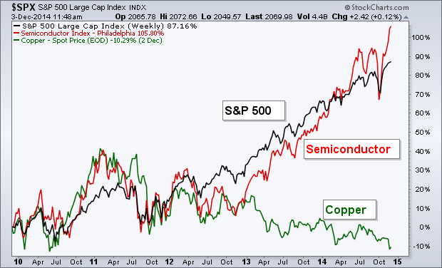
The chart below shows the performance of the S&P 500 (black line), the Semiconductor Index (red line), and the spot price of Copper (green line). You can clearly see that copper has not been enjoying the bull market party while semi’s have been moving right along with the market. It’s a little hard to see, but in 2011 we saw semiconductors break away from the S&P 500 as the industry made a lower low, a divergence that the equity market eventually fixed by falling in price by nearly 20%. Ever since then we’ve gotten confirmation by the semi’s of the new highs in the S&P.
It seems Copper has been expelled while the semiconductors step to the front of the class.
Seems logical and the charts are compelling. So, what should we do with this information? Follow the lead of Semiconductors, right? Perhaps, this relationship lasts 3 years; perhaps, it lasts 30 years. The problem is that we won’t know until after the fact that the market has moved from Semiconductors on to the next leading indicator. Furthermore, what if the lag of a given market barometer is 9-12 months on average. Are your clients fine taking defensive action that far ahead of a market top, even if it means foregoing significant gains? I suspect that this is another one of those market tendencies that sounds great in theory, have some truth to them, but are pretty tough to implement from a portfolio management perspective.
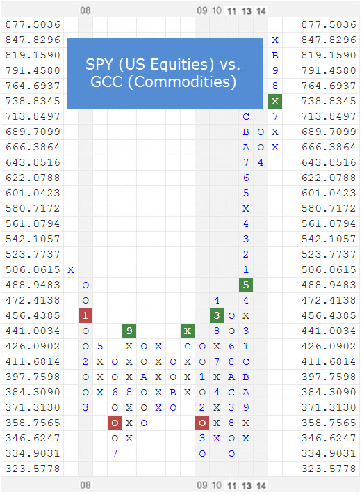
What is an alternative method of risk management to reliance upon market barometers? For users of Dorsey Wright, the answer is probably obvious: relative strength. I’ll give one potential answer: The PowerShares Sector 4 Model. This is a sector rotation strategy, driven by relative strength, that also treats cash as part of the investment universe. Each month, the top 4 sectors are bought. If cash moves into the number 4 ranks from a relative strength perspective, it gets a 25% allocation. If it moves to the number 3 rank, it gets a 50% allocation; 2 rank a 75% allocation, and number 1 rank and it would be 100% of the allocation.
How does this approach to risk management differ from the previous approach of reliance upon Copper (or now Semiconductors)? Rather than hoping that a relationship between a given commodity or sector to the broad market persists in the future, simply rely on relative strength to dictate allocations. Admittedly, rather than being early to take defensive action, you will be somewhat late (by definition, a trend following strategy like relative strength never gets out at the exact top). However, if relative strength helps mitigate some of the downside risk in major bear markets and avoids the problem of a market barometer completely failing from time to time, doesn’t that maker more sense?
The relative strength strategy is NOT a guarantee. There may be times where all investments and strategies are unfavorable and depreciate in value.
HT: Abnormal Returns
