RS Chart of The Day

March 17, 2015

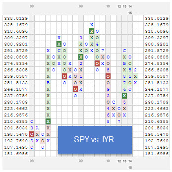
spyvsiyr zpslv2vaf7i RS Chart of The Day

Point and Figure RS Charts are calculated by dividing one security by another and plotting the ratio on a PnF chart. When the ratio is rising, it is plotted in a column of X’s and reflects the numerator outperforming the denominator. Likewise, when the relative strength ratio is declining, it is plotted in a column of O’s and reflects the outperformance of the denominator.

Past performance is not indicative of future results. Potential for profits is accompanied by possibility of loss. This example is presented for illustrative purposes only and does not represent a past recommendation. The relative strength strategy is NOT a guarantee. There may be times where all investments and strategies are unfavorable and depreciate in value. Nothing contained herein should be construed as an offer to sell or the solicitation of an offer to buy any security. This post does not attempt to examine all the facts and circumstances which may be relevant to any product or security mentioned herein. We are not soliciting any action based on this document. It is for the general information of clients of Dorsey, Wright & Associates, LLC (“Dorsey, Wright & Associates”). This document does not constitute a personal recommendation or take into account the particular investment objectives, financial situations, or needs of individual clients. Before acting on any analysis, advice or recommendation in this document, clients should consider whether the security or strategy in question is suitable for their particular circumstances and, if necessary, seek professional advice.
Posted by:


Market Timing vs. Global Tactical Allocation

March 17, 2015

The Irrelevant Investor takes a look back at rolling 6 and 10-year returns for the U.S. stock market:

6 Market Timing vs. Global Tactical Allocation

10 Market Timing vs. Global Tactical Allocation

Where Do Stocks Go From Here?

After six years of virtually uninterrupted gains, people are wondering where we go from here.

Stocks are up more than 200% over the last six years which is the best six-year run since the tech bubble. Looking at the chart, we see that we are well above the 85% historical average. Once stocks have achieved this level of success, returns going forward have declined.

There have been 54 prior periods where six year returns were greater than 200%. The average return over the next three years was 9% (median 20%) compared with an average historical three-year return of 38%. Furthermore, following these strong runs, we have seen negative three-year returns 35% of the time compared with the 17% negative three-year returns that we have seen historically. So, three-year returns following such a strong run have been one quarter of the average three-year return with negative returns occurring twice as often as we have seen historically.

While there might be reason to be cautious looking back over the last six years, when we take a step back the picture starts to change. Over the last ten years, stocks have gained 115% which is just 60% of the historical average ten-year return of 192%.

This type of observation can lead an investor to believe that a choice needs to be made. Given the run that we have had over the past 6 years, should we preemptively reduce equity exposure? Or, should we view the future through the lens of having a sub-par decade and therefore stay exposed to equities with the expectation that they may continue to rise from here?

The advantage of using a global tactical asset allocation strategy for a healthy portion of a client’s allocation is that they can let relative strength make this decision for them rather than engage in the fruitless game of forecasting. The stress of trying to make the right call is taken off the table. Relative strength may not (and, in fact, will not) always be right. However, it does allow an investor to participate in long-term trends and when it is wrong, it will not stay wrong.

Market timing is very different than global tactical allocation. The former relies heavily on the luck of getting calls right and entails a large risk of devastating investment results. The latter is pragmatic and disciplined and, we believe, likely to result in favorable investment results over time.

The relative strength strategy is NOT a guarantee. There may be times where all investments and strategies are unfavorable and depreciate in value.

HT: Abnormal Returns

Posted by:


Relative Strength Spread

March 17, 2015

The chart below is the spread between the relative strength leaders and relative strength laggards (universe of mid and large cap stocks). When the chart is rising, relative strength leaders are performing better than relative strength laggards. As of 3/16/15:

spread1 Relative Strength Spread

This example is presented for illustrative purposes only and does not represent a past recommendation. The performance above is based on pure price returns, not inclusive of dividends or all transaction costs. Investors cannot invest directly in an index. Indexes have no fees. Past performance is not indicative of future results. Potential for profits is accompanied by possibility of loss.

Posted by: