Weekly RS Recap

January 25, 2016

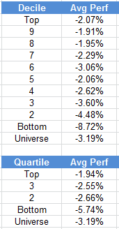
The table below shows the performance of a universe of mid and large cap U.S. equities, broken down by relative strength decile and quartile and then compared to the universe return. Those at the top of the ranks are those stocks which have the best intermediate-term relative strength. Relative strength strategies buy securities that have strong intermediate-term relative strength and hold them as long as they remain strong.

Last week’s performance (1/19/16 – 1/22/16) is as follows:

ranks

This example is presented for illustrative purposes only and does not represent a past recommendation. The performance above is based on pure price returns, not inclusive of dividends or all transaction costs. Past performance is not indicative of future results. Potential for profits is accompanied by possibility of loss.

Posted by:


The Forest and the Trees

January 22, 2016

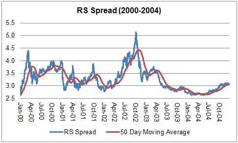
One of our favorite indicators for gauging the performance of relative strength strategies is the Relative Strength Spread. The way that we calculate the RS Spread is to divide the RS leaders by the RS laggards (top quartile of stocks in our ranks divided by the bottom quartile of stocks in our ranks; universe of U.S. mid and large cap stocks). When the chart is rising, relative strength leaders are performing better than relative strength laggards.

See below for both the long-term RS Spread as well as the RS Spread broken down into approximately 5-year chunks:

lt spread

90_94

95-99

00_04

05_09

10_16

Some observations:

  • The long-term chart of the RS Spread (1990-2016*) reflects the vastly superior performance of the RS leaders compared to the RS laggards over time. The ratio started at 1.00 on March 14, 1990 and had risen to 4.59 by January 21, 2016.
  • Three of those approximately 5-year periods were very favorable to RS strategies: 1990-1994, 1995-1999, and 2010-2016*
  • The RS Spread made no real net gains in two of the periods: 2000-2004 and 2005-2009
  • The RS Spread tended to do the worst following major bear markets—periods of sharp laggard rallies
  • The RS Spread tended to do the best during periods of stable leadership
  • The RS Spread was flat from late 2009-late 2014, but has broken to the upside in a major way in recent years

There is always a desire on the part of investors to try to time exposure to different strategies like relative strength and value. Maybe some can pull the timing off well, but I think most investors would benefit most from relative strength strategies by simply doing sufficient homework to understand its long-term performance characteristics and then to allocate a portion of their money to disciplined RS strategies. Investors may then want to seek out uncorrelated strategies (like value) to round out their overall asset allocation. Sometimes relative strength investors have to be patient while RS comes back in favor, but I am not aware of any other strategy that compares as favorably over time.

*Data range: March 14, 1990 – January 21, 2016. This example is presented for illustrative purposes only and does not represent a past recommendation. The performance above is based on pure price returns, not inclusive of dividends or all transaction costs. Investors cannot invest directly in an index. Indexes have no fees. The relative strength strategy is NOT a guarantee. There may be times where all investments and strategies are unfavorable and depreciate in value.

Posted by:


Interpreting Oversold Conditions

January 21, 2016

How oversold is the U.S. equity market at this point? One way to answer that is by looking at the Sector Bell Curve that plots the sector bullish percent charts for the 40 Dorsey Wright sectors. A broad universe of U.S. equities is categorized into these 40 sectors. The bullish percent for each sector measures the percentage of stocks in each of those sectors on a point and figure buy signal (short-term indication of positive trend). The average of those 40 bullish percent readings (BPAVG) was 21.20% as of 1/20/16. Visually, this oversold condition can be observed by the chart below which shows this sector bell curve skewed to the left hand side of the chart.

sector bell curve

We have data on BPAVG going back to 6/13/1997. Over that period of time, only 1.5% of all measurements have been lower than today’s reading. So, short answer is that the market is pretty oversold at this point! The chart below of the S&P; 500 highlights other times over this period where the BPAVG has been as oversold (or more oversold).

spx

Those months and years where the BPAVG has been this oversold (or more) since 1997 are highlighted in yellow: August-October 1998, January 2008, October-December 2008, February-March 2009, October 2011, and now January 2016.

A couple observations:

  • Some of those times when the Sector Bell Curve (BPAVG) was this oversold preceded tremendous moves higher in the broad market (1998, 2009, 2011)
  • Some of those oversold conditions preceded even greater losses in the broad market (2008)

The search goes on for the perfect indicator of a market bottom! Actually, I’m not holding my breath. Markets just aren’t that predictable. With that in mind, I have a couple thoughts on how to proceed:

  1. Diversify. A mix that appeals to me is 1/3 fully-invested momentum and value strategies, 1/3 Tactical Allocation, 1/3 Fixed Income.
  2. Add money to your investments when you get oversold conditions. There is no guarantee that this type of oversold condition won’t get more oversold, but these types of conditions have often created great buying opportunities.
  3. Add other money to your investments on a regular basis no matter what the market is doing. Is this at odds with suggestion #2? No. One of the biggest mistakes investors can make is to not save enough and waiting for “the perfect” opportunity to get in at the bottom can cost an investor a substantial amount of money over time. Sure, for those inclined, use oversold opportunities to take advantage of what may be a great opportunity, but saving on a regular basis is essential to building wealth over time.

NOTHING CONTAINED WITHIN THE SITE SHOULD BE CONSTRUED AS AN OFFER TO SELL OR THE SOLICITATION OF AN OFFER TO BUY ANY SECURITY. THIS POST DOES NOT ATTEMPT TO EXAMINE ALL THE FACTS AND CIRCUMSTANCES WHICH MAY BE RELEVANT TO ANY COMPANY, INDUSTRY OR SECURITY MENTIONED HEREIN. THIS POST IS FOR GENERAL INFORMATION AND EDUCATIONAL PURPOSES. PAST PERFORMANCE IS NOT INDICATIVE OF FUTURE RESULTS. POTENTIAL FOR PROFITS IS ACCOMPANIED BY POSSIBILITY OF LOSS.

Posted by:


High RS Diffusion Index

January 21, 2016

The chart below measures the percentage of high relative strength stocks (top quartile of our ranks) that are trading above their 50-day moving average (universe of mid and large cap stocks.) As of 1/20/16.

diffusion

The 10-day moving average of this indicator is 26% and the one-day reading is 19%. Dips in this index have often provided good opportunities to add to relative strength strategies.

This example is presented for illustrative purposes only and does not represent a past recommendation. The performance above is based on pure price returns, not inclusive of dividends or all transaction costs. Investors cannot invest directly in an index. Indexes have no fees. Past performance is not indicative of future results. Potential for profits is accompanied by possibility of loss.

Posted by:


Sector Performance

January 20, 2016

The table below shows performance of US sectors over the trailing 12, 6, and 1 month(s). Performance updated through 1/19/16.

sector

The performance above is based on pure price returns, not inclusive of dividends or all transaction costs. Past performance is not indicative of future results. Potential for profits is accompanied by possibility of loss. Source: iShares

Posted by:


Markets

January 19, 2016

Via Morgan Housel:

housel

Posted by:


Weekly RS Recap

January 19, 2016

The table below shows the performance of a universe of mid and large cap U.S. equities, broken down by relative strength decile and quartile and then compared to the universe return. Those at the top of the ranks are those stocks which have the best intermediate-term relative strength. Relative strength strategies buy securities that have strong intermediate-term relative strength and hold them as long as they remain strong.

Last week’s performance (1/11/16 – 1/15/16) is as follows:

ranks

This example is presented for illustrative purposes only and does not represent a past recommendation. The performance above is based on pure price returns, not inclusive of dividends or all transaction costs. Past performance is not indicative of future results. Potential for profits is accompanied by possibility of loss.

Posted by:


What To Do With A Correction

January 14, 2016

Wise words from Jim O’Shaughnessy (from an article written August 28, 2014):

In the past, the United States has endured far more perilous times than those we currently face, and I believe that you will never make money betting against the United States over the long-term. We have come through far greater challenges to emerge stronger, more vibrant and ready to face the future. And today, we find ourselves at inflation-adjusted highs for the S&P; 500. Does this mean that stocks will continue to rise? Absolutely not. I’m sure that at some point we will get a 10 to 20 percent correction in the market. But when we do, remind yourself of this simple fact—the U.S. stock market has come back from every setback and gone on to make new highs. Hundreds of years of data back this up. When the next correction comes—and it will come—remind yourself of this simple fact, and BUY.

Past performance is no guarantee of future returns.

Posted by:


High RS Diffusion Index

January 14, 2016

The chart below measures the percentage of high relative strength stocks (top quartile of our ranks) that are trading above their 50-day moving average (universe of mid and large cap stocks.) As of 1/13/16.

The 10-day moving average of this indicator is 37% and the one-day reading is 21%. Dips in this index have often provided good opportunities to add money to relative strength strategies.

This example is presented for illustrative purposes only and does not represent a past recommendation. The performance above is based on pure price returns, not inclusive of dividends or all transaction costs. Investors cannot invest directly in an index. Indexes have no fees. Past performance is not indicative of future results. Potential for profits is accompanied by possibility of loss.

Posted by:


Probable vs. Possible

January 13, 2016

Good advice from Jim O’Shaughnessy:

Investors should make decisions using the long-term base rates a strategy exhibits—in other words, they should concentrate on what is probable rather than what is possible. If you organized your life around things that might possibly happen to you, you’d probably never leave your house, and when you did, it would only be to buy a lottery ticket. Consider, on a drive to the supermarket, it is highly probable that you will get there, buy your groceries and get back home to unpack them without incident. But what’s possible? Almost anything—it’s possible a plane flying overhead could lose an engine falling directly on your car and instantly killing you. It’s possible another car runs a red light and kills you on impact. It’s possible that It’s possible that you get carjacked and your assailant kills you in the process. You get the point—anything is possible buy highly improbable. It’s only when you think in terms of probability that you will get in your car and go, yet few investors do so when making investment decisions. Our brains create cause and effect narratives after something has occurred that seem to make sense, however improbable the event. Witness anyone who invested in the stocks with the highest sales gains after a great short-term run.

Posted by:


Relative Strength Spread

January 12, 2016

The chart below is the spread between the relative strength leaders and relative strength laggards (top quartile of stocks in our ranks divided by the bottom quartile of stocks in our ranks; universe of U.S. mid and large cap stocks). When the chart is rising, relative strength leaders are performing better than relative strength laggards. As of 1/11/16:

This example is presented for illustrative purposes only and does not represent a past recommendation. The performance above is based on pure price returns, not inclusive of dividends or all transaction costs. Investors cannot invest directly in an index. Indexes have no fees. Past performance is not indicative of future results. Potential for profits is accompanied by possibility of loss.

Posted by:


Weekly RS Recap

January 11, 2016

The table below shows the performance of a universe of mid and large cap U.S. equities, broken down by relative strength decile and quartile and then compared to the universe return. Those at the top of the ranks are those stocks which have the best intermediate-term relative strength. Relative strength strategies buy securities that have strong intermediate-term relative strength and hold them as long as they remain strong.

Last week’s performance (1/4/16 – 1/8/16) is as follows:

ranks

This example is presented for illustrative purposes only and does not represent a past recommendation. The performance above is based on pure price returns, not inclusive of dividends or all transaction costs. Past performance is not indicative of future results. Potential for profits is accompanied by possibility of loss.

Posted by:


Q4 Manager Insights

January 7, 2016

Despite a decent fourth quarter, global equity markets had a volatile year in 2015. U.S. and global equities both finished the quarter with solid gains. After the summer correction in the S&P; 500, U.S. stocks snapped back quickly. This was a surprise to many investors who were looking for the end of one of the longest bull markets on record. After the snapback, equities treaded water and moved in a very tight trading range to close out the year. Fixed Income (measured by the Barclay’s Aggregate Index) finished the fourth quarter down slightly, but held on to scrape a 0.55% gain for the year. Commodities, led by oil, continued their sell off and were the worst performing class of the year. The trouble in commodities also affected emerging markets, which finished the year down over -14%.

If you were left scratching your head and wondering why it was so difficult to make money in 2015 you are not alone! According to data from Societe Generale, 2015 was the hardest year to make money in 78 years. U.S. equities (measured by the S&P; 500 Total Return Index) were the best performing major asset class, but only managed to squeak out a gain of 1.38% for the year. That paltry gain was more than bonds, international equities, and short-term T-bills. Way back in 1937 (despite what my kids say I was not around to witness that market!) short term treasuries were the best performing major asset class with a gain of only 0.3%. Even in 2008, bonds were up over 20% so there was somewhere to make money. This year’s environment was very difficult for hedge funds and for strategies that try to capitalize on major global trends.

Momentum and Relative Strength was a bright spot for the year. We noticed that more focused (i.e., focused on one specific market) and concentrated (i.e., fewer holdings) strategies performed better. For example, a concentrated U.S. equity momentum strategy did much better than a strategy with a large number of holdings or a strategy that was invested in multiple asset classes. It was also advantageous to have a momentum overlay combined with other factors. Value strategies didn’t fare well in 2015, but value stocks that also had good momentum did very well. A lot of the momentum outperformance this year came from what momentum strategies avoided rather than what they held. When we looked at the performance of the S&P; 500 industry groups and broke them into quintiles (based on a monthly rebalance), the top four quintiles all had similar performance for the year. The performance of the bottom quintile, however, was dreadful. That quintile was made up mainly of Energy and Basic Materials groups. It is rare to see one group underperform the other four groups by such a large margin (over -13%) for the year.

The Federal Reserve finally took action and raised interest rates by 0.25% during the fourth quarter. The move was long anticipated, but had been put off due to market volatility and concerns about the health of the global economy. It is important to keep in mind that even with the hike, rates are still historically low. We have seen some studies recently that show equities are not as affected as you might think until rates get up around 5%, and we are a long way from that now. This may be more of a problem for the fixed income markets than equities, but only time will tell.

As the current bull market continues to age we expect a few things to happen we believe will be positive for our strategies. First, you will begin to hear more cries that the market is “expensive.” That usually affects valuation based strategies more than relative strength based processes. Second, the market will continue to narrow. That is natural and totally expected as the bull market matures. A narrow market is very positive for our strategies because we can overweight the small pockets of strength that are performing well and avoid the areas that are weak. As a result, we are encouraging people to take a look at their portfolios and overweight momentum relative to value. If you have any questions about your allocations or the best way to get exposure to momentum strategies please call us at any time.

Information is from sources believed to be reliable, but no guarantee is made to its accuracy. This should not be considered a solicitation to buy or sell any security. Past performance should not be considered indicative of future results. Potential for profits is accompanied by possibility of loss.

Posted by:


High RS Diffusion Index

January 6, 2016

The chart below measures the percentage of high relative strength stocks (top quartile of our ranks) that are trading above their 50-day moving average (universe of mid and large cap stocks.) As of 1/5/16.

diffusion

The 10-day moving average of this indicator is 59% and the one-day reading is 45%.

This example is presented for illustrative purposes only and does not represent a past recommendation. The performance above is based on pure price returns, not inclusive of dividends or all transaction costs. Investors cannot invest directly in an index. Indexes have no fees. Past performance is not indicative of future results. Potential for profits is accompanied by possibility of loss.

Posted by:


Relative Strength Spread

January 5, 2016

The chart below is the spread between the relative strength leaders and relative strength laggards (top quartile of stocks in our ranks divided by the bottom quartile of stocks in our ranks; universe of U.S. mid and large cap stocks). When the chart is rising, relative strength leaders are performing better than relative strength laggards. As of 1/4/16:

spread

This example is presented for illustrative purposes only and does not represent a past recommendation. The performance above is based on pure price returns, not inclusive of dividends or all transaction costs. Investors cannot invest directly in an index. Indexes have no fees. Past performance is not indicative of future results. Potential for profits is accompanied by possibility of loss.

Posted by:


Meet This Year’s Best Consumer Staples ETF

January 2, 2016

Via MarketWatch:

Even with all the concern regarding higher interest rates, a scenario that was realized earlier this month, rate-sensitive consumer staples stocks and exchange traded funds have been solid performers in 2015. Two of the 14 Dow Jones Industrial Average Stocks that are up this year are staples stocks: Procter & Gamble Inc. PG, -0.82% and Wal-Mart Stores Inc. WMT, -0.62%

Add to that, the Consumer Staples Select Sector SPDR XLP, -1.12% and the Vanguard Consumer Staples ETF VDC, -1.10% are up 7.7 percent and 6.7 percent, respectively, this year. Those are solid performances, particularly in the face of rising interest rates, but those are from the best showings among staples ETFs. Honors for 2015’s best staples go to the PowerShares DWA Consumer Staples Momentum Portfolio PSL, -1.01% which is up 14 percent year-to-date.

PSL is a smart or strategic beta ETF, meaning it is not capitalization-weighted as are rivals such as XLP and VDC. That also means PSL is not dominated by the likes of Procter & Gamble and Wal-Mart as are XLP and traditional cap-weighted staples ETFs.
PSL’s stellar year-to-date showing relative to its cap-weighted performers could imply, to some investors, that significant risk is involved with betting on PSL over its more traditional rivals. However, that is not the case. Not only has PSL offered superior returns over standard consumer staples ETFs, the PowerShares offering has posted better risk-adjusted returns. For example, PSL’s volatility this year has been 14.6 percent, according to ETF Replay. That is 100 basis points in excess of VDC, but PSL has outpaced the Vanguard Staples ETF by 730 basis points.

PSL follows the Dorsey Wright Consumer Staples Technical Leaders Index, a benchmark that “is designed to identify companies that are showing relative strength (momentum), and is composed of at least 30 common stocks from the NASDAQ US Benchmark Index,” according to PowerShares, the fourth-largest U.S. ETF issuer.

PSL has swelled in popularity this year. When we highlighted the ETF in late September, it had less than $221 million in assets under management. Since then, PSL’s assets under management tally has surged north of $369 million. Only six PowerShares ETFs have added more new assets in 2015 than PSL.

PSL break from the norm among staples ETFs is okay because over the past year, the Dorsey Wright Consumer Staples Technical Leaders Index has offered nearly double the returns of the S&P; 500 consumer staples index and over the past three- and five-year periods, PSL has topped that index. PSL started tracking the Dorsey Wright index early last year.

See www.powershares.com for a prospectus. The relative strength strategy is NOT a guarantee. There may be times where all investments and strategies are unfavorable and depreciate in value.

Posted by:


Weekly RS Recap

January 2, 2016

The table below shows the performance of a universe of mid and large cap U.S. equities, broken down by relative strength decile and quartile and then compared to the universe return. Those at the top of the ranks are those stocks which have the best intermediate-term relative strength. Relative strength strategies buy securities that have strong intermediate-term relative strength and hold them as long as they remain strong.

Last week’s performance (12/28/15 – 12/31/15) is as follows:

ranks

This example is presented for illustrative purposes only and does not represent a past recommendation. The performance above is based on pure price returns, not inclusive of dividends or all transaction costs. Past performance is not indicative of future results. Potential for profits is accompanied by possibility of loss.

Posted by:


Q1 2016 PowerShares DWA Momentum ETFs

January 2, 2016

The PowerShares DWA Momentum Indexes are reconstituted on a quarterly basis. These indexes are designed to evaluate their respective investment universes and build an index of stocks with superior relative strength characteristics. This quarter’s allocations are shown below.

PDP: PowerShares DWA Momentum ETF

pdp

DWAS: PowerShares DWA Small Cap Momentum ETF

dwas

DWAQ: PowerShares DWA NASDAQ Momentum ETF

dwaq

PIZ: PowerShares DWA Developed Markets Momentum ETF

piz

PIE: PowerShares DWA Emerging Markets Momentum ETF

pie

Source: Dorsey Wright, MSCI, Standard & Poor’s, and NASDAQ, Allocations subject to change

We also apply this momentum-indexing methodology on a sector level:

sector

See www.powershares.com for more information.

The relative strength strategy is NOT a guarantee. There may be times where all investments and strategies are unfavorable and depreciate in value.

Posted by: