Our latest sentiment survey was open from 4/12/13 to 4/19/13. The Dorsey, Wright Polo Shirt Raffle continues to drive advisor participation, and we greatly appreciate your support! This round, we had 57 advisors participate in the survey. If you believe, as we do, that markets are driven by supply and demand, client behavior is important. We’re not asking what you think of the market—since most of our blog readers are financial advisors, we’re asking instead about the behavior of your clients. Then we’re aggregating responses exclusively for our readership. Your privacy will not be compromised in any way.
After the first 30 or so responses, the established pattern was simply magnified, so we are fairly comfortable about the statistical validity of our sample. Some statistical uncertainty this round comes from the fact that we only had four investors say that thier clients are more afraid of missing a stock upturn than being caught in a downdraft. Most of the responses were from the U.S., but we also had multiple advisors respond from at least two other countries. Let’s get down to an analysis of the data! Note: You can click on any of the charts to enlarge them.
Question 1. Based on their behavior, are your clients currently more afraid of: a) getting caught in a stock market downdraft, or b) missing a stock market upturn?

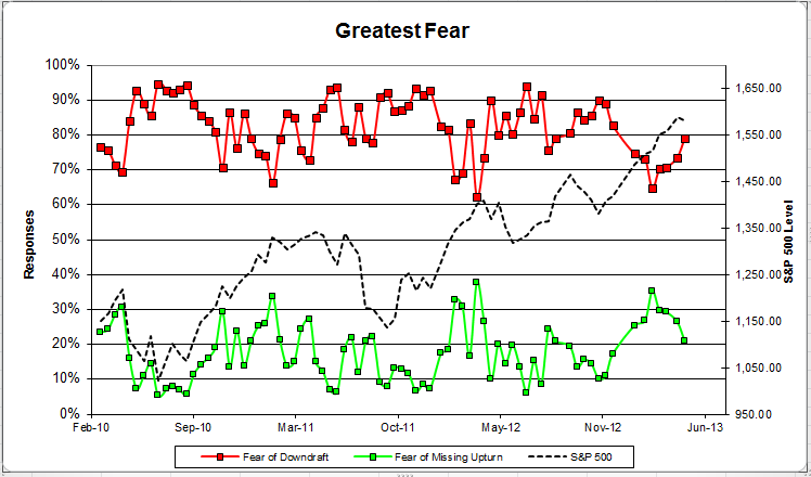
Chart 1: Greatest Fear. From survey to survey, the S&P; 500 rose slightly, and none of our indicators worked correctly. This has to do with when we publish the survey (Friday) and when most people take the survey (Monday). On that Monday, the S&P; had a big down day and these results incorporate that move down. The fear of downturn group rose from 71% to 74%. The fear of missing upturn group fell from 29% to 26%.
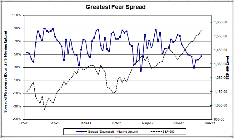
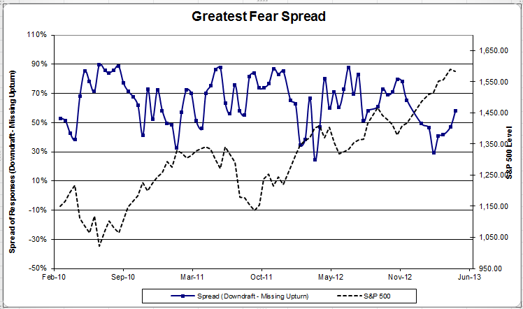
Chart 2: Greatest Fear Spread. Another way to look at this data is to examine the spread between the two groups. The spread rose from 42% to 47%.
Question 2. Based on their behavior, how would you rate your clients’ current appetite for risk?
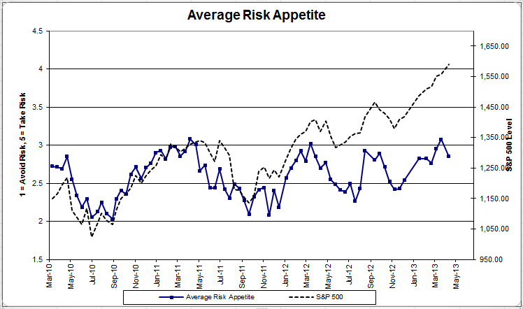
Chart 3: Average Risk Appetite. Average risk appetite dropped this round, from 3.08 to 2.85.
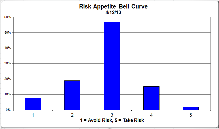
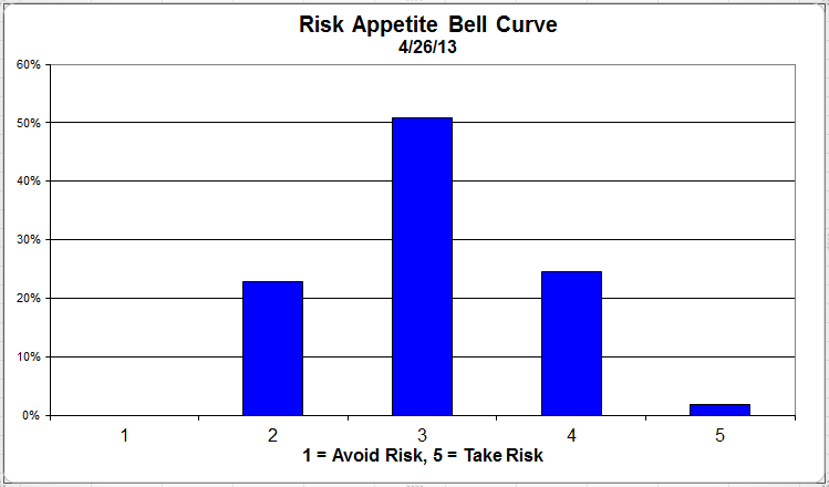
Chart 4: Risk Appetite Bell Curve. This chart uses a bell curve to break out the percentage of respondents at each risk appetite level. This round, over 50% of all respondents wanted a risk appetite of 3.
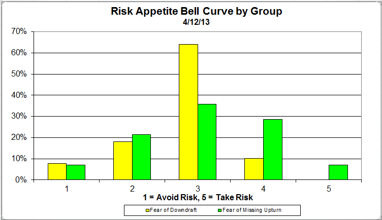
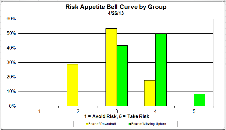
Chart 5: Risk appetite Bell Curve by Group. The next three charts use cross-sectional data. The chat plots the reported client risk appetite separately for the fear of downdraft and for the fear of missing upturn groups. We can see the upturn group wants more risk, while the fear of downturn group is looking for less risk.
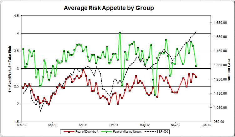
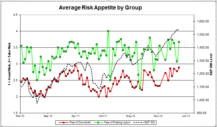
Chart 6: Average Risk Appetite by Group. This round, both groups’ risk appetite fell lower.
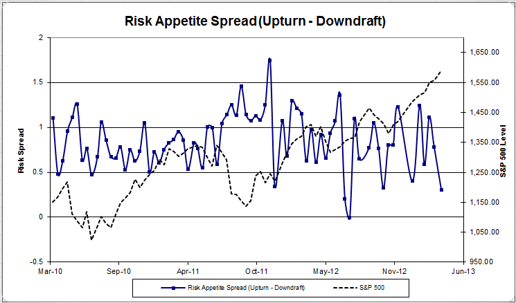
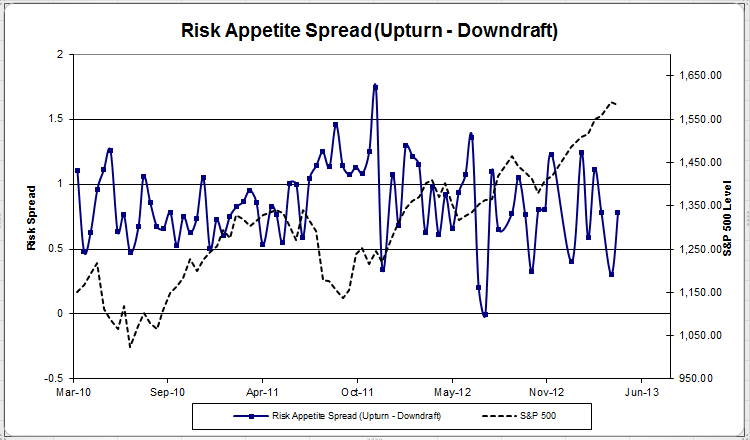
Chart 7: Risk Appetite Spread. This is a chart constructed from the data in Chart 6, where the average risk appetite of the downdraft group is subtracted from the average risk appetite of the missing upturn group. The spread dropped this round.
From survey to survey, the S&P; rose slightly. However, the market fell steeply when most of our respondents were taking the survey, as evidenced by a sharp pullback in client sentiment. All of the indicators showed a marked decrease in client sentiment. However, this is to be expected somewhat, considering how great the first quarter was. Let’s hope for a small pullback and a continued rally into spring.
No one can predict the future, as we all know, so instead of prognosticating, we will sit back and enjoy the ride. A rigorously tested, systematic investment process provides a great deal of comfort for clients during these types of fearful, highly uncertain market environments. Until next time, good trading and thank you for participating.