What’s Really In Your Bond Fund?

December 2, 2009

A new study points out that many bonds funds are less safe than their average bond ratings seem. Lower-rated bonds default at increasing rates, not at rates that increase in a constant fashion. For example, an imaginary portfolio of 50% AAA bonds and 50% A bonds will carry an average rating of AA—but the default risk will be higher than if the portfolio were 100% AA.

One article about the study remarks:

Craig McCann, principal at Securities Litigation and Consulting Group and one of the study’s authors, cites their analysis of 285 taxable intermediate bond funds from Morningstar’s database, in which they excluded all of the duplicative share classes: 47 were graded AAA; 193 were AA; 38 were A; and seven were B. Of those funds, they found that only 18, or about 6%, warranted the grade they were given; 153 of the funds — more than half — should have been a letter grade lower; and, 112, or 40%, should have been two letter grades lower.

You can read the whole white paper here.

The point is that averages can hide a lot of things. Statistics are extremely useful, but you still need to dig in and understand what you are looking at. Due diligence for any investment product must be done carefully so that you know what to expect.

Posted by:


Marriage of Deep Value and Momentum

August 20, 2009

Sam Mamudi, MarketWatch, recently profiled deep-value-pioneer Mutual Shares Corp. Click here to read the article. As explained by Peter Langerman, CEO of Mutual Shares Corp, deep value strategies are looking for companies in pre-bancruptcy or that are distressed. As Langerman puts it, “It’s about buying a dollar value for 50 cents.”

Deep value managers, like Mutual Shares Corp, have found an exploitable market inefficiency. This happens to be a very different market inefficiency than we are focused on at Dorsey Wright, but they are very good at what they do. A momentum or relative strength strategy is rarely involved in buying companies in pre-bancruptcy because our methodology leads us to securities that have been the best relative performers over an intermediate time horizon. Both deep value and momentum have a well-documented history of being able to beat the market over time.

However, each strategy has its vulnerabilities. Deep value traps result when distressed securities are bought only to see them become more distressed. Momentum underperforms during every major change in leadership. However, mix the two strategies together and the benefits of diversification become apparent. Creating two strategies so opposite in spirit and opposite in construction, and therefore so negatively correlated with each other, and still having them both produce positive average returns is an area where financial advisors can add meaningful value to their client.

The chart below is the efficient frontier of Dorsy Wright’s Systematic Relative Strength Global Macro strategy and Mutual Shares Corp’s flagship deep-value strategy, TESIX. As you can see, over this time period having 100% of the portfolio in the Global Macro strategy produced the best returns. However, it is possible to lower the annual standard deviation by having a mix of the two. For reference, the S&P 500 generated annualized returns of -1.80% and standard deviation of 17.32% over this same time.

(Click to Enlarge)

Yes, in this case mixing the two results in lower overall returns, but that is fine with many people. After all, sticking to a winning discipline for decades is the key to investment success. Many investors get twitchy after very short periods of underperformance. Mixing uncorrelated strategies is a way to address this problem. It is not going to result in outperforming every quarter, but it is likely to result in a smoother ride over time. Such an approach may be enough to keep investors from succumbing to the behavioral biases that will cause them to constantly chase the hottest manager.

Certainly, this type of approach is not without its risks. It is not enough to identify uncorrelated strategies. The goal is to identify uncorrelated strategies that are also both able to generate above average returns over time.

Shortly, we will offer the ability to use our website to create efficient frontiers on your own.

To receive information about our Global Macro strategy, including important performance disclosures, please send an e-mail to [email protected].

Click here for disclosures from Dorsey Wright Money Management.

Posted by:


Less Can Be More

August 18, 2009

The WSJ reports that the average stock fund has 172 holdings. What is the point of having that many holdings? Diversification? The table below reveals that there is very little incremental reduction in annual standard deviation once you get past about 20 holdings.

(Click to Enlarge)

Source: M. Statman, “How Many Stocks Make a Diversified Portfolio?” Journal of Financial and Quantitative Analysis 22 (September 1987), pp. 353-64.

The real reason mutual funds own so many stocks was revealed in an academic study conducted by researchers from Yale. The real goal of most mutual fund managers is to reduce tracking error (volatility of portfolio return around a benchmark index.) Many fund managers have realized the challenges associated with deviating from the benchmark and have chosen to increase the number of holdings so that they will never be too much worse than the benchmark. Of course, they will never be too much better either. With the impact of fees, such a closet-indexing approach is very unlikely to add any value over time. However, that doesn’t keep the manager from telling a great story and attracting investors based on their perceived investment prowess. The active-share study completed by K. J. Martijn Cremers and Antii Petajisto examined the proportion of stock holdings in a mutual fund’s composition that was different from the composition found in its benchmark. The greater the difference between the asset composition of the fund and its benchmark, the greater the active share. According to active-share study, there was a positive correlation between a fund’s active-share value and the fund’s performance against its benchmark. For example, a mutual fund with an active-share percentage of 75% indicates that 75% of its assets differed from its index, while the remaining 25% mirrored the index.

The study found that funds with a higher active-share value would tend to be more consistent in generating high returns against their benchmark indexes, which implies that more actively managed funds have more skilled managers. However, higher active share necessarily means higher tracking error. Since the 1980s there has been a steady rise in closet-indexing.

Investors need to understand the real reason that most mutual funds have so many holdings. After all, an active manager can only add value relative to the index by deviating from it. If an investor’s goal is to beat the benchmark over time, buying a mutual fund with over 100 holdings (a closet indexer) is not likely the way to go. To beat the benchmark over time an investor needs to invest in strategies that have fewer holdings and, of course, a winning investment strategy. On the other hand, if the investor’s goal is to match the benchmark over time then it is more cost effective to buy an index fund from Vanguard for 9 basis points.

We make no secret about the fact that our relative strength strategies have high active-share (most above 90%). Most of our strategies have 20-25 holdings. While others serve the closet-indexing market, we have chosen to serve the active-investors market.

Posted by:


DWAFX Ranks Highly at 3-Year Mark

August 11, 2009

The Arrow DWA Balanced Fund (DWAFX) is one of the top mutual funds in its class. It has finished in the 9th percentile in the Morningstar Moderate Allocation Category (better than 91 percent of the 924 funds in this category) over the last three years.

(Click to Enlarge)

DWAFX is the first Dorsey Wright managed mutual fund and we are very pleased with its success. Furthermore, we are very appreciative of the warm reception that it has received in the marketplace – thank you! We developed this strategy because of the following philosophy:

  • The standard 60/40 policy portfolio is too narrow. Broader diversification, with special emphasis on alternative investments, is helpful to returns and risk management.
  • Endowment managers, like David Swenson at Yale, have been generating superior results for years by creating allocations with significant exposure to alternative asset classes. Now that ETFs provide access to most all of the asset classes that have been used in the endowment models, such a broadly diversified approach has been made available to the public through DWAFX.
  • The tactical asset allocation approach, driven by our systematic relative strength process, allows us to be extremely adaptive. This unique process seeks to do an excellent job of protecting on the downside as well as capitalizing on bull market moves in a wide variety of asset classes.

Click here to access the fact sheet for the Arrow DWA Balanced Fund.

Posted by:


RS In Depth

July 24, 2009

Most investors misunderstand—or maybe “over-simplify” is the right term- Relative Strength (RS). I think a big part of the problem is the inherent desire to make RS sound more simple and basic than it really is. Simple processes are easier for a novice to understand and accept as a viable investment strategy. From the standpoint of the expert talking to a novice this is preferable because a novice doesn’t have the time or inclination to learn all of the complexities of the strategy. In other words, a novice doesn’t need to know how to build a watch; they just need to know how to tell time.

The reality is that RS is much more complicated than people actually think. When we talk to advisors they are often under the impression that a strong stock is a strong stock and there is only one way to measure strength. It just so happens that the best measure of momentum, according to whoever you are talking to, is the method that person has been using lately! RS is much more complicated than that. There are numerous ways to measure the strength of a stock.

It is no different than a value strategy. If you ask a room full of value managers what defines a “value stock,” you’re going to get a room full of answers. Some people define value in terms of dividend yield, while others might use a price-to-cash flow model. If you look at the portfolios of these two individuals, they are going to have different holdings even though they are both buying “cheap” stocks. More importantly, the portfolios are going to perform differently during different parts of the market cycle. The market rewards different factors to different degrees at different times. Both factors might outperform over a long time horizon, but over any short time period the performance might be dramatically different. There is nothing wrong with this! If the dividend yield manager underperforms the cash flow manager during a given time period, it might not have anything to do with the skill of the two managers-it might simply be a matter of the market rewarding different value factors at different times.

Just as there are numerous value factors, relative strength can be calculated in many different ways. Even something as straightforward as point & figure relative strength has numerous calculation methodologies. You can use a 3.25% box size, 6.50% box size, the old Chartcraft standard boxes, a matrix (using any box size you want), or anything else you can dream up. You can also favor an RS column change, and RS buy signal, or some combination of the two. Dorsey Wright doesn’t even advocate one superior calculation method, as the research database makes all of these different calculation tools available to you. The market will reward these different RS factors at different times. Sometimes short term strength is rewarded more than long term strength; sometimes it’s the other way around. It is no different than the value stock example discussed above. If one person uses a 12-month price return model to measure RS and another uses a 3-month price return model, their portfolios are going to hold different securities, have different turnover, and performance might be completely different during any given time period. Both managers are using relative strength and buying strong stocks-they are just defining RS slightly differently.

For example, take a look at how several different RS calculation methodologies performed during the first 6 months of 2009. As part of our research and ongoing process of continuous improvement, we track lots of RS factors in the Money Management office (besides our own proprietary measurement). Here, we are just using some simple price-return-over-time models to illustrate our point.

table1 RS In Depth

The data in the table above shows that the way you define relative strength leads to very different return profiles over short time periods. All of these models outperform the broad market over long periods of time (we do have the data on that!) so they are all acceptable ways to determine strength. However, over half a year the market has rewarded each factor very differently.

In addition to the variation in returns between RS factors there will also be variation in returns within an RS factor model. Unless two managers buy the entire basket of high RS securities, their portfolios are going to look different. This may seem obvious, but it is something many people don’t consider when evaluating an RS strategy. While the chosen factor might be robust enough to deliver market-beating returns over time, any sub-set of the high RS basket might perform better or worse than any other sub-set over a given time period. There can be massive variation between portfolios, even ones using the exact same RS factor. Here, we use 100 different random trials to give you some sense of the possible variation. The following table illustrates this point.

table2 RS In Depth

Using exactly the same factor, your returns could range from -21% to +8%, depending on which stocks in the group you ended up with.

We use a unique and robust testing protocol here in the Money Management office. We try to make everything as “real world” as possible. In a paper our portfolio staff wrote way back in 2005, we designed a random trade process that allowed us to randomly select high RS securities for a concentrated portfolio. The theory is this: if you can select stocks at random from a predefined sub-set of a universe and still outperform a benchmark over time you have a remarkably robust process. That random trade generation process was used to test the model in the table above. You can see that with the same parameters and same investment universe there can be wildly different results over a short time period. Over a longer testing period (1995 through mid-2009) all 100 random trials of the simple 6-month model outperformed the broad market. But over a short period of time, it is quite possible to get stuck with a low-probability, lousy outcome. (You can even get quarters where about half the trials outperform and half underperform.)

There is a tendency for investors, when they get stuck with a lousy outcome, to believe the process is broken. It isn’t. Most people want to believe they are in control of every situation so having to think in terms of probabilities often makes them uneasy. However, it’s the reality of investing: not just in an RS strategy, but in every other strategy as well.

As you can see, there is variation in relative strength strategies just like there is variation in returns with every other investment strategy. There isn’t one right or wrong way to calculate RS, although we do know that some ways are better than others! (We happen to be fans of our proprietary method.) Every calculation methodology has strengths and weaknesses. Both the strengths and weaknesses will be exposed at some point during the market cycle. There is no way to avoid this phenomenon. There is no magic unicorn that’s going to appear and tell you the best way to identify a strong stock this week—and it will change next week anyway. You’re better off to stop looking for the unicorn and spend your time testing for a robust method that will work over a long period of time, and then understanding everything you can about the tradeoffs you are making. Our bias is to use exhaustive testing and data analysis to investigate and make decisions about the tradeoffs we need to live with. Perhaps not everyone has the resources and programming ability to make that feasible, but you can spend time thinking about how your factor is constructed and where it might be vulnerable. There are very few guarantees in finance, but I can make this one: if you truly understand everything about the statistical parameters of your process, the next time someone tries to tell you your model is broken, you might have a knowing smile instead of a concerned frown.

Posted by:


Peer Pressure

May 28, 2009

In the 1950′s, a psychologist named Solomon Asch made a startling discovery about the power of peer pressure. He asked experimental subjects to determine the length of one line relative to three other lines. When there was no peer pressure, subjects found it to be a simple test and had 100% correct answers. When there was peer pressure-in the form of confederates of the experimenter who all loudly gave the wrong answer-more than 75% of the subjects also gave an incorrect answer in order not to be out of step with the crowd. It was clear from the control group results that none of the subjects were really confused about the length of the lines, but when faced with group members who all apparently saw the same thing, lots of subjects buckled under.

Every time I see a press release from the CFA Society (full disclosure: I am an affiliate member) that details how many people take the CFA exam every year, I think about Solomon Asch. This year, for example, 128,600 candidates from 154 countries have registered for the June exams. (You can see the press release here.) That is a lot of CFAs in training! There is no doubt that their particular form of fundamental analysis is the dominant method of securities analysis in the world today. More than that, their influence has spread to infect thinking about diversification, asset allocation, portfolio theory and beyond. They’ve developed a large curriculum of readings to reinforce their position and these days it is hardly ever questioned.

Technical analysis is a much older form of securities analysis, one that relies not on theories about how markets operate but on market-generated data such as price and volume. It often continues to be useful when markets don’t operate according to the rules, i.e., most of the time. Technical analysts tend to be a pragmatic lot. They go with what is working, and when it stops working, they get off and go on to the next thing.

The CFA program, in contrast, promotes deep thinking about complex systems, fundamentals, and causation. It doesn’t surprise me that it is hard to be right about things that have so many variables. And I always wonder if they might be missing something by all approaching the problem with the same mindset. Is there pressure to conform to the accepted theories? Do all the lines look the same length to them?

In the financial markets, when everyone is looking at a market and thinking the same way about it, usually it does the opposite of what is expected. I suspect there is a lot of value in approaching asset allocation from a different point of view.

Posted by:


Correlation Does Not Imply Causality

May 21, 2009

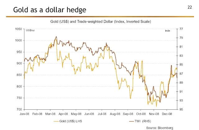
This is an interesting chart that I dredged out of an article by Mebane Faber reporting on a global asset allocation summit. At least during 2008, when the dollar fell, gold went up. (The dollar chart is inverted.) Or is it that when gold went up, the dollar fell? This type of chart can only ever show correlation—and correlation does not imply causality. Who knows what causes what? The problem is that many strategic asset allocation models are built with correlations. The models often assume that the correlations are stable, but experience has shown that they are not. (This is no less a problem for Modern Portfolio Theory.) Models that are built with correlations fail each time there is a regime change where the correlations shift or adjust to a “new” normal. Things that are impossible in finance textbooks happen all the time in real life.

Our Systematic Relative Strength models are not built this way. We look at the relative strength ranking of each item on its own merits. If gold is highly ranked in the Global Macro universe, for example, it would likely be in the portfolio. If the dollar is also highly ranked, it would happily coexist with gold until the rankings dictated that one of them was removed from the portfolio. Relative strength doesn’t make any assumptions about the asset correlations, and we think that is one of its strengths.

 Correlation Does Not Imply Causality

Correlations

Click here for disclosures from Dorsey Wright Money Management.

Posted by:


What’s It Like to Work at Dorsey Wright Money Management?

May 21, 2009

My name is JP Lee, and I’m the youngest member of the team here at DWA Money Management.

John, Andy and Mike have dominated the serious posts so far. I won’t try to compete with them in the data analysis department; instead, I’ll bring a little humanity to the equation. Some soul, if you will. So here goes.

One of the first questions that you ask somebody when you get to know them is, “What do you do for a living?” Depending on who’s asking, I say a number of things.

I’m an assistant at a money management firm.

You know what stocks are, right? I work with stocks.

I work in Pasadena….in an office building.

I stuff envelopes for a living.

Once in a blue moon I’ll meet someone who follows the market or is an investor (I’m 25 years old, I don’t hang out in the Chairman’s Club). It’s always funny to me when people give me their opinions on this stock or that stock, or a brief rundown on what the economy “really” needs to get going again. Rants about corporate greed, the housing market and the next Great Depression, lifted straight out of Newsweek and Time. It’s fun to smile and nod along with market mavens.

At the end of the day, I wear a lot of hats. I answer the phone, send out new client welcome packets, reconcile monthly account statements, and help organize quarterly statements and billing. Every once in a while I might liquidate a new account’s holdings and get the cash ready to invest in the DWA strategy. There’s a lot going on in the office, and there’s only 5 people here. It’s fun and exciting.

As the only member of Generation Y in the office, I consider myself lucky to be here. Just today I saw a headline about college graduates in 2009 that showed that LESS THAN 20% of those who graduate this year will be employed. That’s a scary number.

Stuffing envelopes never sounded so fun. I love this job!

Posted by:


Emotional Asset Allocation

May 8, 2009

The steep losses experienced by investors over the last year and a half have led to many changes in investor behavior. The personal savings rate is ticking up, some measure of frugality has returned to the consumer, and the asset allocation framework in place for many investors is being seriously questioned. Among the changes has been a dramatic reduction in appetite for risk among investors. In fact, 56% of Baby Boomers have now concluded that the stock market is too risky for people their age (San Francisco Business Times, 2/13/09).

This change in appetite for risk is manifested in the floods of money pouring into bond funds, as can be seen in the table below (Investment News, 5/4/09):

Morningstar Category

1Q’09 Net Flows

1. Intermediate-term bond $24,076
2. Precious metals 14,991
3. High-yield bond 7,673
4. Natural resources 6,765
5. Short-term bond 6,210
6. Municipal national short 5,214
7. Long-term bond 4,647
8. Inflation-protected bond 4,551
9. Municipal national intermediate 3,423
10. Intermediate government 3,395

As investors throw their hands up in despair, torn between putting the bulk of their assets in bonds or embarking on an experiment with day-trading financial stocks, I suggest presenting them with the following data. Right now, you may be thinking that you are about to read some fascinating new piece of data. Fascinating is probably not the adjective for life expectancy-data, but perhaps nothing is more important to consider when deciding what changes investors should make right now. The following data is taken from the Centers for Disease Control and Prevention, updated through 2005.

U.S. Life expectancy at birth

Men

75.2 years

Women

80.4

U.S. Life expectancy at age 65

Men

82.2 years

Women

85.0

U.S Life expectancy at age 75

Men

85.8 years

Women

87.8

Emotions are running extremely high right now, which means that investors are very susceptible to making poor investment decisions. Any radical changes in framework for asset allocation should be done with the long-term in mind, especially now. Keep in mind that life expectancy means that one-half of the sample will live shorter than the expectancy, and one-half of the sample will live longer. After all, it is very likely that many of your clients will live well in to their eighties or nineties. With that in mind, a diversified bond portfolio doesn’t make a whole lot of sense; nor does it make much sense to embark on some unproven trading strategy.

When empirical evidence is used, relative strength and tactical asset allocation appear in a very favorable light.

Posted by: