Back to the Future?

April 13, 2011

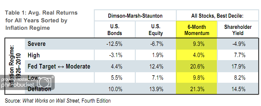
Jim O’Shaughnessy’s April 2011 market commentary provides an interesting analysis of the real returns to stocks and bonds during different inflation environments. Of particular interest to relative strength investors is his analysis of the performance of high momentum stocks. As shown in the table below, the stocks with the highest 6-month price momentum outperformed the benchmark in each of the inflation regimes during the observation period of 1926-2010.

osam041311 Back to the Future?

(Click to Enlarge)

Some may look at the government statistics today and argue that inflation is not currently an issue. However, it is well documented that the United States government has revised its method of calculating inflation several times over the years, which has had the effect of understating inflation. According to Shadow Stats, if the government measured inflation on its pre-1982 methods, it would be running at 11.6% percent right now, or 7.3% using the pre-1998 calculations. In other words, we are arguably already in a period of high or severely high inflation.

O’Shaughnessy covers the performance of high momentum stocks during the last regime of severely high inflation (1973-1980):

As the upcoming Fourth Edition of What Works on Wall Street documents, the ten percent of stocks from our All Stocks universe with the highest six-month price appreciation earned a real (inflation-adjusted) average annual compound return of 15.66 percent, turning $10,000 invested on December 31, 1973 into $27,691 at the end of 1980.

Different inflation regimes provide headwinds for some companies and industries and tailwinds for others. The goal of relative strength strategies is to let relative price performance tell us which companies have the wind at their backs and are producing the best performance in the current environment. History suggests that relative strength strategies tend to do just fine in high inflationary environments.

Past performance is no guarantee of future returns.

 Back to the Future?

Posted by:


RS Layering Video

April 6, 2011

From time to time we have shared some of our relative strength research which has informed the decision rules for our Systematic Relative Strength portfolios. Click here (financial professionals only) to view a video with Mike Moody, John Lewis, and Andy Hyer in which we share the significant increases in performance achieved when different relative layers are added to the process. Specifically, we discuss the results from adding sector and stock selection overlays to a base relative strength model.

Anyone interested in our Systematic RS Aggressive portfolio won’t want to miss this.

layering RS Layering Video

Click here to receive the brochure on our Systematic Relative strength portfolios. Click here for disclosures. Past performance is no guarantee of future returns.

Posted by:


High RS Diffusion Index

March 22, 2011

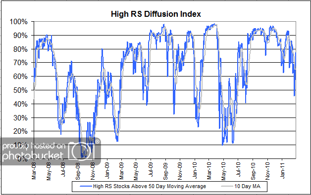
The chart below measures the percentage of high relative strength stocks that are trading above their 50-day moving average (universe of mid and large cap stocks.) As of 3/21/11.

 High RS Diffusion Index

This index has spent the last six months above 50 percent, but has dipped back to the middle of the distribution. The 10-day moving average of this indicator is 65% and the one-day reading is 77%. Dips in this indicator have often provided good opportunities to add to relative strength strategies.

Posted by:


Attention Asset Allocators

March 18, 2011

For this commentary on asset allocation I’ll start with the widely understood justification for asset allocation and then move on to a less well-known concept that has some important implications for those using relative strength strategies.

A fundamental justification for asset allocation is the notion that different asset classes offer returns that are not perfectly correlated, hence diversification reduces the overall risk in terms of the variability of returns for a given level of expected return. Therefore, having a mixture of asset classes is more likely to meet the investor’s wishes in terms of the amount of volatility and possible returns. Asset classes such as stocks, bonds, real estate, commodities, and currencies are typically employed to construct an asset allocation.

pie chart Attention Asset Allocators

However, many financial advisors stop there. Many think of US stocks as one asset class, bonds as one asset class, real estate as one asset class and so on. Such thinking leaves a lot on the table. What if US stocks can be broken down into several viable asset classes? Does this not have the potential to further improve the benefits of asset allocation? For example, this must-read white paper by AQR Capital makes it clear that value and relative strength are two complementary strategies. Remember that both strategies profiled in that white paper select securities from the same universe of U.S. stocks.

Anyone who goes to our website sees the following:

High relative strength stocks have historically provided high returns, but they often do not correlate very well with the broad market. For that reason, high relative strength stocks frequently appear to act like a separate asset class. From an asset allocation perspective, there is significant value in a high-return asset class that is uncorrelated with most other stocks and bonds. Non-correlated performance can help smooth out the returns in a diversified portfolio.

To demonstrate this point, consider the R-squared of our Systematic Relative Strength Aggressive portfolio (which invests in U.S. stocks) to the S&P 500.

rsquared231811 Attention Asset Allocators

Remember that the R-squared statistic gives the variation in one variable explained by another. It is computed by squaring the correlation coefficient between the dependent variable and independent variable (S&P 500 in this case). As shown in the table, 60% of the variation in our Systematic RS Aggressive portfolio can be attributed to the S&P 500 (therefore, 40% of it is not). This means that even though we are fishing from the same pond (although this portfolio can also invest in mid-cap US stocks) the variation of the performance is quite different from that of the S&P 500. In fact, this portfolio has a lower R-squared to the S&P 500 than the Russell 2000 (small cap US stocks), MSCI EAFE (developed international stocks), MSCI Emerging Markets, and the Dow Jones Real Estate Index! This is not a typical result—where the S&P 500 is more correlated to foreign markets than it is to another portfolio composed entirely of domestic securities! A more typical result may be found when looking at the five most popular equity funds, where their R-squared averages 0.96, according to Morningstar.

How can this happen? Well, relative strength identifies those securities that have strong intermediate-term relative strength out of a universe of securities. Often, those securities with the best relative strength are not the stocks that have the biggest influence on the movement of the S&P 500.

All financial advisors are in the asset allocation business. Some do it well. Some do it poorly. I would suggest that including relative strength strategies in your asset allocations has the potential to be very helpful from a performance and diversification perspective.

Click here to receive the brochure on our Systematic Relative strength portfolios. Click here for disclosures.

Posted by:


Relative Strength and Asset Class Rotation White Paper

February 17, 2011

No investment structure has justifiably generated more interest over the past decade than the exchange traded fund. Its growth has been staggering, in part because of its ability to provide investors access to virtually every investable asset class in a very efficient manner. Furthermore, no investment strategy has produced more interest in recent years than global macro strategies because of their mandate to seek out the best investment opportunities wherever they may be found in the world.

A year ago, we released a white paper on our unique, Monte Carlo-based testing process which detailed the exceptional returns delivered by a relative strength-based asset class rotation strategy. That paper applied our testing process to a universe of exchange traded funds.

We are now re-releasing Relative Strength and Asset Class Rotation, updated with data through 2010 (Click here to access). Additionally, the paper now includes an appendix which provides supplemental information about different relative strength factors.

Testing, such as is detailed in this white paper, has provided the insights needed to develop our Global Macro portfolio. Click here to receive our brochure.

whitepaper 1 Relative Strength and Asset Class Rotation White Paper

Posted by:


Relative Strength Astounds the Skeptics Again

February 16, 2011

Morningstar ran a recent skeptical look at momentum as a return factor. The author, Shannon Zimmerman, was upfront about his bias as an analyst:

As an analyst, I’m a fundamentalist at heart, focusing primarily on fund managers whose success owes to bottom-up research and strict valuation work.

Still, he tried to give relative strength (known in academia as “momentum”) a fair look, especially since strict valuation work was notably unsuccessful. He notes:

It’s a fascinating topic, particularly for those who favor fundamental money managers, a group that, on average, has generally lost to the relevant bogies. Contrary to that track record, the data on price momentum seem to show remarkable long-haul success.

Then he brings up a couple of straw men to explain why relative strength may not really work. First, he suggests that the high returns from momentum may be concentrated in a few short periods of time—more on this later— (like the famous small-cap advantage over large caps) or that it may be a function of style.

In addition to time-series static, for example, how much of momentum’s long-haul outperformance may owe to style? Has the tactic’s showing been powered by pockets of success in, say, growth stocks or mid-cap names?

Fortunately for the home team, Ibbotson completed a recent research paper on that very topic. And what did they find?

…the conclusion is striking: Regardless of where in the style box they reside, portfolios comprising funds that provide the greatest level of exposure to high-momentum stocks significantly outperform those with the lowest levels.

While this may be surprising to a fundamentalist, this is no surprise at all to those of us that have been delving through relative strength research for many years. Relative strength seems to be a universal return factor, present in domestic and international securities—and even global asset classes. Clearly, Ibbotson showed that it was present in every style box.

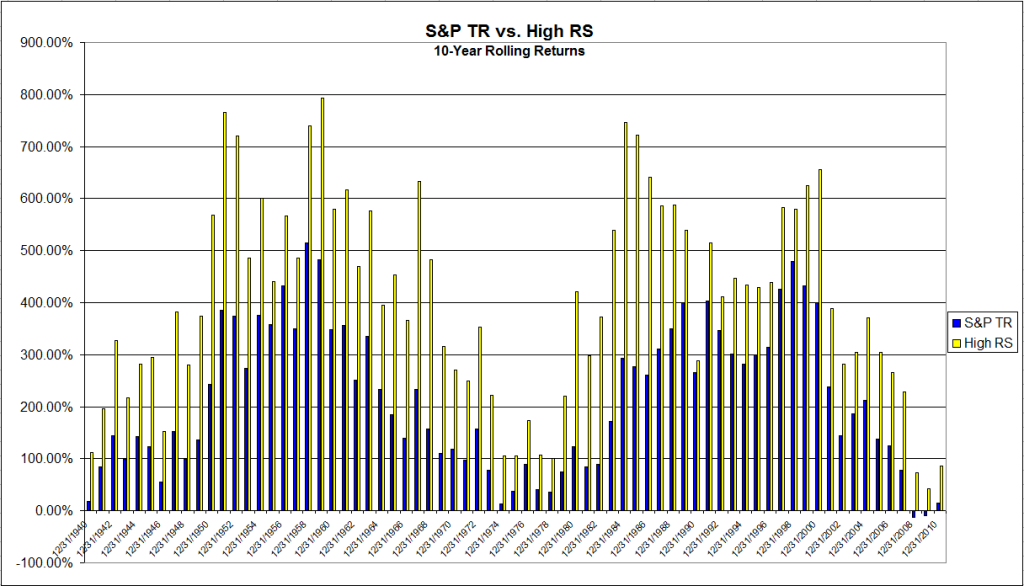
As for the time concentration issue, not to worry. We tracked down total return data for the S&P 500 going back to 1930 and compared it to the momentum series on the website of Ken French at Dartmouth (top half in market cap, top 1/3 in momentum). Ironically, Ken French is one of the leading apologists for the efficient market theory. The chart below shows 10-year rolling returns, which is why it starts in 1940. The average ten-year returns? 405% for relative strength and 216% for the S&P 500, a near doubling! That’s without the momentum series getting any credit for dividends. Even more impressive, the ten-year rolling return of the relative strength series outperformed in 100% of the time periods. Clearly, unlike the small-cap versus large-cap issue, relative strength performance is not limited to certain narrow time periods.
 Relative Strength Astounds the Skeptics Again

Click to enlarge

Source: J.P. Lee, Dorsey, Wright Money Management

Why are value investors always so shocked by the strong performance of relative strength methods? I think there are two major reasons: 1) the value cult has drowned out discussion of other successful return factors, and 2) the reason for strong momentum is poorly understood.

The value cult drowns out other schools of investing, but it developed its following largely by historical accident. Ben Graham and David Dodd’s classic Securities Analysis came out early on, in 1934, and found a vocal contemporary advocate in Warren Buffett. In other words, much of the historical prominence of value investing is due to its early start—and the fact that it developed and was propagated in academia, where it had a chance to be taught as the shining, virtuous path to wealth to generations of students. Its tenets were never really questioned bacause value investing is also logical, pretty transparent, and it works. However, it is a logical mistake to assume that since value investing works, it is the only thing that works.

Largely overlooked by the value cultists is the fact that Warren Buffett’s fortune has been made in growth stocks with high reinvestment rates and arbitrage, not cigar butts. From James Altucher’s book Trade Like Warren Buffett: “…Buffett achieved much of his early success from arbitrage techniques, short-term trading, liquidations, and so on rather than using the techniques he became famous for with stocks like Coca-Cola or Capital Cities. In the latter stages of his career he was able to successfully diversify his portfolio using fixed income arbitrage, currencies, commodities, and other techniques.” (Note: when Buffett purchased his stake in Coca-Cola, it carried a P/E of 13, while the overall market was selling for a P/E of 10! Not exactly a traditional value investment.) In recent years, Buffett has become famous for a giant derivatives trade where he essentially wrote a massive amount of naked put options on the U.S. market. In other words, the popular image of Warren Buffett as a buy-and-hold value investor is completely false. I’m not bashing here—Warren Buffett is clearly a great investor, and while he did take Ben Graham’s course at Columbia, much of his success is due to his investment flexibility, not some imaginary ability to identify value stocks and then hold them forever.

Likewise, Ben Graham made no secret of the fact that his personal fortune from the Graham-Newman Corporation was, in fact, due to the growth stocks purchased by his partner Jerry Newman. One magazine article I read quoted the anointed father of value investing, Benjamin Graham, as saying “Thank God for Jerry Newman! If it weren’t for him, we never would have made any money.” Based on the real lives of Buffett and Graham, profitable investing is a little more complex than reading The Intelligent Investor a few times, and clearly not limited to any strict definition of value investing.

Once value cultists concede that successful investing can be done in several ways, we’re left with trying to understand why relative strength works. Why do stocks that are strong tend to stay strong for a while? Simply put, strong stocks are typically in a sweet spot, either on a fundamental or macroeconomic basis. High RS stocks generally have tremendous current fundamentals.

Let’s look at a current example—the best performing stock in the S&P 500 last year, Netflix. In a moribund economy, the year-over-year change in revenues at Netflix accelerated from 19% growth in Q4 2008 to 34% growth by Q4 2010. While revenues were increasing 34%, earnings per share went up 55%, which indicates that margins were expanding. Investors, for some reason, were attracted to a stock with rapid and accelerating revenue growth and profit margins. Is that really so difficult to understand?

Can Netflix continue to accelerate revenues and margins? The laws of mathematics tell us that this feat cannot be pulled off forever—but it’s already gone on for a couple of years and that’s certainly long enough to make a lot of money. How much longer it will continue is anyone’s guess. (Certainly it has gone on longer than Whitney Tilson expected.) The high relative strength investor looks for stocks that are performing—but stays with them only as long as that performance continues. At some point, Netflix will hit a speed bump, and when it does, the high relative strength investor will happily part with the shares—hopefully at a tasty profit.

Lots of practitioner and academic studies show this exact pattern: if you hold strong assets and ruthlessly replace assets that become weak, the portfolios do very well. There’s really no mystery to it.

So, Mr. Zimmerman, if you’re reading this, don’t beat yourself up. I’m sure you’re a great guy. You’re not the first value investor that has had trouble understanding how relative strength operates as a return factor. And you should take heart in this: studies show that portfolios combining relative strength and value have uncorrelated excess returns, so it works great to have a mix of both styles. Value works, but relative strength rocks.
Posted by:


Alternative Indexing Strategies

February 11, 2011

Yet another article, this time in the Wall Street Journal, that discusses equal weighting and fundamental weighting—but has no mention of relative strength weighting. In a previous post, I discussed how relative strength weighting may well outperform both of these alternative methods over a long period of time. The new Wall Street Journal article does mention conditions under which each weighting style should do well:

A market-cap-weighted index fund is likely to beat an alternatively weighted index fund when large-cap or growth stocks are in favor. An equal-weight index fund should win when smaller stocks are hot, or certain sectors outperform. And a fundamentally weighted index fund should shine when smaller-cap and especially value stocks are in vogue.

Here’s the nice thing about relative strength weighting: it doesn’t matter if large cap or small cap stocks are in favor, nor does it matter whether growth or value is at the forefront. Relative strength is agnostic about such matters—it will simply allocate to where the strength is. Recent strength has been in mid and small caps, so equal weight and fundamental indexes have looked good. At some point, strength will switch to large cap names and those indexing styles may flounder. Relative strength indexes will simply adapt to owning large cap names. Something to keep in mind.

Posted by:


Relative Strength Spread

February 8, 2011

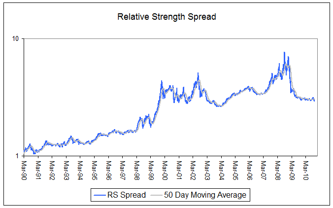
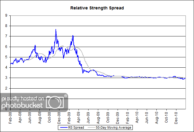
The charts below show the spread between the relative strength leaders and relative strength laggards (universe of mid and large cap stocks). When the chart is rising, relative strength leaders are performing better than relative strength laggards. As of 2/7/2011:

Since early 1990, the battle between the leaders and the laggards has been convincingly won by the leaders, albeit with intermittent pullbacks.

spread111111 1 Relative Strength Spread

(Click to Enlarge)

A closer look over the past couple years shows one of those intermittent pullbacks, which has been followed by 18+ months where the leaders and the laggards have generated similar performance.

 Relative Strength Spread

(Click to Enlarge)

Read our “Relative Strength Outlook Through 2014″ for an idea of what may come next.

Posted by:


Weekly RS Recap

February 7, 2011

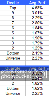
The table below shows the performance of a universe of mid and large cap U.S. equities, broken down by relative strength decile and quartile and then compared to the universe return. Those at the top of the ranks are those stocks which have the best intermediate-term relative strength. Relative strength strategies buy securities that have strong intermediate-term relative strength and hold them as long as they remain strong.

Last week’s performance (1/31/11 - 2/4/11) is as follows:

 Weekly RS Recap

Last week was a big week for the universe, and high-RS stocks managed to outperform the universe by nearly 250 basis points. It was a great week for the market, especially the high-RS universe.

Posted by:


Is Your Index Fund Broken?

January 31, 2011

That’s the provocative title of a recent article in Smart Money. The article makes a controversial claim:

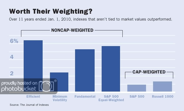
The Journal of Indexes gives academic treatment to bland investments, and so might not seem a likely source of hot controversy. The latest issue, however, is packed with it-and has greatly annoyed mutual fund titan Vanguard. A report therein gives new support for the claim that most index investors are unknowingly missing out on a large portion of the returns that their passive approach ought to provide.

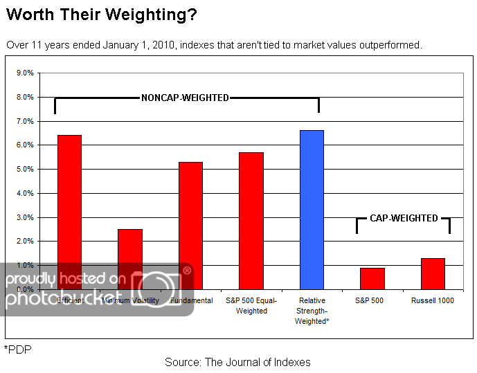
Are investors really missing out on a large part of the passive return? The article implies that a variety of alternative weighting methods like efficiency weighting, volatility weighting, equal weighting, and fundamental weighting provide better returns than traditional capitalization weighting. ETFs are even available for some of these alternative methods, most notably equal weighting (RSP) and fundamental weighting (PRF). Over the eleven-year period cited in the article, all of them have better returns than capitalization weighting.

 Is Your Index Fund Broken?

Source: Smart Money/The Journal of Indexes

Here’s what drives me crazy: when alternative weighting methodologies are discussed, there is always one method omitted. That method is relative strength. Perhaps it is no surprise that over the eleven-year period cited in the article, relative strength weighting outperformed all of the other methods. (And I didn’t get to cherry pick the time period-the article made that choice. If the blowout year of 2010 was included in the results, relative strength would have an even larger advantage over its rivals.) It’s also nice to note that there is a relative strength weighted index available, the Technical Leaders Index (PDP). Here’s what the same chart looks like if relative strength weighting is included.

 Is Your Index Fund Broken?

Source: Journal of Indexes, Dorsey Wright

Why is relative strength weighting always left out? If I were cynical, I might say that relative strength is intentionally disregarded so that alternative methodologies do not have to show their comparative performance. But since I am in a charitable mood, I think the reason it is often ignored is because it is too simple. Yes, too simple.

It does not require manipulation of a massive fundamental database. It does not require equations and a mainframe computer to calculate a covariance matrix. It does not require a CFA, MBA, or PhD. (Think how much money you could save on grad school!) Instead, it requires a pocket calculator or spreadsheet and one of the many methods for measuring relative strength. We are partial to our proprietary measurements, but lots of methods work just fine. What does it say about your complicated alternative indexing method when it can be outperformed by something a middle-school student could learn to calculate?

There is one big advantage to capitalization weighting: it can be implemented in nearly infinite size. Along with theoretical reasons (“owning the market portfolio” in Modern Portfolio Theory), that may well be one reason why institutions, and Vanguard, believe it is the way to go. On the other hand, it is not really a stretch to believe that there are alternative indexing methodologies that could be designed for better performance. We think that relative strength has been demonstrated to be the simplest and most robust way to build the better mousetrap.

Posted by:


Relative Strength Goes Dutch

January 28, 2011

Two very clever investment strategists at Robeco, an investment firm in the Netherlands, recently published a paper on global tactical sector allocation. They tested relative strength (i.e., momentum in academia) and several other factors to see what worked-and what continued to work after publication. Here’s what they found:

We document significant returns for momentum (1-month and 12-1 month) and the Sell in May seasonal. Interestingly, the predictive power of these factors remains after their publication dates. Although not previously tested for sectors we provide evidence which shows that sectors with positive earnings revisions outperform sectors with negative earnings revisions. We confirm the US findings of Capaul (1999) that valuation, measured as mean-reversion and dividend yield, does not work for global sector allocation. Furthermore, monetary policy fails to predict global sector returns, especially after publication date.

Although it is no surprise to us, relative strength worked in a couple of different formulations, and continued to work after the factors were published. Valuation using mean-reversion and dividend yield did not work, nor did monetary policy. Why does relative strength continue to work when other factors fail? I believe that it is because relative strength is adaptive and does not have catastrophic failures when there is a paradigm shift.

One of the nice things about relative strength is that the factor is so robust it works when measured in many different ways. Our own proprietary RS calculation is the engine behind the Global Macro strategy and the the two Arrow mutual funds that we subadvise.

HT to CXO Advisory.

To receive a brochure for our Systematic RS portfolios, please click here.

Click here to visit www.arrowfunds.com for a prospectus & disclosures. Click here for disclosures from Dorsey Wright Money Management. Past performance is no guarantee of future results.

Posted by:


New Relative Strength White Paper

January 28, 2011

A year ago, we released a white paper on our unique, Monte Carlo-based testing process which detailed the exceptional returns delivered by systematic relative strength models over time. That paper applied our testing process to a universe of mid and large cap US stocks.

We are now re-releasing Bringing Real-World Testing To Relative Strength, updated with data through 2010 (Click here to access). Additionally, the paper now includes an appendix which provides supplemental information about different relative strength factors.

Testing, such as is detailed in this white paper, has provided the insights needed to develop our family of Systematic Relative Strength portfolios. Click here to receive our brochure.

whitepaper New Relative Strength White Paper

Posted by:


Small Caps Forever?

January 27, 2011

Maybe Jeff Reeves is right about small caps versus large caps, maybe he isn’t. All I know is that it is quite hazardous to make any kind of claim based on three years of data. In a commentary in Marketwatch, “Investors Should Never Buy Large Cap Stocks,” this is his thesis statement:

I calculated the returns of both the S&P 500 and Russell 2000 index across the last three years. And for 33 of the past 36 months, an investor putting money into an index fund would have been better served by purchasing the small cap Russell index instead of the S&P.

After a discussion of some of the ups and downs of the last three years, he concludes:

In short, whether the market is about to take a historic flop like it did in 2008, or if it’s poised for a historic run like it saw in 2009, over the long term you are better off buying into small-cap stocks.

Take that advice at your own risk! I’m not sure that three years qualifies as the “long term.” As far as investment horizons go, that’s pretty short. There is some Ibbotson data that suggests that small caps may do better than large caps over the very long term, but that conclusion has always been in dispute. And what’s not in dispute is that markets also go through long cycles of large cap dominance.

Right now, yes, small caps are great. It’s the strongest area in the style box and our relative strength rankings like it too. But this too shall pass, and at some point another asset class or style will be dominant.

Interestingly enough, Long Term Capital Management, according to Roger Lowenstein’s book When Genius Failed, also based their convergence trades on a three-year database! They thought they had plenty of data because they had actual tick data. Their three-year database didn’t work out too well. This testing process could not contrast more with the testing process used by Dorsey, Wright Money Management. The relative strength factor has an 80+ year record of success and our unique Monte Carlo testing process makes the portfolio results repeatable and robust.

Maybe small caps will outperform from here to infinity and beyond. But I wouldn’t bet on it based on three years of selective data.

Posted by:


Relative Strength Webcast Replay

January 26, 2011

Dorsey Wright portfolio manager, John Lewis, recently presented a webcast for the MTA, titled “Relative Strength and Portfolio Management” that is a must-see for any advisor employing relative strength strategies in their business.

In this webcast, John presents the results of a series of relative strength studies that reveal the best methods of implementing this powerful return factor.

Click here to access the replay.


Posted by:


The Juggernaut Destroying the Efficient Market Hypothesis

January 7, 2011

There’s a big article on momentum in stock markets in The Economist. Momentum is otherwise known by its original name, relative strength, if you are a stock market historian. Like all articles that actually examine relative strength as a return factor, it results in nearly unqualified gushing:

Since the 1980s academic studies have repeatedly shown that, on average, shares that have performed well in the recent past continue to do so for some time. Longer-term studies have confirmed that this “momentum” effect has been observable for much of the past century. Nor is the phenomenon confined to the stockmarket. Commodity prices and currencies are remarkably persistent, rising or falling for long periods.

Actually, stock market traders noticed this tendency by 1900, so it must have been apparent even in the 1800s. And the first computerized test that I know of dates to the late 1960s, even earlier than the mid-1980s mentioned in the article.

The momentum effect drives a juggernaut through one of the tenets of finance theory, the efficient-market hypothesis. In its strongest form this states that past price movements should give no useful information about the future. Investors should have no logical reason to have preferred the winners of 2009 to the losers; both should be fairly priced already.

Markets do throw up occasional anomalies—for instance, the outperformance of shares in January or their poor performance in the summer months—that may be too small or unreliable to exploit. But the momentum effect is huge.

I’ve underlined my favorite parts. The article goes on to cite a study done on the British market from 1900 by chaps at the London Business School. Not surprisingly, buying the relative strength leaders was tremendous, earning more than 10% a year above the return on the laggards. You can see the magnitude of the effect in the chart below. $1 turned into $49 buying the laggards, but turned into $2.3 million buying the relative strength leaders. (They used British pounds, but the unit equivalency is the same.) As they say, the momentum effect is huge.

 The Juggernaut Destroying the Efficient Market Hypothesis

Source: The Economist

The article points out one other thing that I believe is very, very important.

Even the high priests of efficient-market theory have acknowledged the momentum effect.

This is true: even academics have been forced to acknowledge the power of relative strength as a return factor. It’s impossible not to; it’s in the data. Since there is really no way to deny it, even hard-core efficient market types have admitted its existence. The part that always makes me scratch my head is that they follow up their admission by telling investors it’s impossible to outperform and that they should just buy index funds!

Is relative strength magic? No. Does it work all of the time? No. But its power is undeniable, which is why our investment process rests on systematic application of relative strength as a return factor. We think this gives us an excellent chance of outperformance across equity markets and global asset classes over time.

Posted by:


Dividend Danger

January 5, 2011

Dividends are nice. Lately, they have become downright popular with the investing masses. So here is Geoff Considine, writing in Advisor Perspectives, to remind us:

The financial crisis showed that traditional metrics, such as a stock’s dividend history and its payout ratio, failed to warn investors of impending dividend cuts.

Standard and Poors’ Dividend Aristocrats index provides a well-known list of companies that have at least a 25-year track record of raising dividends every year. Even among these firms, however, there is a real risk that dividends may fall. Pfizer (PFE) and General Electric (GE), two firms that had previously been on the list of Dividend Aristocrats prior to 2009, dramatically reduced their dividends in that year, as did several other firms on the list. In all, ten of the Dividend Aristocrats were removed from the list at the end of 2009, 20% of the total.

Is nothing sacred? Apparently not-even Dividend Aristocrats can go to the dark side. Mr. Considine proposes using volatility to warn of impending problems, but I think the real key is paying attention to price. Stocks that cut their dividends almost always have poor price performance leading up to the cut because the market tends to anticipate the event. Paying attention to relative strength is usually a great way to avoid dividend danger.

RESEARCH NOTE: For example, three companies were deleted from the Dividend Aristocrats list at the end of December 2010: LLY, SVU, and TEG. All were on RS sell signals. Notably, LLY has been on a point & figure RS sell signal since 4/19/1999; SVU has had the same status since 11/14/2002. JP Lee tracked down the deletions from 2009 and 2008 for me, and when I examined them I discovered that all of them spent much or all of the deletion year on an RS sell signal. Some of the long-standing RS sell signals were in titans of American industry like GE (RS sell 9/20/2001) and PFE (RS sell 7/12/2001). Some, like 2009 deletion GCI, had a complete RS collapse while the stock went from $62 to $4. We use a much more sophisticated measurement of relative strength for our managed accounts, but even a blunt instrument like buy and sell signals on a point & figure RS chart may have promise in identifying potential dividend problems.

Posted by:


Rethink Your Weighting Methodology

December 30, 2010

ETFdb has a good article on Ten New Years’ Resolutions for ETF Investors. One of their suggestions is to consider other weighting methodogies. Although it may seem like a very technical topic, weighting can make a difference:

If you achieve equity exposure through an ETF, chances are at least one of the funds you own is linked to a market capitalization-weighted index. Most equity ETFs are, simply because many of the best-known equity benchmarks are cap-weighted–meaning that weightings to individual securities are determined based on the value of components’ equity (market capitalization is equal to shares outstanding multiplied by price per share). But some investors have expressed concerns over the methodology used to construct and maintain cap-weighted indexes. Because there is a direct link between stock price and the allocation an individual security receives, there is a tendency to overweight overvalued stocks and underweight undervalued stocks.
There are a number of equity ETFs linked to indexes constructed using various other weighting methodologies, including equal-weighted and dividend weighted funds. Generally, there will be considerably overlap between these funds, with the weighting strategy being the primary difference. And while this may sound like a relatively minor twist, the impact on bottom line returns can be material.

It is true that the difference in returns can be material. They demonstrated some of the options in the following table from the article, with returns through 12/21:

ETF Weighting YTD Gain
S&P Equal Weight ETF (RSP) Equal 21.0%
FTSE RAFI U.S. 1000 (PRF) RAFI 19.0%
RevenueShares Large Cap ETF (RWL) Revenue 16.2%
WisdomTree Large Cap Dividend (DLN) Dividend 14.3%
S&P 500 SPDR (SPY) RSP 14.1%
WisdomTree Earnings 500 Fund (EPS) Earnings 12.7%

A range from 12.7% to 21.0% is certainly significant. Unfortunately, ETFdb neglected to consider another weighting methodology: relative strength weighting. The PowerShares DWA Technical Leaders Index takes the same basic universe as the ETFs in the table, but it plucks out the strongest ones and weights them by relative strength. Through 12/21, the return for the index portfolio ETF, PDP, was up 27.2%, outstripping everything listed in the table. Something to keep in mind.

Posted by:


2005 All Over Again?

December 20, 2010

Michael Santoli highlights the similarities between 2004 and 2010 in his Barron’s column over the weekend:

The year 2004 has served as a useful, if imperfect, touchstone here for at least a year. Some parallels are eerie, some are mere diverting coincidence. As 2004 opened, the Standard & Poor’s 500 index had rallied ferociously off a March bear-market low and sat at 1112; this year it began at 1115, having surged even further from its March 2009 bear-market trough.

In ’04, it knocked around a narrow path until a late-year rally carried it above 1200 to 1211. This year the ride was similar, if more dramatic, rallying into April and then dropping quickly by 17%, before the late-year rally carried it back above 1200, to a current 1243.

In both years, the consensus entering the year was that Treasury yields should rise and the market would remain volatile. In both years, the 10-year Treasury yield, while jumpy, hardly budged from start to finish, and market volatility plummeted all year, reflecting the numbing effects of heavy liquidity.

Then, as now, the market was up respectably, yet finished at a valuation lower than where it started, with corporate earnings advancing far more than share prices did, even as profit growth was about to decelerate sharply.

And the psychology on Wall Street now is pretty close to where it was a few years ago—mostly bullish, with a growing collective belief that things have turned for the better, after months of mass frustration over the unsatisfying pace of economic recovery.

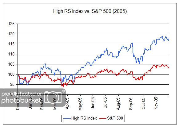
My boldface emphasis added. If the psychology of market participants today is similar to that seen at the end of 2004, it could bode well for relative strength strategies in 2011 as investors increasingly gain confidence in market leadership. As shown in the chart below, 2005 was a very good year for relative strength strategies with our High RS Index gaining 16% while the S&P 500 was up only 3%.

2005 2005 All Over Again?

(Click to Enlarge)

“High RS Index” is a proprietary Dorsey, Wright Index composed of stocks that meet a high level of relative strength. The volatility of this index may be different than any product managed by Dorsey, Wright. The “High RS Index” does not represent the results of actual trading. Clients may have investment results different than the results portrayed in this index. Past performance is no guarantee of future results.


Posted by:


Relative Strength Outlook Through 2014

December 14, 2010

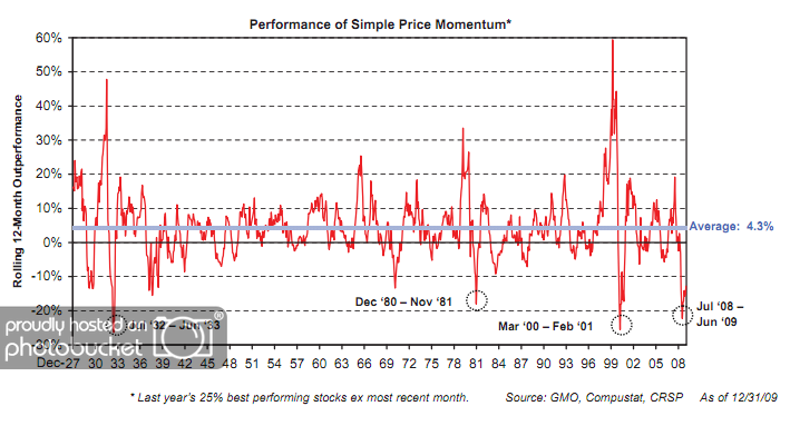
When discussing the long-term results of relative strength strategies, we often refer to the data found at the Ken French Data Library. Click here, here, and here for some of our past commentary on this data which highlights the magnitude and consistency of outperformance over time. A close study of the data reveals that a high percentage of rolling 5-year periods have been favorable for relative strength strategies. However, the data clearly shows that relative strength strategies periodically get put through the wringer! Nothing is perfect. One such period was June 2008-June 2009, as is shown in the chart below.

GMO1 Relative Strength Outlook Through 2014

(Click to Enlarge)

As shown in the chart above, a simple relative strength strategy underperformed a cap-weighted benchmark by roughly 20% from June 2008 to June 2009. What was it about that environment that made it so difficult for relative strength strategies? Simple answer: frequent leadership changes. In other words, there was a dearth of sustainable trends during this period of time.

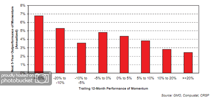
Now for the good news! After identifying four such periods of underperformance of relative strength strategies since 1927, GMO then calculated the outperformance of a simple relative strength model over the subsequent five years.

GMO2 Relative Strength Outlook Through 2014

(Click to Enlarge)

GMO points out that relative strength strategies have generated nearly 7% annual outperformance over a cap-weighted benchmark over the 5 years following periods of being sharply out of favor. Right on cue, relative strength has mounted a comeback over the last year and a half as we detailed here.

I would hope that this data would get some investors excited! It certainly gives me reason to believe that the next several years could be very rewarding for relative strength investors.

Past performance is no guarantee of future returns.

Posted by:


Tax Efficient Portfolio Turnover

December 9, 2010

In making the decision between passive index funds and active strategies, investors have several considerations. First, they must do their homework to find out if there is reason to believe that a given active strategy is likely to outperform a passive index over time. In the case of relative strength strategies, we addressed that question in one of our white papers (click here). Investors will also want to know about the volatility characteristics of the strategy and understand how a given strategy may complement their overall asset allocation. That is also a topic that we address frequently (click here). Furthermore, because short-term gains are given different tax treatment by the IRS, investors will want to know about the tax efficiency of a given active strategy.

Depending on the investor’s income-tax bracket, the tax treatment of capital gains is as follows:

taxes120910 Tax Efficient Portfolio Turnover

Source: The Investment FAQ

As a brief primer on relative strength strategies, the process goes like this: Take a universe of securities; rank them by their relative strength; construct a portfolio of high relative strength securities; hold on to strong securities, sell any holdings which weaken beyond an acceptable relative strength rank and replace with another high relative strength security. Such a process obviously involves some portfolio turnover in order to keep the portfolio fresh with high relative strength securities. If, for example, a given active strategy has annual portfolio turnover of 125%, does that mean that it is tax inefficient? Not necessarily. Remember, a relative strength strategy is designed to hold on to the winners and to cut the losers. This often results in the majority of the gains coming in the form of long-term capital gains.

In fact, the table below shows the percentage of gains that are long-term vs. short-term from 1996-2010 of our Systematic Relative Strength Aggressive strategy.

LTST3120910 Tax Efficient Portfolio Turnover

(Click to Enlarge)

As noted in the table above, this has been a very tax-efficient strategy over this time. In fact, the percentage of gains that were short-term capital gains (and therefore taxed at the higher rates) was never above 31%. I suspect that the tax efficiency is much better than many investors would have expected.

To receive the brochure for our Systematic Relative Strength portfolio, click here.

Click here for disclosures. Past performance is no guarantee of future results.

Posted by:


Cognoscenti Only, Please

November 24, 2010

The Stockbee ran a piece on relative strength the other day. It was a compendium of academic citations on relative strength and some endorsements by other researchers like Ned Davis. That alone should be enough to get investors to take it seriously. The quote that caught my eye, though, was from former hedge fund manager, Mark Boucher, detailing his research findings:

In the mid- to late-1980s, I was involved in a large research project with Stanford Ph.D., Tom Johnson and his graduate students. Our objective was very similar to what every trader is obsessed with today: We wanted to determine which tools actually made money in stocks, bonds, currencies and futures. I am pleased to report that we found what we were searching for. We measured the performance of all indicators that had results we could easily measure. These included: PEs, P/Ss, volume accumulation, volatility, trend-following tools, earnings models, earnings growth and momentum, growth rates of earnings, projected earnings growth, value compared to earnings growth, chart patterns, pace of fund accumulation of the stock, capitalization—you name it.
Of all the independent variables we tested, Relative Strength (RS) was the most consistent, reliable and robust. It single-handedly improved profit better than anything else we tested.
I didn’t even have to add the bold. Stockbee did that for me. Value is a very well-known return factor; I am always surprised that relative strength is almost completely unknown outside the cognoscenti.

Posted by:


Value or Growth: Which is Better?

November 22, 2010

This isn’t exactly the topic of my post, but it’s an inquiry along those lines, and it probably got your attention. My occasion for thinking about this was a comment in the Prudent Speculator newsletter, published by Al Frank Asset Management through Forbes. John Buckingham is the chief investment officer, one of the most respected deep value investors around, and has the track record to prove it. In addition, he is a super nice guy and a friend of mine. John cited data from the Ibbotson Yearbook, compiled by Eugene Fama and Ken French, that indicated that value stocks had higher returns than growth stocks:

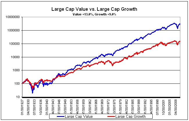
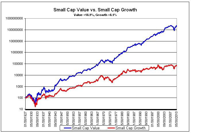
Certainly there have been periods (the 30s and 90s) during which value stocks have lagged growth, but data compiled by Eugene Fama and Ken French show that from 1928-2009, large value stocks had an 11.0% geometric return, compared to 8.7% for large growth, while small value stocks have outperformed by a wider margin (13.9% to 9.0%).

It is untrue that value outperforms growth, contradicted by both experience and statistics, but it is a popular misconception. The misconception stems from the way in which value and growth are defined. The Ibbotson Yearbook in question uses the book-to-market ratio as their metric. This is probably the most common definition in the academic literature as well. Value is virtuously defined as having high book-to-market values. Growth is defined in opposition as those stocks with low book-to-market values. In other words, growth is defined rather perversely as bad value! If growth is defined as bad value, it’s not too surprising that bad value performs worse than good value!

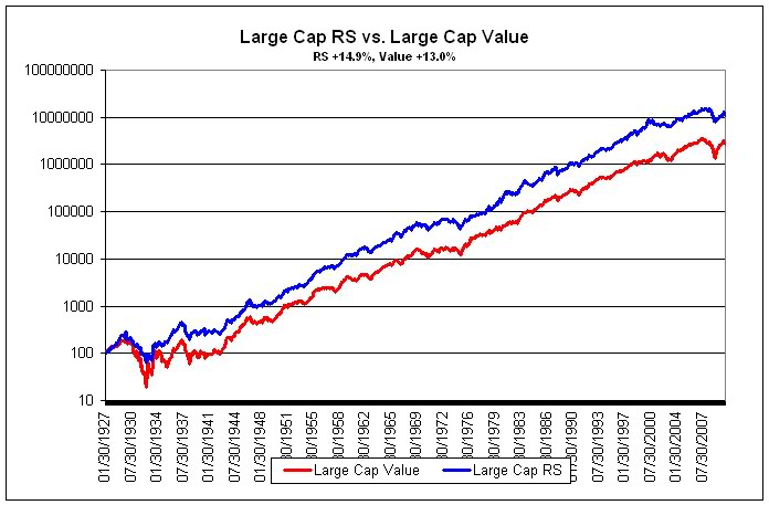
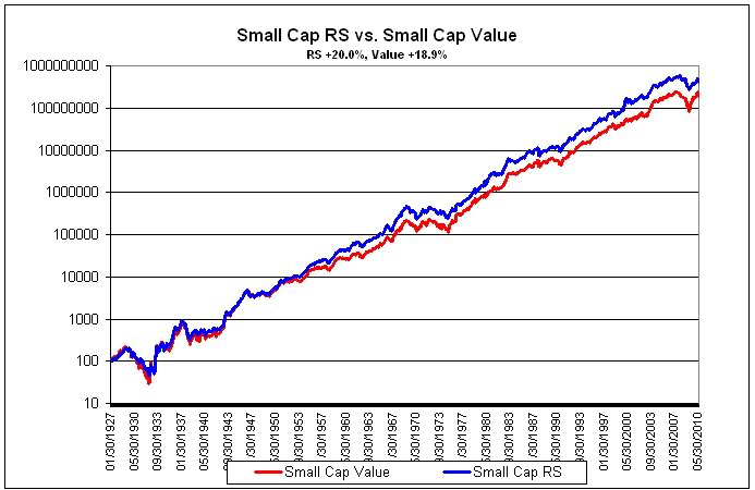
Our research assistant, J.P. Lee, went to the Ken French data library and looked at portfolios formed by market capitalization and book value. The relationships are just as Ibbotson reported, although the numbers are slightly different because of different time periods and a slightly different methodology. For the period from 1/30/1927 to 6/30/2010, large cap value (high book-to-market) stocks had a 13.0% compounded return, compared to 9.0% for large growth (low book-to-market/bad value). Small value stocks outperformed by a wider margin (18.9% to 8.1%). The charts below show the relationships. (Click all charts to enlarge)

 Value or Growth: Which is Better?

 Value or Growth: Which is Better?

source: Ken French Data Library

Of course, growth investors don’t actually busy themselves trying to find overpriced stocks! John Brush has written a very important paper about this, Value and Growth, Theory and Practice, (archived on our website) which was published in 2007 in The Journal of Portfolio Management. He points out that all the conventional academic definition shows is that good value beats bad value. He proposes, instead, a list of ten selection factors to define the value and growth styles.

VALUE FACTORS GROWTH FACTORS
Dividend-to-price Short-term change in earnings-to-price
Earnings-to-price Long-term change in earnings-to-price
Cash flow-to-price Estimate revisions
Expected future earnings-to-price Earnings surprise
Book value-to-price Price momentum

source: John Brush, Journal of Portfolio Management

Note that the value factors are static, while the growth factors are dynamic. As Brush puts it:

Most value managers will agree that the static factors describe their style. Most growth managers will perhaps more reluctantly recognize the dynamic measures as the basis of their style.

Brush shows that annualized excess returns for un-rebalanced portfolios formed monthly for the period from 1971-2004 are higher for growth stocks over holding periods up to a year, then shift slightly in favor of value stocks for longer holding periods. Of course, in real life, portfolios are not left unchanged for years at a time. Evidence from actual mutual fund portfolios shows that growth stock returns are very similar to value stock returns, if not slightly ahead. For example, John Bogle of Vanguard fame, in his 2003 book, Common Sense on Mutual Funds, writes:

In recent years, the conventional wisdom has been to give the value philosophy accolades for superiority over the growth philosophy. Perhaps this belief predominates because so few observers have examined the full historical record…For the full 60-year period, the compound total returns were: growth, 11.7 percent; value, 11.5 percent - a tiny difference.

Relative strength is a growth factor. Academics refer to it as price momentum, which is how you will find it listed in the table above. We think it is the most powerful growth factor, and also the most adaptable. Because of its incredible adaptibility, we use relative strength exclusively to manage portfolios. When you compare high relative strength to value, suddenly the tables are turned. Keep in mind that the charts below are generated from the exact same Ken French data library. Value is still defined as high book-to-market, the same data definition that made growth/bad value look like such a nebbish in the last set of charts. But this go round, growth/bad value has been replaced with a worthier opponent, high relative strength.

 Value or Growth: Which is Better?

 Value or Growth: Which is Better?

source: Ken French data library

When it is a fair fight, it’s pretty clear that relative strength is not inferior to value at all. Large cap high RS stocks had a 14.9% compounded return, compared to 13.0% for large cap value. Relative strength also outperformed in the small cap arena, with compounded returns of 20.0%, compared to 18.9% for small cap value.

And, as it turns out, relative strength and value are quite complementary. Their excess returns tend to be uncorrelated, a fact that is remarked on both in Bogle’s book and Brush’s article. Any advisor that has been in the business for a while has seen this effect-both value and growth go through pronounced cycles. Now that we know that both relative strength and value are powerful return factors, and that their excess returns are uncorrelated, what are the practical implications for an advisor?

1) If relative strength is the premier growth factor, it might make sense to replace the growth managers in your stable with managers that use relative strength.

2) Since the excess returns from relative strength and value are uncorrelated, it might make sense to expose clients to both return factors. Brush’s article suggests that a 50/50 mix is the best combination.

So which is better, value or growth? The truth is none of the above. Both are valuable return factors for a portfolio-and because they tend to offset one another, they are even better in combination. If you like, think of the client’s portfolio as a Milky Way bar. Chocolate is good; so is caramel. And together, mmm!

 Value or Growth: Which is Better?

source: Skiptomylou.org

Posted by:


The Search for Confirmation

November 9, 2010

I suspect that many of us find it entertaining to listen to colorful tales of investment managers who comb the world for uncovered pieces of information that have not been fully priced into the financial markets. These clever investors then reap enormous profits as the market comes around to their way of thinking. Surely, many of us also feel sorrowful as we listen to the stories of investment managers who rack up enormous losses while sitting in positions only to find out that the market never comes around to their way of thinking….oh wait, the latter version of the stories are never told are they! The losing managers are never paraded around CNBC to tell their sorry story; that is the role reserved for the seers of finance who just might give us insight into what will come next. Because of this one-sided coverage, investors can be led to believe that the key to outsized returns is to “know something that others don’t.”

We have chosen a different path. We are aware of the potentially disastrous effects of overconfidence in the financial markets. What if our insight turns out to be flat out wrong? How long should we stay with such a position? Furthermore, we have great respect for the financial market’s ability to weigh all the evidence and for the supply and demand relationship to render a judgement about the direction of given trend. We are also aware of the potential to generate superior performance by implementing a systematic trend-following approach to investing.

Karl E. Weick and Kathleen M. Sutcliffe have written an excellent book, Managing the Unexpected, about why some organizations perform so much better than others. According to them, a key to good performance over time is to minimize the tendency to always seek confirming evidence for our current positions:

Many of your expectations are reasonably accurate. They tend to be confirmed, partly because they are based on your experience and partly because you correct those that have negative consequences. The tricky part is that all of us tend to be awfully generous in what we accept as evidence that our expectations are confirmed. Furthermore, we actively seek out evidence that confirms our expectations and avoid evidence that disconfirms them. For example, if you expect that Navy aviators are brash, you’ll tend to do a biased search for indications of brashness whenever you spot an aviator. Your’re less likely to do a more balanced search in which you weigh all the evidence and look just as closely for disconfirming evidence in the form of aviator behavior that is tentative and modest. This biased search sets at least two problems in motion. First, you overlook accumulating evidence that events are not developing as you thought they would. Second, you tend to overestimate the validity of your expectations. Both tendencies become even stronger if you are under pressure. As pressure increases, people are more likely to search for confirming information and ignore information that is inconsistent with their expectations.

From our perspective, a key to our long-term success is to remove the element of emotion from the investment process. Sure, we have strong emotions about what is going on in the financial markets just like everyone else. However, our emotions or our perceived insight into uncovered value will never be the impetus for any of our buys or sells. We will always defer to the market to tell us when it is time to move in or to move on.

Posted by:


Momentum Makes A Comeback

November 8, 2010

From mid-2008 to mid-2009, momentum (aka relative strength) as a return factor was very much out of favor as the market experienced frequent leadership changes. One way to deal with such periods of underperformance is to change or tweak your model, as no doubt many did. However, those of us with an eye on the long-term results of momentum investing were well aware of the fact that momentum (as well as all long-term winning investment factors) goes through periods of underperformance. Sticking to the discipline has been heartily rewarded in 2010.

The chart below shows monthly cumulative performance of the seven different baskets of factors tracked by The Leuthold Group-specifically, it shows the “spread” of returns after grouping each factor into quintiles at the beginning of the time frame. The spread is the return for the first (best) quintile minus the return for the fifth (worst) quintile.

leuthold110810 Momentum Makes A Comeback

(Click to Enlarge)

Shown by permission from The Leuthold Group

The two obvious standouts are momentum (good) and growth (poor). Value ends up being fairly trendless in 2010. Given the historical tendency for momentum to enjoy multi-year periods of outperformance, we think that the next couple years could continue to be very favorable for momentum investing.

Posted by:


High RS Diffusion Index

October 6, 2010

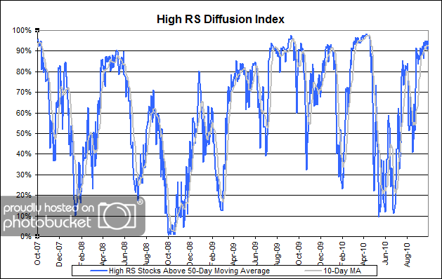
The chart below measures the percentage of high relative strength stocks that are trading above their 50-day moving average (universe of mid and large cap stocks.) As of 10/5/10.

 High RS Diffusion Index

The 10-day moving average of this indicator is 93% and the one-day reading is 95%. After pulling back to the middle of the distribution in August, this index has risen sharply in recent weeks and continues to hold its ground at the top of its range.

Posted by: