Updated White Paper Data

April 8, 2010

Back in January, we published a white paper that discussed using relative strength and portfolio management. If you haven’t read the paper (or would like to read it again) it can be found here. (Note: Please see the original paper for all of the necessary disclosures.) The original paper also outlines the unique process we use to test various relative strength factors. All of the data in that paper was updated through 2009. Since we have just finished updating all of our data through the end of Q1, we can update the data in the paper.

The first quarter was very good for relative strength. The data in the original paper showed that the best returns come from an intermediate term time horizon (about 3-12 months). Last year that was very different. We found very good returns for 2009 at very short-term time horizons. A 1-Month RS factor was actually one of the better performers in 2009. Over longer periods, a 1-Month RS factor has been a very poor performer so we definitely saw some anomalies during the huge laggard rally last year. The first quarter of 2010 was much more normal for relative strength strategies. The table below shows the performance for the first three months of 2010 for all of the models we tested in the original paper.

 Updated White Paper Data(Click To Enlarge)

The best returns came in the 6-12 month time horizon, which is what we would expect. (For those of you who are confused about the “Factor,” it is not a holding period. It is the lookback period for calculating relative strength. So the 6-Mo Price Return, for example simply takes the 6-month return for all stocks in the universe and ranks them from best to worst.)

The next table shows the cumulative annualized returns for all of the models updated through 3/31/10.

 Updated White Paper Data

(Click To Enlarge)

The various models keep chugging along! The intermediate term factors work very well. Even when we are throwing darts at a basket of high relative strength stocks we find 100 out of 100 trials outperforming the benchmark over time. As the original paper showed, relative strength models aren’t going to outperform each quarter or each year, but over time they do exceptionally well.

Posted by:


Perfect Sector Rotation

March 30, 2010

CXO Advisory has a very interesting blog piece on this topic. They review an academic paper that looks at the way conventional sector rotation is done. Typically, various industry sectors are categorized as early cycle, late cycle, etc. and then you are supposed to own those sectors at that point in the business cycle. Any number of money management firms (not including us) hang their hat on this type of cycle analysis.

In order to determine the potential of traditional sector rotation, the study assumes that you get to have perfect foresight into the business cycle and then you rotate your holdings with the conventional wisdom of when various industries perform best. A couple of disturbing things crop up, given that this is the best you could possibly do with this system.

1) You can squeak by with about 2.3% annual outperformance if you had a crystal ball. If you are even a month or two early or late on the cycle turns, your performance is statistically indistinguishable from zero.

2) 28 of the 48 industries studied (58.3%) underperformed during the times when they were supposed to perform well. There’s obviously enough noise in the system that a sector that is supposed to be strong or weak during a particular part of the cycle often isn’t.

CXO notes, somewhat ironically:

Note that NBER can take as long as two years after a turning point to designate its date and that one business cycle can be very different from another.

In other words, it’s clear that traditional business cycle analysis is not going to help you. You won’t be able to forecast the cycle turning points accurately and the cycles differ so much that industry performance is not consistent.

Sector rotation using relative strength is a big contrast to this. Relative strength makes no a priori assumptions about which industries are going to be strong or weak at various points in the business cycle. A systematic strategy just buys the strong sectors and avoids the weak ones. Lots of studies show that significant outperformance can be earned using relative strength (momentum) with absolutely no insight into the business cycle at all, including some studies done by CXO Advisory. Tactical asset allocation is finally coming into its own and various ways of implementing are available. Business cycle forecasting does not appear to be a feasible way to do it, but relative strength certainly is!

Posted by:


Shaq, Lebron, J.J. and Relative Strength Sensitivity

March 29, 2010

Which of the following is more likely to lead the NBA in scoring over the next couple of years?

Among the topics discussed in our recent white papers (here and here) is relative strength sensitivity. In other words, when selecting stocks, is it best to buy those stocks that have had the best relative strength over short, intermediate, or longer-term time horizons? Our papers pointed out that using a relative strength factor that focuses on relative strength over roughly the last 6-12 months when selecting stocks has led to the best long-term performance.

In a recent presentation, Mike explained stock selection within a relative strength model by comparing it to trying to identify those NBA players that are likely to be the highest scorers over the next couple years. One option would be to look at a player like Shaquille O’Neal who has averaged 24.1 points per game over his 18-year career. That is spectacular performance. However, this year he is only averaging 12 points per game for the Cleveland Cavaliers.

On the other end of the spectrum, you might reason that that player who scored the most points over the last week or month is most likely to be the best scorer in coming years. That might lead you to a player like J.J. Redick who just put up 23 points against the Nuggets, but who has only averaged 6.9 points over the course of his career.

Alternatively, one might select from among the list of players who have scored the most over the last year. The table below is for the 2009-2010 season:

It should make sense that if you use an extremely long time horizon to measure relative strength (Shaq) you run the risk of getting a stock that is running out of steam. If you use a very short time horizon to measure relative strength (J.J. Redick) you run the risk of getting a stock that happened to get a short-term pop, but may be unlikely to sustain that over time. However, using an intermediate-term measure of relative strength (Lebron) leads to those stocks most likely to be the best performers in the coming years.

Posted by:


New Dorsey Wright Podcasts

March 29, 2010

Dorsey Wright Podcast - Bringing Real World Testing to Relative Strength

Paul Keeton and John Lewis, CMT; Portfolio Manager at Dorsey Wright Money Management - Bringing Real-World Testing To Relative Strength, 3/24/2010

Dorsey Wright Podcast - Dorsey Wright Money Management

Tom Dorsey and Andy Hyer - Communicating Dorsey Wright Money Management Strategies, 3/26/2010

Disclosures on Dorsey Wright Money Management Strategies

PDP, PIE, PIZ Disclosures
DWAFX, DWTFX
Disclosures
Rydex DAP Models Disclosures (here)
Systematic Relative Strength Portfolios Disclosures (here, here, and here)

Posted by:


RS in Australia

March 18, 2010

Blog reader, Matthew Brooks, writes:

By the way, relative strength is a great strategy for selecting stocks in Australia also. I just published a book that looked at the stock market strategies that work in Australia.

http://www.thesuperinvestor.com.au/order_book.php

It’s a bit like What Works On Wall Street … but for stocks listed on the ASX. Relative Strength was the single best criteria in Australia. Thought you might be interested as the Bibliographies on some of your reports read like a list of my favourite books.

Looks like an interesting book. It is not surprising to see that relative strength works all over the world, given the fact that RS capitalizes on trends, and trends certainly aren’t confined to the U.S.

Posted by:


Relative Strength Is Everywhere

March 15, 2010

CXO Advisory recently published another study on momentum (otherwise known as relative strength) and style rotation. Not surprisingly, their conclusion was:

In summary, a simple style momentum strategy implemented with ETFs may perform well compared to the overall stock market and individual style ETFs.

Since we have been using style funds in some of our relative strength strategies for years, we could have told you the same thing, but it is always nice to have some validation by a completely independent party.

Relative strength is an incredibly adaptable method. We’ve demonstrated in our own white papers that it works nicely with stocks and asset classes. It works for industry rotation and style rotation. There is lots of third-party validation as well, whether from CXO Advisory here, other practitioners, or academics.

One of the things I particularly like about relative strength is that it can deal with a disparate basket of assets, which is considerably more difficult with other proven return factors like deep value. Value is not too tricky when comparing two similar assets, like two stocks. If you want to get more sophisticated, you can even build a complicated model to determine if stocks are cheaper than bonds. But how easy is it to determine whether crude oil, Apple Computer, or emerging market debt is cheapest? The assets and the metrics typically used to value them are not universal. With relative strength-no problem. It’s not difficult to determine which is the strongest asset and it can be done on an apples-to-apples basis.

Posted by:


New White Paper: Relative Strength and Asset Class Rotation

March 11, 2010

In January we published a white paper that outlined our testing process, and illustrated why we believe applying relative strength in a systematic fashion can produce great investment results over time. The original blog post on the paper can be found here and the original white paper can be downloaded in pdf format here.

We received a lot of positive feedback on the original paper. In the first white paper, we tested several relative strength factors on a universe of mid- and large-cap U.S. equities. The new research expands on the original work by testing a variety of relative strength factors on a universe of asset classes. The investment universe for this white paper is domestic sectors, domestic styles, alpha generating, global equity, international equity, inverse equity, real estate, commodities, currencies, government bonds, and specialty fixed income. The complete white paper on relative strength and asset class rotation can be downloaded here.

If you are a frequent reader of our blog you are well aware of our feelings about the Tactical versus Strategic Asset Allocation debate. We believe Tactical Asset Allocation is a much better way to invest than Strategic Asset Allocation. In the white paper, we show how a Tactical strategy can be implemented in a real-world setting. We find that concentrating on strong asset classes can lead to outperformance over time. We also use our Monte Carlo process to test the robustness of those findings. Finally-and very importantly-we show how the volatility of an asset class rotation portfolio changes over time.

When volatile assets, such as stocks, are declining, an RS strategy might rotate into a much less volatile asset class, like bonds or currencies, that is holding up better. This is very different from the approach taken by a Strategic Asset Allocation portfolio. An important byproduct of using relative strength is that the portfolio adapts to changing market conditions. Perhaps the most powerful image from the white paper is Figure 2, which shows the trailing 12-month beta of the model versus the S&P 500, as well as for a 60/40 benchmark versus the S&P 500:

As shown, a tactical approach to asset allocation allows the risk to increase and decrease depending on the market environment. Our experience has been that this is exactly what clients want and need. They need a dynamic process that seeks to protect them during the bad times, but one that is flexible enough to capitalize during the good times.

We’re excited about being able to share this research about using relative strength to manage a tactical allocation portfolio. We use a similar process (although we don’t pick investments at random!) to run our Systematic Relative Strength investment strategies. Our asset class rotation strategy is available via our Global Macro separate account (click here for the fact sheet), or through a mutual fund (DWTFX) we manage through Arrow Funds (click here for the fact sheet).

Posted by:


If You Miss the 10 Best Days

March 5, 2010

We’ve all seen numerous studies that purport to show how passive investing is the way to go because you don’t want to be out of the market for the 10 best days. No one ever mentions that the “best days” most often occur during the declines!

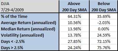
It turns out that the majority of the best days and the worst days occur near one another, during the declines. Why? Because the market is more volatile during declines. It is true that the market goes down 2-3x as fast as it goes up. (World Beta has a nice post on this topic of volatility clustering, which is where this handy-dandy table comes from.)

 If You Miss the 10 Best Days

from World Beta

You can see how volatility increases and the number of days with daily moves greater than 2.5% really spikes when the market is in a downward trend. It would seem to be a very straightforward proposition to improve your returns simply by avoiding the market when it is in a downtrend.

However, not every strategy can be improved by going to cash. Think about the math: if your investing methodology makes enough extra money on the good days to offset the bad days, or if it can make money during a significant number of the declines, you might be better off just gritting your teeth during the declines and banking the higher returns. Although the table above suggests it should help, a simple strategy of exiting the market (i.e., going to cash) when it is below its 200-day moving average may not always live up to its theoretical billing.

 If You Miss the 10 Best Days

 If You Miss the 10 Best Days

click to enlarge

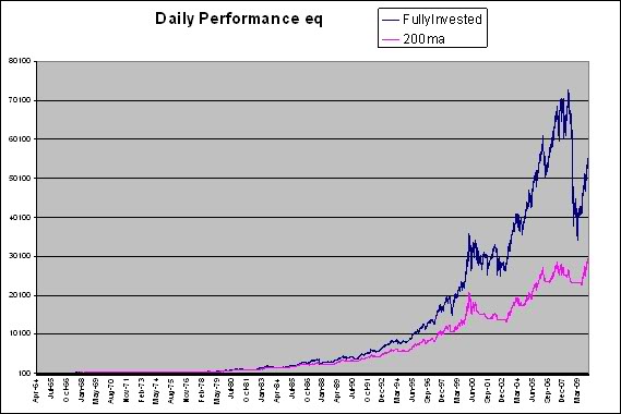
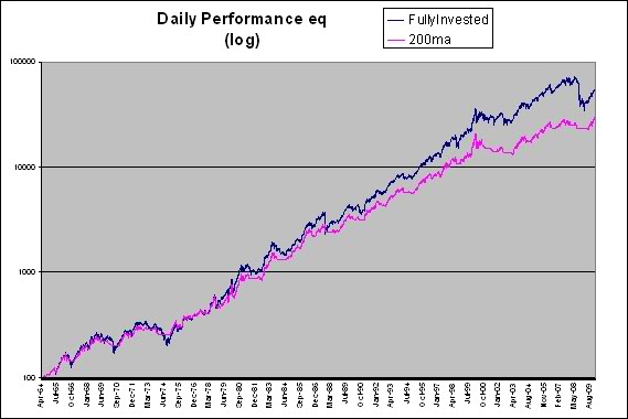
Consider the graphs above. (The first graph uses linear scaling; the second uses logarithmic scaling for the exact same data.) This test uses Ken French’s database to get a long time horizon and shows the returns of two portfolios constructed with market cap above the NYSE median and in the top 1/3 for relative strength. In other words, the two portfolios are composed of mid- and large-cap stocks with good relative strength. The only difference between the two portfolios is that one (red line) goes to cash when it is below its 200-day moving average. One portfolio (blue line) stays fully invested. The fully invested portfolio turns $100 into $49,577, while the cash-raising portfolio yields only $26,550.

If you would rather forego the extra money in return for less volatility, go right ahead and make that choice. But first stack up 93 boxes of Diamond matches so that you can burn 23,027 $1 bills, one at a time, to represent the difference-and then make your decision.

 If You Miss the 10 Best Days

The drawdowns are less with the 200-day moving average, but it’s not like they are tame-equities will be an inherently volatile asset class as long as human emotions are involved. There are still a couple of drawdowns that are greater than 20%. If an investor is willing to sit through that, they might as well go for the gusto.

As surprising as it may seem, the annualized return over a long period of time is significantly higher if you just stay in the market and bite the bullet during train wrecks-and even two severe bear markets in the last decade have not allowed the 200-day moving average timer to catch up.

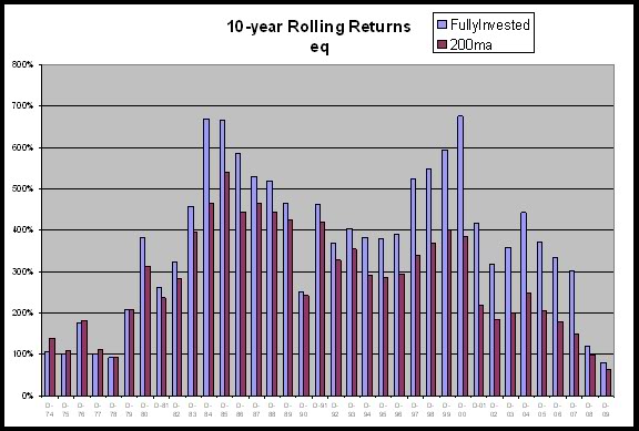
At the bottom of every bear market, of course, it certainly feels like it would have been a good idea (in hindsight) to have used the 200-day moving average to get out. In the long run, though, going to cash with a high-performing, high relative strength strategy might be counterproductive. When we looked at 10-year rolling returns, the fully invested high relative strength model has maintained an edge in returns for the last 30 years running.

 If You Miss the 10 Best Days

click to enlarge

Surprising, isn’t it? Counterintuitive results like this are one of the reasons that we find testing so critical. It’s easy to fall in line with the accepted wisdom, but when it is actually put to the test, the accepted wisdom is often wrong. (We often find that even when shown the test data, many people refuse, on principle, to believe it! It is not in their worldview to accept that one of their cherished beliefs could be false.) Every managed portfolio in our Systematic RS lineup has been subjected to heavy testing, both for returns and-and more importantly-for robustness. We have a high degree of confidence that these portfolios will do exceedingly well in the long run.

Posted by:


Old Habits Die Hard

March 3, 2010

The Great Recession was supposed to scar consumers for life and scare them into saving. Personally, I thought consumers might permanently change their behavior as they did after the Great Depression in the 1930s. But just as investor behavior is seemingly intractable, consumer spending behavior is hard to change. According to an article in the Washington Post:

Consumers spent more and saved less in January, according to government data released Monday, a sign that Americans feel increasingly secure about their financial situation, economists said. The growth in spending and the decline in savings were, respectively, more and less than analysts had predicted — adding weight to a growing consensus that consumers’ newfound frugality was just a fling.

Maybe consumers feel like the recession is over and they are willing to spend again. If so, most economists (again!) are going to be caught off guard.

Sectors catering to the consumer might perform more strongly than people expect. When I looked at our relative strength sector work yesterday, the biggest positive changes in RS over the last several weeks have come in healthcare, consumer staples, and consumer cyclicals. It’s impossible to know if the strength will be durable, but it’s certainly not what the consensus expected.

Posted by:


How To Create Good Portfolio Performance

February 3, 2010

Clay Allen of Market Dynamics has a fantastic, fantastic essay on the process needed to generate good performance in a portfolio. The process is incredibly simple, but most often ignored.

Surprisingly, the key to good performance is the ability to identify those stocks that are detracting from the performance of the portfolio. Most portfolio managers spend most of their time and effort trying to find the next big winner in the stock market but good portfolio performance depends more on finding and eliminating the bad stocks from the portfolio.

Why is the process ignored? Because most investors do not want to take a loss! This aspect of investor behavior is so ingrained that academics writing about behavioral finance have given the tendency a name, the disposition effect. (If you google for it, you will find dozens of articles written about it.) No doubt the disposition effect costs amateur investors untold millions in aggregate profits every year.

Mr. Allen’s essay is an eloquent restatement of a fundamental principle: cut your losses and let your winners run. The casting-out process used in our systematic relative strength process does exactly that. Each asset has a stop based on its relative strength rank. If it falters in relative performance, it is kicked out of the portfolio and replaced. Mathematically, this is the correct way to run a portfolio. The recent White Paper on our relative strength testing process shows that even randomly selected high relative strength stocks will outperform over time, as long as the weak stocks are knocked out of the portfolio on a consistent basis. Managing the portfolio properly is as important to the ultimate result as the research to find the strong stocks.

Posted by:


How to Find the Winners

February 2, 2010

Martjin Cremers, a professor at Yale, and his colleague, Antti Petajisto, authored a paper on the concept of active share. Advisor Perspectives recently interviewed Mr. Cremers to ask about his research. (This link is worth checking out, as it has links to additional articles such as From Yale University: New Research Confirms the Value of Active Management and Compelling Evidence That Active Management Really Works.)

Active share is a holdings-based measure of how different the holdings in an active portfolio are from the benchmark portfolio. As an example, an S&P 500 index fund would have an active share of 0%, since the holdings would be identical to the benchmark. Portfolios with low active shares around 20-60% are still so close to the benchmark that they are considered closet indexers.

Where Cremers and Petajisto differ from the establishment is that by segmenting managers in this way, they believe they are able to identify a subset of managers-those with high active share-who can outperform the benchmark over time.

That result is probably the most controversial. We find significant evidence, in our view, that a lot of managers actually do have some skill.

What I find refreshing about their approach is their willingness to examine aggregate data more thoroughly. In aggregate, their data also shows that fund managers do not outperform the benchmark. Most studies stop there, pretend not to notice that numerous tested factors show evidence of long-term outperformance, and then advise investors to buy index funds and to forget about active management.

Cremers and Petajisto were not content to take the lazy road. And, in fact, when looked at in more granular fashion, the data tells a different story. Closet indexers do worse than the market, but many managers with high active share show evidence of skill. This is much more in accord with other academic research that shows that broad, robust factors like relative strength and deep value can outperform over time. A manager that pursued such a strategy would have high active share and would have a good chance of long-term outperformance. That’s exactly what our systematic relative strength strategies are designed to do.

Posted by:


New White Paper: DWAMM Testing Process

January 26, 2010

Anyone involved in developing and implementing systematic investment strategies should be obsessed with testing. There is no end to the advice you can find about how to invest. The problem for investors is that most of these investment ideas don’t actually stand up to rigorous testing. They may sound good, and they may have worked for a short time period, but when you test them over different market conditions they don’t work as advertised.

We focus on relative strength as the main (or only) factor in our investment process. There has been quite a bit of testing done over the years that shows how well RS/Momentum works over intermediate-term time horizons. There are certainly other factors that stand up to rigorous testing over time, but RS is where we feel we have an exploitable edge over time. Market technicians have used RS/Momentum for many years. The development of computers in the 1960′s even allowed large-scale testing of the idea that strong stocks outperform over intermediate-term time horizons. The academic community got into the act in the early 1990′s, and have continued to research the topic heavily because it was such a blow to long-held academic theories about stock market behavior. With so many different people testing RS using different universes and different formulations for calculating RS, I think it’s safe to say that RS/Momentum strategies can add alpha over time.

What is frustrating about most of this testing is that is very difficult to implement in an actual portfolio. Do you really want to go long 200 stocks and short 200 stocks and rebalance the whole portfolio every month? Not likely. So in the real world, portfolio managers take a factor that has been proven to work, and then begin haphazardly applying it to their style. Is it a sound investment strategy to take a list of high RS stocks and then buy a subset that have “good managements?” Will it work if you cherry pick some stocks with good value characteristics out of the high RS list? What if you don’t rebalance on the same schedule as the RS testing? These are just some of the problems if you don’t implement your strategy exactly as the research was done.

We designed a custom testing process here that determines how robust RS/Momentum is as a factor. Instead of rebalancing each month, quarter, or year we run a continuous process that behaves like an actual portfolio manager would. We also run a Monte Carlo process that buys high RS stocks at random instead of just taking the top ranked stock. This helps us determine what kind of range in outcomes we can expect over time, and what can happen if you get lucky or unlucky in your stockpicking.

In a whitepaper available here we outline our unique testing process using several well-known RS factors. We have a proprietary RS factor we use for our actual portfolio management, but we used well-known factors because people are always amazed that it doesn’t take a “silver bullet” to outperform over time using RS.

Posted by:


Is Buy-and-Hold Dead?

January 8, 2010

The Journal of Indexes has the entire current issue devoted to articles on this topic, along with the best magazine cover ever. (Since it is, after all, the Journal of Indexes, you can probably guess how they came out on the active versus passive debate!)

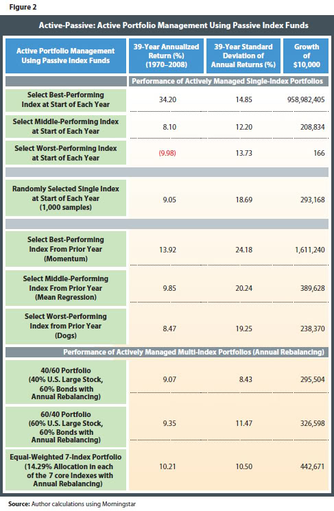
One article by Craig Israelson, a finance professor at Brigham Young University, stood out. He discussed what he called “actively passive” portfolios, where a number of passive indexes are managed in an active way. (Both of the mutual funds that we sub-advise and our Global Macro separate account are essentially done this way, as we are using ETFs as the investment vehicles.) With a mix of seven asset classes, he looks at a variety of scenarios for being actively passive: perfectly good timing, perfectly poor timing, average timing, random timing, momentum, mean reversion, buying laggards, and annual rebalancing with various portfolio blends. I’ve clipped one of the tables from the paper below so that you can see the various outcomes:

 Is Buy and Hold Dead?

Click to enlarge

Although there is only a slight mention of it in the article, the momentum portfolio (you would know it as relative strength) swamps everything but perfect market timing, with a terminal value more than 3X the next best strategy. Obviously, when it is well-executed, a relative strength strategy can add a lot of return. (The rebalancing also seemed to help a little bit over time and reduced the volatility.) Maybe for Joe Retail Investor, who can’t control his emotions and/or his impulsive trading, asset allocation and rebalancing is the way to go, but if you have any kind of reasonable systematic process and you are after returns, the data show pretty clearly that relative strength should be the preferred strategy.

Posted by:


RS Primer

December 29, 2009

Good primer on relative strength by CSS Analytics:

I have done a lot of research in this area and the first conclusion I can make is that it should be a major portion of any trader or investors portfolio strictly because it is so durable and robust. Whether its asset classes, sectors, stocks, commodities, currencies—-you pick a time frame over the last 40-50 years and this simple method of buying strength and selling weakness has outperformed traditional buy and hold strategies. This outperformance or alpha is also robust to most transaction cost assumptions.

Four-stage model depicting how relative strength occurs:

Based on my own observation and theory I feel that a simple four-stage model best depicts how relative strength occurs and why it takes time to develop rather than occuring instantaneously. The relative strength effect is driven by behavioural feeback loops where investors sequentially pour money into the asset du jour for a plethora of reasons including positive perceived fundamentals, psychological beliefs such as fear or greed, or for positive economic or default risk factor sensitivity. Essentially it starts when certain investors create a theory such as: “emerging markets will outperform because of the accelerated pace of development” and begin to accumulate investments in assets tied to this theory (Stage 1: the early adopters). As time goes on the theory itself becomes more widely known and the rationale becomes more widely accepted. Others quickly catch on and start investing in the same idea (Stage 2: recognition and acceptance). The next stage (and longest stage) is where initial investors wait for hard proof that the idea or theory is supported by tangible evidence in a variety of forms whether economic indicators, qualitative or anectdotal accounts to mention a few. (Stage 3: validation). The “Validation Stage” tends to last long as the early investors are looking for ongoing proof that supports or refutes their theory. The nature of economic data and other information sources is that they require multiple readings to establish that a trend is in fact statistically valid. This is why it is impossible for markets to adjust instantaneously even with purely rational investors. There are two paths the validation stage can take—either the evidence to refute the theory is strong , and as a consequence momentum will fail as early investors bail out. Or if the evidence continues to support and even exceed expectations, the early investors will add to their positions alongside the second stage investors. This added money flowcements the trend and the relative strength begins to really accelerate. At this point we reach the final stage where everyone agrees that a given market is and should go up and people are hopping on the bandwagon simply because the market is going up. This is both the fastest stage and the most rewarding per unit of time (Stage 4: mania).

Posted by:


Unpredictable, But Not Unexpected

December 23, 2009

Jim O’Shaughnessy, author of What Works on Wall Street, has done a great deal of research on momentum investing. He recently produced commentary in which he pointed out that strong returns in the stock market this year have been driven by stocks that had been pushed down the worst in the six months leading up to the March 9th bottom. Since then, previous losers (low-momentum stocks) have outperformed previous winners (high-momentum stocks) by a staggering amount. O’Shaughnessy stated the following:

As with any strategy, there have been and will be periods where momentum underperforms. Since 1926, there have been several other periods when low-momentum stocks outperformed high-momentum stocks. In general, these periods are aligned with recessionary inflection points when stock leadership changes. These periods are unpredictable, but not unexpected.

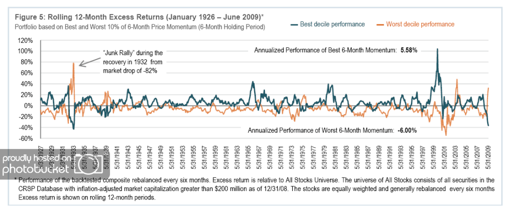
Using the CRSP database, O’Shaughnessy studied momentum investing back to 1926 and concluded that there is a consistent advantage to buying high-momentum stocks. The stocks in the best six-month price momentum decile had excess returns of 5.6 percent per year over his All Stocks Universe, while the stocks in the worst six-month price momentum decile lost 6.0 percent per year versus the All Stocks Universe. Click here for disclosures of the testing process. Historically, investing in “out-performers” versus “underperformers” has created a spread of 11.6 percentage points, as seen in the chart below:

6 MonthMomentum Unpredictable, But Not Unexpected

(Click to Enlarge)

As seen in the chart above, historical periods where the worst 6-month momentum outperformed the best 6-month momentum were followed by periods- often multi-year stretches-where high momentum performed very well.

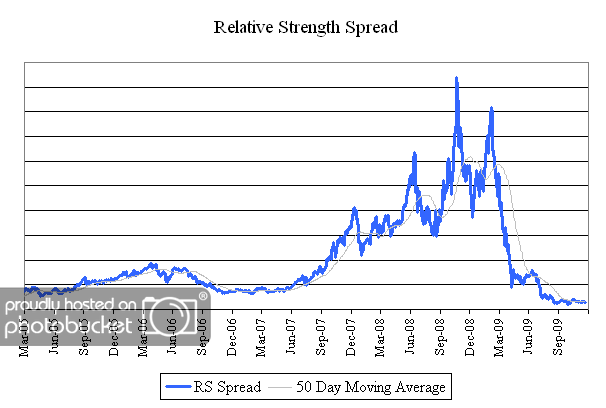
The chart below is the spread between the relative strength leaders and relative strength laggards of U.S. mid and large cap stocks. When the chart is rising, relative strength leaders are performing better than relative strength laggards. Given the historical tendency for high momentum to bounce back strongly from periods of underperformance, the chart below will be important to watch in coming months.

spread 1 Unpredictable, But Not Unexpected

(Click to Enlarge)

Posted by:


Beating Buy-and-Hold, Again

December 22, 2009

Although it always seems counterintuitive for incredibly simple momentum strategies to be able to beat the market, yet more evidence is provided in a brief article from CXO Advisory. (Relative strength is often called “momentum” in academic literature.)

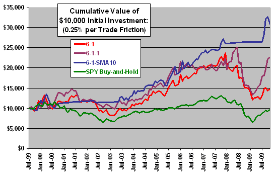
Their method was simple. They used the nine domestic sector SPDRs, held the top one based on a simple momentum ranking, and revisited the ranks monthly, switching if necessary. Three simple models were used: 1) top 6-month return, 2) top 6-month return ending 1 month ago, and 3) top 6-month return or cash if the top sector SPDR was below its 10-month moving average (a la Mebane Faber’s paper).

You can see the equity curve below, although there is better detail in the original article. (The model that can go to cash was obviously helped by two big bear markets in the last ten years; in an up market decade it might be different.)

 Beating Buy and Hold, Again

Now, I’m not sure any compliance department would sign off on a strategy that only held one sector at a time, but it is certainly eye-opening that all three strategies outperformed the market. This finding is rampant throughout many, many academic and practitioner studies, including ones archived on our website. Systematic use of relative strength works.

Posted by:


What They Were Saying 10 Years Ago

December 21, 2009

There are a lot of articles floating around right now reviewing the market forecasts of ten years ago, such as this one by Brett Arends in the WSJ.

Hands up if you had Southwestern Energy.

No? How about XTO Energy? Range Resources? Precision Castparts?

You should have. These were top stocks of the decade in the Standard & Poor’s 500-stock index. Ten years ago, the smartest thing you could have done with your money was to invest in these. Each $1,000 invested then would be worth tens of thousands today.

Now look at the stocks the experts told you to buy instead.

The most widely recommended — according to a quick survey at the time in the Washington Post — were America Online, Cisco Systems, Qualcomm, MCI WorldCom, Lucent Technology and Texas Instruments.

Ahem.

Any people who invested in that portfolio have lost about two-thirds of their money. The average stock picked at random was up 3%, including dividends

The best investments are usually the ones nobody is talking about. Ten years ago, everybody was talking about which technology stocks to buy. Almost nobody was talking about gold. The Bank of England could barely give the stuff away at $260 an ounce.

Why are people so fascinated with trying to forecast the future? I don’t get it. The track record of forecasters is utterly pathetic. Do people not know that there are more enlightened methods of investing? The data supporting trend-following, including the compilation on our website, is legion. Trend following has warts as well, but those can be relatively easily understood and should be evaluated within the context of long-term results. Those investors who accept the limitations of trend following, and commit to the process for the long-run, are in a remarkably better position that those who try to divine the impossible.

Posted by:


Laggard Rally Progression

December 15, 2009

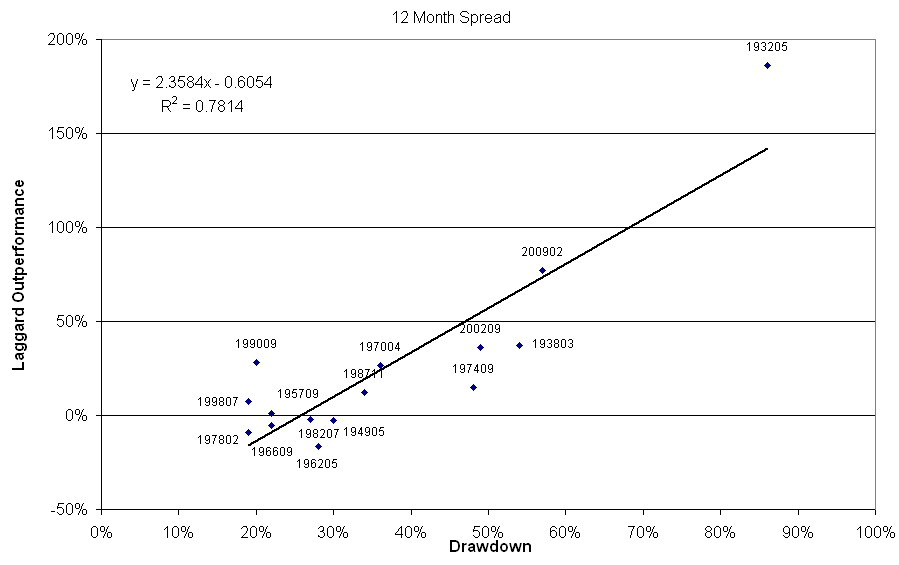
The laggard rally of 2009 has been the second largest in history. Only the massive laggard rally off the market low in 1932 was larger (and by a substantial amount!). Doug Ramsey of The Leuthold Group (http://www.leutholdgroup.com) published a great study in their December 2009 Green Book that addressed laggard rallies in relation to market drawdowns. His thesis is that the larger the market drawdown, the larger the laggard rally.

Doug was kind enough to help me sort through the source data they used for the research (6 Portfolios Formed On Size & Momentum on Ken French’s website) so I was able to recreate his results, which are shown below.

LR12 Laggard Rally Progression

(Click To Enlarge)

The chart above measures the market drawdown on the horizontal axis, and the amount of the laggard outperformance over 12 months on the vertical axis. You can see the very strong relationship between drawdown and laggard outperformance. The laggard rally from the lows of the most recent drawdown are basically sitting on the regression line. In terms of the fitted model, this is about what we should have expected.

The striking relationship between drawdown and laggard outperformance got me thinking. We are always on the lookout for a reliable regime switching methodology that can reliably predict these periods of laggard outperformance. We have tested a lot of ideas, but nothing ever seems to improve the performance of simply sticking with the winners over the long haul. I broke the performance of the laggards out into multiple time periods to see how the laggard rally unfolds over time. The charts below show what happens over the first three months from the market bottom. One chart includes all of the data, and the second chart excludes the datapoint from the bottom in 1932 because it was such an outlier.

LR Laggard Rally Progression

(Click To Enlarge)

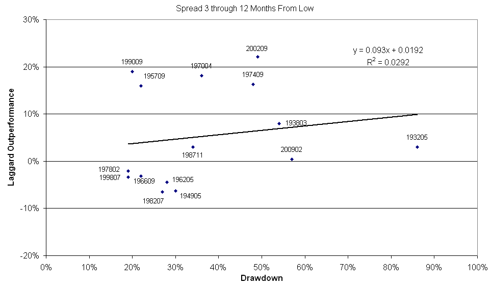
You can see there is a very strong relationship between drawdown and laggard outperformance over the first three months after the market low. Excluding the datapoint from 1932 weakens the fit somewhat, but the relationship is still there. Now compare the performance over the first 3 months to the performance of the next 9 months (months 3-12).

LR312 Laggard Rally Progression

(Click To Enlarge)

Once you get past the initial thrust off the bottom there is very little correlation between laggard outperformance and drawdown. Sometimes the laggard rally ends, and the leaders begin to outperform again. Other times the laggards continue to outperform. It is very unreliable and you might as well just toss a coin.

In looking at the data, it is my opinion that the reason it is so difficult to consistently capitalize on the laggard rallies is that market timing becomes so important. Most of the consistent money is made in the laggards in the initial thrust off the lows. I think it goes without saying that in order to get in at the lows you either need to be a very good market timer or very lucky! Buying laggards near what you think is the bottom can be a disaster. Many people (yours truly included) thought the market bottomed in November 2008. If you had bought some bank stocks at that point you had problems as they got crushed in the first part of 2009. Bank Of America, one of the poster children for laggard stocks in the decline, went from $11.50 to $3.75 from the November lows until the ultimate lows in March 2009. You would have ultimately been bailed out in that trade if you held on because the laggard rally has been so dramatic. But I think everyone reading this needs to be honest with themselves: very few people would have actually held on to that stock for the entire round trip.

Catching a nice laggard rally requires tremendous timing. It also requires incredible fortitude because you must buy companies that appear to have very dim prospects of survival (let alone outperformance). If you can do these two things you must be extremely nimble because the effect doesn’t appear to be consistently reliable once the initial thrust is done. We have just seen the second largest laggard rally in history (at least according to this data). This laggard rally has been about double what we have seen from the rallies off the lows in 1938, 1990, and 2002. Given the magnitude of outperformace by the laggards it is extremely tempting to attempt to enter into a regime switching methodology to capitalize on it. I see two problems with this. First, over time it has been more difficult to consistently capitalize on this phenomenon than the most recent rally would suggest. Second, this laggard rally has been historically huge. You probably won’t get the same results going forward for quite some time. Of course there will be laggard rallies in the future, but history shows they have a higher probability of being much more muted than the current one.

Posted by:


Black Swan Of Laggard Rallies

December 9, 2009

It has been a difficult year for Relative Strength strategies. RS is a “success-based” factor, and what has worked this year has been companies that have had little success. From an RS standpoint, the laggards (those stocks that declined the most heading into the market low) have outperformed the leaders (those that held up the best in the market decline) by a historically wide margin. According to research by The Leuthold Group in their December 2009 Green Book, this year has been the second best year for laggard outperformance in history. The best year for the laggards to outperform the leaders was all the way back beginning at the market low in June 1932. Their study uses Ken French’s data, and calculates the performance spread between the leaders and laggards in the first 12 months of a new bull market.

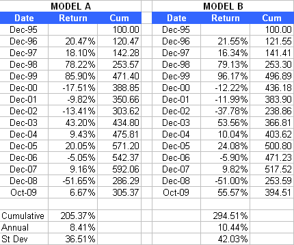
The historically high laggard outperformance presents interesting challenges for anyone who is testing and systematically applying an RS factor. Take the following two models, for example:

Models Black Swan Of Laggard Rallies

For purposes of this post the actual model specifications don’t matter. But for those of you who will e-mail me anyway, Model A is a simple 12-month trailing return model with 50 holdings. Very straightforward and plain vanilla. Model B is just a test I was playing around with that attempts to adapt more quickly to the market. In effect, the RS factor is a 12-month trailing return unless there is a 20% swing in the S&P 500. If there is a 20% swing, the lookback period changes from 12 months ago to the market high or low where the swing is measured from.

If you just look at the cumulative return you would say that Model B is much better. But is it really? There are some big differences in the performance of the two models in 2002 and 2003, but look at the difference in 2009. Essentially, all of the outperformance from Model B comes in 2009. In fact, if you ran these two models as of 12/31/2008 you would have said that Model A is better (+186% for Model A versus +154% for Model B).

You can’t simply look at the return streams of any model in a vacuum. There are reasons why the returns are what they are, and those reasons need to be considered. I think hitching your wagon to an RS strategy that makes a huge percentage of its relative (to other models) gains in a year like 2009 is asking for trouble. According to Leuthold’s research, the next set of laggard rallies that were difficult for RS were off the market lows in 1990, 2002, and 1938. All three of those instances were around 40% outperformance by the laggards over 12 months. This current laggard rally is almost 2 times that (77%).

Could it be that we have just seen the proverbial Black Swan of laggard rallies? It’s certainly possible. While a laggard rally of this magnitude can certainly happen again (and probably will at some point), the data suggests that relying on this type of rally to generate returns using an RS model over long periods of time is not wise. So like most things that get tested, I would say the idea of Model B was very interesting, but will wind up in the graveyard of good ideas.

Posted by:


Ken French Should Check His Website

December 3, 2009

A new paper from Eugene Fama and Ken French is circulating, suggesting that active mutual fund managers don’t add value. Articles, like the one here at MarketWatch, have been appearing and the typical editorial slant is that you should just buy an index fund.

I have a bone to pick with this article and its conclusions, but certain things are not in dispute. Fama and French, in their article Luck versus Skill in the Cross Section of Mutual Fund Returns, look at the performance of domestic equity funds from 1984 to 2006. (You can find a summary of the paper here.) They discover that the funds, in aggregate, are worse than the market by 80 basis points per year-basically the amount of the fees and expenses. (After backing out fees and expenses, the funds are 10 basis points per year above the market.) After that, Fama and French run 10,000 simulations with alpha set to zero to see if the distribution of returns from actual fund managers is any different from the distribution of returns from the random simulations. They conclude it is not very different and suggest that any fund manager that outperforms is simply lucky.

Let me start my critique by pointing out that, based on their sample and their experimental design, their conclusions are probably correct. Existing mutual funds in aggregate pretty much own the market portfolio and underperform by the amount of fees and expenses. There clearly are some above-average mutual fund managers, but as Fama and French point out, it’s difficult to tell statistically from just performance data if they are good or simply lucky. Within a big sample of funds like they had, after all, a few are bound to have good performance just because the sample is so large.

This is quite a quandary for the individual investor, so let’s think about the realistic scenarios and their outcomes-in other words, let’s take actual investor behavior into account.

Scenario 1. Buy a mutual fund after its good performance is advertised somewhere and bail out when it has a bad year. Continue this behavior throughout your investment lifetime. According to Dalbar’s QAIB and other data, this is what actually happens most of the time. Not a good outcome-underperformance by a large margin, often 500 basis points or more annually.

Scenario 2. Buy a decent mutual fund and make the radical decision to leave it alone, come hell or high water. Do not be tempted by the blandishments of currently hot funds or panicked by underperformance in your fund when it inevitably happens. Close eyes and hold on for dear life. Continue your ostrich-with-its-head-in-the-sand routine throughout your investment lifetime. Your outcome, as Fama and French point out, will probably be market returns less the 80 basis point per year in fees. Your returns will probably be 400 basis points annually or more better than Scenario 1.

Scenario 3. Throw active management overboard entirely. Buy an S&P 500 index fund or a total market index fund and proceed as in Scenario 2. Your outcome might be 60-70 basis points per year better from reduced costs than the investor in Scenario 2. (Your cost is that you don’t get to brag at cocktail parties on the occasions when your actively managed fund has a good year.) On the other hand, you are no less likely to succumb to Scenario 1 than an actively managed mutual fund investor. Unfortunately, index mutual funds tend to show the same pattern of lagging returns due to investor behavior as actively managed funds.

Scenario 4. Visit Ken French’s own website. Look for factors that are tested and that have outperformed consistently over time. Hint: relative strength. (Academics tend to call it ”momentum,” I suspect because it would be very deflating to have to admit that anything related to technical analysis actually works.) Find a manager that exposes a portfolio to the relative strength factor in a disciplined fashion over time. Buy it and pretend you are Rip Van Winkle. Continue this dolt-like behavior for your entire investment lifetime. Your outcome, according to Ken French’s own website, is likely to be market outperformance on the magnitude of 500 basis points per year or more. (You can link to an article showing a performance chart back to 1927 here, and the article also includes the link to Ken French’s database at Dartmouth University.)

I prefer Scenario 4, but maybe that’s just me. Since it is well-known even to Eugene Fama and Ken French that momentum has outperformed over time, what is their study really saying? It’s saying that essentially no one in the mutual fund industry is employing this approach. That’s more a problem with the mutual fund industry than it is with anything else. (Mutual fund firms are businesses and they have their reasons for running the business the way they do.) One option, I guess, is to throw up your hands and buy an index fund, but maybe it would make more sense to seek out the rare firms that are employing a disciplined relative strength approach and shoot for Scenario 4.

Their experimental design makes no sense to me. Although I am 6’5″, I can no longer dunk a basketball. I imagine that if I ran a sample of 10,000 random Americans and measured how close they could get to the rim, very few of them could dunk a basketball either. If I created a distribution of jumping ability, would I conclude that, because I had a large sample size, the 300 people would could dunk were just lucky? Since I know that dunking a basketball consistently is possible-just as Fama and French know that consistent outperformance is possible-does that really make any sense? If I want to increase my odds of finding a portfolio of people who could dunk, wouldn’t it make more sense to expose my portfolio to dunking-related factors-like, say, only recruiting people who were 18 to 25 years old and 6’8″ or taller? In the same fashion, if I am looking for portfolio outperformance, doesn’t it make a lot more sense to expose my portfolio to factors related to outperformance, like relative strength or deep value, rather than to conclude that managers who add value are just lucky? No investigation of possible sub-groups that were consistently following relative strength or deep value strategies was done, so it is impossible to tell. Fama and French are right, I think, in their assertion that plenty of luck is involved in year-to-year performance, but their overall conclusion is questionable.

In short, I think a questionable experimental design and possible sub-groups buried in the aggregate data (see this post for more information on tricks with aggregate data) make their conclusions rather suspect.

Posted by:


The Flaw of Averages

December 2, 2009

A fantastic article in the Wall Street Journal today discusses the problems with aggregated data, something we have discussed previously on this blog.

The article discusses Simpson’s Paradox, a statistical phenomenon that can make averages misleading due to the differing sizes of subgroups. It uses the example of unemployment. The current unemployment rate is 10.2%, not as bad as at the peak of the 1982 recession when it was 10.8%. However, according to Princeton University economics professor Henry Farber, compared with a similarly educated worker in 1982, “the worker today has higher unemployment at every education level.” It turns out that the average unemployment rate is only lower now because today’s workers are, on average, more educated.

College graduates, who have the lowest unemployment rate, are now more than a third of the work force, compared with roughly 25% in 1983, says the Labor Department. Meanwhile, the share of high-school dropouts has shrunk to roughly 10% of the work force, from nearly 20% in 1983.

It could easily be argued that this recession is worse than 1982, since college graduates (4.9% versus 3.6%) as well as high school dropouts (14.9% versus 13.6%) are having more trouble finding jobs.

Aggregate data is tricky and can often obscure the real truth behind the numbers. People find statistics persuasive and many groups cite statistics to “prove” their position. This article points out that it is entirely possible that the statistics they cite prove exactly the opposite position.

In the investment industry, junk statistics can sometimes crop up in backtesting. It’s important to know how the backtesting was conducted, whether the data set has survivor bias, how many parameters are fit to the data, and what kind of testing for robustness was done. All too often, product behavior going forward does not match what was expected from the backtest. Part of the appeal of our Systematic Relative Strength family of products, I think, is that the statistical testing is well done. In fact, we are planning to put out a white paper on our proprietary testing methods and how they differ from what is typically seen in the not-too-distant future. If you are interested in being on the distribution list for this white paper and you are not already on our distribution list, please sign up here.

Posted by:


52-Week RS Model

November 23, 2009

Relative strength strategies are compelling for a number of reasons. First, intuitively it make sense that buying and holding winners and selling losers should be an effective way to navigate the markets. Second, relative strength has been shown time and time again by practitioners and academic studies to be a viable method of beating the market over time. Surely, one of the most effective ways to help investors to commit to a relative strength strategy for the long-term is to share with them some of the body of research on relative strength investing.

Among the relative strength factors that we test is a nonproprietary 52-week return model. This model ranks a universe of securities by their trailing 52-week performance and then divides them into percentile ranks. The investment universe for this model is the S&P 900, which consists of U.S. mid and large cap stocks. The testing period is the nearly 14-year period from 12/31/1995 - 9/30/2009. For this test, we defined a target number of holdings for the portfolio, a buy threshold, and a sell threshold. The buy threshold was the minimum percentile score a stock would need to make it eligible for inclusion in the portfolio. If we set this parameter at 90, for example, only stocks in the top declile (or those with a percentile rank above 90) were eligible for inclusion in the portfolio. The sell threshold was the level at which a stock was automatically sold out of the portfolio and replaced with a stronger stock. We used a buy threshold to define a basket of eligible stocks and then picked one stock at random from the basket. Each security was reviewed weekly and not sold unless its rank fell below the predefined sell threshold. We used this methodology to run 100 simulations for the model with the given parameters. These Monte Carlo simulations also demonstrate the robustness of relative strength because they show the returns are not clustered in a small number of stocks.

Results of this test are shown below:

(Click to Enlarge)

The green dot is the return of the S&P 500 in that given year. The red bar is the average return of the 100 simulations of the relative strength model. The range of returns of each of the trials is also shown.

The percentage of trials that resulted in outperformance in any given year is shown in the table below.

The table below shows the results of all of the simulations over the entire test period.

For comparison, the cumulative return of the S&P 500 over this time period was 71.62% while the average relative strength simulation over the same time was 211.16%. Even the single worst trial for the relative strength model generated superior returns over the that period of time.

Conclusions

  • The Monte Carlo methodology is evidence of robustness of the process, since all 100 trials led to outperformance over the entire test period.
  • Year-to-year there is large dispersion in the performance of this relative strength model compared to the S&P 500.
  • With the exception of 2007, the last couple years have not been a good environment for relative strength.
  • If you believe, as we do, that winning investment styles move in and out of favor over time then you may wish take advantage of the opportunity to add to a long-term winning strategy while it is out of favor.

Posted by:


Oversimplification

November 5, 2009

This is an example of what many of the critics of technical analysis see. This is an example of what we see.

“Everything should be made as simple as possible, but no simpler.

-Albert Einstein

Posted by:


Sector Relative Strength Charts

October 22, 2009

The charts below show the relative strength of the S&P 500 sectors versus the overall index.

(Click to Enlarge)

Source: Bespoke Investment Group

Consumer Discretionary, Technology, and Materials all have great looking relative strength charts. Not so much for some of the others.

Posted by:


Skeptical Pragmatism on the Rise

September 18, 2009

I suspect that most of us like to think of ourselves as pragmatists, as opposed to ideologues. Politicians have certainly picked up on the fact that people like to hear much more about pragmatism than ideology. What politician doesn’t describe them self as someone who champions “common sense solutions?” Yet, how much of what comes out of Washington actually has a positive effect on the country as a whole? But, I digress. Most understand that theories have to be backed up by evidence in order to have any real positive effect in our lives.

Wall Street is filled with theories. Some work, some don’t. After years of being fed a steady diet of a given investment ideology (buy and hold, strategic asset allocation, etc.) and then not seeing the theory materialize into reality, many investors are feeling a bit jaded these days. The ranks of the skeptical pragmatists are rising.

Pragmatism is the essence of relative strength investing – in theory and practice! In this vein, consider our commentary from several years ago as we discussed the foundations of relative strength:

The Dorsey Wright Daily Equity Report talks a lot about relative strength and every Dorsey, Wright subscriber knows by now—or should—that Dorsey, Wright Money Management uses a systematic application of relative strength to manage all of our products. What is perhaps not so apparent is WHY we choose to use relative strength as our primary tool.

Simply stated, relative strength is “best by test.” Relative strength has been around in many forms for at least seventy years. Dorsey, Wright Money Management didn’t invent it, but we think we have refined it into a powerful tool for portfolio management.

The most widely-known modern treatment of relative strength was done by James O’Shaughnessy in his book What Works on Wall Street. He tested, in a rigorous manner, what investing strategies can actually be proven to work in the stock market. He got access to the Compustat database and tested everything that had been purported to work—investing based on market capitalization, P/E ratios, price-to-book ratios, price-to- cashflow ratios, price-to-sales ratios, dividend yields, earnings per share, profit margins, return on equity, and relative strength—over a long period from 1951 to 1996. He tested them independently and in conjunction with other variables. He found that the market clearly and consistently rewarded certain attributes and consistently punishes others over a long period of time.

His results were rather conclusive. He wrote, “Relative strength is one of the criteria in all 10 of the top-performing strategies, proving the maxim that you should never fight the tape.” In addition, he pointed out that the worst strategy he tested was the anti-relative strength strategy of bottom fishing.

The next piece of the puzzle was provided by John Brush at Columbine Capital, in his study of common return factors and their failure rates. He considered a return factor to be a failure if, for that month, the bottom decile in the ranking outperformed the top decile in the ranking. So, for example, if the top dividend yielders had a terrible month while the no-yielders had a great month, the dividend yield factor would be considered a failure for that month. A long time period again was studied, from 1971 to 2003.

In fact, dividend yield failed as a return factor 49.7% of all months. Price/book failed 43.8% of the time. Price/cash flow wimped out 38.4% of the months. Earnings yield was the best of the value factors and had a 37.4% failure rate. Earnings surprise was a little better at 36.9%. Among the best factors were estimate revision with only a 31.9% failure rate and price momentum—what Dorsey, Wright subscribers would call relative strength—at 27.3%. In other words, of all of the return factors, relative strength is the most reliable, with nearly 3 of 4 months showing strong stocks outperforming weak ones.

Finally, the portfolio staff at Dorsey, Wright Money Management published a study on relative strength in the August 2005 issue of Technical Analysis of Stocks & Commodities magazine. This paper is unique because of the way in which we tested relative strength on a portfolio basis. Our study made it clear that relative strength can be used to run actual portfolios by itself. In other words, it is not necessary to use relative strength as a starting point from which further analysis is done. It is an incredibly robust and powerful tool on its own.

By now, the WHY should be clear. We don’t use relative strength because it happens to be only what is available to us. We use relative strength because it shows the best performance over long periods of time and because the probability of outperformance any given month is higher than in other strategies. That’s what we mean when we say “best by test.”

To read more documented relative strength research, please visit our website. Given that relative strength is the consummate pragmatic approach to investing, an increasing number of investors are ready to learn more.

Posted by: