Measurements of market breadth are a staple for technical analysts. Market breadth refers to measures of participation. Common market breadth indicators would include things like advance-decline lines or the NYSE Bullish Percent.
This has got to be one of the more hated rallies I can remember, possibly because so few people have been on board for it. But some measures of market breadth are confirming the move to new all-time highs.
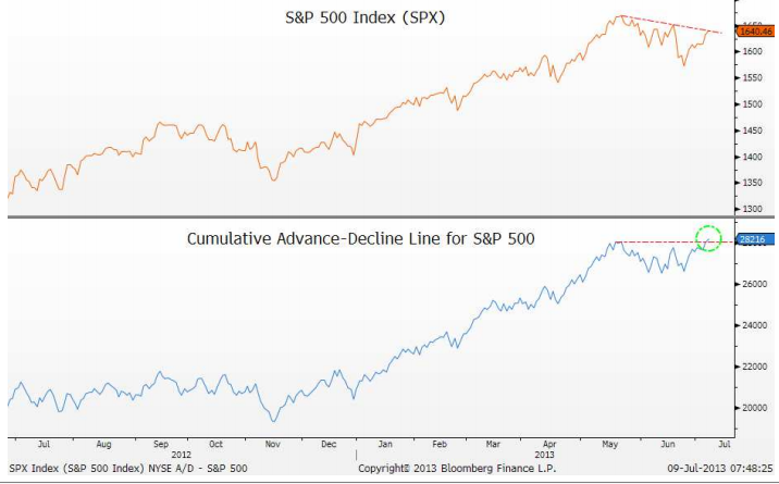
Josh Brown of The Reformed Broker highlighted a chart of market breadth recently, as you can see below.
Source: The Reformed Broker, Bloomberg (click on image to enlarge)
This breadth breakout appeared on July 9 and the S&P 500 powered higher from there.
The typical take on market breadth from market technicians is that negative divergences in breadth will normally appear prior to a drop in the market. That’s not what’s happening now—in fact, just the opposite is the case. Market breadth expanded this time prior to the stock market moving to an all-time high.
Bulls and bears can both be articulate. It’s easy to listen to a well-spoken commentator who presents just one side of the story and have it feel very convincing. It’s useful to look at market-generated data as a check; sometimes the data has a very different picture of the issue.


