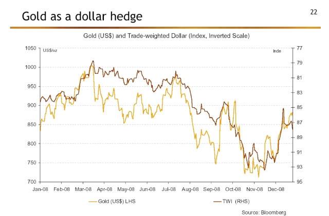
This is an interesting chart that I dredged out of an article by Mebane Faber reporting on a global asset allocation summit. At least during 2008, when the dollar fell, gold went up. (The dollar chart is inverted.) Or is it that when gold went up, the dollar fell? This type of chart can only ever show correlation—and correlation does not imply causality. Who knows what causes what? The problem is that many strategic asset allocation models are built with correlations. The models often assume that the correlations are stable, but experience has shown that they are not. (This is no less a problem for Modern Portfolio Theory.) Models that are built with correlations fail each time there is a regime change where the correlations shift or adjust to a “new” normal. Things that are impossible in finance textbooks happen all the time in real life.
Our Systematic Relative Strength models are not built this way. We look at the relative strength ranking of each item on its own merits. If gold is highly ranked in the Global Macro universe, for example, it would likely be in the portfolio. If the dollar is also highly ranked, it would happily coexist with gold until the rankings dictated that one of them was removed from the portfolio. Relative strength doesn’t make any assumptions about the asset correlations, and we think that is one of its strengths.
Click here for disclosures from Dorsey Wright Money Management.


