What Rally?

April 20, 2010

Andy and I did a podcast yesterday (well, really a “podcast plus” because it included a couple of pictures too) about the abnormally low investor participation in the stock market rally from the March 2009 lows and what might account for it. Today I saw an article in Investment News that may partially explain investors’ lack of interest. They don’t know the stock market has gone up!

Advisers know that the stock market has been on a tear since bottoming out in March 2009, but good luck convincing the average investor.

According to a survey of 1,000 individual investors by Franklin Templeton Investments Corp., 66% of the respondents said the stock market fell or was flat last year. In fact, the S&P 500 gained 28% in 2009.

Wow. Obviously the mainstream media is not getting this story out and/or the average investor isn’t paying any attention to the business news.


Relative Strength Spread

April 20, 2010

The chart below is the spread between the relative strength leaders and relative strength laggards (universe of mid and large cap stocks). When the chart is rising, relative strength leaders are performing better than relative strength laggards. As of 4/19/2010:

The sharp decline in the RS Spread during much of 2009 has transitioned to a flat relative strength spread that may very well be setting the stage for a favorable environment for relative strength.


Investor Indifference - Discussed

April 20, 2010

What if they gave us a bull market and nobody came? Mike Moody and Andy Hyer discuss. (Click here to view Investor Indifference to Bull Market, 04.19.10)


Dorsey, Wright Sentiment Survey Results — 4/9/2010

April 19, 2010

Our sentiment survey was open from 4/9/2010 through 4/15. The response rate was not bad–we had 79 responses this week. Your input is for a good cause! If you believe, as we do, that markets are driven by supply and demand, client behavior is important. We’re not asking what you think of the market—since most of our blog readers are financial advisors, we’re asking instead about the behavior of your clients. Then we’re aggregating responses exclusively for our readership. Your privacy will not be compromised in any way.

After the first 30 or so responses, the established pattern was simply magnified, so we are comfortable about the statistical validity of our sample. Most of the responses were from the U.S., but we also had multiple advisors respond from at least two other countries. Let’s get down to an analysis of the data! Note: You can click on any of the charts to enlarge them.

Question 1. Based on their behavior, are your clients currently more afraid of: a) getting caught in a stock market downdraft, or b) missing a stock market upturn?

Chart 1: Greatest Fear. 71.4% of clients were fearful of a downturn, down somewhat from last survey’s 75.7%. Only 28.6% were afraid of missing an upturn, again higher than last survey’s 24.3%. Client fear is slowly abating, which is what you would expect, especially considering how good the stock market has been over the past year.

Chart 2. Greatest Fear Spread. Another way to look at this data is to examine the spread between the two groups. That spread has narrowed to 43% from 51% last survey. Chart 2 is constructed by subtracting the percentage of respondents reporting clients fearful of missing an upturn from the clients reported as fearful of a market downdraft.

Question 2: Based on their behavior, how would you rate your clients’ current appetite for risk?

Chart 3: Average Risk Appetite. The average risk appetite this week was 2.69, little changed from last survey’s 2.71. This question is designed to validate the first question, but also to gain more precision and insight about the reported risk appetite of clients.

Chart 4: Risk Appetite Bell Curve. This chart uses a bell curve to break out the percentage of respondents at each risk appetite level. Right now the bell curve is biased to the low-risk side.

Chart 5: Risk Appetite Bell Curve by Group. The next three charts use cross-sectional data. This chart plots the reported client risk appetite separately for the fear of downdraft and for the fear of missing upturn groups. We would expect that the fear of downdraft group would have a lower risk appetite than the fear of missing upturn group and that is what we see here.

Chart 6: Average Risk Appetite by Group. A plot of the average risk appetite score by group is shown in this chart. The fear of missing downdraft group had an average risk appetite of 2.51, while the fear of missing upturn group had an average risk appetite of 3.14. Theoretically, this is what we would expect to see.

Chart 7: Risk Appetite Spread. This is a spread chart constructed from the data in Chart 6, where the average risk appetite of the downdraft group is subtracted from the average risk appetite of the missing upturn group. The spread is currently 0.63, slightly up from last survey’s 0.48.

As time goes on, we will get a better feel for the most useful ways to present this sentiment data. This survey we have added the S&P 500 level in the background. We think it will be a unique sample because, unlike most of the existing sentiment surveys, it employs a third-party rating system, where advisors rate client behavior. As a result, it has the potential to be more accurate than sentiment surveys that rely on self reports. Thank you for participating!


Advice From #1

April 19, 2010

Brian Pfeifler, who is currently ranked number 1 in Barron’s list of the 100 Top Financial Advisors of 2010, on how he runs his business:

“I don’t want to spend my time dealing with jet charters, dog-walking or bill paying. I want instead to concentrate on asset allocation and manager selection — that is more than a full-time job,” he says. “To say I can do more than that is not being honest about my capabilities.”

Barron’s notes that Pfeifler currently has $4.8 billion in assets under management.

It is so easy for financial advisors to fall into the trap of being a jack of all trades, master of none. Yet, the best in the industry find out where they excel and outsource the rest.


The Taxman Cometh

April 19, 2010

The difference between death and taxes is death doesn’t get worse every time Congress meets. —Will Rogers

I suspect that if the wealthiest 10 percent of Americans were surveyed to find out if they believed that the best stock market returns came when tax rates were relatively high or if they came when tax rates were relatively low (compared to tax rates over the past century) that the results would fall on the side of believing that low tax rates and high stock market returns go together. That is certainly what I would have guessed…until I read John Buckingham’s recent blog post analyzing the data over the past 84 years. Using data from The Tax Foundation and Ibbotson, Buckingham pointed out that the average tax rate from 1926-2009 was 46% with a median of 50%. Using that median as the dividing line, here are the non-annualized equity performance figures:

(Click to Enlarge)

I certainly wouldn’t use this data to suggest that high tax rates and big government are the way to go, because I don’t. However, I think it is a safe assumption that taxes are going up in the next decade. After all, the new healthcare legislation will bring a number of new taxes starting in 2013 and the tax on long-term capital gains rises from 15% to 20% starting in 2011. Surely, there are more taxes to follow. However, this does not mean that the stock market has to tank. We have to remember that the stock market even generated excellent returns in the 1950s when the top tax rate ranged from 59-75%! As wealthy investors consider whether or not to commit capital to the stock market in the coming decade, rising taxes shouldn’t necessarily be a factor that deters them.


Weekly RS Recap

April 19, 2010

The table below shows the performance of a universe of mid and large cap U.S. equities, broken down by relative strength decile and quartile and then compared to the universe return. Those at the top of the ranks are those stocks which have the best intermediate-term relative strength. Relative strength strategies buy securities that have strong intermediate-term relative strength and hold them as long as they remain strong.

Last week’s performance (4/12/10 – 4/16/10) is as follows:

The relative strength laggards had a slightly better week than the relative strength leaders last week.


Inherently Unstable

April 16, 2010

No, this is not a post on personality disorders.

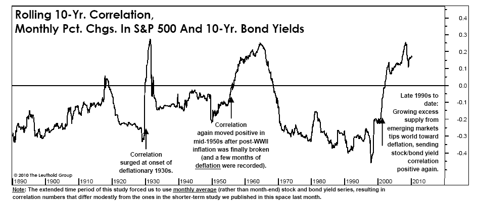
Rather, it is a post on the inherently unstable nature of correlations between securities and between asset classes. This is important because the success of many of the approaches to portfolio management make the erroneous assumption that correlations are fairly stable over time. I was reminded just how false this belief is while reading The Leuthold Group‘s April Green Book in which they highlighted the rolling 10-year correlations in monthly percentage changes between the S&P 500 and the 10-year bond yield. Does this look stable to you? Chart is shown by permission from The Leuthold Group.

(Click to Enlarge)

If you are trying to use this data, would you conclude that higher bond yields are good for the stock market or bad? The answer is that the correlations are all over the map. In 2006, William J. Coaker II published The Volatility of Correlations in the FPA Journal. That paper details the changes in correlations between 15 different asset classes and the S&P 500 over a 34-year time horizon. To give you a flavor for his conclusions, he pointed out that Real Estate’s rolling 5-year correlations to the S&P 500 ranged from 0.17 to 0.75, and for Natural Resources the range was -0.34 to 0.49. History is conclusive - correlations are unstable.

This becomes a big problem for strategic asset allocation models that use historical data to calculate an average correlation between securities or asset classes over time. Those models use that stationary correlation as one of the key inputs into determining how the model should currently be allocated. That may well be of no help to you over the next five to ten years. Unstable correlations are also a major problem for “financial engineers” who use their impressive physics and computer programming abilities to identify historical relationships between securities. They may find patterns in the historical data that lead them to seek to exploit those same patterns in the future (i.e. LTCM in the 1990′s.) The problem is that the future is under no obligation to behave like the past.

Many of the quants are smart enough to recognize that unstable correlations are a major problem. The solution, which I have heard from several well-known quants, is to constantly be willing to reexamine your assumptions and to change the model on an ongoing basis. That logic may sound intelligent, but the reality is that many, if not most, of these quants will end up chasing their tail. Ultimately, they end up in the forecasting game. These quants are rightly worried about when their current model is going to blow up.

Relative strength relies on a different premise. The only historical pattern that must hold true for relative strength to be effective in the future is for long-term trends to exist. That is it. Real estate (insert any other asset class) and commodities (insert any other asset class) can be positively or negatively correlated in the future and relative strength models can do just fine either way. Relative strength models make zero assumptions about what the future should look like. Again, the only assumption that we make is that there will be longer-term trends in the future to capitalize on. Relative strength keeps the portfolio fresh with those securities that have been strong relative performers. It makes no assumptions about the length of time that a given security will remain in the portfolio. Sure, there will be choppy periods here and there where relative strength models do poorly, but there is no need (and it is counterproductive) to constantly tweak the model.

Ultimately, the difference between an adaptive relative strength model and most quant models is as different as a mule is from a horse. Both have four legs, but they are very different animals. One has a high probability of being an excellent performer in the future, while the other’s performance is a big unknown.


Why No One Pays Attention to Economists

April 16, 2010

This article from Time Magazine is priceless. Two econ professors are suggesting that young people use 2-1 leverage to buy stocks for their long time horizon retirement portfolios. Apparently their Monte Carlo simulation didn’t include all of the margin calls you would get during every drawdown. Long on IQ perhaps, but short on common sense.


Investing for Income

April 16, 2010

As the front end of the baby boomers hit retirement age, investing for income has become their mantra. Retirees are often sold terrible investments because of their known propensity to lunge at income the way a starving fish attacks a baited hook. But is investing for income desirable, or even possible? Let’s take a look at the income possibilities from bonds, stocks, and alternatives.

Bonds are boring and safe, and are usually the first place investors go for income-except that with current interest rates, there isn’t much income available. Most retirees can’t live on 2-year Treasury yields of 1.04%, and moving out to the 30-year Treasury at 4.72% brings with it a significant chance of getting hurt by inflation. Yields on junk bonds (euphemistically known as high-yield bonds) are higher, but that crosses over from investing for income to its less glamorous cousin, “reaching for yield.” Junk bonds might work for a while, as long as the economy is in recovery mode, but are probably not a long-term solution for a retiree. As the saying goes, “More money has been lost reaching for yield than at the point of a gun.”

Many investors have looked to the stock market for dividend yield. Doug Short has a nice piece on the disappearing yields in stocks on his excellent site. The chart below is taken from his article. Stock prices have been rising, but dividend yields have been going the other direction.
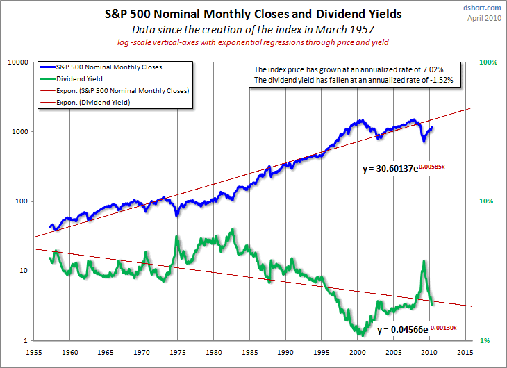
Click to enlarge. Source: dshort.com

The traditional high-dividend sectors for investors were always banks, oil stocks, utilities, and REITs. When stock prices plunged in 2008, many banks eliminated or severely slashed their dividends. Some REITs had the same problem. Oil stocks and utilities don’t have nearly the dividend yields they used to. All of the dividend cuts and reductions caused the high-yielding equities to do worse than the general market. (See the chart below for a comparison of the S&P 500 to the Dow Jones Select Dividend Index ETF.)
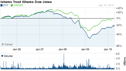
Source: Yahoo! Finance

Alternatives range from MLPs (typically finite lives and unstable income streams) to all sorts of structured products. This morning someone sent me an offering flyer for a 12-year 8% CD, where the quarterly rate is based on the slope of the yield curve. 8% was the cap rate, but it could drop to 0% if the yield curve flattened out. I’m not sure Mrs. Jones is ready to speculate with derivatives.

All in all, it appears that the income investor has hit a rough patch and there seems to be no easy way out. I’m going to let you in on a secret that very few investors know: capital gains can be spent just as easily as dividends. Ok, that’s not really a secret at all, but many investors act like it is. They chase yield so they can spend the income, but really, total return is all that matters.

Segmentation, like the distinction investors often impose between income and principal, is a natural function of the mind. Many retirement planners have been using this human tendency to segment things by presenting a retirement income solution that consists of a number of buckets, a solution that is generally well-received by clients.

The first bucket is the liquidity bucket, where spending will be drawn from. The second bucket is the income bucket, which is typically put into some kind of fixed-income investment. The third bucket is the growth bucket. By segmenting the growth portion, the investor might be more willing to leave it alone as it gyrates with the market.

When there is a particularly good quarter or good year, the growth bucket can be trimmed back and the proceeds “deposited” into the liquidity bucket. Obviously, you could use any number of buckets depending on how finely you choose to segment the investment universe. The relative size and specific composition of each bucket would be determined by the client’s situation. Most often, all of this can be done within one account. The buckets are mental, but they help separate the investments and their specific purpose in the client’s mind.

When viewed in the context of buckets within a single account, it becomes quite apparent that total return is what counts. Investing for income may be a misnomer; investing for total return is the real deal.


Sector and Capitalization Performance

April 16, 2010

The chart below shows performance of US sectors and capitalizations over the trailing 12, 6, and 1 month(s). Relative strength strategies buy securities that have strong intermediate-term relative strength and hold them as long as they remain strong. Performance updated through 4/15/2010.


Fund Flows

April 15, 2010

The Investment Company Institute is the national association of U.S. investment companies, including mutual funds, closed-end funds, exchange-traded funds (ETFs), and unit investment trusts (UITs). Members of ICI manage total assets of $11.82 trillion and serve nearly 90 million shareholders. Flow estimates are derived from data collected covering more than 95 percent of industry assets and are adjusted to represent industry totals.

The affinity for taxable bonds among retail mutual fund investors continued in the week ending 4/7/2010.


How Yale Makes the Endowment Model Work

April 14, 2010

Justin Fox, the author of The Myth of the Rational Market, has a very provocative blog at Harvard Business Review. In a recent comment he discusses Yale’s endowment model and why it works for Yale.

Mr. Fox discusses the broad idea behind David Swensen’s approach: buy a lot of uncorrelated assets and be willing to go far afield to find them. When you read Swensen’s book, it also becomes clear that Swensen prefers assets that can have equity-like returns. He is happy to own alternative assets if he thinks the returns are there. Another thing Mr. Fox points out is that Swensen’s allocations to various asset classes are not fixed. He is willing to change his asset mix and to let the portfolio adapt over time.

Many managers who have tried to emulate Mr. Swensen-and it has certainly become quite popular in the institutional pension community-are disenchanted with the “Yale Model” because 2008 was an atypically bad year. In classic investor fashion, many of the mini-Swensens are “rethinking their approach.” Mr. Fox points out that many in the institutional community were not really following Mr. Swensen’s approach in the first place, but the major reason that his imitators are having doubts (and Mr. Swensen is not) has to do with a loss of nerve more than anything else. Mr. Fox believes that the Yale endowment model will continue to work for Yale because:

…Swensen is still in charge, and has built up enough political capital through the decades that he’ll be allowed to stick to his guns. That hasn’t been true of the managers of Harvard’s endowment since Meyer left in 2005 (to start a hedge fund and take home bigger paychecks). That hasn’t been true of the managers of California’s CalPERS. And it hasn’t been true of 99% of the other institutions that thought they were following the Yale model.

The real Yale model, then, involves more than just an investing approach. It requires finding a very smart, capable person not motivated chiefly by money (Swensen could have made vastly more on Wall Street than he has at Yale) who is willing to stick with the same job for decades. And it involves an institution that puts enough trust in that person to weather a bad year or two without lots of second guessing. (Tellingly, there are echoes here of the way things work at Warren Buffett’s Berkshire Hathaway.)

[The emphasis is mine.]

In the end, it gets back to investor behavior, whether the investors are institutional and retail. Did you do your due diligence on the strategy? Do you really understand what the manager is trying to do? If so, buy it and hang on for the long run. Give the strategy time to work. Flipping strategies every time there is a period of adversity (see DALBAR) is not a winning method in the long run.

Ultimately, Mr. Fox’s point is universal. It is applicable to Yale’s endowment model, but also every other disciplined investment strategy, including Warren Buffett’s. You have to first do your homework and then stick to your guns. There will be challenges along the way, but you’re likely to come out ahead if you can stay focused on a winning strategy.


Investor Indifference to Historic Bull Market

April 14, 2010

Thirteen months into one of the most powerful bull markets in history and investors still don’t believe.

In their April Green Book, The Leuthold Group analyzed the average path of trading volumes in the first two years of all bull markets dating back to 1932. The charts below suggest that one year into a new cyclical bull market, NYSE trading volumes (on a ten-week average basis) should be about 70-80% above the level seen at the prior bear market low. Recent NYSE volumes, however, have been running about 25% below the levels seen at the March 2009 bear market low. In other words, volumes now amount to less than half what they have normally been at this stage of a new bull market.

Charts used by permission from The Leuthold Group.

In reviewing the volume trends in each of the 15 bull markets that were studied, the only pattern even close to the 2009-2010 example occurred in the aftermath of the 1987 crash.

The damage to investor confidence suffered during both the 1987 crash and the 2007-2009 meltdown resulted in similarly depressed trading volume. The impressive gains (76% return) for the S&P 500 since the March 2009 lows still have not been enough to lure investors back into the market en masse. As we show in our weekly mutual fund flows report, investors are still fighting the last battle and continue to direct money into fixed income at the expense of other categories like domestic equities.

I would like to believe that investors can be persuaded to make investment decisions with greater reliance on logic than emotion, but history teaches us that I shouldn’t hold my breath. However, great gains can be made on low market volume or high. For those investors already “in the game” they can find some comfort in knowing that there are still plentiful amounts of money on the sidelines that can potentially drive the market much higher from here.


Relative Strength Diffusion Index

April 14, 2010

The chart below measures the percentage of high relative strength stocks that are trading above their 50-day moving average (universe of mid and large cap stocks.) As of 4/13/10.

The 10-day moving average of this indicator is 96% and the one-day reading is 97%. This oscillator has shown the tendency to remain overbought for extended periods of time, while oversold measures tend to be much more abrupt.


The Evolution of ETFs

April 13, 2010

The first big ETF, SPY, was designed as an institutional product. It offered a large investor a way to put money to work in the market quickly. It wasn’t until iShares came along with a big investor education push that ETFs were marketed to the retail financial advisor. (Dorsey, Wright was intimately involved in the investor education road shows by many sponsors, by the way. And still is.) Now 50% of ETF assets are held through financial advisors. That’s the back story.

Yet according to a study by Greenwich Associates, and reported on here at Index Universe, the biggest growth for ETFs may still be ahead. Greenwich’s study indicates that a minority of institutions actually use ETFs, but suggests that a large percentage of them expect to expand their usage over the next three years. The main barrier for the institutions is lack of familiarity with the instruments. From a simple math standpoint, increasing institutional usage of ETFs by a few percentage points has much more potential than trying to push investor education down to the self-directed retail investor.

Dorsey, Wright Money Management is on the cutting edge of this trend. We are sub-advisors for two mutual funds, the Arrow DWA Balanced Fund (DWAFX) and the Arrow DWA Tactical Fund (DWTFX), that are comprised almost entirely of ETFs. I would not be surprised to see more and more mutual funds, hedge funds, and other institutions ramp up their use of ETFs over time. The biggest hurdles for institutions, I suspect, involve trading liquidity and NAV tracking. As volume in the ETF marketplace grows, these issues should resolve themselves to some extent. Lots of small, illogical, or “me too” products may go by the wayside in the process, but eventually the ETF market should be stronger because of it. Personally, I hope we will see an expansion of alpha-generating semi-active strategy ETFs, like the RAFI indexes or our own Technical Leaders Indexes.

Products that use only ETFs, like our Global Macro separate account have made global, tactical asset allocation a reality for the individual investor only because of the proliferation of ETFs in numerous asset classes-asset classes that were not easily investable for individuals in the past. As institutions become more involved, we may see a further evolution of sophisticated ETF products in the marketplace. The last five years have been remarkable, but the best may be yet to come.


Relative Strength Spread

April 13, 2010

The chart below is the spread between the relative strength leaders and relative strength laggards (universe of mid and large cap stocks). When the chart is rising, relative strength leaders are performing better than relative strength laggards. As of 4/12/2010:

After declining sharply from March to August 2009, the relative strength spread has flattened out. This transition could very well be setting the stage for a more favorable environment for relative strength strategies.


Stock Investors: Be Happy About Bond Buyers

April 12, 2010

In a recent New York Times article, Mark Hulbert discussed an academic research paper that examined market timing using mutual fund flows, specifically mutual fund flows between stock and bond funds. The general premise is a simple one: mutual fund investors are rotten market timers.

The researchers focused on exchanges between equity and fixed-income funds in the same mutual fund family. In line with previous research on money flows into and out of mutual funds, they found that as the stock market rises, investors tend to transfer money from bond funds to stock funds, and vice versa. They also found something that had escaped notice among researchers: that the stock market tends to reverse itself in the weeks and months after these exchanges.

In other words, when mutual fund investors finally got around to switching from stocks to bonds, or from bonds to stocks, things tended to go against them. Paradoxically, stock owners should probably be quite happy that there has been a continuing surge of money into bond funds!

To illustrate the potential benefit of a contrarian interpretation of fund data, the authors built a hypothetical portfolio that, from the beginning of 1984 through 2008, switched back and forth between the Standard & Poor’s 500 index and 90-day Treasury bills. If total net exchanges listed in the three most recent I.C.I. press releases were out of equity funds, the portfolio would be fully invested in the index for the next month. Otherwise, it would hold T-bills.

Over those 25 years, according to the researchers, the portfolio produced an annualized return of 12.0 percent — or 1.6 percentage points a year ahead of buying and holding.

By buying stock funds when mutual fund investors were bailing out of them in favor of bonds, the strategy portfolio managed to outperform-and did so even though it was in cash nearly half of the time.

The bottom line for most mutual fund investors is this: Shift money into or out of your stock funds at your own peril.

Why is the timing of the average investor so lousy? It has to do with the fact that most investor decisions are made on the basis of emotion-they bail out of stock funds when they lose hope. It really is darkest before the dawn, and the article mentions that investors switched money from stocks to bonds right before the historic bottom in the stock market in March 2009. Our entire investment process is systematic and adaptive. Emotions don’t enter into it. Any investment process, including ours, will make plenty of mistakes, but making decisions emotionally will not be one of them.


Weekly RS Recap

April 12, 2010

The table below shows the performance of a universe of mid and large cap U.S. equities, broken down by relative strength decile and quartile and then compared to the universe return. Those at the top of the ranks are those stocks which have the best intermediate-term relative strength. Relative strength strategies buy securities that have strong intermediate-term relative strength and hold them as long as they remain strong.

Last week’s performance (4/5/10 – 4/9/10) is as follows:

Another excellent week for high relative strength securities with the top quartile outperforming the universe by 53 basis points and the top decile outperforming by 136 basis points.


Dorsey Wright Sentiment Survey - 4/9/10

April 9, 2010

Here we have Round Three of the Dorsey, Wright Sentiment Survey, the first third-party sentiment poll. As you know, when individuals self-report, they are always taller and more beautiful than when outside observers report their perceptions! Instead of asking individual investors to self-report whether they are bullish or bearish, we’d like financial advisors to weigh in and report on the actual behavior of clients. It’s two simple questions and will take no more than 20 seconds of your time. We’ll construct indicators from the data and report the results regularly on our blog–but we need your help to get a large statistical sample!

Contribute to the greater good! You WILL NOT be directed to another page by clicking the survey. It’s painless, we promise.


Momentum and Value in Inflationary Times

April 9, 2010

Mark Hooker, Ph.D, of Advanced Research Center recently released a study in which he looked at the returns from value and momentum during low/medium/high inflationary episodes in the US back to the 1920s.

After many years of being a minor concern for US investors, inflation worries have again assumed a more prominent position in the investment landscape. While core inflation has remained muted, headline figures have been whipsawed by dramatic movements in energy prices, and the outlook has been clouded by countervailing pressures from the deep recession on the one hand and the government’s massive stimulus measures and the resulting extraordinarily high deficits on the other hand. These forces threaten to trigger a shift from the benign inflation regime enjoyed over the past roughly 25 years in the U.S. to something more like the volatile earlier experience shown in Chart 1.

(Click to Enlarge)

Dr. Hooker used the data library compiled and made available by Professor Ken French. It contains returns on US stocks grouped into deciles by several factors that are relevant for bottom-up quantitative stock selection models back to the 1920s. He used book-to-price ratio as his value metric, and he used trailing 12-month total return for his momentum metric.

In our analysis, we evaluate the performance of a value-only, a momentum-only, and a 50/50 value/momentum model, in each case as represented by returns on the top-ranked decile (10%) of stocks relative to the bottom decile.

The results of the study are found in the tables below:

(Click to Enlarge)

(Click to Enlarge)

The study concludes that value does better during low or falling inflation while momentum does much better during rising and high inflation. Again, we see the merit of combining value and momentum strategies. Furthermore, in light of the surge in money supply (15% year-over-year growth in the M1 money supply) that we have seen in recent years, and economic recovery that is well on its way, I think it is reasonable to expect that inflation will be on the rise in coming years. Momentum (relative strength) strategies may well be increasingly valuable in the years ahead.

HT: World Beta


Sector and Capitalization Performance

April 9, 2010

The chart below shows performance of US sectors and capitalizations over the trailing 12, 6, and 1 month(s). Relative strength strategies buy securities that have strong intermediate-term relative strength and hold them as long as they remain strong. Performance updated through 4/8/2010.


Investors Are Green

April 8, 2010

But advisors rarely mention socially responsible investing (SRI) to them. That’s one of the findings of a recent study by Allianz Global Investors. It may just be that advisors are mostly focused on the investment merits of various items and assume that’s what the only thing there clients are concerned about as well. Advisors certainly don’t want to offend clients by pushing SRI on them, so perhaps they just steer clear of the whole issue. It does seem, however, that SRI is appealing to more clients than you might guess.

In that regard, most advisors are probably not even aware that we run a Systematic Relative Strength SRI Core equity product. The social screening is done for us by KLD Research and Analytics. We simply apply our core equity process to the screened universe. The portfolio metrics are almost identical to the metrics for our (much more popular) non-SRI Core portfolio. Maybe more clients would be interested in it if they knew it was available.


Global Macro Presentation

April 8, 2010

We have just posted a new 15-minute video presentation on our Global Macro strategy to our website. Click here to view (Financial Professionals Only.) This global tactical asset allocation strategy can invest in U.S. equities (long & inverse), international equities (long & inverse), currencies, commodities, real estate, and fixed income.


Updated White Paper Data

April 8, 2010

Back in January, we published a white paper that discussed using relative strength and portfolio management. If you haven’t read the paper (or would like to read it again) it can be found here. (Note: Please see the original paper for all of the necessary disclosures.) The original paper also outlines the unique process we use to test various relative strength factors. All of the data in that paper was updated through 2009. Since we have just finished updating all of our data through the end of Q1, we can update the data in the paper.

The first quarter was very good for relative strength. The data in the original paper showed that the best returns come from an intermediate term time horizon (about 3-12 months). Last year that was very different. We found very good returns for 2009 at very short-term time horizons. A 1-Month RS factor was actually one of the better performers in 2009. Over longer periods, a 1-Month RS factor has been a very poor performer so we definitely saw some anomalies during the huge laggard rally last year. The first quarter of 2010 was much more normal for relative strength strategies. The table below shows the performance for the first three months of 2010 for all of the models we tested in the original paper.

(Click To Enlarge)

The best returns came in the 6-12 month time horizon, which is what we would expect. (For those of you who are confused about the “Factor,” it is not a holding period. It is the lookback period for calculating relative strength. So the 6-Mo Price Return, for example simply takes the 6-month return for all stocks in the universe and ranks them from best to worst.)

The next table shows the cumulative annualized returns for all of the models updated through 3/31/10.

(Click To Enlarge)

The various models keep chugging along! The intermediate term factors work very well. Even when we are throwing darts at a basket of high relative strength stocks we find 100 out of 100 trials outperforming the benchmark over time. As the original paper showed, relative strength models aren’t going to outperform each quarter or each year, but over time they do exceptionally well.