Our latest sentiment survey was open from 6/3/11 to 6/10/11. The Dorsey, Wright Polo Shirt Raffle is back once again, due to popular demand. Thank you to all who continue to participate. This round, we had 117 advisors participate in the survey. If you believe, as we do, that markets are driven by supply and demand, client behavior is important. We’re not asking what you think of the market—since most of our blog readers are financial advisors, we’re asking instead about the behavior of your clients. Then we’re aggregating responses exclusively for our readership. Your privacy will not be compromised in any way.
After the first 30 or so responses, the established pattern was simply magnified, so we are comfortable about the statistical validity of our sample. Most of the responses were from the U.S., but we also had multiple advisors respond from at least five other countries. Let’s get down to an analysis of the data! Note: You can click on any of the charts to enlarge them.
Question 1. Based on their behavior, are your clients currently more afraid of: a) getting caught in a stock market downdraft, or b) missing a stock market upturn?
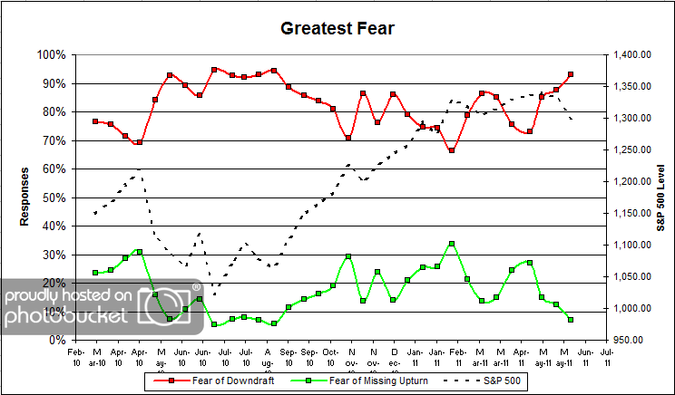
Chart 1: Greatest Fear. From survey to survey, the S&P was down -2.5%, and client fear levels rose to 93%. Client fear levels are now at the highest levels we’ve seen since August of 2010. Historically, retail investors have a terrible track record at timing the market (see DALBAR), so we would be inclined to take a contrarian position given these sentiment numbers.
Keep in mind that since the all-time fear highs of July 2010 (at 94%), the stock market has rallied +27%.
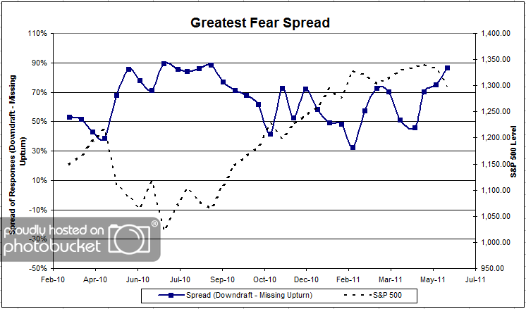
Chart 2. Greatest Fear Spread. Another way to look at this data is to examine the spread between the two groups. The spread rocketed higher this round from 75% to 86%.
Question 2. Based on their behavior, how would you rate your clients’ current appetite for risk?
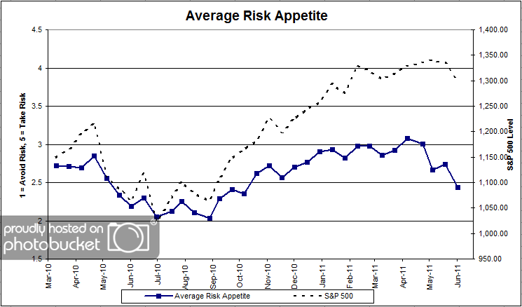
Chart 3: Average Risk Appetite. Average risk fell dramatically this round, from 2.73 to 2.44. After finally clearing an overall average of 3 earlier this year, average risk appetite is down big on the year. We’ve still got a ways to go until we reach our all-time lows from September 2010.
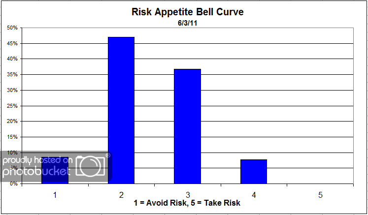
Chart 4: Risk Appetite Bell Curve. This chart uses a bell curve to break out the percentage of respondents at each risk appetite level. Here we see more evidence of a fear-dominated atmosphere. There were zero 5′s, and nearly half of all respondents were looking for a risk appetite of 2.
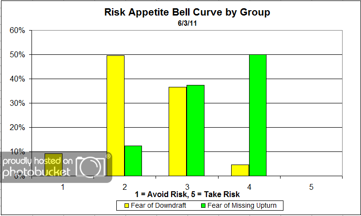
Chart 5: Risk Appetite Bell Curve by Group. The next three charts use cross-sectional data. This chart plots the reported client risk appetite separately for the fear of downdraft and for the fear of missing upturn groups. This chart also sorts out pretty much as expected, with the fear group wanting less risk and the opportunity group wanting more. When the fear levels become as extended as they are now, it creates a few problems with the average risk by group number. Namely, there are so few respondents in the opportunity group, we begin to lose the smoothing effect of having a large number of participants.
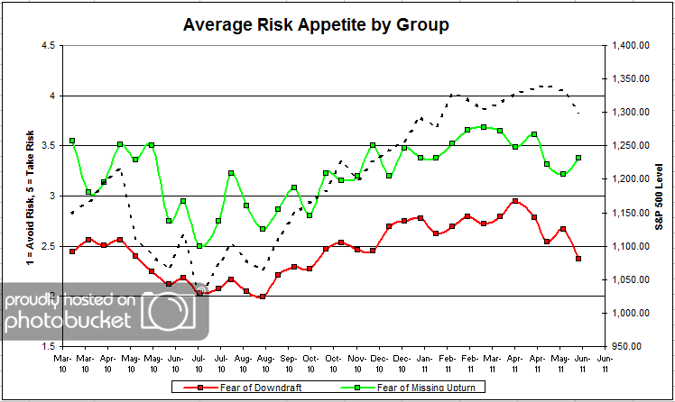
Chart 6: Average Risk Appetite by Group. Here we see the fear group’s risk appetite plunge, while the opportunity group’s appetite actually rises. Earlier I mentioned that because there are so few respondents in the opportunity group, it has less statistical validity because we lose the smoothing effect of having a large number of responses. I’d wager that the number bounced so much on account of the number of participants, rather than that group actually wanting to add risk that badly.
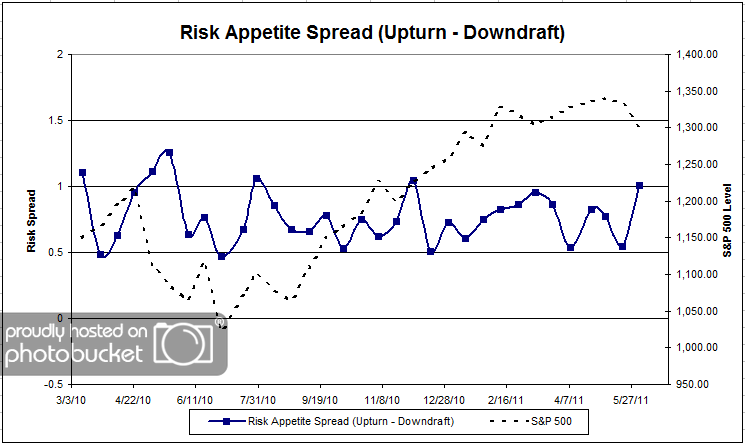
Chart 7: Risk Appetite Spread. This is a spread chart constructed from the data in Chart 6, where the average risk appetite of the downdraft group is subtracted from the average risk appetite of the missing upturn group. The spread jumped this round, due to a move in the opposite direction for both groups.
This round, we hit fear levels that we haven’t seen since August of 2010. On one hand, that’s a bad thing because clients are scared and probably less willing to allocate to anything except “super-safe” investments like bonds and cash. On the other hand, some studies have shown that it might be profitable to add money during the times when retail investors are the most freaked out. For example the market has rallied nearly 30% since fear levels were hovering in the mid-90s in the summer of 2010.
No one can predict the future, as we all know, so instead of prognosticating, we will sit back and enjoy the ride. A rigorously tested, systematic investment process provides a great deal of comfort for clients during these types of fearful, highly uncertain market environments. Until next time, good trading and thank you for participating.


 Posted by JP Lee
