Relative Strength and Market Volatility

September 30, 2011

Markets have been extremely volatile over the last couple of months. Volatile markets are very difficult to navigate. It is very easy to make mistakes, and when a mistake is made it is magnified by the volatility. From a relative strength standpoint, there are things you can do to help ease the pain of all of these large, unpredictable market moves. But judging by all the client calls we have taken over the years-almost always when volatility was high-the steps needed to make a relative strength model perform well are most definitely not what most investors would think!

Before we look at relative strength specifically, let’s take a step back and look at different investment strategies on a very broad basis. There are really two types of strategies: trend continuation and mean reversion. A trend continuation strategy buys a security and assumes it will keep moving in the same direction. A mean reversion (or value) strategy buys a security and assumes it will reverse course and come closer to a more “normal” state. Both strategies work over time if implemented correctly, but volatility affects them in different ways. Mean reversion strategies tend to thrive in high volatility markets, as those types of markets create larger mispricings for value investors to exploit.

When we construct systematic relative strength models, we have always preferred to use longer-term rather than shorter-term signals. This decision was made entirely on the basis of data—by testing many models over a lot of different types of markets. Judging by all the questions we get during periods of high volatility, I would guess that using a longer-term signal when the market is volatile strikes most investors as counter-intuitive. In my years at Dorsey Wright, I can’t remember talking to a single client or advisor that told me when markets get really volatile they look to slow things down!

During volatile markets, generally we hear the opposite view-everyone wants to speed up their process. Speeding up the process can take many forms. It might mean using a smaller box size on a point and figure chart, or using a 3-month look back instead of a 12-month look back when formulating your rankings. It might be as simple as rebalancing the portfolio more often, or tightening your stops. Whatever the case, most investors are of the opinion that being more proactive in these types of markets makes performance better.

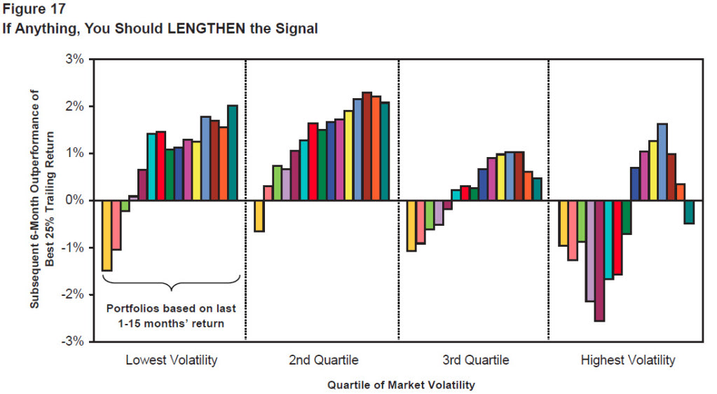
Their gut response, however, is contradicted by the data. As I mentioned before, our testing has shown that slowing down the process actually works better in volatile markets. And we aren’t the only ones who have found that to be the case! GMO published a whitepaper in March 2010 that discussed momentum investing (the paper can be found here). Figure 17 on page 11 specifically addresses what happens to relative strength models during different states of market volatility.

MomVol Relative Strength and Market Volatility

(Click Image To Enlarge. Source: GMO Whitepaper, Sept. 2010)

The chart clearly shows how shortening your look back period decreases performance in volatile markets. The 6-12 month time horizon has historically been the optimal time frame for formulating a momentum model. But when the market gets very volatile, the best returns come from moving all the way out to 12 months, not shortening your window to make your model more sensitive.

Psychologically, it is extremely difficult to lengthen your time horizon in volatile markets. Every instinct you have will tell you to respond more quickly in order to get out of what isn’t working and into something better. But the data says you shouldn’t shorten your window, and conceptually this makes sense. Volatile markets tend to be better for mean reversion strategies. But for a relative strength strategy, volatile markets also create many whipsaws. When thinking about how volatility interacts with relative strength, it makes sense to lengthen your time horizon. Hopping on every short term trend is problematic if the trends are constantly reversing! All the volatility creates noise, and the only way to cancel out the noise is to use more (not less) data. You can’t react to all the short-term swings because the mean reversion is so violent in volatile markets. It doesn’t make any sense to get on trends more rapidly when you are going through a period that is not optimal for a trend following strategy.

We use a data-driven process to construct models. We have found that using a relatively longer time horizon, while uncomfortable, ultimately leads to better performance over time. Outside studies show the same thing. If the data showed that reacting more quickly to short-term swings in volatile markets was superior we would advocate doing exactly that!

As is often the case in the investing world, this seems to be another situation where doing the most uncomfortable thing actually leads to better performance over time. Good investing is an uphill run against human nature. Of course, it stands to reason that that’s the way things usually are. If it were comfortable, everyone would do it and investors would find their excess return quickly arbitraged away.
Posted by:


Sector and Capitalization Performance

September 30, 2011

The chart below shows performance of US sectors and capitalizations over the trailing 12, 6, and 1 month(s). Performance updated through 9/29/2011.

Posted by:


Fund Flows

September 29, 2011

The Investment Company Institute is the national association of U.S. investment companies, including mutual funds, closed-end funds, exchange-traded funds (ETFs), and unit investment trusts (UITs). Members of ICI manage total assets of $11.82 trillion and serve nearly 90 million shareholders. Flow estimates are derived from data collected covering more than 95 percent of industry assets and are adjusted to represent industry totals.

Hybrid funds had the biggest inflows last week, bringing their YTD net flows to $32 billion. However, the two extreme ends of the money flow spectrum in 2011 are fixed income funds, having pulled in a net $106 billion, and domestic equity funds, which have shed a net $84 billion.

Posted by:


Bad Vibrations

September 28, 2011

Economists are beginning to think that the recent market decline may presage a recession. Most are not convinced, but many are on the cusp. Ed Yardeni has a troubling chart today on unemployment. He writes:

One of my favorite monthly indicators of the labor market is especially disturbing. In its monthly survey of consumer confidence, the Conference Board asks their respondents whether jobs are available, plentiful, or hard to get. The percentage saying that “jobs are hard to get” (JHTG) is highly correlated with the unemployment rate. In August, it increased to 50% from 44.8% in July. Its most recent low was 42.4% during April 2011. So the labor market has actually been deteriorating every month for the past three months, according to this measure. It gets worse: The latest reading is the highest since May 1983. And that’s after the White House spent $880 billion aimed at creating 3.7 million jobs over the past two and a half years. We certainly didn’t get our money’s worth.

The chart that goes along with it is below.

Source: Dr. Ed’s Blog (click on chart to enlarge)

The question before investors is always how to respond to perceived bad news. It’s a complicated problem because it is never clear how much bad news is already baked into the market. One of the typical problems retail investors have is bailing out of markets rife with bad news, having the bad news come out, and then watching the market go up as the market decides the bad news wasn’t quite as bad as it could have been! Sometimes you can make an educated guess when sentiment is at an extreme level, but it’s never precise.

So, simply responding to bad news won’t get you anywhere.

Relative strength is often a productive way to approach this problem. Relative strength lets the market separate the winners from the losers. When the economy weakens or strengthens, companies are affected differentially. New orders may decline at a factory, but the profit margins may increase due to higher productivity with fewer employees or from increased automation. The market is usually pretty good at figuring out where the offsets are—and also where they aren’t.

The point of the game is to adapt. If the securities or asset classes you hold are performing poorly, ditch them. If the replacements perform poorly, ditch them too. Most money is lost stubbornly holding a position while waiting for the market to confirm your personal opinion. When it works, the iconoclasts receive acclaim and media adoration, which might be part of the reason stubbornness is seductive. (That, and not having to admit you were wrong.) But there aren’t enough roses in the world to put on the gravestones of stubborn traders whose opinion didn’t quite work out. Adapt or die.

Posted by:


Goodbye, Old Theory

September 28, 2011

This is the title of of Bob Veres’ piece in Financial Planning about some of the problems with Modern Portfolio Theory. He points out some of the salient problems that have come to light involving mean variance optimization and correlation. A few interesting excerpts:

Recently, we’ve seen data showing the efficient frontier is kind of a silly idea. If you draw one for every decade, using retrospective return and volatility numbers, you get a whole bunch of fishhook graphs in different parts of the risk/return space, with different shapes and slopes. Invest precisely along last decade’s frontier and you’re likely nowhere near the one that fits the current decade.

Why would modern portfolio theory inputs use single numbers for all the correlations when they clearly move around, and converge when markets do what they did in 2008?

…our investing world has developed a lot of strange taboos. “In the investment markets, we are learning that when volatility rises, it tends to stay high-what they call volatility clustering,” he says. “If portfolios are entering a period of high volatility, one might respond by taking some risk off the table.” In the enterprise risk management world, that is common sense. In the investment world, such behavior is labeled market timing.

You’ll benefit from reading the whole article. Bob Veres highlights some of the critical issues, such as the need for MPT to evolve from its original form as new data arises. He points out:

…modern portfolio theory is not very different in the way we apply it than it was when Dwight Eisenhower occupied the White House.

We’ve learned a lot since then about correlation stability, volatility clustering, and tactical asset allocation. The future of investment management is exciting, but we need to move beyond the 1950s and incorporate everything we have learned since then. I suspect that tactical asset allocation and systematic use of relative strength and value as factor returns will play a big part going forward.

Goodbye (and good riddance)

Source: kunjumon.com

Posted by:


Ritholz: Take The Loss

September 28, 2011

Barry Ritholz has a really smart piece -Take The Loss-with important implications (in the event that you want to succeed over time!) for individuals, investors, businesses, and nations. Here is a teaser:

There will be losses. How you handle them determines your fortune, your fate and your future.

If you want to understand the sell discipline of relative strength models, you’ll benefit from reading Relative Strength and Asset Class Rotation by John Lewis. Dig deep and read the appendix so that you can understand the pros and cons of altering the relative strength sensitivity.

Posted by:


High RS Diffusion Index

September 28, 2011

The chart below measures the percentage of high relative strength stocks that are trading above their 50-day moving average (universe of mid and large cap stocks.) As of 9/27/11.

The 10-day moving average of this indicator is 54% and the one-day reading is 58% — well above the washed out levels reached in mid-August.

Posted by:


Relative Strength Spread

September 27, 2011

The chart below is the spread between the relative strength leaders and relative strength laggards (universe of mid and large cap stocks). When the chart is rising, relative strength leaders are performing better than relative strength laggards. As of 9/26/2011:

The RS leaders and the RS laggards have generated similar performance over most of the past two years. A meaningful breakout of this pattern could bode well for relative strength strategies in the coming years.

Posted by:


Gold’s Pullback

September 26, 2011

John Roque observes:

For every year from 2002 to 2010 gold has, at least, corrected to its 40-week moving average and been down, peak to trough on average 15.6% (see table).

Meanwhile, the overall trend of gold has been powerfully higher.

Click to enlarge.

Disclosure: Dorsey Wright currently has a position in gold. A list of all holdings for the trailing 12 months is available upon request.

HT: Barry Ritholz

Posted by:


Bridgewater’s World View

September 26, 2011

Bridgewater is the largest hedge fund in the world right now, with assets of $122 billion. Their founder, Ray Dalio, has some very specific ideas about global macro trends in this piece from Business Insider:

Dalio divides the world into two groups.

Here’s how he describes the first, developed debtor nations (the U.S, Greece, Spain, and Italy, for example):

  • They spent years overspending, financed by their government’s borrowing
  • They are in the process of deleveraging debt
  • As a result, they are being forced to lower their debt relative to their income levels, constrain spending levels and make improvements in the job market
  • Some are worse off than others. Greece, Spain and Italy, for example, can’t print money to pay off their debts. To make up for slow credit growth, they will have decade-long depressions and debt defaults.
  • The U.S. is trading like a country in decline

The second are emerging creditor countries (Brazil, India and China, for example). Here’s what’s happening there:

  • They are leveraging up
  • They will account for 70% of global GDP in 15 to 20 years versus 47% now. Read: They will be tomorrow’s economic leaders.
  • Some, such as India and China, have currencies and monetary policy linked to those in the U.S. They are experiencing inflation because their interest rates are too low. They will have to unlink from the U.S. or face intolerable conditions.
  • They are trading more like blue chips

I think the distinction between creditor and debtor nations is interesting. Western economists have for a long time believed that economic growth is driven by consumer spending. I think economists are confusing cause and effect. On the contrary, I think economic growth is driven by savings and capital investment—consumer spending is just the effect of the economic growth, not the cause of it.

Creditor nations have savings. Of course, if the savings get stuffed into a mattress (Japan) no economic growth occurs. But if the savings is turned into productive capital investment, you can see really dynamic economic growth (China, Korea, Singapore). There’s not necessarily a direct linkage between more rapid economic growth and a better stock market, but it might not hurt.

Lots of other things have to go right—countries have to have well-functioning political and legal systems, for starters. But if Bridgewater is right about the very long term shape of things, it seems pretty critical to have global tactical asset allocation as part of a core portfolio. Lots of individual companies around the world will also profit from these trends. No doubt there will be plenty of zig-zags in the long-term trend, but savings and capital investment should win out in the end.

…………

There’s more to the story, as is usually the case. I’m always curious about this stuff and I discovered that since 2007, the Bank of International Settlements has been publishing a list of creditor and debtor nations. Our crack researcher, J.P. Lee, sifted through the data. For each creditor and debtor nation he searched for a corresponding ETF, which was available for most economies of any size. If the economy was tiny and no ETF existed, he ignored it. Then J.P. calculated and averaged the returns for the creditor and debtor nations separately. The results might surprise you.

click to enlarge

In short, the returns seem unrelated to creditor or debtor nation status. This is a very small sample because only a few years of data are available, but there is no large, systematic advantage to owning creditor nations.

It suggests to me that tactical asset allocation is really important. Apparently creditor nations do not always invest their surplus domestically. It seems entirely possible that a creditor nation could invest the bulk of its surplus overseas, or wherever the best return is perceived to exist. Once again it seems that money goes where it is treated best—and that could be a creditor or a debtor nation at any given point.

Posted by:


Weekly RS Recap

September 26, 2011

The table below shows the performance of a universe of mid and large cap U.S. equities, broken down by relative strength decile and quartile and then compared to the universe return. Those at the top of the ranks are those stocks which have the best intermediate-term relative strength. Relative strength strategies buy securities that have strong intermediate-term relative strength and hold them as long as they remain strong.

Last week’s performance (9/19/11 – 9/23/11) is as follows:

It was a week of heavy losses for the U.S. equity markets last week, but the silver lining for high relative strength stocks is that they did outperform the universe and significantly outperformed the relative strength laggards.

Posted by:


Dorsey, Wright Client Sentiment Survey - 9/23/11

September 23, 2011

Here we have the next round of the Dorsey, Wright Sentiment Survey, the first third-party sentiment poll. Participate to learn more about our Dorsey, Wright Polo Shirt raffle! Just follow the instructions after taking the poll, and we’ll enter you in the contest. Thanks to all our participants from last round.

As you know, when individuals self-report, they are always taller and more beautiful than when outside observers report their perceptions! Instead of asking individual investors to self-report whether they are bullish or bearish, we’d like financial advisors to weigh in and report on the actual behavior of clients. It’s two simple questions and will take no more than 20 seconds of your time. We’ll construct indicators from the data and report the results regularly on our blog–but we need your help to get a large statistical sample!

Click here to take Dorsey, Wright’s Client Sentiment Survey.

Contribute to the greater good! It’s painless, we promise.

Posted by:


An Overlooked Investment Opportunity

September 23, 2011

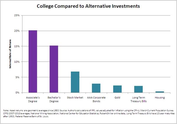
Yes, it’s a college degree. According to an article in the Atlantic:

The typical college graduate earns $570,000 more than the average person with only a high school diploma over her lifetime. That makes college the best big investment on the market, Michael Greenstone and Adam Looney find in this remarkable report on the value of a higher education.

Let’s say you’re deciding where to invest $100,000 at age 18. Maybe you think to put it in gold, corporate bonds, U.S. government debt, or hot company stocks. It turns out the best investment — by far — is college. “The $102,000 investment in a four-year college yields a rate of return of 15.2 percent per year,” the authors report, “more than double the average return over the last 60 years experienced in the stock market” and more than five times the return in corporate bonds, gold, long-term government bonds, or housing.

college An Overlooked Investment Opportunity

Source: The Atlantic

Now imagine if you take those enhanced earnings and invest them in the stock market…

Posted by:


Sector and Capitalization Performance

September 23, 2011

The chart below shows performance of US sectors and capitalizations over the trailing 12, 6, and 1 month(s). Performance updated through 9/22/2011.

Posted by:


Fund Flows

September 22, 2011

The Investment Company Institute is the national association of U.S. investment companies, including mutual funds, closed-end funds, exchange-traded funds (ETFs), and unit investment trusts (UITs). Members of ICI manage total assets of $11.82 trillion and serve nearly 90 million shareholders. Flow estimates are derived from data collected covering more than 95 percent of industry assets and are adjusted to represent industry totals.

Taxable bond funds again attracted the most new money last week; domestic equity funds again had the biggest outflows.

Posted by:


High RS Diffusion Index

September 21, 2011

The chart below measures the percentage of high relative strength stocks that are trading above their 50-day moving average (universe of mid and large cap stocks.) As of 9/20/11.

The 10-day moving average of this index is now up to 51% after falling to nearly 10% several weeks ago.

Posted by:


Retirees’ Unrealistic Expectations

September 20, 2011

At Marketwatch, columnist Robert Powell has some commentary on a recent article by Dan Ariely about asset allocation and retirement expectations. For me, one of the interesting things was the way in which Mr. Ariely quantified retiree expectations:

But according to research conducted by Dan Ariely, people need 135% of their final income to live the way they want in retirement. The reason for this astounding difference has to do largely with the way Ariely, a professor of economics and behavioral finance at Duke University, did his research.

Instead of asking people to ballpark how much of their final salary they will need, he asked the following questions: How do you want to live in retirement? Where do you want to live? What activities do you want to engage in? And similar questions geared to assess the quality of life that people expect in retirement.

Ariely then took the answers and “itemized them, pricing out their retirement based on the things that people said they’d want to do and have in their retirement.” Using those calculations, he found that people want to retire to a standard of living beyond what they currently enjoy. (Who wouldn’t if money were no object?) Read Ariely’s blog post on the topic here.

When retirees’ desires were actually priced out, they clearly desired to have their standard of living increase! It takes a lot of capital to do that, capital that most retirees do not have. The old rule of thumb was that retirees needed 70% of their working income to retire. But no one knows who came up with that number or how they ballparked it!

Having spoken with many advisors over the years about this topic, my experience suggests that a more realistic estimate is that clients are comfortable when they have closer to 100% of their working income when they retire. Some expenses do go down, but other expenses, particularly travel and healthcare, tend to go up.

In some cases, when expenses go down, it’s not voluntary! Expenses go down because they have to—the retiree simply does not have enough income and is forced to cut back.

The retirement predicament really cries out for advisors to get to their clients early, get them started on a savings plan, and stay very focused on their investment performance throughout their working careers. It’s going to be tough to meet goals otherwise. The best time to get started is when you take your first job. The second-best time to get started is today!

Posted by:


What’s Hot…and Not

September 20, 2011

How different investments have done over the past 12 months, 6 months, and month.

1PowerShares DB Gold, 2iShares MSCI Emerging Markets ETF, 3iShares DJ U.S. Real Estate Index, 4iShares S&P Europe 350 Index, 5Green Haven Continuous Commodity Index, 6iBoxx High Yield Corporate Bond Fund, 7JP Morgan Emerging Markets Bond Fund, 8PowerShares DB US Dollar Index, 9iBoxx Investment Grade Corporate Bond Fund, 10PowerShares DB Oil, 11iShares Barclays 20+ Year Treasury Bond

Posted by:


The Real Goal of Forecasting

September 19, 2011

The Wall Street Journal had an article on forecasting a while back, partly highlighting how bad forecasts typically were. When I re-read it, one of the things that struck me was the following quote:

Sometimes forecasting isn’t even about the future, some researchers say. The true goals of some predictions, says Kesten Green, a forecasting researcher at Monash University in Melbourne, Australia, include lighting a fire under the sales force or alarming the public into some sort of action.

That’s very true in the public policy arena when someone has an axe to grind. In the financial markets, it seems like the forecasts are often designed just to get attention. If your goal is “hey, look at me,” it’s understandable why some of the forecasts are so extreme. The more in tune with public sentiment and the crazier the forecast is, the more attention it gets.

With public confidence in the financial market very low right now, no one wants to hear about a Dow 36,000 forecast—but a Dow 6,000 forecast will have lots of eager listeners. Is that really forecasting or is it just pandering?

You can always make an articulate case for whatever you want, if you selectively choose data and interpret it liberally. That doesn’t make it correct. While it is sometimes interesting to contemplate what might happen, no one really knows. And often, worrying about what might happen keeps investors from acting in the here and now.

We think the market is so incredibly complex that it is not possible to make consistently accurate forecasts. As a result, we rely on an adaptive process that modifies portfolio holdings as conditions evolve. That way the portfolio is based on what is actually happening, as opposed to what may or may not happen in the future.

Posted by:


The Return of Stagflation?

September 19, 2011

The term stagflation is a holdover from the 1970s, a period of sluggish economic growth and relatively high inflation. With falling inflation and strong economic growth over the past couple of decades, stagflation has been forgotten. My memory of stagflation was roused when I read an article in Bloomberg with these items scattered throughout the story:

The cost of living in the U.S. rose more than forecast in August as consumers paid more for food, energy and housing.

The consumer-price index increased 0.4 percent after a 0.5 percent gain in July, figures from the Labor Department showed today in Washington.

The rise in commodity prices earlier this year prompted some companies such as Lowe’s Cos. to pass on the higher costs at a time when Americans’ wages are stagnating. Federal Reserve Chairman Ben S. Bernanke last week said inflation was likely to moderate as some price increases prove “transitory.”

“There has been more momentum in underlying inflation than many had expected,” Jeremy Lawson, a senior U.S. economist at BNP Paribas in New York.

Applications for U.S. unemployment benefits unexpectedly rose last week to the highest level since the end of June, underscoring a struggling labor market, the Labor Department also said. Jobless claims climbed by 11,000 to 428,000 in the week ended Sept. 10 that included the Labor Day holiday.

The Federal Reserve Bank of New York reported manufacturing in the region contracted at a faster pace in September. The Federal Reserve Bank of New York’s general economic index dropped to minus 8.8, the weakest reading since November, from minus 7.7 in August.

Hmm…inflation higher than forecasted, growth lousy. That’s the general recipe for stagflation, which we might end up hearing about again. From Wikipedia:

In economics, stagflation is a situation in which the inflation rate is high and the economic growth rate is low. It raises a dilemma for economic policy since actions designed to lower inflation may worsen economic growth and vice versa. The portmanteaustagflation is generally attributed to British politicianIain Macleod, who coined the phrase in his speech to Parliament in 1965.[1][2][3][4]

The concept is notable because, in Keynesian macroeconomic theory which was dominant between the end of WWII and the late-1970′s, inflation and recession were regarded as mutually exclusive, the relationship between the two being described by the Phillips curve. In addition because stagflation has generally proven to be difficult and, in human terms as well as budget deficits, very costly to eradicate once it starts.

Stagflation is a problem to deal with using typical Keynesian economic tools because it’s not theoretically supposed to exist in the first place. You should take some comfort in knowing that relative strength leaders began to outperform relative strength laggards in the 1970s about five years before the bull market began in earnest in 1982. Stagflation creates winners and losers too—and relative strength is designed to find the winners.

Source: boardmark.com

Posted by:


Dorsey, Wright Client Sentiment Survey Results - 9/19/11

September 19, 2011

Our latest sentiment survey was open from 9/9/11 to 9/16/11. The Dorsey, Wright Polo Shirt Raffle continues to drive advisor participation, and we greatly appreciate your support! This round, we had 109 advisors participate in the survey. If you believe, as we do, that markets are driven by supply and demand, client behavior is important. We’re not asking what you think of the market—since most of our blog readers are financial advisors, we’re asking instead about the behavior of your clients. Then we’re aggregating responses exclusively for our readership. Your privacy will not be compromised in any way.

After the first 30 or so responses, the established pattern was simply magnified, so we are comfortable about the statistical validity of our sample. Most of the responses were from the U.S., but we also had multiple advisors respond from at least two other countries. Let’s get down to an analysis of the data! Note: You can click on any of the charts to enlarge them.

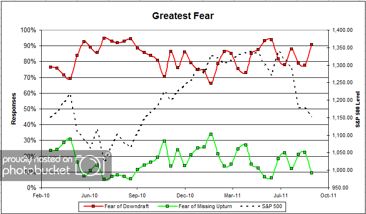
Question 1. Based on their behavior, are your clients currently more afraid of: a) getting caught in a stock market downdraft, or b) missing a stock market upturn?

greatestfear 37 Dorsey, Wright Client Sentiment Survey Results   9/19/11

Chart 1: Greatest Fear. From survey to survey, the S&P fell around (-1.8%), and client fear levels spiked in a big way. This round, client fear levels jumped to 91% from 78%, while the opportunity group fell from 22% to 9%. What’s interesting to note here is that it took a few extra weeks after the major market move before we saw the big spike in fear levels. It might be that clients were away on vacation for the summer, and now that school is back in session, everyone is taking a hard look at the overall stock market and where they want to be positioned. Whatever it is, sentiment levels are not pretty right now.

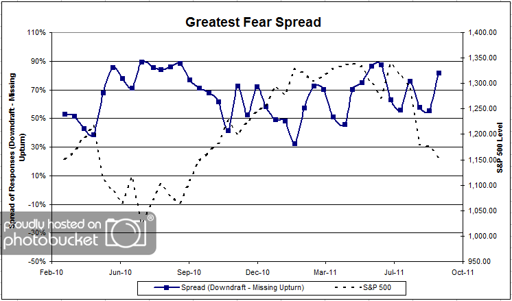
greatestfearspread 39 Dorsey, Wright Client Sentiment Survey Results   9/19/11

Chart 2. Greatest Fear Spread. Another way to look at this data is to examine the spread between the two groups. The spread jumped by a large margin, from 55% to 82%.

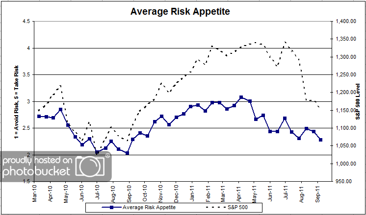
Question 2. Based on their behavior, how would you rate your clients’ current appetite for risk?

avgriskapp 30 Dorsey, Wright Client Sentiment Survey Results   9/19/11

Chart 3: Average Risk Appetite. Overall risk appetite numbers fell in-line with the market, but not to the same degree as the overall fear numbers. The average risk appetite fell from 2.43 to 2.28 this round.

riskappbellcurve 24 Dorsey, Wright Client Sentiment Survey Results   9/19/11

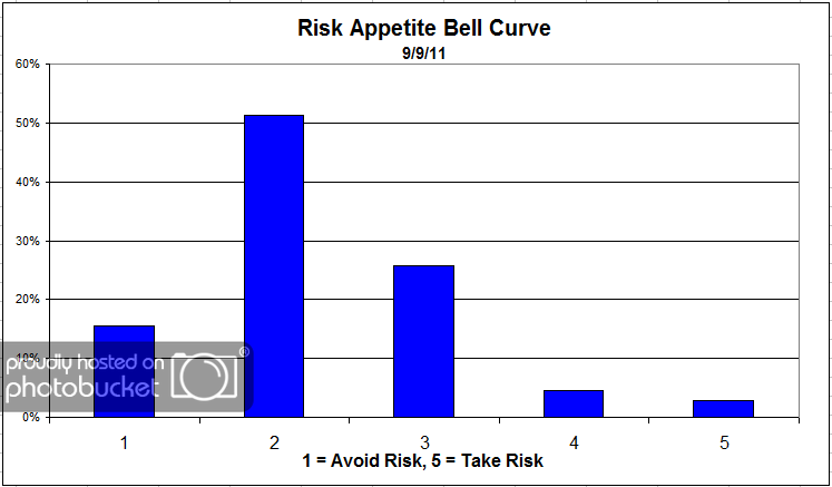
Chart 4: Risk Appetite Bell Curve. This chart uses a bell curve to break out the percentage of respondents at each risk appetite level. Low risk continues to dominate client sentiment, with over half of all respondents wanting a risk appetite of 2.

riskappcurvegroup Dorsey, Wright Client Sentiment Survey Results   9/19/11

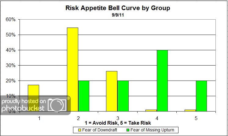
Chart 5: Risk Appetite Bell Curve by Group. The next three charts use cross-sectional data. This chart plots the reported client risk appetite separately for the fear of downdraft and for the fear of missing upturn groups. This bar chart sorts out as we expect, with the fear group looking for low risk and the opportunity group looking for more risk.

avgriskappgroup 20 Dorsey, Wright Client Sentiment Survey Results   9/19/11

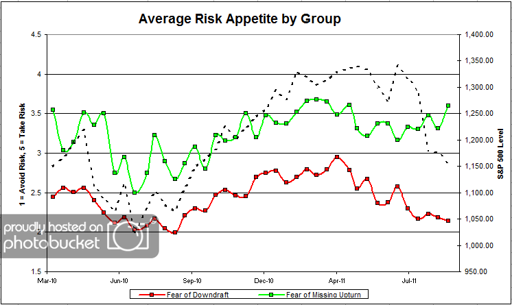
Chart 6: Average Risk Appetite by Group. Here we see the opportunity group acting up again, like they are prone to do. The opportunity group’s risk appetite bounced higher this round, while the fear group’s risk appetite moved slightly lower.

riskappspread 30 Dorsey, Wright Client Sentiment Survey Results   9/19/11

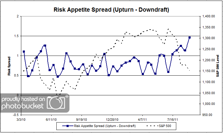
Chart 7: Risk Appetite Spread. This is a spread chart constructed from the data in Chart 6, where the average risk appetite of the downdraft group is subtracted from the average risk appetite of the missing upturn group. The spread reached new all-time highs this round, as the two camps’ appetites moved in opposite directions.

This survey round, the overall fear numbers hit their highest levels since the market started to move lower at the beginning of the summer. What’s interesting is the month or so time-lag it took for fear levels to jump after the market’s terrible summer. Are people just coming back from vacation to see what’s been going on? Or is this a deeper shift in client sentiment? As usual, the overall risk appetite numbers moved in-sync with the market.

No one can predict the future, as we all know, so instead of prognosticating, we will sit back and enjoy the ride. A rigorously tested, systematic investment process provides a great deal of comfort for clients during these types of fearful, highly uncertain market environments. Until next time, good trading and thank you for participating.

Posted by:


Weekly RS Recap

September 19, 2011

The table below shows the performance of a universe of mid and large cap U.S. equities, broken down by relative strength decile and quartile and then compared to the universe return. Those at the top of the ranks are those stocks which have the best intermediate-term relative strength. Relative strength strategies buy securities that have strong intermediate-term relative strength and hold them as long as they remain strong.

Last week’s performance (9/9/11 – 9/16/11) is as follows:

The market had big gains last week-led by performance from the relative strength laggards.

Posted by:


The Cost of Retirement: More Than You Think

September 16, 2011

Moshe Milevsky, a professor at York University in Canada, has written a lot of articles discussing lifetime income. He is an advocate of annuities, although that is a somewhat controversial position in the industry. (Some argue that the default risk of the insurance company itself is somewhat of a wild card. Hello, AIG.) He discusses annuities in this article from Advisor One too, but what struck me most was just the raw cost of retirement income.

If you are retiring at the age of 65 and would like a $1,000 monthly income stream until life expectancy, which is age 84.2 — after which, I presume, you plan to shoot yourself — and this money is invested at a real rate of 1.5%, then you need a nest egg of a little over $200,000 at retirement. So says the math.

….

Now I deliberately selected 1.5% as the investment return in the above paragraph, since it is the best rate you can actually guarantee in today’s environment on an after-inflation basis. Note that in late July 2011, long-term inflation-linked (government) bonds are yielding 1.5%. We all might believe this is artificially low, but it is the best you can get if you want something that is guaranteed. The mighty bond market speaks.

Of course, if you worry about events that have probabilities smaller than 50% — like living beyond life expectancy — and you plan your retirement to the 75th percentile, which is age 90, then you need a retirement nest egg of approximately $251,000. This will generate the $1,000 monthly income for the extra six years. Stated differently, the present value of $1,000 per month until the age of 90 is $251,000 when discounted at 1.5%. And, if you worry about events with probabilities smaller than 25% and you plan to the 95th percentile of the mortality table, which is age 97, then you need a nest egg of $306,000 to generate the $1,000 of monthly income. Big numbers. Low rates.

He includes a table of returns in his article, but anyway you cut it, $250-300,000 to generate only $1000 of monthly income is a lot! Many retirees are planning—or maybe “hoping” is the appropriate word—to retire with the same level of income as they are currently earning.

Many retirees would be delighted to get $6000 per month in income, but turn green when they realize they will need a minimum portfolio size of $1.5 million. One of the big risks this can create, according to Mr. Milevsky, is a thinking error, often perpetuated by some retirement planning software:

Assuming a more aggressive portfolio, in the hopes that you can move to the upper right-hand corner of the table — and hence require a smaller nest egg for retirement — is a mirage. You can’t tweak expected return (a.k.a. asset allocations) assumptions until you get the numbers that you like.

Boosting your expected return by adjusting your asset allocation must also consider the possibility that you won’t achieve your expected return! After all, there is no guarantee of results in any market.

The safest and best way to avoid a retirement shortfall is simply to save more, save longer, and invest better. If your assumptions are conservative and your investment results are favorable, you might end up with extra capital. That’s a high-class problem to have. If your assumptions are too aggressive, you’ll end up like all of the public and corporate defined benefit plans: under-funded. The further you are away from collecting Social Security, the less likely it is you’ll see all of it, so you can’t count on that to bail you out.

It’s time to roll up your sleeves and start saving.

Meal Planning for the Bad Saver

Posted by:


The Truth About Random Walkers

September 16, 2011

The Mercenary Trader has some fun factoids about one of the most prominent efficient market theorists, Paul Samuelson. Mr. Samuelson promoted efficient markets, but never believed it himself. The tone of the article is highly aggrieved and quite a bit of fun to read. Here’s a great excerpt to whet your appetite:

As background, we all know the arrogance of the Efficient Market Hypothesis, right? Particularly the high and mighty godfathers of EMH. Eugene Fama is on record as saying “God himself” could not dispute the efficiency of markets.

And of those EMH fathers, few were higher and mightier — or more insanely arrogant — than Paul Samuelson, the founder of neoclassical economics…

So here’s the thing that blew me away.

Right at the same time EMH was gaining real traction… and right at the time Paul Samuelson was proclaiming in favor of absolute randomness for the markets…Samuelson was investing his OWN money with Warren Buffett — and with Commodities Corp.

At the very genesis of EMH gaining a foothold as indisputable academic dogma, the guy pounding the table for that dogma was making big side bets with the great investors and traders of the era!

I mean, talk about chutzpah!

Here is this “I’m too brilliant for you to comprehend” S.O.B. telling the entire world that no one can beat the markets — and thus helping to deeply legitimize academic theories that would later be major contributors to systemic crisis through the foolhardy actions of poorly run institutional funds — and at the very same time, the guy is investing his own money in the private belief that markets can be beat!

It’s like the Pope practicing Islam on the side.

….

So the high priests of EMH never actually believed their own theory. They just got legions of less bright minions to take EMH as diehard gospel, with the final culmination of arrogance + ignorance being Alan “Bubbles Can’t Be Recognized” Greenspan and Ben “Global Savings Glut” Bernanke.

In other words, “one of the most remarkable errors in the history of economic thought” — per the description of Yale professor Robert J. Shiller — was not just an error but a lie.

It’s always been our contention that a well-executed systematic process designed around a strong return factor—whether relative strength or value—should have a good chance to outperform the market over time. Unfortunately, Bogleheads, some financial journalists, and even some financial advisors now assert the superiority of passive investing. I wonder if they have ever looked at Ken French’s data or wondered why Paul Samuelson was not putting his money where his mouth was?

Posted by:


Sector and Capitalization Performance

September 16, 2011

The chart below shows performance of US sectors and capitalizations over the trailing 12, 6, and 1 month(s). Performance updated through 9/15/2011.

Posted by: