—-this was originally published 10/26/2009. Although the US dollar has recently held up relatively well versus the Euro (until today!), there is still significant concern about its long-term status.
The Results Are In
November 30, 2011James O’Shaughnessy’s book What Works On Wall Street is required reading for every investment professional as it provides a detailed look at the results of different investment strategies over time. The fourth edition was just released and has the benefit of data that now goes back to 1926, whereas the previous editions only went back to 1963. Any quantitative manager (or user of quantitative strategies) needs to know the historical merits of focusing on different return factors.
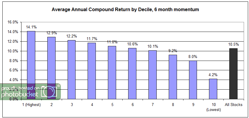
O’Shaughnessy details the results of relative strength from 1926-2009:
A $10,000 investment on December 31, 1926, in the decile of stocks from All Stocks with the best six-month price appreciation is worth $572,831,563 at the end of 2009, a compound return of 14.11 percent a year. This return dwarfed an investment in the All Stock universe, which turned $10,000 into $38,542,780 over the same period, an average annual compound return of 10.46 percent.
It is also important to point out that O’Shaughnessy found that this relative strength portfolio outperformed the benchmark in 68% of single-year returns, 79% of rolling 3-year returns, 87% of rolling 5-year returns, 95% of rolling 7-year returns, and 98% of rolling 10-year returns.
Also, keep in mind that this is just a generic relative strength strategy based on a 6-month return factor with annual rebalances. His book also showed that using a 12-month relative strength factor also outperformed the benchmark with an compound return of 12.34 percent.
In case you were wondering, a strategy based on buying stocks with the worst 6-month returns and then holding for a year had an annualized return of 4.15 percent! As stated in the book, “If you’re looking for a great way to underperform the market, look no further [than buying relative strength laggards].”
O’Shaughnessy on the symmetry for the relative strength deciles:
The decile returns for All Stocks by six-month price appreciation reveal a perfect staircase, with the performance of decile 1-containing the best six-month price performing stocks-at the top and returns of the other deciles descending in step to the tenth decile, which contains the worst six-month price performers. The top six deciles all beat All Stocks, with the bottom four all underperforming the universe.
Source: What Works On Wall Street
The results are in and they are highly favorable for relative strength investing.
Posted by: Andy Hyer
Modern Portfolio Theory in Practice
November 30, 2011Contained in a Jonah Lehrer article on Frontal Cortex is this gem:
Consider the story of Harry Markowitz, a Nobel Prize-winning economist who largely invented the field of investment-portfolio theory. By relying on a set of complicated equations, Markowitz was able to calculate the optimal mix of financial assets. (Due to loss-aversion, most investors hold too many low-risk bonds, but Markowitz’s work helped minimize the effect of the bias by mathematizing the decision.) Markowitz, however, was incapable of using his own research, at least when setting up his personal retirement fund. “I should have computed the historical co-variances of the asset classes and drawn an efficient frontier,” Markowitz later confessed. “Instead, I visualized my grief if the stock market … went way down and I was completely in it. My intention was to minimize my future regret. So I split my contributions 50/50 between bonds and equities.”
I added the emphasis. When faced with an emotional consequence, even the man who invented the efficient frontier became an irrational investor! Honestly, this is just human. I’ve written a lot about how investors-in reality-make decisions to minimize their chances of looking stupid. This is just what Markowitz did, and we all have this tendency. The assumption that investors would ever be rational was simply a faulty foundation.
If we know that investors are going to act in predictable ways, shouldn’t that be incorporated in the way we approach asset allocation?
Posted by: Mike Moody
Relative Strength Spread
November 30, 2011The chart below is the spread between the relative strength leaders and relative strength laggards (universe of mid and large cap stocks). When the chart is rising, relative strength leaders are performing better than relative strength laggards. As of 11/29/2011:
Using history as a guide, we expect this spread to eventually resume its upward trend. A meaningful positive breakout in this indicator could bode very well for relative strength strategies.
Posted by: Andy Hyer
What Still Works on Wall Street?
November 29, 2011The early editions of James O’Shaughnessy’s bible What Works on Wall Street identified two combination strategies that were so good that mutual funds were formed to implement the strategies. Cornerstone Value was a large cap dividend strategy, while Cornerstone Growth combined value with relative strength. The funds have been around since 1996 or so. CXO Advisory poses the question:
Has 14 years of out-of-sample performance of these two mutual funds confirmed the motivating backtests?
HFCVX [Hennessy Cornerstone Value] underperforms both its benchmark Russell 1000 Value Index and the S&P 500 Index. The fund underperforms the S&P 500 Index by about 0.5% per year, compared to the backtested average annual outperformance of about 7%. Also, its standard deviation of annual returns (20.1%) is higher than that for the benchmark Russell 1000 Value Index (18.7%). Backtested outperformance has not persisted over a 14-year out-of-sample implementation.
HFCGX [Hennessy Cornerstone Growth] outperforms both its benchmark Russell 2000 Index and the S&P 500 Index. The fund outperforms the S&P 500 Index by about 2.5% per year, compared to the backtested average annual outperformance of about 10%. Its standard deviation of annual returns (21.2%) is about the same as that for the benchmark Russell 2000 Index (21.1%). Backtested outperformance has persisted at a subdued level over a 14-year out-of-sample implementation.
Source: CXO Advisory
In other words, the dividend strategy has not been able to beat the market over the last 14 years, while the relative strength strategy has outperformed in real life. This mirrors CXO’s findings earlier. I might note that the outperformance of the Cornerstone Growth strategy comes despite the Q3-Q4 2008 - Q1-Q2 2009 performance of relative strength, which was a big historical outlier. The underperformance of relative strength was epic during that brief period—and Cornerstone Growth outperformed anyway. I would further note that the 2.5% annual outperformance is after fees.
Evidence suggests that relative strength is a strategy worth implementing.
Posted by: Mike Moody
High RS Diffusion Index
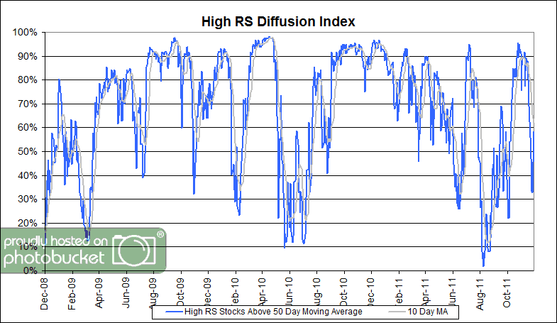
November 29, 2011The chart below measures the percentage of high relative strength stocks that are trading above their 50-day moving average (universe of mid and large cap stocks.) As of 11/28/11.
This index has dropped to the middle of the distribution over the last couple of weeks. The 10-day moving average of this indicator is 62% and the one-day reading is 58%.
Posted by: JP Lee
Apple Computer: Massive P/E Compression
November 28, 2011Apple Computer has unquestionably been one of the best momentum stocks over the past decade. It is +1,314% from December 31, 1999-November 25, 2011, while the S&P 500 is -21% over that same period of time. It has also been one of the holdings in the DWA Technical Leaders Index (PDP) since its inception of 3/1/2007 and it has outperformed the S&P 500 handily over that period of time (Apple is +317% vs. -17% for the S&P 500).
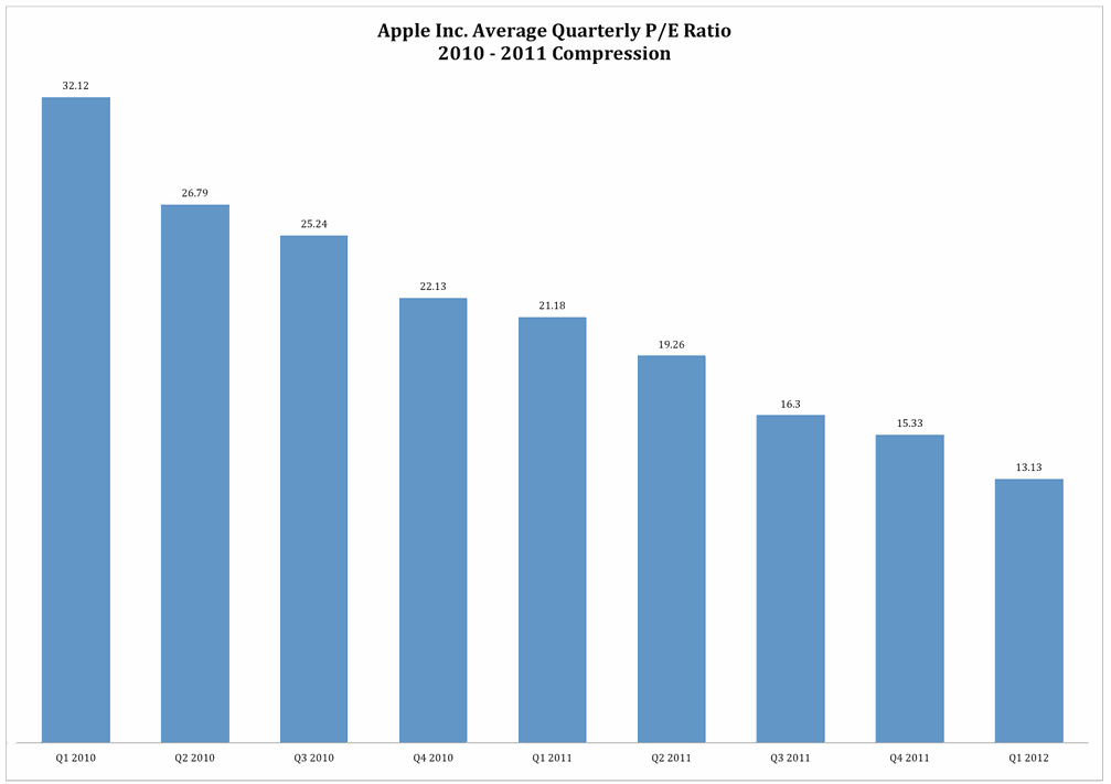
However, as pointed out by Bullish Cross, even with the strong performance of Apple’s stock, there has been massive P/E compression over the past couple of years.
(Click to enlarge)
The stock is now trading at an extremely low 13.1 trailing P/E ratio. We’re talking about a valuation level that Apple hasn’t seen in nearly a decade – this despite the fact that the company grew its earnings 82% this year which is the highest in over 7 years. We’re talking about a valuation that is more than 10% lower than the lowest point during the financial crisis.
Seemingly, Apple is an increasingly undervalued stock as investors have been slow to fully price in the exceptionally strong fundamentals. Clearly, just because a stock has a sustained period of outperformance does not mean that it is necessarily becoming overvalued on a fundamental basis.
See www.powershares.com for more information about PDP. Past performance is no guarantee of future returns. A list of all holdings for the trailing 12 months is available upon request.
HT: Abnormal Returns
Posted by: Andy Hyer
Dorsey, Wright Client Sentiment Survey Results - 11/18/11
November 28, 2011Our latest sentiment survey was open from 11/18/11 to 11/25/11. The Dorsey, Wright Polo Shirt Raffle continues to drive advisor participation, and we greatly appreciate your support! This round, we had 61 advisors participate in the survey (holiday week = light traffic). If you believe, as we do, that markets are driven by supply and demand, client behavior is important. We’re not asking what you think of the market—since most of our blog readers are financial advisors, we’re asking instead about the behavior of your clients. Then we’re aggregating responses exclusively for our readership. Your privacy will not be compromised in any way.
After the first 30 or so responses, the established pattern was simply magnified, so we are comfortable about the statistical validity of our sample. Most of the responses were from the U.S., but we also had multiple advisors respond from at least two other countries. Let’s get down to an analysis of the data! Note: You can click on any of the charts to enlarge them.
Question 1. Based on their behavior, are your clients currently more afraid of: a) getting caught in a stock market downdraft, or b) missing a stock market upturn?
Chart 1: Greatest Fear. From survey to survey, the S&P fell -3.0%, and client fear levels responded in-kind. The overall fear number rose from 88% to 93%; the greatest fear numbers are now the highest we’ve seen since mid-June. On the flip side, the opportunity group fell from 12% to 7%. Client sentiment remains terrible.
Chart 2. Greatest Fear Spread. Another way to look at this data is to examine the spread between the two groups. The spread jumped this round, from 77% to 87%.
Question 2. Based on their behavior, how would you rate your clients’ current appetite for risk?
Chart 3: Average Risk Appetite. Overall risk numbers plummeted this round, from 2.44 to 2.08. Overall risk appetite is now the lowest we’ve seen since September of 2010.
Chart 4: Risk Appetite Bell Curve. This chart uses a bell curve to break out the percentage of respondents at each risk appetite level. Over 50% of all respondents want a risk appetite of either 1 or 2.
Chart 5: Risk Appetite Bell Curve by Group. The next three charts use cross-sectional data. This chart plots the reported client risk appetite separately for the fear of downdraft and for the fear of missing upturn groups. This bar chart sorts out as we expect, with the fear group looking for low risk and the opportunity group looking for more risk. Keep in mind that with the light holiday response, there were only 4 total respondents in the upturn category.
Chart 6: Average Risk Appetite by Group. Both groups’ risk appetite fell, just like the overall risk number.
Chart 7: Risk Appetite Spread. This is a spread chart constructed from the data in Chart 6, where the average risk appetite of the downdraft group is subtracted from the average risk appetite of the missing upturn group. The spread jumped by a small degree this round.
This survey, we saw the market dip lower, and both client fear levels and overall risk appetite respond as expected. The overall risk appetite number paints an ugly picture — client sentiment is now the worst it’s been since September of 2010. While that’s never a good thing, some studies have shown that when client sentiment reaches these types of overextended low levels, the stock market does well going foward.
No one can predict the future, as we all know, so instead of prognosticating, we will sit back and enjoy the ride. A rigorously tested, systematic investment process provides a great deal of comfort for clients during these types of fearful, highly uncertain market environments. Until next time, good trading and thank you for participating.
Posted by: JP Lee
Long Horizon Investing
November 28, 2011Institutional pension funds and foundations-most obviously-have long-term investment horizons. What is less well-appreciated in the investment industry is that individuals have long-term horizons too. If anything, an individual’s task is more complex, since it is broken into a long capital accumulation phase and then, possibly, into a capital distribution period. (If capital accumulation is extraordinarily successful, some accounts never have a distribution phase. The portfolio sometimes just continues to accumulate because the spending never approaches the fecundity of the portfolio.)
Like a institutional pension fund, an individual’s retirement savings has a very long life span—because it is, in fact, your pension fund. A recent article by Andrew Ang of Columbia University and Knut Kjaer points out some of the chief advantages of long horizon investing:
Long horizon investors have an edge. They can ride out short-term fluctuations in risk premiums, profit from periods of elevated risk aversions and short-term mispricing, and they can pursue illiquid investment opportunities. The turmoil we have seen in the capital markets over the last decade has increased the competitive advantage of a long investment horizon. Unfortunately, the two biggest mistakes of long horizon investors—procyclical investments and misalignments between asset owners and managers—negate the long horizon advantage. Long horizon investors should harvest many sources of factor risk premiums, be actively contrarian, and align all stakeholders so that long horizon strategies can be successfully implemented. Illiquid assets can, but do not necessarily, play a role for long horizon investors, but investors should demand high premiums to compensate for bearing illiquidity risk and agency issues.
I put their recommendations in bold. For individuals, aligning stakeholders shouldn’t be a huge problem. You’re the only stakeholder, which is another advantage over an institution.
It makes perfect sense to harvest multiple factor risk premiums. Historically, relative strength is among the largest of these, but lots of them are worthwhile. Value is a well-known factor and minimum volatility also seems promising. A big benefit of these two factors is that the excess returns are often negatively correlated with relative strength. You can build better equity exposure by combining uncorrelated factors.
Finally, they suggest being actively contrarian. I read this as being willing to add to a strategy when it is out of favor, something they euphemistically term as “short-term fluctuations in risk premiums.” When relative strength has underperformed, add to it. When value has underperformed, plump up your portfolio in that area. Although the fluctuations can often be hair-raising, they are very correct about what a big mistake procyclical investments can be. (Procyclical is just a fancy word for buying high and selling low.)
Their conclusion is also worth reiterating: The turmoil we have seen in the capital markets over the last decade has increased the competitive advantage of a long investment horizon.
As an individual investor, you have some handicaps relative to institutions. But if you work from the standpoint of a long investment horizon, you also have a big potential competitive advantage. Whether you turn that potential into reality or not is a function of how successfully you implement their recommendations-constructing a portfolio to capture several return factors and adding to a strategy on dips.
Posted by: Mike Moody
Weekly RS Recap
November 28, 2011The table below shows the performance of a universe of mid and large capU.S.equities, broken down by relative strength decile and quartile and then compared to the universe return. Those at the top of the ranks are those stocks which have the best intermediate-term relative strength. Relative strength strategies buy securities that have strong intermediate-term relative strength and hold them as long as they remain strong.
Last week’s performance (11/21/11 – 11/25/11) is as follows:
It was a bad week for the market, but high relative strength stocks held up much better than the universe.
Posted by: Andy Hyer
Fund Flows
November 25, 2011The Investment Company Institute is the national association of U.S. investment companies, including mutual funds, closed-end funds, exchange-traded funds (ETFs), and unit investment trusts (UITs). Members of ICI manage total assets of $11.82 trillion and serve nearly 90 million shareholders. Flow estimates are derived from data collected covering more than 95 percent of industry assets and are adjusted to represent industry totals.
Last week saw massive outflows in hybrid funds, while domestic equities were nearly flat. Is the tide turning? In light of this short holiday week market action, probably not.
Posted by: JP Lee
Momentum Over Multiple Cycles
November 23, 2011In a recent interview, Jim O’Shaughnessy made the case for following quantitative strategies that have performed well over multiple market cycles:
The average investor does significantly worse than a simple index … It’s literally because of the way our brains are wired. As [neuro-finance researchers] look at super-fast scans of the brain making decisions under uncertainty, we see that even with a so-called professional investor making the choice, it is not the rational centres of the brain that fire when they’re making those choices. It is the emotional centres of the brain.
That’s one of the reasons why finding good strategies that have performed well over multiple market cycles – and then having the ability to stick with them through thick and thin, even when they’re not working for you – is the key to good long-term success.
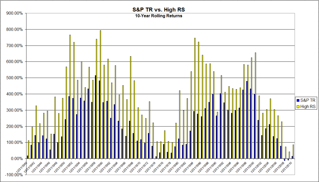
Which brings me to the long-term performance of relative strength strategies. We tracked down total return data for the S&P 500 going back to 1930 and compared it to the momentum series on the website of Ken French at Dartmouth (top half in market cap, top 1/3 in momentum). The chart below shows 10-year rolling returns, which is why it starts in 1940. The average ten-year returns? 405% for relative strength and 216% for the S&P 500, a near doubling! That’s without the momentum series getting any credit for dividends. Even more impressive, the ten-year rolling return of the relative strength series outperformed in 100% of the time periods.
Click to enlarge
Source: J.P. Lee, Dorsey, Wright Money Management
Results such as these should provide more than enough confidence to stick with relative strength through the thick and thin.
Posted by: Andy Hyer
From the Archives: Stops Degrade Performance
November 23, 2011Ok, I wrote that just to tweak you. But it is true–most of the time. Perry Kaufman, in his book Smarter Trading discusses (and provides evidence) stops and the effect they have on trading systems. Most of the time, they make your performance worse–but that doesn’t mean you can do without risk management entirely. At the very least, you need some kind of catastrophe insurance, whether it is a very wide stop loss or some kind of exposure regulation for an entire portfolio.
This graphic from our friend at Blackstar Funds, Eric Crittenden, by way of Michael Covel’s Trend Following website, shows that a lot more stocks go boom than academics would predict, making that catastrophe insurance quite handy. And they don’t always come back, by the way, a fact that makes bottom-fishing akin to running through a dynamite factory with a match. You might live, but you’re still an idiot.
—-this article was originally published 10/23/2011. Bottom-fishing is no less dangerous today. Using relative strength works counter to that strategy.
Posted by: Mike Moody
High RS Diffusion Index
November 23, 2011The chart below measures the percentage of high relative strength stocks that are trading above their 50-day moving average (universe of mid and large cap stocks.) As of 11/22/11.
This index has dropped to the middle of the distribution over the last couple of weeks. The 10-day moving average of this indicator is 75% and the one-day reading is 47%.
Posted by: Andy Hyer
The #1 Investment Return Factor No One Wants to Talk About-Still
November 22, 2011I noticed another article on alternative beta indexes in Advisor Perspectives the other day. In it, Jason Hsu of Research Affiliates extols the virtues of a variety of alternatively constructed indexes. He concludes:
While the Fundamental Index strategy remains very close to our heart, we are very encouraged by the increasing innovation in the field of alternative betas. Despite often very different approaches, their respective results validate the entire idea of deviating from the binary active–passive world of the past. Some of the most compelling attributes of both are embedded in alternative betas. Like active managers, these methods can produce excess returns and produce different market exposures than mainstream indices, resulting in lower volatility and increased Sharpe ratios. Like traditional indices, most will have lower management costs, many will have similarly skinny implementation costs, and all will have lower governance/monitoring costs than active strategies. Furthermore, some of the most scalable approaches efficiently capture the value and small-cap effects without the long/short requirement, monthly maintenance, and illiquidity of a true Fama–French implementation.
Most investors make their biggest bets on equities, comprising more than 50% of their asset allocation. Accordingly, they have sought to diversify risk within equities by style, size, and geography. We assert that investors should go to greater lengths to diversify their equity portfolio. The past 10 years have brought considerable pain to both sides of the equity active–passive aisle. The third choice of alternative betas—even the simplest such as Equal-Weighting—would have resulted in a far better outcome. Will history repeat? Nobody knows. However, we think the evidence is far too compelling to ignore. We suggest moving alternative betas up your to-do list.
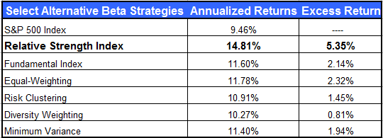
A wide variety of alternative indexes are discussed in the article—with the exception of relative strength. For some reason, no one ever wants to talk about it. However, for your convenience, we are including a table from a prior post that compares relative strength indexing to other methods.
Source: Dorsey Wright Money Management
I understand why proponents of other indexing methods don’t like to discuss it—but it’s a good reason for investors to take a close look at it.
Posted by: Mike Moody
Tax Mobility
November 22, 2011In another demonstration of the fact that money goes where it is treated best, Investment News points out an interesting tidbit from the Census Bureau:
The percentage of Americans who moved residences reached its lowest point last year in more than six decades, the Census Bureau said. Those who did transfer often relocated for employment reasons. Many moved to states with no individual income tax.
I added the bold. The biggest state-to-state migrations were from high-tax states to low-tax states, like California to Texas or New York to Florida. This suggests one reason why tax increases rarely provide the additional revenues that are forecast.
Relocations generally were way down, primarily because it is difficult to move if your house is underwater. Still, some savvy Americans moved to where the jobs were—or where the taxes weren’t. In some cases, not surprisingly, those two things are related.
Global assets compete for capital in the same way. Assets that have the potential to perform well pull capital toward them, across borders if necessary. In a competitive global economy, it might make sense to have core assets in a global macro strategy.
Posted by: Mike Moody
What’s Hot…and Not
November 22, 2011How different investments have done over the past 12 months, 6 months, and month.
1PowerShares DB Gold, 2iShares MSCI Emerging Markets ETF, 3iShares DJ U.S. Real Estate Index, 4iShares S&P Europe 350 Index, 5Green Haven Continuous Commodity Index, 6iBoxx High Yield Corporate Bond Fund, 7JP Morgan Emerging Markets Bond Fund, 8PowerShares DB US Dollar Index, 9iBoxx Investment Grade Corporate Bond Fund, 10PowerShares DB Oil, 11iShares Barclays 20+ Year Treasury Bond
Posted by: Andy Hyer
From the Archives: Performance Chasing
November 21, 2011Jason Zweig, in an interview with Morningstar, points out that performance chasing is seen in all parts of the investment world:
There was a beautiful study that was published in the The Journal of Finance a couple of years ago about the selection of institutional money managers. It basically found that the professionals who pick money managers, in this case it was pension funds, tend to buy high and fire low. They invest in whichever managers have the best trailing three-year performance and then sell whichever have the worst trailing three-year performance. The study showed that if they had flipped their decisions–if they had bought the ones with the worst three-year performance and sold the ones with the best–they actually would have gotten better returns. And of course if they had done nothing–if they had just put the portfolio on ice–they also would have done better. Performance-chasing, despite all the propaganda you hear in the financial industry, is not purely the province of retail investors. It’s not the so-called “dumb money” on Main Street that buys high and sells low. Everyone does it.
You have three choices: you can go with a manager when they are hot, you can go with a manager when they are cold, or you can do nothing. Investors, in aggregate, make the worst choice of the three! If you don’t have the emotional resilience to go against the grain, at least have the patience to sit on your hands.
—-this article originally appeared 10/23/2009. We’re a couple of DALBAR reports down the line and investors, in aggregate, continue to make the worst possible choice. Your best bet is to pick a sound strategy and add to it during periods of underperformance.
Posted by: Mike Moody
Bold Recession Call
November 21, 2011Back in September, the Economic Cycle Research Institute (ECRI) announced publicly that the US was headed into a recession. Advisor Perspectives carried the article:
Today the ECRI publicly announced that the U.S. is tipping into a recession.
Early last week, ECRI notified clients that the U.S. economy is indeed tipping into a new recession. And there’s nothing that policy makers can do to head it off.
ECRI’s recession call isn’t based on just one or two leading indexes, but on dozens of specialized leading indexes, including the U.S. Long Leading Index, which was the first to turn down — before the Arab Spring and Japanese earthquake — to be followed by downturns in the Weekly Leading Index and other shorter-leading indexes. In fact, the most reliable forward-looking indicators are now collectively behaving as they did on the cusp of full-blown recessions, not “soft landings.”
The graphic attached looked very convincing.
Source: ECRI, Advisor Perspectives
Now that we have the additional perspective afforded by time in mid-November, a couple of things are apparent.
1) It’s possible we won’t have a recession at all. The Leading Economic Index has continued to rise and, if anything, the economy has appeared to accelerate slightly.
2) Even if we are still on a path to a recession, markets have not responded in a way that would be expected. For example, since September 30 the best performing domestic sectors have been energy, basic materials, industrials, and consumer discretionary stocks—exactly what you would expect for an economy in expansionary mode. The worst performing sectors have been telecom, healthcare, utilities, and consumer staples—exactly what should do well in a recessionary environment.
Source: Dorsey Wright Money Management
I’m not trying to pick on ECRI here. They know far more about economic forecasting than I ever will. In fact, they’ve probably forgotten more than I ever learned. ECRI is clearly credible or no one would pay attention to their forecast in the first place—they’ve had many successful forecasts in the past and they’ve earned their credibility.
I’m just trying to draw attention to how difficult the forecasting game is. ECRI has access to good data and trained economists with a lot of experience, something that a retail investor will not be able to recreate—and they still make mistakes. For the typical investor, using relative strength in a systematic way is likely to be a more fruitful approach to investment than relying on even an expert forecast.
Posted by: Mike Moody
Weekly RS Recap
November 21, 2011The table below shows the performance of a universe of mid and large cap U.S. equities, broken down by relative strength decile and quartile and then compared to the universe return. Those at the top of the ranks are those stocks which have the best intermediate-term relative strength. Relative strength strategies buy securities that have strong intermediate-term relative strength and hold them as long as they remain strong.
Last week’s performance (11/14/11 – 11/18/11) is as follows:
High relative strength stocks held up better than the universe and better than the laggards in a rough week for the markets.
Posted by: Andy Hyer
Name That Emotion
November 20, 2011Panicked clients literally may not be able to hear you. In order to get them to listen to your advice, you need to get them calmed down first. From Financial Planning:
“It’s been found that when you can label the reaction, physiologically the amygdala calms down and all of a sudden there’s access to the cognitive side of the brain,” [Cynthia] Harrington said. “The challenge is how to do that without sounding patronizing.”
The whole article is worth reading. Based on our own surveys and other sentiment indexes, clients’ confidence in financial markets seems particularly low right now. A big part of any advisor’s job is helping clients make effective decisions, something that is not easy under any circumstances.
Posted by: Mike Moody
Dorsey, Wright Client Sentiment Survey - 11/18/11
November 18, 2011Here we have the next round of the Dorsey, Wright Sentiment Survey, the first third-party sentiment poll. Participate to learn more about our Dorsey, Wright Polo Shirt raffle! Just follow the instructions after taking the poll, and we’ll enter you in the contest. Thanks to all our participants from last round.
As you know, when individuals self-report, they are always taller and more beautiful than when outside observers report their perceptions! Instead of asking individual investors to self-report whether they are bullish or bearish, we’d like financial advisors to weigh in and report on the actual behavior of clients. It’s two simple questions and will take no more than 20 seconds of your time. We’ll construct indicators from the data and report the results regularly on our blog–but we need your help to get a large statistical sample!
Click here to take Dorsey, Wright’s Client Sentiment Survey.
Contribute to the greater good! It’s painless, we promise.
PS - This is the last chance to enter the drawing for a Dorsey Wright Polo Shirt this quarter. Good luck!
Posted by: JP Lee
Sector and Capitalization Performance
November 18, 2011The chart below shows performance of US sectors and capitalizations over the trailing 12, 6, and 1 month(s). Performance updated through 11/17/2011.
Posted by: Andy Hyer
Dichotomy of U.S. and European Bond Yields
November 17, 2011While yields on a number of European bonds (Italy, Spain, Portugal, Greece…) are at or above 7%, it is interesting that U.S government bond yields are going in just the opposite direction. The chart below (printed with permission from The Leuthold Group) shows that U.S. Government bond yields remain near all-time lows.
(Click to enlarge)
As trend followers, we’ll continue to go with the flow while the markets sort these sovereign debt issues out.
Posted by: Andy Hyer
