Fed Model Casualty of Paradigm Shift

November 30, 2012

The Economist details the Fed Model’s reversal of fortune:

If you invested in equities in the 1990s, you were bound to hear, sooner or later, about the “Fed model”. This, I should hasten to add, was not the official position of the Federal Reserve but the name given to a relationship found by three economists between Treasury bond yields and stockmarket valuations. Lower bond yields lead to higher price-earnings ratios or, if you invert the latter, lower earnings yields. Those who thought that equities were ridiculously overvalued in the late 1990s were told that they “just didn’t get it”.

The idea was fairly simple. The present value of a stock was its future cashflows, discounted at some rate that was derived from the bond market. The lower the discount rate, the higher the present value. The brilliant thing about this measure, from the bulls’ point of view, was that it was based on the prospective earnings ratio. So you could forecast rapid earnings growth, thereby lowering the prospective p/e, and claim that the market was “cheap”. At the level of individual stocks, the trick was even simpler - investment banks needed to show that a stock was cheap in order to sell it. So they simply persuaded analysts to forecast future earnings growth that was sufficiently high to make the prospective p/e look cheap.

If you look at the chart, you can see that the Fed model did appear to work for about 15 years, and then it didn’t. The two ratios have gone their separate ways over the last decade; low bond yields have not meant higher stock valuations, but the reverse.

fed model Fed Model Casualty of Paradigm Shift

Ah, the beauty of trend following. Conceptually simple, but effective. Sure, it goes through periods of being out of sync with the market, but the risk of trend following fundamentally breaking (like the Fed Model apparently has) is remote.


Posted by:


Sector and Capitalization Performance

November 30, 2012

The chart below shows performance of US sectors and capitalizations over the trailing 12, 6, and 1 month(s). Performance updated through 11/29/2012.

Numbers shown are price returns only.

Posted by:


It’s All Relative

November 29, 2012

James Montier points out that absolute concepts of valuation make no sense:

We don’t like stocks as an asset class compared to what we think fair value should be. However, the alternatives are generally really awful. This problem is exacerbated if financial repression lasts beyond our forecast horizon of seven years. So, at the margin, an investor would probably be wise to give equities a little more benefit of the doubt, and hence a little more weight in their portfolio than they would do, if the Fed weren’t pursuing policies of financial repression.

HT: Abnormal Returns

Posted by:


Fund Flows

November 29, 2012

Mutual Fund flow estimates are derived from data collected by The Investment Company Institute covering more than 95 percent of industry assets and are adjusted to represent industry totals.

Posted by:


DWAS Among ETFs Outpacing IWM

November 28, 2012

Benzinga has a favorable review of DWAS, the PowerShares DWA Small-Cap Technical Leaders Index:

IWM’s recent ups and downs underscore the notion that there are other small-cap ETFs that could deliver more upside in a possible risk on rally. Consider these ETFs that have been outpacing IWM in recent months.

The PowerShares DWA SmallCap Technical Leaders Portfolio (DWAS) debuted in July, but its rookie status is not what makes this fund unique. Rather than being a traditional cap-weighted ETF, DWAS evaluates relative strength characteristics of various stocks before including them in the fund. Dorsey Wright selects possible constituents “from a small-cap universe of approximately 2,000 of the smallest U.S. companies selected from a broader set of 3,000 companies,” according to PowerShares.

From there, DWAS is whittled down to 200 holdings. At the sector level, DWAS is heavy on discretionary, financial services, health care and technology names. Favorable seasonal trends for discretionary names have helped DWAS rise 0.86 percent in the past month. Over the past 90 days, the ETF is up 0.94 percent. IWM is down over both time periods.

For more information about DWAS, see www.powershares.com. Potential for profits is accompanied by possibility of loss.

Posted by:


Coping With the New Normal

November 28, 2012

The “new normal” is a phrase that strikes fear into the heart of many investors. It is shorthand for the belief that the US economy will grow very slowly going forward, as opposed to resuming its typical growth rate. For example, here is the Research Affliliates version of the new normal, as presented in a recent article from AdvisorOne:

Unless the U.S. makes politically difficult changes in immigration, employment and investment policies, Americans should expect a long-term “new normal” rate of growth of just 1%. So says investment management firm Research Affiliates, in a research note that brings a wealth of demographic and historic data to bear on current fiscal projections.

Christopher Brightman, the report’s author and head of investment management for the Newport Beach, Calif. Firm founded by indexing guru Rob Arnott, is critical of White House and Congressional Budget Office growth projections that assume 2.5% long-term growth.

Brightman argues the U.S. will find it nearly impossible to recapture the 3.3% average annual growth that prevailed from 1951 to 2000 as a result of negative trends in the key areas that affect GDP: population growth, employment rate growth and productivity.

PIMCO and other firms have also been exponents of the new normal view, and although the specifics may vary from strategist to strategist, the general outlook for sluggish growth is the same.

Investor response to date has been less than constructive and has mostly resembled curling up into the fetal position. Although I have no idea how likely it is the new normal theory will pan out, let’s think for a moment about some of the possible implications.

  • if US economic growth is slow, it may slow growth overseas, especially when the US is their primary export market.
  • economies less linked to the US may decouple and retain strong growth characteristics.
  • inflation and interest rates may stay low, leading to better-than-expected bond returns (where default is not an issue).
  • ever more heroic measures to stimulate US economic growth may backfire, creating a debt bomb and high future inflation.
  • growth may be priced at a premium multiple for those stocks and sectors that are demonstrating strong fundamentals. In other words, if growth is hard to find, investors may be willing to pay up for it.
  • slow economic growth may cause a collapse in multiples, as future growth is discounted at a much lower rate.

In other words, you can still get pretty much any investment scenario out of new normal assumptions. It’s just about whether a particular strategist is feeling pessimistic or optimistic that day, or more cynically, whether they are talking their book.

To me, this is one of the best arguments in favor of tactical asset allocation driven by relative strength. Relative strength lets the market decide, based on which assets are strong, what to buy. At any given time it could be currencies, commodities, stocks, bonds, real estate, or even inverse funds. And it might change over time, as new perceptions creep into the market or as policy responses and market consequences interact in a feedback loop. Relative strength doesn’t make any assumptions about what will happen; it treats good performance favorably regardless of the source. Tactical asset allocation, then, is just an attempt to extract returns from wherever they might be available. That trait may come in handy in a tough market.

Posted by:


High RS Diffusion Index

November 28, 2012

The chart below measures the percentage of high relative strength stocks that are trading above their 50-day moving average (universe of mid and large cap stocks.) As of 11/27/12.

The 10-day moving average of this indicator is 46% and the one-day reading is 64%. This index has rebounded sharply after hitting a single day low of 19% on 11/15/12.

Posted by:


Behavioral Finance: Inside the Client’s Brain

November 27, 2012

I admit to a prurient interest in behavioral finance. Perhaps this is due to my background in psychology—or just from having dealt with a broad range of clients for many years. Investor behavior is sometimes amazing, and behavioral finance, the academic specialty that has grown up to examine it, is equally interesting. One of the most practical discussions of behavioral finance I have seen appeared recently on AdvisorOne. It was written by Michael Finke, the coordinator for the financial planning program at Texas Tech.

It is my strong recommendation that you read the entire article, but here are a few of the behavioral finance highlights that jumped out at me:

  • Breaking habits requires deliberate intention to change routines by using our rider to change the direction of the elephant. How do we motivate people to change behavior to meet long-term goals? Neuroscience suggests that the worst way to motivate people is to focus on numbers. Telling someone they need to save a certain amount to achieve an adequate retirement accumulation goal may be convincing to the rational brain, but not so convincing to the elephant.
  • Explaining a concept in a visual or emotional sense uses much more of our brain functions than is used by numbers. If you think of people as being emotional and visual, you’ve essentially tapped into 70% of the brain real estate. There is that rational side, but that rational side might be more like 20% of the real estate. The rational side used to solve math problems might be 8% of the real estate.
  • It can be useful to frame desired actions as the status quo in order to take advantage of this preference. For example, setting defaults that are beneficial can have an unexpectedly large impact on improving behavior.
  • The most powerful emotional response related to financial choice is fear. Fear leads to a number of observed decision anomalies identified in behavioral finance such as the excessive attention paid to a loss. Framing decisions so that they do not necessarily involve a loss is an important tool advisors can use to avoid bringing the amygdala to the table.
  • “Dollar cost averaging is an illusion,” notes James. “Unless we have mean reversion in the market (and if we do we can make lots of market timing bets and make ourselves rich), dollar cost averaging does not work. But if people believe that they are buying shares cheaper in a recession, the story makes people stay in the market at the times when their fear-driven emotional side wants them to get out of the market. We have a story that, even if it’s completely false, is generating the behavior that is going to be portfolio maximizing in the end. So maybe the answer to the usefulness of dollar cost averaging isn’t ‘well we’ve figured it out and it doesn’t work, so don’t use it,’ the answer is ‘actually it’s not true but it gets your clients to behave the right way so keep telling them that.’”

The biggest impediment to good returns is typically investor psychology. If behavioral finance ideas can help clients control their behavior better—and thus lead to better investment outcomes—some of these ideas may prove useful.

gear head leanfrog Behavioral Finance: Inside the Clients Brain

Source: Lean Frog (click on image to enlarge)

Posted by:


Relative Strength Spread

November 27, 2012

The chart below is the spread between the relative strength leaders and relative strength laggards (universe of mid and large cap stocks). When the chart is rising, relative strength leaders are performing better than relative strength laggards. As of 11/26/2012:

Posted by:


Weekly RS Recap

November 26, 2012

The table below shows the performance of a universe of mid and large cap U.S. equities, broken down by relative strength decile and quartile and then compared to the universe return. Those at the top of the ranks are those stocks which have the best intermediate-term relative strength. Relative strength strategies buy securities that have strong intermediate-term relative strength and hold them as long as they remain strong.

Last week’s performance (11/19/12 – 11/23/12) is as follows:

Broad rally for the equity markets last week; the best performance came from the top relative strength quartile.

Posted by:


Client Sentiment Survey - 11/23/12

November 26, 2012

Here we have the next round of the Dorsey, Wright Sentiment Survey, the first third-party sentiment poll. Participate to learn more about our Dorsey, Wright Polo Shirt raffle! Just follow the instructions after taking the poll, and we’ll enter you in the contest. Thanks to all our participants from last round.

As you know, when individuals self-report, they are always taller and more beautiful than when outside observers report their perceptions! Instead of asking individual investors to self-report whether they are bullish or bearish, we’d like financial advisors to weigh in and report on the actual behavior of clients. It’s two simple questions and will take no more than 20 seconds of your time. We’ll construct indicators from the data and report the results regularly on our blog–but we need your help to get a large statistical sample!

Click here to take Dorsey, Wright’s Client Sentiment Survey.

Contribute to the greater good! It’s painless, we promise.

Posted by:


Compound Interest

November 21, 2012

Paul Merriman, in a column for Marketwatch, has a nice discussion about the power of compound interest. He shows that the effect of compound interest is exponential, not linear, and points out what a huge difference time and a somewhat higher compounding rate can make.

One big mistake clients often make is that they don’t allow enough time for their investments to compound. DALBAR documents that the holding periods for both stock and bond funds average around three years. Although compound interest is astonishing, that is not nearly enough time to let an exponential function kick in. With exponential growth, by definition, much of the growth is going to be backloaded. Investment growth will be much more noticeable after twenty good years than after three.

Advisors that can get their clients to be patient and leave their investment funds alone, whether achieved through a strong and trusting relationship or through a calming asset allocation, will allow the clients a chance to reap rewards over time. If the client is changing course every three years, there’s almost no chance for that to happen. In the investment industry, we like to think of ourselves as investment gurus-but it might be better to re-imagine ourselves as compound interest gurus.

Posted by:


Quote of the Week

November 21, 2012

Why when we see nothing but improvement behind us, do we see nothing but deterioration before us - Macaulay

HT: Jim Pethokoukis

Posted by:


High RS Diffusion Index

November 21, 2012

The chart below measures the percentage of high relative strength stocks that are trading above their 50-day moving average (universe of mid and large cap stocks.) As of 11/20/12.

The 10-day moving average of this indicator is 38% and the one-day reading is 55%. Dips in this indicator have often provided good opportunities to add to relative strength strategies.

Posted by:


Never-Ending Bond Bubble Debate

November 20, 2012

In case you haven’t had enough of the debate about whether or not bonds are in a bubble (a debate which has gone on for several years now), see Jim Grant’s take below:

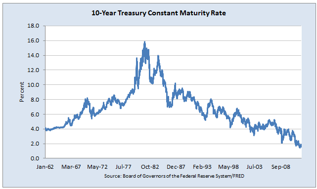
For some additional perspective, consider the chart of 10-year interest rates (which moves inversely to bond prices):

10 year Never Ending Bond Bubble Debate

If you think that there is a chance that Jim Grant may be right about bonds, it probably makes sense to have a game plan for tactically managing your fixed income exposure going forward.

Posted by:


Client Sentiment Survey Results - 11/9/12

November 20, 2012

Our latest sentiment survey was open from 11/9/12 to 11/16/12. The Dorsey, Wright Polo Shirt Raffle continues to drive advisor participation, and we greatly appreciate your support! This round, we had 69 advisors participate in the survey. If you believe, as we do, that markets are driven by supply and demand, client behavior is important. We’re not asking what you think of the market—since most of our blog readers are financial advisors, we’re asking instead about the behavior of your clients. Then we’re aggregating responses exclusively for our readership. Your privacy will not be compromised in any way.

After the first 30 or so responses, the established pattern was simply magnified, so we are fairly comfortable about the statistical validity of our sample. Some statistical uncertainty this round comes from the fact that we only had four investors say that thier clients are more afraid of missing a stock upturn than being caught in a downdraft. Most of the responses were from the U.S., but we also had multiple advisors respond from at least two other countries. Let’s get down to an analysis of the data! Note: You can click on any of the charts to enlarge them.

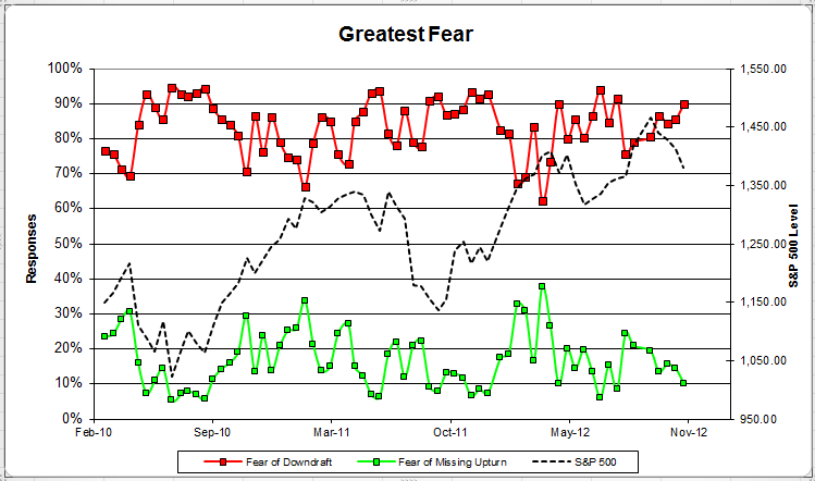
Question 1. Based on their behavior, are your clients currently more afraid of: a) getting caught in a stock market downdraft, or b) missing a stock market upturn?

greatestfear 1 Client Sentiment Survey Results   11/9/12

Chart 1: Greatest Fear. From survey to survey, the S&P 500 fell just over -2%, and all of our sentiment indicators responded as expected. The fear of downdraft group crept up to 90%, up from 86%. The fear of missing opportunity group fell from 14% to 10%.

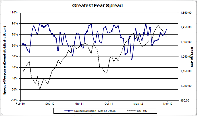
fearspread 3 Client Sentiment Survey Results   11/9/12

Chart 2: Greatest Fear Spread. Another way to look at this data is to examine the spread between the two groups. The spread continued to rise, up to 80% from 71%.

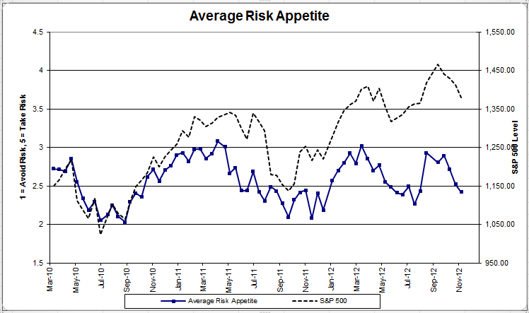
Question 2. Based on their behavior, how would you rate your clients’ current appetite for risk?

avgriskapp 48 Client Sentiment Survey Results   11/9/12

Chart 3: Average Risk Appetite. Average risk appetite fell for the second straight week, dropping from 2.52 to 2.42.

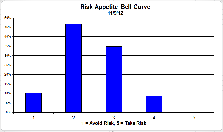
riskappbellcurve 36 Client Sentiment Survey Results   11/9/12

Chart 4: Risk Appetite Bell Curve. This chart uses a bell curve to break out the percentage of respondents at each risk appetite level. This round, over 90% of all respondents wanted a risk appetite of 3 or less.

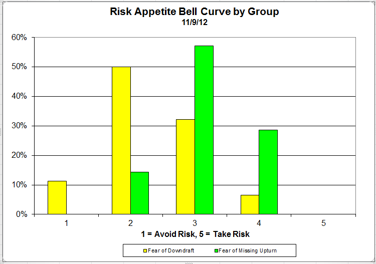
bellcurvegroup 12 Client Sentiment Survey Results   11/9/12

Chart 5: Risk appetite Bell Curve by Group. The next three charts use cross-sectional data. The chat plots the reported client risk appetite separately for the fear of downdraft and for the fear of missing upturn groups. We can see the upturn group wants more risk, while the fear of downturn group is looking for less risk.

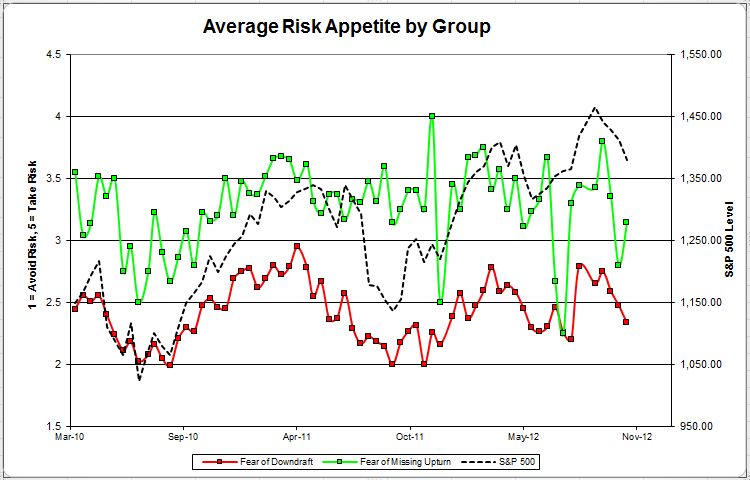
avggrouprisk Client Sentiment Survey Results   11/9/12

Chart 6: Average Risk Appetite by Group. This round, the upturn group’s risk appetite grew after an uncharacteristic low last survey. The downturn group’s average fell with the market.

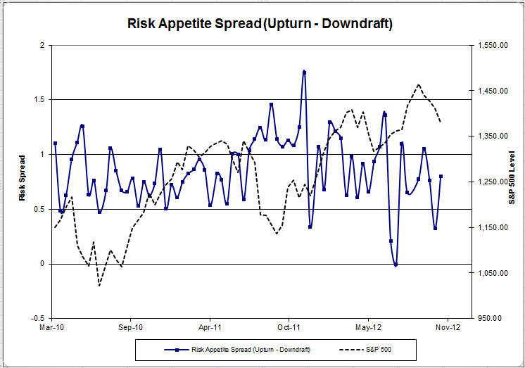
riskappspreadd Client Sentiment Survey Results   11/9/12

Chart 7: Risk Appetite Spread. This is a chart constructed from the data in Chart 6, where the average risk appetite of the downdraft group is subtracted from the average risk appetite of the missing upturn group. The spread continues to trend within its set range.

The S&P 500 fell by -2% from survey to survey, and our sentiment indicators responded correctly. The overall fear number grew to 90%, meaning 90% of all clients are more worried about losing money in the market versus missing a market rally. The overall risk appetite also fell this round, in line with the market.

No one can predict the future, as we all know, so instead of prognosticating, we will sit back and enjoy the ride. A rigorously tested, systematic investment process provides a great deal of comfort for clients during these types of fearful, highly uncertain market environments. Until next time, good trading and thank you for participating.

Posted by:


More Than Just Information Required

November 20, 2012

Ramit Sethi tweets:

Likewise, there is no shortage of investors (with all the information in the world at their fingertips) who continue to engage in behavior that greatly impairs their investment returns. For your entertainment, here is just one example.

Posted by:


Changing With The Times

November 20, 2012

Josh Brown’s tweet this morning pretty much sums up the problem that BBY, HPQ, and JCP face:

There is also a shortage of demand for the company’s stocks, as reflected by the chart below (the red line is the S&P 500):

Source: Yahoo! Finance

Times change. There are no guarantees that companies that achieve great success will stay at the top forever. In fact, the nature of capitalism makes the strategy of buying and holding individual stocks a very risky proposition over time. Enter relative strength, which does an effective job of keeping you with the winners while they are strong, but also provides an efficient way to exit when it’s time to move on.

A list of all Dorsey Wright holdings for the trailing 12 months is available upon request.

Posted by:


Relative Strength Spread

November 20, 2012

The chart below is the spread between the relative strength leaders and relative strength laggards (universe of mid and large cap stocks). When the chart is rising, relative strength leaders are performing better than relative strength laggards. As of 11/19/2012:

The RS Spread is currently trading right at its 50 day moving average.

Posted by:


Yet Another Blow to Modern Portfolio Theory

November 19, 2012

Modern Portfolio Theory is predicated on the ability to construct an efficient frontier based on returns, correlations, and volatility. Each of these parameters needs to be accurate for the efficient frontier to be accurate. Since forecasting is tough, often historical averages are used. Since the next five or ten years is never exactly like the last 50 years, that method has significant problems. Apologists for modern portfolio theory claim that better efficient frontiers can be generated by estimating the inputs. Let’s imagine, for a moment, that this can actually be done with some accuracy.

There’s still a big problem. Volatility bumps up during adverse market conditions, as reported by Research Affiliates. And correlations change during declines—and not in a good way.

From the abstract of a recent paper, Quantifying the Behavior of Stock Correlations Under Market Stress:

Understanding correlations in complex systems is crucial in the face of turbulence, such as the ongoing financial crisis. However, in complex systems, such as financial systems, correlations are not constant but instead vary in time. Here we address the question of quantifying state-dependent correlations in stock markets. Reliable estimates of correlations are absolutely necessary to protect a portfolio. We analyze 72 years of daily closing prices of the 30 stocks forming the Dow Jones Industrial Average (DJIA). We find the striking result that the average correlation among these stocks scales linearly with market stress reflected by normalized DJIA index returns on various time scales. Consequently, the diversification effect which should protect a portfolio melts away in times of market losses, just when it would most urgently be needed.

I bolded the part that is most inconvenient for modern portfolio theory. By the way, this isn’t really cutting edge. The rising correlation problem isn’t new, but I find it interesting that academic papers are still being written on it in 2012.

The quest for the magical efficient portfolio should probably be ended, especially since there are a number of useful ways to build durable portfolios. We’re just never going to get to some kind of optimal portfolio. Mean variance optimization, in fact, turns out to be one of the worst methods in real life. We’ll have to make do with durable portfolio construction. It may be messy, but a broadly diversified portfolio should be serviceable under a broad range of market conditions.

Posted by:


Weekly RS Recap

November 19, 2012

The table below shows the performance of a universe of mid and large cap U.S. equities, broken down by relative strength decile and quartile and then compared to the universe return. Those at the top of the ranks are those stocks which have the best intermediate-term relative strength. Relative strength strategies buy securities that have strong intermediate-term relative strength and hold them as long as they remain strong.

Last week’s performance (11/12/12 – 11/16/12) is as follows:

The relative strength laggards were generally the worst performers last week.

Posted by:


Stocks Are Not Expensive

November 16, 2012

There seems to be a lot of banter about the fiscal cliff lately, but not much talk about market valuations. Ed Yardeni puts out a very interesting valuation chart which suggests that stocks are not expensive. The blue lines are just PE multiples calculated on forward earnings. Right now the market is between 12x and 13x earnings, which is below the 15x historical average. This is, of course, a moving target—earnings could go down from here and turn the whole chart down. But at least for right now, stocks are not expensive based on estimates.

Source: Dr. Ed’s Blog (click on image to enlarge)

Why do I even bring this up? After all, we’re not fundamentally oriented anyway. Price is often a better indicator of where earnings are headed than the analyst’s estimates.

I bring it up because apocalyptic thinking seems to have infected the American public. Confidence in our politics is at a low point and the economy is sluggish. It is easy to extrapolate and conclude that things will never get better. (Given all of the negative discourse, maybe the public should be forgiven for believing, incorrectly, that the stock market has performed poorly.)

That’s probably a bad guess. American business is remarkably adaptive. In fact, you can see from the chart that aggregate earnings for the stock market are basically back to pre-bear market levels. Before the decline, stocks were happily trading for more than 14x earnings; now stocks are shunned at 12x earnings!

Posted by:


Sector and Capitalization Performance

November 16, 2012

The chart below shows performance of US sectors and capitalizations over the trailing 12, 6, and 1 month(s). Performance updated through 11/15/2012.

Numbers shown are price returns only.

Posted by:


The Disposition Effect

November 15, 2012

“Everyone” knows that you are supposed to cut your losses and let your winners run—except maybe actual investors. Real-life investors do the opposite, something that behavioral finance types call the “disposition effect.” Aswath Damodaran has a nice summary of the disposition effect on his blog, Musings on Markets.

In particular, there is significant evidence that investors sell winners too early and hold on to losing stocks much too long, using a mixture of rationalization and denial to to justify doing so. Shefrin and Statman coined this the “disposition effect” and Terrence O’Dean looked at the trading records of 10,000 investors in the 1980s to conclude that this irrationality cost them, on average, about 4.4% in annual returns. Behavioral economists attribute the disposition effect to a variety of factors including over confidence (that your original analysis was right and the market is wrong), mental accounting (a paper loss is less painful than a realized loss) and lack of self control (where you abandon rules that you set for yourself).

Whatever the presumed psychological attribution of the disposition effect, 440 basis points of return per year is a lot!

Mr. Damodaran explores a few possible solutions to eliminate the disposition effect. They boil down to this:

  • Regular evaluation of your portfolio
  • A rules-based, automated way to make portfolio decisions

This is very good advice indeed! Although we are not quants in a traditional sense, we use a systematic process for all of our investment products. It requires us to do regular portfolio evaluations and adhere to a rules-based method for making portfolio buy-and-sell decisions. That’s not to say that every decision will be correct—just that we’re not letting irrational psychological factors dictate our investment behavior. If we can recapture some of that 4.4% annual return that average investors give up, it will be a pretty good trade-off.

Posted by:


Fund Flows

November 15, 2012

Mutual Fund flow estimates are derived from data collected by The Investment Company Institute covering more than 95 percent of industry assets and are adjusted to represent industry totals.

Posted by: